Yellow Paint Samples For The Exterior Of My House
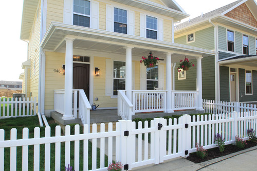
I am so excited about painting the exterior of my house yellow, and I’ve been on the hunt for the perfect yellow. I don’t want it too saturated, too bright, or too gold. And I read an article (which I forgot to bookmark and can’t find now) that said that yellow houses tend to be a crowd favorite and sell faster than other houses as long as it’s the right yellow. The article warned against yellows with green undertones.
So after looking at probably 200 yellow houses on Houzz.com, Pinterest and Google, I finally found what I think is the perfect yellow…
And fortunately that builder gave the name of the yellow that was used on that house. It’s Sherwin Williams Banana Cream. When I found the sample in my Sherwin Williams fan deck, I was pretty shocked. Not only did it look way more saturated than I thought it would, but it also has very noticeable red underetones. But I decided to give it a shot anyway. I bought a sample of Banana Cream, along with four other yellows that looked pretty close to it in intensity, but with slightly different undertones.
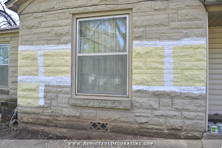
I put them all up on my house, along with Extra White so that I can see what each yellow will look like next to white trim. (FYI, Extra White is the white color right out of the can.) Here are my yellow samples shown on the Austin stone exterior of my house…
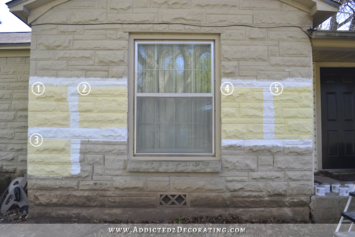
Can you tell a difference? Ha! I was very shocked at how similar they all look! These colors are all Sherwin Williams, and the names are:
1. Banana Cream
2. Friendly Yellow
3. They Call It Mellow
4. Lantern Light
5. Glad Yellow
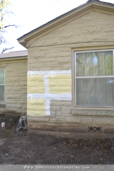
They do have ever-so-subtle differences. The Banana Cream (1) definitely has more red undertones. Friendly Yellow (2) is a slightly brighter yellow.
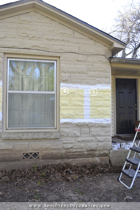
Lantern Light (4) also has red undertones and is just a touch more saturated in color than Banana Cream (1). And Glad Yellow (5) is a brighter (the word “clearer” comes to mind) yellow, and I think it might possibly have very slight green undertones to it. The difference is very subtle, but I think that it’s enough of a difference that it would be really noticeable when it’s on the entire exterior of my house…and not in a good way.
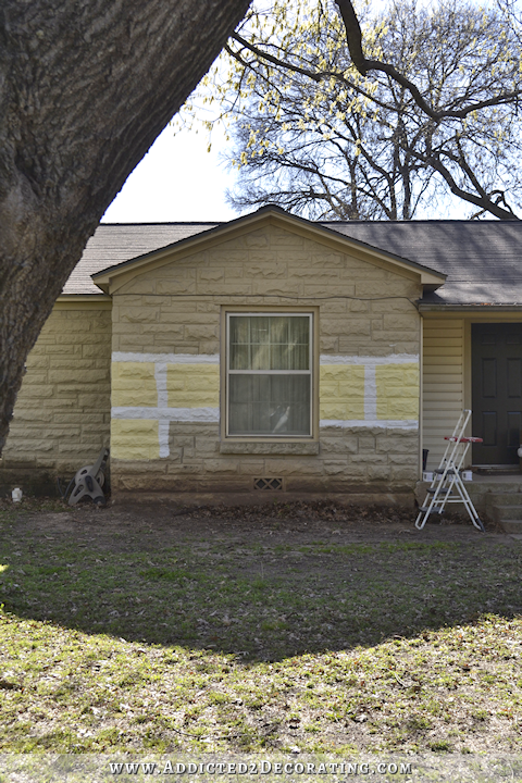
So in the end, I think I’m going to stick with Banana Cream on the top far left. I didn’t think I’d like the red undertones at all, but I think it’s those red undertones that actually keep the yellow from being too bright and garish. Of all of the samples, even though they’re so similar, the Banana Cream has the softest and creamiest appearance of them all.
I’m so excited about having a yellow house! 🙂
I really have no idea when I’ll actually be able to do the painting. Our forecast is showing thunderstorms all next week, so obviously I can’t do it then. But I do want to it as soon as the forecast shows a stretch of a few days with beautiful weather. Here in central Texas, we have to take advantage of any spring-like weather we get, because it doesn’t last long around here. And I’d rather not be outside in 90- and 100-degree weather painting my house. 🙂 So I’ll continue working inside, and keeping an eye on the forecast. As soon as things look clear for a few days, I’ll be heading outside with a power washer and paint sprayer and getting down to business on the exterior of my house.

Addicted 2 Decorating is where I share my DIY and decorating journey as I remodel and decorate the 1948 fixer upper that my husband, Matt, and I bought in 2013. Matt has M.S. and is unable to do physical work, so I do the majority of the work on the house by myself. You can learn more about me here.


I love yellow houses too, though I’ve never had the pleasure of living in one. I think Banana Cream looks perfect. Can’t wait to see it!
I don’t like yellow, but if I did, Banana Cream would be the one. Here’s where your sprayer will come in very handy. We have burnt adobe walls (inside and out). The inside I paint by hand and it takes FOREVER, with all the texture. The walls around our property (a good 1/3 acre is walled in), I sprayed, in less than five hours total. All walls. Love that sprayer.
I love the yellow leaves in the background of the first pic posted! I think your home will look lovely yellow. I’ll pray for a good stretch of clear spring weather for you to work in.
Whoops-It’s the fifth pictures that has the leaves in the background.
Holy Buttercream! You painted samples on the front of the house!?!? You are awesome!!!
And your bushes are gone too?
Just curious…have you virtually “painted” the house using the SW Colorsnap tool (https://www.sherwin-williams.com/visualizer/#/active/scenes)?
Wondering if it would be close to the actual shades you’re looking at? I know computer screens have their own funky effect on color/shading but being able to upload your own house could be a fun way to experiment.
Yep, I painted right on the front of my house. 🙂 My mom was a little shocked when I told her I was going to do that, but I’m hoping that having those samples right smack dab on the front of my house will keep me from procrastinating on painting. 🙂 If I had painted them in an inconspicuous place, I could see it being a year or two from now, with me still living with paint samples painted in an inconspicuous place and my house still not painted. And I needed to paint directly on the stone because no sample boards would give a true representation of what that paint would look like painted on rough stone. So I put it front and center, right on the stone. 🙂
My Hero!!
I came across this post in searching for yellow paints by Sherwin Williams. I, too, have been dreaming of a yellow house since I can remember. It seems the color names have changed now, but I was advised they don’t offer/recommend any of the yellows (similar to your options) for exterior due to subject to fading from UV exposure. Can you share your experience and any fading or loss of color brilliance?
I love your logic! Can’t wait to see the results!
I think more people would make less mistakes if they took this route, painting right on the front, painting right on the cupboard needing painting, etc. It is so hard to “see” a new color or backsplash when you put it against the old backsplash instead of against the cupboard where it should be tested against. Did that come out right? Anyway, Love the new color, its what I picked before I even knew the names. Can’t wait to see it!!
I totally agree that contrary to popular advice, painting in an inconspicuous place could allow for procrastination, especially as many pending projects as you always have calling you !!
Brave girl !
I love the Banana Cream! I also like that the stone and the house will be the same color. The stone will give a little texture and it is sooooo pretty in yellow. The dining room looks awesome too! So glad you can move on to some FUN stuff!
Sheila F.
As much as I thought I was going to like Banana Cream, it looks a bit muddier than all the other samples. I like #2 Friendly Yellow or #5 Glad Yellow and yes, the word clear does apply to #5. It really depends on what colour you use for any trim. Good Luck with whatever you choose!
I’m so glad you are doing exterior because I need to and now I get your expert information on how to do it. Plus I want to paint it yellow but was a ft raid to choose it! So banana cream will be my go to color also!
Afraid
When I was picking out house colors and chose yellow, I took the color slip to the counter and was told they couldn’t make that in an outdoor paint. Apparently you have to watch out for that. I don’t remember why.
Fortunately, a friend had their house painted in the exact same color, and I was able to do a color match.
I don’t live in that house anymore, but I still admire it when I drive by.
I also remember the paint color didn’t have the word yellow in the name.
I actually yelled an excited “IIIIII, she’s painting it yellow”. I love your colour decision, it took a second look to notice differences, but I think that Banana Cream is indeed the best yellow, for the reasons you mentioned. I hope you get a few sunny days really soon!
A few years ago, I painted my house yellow with a cream trim. I painted the shutters a muted green with a deep purple front door. I’ve had so many people in town stop to compliment me on the color palette. It is such a cheerful color and it’s a great backdrop for flowers and landscaping. I like the texture of your painted stones. I think the color will be very warm and welcoming!
We need a picture!
8 yrs later….I’d like to see a Pic too !
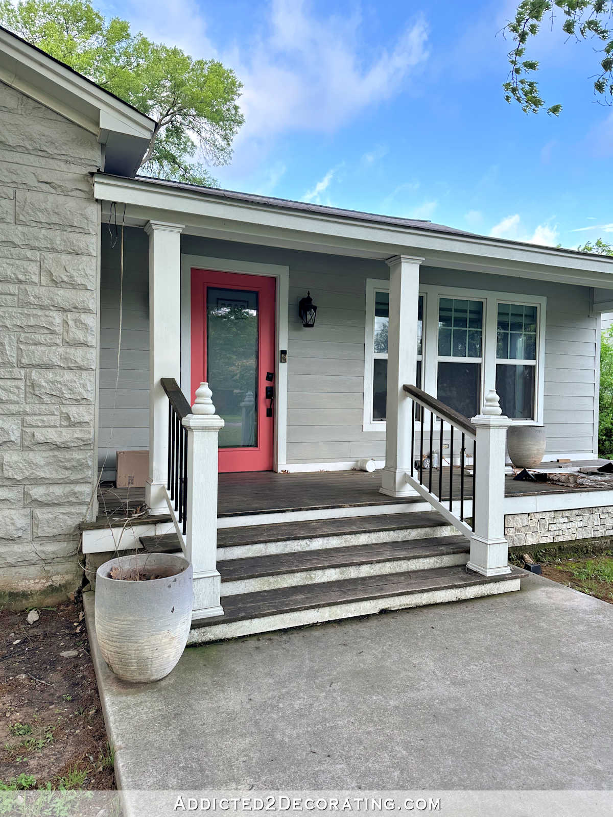
I actually ended up painting our house exterior gray. I have a gray house, white trim, stained wood front porch, white columns, navy blue shutters, and a coral front door. The yellow was a nice idea, but in the end, I couldn’t bring myself to paint Austin stone yellow.
I think your house will look AMAZING in yellow. When you first wrote about it, I was not convinced, but seeing the yellow colors on the stone work persuaded me. I so enjoy reading about your adventures!
Eagerly awaiting your exterior painting instructions. I have never used a sprayer because I was told that the paint must be diluted before spraying…and that dilution resulted in the need to apply two or more coats. When buying high solids paint, why then would I dilute it???
I always thought that whether or not you have to dilute paint depended on the sprayer. Some sprayers require paint to be thinned, while others don’t. The sprayer I got doesn’t require thinned paint, so I don’t plan on it, and I hope to goodness I can get it all in one pass.
I love the yellow for the exterior! I hope you’ll have a few days of sunny weather soon so you can get it pressure washed and painted. Are you planning to add shutters? What color will the front door be? It’s gonna be epic!
Onward and Upward!
I’m actually going to wait and see on the shutters. But overall, I think I’ll stick with a yellow, white and black combo, like the first picture in the post. I like the brightness of the yellow and white for all of the paint, and then black accents like lights, house numbers, etc.
Yep, I agree, that will be a classic and timeless combination, and a great backdrop for whatever plants and flowers you choose when you get to the landscaping. Looking forward to seeing it done!
LOVE the color you chose! I can’t wait to see it finished. You are really going to love the Wagner sprayer…we painted the exterior of our home last year from dingy white to a deep charcoal grey, “Mined Coal” by Behr using the same sprayer. We used Sherwin Williams Showcase exterior paint and it went on so smooth. It took no time at all to paint our 1800 sq. ft. house.
I love your stone! I like how it is bumpy yet cut into nice rectangular shapes. To my untrained eye it appears to be in good shape too. I would want to keep it on the exterior even in a remodel. I did not know what I would think about it painted yellow but I really like it, in Banana Cream. I wish I could see undertones like you do. They have to be really blatant for me to perceive them.
Can you tell us what power washer you have? I plan on painting the exterior of my house as well, and would definitely love your input!
I don’t actually own one. I was planning on renting one for a day. I’d love to buy one, but haven’t really even looked at them or read reviews on any of them yet, so I can’t even share which direction I’d be leaning if I were planning on buying one.
Personally, I’d liked Lantern Light the best – but I get that Banana Cream seemed to fit your criteria best. All of them do look beautiful – I’m a big fan of pastel homes!
You make no mention of #3. What steered you away from it?
Enjoy reading your posts!
I love yellow! It’s warm, sunny and just makes me smile. My favorite was 4 as it appeared a bit brighter than the others. 1 is a close second for me BUT it isn’t my home, is it? LOL
I’m so excited to see it! I love being along for the ride .
Banana Cream for me has the green undertones! Unless it’s just not as thick as the other pain swatches, or the rock color is showing through. Just thought I’d throw that out there.
*paint lol I also looked on the Sherwin Williams paint page and they paired it with Sage Green to compliment it, so….here’s the link to that. https://www.sherwin-williams.com/homeowners/color/find-and-explore-colors/paint-colors-by-family/SW6673-banana-cream/#/6673/?s=coordinatingColors&p=PS0
I was sooooooo hoping you’d pick Banana Cream!!!!,
LOVE it and the “depth” of it……really beautiful and a bit shuttle looking….can not WAIT!!,,!
Have a great time painting….what a change that’s going to make!
I’m not loving the yellow. The article you read about yellow yellow being a crowd favorite as long as it’s the “right yellow”. I’d qualify it further and say as long as it’s on the “right house”. I think it is beautiful on that traditional house. I just don’t see it on your house.
I’m sure you’ll prove me wrong. And even if you don’t it’s your house and it only matters that you love it.
When we built out house, we had yellow siding put on. I love it! All our trim is white, our roof is a dark red and soon our front door will be. I have always read where yellow houses sell faster. Hope that is true when we get ready to sell!
As the former owner of a yellow house, I can attest that you are right to be cautious about choosing the proper shade. When we bought our house, it had been freshly painted and the yellow was too bright. Since it was a boxy two-story, it looked like a big haystack. Over the years, the paint faded to a more acceptable shade. When we had it repainted, we chose a very toned-down, neutralized pale yellow. It was just right. then we had the only yellow house in the neighborhood. There are now two in our present neighborhood, one a beautiful pale yellow; the other too bright. Our old yellow house is still there and still yellow.
I also like most others here, LOVE the Banana Cream! I can’t see the undertones so much just from these pictures, but it is gonna look fantastic in Banana Cream withe the white trim…..and yes I like the black door also!! Can’t wait to see it done! Hurray!
I personally like #3. I think it looks like a less murky #1, slightly more bright, but not bright.
I can say living next to a new, just sided yellow 2 story home with white trim, that it is beautiful. I love looking out my window seeing that cheery color. I think the color would look good on any size home if it’s the right shade. With the white & black accents it’s gonna be awesome! Can’t wait to see it all done. I’m sure your neighbors will have lots of compliments. Hope you can start on it soon. Will be a nice break from working inside so long. Good luck!
The yellow/white combination looks so fresh and inviting. I like the Banana Cream, it’s going to look gorgeous on your exterior. Fingers crossed for some good weather so you can get it done. You are making awesome progress this year.
From everything we have seen of the interior of your house I can not imagine a better “preview” then the yellow exterior. Perfect choice. I have yellow house but its not the same. Its more banana split with old bananas… Sigh. Aluminum siding and chocolate brown trim. I feel lost on how to correct the issue in the easiest way possible.
Banana Cream is the one I like the best when compared to all the subtle differences of the other samples. I will look great and unify everything. Looking forward to seeing it all done.
#2 Friendly Yellow, absolutely! Love your blog.
I love a yellow house with black shutters and agree Banana Cream is the best of your selections. Not to confuse matters but check out Montgomery White by Benjamin Moore. Although is is “white,” it reads yellow.
without your inspiration foto I would have chosen either #3 or#5 from your selection, but after scrolling back and forth a couple of times, I realised that it is exactly the red undertones and slight “murkishness” of #1 which makes it so fantastic when seen on the complete house! I’m not normally a fan of yellow, but this buttery, vanilla-version is great and in combination with the white trim, it looks simply lovely. So I, too, keep my fingers crossed for the right weather in Texas for you to get your house all pretty 🙂
I am also in the process of picking out a yellow for my house exterior – I was leaning towards Compatible Cream but I think I need just one more sample of that Banana Cream. I also paint right on the walls for the same reason, but it’s still sometimes many, many months before I finish the work, lol. I’m in the hill country a little south and west of you, and we’re of mixed mind on the upcoming rain – we need it, but we would like to get the exterior done before the Texas ‘hell high’ settles into place, ugh. I love that you share your selection processes (and thought processes!) on everything you do – and it’s such fun to see your work progress!
I think all the yellow paint samples pretty much look alike except yes, I can see the green cast to no. 5. The yellow color is really going to add a lot of cheer and perkiness to the house. But what about the siding on the right hand side of the house? Is it vinyl and can you paint vinyl siding? It the siding going to be yellow too?
Some landscaping would really add a lot to the overall appearance of the house after it’s painted. Some nice garden borders with nice well kept shrubs and easy care perennials would look nice with the new exterior. Maybe stone mulch. It looks like that tree shades out the grass so it’s probably impossible to have a grass yard that Hank Hill would be proud of. Maybe trim the tree?
Yes, you can paint vinyl siding. The general rule has always been that you can’t go from light vinyl siding, and paint it a dark color with just regular paint. The paint will shrink and buckle the vinyl siding. However, Sherwin Williams now has an additive that they can add to their paint so that it can be used specifically on vinyl siding, and that additive makes the light-to-dark problem no longer an issue.
Thanks Kristi! I didn’t know that vinyl siding can be painted. So there is hope for my house yet.
Oh, another question Kristi. What is the black wire strung across the house exterior? can you get rid of it?
I actually don’t know what that is. I tried to follow it the other day and see where it came from and where it goes, but it’s hidden behind siding on the front porch, so I’m still not sure. And I really have no idea why the person who installed that wire decide to string it straight across that part of the house. 😀
Is it your cable?
We put a soft yellow siding on our Sears cape and trimmed it in white and black shutters and trim. It was gorgeous and we never tired of it. Similar to your choice.
The Banana Cream is my favorite of the bunch from a distance too. I think I read the same article you did. If I’m recalling correctly, it was on was houzz.com 🙂
What happened to the finished cleaned up dinning room and music room. It would be so nice to see something done. I know your kitchen is done, but you already to have plans to change it, and your are now going outside to play with color since you got the new sprayer. Go back inside please and finish those rooms. That should be the goal. I can’t imagine that it would be 90 or 100 early in the day, so paint outside in am, get one wall or two done. They come back and do the trim work on those wall. Finish other walls and follow through. Still waiting to hear what your dinning room table will look like. I though you were going industrial, PB
Mary Anne, I am sure you mean your words kindly and I know Kristi doesn’t need anyone jumping in to defend her but I am going to say that your message reads as if you are a mother addressing a child or an employer with a not-very-bright employee. (You aren’t her mother are you? If so, I apologize but maybe you should hash these things out in private not on blog comments.)
Kristi has explained many times why she works the way she does. It may not be the way you or some others would go about doing it but it is her house, her life, her blog–that we all read for free. I’m very interested to see the finished dining room but I can also understand why she needs a break from it. The outside stuff is interesting to read about, too. I’ve been thinking about painting my house yellow; I will check out some of the colors Kristi did.
Thanks Adele
If people would actually read things she already explained why. The summer gets horribly hot and you can’t paint in those conditions. She’s doing this before it gets too hot, and she has all summer to work indoors where its comfortable. I agree with others that your tone seems really bossy on here. She doesn’t have a timeline and I agree that sometimes I just get tired of working in one room and need a break sometimes. It would be nice if people would just try to enjoy the flow instead of always trying to make people do things their way.
Benjamin Moore Hawthorne Yellow. Best yellow for exteriors.
I am in the middle of researching the selection process of paint colors. I learned that each color has an LVR number. It has to do with the light reflectivity of the color. The scale runs from 0 – 100 with zero being closer to a black and 100 being closer to a white. I bought a bunch of sample paints paying close attention to the LRV numbers. I ended up not liking the one with an 80+ LRV rating. Keeping it in the middle rage of 60 will work better for me. All that to say, maybe that “clearer” color has a higher LRV number. The more the color reflects light, the “brighter” or “clearer” it will appear. You might look at the back of the fan deck and see the LRV numbers. If not, I found it is located on the website of many paint companies, ie Benjamin Moore’s. Can’t wait to see your finished house.
First things first. That stretched horizontal wire has to go. Get a longer one and at least run at the soffit. Better yet is to drill hole in attic and hide it all together.
Paint is cosmetic. The wire is ugly.
Adele and Carol, I am sure you mean well, but if you have been following Kristi for as long as I have, one thing is very apparent and that is that once she gets stated on a project, with the exception of the kitchen, she has a tendency to stop doing. I am sure it is because she is busy looking for advertisers for her blog, as that and clicks are what get her money. I very often play devils advocate with Krisiti and she knows it. Sometimes she get carried away, as in the molding in the dining room. She spends hours, as she readily admits, pouring over pictures from someone else, often finding hundrends of things she likes. Then she starts second guessing her own style. She is flamboyant. She is not traditional, except in the sense that she likes moldings and very often traditional elements that go with that look, as in pocket doors. Kristi knows that I have been an interior designer for years. Yes, I am old enough to be her mother. I have worked with clients who want me to do their living rooms telling me they have no idea of what they want. You arrive at their home giving them an hourly cost for consultation, which is deducted, if they choose you and go with your designs. We make our money on “kick backs”, not a nice word but that is how I see it. You buy furniture from a particular house, you get a good price for your client and then you also get twenty percent off the top. That is how we get paid. Then we get the, I know I said I didn’t know what I wanted but I really like this chair and this sofa and on and on with a miss mash of unmatched colors, furniture, rugs, wall paint fixtures etc. Kristi is fortunate that she has experience in DIY work. She, admittedly has no education in design. My issue with the dinning room was regarding a question I had asked yesterday. She once again admittedly, changes her mind, a lot~ That is her prerogative. I often cannot keep up with it and I do not have the time to go clicking around on her web site trying to find what she has finally decided. I am trying to ascertain her dinning table style, since last I remembered it was industrial, from PB or WS or RH. If that is the case, none of the chairs she has show us seem to go with industrial. That question, coupled with the commitment from her to have everything finished and cleaned up for showing today, becomes frustrating for someone who is very excited to see her work. I realize that her new toy had to played with, but she did spray the walls in the house. She could have waited a few days to test paint the outside. After all, by her own admission, the house has to be power washed before it can be painted. It is quite possible that once she has cleaned the house she may change her thoughts on the paint. So, as long as Kristi isn’t bitching at me, I shall continue to play devils advocate. We ladies from the Northeast have a tendency to speak our minds. Maybe because we are still such a melting pot of interesting and enlighting people. Have a lovely weekend ladies.(ok, this was a bit bitchy and BTW, I have never talked down to any of my four children, nor have I done so with people I work with. I never employed people, just work in hand in hand in trades)
Please don’t characterize what you say and do here as typical of ladies of the northeast. Not in my experience. And I don’t wish to be painted with that brush.
Kristi, that yellow is lovely, and I’m so looking forward to seeing how your painted exterior will look.
PS: I enjoy your process, as well as your results.
Ditto what Ellen W. said. If you want to be outspoken, fine, but own it. Don’t make it out to be a “Northeast” thing. I’m an East Coast girl through and through, and I’m not afraid to speak up, but there’s a difference between outspoken and just plain rude.
“Maybe because we are still such a melting pot of interesting and enlight[en]ing people.” Wow. I’m not really sure why you read Kristi’s blog if it’s so frustrating for you. I get excited about her projects too, and sometimes impatient to see things finished, but it’s her life, in real time, not a TV show.
If you’ve been following Kristi for so long, then I’d think that you would have read her explanations for jumping around the way she does at least a half dozen times. I don’t think your “devil’s advocate” comments are going to change that.
Another Northeastern lady here to agree with Ellen and Linda! We are no more interesting or enlightened than anyone from any other region- that was a very high and mighty statement to make.
And really, of ALL the players out there, do you really think the devil is the one who needs an advocate? I’ve always hated that term.
Keep up the excellent work, Kristi! Your house is turning out beautiful, even with your admitted lack of design education 😉
Mary Ann, you interesting and enlightened nut, you!
I, too, am from the northeast. And in the 35+ years that I have been involved in/obsessed with decorating I have never found a more inspirational and informative source than Kristi’s blog. And, like most of us, I’ve read a lot of Martha and watched a lot of HGTV.
Last summer when I was building a wall in my kitchen, installing wall cabinets as base cabinets in an alcove and making a peninsula with a concrete counter, my kids politely questioned my ability to complete such a plan. And I know my husband thought I was nuts. I just told them about this great lady I found on the internet that could anything, and was nice enough to share instructions.
And your less than kind comments really pissed me off. Because I realized that I never comment, never thank Kristi and let her know how great her work is. And I LOVE that she shows the mess and the skipping around and that she takes the time to take and share pictures of it all.
Thank you, Kristi. You’ve inspired me to do more than I thought I could. I love my kitchen and I wasn’t crazy to do it myself 🙂
And Mary Anne, how the hell can you be a decorator and not know how to spell dining room?
You got it wrong 5 out of 6 times.
Okay, that was bitchy
That three tiere splashback from no gutter and no landscaping will really show on yellow. You might want to paint the trim first and get gutters. Then paint the house and get shrubs and grass. Since it’s nothing but dirt now it will splash up and you won’t like it. Even though it seldom rains in Texas. Ha! Not Oregon anyway.
I went to look for the yellow paint samples on the Sherwin Williams website since I can’t really tell the difference in the photos. Anyway, I noticed they have a 30% off paint coupon for the month of March and 15% off painting supplies.
http://www.sherwin-williams.com/special-offers/sherwin/coupon/advertised/
Kristi, I’m going to pitch another idea to you. Consider faux painting your stone to look like mixed stone and paint the siding yellow and the trim white or off white in a shade to go with the stone. Lori
oh I like that idea!
I guess maybe it is jut me, but they look so darn similar that I can’t tell any meaningful difference, so I don’t think it really makes a difference which one you choose, they are all pretty!
Hi Kristi,
I am a yellow fan, but have you considered painting the stone a different color than the siding? I actually like the WHITE paint on the stone (the paint that you used to divide the yellow samples on the stone, LOL!!!) I would let the stone glory in its “stone-ness” and look like the stone it is. You could also maybe add some austin stone veneer along the front edge of the porch for continuity (or around the base of the columns or as planter/curbs on either side of the front steps, etc. If Austin stone comes in a paver form, maybe you could cover the concrete porch or steps with it. Just my 2 cents.
All the green outside from leaves and grass has a tendency to reflect on everything and give yellows a greenish cast, so going with a reddish undertoned yellow makes sense. (I experience this inside my own home, which backs up to a wooded ravine and my interior walls are a golden yellow!) And I’ve learned, from “experts” and personal experience, that you always go with grayed down, muted colors outside (even with whites) as otherwise on sunny days you could be blinded by the brightness! I do like your original choice, banana cream, for the yellow.
Best wishes!
Hi,
I read your blog all the time, I’m so inspired by all your molding/trim work that I’m starting my first molding/trim project – still a little intimidated by the miter saw. I was surprised to see Friendly Yellow in a list of paint colors, I usually see Benjamin Moore colors on most blogs. We used Friendly Yellow in my son’s nursery that was decorated in a Peter Rabbit theme. That color stayed on the walls into his toddler years because we loved it, it was cozy and welcoming. Not sure how it would work for the exterior but I did miss it when we painted over with with a Hot Wheels blue!
Proof of my mantra ‘a good color is a good color’, Banana Cream has been mine favorite go-to for soft yellow for years. No ‘pee-pee’ undertones, no peach, just pretty. I think it will be great.
Yellow is not my thing at all but the Banana Cream is the best one of the bunch. Glad you found one that you are happy with.
Kristi, I love the banana cream. I used to make and paint hair bows for little girls for various children’s boutiques. Many, many times I used a cream colored ribbon for a yellow outfit because it matched better than a true yellow. You might want to look at some of the creams they have in paints. As always, I love your taste and look forward to your posts
I just painted my house they call it mellow yellow. Can someone please suggest a blue color for the door and the color white I should use? My roof is brownish. Thank you from Florida
Kristi, that color works very well for your home! You’ve inspired me to add Banana Cream to my own narrowed-down list of colors. And I’ve wanted to use Extra White as the trim color from the get-go. Interestingly, did you know that out of the five colors from which you initially chose, only two of them are colors that Sherwin-Williams notes as being suitable for exterior use? Luckily, Banana Cream is one of them. However, it makes me wonder what would happen if someone was to paint the exterior of their home with Friendly Yellow, for example, as that is listed by Sherwin-Williams as being only an interior color.
As for the Banana Cream, I’m curious how it has held up over the years and if it has done a good job of resisting fading. Congratulations on choosing such a splendid color for your home!
Thanks for article. Contemplating painting my house yellow. What color door or shutters did you do?
Love it! What color did you use on your foundation? It’s perfect.
SO i really like the banana cream and the friendly yellow. I called my local sherwin williams and they said its not made for the exterior of the home. :(…Why is that? they bascially told me to pick another color.
What?! That doesn’t sound right. Perhaps you spoke to someone who’s new and doesn’t know what they’re talking about. You can paint a house any color you want! And they can mix their exterior Duration paint in any of their colors. I’d call or go back and talk to someone else.