Yellow Piano In A Black & White Music Room
I only have a small update for you today because I’m waiting for some workers to get here to finish up the drywall on the ceiling of my dining room and entryway, and if they have time, the hallway as well. Yep, I finally gave up. 🙂 I just had to face the reality that there are a some things I’m really good at, some things I can muddle my way through, and other things that I just need to let the pros do. Mudding ceilings falls into that last category. I’m fine with walls, but I just can’t do ceilings. Anyway, they’re supposed to be here at 8:30 this morning (45 minutes from now) and I still have to clear a few things out of the dining room.
But I wanted to quickly show y’all how my yellow piano looks in my black and white music room. Since I finished the basic stuff on my music room last week, I’ve just been thoroughly enjoying it in its empty state. To be honest, I’ve been afraid of moving that piano in there because I was so unsure how the yellow would look in there. And since I was still really excited about how the basic stuff on the music room turned out, I wasn’t quite ready for any potential disappointment.
You’ll remember that I painted that piano yellow when I thought that I was going to do the hand-painted “wallpaper” on the walls of the music room.
The yellow piano was perfect for that — bright, fun, and lighthearted.
But I just kept remembering when I first painted that piano yellow. The wall in the music room at that time was solid black, and I thought the yellow against solid black looked terrible.
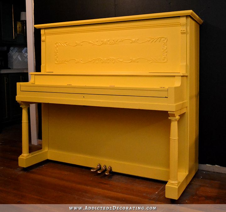
It looked like a bumblebee, and the piano seemed to glow against the black wall.
So I’ve been putting it off and dreading it. But with the drywall guys coming this morning, I finally had to get the piano out of the dining room and back into the music room. And you know what? I LOVE how it looks in there! Interestingly, even with black walls, that room is so light and bright now during the day. And I think that the abundance of white in the room really helps to eliminate that potential bumblebee effect for the most part.
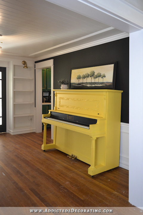
Oh, and do you see what’s on top? That’s the painting that my mom painted for me to go in my kitchen!
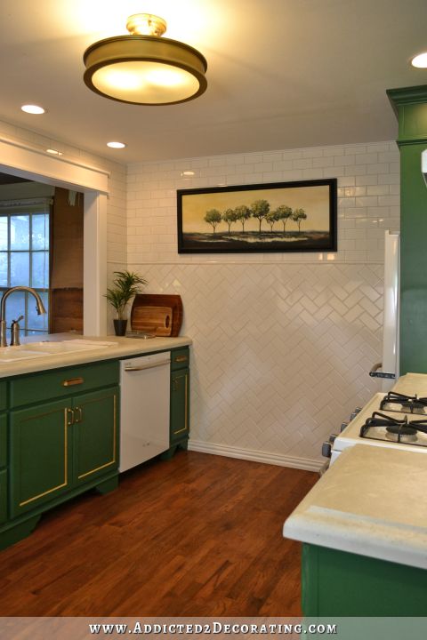
That painting was custom made for my kitchen — the size, the colors. So when I had to take it down to create the opening into the dining room, I was afraid that it might be challenging to find a new home for it. But I think it looks terrific above the piano! It really looks like it was custom made to go there as well! With its subtle yellow, green, and black, it works really well to tie together the piano, the music room, and the kitchen.
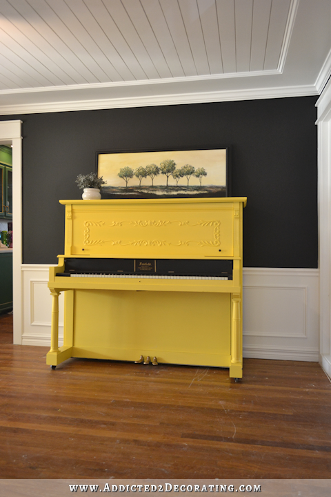
I might have to do a little something on the frame, though. Right now, it blends right in to the wall, and I’d like for it to stand out a bit more. Maybe just a coat of off-black paint will help with that, so we’ll see.
I’m so relieved that I like how the piano looks in there! I was dreading the thought of having to repaint that piano…for a third time. 🙂

Addicted 2 Decorating is where I share my DIY and decorating journey as I remodel and decorate the 1948 fixer upper that my husband, Matt, and I bought in 2013. Matt has M.S. and is unable to do physical work, so I do the majority of the work on the house by myself. You can learn more about me here.


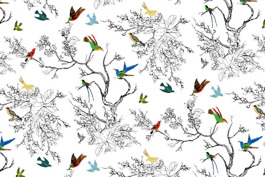
Think you should do a larger painting of the bird wall paper you loved so much and put that over the piano, or something even larger and bolder. The tree painting is lovely, but too subtle. You need something more impactful over that piano. Then no bumble bee effect whatsoever.
Love the idea of the birds but i like the trees too its just small
I think I was reacting to the size as much as anything. Seemed out of scale.
Not too crazy about the birds wallpaper picture idea, but like very much this small tree painting. Remember one’s eyes need to have some restful space instead of zooming all around the room to so much detail. The piano, the moldings on ceiling and lower walls, the ceiling boards, the bookcases, the black and white delineation…… There is enough already without adding more bright detail. and think about when the bookcases are styled. More colorful detail. You have to move back and view the room as a whole, not just a picture of the piano on a small piece of the wall. I say this as I learned from experience. I was always the “more is better” gal until I was gone for a month and walked back into my small cottage. Whoa! Everything sort of hit me at once and I saw what this decorating rule was all about. Sometimes we need fresh eyes to see the whole. Anyway, I like this room a little simpler since there is so much basic detail. I think the yellow piano gives it just the pop it needs. Just my opinion. I know Kristi will do it just like she likes and she is so talented. but couldn’t resist throwing in my thoughts to this first reply. 🙂
I agree. I think the tree painting is perfect and will be even better when Kristi changes the frame color.
What about painting the frame a green? Something subtle, but that will tie in the kitchen cabinets, which peek-a-boo nicely from the kitchen. Maybe even green with gold accents?
The piano looks wonderful, and the painting pulls the kitchen color in and has a good scale for the space. I’m relieved to know that you sometimes have to call in a “professional” (although you are the consummate pro!). 🙂
oh wow, that looks really light and fun! the yellow makes the room even brighter, but in a good way – and the picture is just perfect there! are you going to hang it on the wall? I think that would do the picture more justice as now it seems a bit like an afterthought put on the piano (yeah well, it just is like that, isn’t it? but it just looks like it’s been custom-made for exactly this wall and thus should be hung on the wall!!) I’m amazed at the impact of the room – I love black as a wall colour but think you combo with the white parts on the wall is genius as it has all the positive effects of the black without it giving a dark and dreary feeling. great start to the year 🙂
I am going to hang it on the wall eventually. I just didn’t have any picture hanging hardware on hand, and I want to do something with the frame before hanging it.
I love it all, I agree with you that a little something to the frame of the painting is necessary. It needs to stand out a bit more. Do you plan to hang it on the wall or rest it against the piano top like it is now? I think it would look better hung equal distance between the piano and the crown molding. Honestly, I think that painting is just perfect in there though, it brings everything together so nicely !
I’ll hang it as soon as I get the picture hanging hardware and do something with the frame.
Looks great!
Looking good. What about having the painting mounted, somehow to a large mirror? Frame def needs a Kristi touch! Still not a fan of the wallpaper idea…..but…….just love the black walls.
I like that idea!
Agree with Deb…would do a painting of the bird wallpaper to hang…or maybe two vertical paintings. Love the direction is it going and know you will be so glad to get it finished.
If I were you I would still use the bird and tree motief on the black wall behind the piano, only paint the trees white and the birds various colors. I think that would be stunning and unique. Love the yellow piano.
I was worried about the yellow piano in such a sophisticated room- but it looks great!! Such a beautiful space!!! I’m glad you’ve hired someone to do the ceilings- you’ve got plenty of other things to do.😊
It looks perfect! The painting ties everything together and along with the plant adds that little touch of green to refresh! Love it!
Absolutely lovely as it is – your ceiling is to die for
LOVE it!!!
I agree, the ceiling really makes everything look spectacular and helps with the bumble bee affect and that painting really makes it all work. I really love it too!
I love, love, love how this room turned out! The color is perfect and so is the painting. Maybe on the piano bench you could cover it with fabric that has the stencil you were going to do on the walls? As always it’s looks amazing!
Call me crazy, but i think a bit of that “wallpaper” on the piano itself would look amazing. It almost looks as though there is a frame for it with the delail.
Love the piano in the room, and I do love the picture but I don’t know if I love it in that room. The shape and location is great – just the style of the painting I don’t know if its suiting to the room. BUT once everything it put back together I could feel totally different! I like the idea of what a few other people mentioned about doing the “wallpaper” in a frame and hanging it – I think that would look great above the piano in the same size frame! Great job Kristi, everything is coming together beautifully!!
I agree. The room is stunning! And, the piano is darling in the room. And, the picture is awesome! But, I think it might be a little dark (or heavy maybe?) for that particular room. I think you will find the perfect place for that fabulous painting, though. And, I have no words of wisdom re: what should be hanging in its place. Art, for me, is the hardest, most crucial part. Great job. The room is just gorgeous! I hope you are very proud of yourself! 🙂
I just had a thought about the painting. How about a antique gold frame around it? (to tie in with your antique gold sconces) In my mind that seems like it would look great! 🙂
I agree with antique gold for the frame. You could also use antique gold on the relief on the piano. It would pick up the lettering, pedals and the frame. Looks terrific!
I was excited to see that you used the painting in the music room, it looks perfect!
Looks great! And the little black part on the piano helps things, too! As for the painting, I think it’s even better there than in the kitchen!
And it seems like you are going to have the front part of your house done pretty soon (“at least for now”). I think it will make you much more comfortable if you are working in, say, the breakfast room later or your office, and you go back to a done part at the end of the day.
Can’t wait to see this front part finished!
I agree with Phoebe. Maybe a dry brush with the gold on your frame and distress it a little. It looks awesome.
I was wondering when you were going to show us how the piano looked in the room. I was so excited to see that in my inbox this morning. The piano looks great against all the white trim and the contrasting walls. I agree with the frame getting lost on the wall and would be tempted myself to try a bold color on the frame to really pop against the black, but I trust whatever you try will end up looking fantastic.
Kristi what about a mirrored frame around the current frame would not have to be large just a touch of sparkle?
I love how this is turning out. The picture above the piano is perfect! This room would make me smile every time I walked through, or stopped to read a book or magazine off the bookshelf. Awesome space. I anxiously await your next spaces and your finishing touches in the music room.
Love it!!!!!!!!
Love the yellow piano in the space and so glad you were able to re-use your mom’s beautiful art! Agree about the frame, though. Maybe you could paint it with the iridescent paint you were going to stencil on the black walls to make it stand out.
Your mother’s painting is just perfect for the music room. And the yellow piano? It gives an already striking room and bit of cheer. Love everything you’ve done there. You have already proven you CAN do ceiling drywall, but why do it when it’s something you really don’t enjoy? I’m glad you brought in some pros. I just hope they can do the precise and exacting quality of work that you do.
I agree. Painting is just what’s needed…don’t move it
Bubble bee does not even enter my mind! Turned out amazing and your mom’s painting makes it all work! Perfection is the word that comes to my mind!
Agree. The piano does look good in the music room, and your mom’s picture ties it in together. No bumblebee effect. It looks from the comments like the consensus of Kristi fans is “WELL DONE”
I love it!
Love it!!!
SO glad you called in outside help to finish your ceiling sheetrock. It’s not a defeat, it’s the acceptance of reality. Mother Nature did not design female bodies for sustained, heavy overhead work.
Hi Kristi
I like the idea of hanging that painting on the wall above the piano too. (after you’ve finished with the frame enhancement of course) See how you feel about that by sitting the painting on something that would raise it to the right hight before committing to it.
hmm where’s spell check when you need it…
Hi Kristi. Good for you for hiring mudder’s:)
I love the piano and the painting! It ties the kitchen in so nicely. I had been a huge fan of the wallpaper… But now think your moms painting is sophisticated and just perfect(when hung).
Looks fantastic!
I KNEW that piano would look awesome in the music room!! I love it and the painting does a terrific job of putting all rooms together. I do agree that the frame needs to be more defined but am not sure what color.
I love it!!!!
So glad for you as well…..it looks fabulous and not at all out of place!!
Again dear one…..you DID fantastic !!!!!!
I really love the piano in the room and the painting that your mom did looks stunning in there. I actually like it in the current frame. I love the way that the frame blends into the wall and I think it makes the painting stand out more. Whatever you do will be fabulous, I’m sure.
I agree. I like the current frame too. It really does make her moms painting stand out – the green color against the wall and the green cabinets just around the corner…beautiful.
Can you do a YouTube of you playing the piano? Or a whole house walk through? I love the painting there!
I’ll do both of those eventually! 🙂 The one of me playing the piano might be a while, though. I haven’t played in a decade, so to say I’m rusty would be a huge understatement. 😀
great job! Enjoy your master piece……
It looks just beautiful. Congrats!
Thanks for the peek at how fabulous this room is going to be. It only took 2 decorative items to reveal how fresh-looking yet elegant the room will be when completed. The painting is perfect over the piano. I also think the wood floors add a great deal to the design of this room. Well done!
Even though it is costly to hire drywallers, I believe it will be cost effective for you. They will fly through a job you dread and which is very hard for you because you hate it. You will be able to move on far more quickly with the finish work you excel at. Personally I think it is money well spent when you hate the overhead drywalling and it is difficult for you to do alone. Can’t wait to see the next stage of the process!
Just had a thought…since you can see the kitchen cabinets in the same sight line as the piano, I wonder how a thin gold line on the outer front edge of the painting frame would look? Might be a subtle way of bringing out the frame…
not bright gold, more towards brass tones
Wow, I really love it! You keep doing what you are doing the house is looking awesome!
Oh my gosh I love the piano against the wall and I think it’s your mom’s picture that actually makes it look like it belongs there. The picture makes the transition from the yellow piano to the black wall seem less stark than it might have been. Love love love it.
I’ve been gone from your blog for a couple of months and I see I have so many post to read to make up for that! So much has been done. Love all the changes.
I love the look of the piano and painting against the dark walls. Keep it!
Oh my goodness! I LOVE IT!!!! Personally I love that the picture is smaller, I like the restfulness of the scene as well as the blank space above it!
Now I *really, really* want to paint some walls black and some furniture a super bright fun color! =D
Kristi, your music room is awesome…and the piano couldn’t be a better color with the black! The painting looks great, too.
Kristy, I love it!! I would change the frame too. How do you think it will look with black matting and a white frame? Also, I love how the piano is painted black behind the keys, looks great!
Yes, it looks great. I think the painting on the piano really contributes to reducing the potential bumblebee problem. It blends/mellows the three colors. Nice.
I love this piano in here! I personally love the picture also. I wonder if painting a small line of the antique gold around the out side of the frame would be all that is needed to anchor it on the wall. I like how it would mimic the name on the piano, the gold trim of the kitchen cabinets, the birds on the doors and the sconces. Is the bird motif available in fabric? Perhaps you could do you own rendition with fabric paint and use it on pillows or as an accent in the backs of your chairs for this room. So happy you had the drywall hired out. You can move on to your real talent!
Sheila F.
I see a bronze/gold renaissance frame on your mom’s painting. I just love the pop of yellow on the black with all the beautiful trim work you have done in your music room. You never disappoint, Kristi!
I would have had the same worry about the piano color/wall color. And I’m surprised at how great it looks in the room. Really great. Your moms painting warms everything up and dials down the extreme colors, I think. You have such an interesting, beautiful house.
i think the painting looks really good – i don’t think it is too small or out of scale. also, there will be plenty of other pattern going on in the room when you add stuff to the shelves and whatever you do to the other wall, so the painting should fit in well just as it is, whether you hang it or lean it.
I just really dislike that yellow piano and I dislike it even more in that elegant music room.
Oh how I miss those pony walls.
Good thing it’s not your piano, your music room, or your house, isn’t it Kismet? It’s also a good thing Kristie is decorating her house for herself and her husband, and not for you.
Boy was I WRONG!!!!… and very happy to be so :). I despised that yellow piano but I have to say that I love it and your mom’s painting :)!!!! I agree with the others, that painting ties everything beautifully. I like the frame as is but can imagine it with gold edging like your kitchen cabinet doors.
I think the painting size is perfect as a base for staging the piano top. Love the size. Love the colours.
I just love the piano against the white wainscoting and black wall and I really like your Moms artwork above the piano, as it blends in the colors so well. I agree that the frame needs something to make it stand out against the black wall. Maybe your bird print could be on your piano stool or as decor cushions on your armchairs when you get to decorate the music room. This room looks absolutely stunning and I anxiously await for the day when you decorate it and style the bookcases after your dining room and entryway are completed……it is going to be so magazine worthy!!
The painting really ties the piano and the room together – I love it! Plus it is the right size to go over the piano 🙂
My opinion: antique gold/bronze frame on picture. Definitely hang the picture on the wall. Leave some wall space to hang a guitar. We have 2 guitars hanging in our house and it’s such a nice form of “art”.
Have you seen this Bow Front Bird Chest? Perhaps you could still have your birds somewhere in the room.
http://lindycottagehill.blogspot.com/2011/02/bow-front-bird-chest.html
Your last picture showed up in my feed reader and I just smiled, it looks lovely!!!
I love it, I think the painting is perfect, i really like the wallpaper idea but maybe for another room. I would not change a thing.
Stunning! Bold! Love it!
I think it looks good. Not too garish. I especially like it opened so the black is visible above the keys. I would think about doing the bench in black with maybe the bird fabric upholstery. I did expect it to be on the opposite wall!
Kristi…honestly..I just LOVE it!!! I must admit I wasn’t sure simply because I’m not a fan of bright saturated shades of yellow..but as usual. Your ideas work! It’s just stunning!!!!! And next to your kitchen. It just seems to be perfect for that location…
It looks awesome. I really really like the painting above the piano – I think the colours and proportions are just right, it will look amazing when hung.
And yay for workers! Currently have some guys over installing wood flooring after being up til 2am finishing off the adjacent tiled area to be ready for today.
Should you plan out the major features of the rest of that room before deciding on artwork?
Looks lovely! Personally, I’m not a fan of the color yellow, but it works well in this room. Your mom’s painting looks even better here than in the kitchen I think. The wainscoting really makes the room. Can’t wait to see it completely finished with a buffed floor and the rest of the furnishings/accessories.
The painting has the perfect new home! Love it
I’ve been worried about the bumble bee effect of the yellow piano in that room ever since you wrote that you were definitely going with black on the walls but it looks good and the painting ties everything in. I like the suggestion a couple of people made about hanging the small painting within a mirror. You could accessorize the top of the piano with a few pieces like a mantel. The picture in the first link is rather over the top but you get the idea. The simpler frame (13th photo down) in the second link is more like what I was thinking so it doesn’t compete with your crown molding and ceiling.
http://www.roys-antiques.com.au/index.php?page=shop.product_details&flypage=shop.flypage&product_id=643&category_id=10&manufacturer_id=0&option=com_virtuemart&Itemid=33
http://www.designmanifest.com/inspiration/what-goes-above-the-sofa-mirrors/
I still love the Schumacher Birds and Butterflies pattern but I have to agree with Michelle, the eyes need a spot to rest on so I think I’d just splurge on enough fabric for a piano bench cushion or an occasional chair.
Hi Kristi, love the room! And the yellow piano is awesome in it. Does your favourite bird and branch wallpaper come in fabric? While I think it’s to busy for a wall it would look great as the bench top to your piano or even the cover to a small chair. Great job! Cheers