My Very Scary Bathroom Before…And A Plan
Last week, I finally finished up my kitchen makeover, and this week I hope to finish up my dining area makeover (just a handful of projects left!!), and possibly even my utility closet/hallway makeover (big project there will be installing a pre-hung door…yikes!). It’s an ambitious goal, but I really think I can do it.
So I’ve been thinking about what I want to work on next. It would make sense to move on to my bedroom, since I’ve actually gotten quite a bit done in there. But I’ve decided instead to tackle a room that has been neglected since the day we moved into this condo.
The bathroom.
I don’t think I’ve ever shared a picture of the bathroom on my blog. It’s horrible. All of the finishes and fixtures are original…and worn…and disgusting…and some are broken (like the faucet). It’s always been one of those “I’ll get to it soon” projects, but here we are six years later, and I still haven’t gotten to it. So it’s time.
So here is the very embarrassing “before” picture that I took when we moved in. It would be less embarrassing if it didn’t still look exactly like this…but it does.

See the wallpaper? Ha! Of course you do. How could you NOT see it, right? Well, what you don’t see from the picture is that the wallpaper is covered with flowers and…(wait for it)…
STRAWBERRIES.
Strawberry wallpaper in the bathroom?! What the heck?
So it’s time. And I’ve got some ideas rolling around in my head.
I want tile on the wall, but I need to keep it inexpensive. So what’s the best way to use an inexpensive tile but keep it from looking boring? Use an interesting pattern! I want to do a subway tile in a herringbone pattern, and I found a great example over at Love, Sweat and Tears.


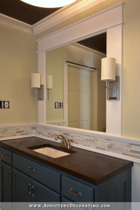
I don’t want the walls tiled from floor to ceiling. Instead, I’d like it about chairrail height, and then above the chairrail, I’d love to use a bold, dramatic color. As I was gathering inspiration the other day, I came across this picture from Lonny.

That gorgeous combo of bright white, dark teal, and touches of black just makes me weak in the knees! But there’s one big difference between that bathroom and mine. Natural light. You’ll notice that my little bathroom has no natural like, and is kind of cave-like. So I’m not sure at all if I can pull off such a bold color. But a girl can dream!
You can’t see it in my “before” photo above, but the mirror in the bathroom is a plain builder’s grade plate glass mirror. I really dislike those things, so I need an inexpensive but fantastic idea for a mirror. And ever since I saw this home office makeover from Stacy at Not Just A Housewife, I’ve had the image of her fantastic mirror stuck in my head. I’d love to make something like that for my bathroom!

That’s pretty much as far as I’ve gotten with my planning…daydreaming…about my bathroom makeover. It’s such a tiny space, and I want to pack a lot of style in there without the room feeling overwhelming when someone walks in.
So tell me…what are your thoughts on my plan. Do you like a herringbone tile pattern as much as I do? (Or a herringbone ANYTHING for that matter? I’m a bit obsessed with herringbone at the moment.) What do you think of such a dark wall color in a room with no natural light? Think I can pull it off since it’ll be used with so much bright white?
I really can’t wait to get started. But first…dining area and hallway/utility closet. I can’t allow myself to get too sidetracked.

Addicted 2 Decorating is where I share my DIY and decorating journey as I remodel and decorate the 1948 fixer upper that my husband, Matt, and I bought in 2013. Matt has M.S. and is unable to do physical work, so I do the majority of the work on the house by myself. You can learn more about me here.
I cannot wait to see what you come up with. I’m sure it will be beautiful. Megan
I love your ideas for the small bath. I definitely agree you should go with drama in the color. Bathroom is a great place for the drama as no matter what, you aren’t in there for TOO long at a time.
I cannot believe someone used strawberries in a bathroom!! Haha!! I know whatever you come up with will be fab!! I love that deep teal in that one photo and love the herringbone tile!! Excited to see some sneak peeks of the changes and your dining room!!! ~ Lori
Love the tile idea! We have a tiny, dark basement 1/2 bath (no window) done in Sherwin Williams Reflecting Pool which is close to a grayed Tiffany blue with red accents and with great lighting – it pops!
Have done subway tile in the typical brick pattern, but that herringbone looks awesome! You’ve picked some great inspiration baths for yours. Look forward to seeing where you go with it. If a good chunk of the walls are white, you might still get away with a deep color? Will be interesting to see how that goes.
I think it’s kind of natural that a bathroom you use with any regularity isn’t a room you’ve pounced on already. It’s the inconvenience factor for me at least.
Herringbone is the new chevron!
Oooo! Love the heringbone pattern! How funny about strawberries in the bathroom! But really your bathroom looks a lot like the one we are redoing at our house. We are just now pulling up the old vinyl floor so we can tile (or rather that Lowe’s can tile for us). Can’t wait to see how yours will turn out!
I am so glad that you shared this today…it makes you feel so real – that you, like many of us, have that “ugly” room in your house…I am sure that once you get started it will be amazing – I am so inspired by your projects!
I must tell you I just painted my kitchen that dark teal colour (smoked turquoise from CIL paints – colour matched to a BEHR paint) it is a really beautiful colour – I will be waiting anxiously to see how it turns out!
Can you add a tube light in the bathroom ceiling to bring in natural light? I agree the teal and white bathroom is striking!
I am finishing a bathroom reno for a client now, I will post soon, but I love the herringbone subway, do it! When you have no light coming in, I think I would stay with a lighter palette….if you had a least a little window…maybe darker color…You can get pops of bold color in accessories too…
Love the herringbone subway tile! I have a master that I am ready to overhaul as well! Can’t wait to see what you end up doing!
I totally love the herringbone tile idea too! I’ve got some tiling to do in the coming months, thanks for the inspiration 🙂
I think your plan will work out beautifully – white and deep teal always look clean and tidy. Herringbone pattern is one of my favorites and I’m sure it’ll be great. Could I suggest you paint your cupboards bright white? It’ll add light, cleanliness and leave your floor open to maybe black and white tiles? Just a thought that came to me when I looked at your bathroom. Can’t wait to see the final product as your kitchen is amazing!
Just. Do. It. Kristi. The tile will be fabulous and if the paint is too dark it’s still a bazillion times
better than strawberries. You can always change paint. Buy a sample to test the paint
in your light conditions. I have a dark bathroom too and my paint choice looked right
tinted at 50% of the colour I thought I wanted. It was surprising how dark it looked in the room.
Can’t wait to see how gorgeous your room turns out.
That is definitely great transformation of your scary bathroom. It really looks differently now than it looks before. Very nice job and you made it perfect!
Love the first pic – that peacock blue is amazing! You can do it – if your kitchen turned out that fabulously – I know you’ll rock the bathroom!
Kelly
I think the teal color really looks like “you”! I’m not excited about the herringbone pattern, but that probably just means I’m too traditional and boring. I’m sure you’ll rock it!
I was trying to think of something good to say but I can’t seem to get past the “strawberrry” wallpaper in the bathroom. What are people thinking? As far as your mirror in your bathroom goes how about framing it. It would give it a classy look without breaking your bank. Just an idea!
I like herringbone very much and it’ll look beautiful with the white tiles 🙂 I had our brick laid like that at the last house and I loved it so much. My outside was harder to leave then the house! LOL 🙂 I’m sure whatever you do, it’ll look great!!
I painted my bathroom a deep rusty red. It’s a room with NO natural light and it is gorgeous. I was very unsure of using such a dark color, but I did paint the whole thing that color, walls and ceiling so it’s not busy, just cozy (i have a light tan tile on the floor and white fixtures).
That’s a truly ‘special’ bathroom 😉 I can see why you want/need to change it! I’m going to suggest something different from what some of your readers have suggested…
I wouldn’t paint your bathroom a bold colour, because you mentioned that you want to sell this condo and move into a house. I’m in Houston, and from what I know, people here in Texas love SPACE. A bold colour, while fun and interesting, definitely makes a room more ‘cozy’, if you will. I’d go with white cabinetry, choose a paler shade of what you would want for the walls (ie a lighter aqua, accent with turquoise and orange as I’ve seen you carry those colours throughout the rest of the apartment. I’m renovating our house right now and I’m constantly having to restrain myself because I’m renovating to sell – not to stay.
I also wanted to say that I’m so inspired by how you get your hands dirty. I mean, girl – seriously, you’re impressive, and you keep a fantastic attitude! I wish I lived closer, I’d *love* your opinion on the projects I have going on, and I think you’re just a really inspiration person. thank you so much for putting so much time and effort into your blog and sharing your life with us. If you’re ever in Houston, latte’s are on me!
Thanks so much, Kimberly! What a sweet comment! And if I’m ever in Houston, I’ll definitely let you buy me a latte! 😉
Absolutely! So, curious minds are dying to know lol – what colour are you painting the bathroom?
If I knew, I’d tell you. But as Matt likes to remind me, I change my mind like I change my….well, I think we all know how he finishes that statement. 😀 I definitely want some sort of blue or blue-green color, but I’m not married to the idea of teal. We’ll see! It’ll probably be as much as surprise to me as it is to everyone else!
haha, that’s cute 🙂 Looking forward to seeing what you choose! I ended up going with a colour that John and Sherry over at YoungHouseLove used in their home – Water Chestnut by Glidden, and since everything else is white/cream in there, it warmly neutralized everything but still left room for aqua accents. I think I would have gone with a blue for myself, but because of selling, I went with a ‘safe’ neutral, which has depth and would appeal to most buyers. Did I mention how much I’m looking forward to moving? no wonder I’m sewing orange cushions for my couch. My reasoning is ‘it’s fall’. 😉
I love the idea of the herringbone. although, I would want to top it with a wide straight band of molding at as you mentioned, chair radio height. for the top, maybe instead of a dark teal, how about a bright, yet rich looking, Caribbean rich surf blue. just a thought. I had to do that with a huge buffet and hutch I had repainted. I wanted the richness but not the darkness, and I love teal….so, it ended up being real rich looking, yet bright. can’t wait to see what decide. I know it will be great.
Oh yes, I’ll definitely be topping it off with some moulding like I did in John & Alice’s bathroom makeover: https://www.addicted2decorating.com/john-alices-master-bathroom-the-reveal.html
The wall color is definitely negotiable, and the Caribbean blue sounds beautiful!
Hi Kristi…I am really enjoying your blog and your ability to tackle many things and be so hands on with your projects. Let me preface by saying that I have a degree in Int Design and practiced for about 10 years and continue to take on projects regularly. I really am sympathetic to your bathroom project. So many struggle with outdated and window-less spaces – they’re very common. And because of my experience, I want to warn you about some of the issues you’re contemplating. The herringbone is lovely and I AM a fan. But perhaps one of the reasons those pictures look so wonderful is because of the light and the fact that when standing in that kitchen, the pattern is visible at eye level. Your bathroom will not have light, and the pattern will be only visible to @ 36″ – so unless you’re sitting on the wc, it won’t be visible and the pleasure of the effect will be lost. So, maybe it doesn’t matter, just consider my point. The dark teal is lovely too, but because of the lack of light may close your space. Maybe consider a stencil pattern? Use white on the teal and it will brighten. Or, consider a light or neutral field and do accents of the teal. The mirror surround idea may be the place to do that or use towels, a trim on the shower curtain, or paint the back of some enclosed shelving that color to make accessories pop. Best of luck – I’ll be watching.
Thanks for your ideas, Jackie! I’ve been daydreaming about that herringbone tile so long now that I’m afraid I’m stuck on it. Hopefully it’ll pay off, and I’ll love it! I’m not quite so married to the idea of teal walls. Who knows…they may end up orange!! 😀 We’ll see!
Oh my goodness it is going to look amazing! I LOVE the direction you want to go. The colors are going to look fabulous! The herringbone tile will add some nice style as well. I am looking forward to updates 🙂
Have a wonderful week!!
Thanks, Meegan! I’m really excited about the herringbone tile myself. I’ve been daydreaming about it for months now!! But I won’t let myself start on it until I get these other projects finished!!!
I think your ideas are fantastic and would def go with the great color. The white bottom half of wall will help lighten things up. We just did a basement bath with no natural light with a painted white bottom half with chair rail. We raised the chair rail height higher than normal so there would be more white and to make the room look more spacious. The upper wall is BM Dutch Tile blue and the room has plenty of light and doesn’t look like a cave at all. We have one overhead can light. There are 2 mirrors and we put a wall sconce by each mirror. . I say go for it and maybe add an extra light or two!
That sounds very pretty, Lisa! I tried to look up BM Dutch Tile Blue online and couldn’t find it. I found a Dutch Tile Blue from Sherwin Williams, though. Is that it?
Yep, that’s it. Sorry, about the mix up. We only have a SW store nearby and they mixed me up some BM colors for the basement, too. Anyway, glad you found it. Once we were home we decided we better lighten the color a little (probably 25%) since there was no natural light. It worked out great. Looks like the color we wanted, but didn’t darken the bathroom.
Hi Kristi – thanks for a great post on starting from “ground zero!” You’ve got such great ideas and abilities and your tutorials are THE BEST! I have to agree with Kimberly about the teal, though. If your goal is still to sell the condo, maybe better to bring in the teal with accessories. Can’t wait to watch this project evolve!
Thanks, Kim! And I know that the teal probably isn’t the best or most practical choice. But then again, I’ve never been known for making choices based on practicality. 😀 Who knows…I may end up with orange walls!! Ha!
Wow! That’s a tight space. I love the herringbone. I’m just wondering if you might go higher with it. It would give you more white in the space and, perhaps make the herringbone more visible. As far as the darker blue color, do it! If it’s too dark, you can always repaint with a lighter color. And it won’t take much paint or time. Are you going to paint the cabinetry? Were you thinking white or going with the color?
I’m looking forward to seeing how it turns out. All your other projects are fab. I’m sure this one will be too!!
Great combination. Have you thought about using teal on the ceiling and in some towels? Maybe a white background on your shower curtain with a bit of teal in it.
Hmmm…I hadn’t thought of that idea, Iris. I almost feel like teal on the ceiling would make it feel more closed in and cavelike than teal on the walls with a white ceiling. I’ll have to think about that!
I praise you for holding off on the bathroom until you can do it right and all at once (sort of!) We’re all looking forward to your step-by-steps.
Since you’ll be selling soon, I’m going to cast my vote with what looks like the minority — against the dark teal. Color is such a personal thing, I’d go for something less in-your-face. I know others will disagree, but with a home on the market, you have to think more generically. You’ll be out of there soon, and meanwhile you can live with a pale teal or light grey that anyone shopping for a home can visualize their towels matching.
I also like the idea of a tube light. Not sure if it’s a DIY project, but I do know they cost less than most people think. Not sure if there is another floor of condos above you or not, which would complicate things.
Have you thought about mirrors on opposite walls? People like big baths, so light colors and mirrors will confuse the eye about boundaries. I’m sure you know this stuff.
Once again, I appreciate your enthusiasm and honesty. We’re all cheering you on!
We’re on the ground level, and there’s a condo above us, so the tube light won’t be a possibility. 🙁
An easy way to upgrade the mirror is to frame it. Use adhesive to attach the frame to the mirror. There are tutorials available.
I’ve done that before, and I thought about doing it in this bathroom. It would certainly be the easiest fix. But I think I’m wanting something with a little more style. Something uncommon and interesting. We’ll see! 🙂
Don’t do anything too wild since you are considering selling the condo. Good luck.
“Sidetracked” is my middle name! Stick to your guns and finish those other projects before moving on to the bathroom. I like all your ideas. I think the color will work since you are going with the white subway tile. You could twek it a little lighter and get the same bold results. Do you plan to remove the cabinet that is over the toilet; it’s really taking up visual space. I know it probably really handy to have for storage but I think it has to go! You should be able to use your esisting mirror and cut it down and then frame it like your inspiration photo. Can’t wait to see this room complete!
Oh yes…taking that cabinet down is on the top of my “to do” list for this tiny bathroom. I’ve hated that thing since day 1, and I’ve lived with it for far too long!! I’m hoping to replace it with something (possibly something that I make) that’s much more wall-hugging…perhaps the depth of a roll of toilet paper. 😀
Are you going to create storage? If you can inset shelves between studs, I’d suggest doing so because that bathroom is so small, and any storage will be welcomed – not to mention pretty, in terms of decor options. That cabinet above the mirror – or is it above the toilet? Is ya…a wee bit fugly..lol..but some crisp white shelves, classy moldings and voila – you have a bathroom that while small, people can visualize where to put everything.
Have you contacted a realtor and had them walk through your condo, to suggest where to spend your hard-earned dollars? I did it a few months ago…got ideas, did about half of them..and then I had a different realtor come by last week. While they were both on the same page for the most part, it was really interesting what the second realtor had to suggest, and I felt she knew the market better. Just a suggestion that may save you $$ 🙂 I dunno about you, but I can’t WAIT to get into the home that I’ll be staying in for a while!
Yes I love the herringbone design! Go for it 🙂
Thanks so much for the shout out Kristi! We absolutely love our herringbone tile 🙂 In fact, I think it’s my favorite project that we’ve done in our house. Definitely go for it. It’s not that difficult, and you’ll want to stare at it for hours when your finished 🙂 A year and a half later, and I’m still in love with ours. Can’t wait to see your after photos!
It is really awesome. The idea of a small bathroom is really great. I like everything that you have put into the bathroom to make it grand.
Can’t wait to see what you have come up with. If it is anything like your other post, then I am sure it will be fantastic.
I love the choice of color you’ve chosen for the bathroom. I would be surprised if a good interior painting Olympia WA specialist couldn’t transform that wall for you. That wallpaper needs to GO! Keep us updated, this project looks interesting — thanks for sharing this!
Creative ideas are inspirational; and the herringbone tiling looks really great. Stone cleaners can offer tile and grout cleaning which is a cost-effective process should you be looking to restore your tired tiles. Your blog is really informative and it is great to see the finished product!
I wanted to stop by (came over via Pinterest) and say to not let the lack of natural light stop you from painting a bold color in your bathroom. Our full bath is the only room in the house without a window, and I painted it Acapulco Cliffs by Porter Paints. It looks so good in there and makes me smile every time I see it. Plus, if you hate it, it’s only paint. Can’t wait to see what you do!
I’m so addicted to your blog and all you have to share. I say go with what you want..people look more at the “bones” of the structure than at the color you choose..for goodness sake your cabinets are turquoise, and beautiful..the whole place is and putting the color that you like in a home that you have to live in is what matters..the place is beautiful and if people don’t like the paint color they will change it. I was never a “blue” person until you showed me how beautiful it can be. So say GO FOR IT!!!! I can’t wait to see the whole place done…