Bathroom Makeover Progress – Painted Tile, New Wall Color, and Improved Resin Artwork
I’ve made a bit more progress on the bathroom, and if all goes as planned, I should have it finished today. And I’ve made a few changes that I think made a pretty big impact.
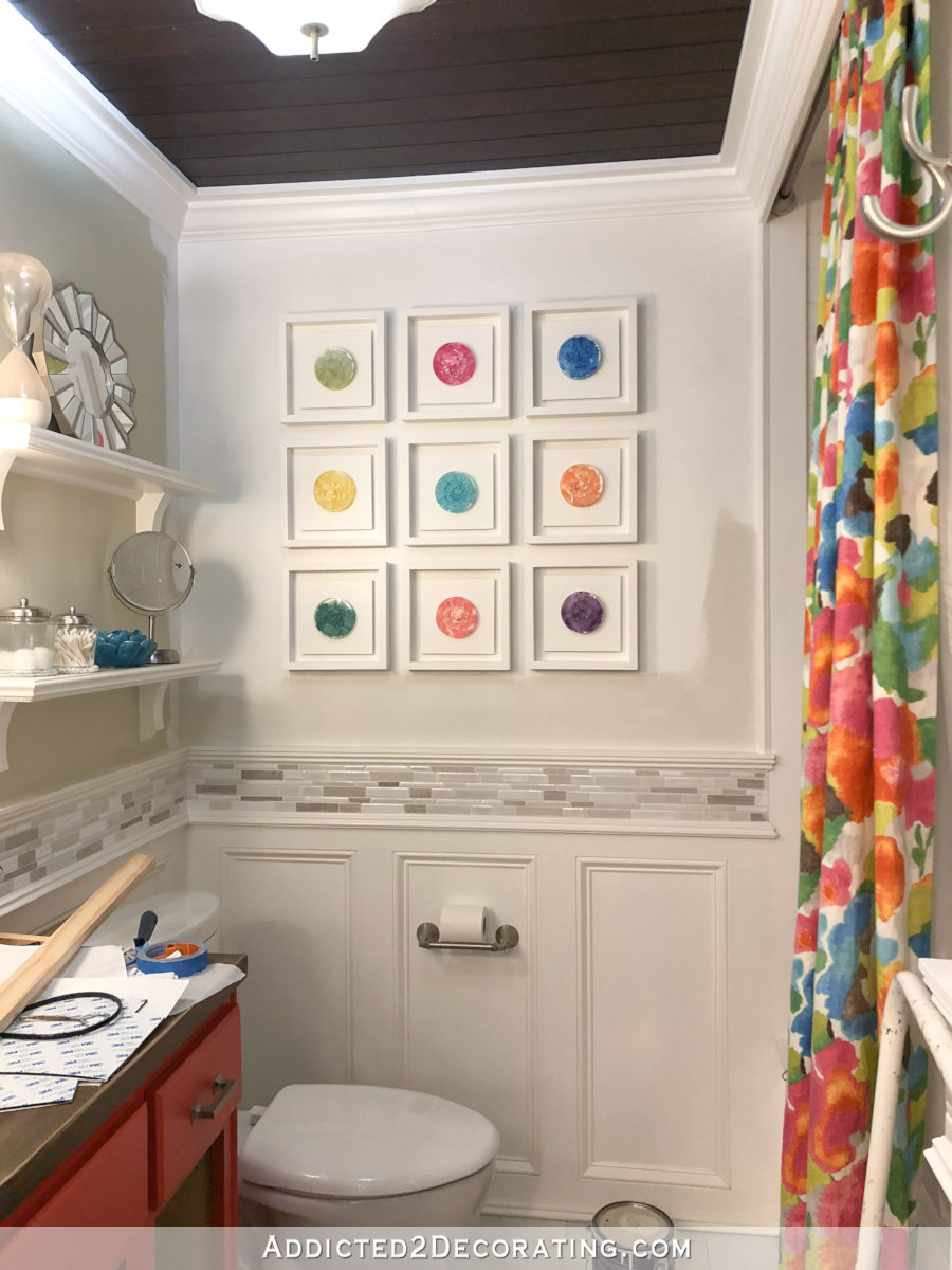
If you’ll remember, this is what it looked like two days ago…
And this is what it looks like now…
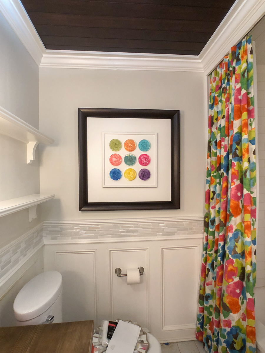
I like this current version so much more!
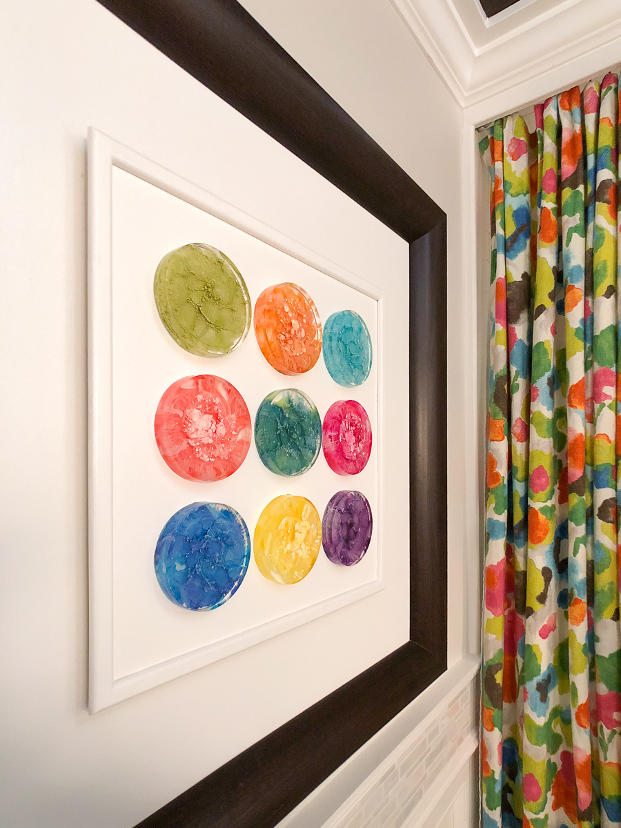
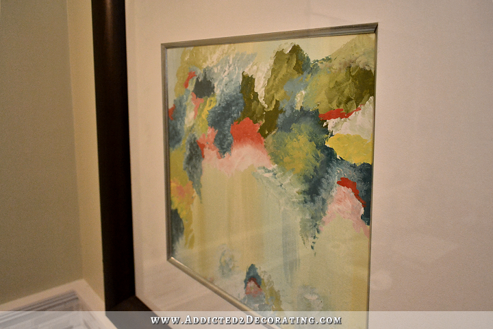
First of all, the series of nine separate framed resin petries is gone, and based on the suggestion that about half of you made, I put them all in one frame. And since I didn’t want to build another frame, I just decided to use the one that had been there all along. If you’ll remember, it used to look like this…
I like that the frame carries the stained wood look from the countertops and the ceiling to that far wall. I do wish the frame were a bit lighter in color, though. I’d prefer it to match the countertops and not the ceiling, but unfortunately, that frame isn’t real wood. If it were, I would have refinished it by now. But it’s actually a cheap paper veneer with a printed wood grain on it wrapped around MDF moulding.
I’ve had two of those frames since about the first week we lived in the condo, and while they’re not exactly something I’d spend money on today, at least it works better (to my eye, at least) than the nine separate white frames.
I also tried different spacing on the petries and found that I preferred them closer together with a large border. This made them read as one singular art piece, where more spacing between them looked a little discombobulated to me. So I basically made this with the same idea as the original shadow box frames, with a center portion that is raised to accentuate the area where the petries are attached.
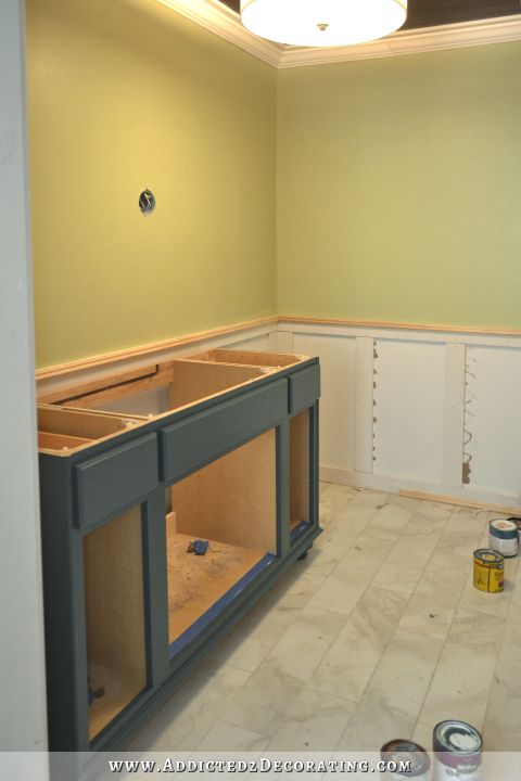
So in addition to the new artwork arrangement, the bathroom also has a new wall color — Benjamin Moore Classic Gray. I can’t believe how much lighter the bathroom looks now! I hadn’t realized how dreary the previous wall color (a muted, grayed light green custom color) was making the room feel until I repainted it Classic Gray, and it just feels like a breath of fresh air in there now.
That barely-there gray is pretty much the only neutral wall color that I really like. I have it in every room of my house that I’ve painted so far, with the exception of the pantry (where white walls just seemed to work, for some reason) and the kitchen (which has fully-tiled walls). But this barely-there gray gives just enough contrast so that white crown moulding and door/window casings still show up.
And finally, did you notice a change in the tile?
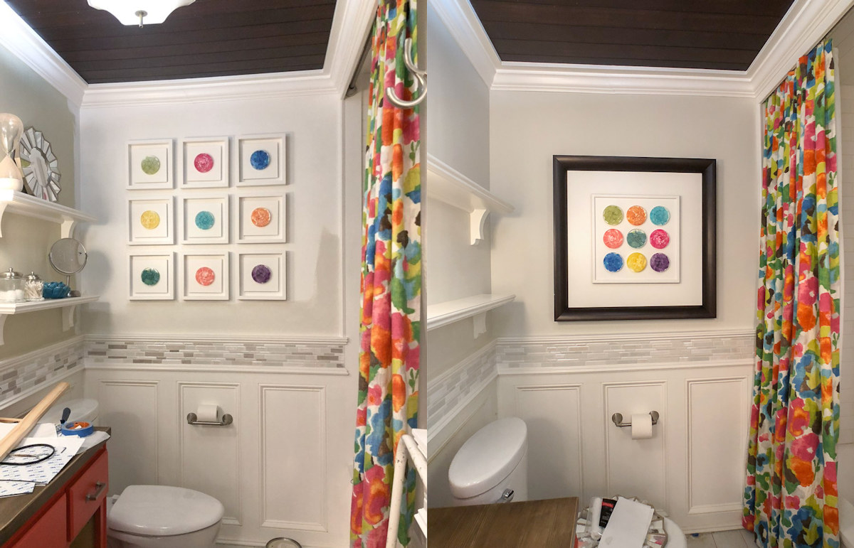
As I was making changes to add more color to the bathroom, it became obvious to me that the tile just wasn’t really doing much for the bathroom. And then as I read your comments on my last post, it became obvious to me that the same was obvious to you. 😀
So I pondered and mulled over some options, and I finally decided that the tile had to go, and I would get new tile. I got in my car and headed to Lowe’s (because they have a much better selection of mosaic and wall tile than Home Depot), and headed for the tile section of the store. After looking at all of the options, I finally decided that a white penny tile was the best option from the tiles they had in stock. It’s all white, so it wouldn’t be distracting. The tiles are small and round, so that would give some curves to an otherwise rectangle-filled room, and would echo the round petries.
And after I filled my cart with all of the tile I’d need to install the new accent tile around the room and the matching accent tile at the back of the open shelves, I started heading for the cash register like a woman on a mission. When I got about a third of the way there, I stopped. It’s like I had been running on some sort of adrenaline-fueled urgency to just get the stuff and get the project done.
But all of a sudden, the engine ran out of fuel, and I stopped and thought, “What the heck am I doing?” I realized that I’d rather shove a fork into my leg than completely redo the tile in that bathroom. I was just creating needless busy work for myself, and this project that was supposed to be a quick bathroom makeover was starting to spiral out of control. If I didn’t put the kibosh on this, before I knew it, I’d be swapping out the floor tile, and then redoing the wainscoting, and then redesigning the mirror, and then purchasing new sconces.
So I turned around, put all of the tile and supplies back, and grabbed a quart of my favorite Zinsser oil- based primer, and left. (I mean, I paid for it, and then left.) 😀
And using a small square artist brush, I just painted over the dark tiles. That mosaic tile is comprised of honed stone (marble?) tiles and very shiny glazed porcelain tiles. The honed stone tiles are the dark ones, and those were the problem to my eye. So I just strategically primed over those with the oil-based primer, and then went back and used the Classic Gray (i.e., the same color I used on the walls) to finish them off.
Is it perfect? Nope. But is it finished? Yep. And in a fraction of the time it would have taken me to completely re-tile that accent border and the back of the open shelves. If I were designing this bathroom from scratch and planned to use that wall color, that vanity color, and that shower curtain fabric, that’s certainly not the tile (even in it’s current, more neutral state) that I would have chosen for that border. But I’m happy with it. At least now, it’s quieter and not shouting for attention. It’s just an added neutral texture.
So I just have a few things left to do. Two of the walls need a second coat of paint. The small stained wood countertop in the area with the open shelves needs two or three coats of clear coat finish. And then I need to re-install the cabinet doors on the vanity. Then I need to clean up all of my tools and supplies and dust, and it’ll be finished.
Helpful sources and products:
If you want to see how I made those original shadow box frames, you can find that here…
- Benjamin Moore Classic Gray — My favorite barely-there neutral wall color that I used on the bathroom walls above the wainscoting.
- Zinsser Cover Stain oil-based primer — This is my absolute favorite primer. I use it on everything except drywall. If I need to prime new drywall, I’ll use a water-based product made for priming drywall. But for everything else — kitchen cabinets, furniture, ummm…mosaic tile 😀 — this is the only one I’ll use. It can be brushed or sprayed (although on wood with deep grain, like oak, brushing is better), and when it’s completely dry, it sands beautifully to an amazingly smooth finish with 220-grit sandpaper. And then you can use either oil-based or latex (i.e., water-based, emulsion, acrylic) paint on top. This is my go-to primer for just about everything.
Update:
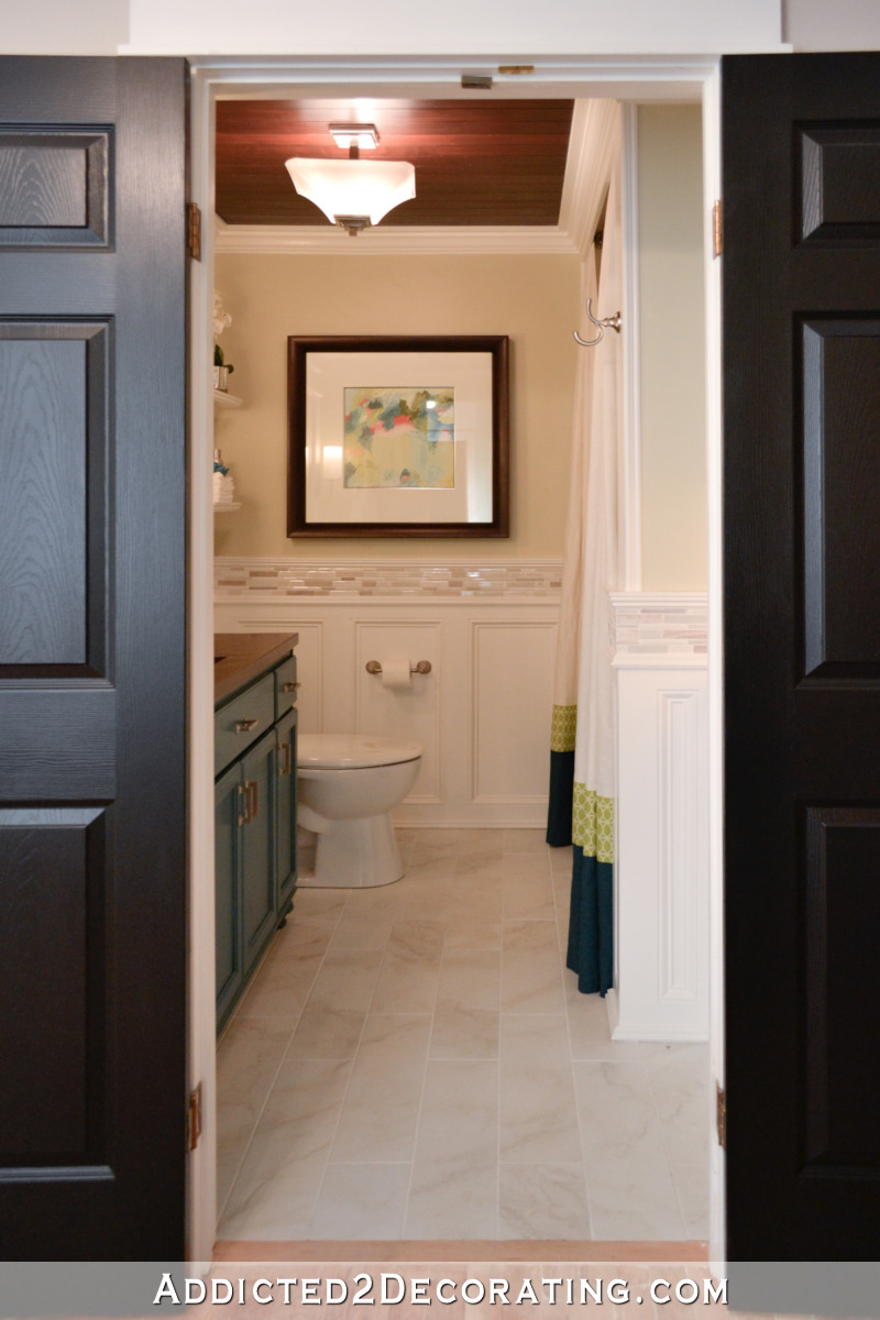
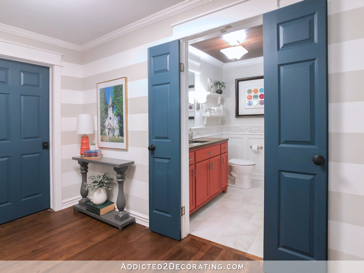
My bathroom makeover is finished! Want to see the entire project from start to finish? You can find every single post about the bathroom makeover right here…
Or you can skip to the end and see how it turned out. Here’s a peek of the finished bathroom…
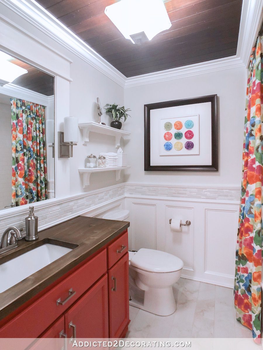
You can see more pictures on the before and after post right here…

Addicted 2 Decorating is where I share my DIY and decorating journey as I remodel and decorate the 1948 fixer upper that my husband, Matt, and I bought in 2013. Matt has M.S. and is unable to do physical work, so I do the majority of the work on the house by myself. You can learn more about me here.
Lovely! Love the wall color, the one piece set with patties & the toned-down tile. Just right!
You did it, girl! The color is great, the one pic is great and the only part I was worried about was the tile, and by golly, you fixed that, too! Way to go, Kristi!
WOW what a difference!! Looks great Kristy!!
Sorry…Kristi!!
Bravo, you tied everything together beautifully.
I thought I really liked the individual frames but I like them all in one from better. Will you be staging the shelves differently than what was there? I think all of the glass and mirrored elements were giving an elegant/traditional vibe. And now all your pops of color give a playful/daring vibe! Some fun accessories that pull some of the colors from your curtain would look great there!
I’m thinking about doing all white items so that they don’t compete with the framed petries.
That will look great!
The tile looks so much better. I had noticed it but since your design style is so incredible, I didn’t write anything. So, thank you, you have made me feel better about my thoughts because of what you did.
Also, the black frame is so beautiful and so grounding. It pulls the eye from the black ceiling to the beautiful framed tiles. Good for you.
So proud of you for stopping. There are so many things that you could spend that time and money on that will really noticeably affect your life. The painted tiles look great and there’ll be time later if you’re unsatisfied with it long term. The lazy person in me just cringes when contemplating redoing something you’ve already done when there are so many other projects. The little wound in my heart created by the redo of the kelly green and gold kitchen is still not completely healed. This isn’t to say you’re wrong. It’s your money and your time and you can do whatever you want with it, it’s just hard to not imagine I’m the one having to do the work.
Did you see on my Instagram that I’m considering a similar green for my studio cabinets? 🙂 I think it would look great with the wallpaper I’m going to use.
I like these changes! Since you made the tile work so well using paint, you might as well paint the frame that you hung. While you can’t ‘refinish’ it like the countertop, I’m confident that with the right prep, you can mimic the countertop with paint. It wouldn’t have to be a full-on woodgraining job; just the idea of wood. For years I’ve painted plastic, hard cardboard, you-name-it, and it has always worked. Prime it with a spray-primer and you’ll be good to go with the paint of your choice.
Rather stick a fork in my leg!! Made me LOL.
Me too!
Me too!
The change to the tile made the biggest difference! Everything flows now!
Yay!
Love it. I like how the colors of the art, even the frame, pick up the colors in the shower curtain.
I love that too!
I love that you are fearless in going after what you want and that you don’t settle for less! Thank you for the inspiration and giving us ‘permission’ to do the same – I hope that comes across the way I mean it on the internet, lol. I see you do and redo until you’re happy with the result, and it has made it easier to do the same with my own home. The bathroom refresh/redo is lovely!
Thanks for sharing the inner workings of your mind. It is amazing how easy it is to get carried away with projects and it good to be reminded that simple solutions are, indeed, most often the most elegant.
Wow! I really like what you did with the artwork. Now did you have to prep the tiles you painted at all? Clean and sand lightly or did you just paint away??
Since I was using it on unsealed, honed marble tiles, I didn’t do any sanding. I just went straight to the oil-based primer and then paint. Had I been trying to paint a shiny tile, I would have sanded first.
Another win! Another beautiful job. Gosh, I wish you were my bestfriend neighbor to help me out some LOL.
I like it. I like it a lawt. Everything flows from the shower curtain and works well together. The resin art work looks much better as one piece of art, and the frame brings out the darkest color in the shower curtain. Glad you stopped with the new tile and just painted over the ones in the border that were the darkest. Good save, Kristi!
I’m laughing because before I read the post but after comparing the before & afters, I said to myself WOW, those changes really brightened up that tile border…then I read the post. I always say “I’d rather stick needles in my eyes rather than do such and such” instead of fork, but now I have options…LOL! Love your decor as usual!
I love the outcome! Those resin rounds are beautiful and perfect for the bathroom. All the colors really work! It is a lovely room!
Fabulous! I think the darker frame is totally fine because your tile boarder visually separates the top half of the bathroom from the bottom half where the counter is.
Love the new art arrangement and frame! The wall color is so fresh and neat! Smart thinking on the tile!! Love it all!
Love it. The only change I would suggest is just raising the height of the frame a few inches.
In the picture, it looks a little out of balance to me since it seems a little low. I’m all about hanging items at eye level (for most). I’m sure it isn’t noticeable when in the room itself.
I do love me some penny tile, but you definitely made the right decision to stop the madness and go for the easier fix. I love the fresher colors and can’t wait to see you stage the entire room.
Now, move on to the studio, woman!! 🙂
The painted tiles make such a difference! The painted walls make such a difference!
The resin petri dishes look so much better grouped closer together! They kinda looked lonely when they were far part. Is that frame dark brown or black? It looks great with your ceiling but you mentioned your vanity top doesn’t match those now. Would it be too much of a job to restain the vanity the same as the ceiling? Or am I opening a can of worms?
Everything looks beautiful!
The frame is a dark brown with a slight wood grain appearance. I actually refinished the countertop a couple of weeks ago specifically because I wanted it lightened up a bit. I’m okay with the countertop not matching the ceiling. I just wish the frame matched the countertop instead of the ceiling.
I am really loving the new colors in your bathroom. I especially love the coral vanity. And that new shower curtain fabric is awesome! The painting of the darker tiles is an excellent idea. Personally, I like the petris in the individual white frames. Maybe it’s the darker frame that is throwing me off. Anyway, I love the new direction you have been going in, adding all of the bright colors to your home. And again, your many talents always amazes me! Can’t wait to see your TV show that I’ve been wishing for, come to life….wink, wink.
I love it! I was so disappointed that the petri art wasn’t working because the colors are fantastic. It’s perfect.
It’s utterly beautiful, and all of it hangs together now.
Brava!
Another slam outta the park! Love how you kept the tile but used your creativity and ingenity to paint over the darkest tile. That room just makes me happy looking at it!
Kristi
I love all the things you do. Your Petri dishes are so beautiful and since I work with some epoxy I know how much work they are. ( I haven’t done any dishes yet just counter tops ). I have also painted tile and was amazed at how good they turned out. Someone before I bought my house put brown tiles in an all black and white bathroom. I hated the thought of ripping them out so got oil based white primer and painted it. Looks terrific!
Well I just wanted to ask one thing about how you changed the Petri dishes. I like them in the one big frame but I thought maybe it would look better centered on the wall or at least a little higher like when they were individual. It’s a minor change and you can look at it before you do any changes. Just thought I’d throw that in. But don’t get me wrong, you are so talented and a great inspiration! I’ve tackled more lately watching you than I ever did before!
I thought the same thing about the height of the artwork. Kristi is a shorty (like me!), so she might not notice the height standing there. But it does look a little too low to me in the picture.
I did raise it a couple of inches this afternoon, but I didn’t center it vertically. That would have put the bottom of the frame at my forehead height, which is way too high for artwork.
Ha! My husband is an entire foot taller than me and whenever he tries to hang art without my input it ends up with the bottom of the frame at my forehead! LOL! But, if I hang it where I want it, the tops of the frames are usually at HIS forehead! We always have to work together to find a good midpoint. (this is all dependent on the size of the piece, the height of the ceiling, etc.)
Wow! Looks great. I liked the first color you painted the vanity… just saying 🙂
Hi Kristi-
Can you pist a pic of the bathroom from the doorway, so that it shows the vanity color, artwork, shower curtain all together? Thnx 😊
*post
I will when it’s all finished. 🙂
so funny, I think I’m the only one that liked the tile (the update looks good too though!) but since I’m not the one living with it, lol, I’m glad you found a simple solution that works for you! The bathroom looks lovely. 🙂
Definitely, yes! Painting the tile made all the difference! Love, love the gray and the change in the petrie display. Score! Beautiful bathroom. So happy and cheerful and much more you. Well done!
If you get tired of the tile and want to add a bit of color later, try using the alcohol inks on them. You can keep it muted but it is a lot cheaper than redoing it all.
You’ve done such a nice job in there, the before and after pics are just amazing!
I don’t normally comment, but I have to say, I love love love the way the tile turned out with all the color. looks fantastic and so glad you didn’t retile.
Look at all the money you saved by not buying tiles!! What a bargain!! Great update!
Nice one! I too see what other commentators have said: When you put up the individual frames, you had them centered inside the wall ‘frame’, side to side and up and down. The single frame with its dark outline isn’t centred up and down and looks too low now it encases those lovely symmetrical pops of colour!
If I center it vertically, the bottom of the frame is the height of my forehead. That’s way too high for artwork. I did move it up a couple of inches, though.
Oh wow! Amazing how different things look with just small changes. I love the Petri dishes better this way. Just beautiful!
You are a courageous and inspiring woman. I admire all you do and I wouldn’t change a thing. It’s perfect as is. I cannot wait to see what you do next.
Well, I am doing the happy dance! I commented last time that maybe just the darker tiles could be painted (but of course the neutral looks better than all the colors I also suggested). For a minute or two, I feel like a decorator! I can’t believe what a difference it made. Wow. Great work as usual Kristi. Also glad to know I’m not the only one who does the forehead slap while in line at the home improvement store.
Home run on this one, for sure. I got a chuckle out of visualizing you backtracking in the store to dutifully return the items to their places because the solution surfaced in your mind en route to the cash register.
Painting the dark tiles was such a great solution. The texture adds a nice element, I think. I love the petries in the single frame. (I agree with some others, the frame should be a tad higher.) Wall color and great shower curtain fabric to coordinate with the cabinet.
The bathroom came together beautifully.
What’s next?
As soon as I get finished with the bathroom, I have three projects I want to do in the kitchen, and then on to the studio.
YES! Even though I thought the bathroom was beautiful before, it’s now a bold, happy more YOU bathroom. (and Me) Thanks for the constant inspiration and funny tale of the Lowe’s epiphany, so relatable.
I knew you would pull it all together. I am happy my advice was on target with your final decision. I think the Petri colors seem brighter now than they did in all the small frames. It looks awesome!
Wall color made a huge difference— would not have thought that would be such a game changer and I’m so glad that the chair rail tile is toned down… looks soooo good!
I don’t know what you have planned for the shelves above the toilet but I like nothing there! When you had stuff on the shelves it took away from the shower curtain and resin artwork.
Overall…. Homerun, chickie!
I have to tell you, I follow several decorators that do fantastic projects. But your creativity is far beyond what the do with store bought finished items. I love color as you do, but I fear it a bit in decorating. Only because I’ve been there where I decorated my whole home in what was in at the time, only to regret it about 3 years later. The way you incorporate color is amazing. This bathroom is probably my favorite bathroom I’ve ever seen. I’d love to have you help me with my home. I’m desperately trying to find wood flooring to replace a house full that had water damage. I’m struggling to find the right one. After that I have many more projects.
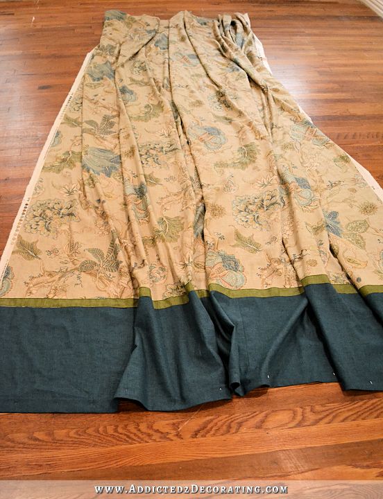
Beautiful bathroom curtains! Please tell me the name of the fabric, thank you😊
I love the color of your artwork. What a great idea and I’ve never seen anything like it. My favorite part of the post was that you would rather put a fork in your leg than retile. I laughed out loud. Thank you for not making everything sound so easy. It’s refreshing to read that.
Bravo! I am SO ready to see more reveal pictures!
Very nice. I knew you’d figure it out!
I realize that this isn’t what this particular post is about, but I’ve been wondering why you chose to go with a single/working shower curtain this round vs. the two flanking panels you did perviously?
When I did the two panels, they were purely decorative and were attached in such a way that the tops had to be flat against the trim at the top of the ceiling around the tub. There really wasn’t another way to attach it since there’s not really enough room for two rods behind that top trim piece. This time, I just decided to use it as a real curtain and hang it on the rod so that the top would have more fullness. And since I only use one curtain liner with 12 rings, then the decorative curtain also needed to be a single curtain on 12 rings.
Gotcha…I must’ve missed the post about your recent restraining! The bathroom looks fabulous!
I really really like the dark frame and the art reading as one piece rather than 9 pieces. The dark frame immediately brought the beautiful cieling to my attention and makes the room seem taller and more expansive. I don’t think matching the wood color of the counter would have achieved that. Could not believe how much the wall paint changed the tile! Then I read on to see that you had painted it. Good for you. The room is cheerful and vibrant while at the same time calm and soothing. I also love that you used fabric you had on hand…that’s one of my favorite things to do, find a place for a bespoke fabric.
Wow, what a difference! I love this version.
Yes! I never minded the tile but when you put up the new curtain and petries it did start to look cluttered. The more subdued tile is very nice.
Much better! The dark frame with the grouping of 9 petris is what I originally thought you’d do and the muted tiles look great.
Happy is what comes to mind when I see your bathroom. I love it! I love the bright bold colors! And toning down the tile was inspired!
Have you thought about painting all the mosaic tiles? The texture will still show but the tile area will match the lower portion of the wall.
I considered it, but I much prefer the subtle neutral color differences.