DIY Shadow Box Frame (And My Artwork Fail)
A few days ago, I shared with y’all that I wanted to frame a series of nine resin petries to hang on the bathroom wall during its current colorful makeover. First I want to show you how I made the simple DIY shadow box frames that I made for the petries, because you can use this idea to frame all kinds of two-dimensional and three-dimensional items. And then I’ll show you why I don’t think they work well on the bathroom wall.
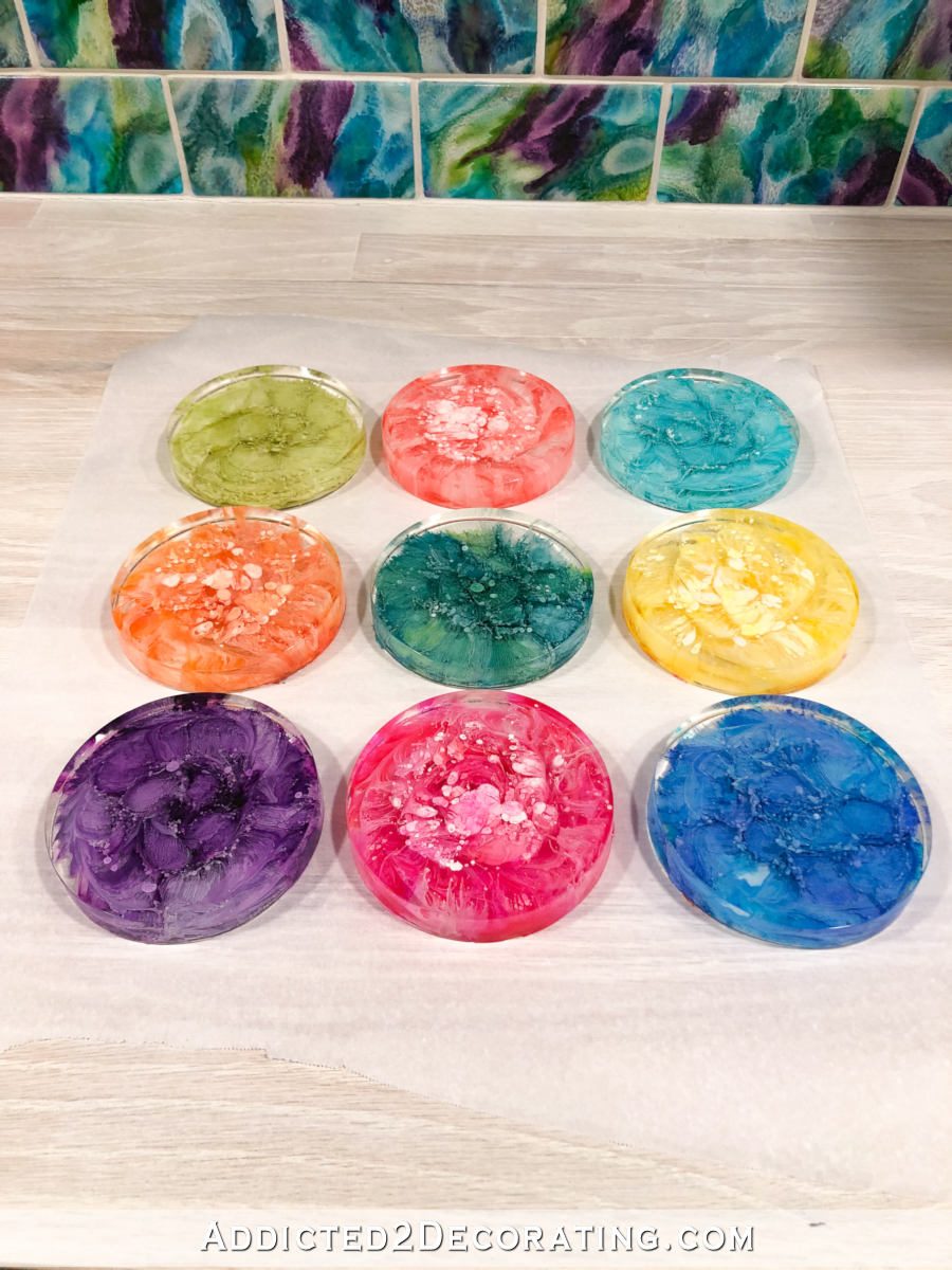
These are the resin petries I wanted to frame. They’re about four inches in diameter.
And I wanted to display them in very simple easy-to-make shadow box frames.
How to build the shadow box frames
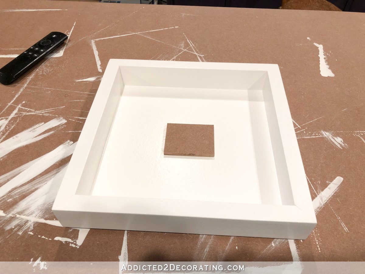
Step 1: Cut four pieces of 1″ x 2″ lumber the same length, mitered on the ends.
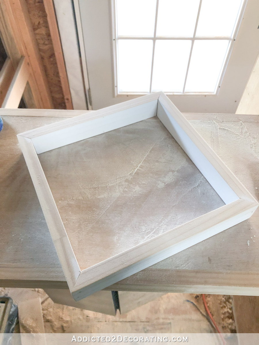
I cut my four pieces to approximately 10 inches long, mitered on the corners. Then I put them together using wood glue and 1.25-inch 18-gauge nails.
Note that I would generally use my table saw to cut a rabbet into the 1″ x 2″ lumber before cutting the pieces, but for some reason, I couldn’t get the blade on my table saw to raise or lower. So cutting a rabbet in the back of the lumber wasn’t an option. But that’s okay, because this allows me to demonstrate the absolute easiest version of this frame idea.
After nailing the pieces together, I used my rotary sander to sand the top, sides and back of the frame and even out any imperfections on the mitered corners.
Step 2: Cut a piece of MDF and attach to the back of the frame.
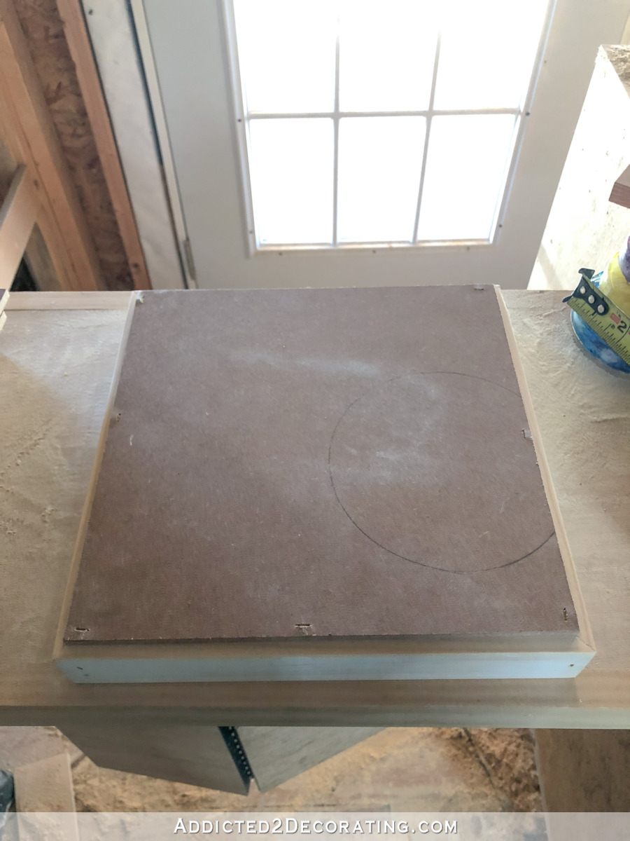
I used 1/4-inch MDF and cut it to about 1/2-inch less than the outside dimensions of the frame. My frame was ten inches square, so I cut the MDF to be 9.5 inches square. Then I attached it to the back of the frame using 3/4-inch narrow crown staples. But if you don’t have a stapler, finish nails will work.
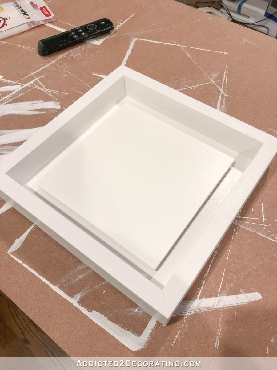
Here’s what it looks like from the front…
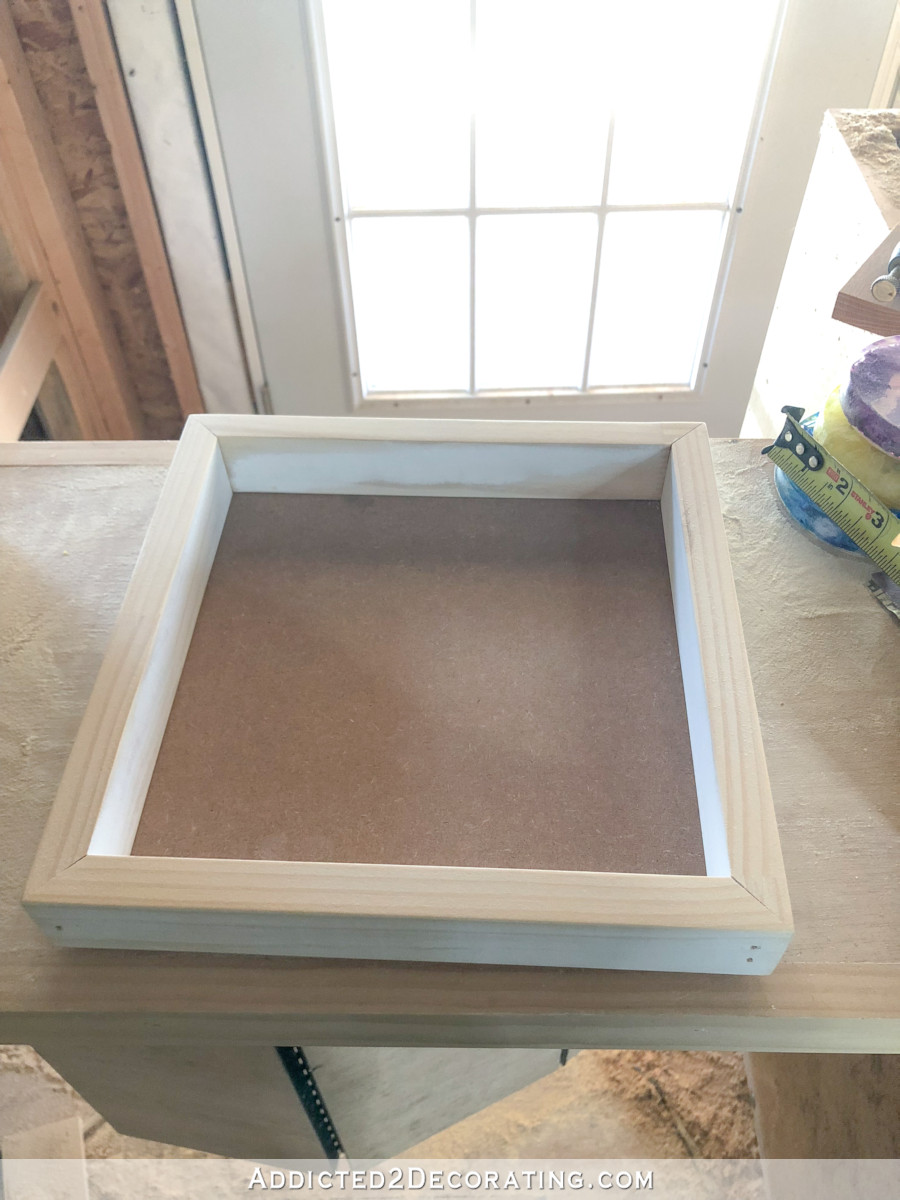
Of course, you could call it finished at that point. You’d just need to wood fill the nail holes, sand, and give the whole thing a couple of coats of paint. But I wanted mine to have a little extra detail.
Step 3: Add dimension to the display area with MDF
I wanted my frames to have a display area with a raised effect, so I cut a small square of 1/4-inch MDF and glued it to the center of the frame.
And then I cut a larger piece of 1/4-inch MDF that measured about 3/4-inch less than the inside dimensions of the frame on each side. I painted this piece to match the frame, and then when it was dry, I glued it on top of the smaller piece.
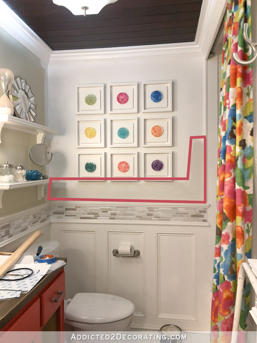
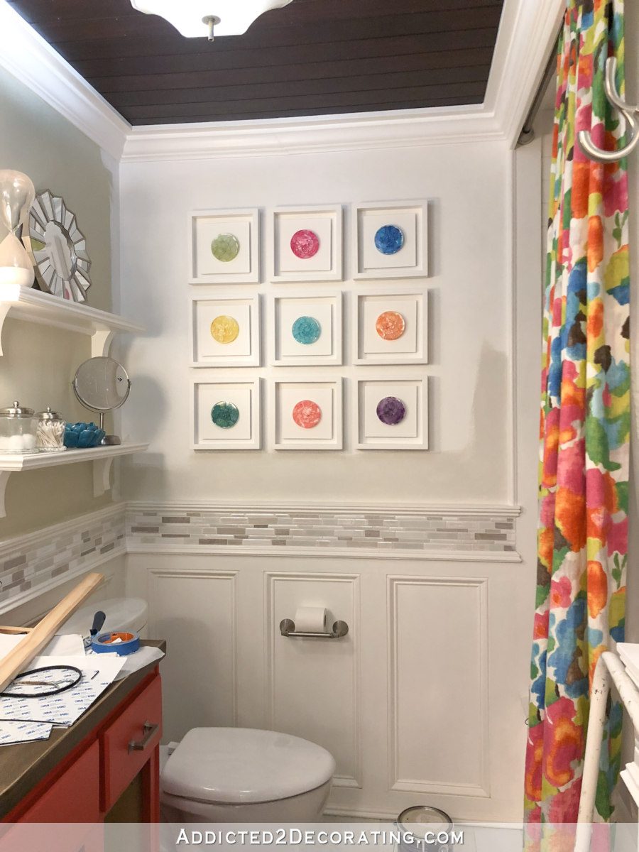
And that’s it! At that point, I was ready to attach my resin petries. Here’s how my series of nine colorful petries looked inside my DIY shadow box frames arranged as a grid on the breakfast room floor.
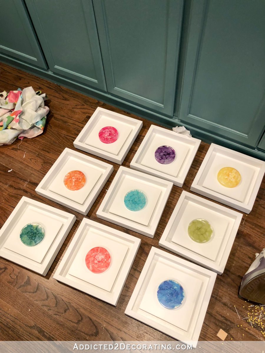
I loved how that looked!
Unfortunately, my enthusiasm diminished when I got the series of frames hung on the bathroom wall.
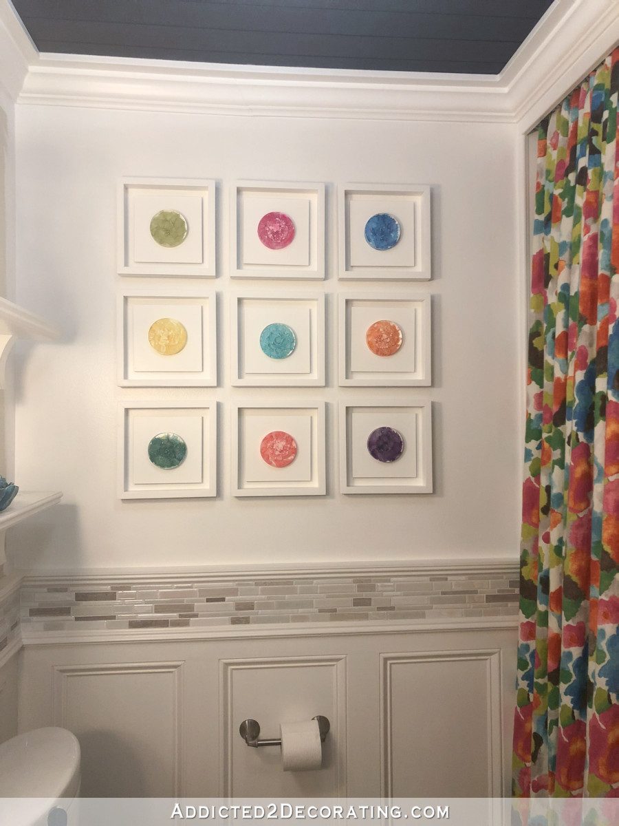
I love the idea, and when I isolate the nine frames, I love the look of them hanging together. What I don’t like is how they look on that particular wall.
There are just so many rectangles and squares. There are so many boxes and corners that even the nine round petries can’t save the day. There’s the box-in-box effect of the wainscoting, with a hundred or more little rectangles just above it in the accent tile. And then there’s more box-in-box effect in the series of nine framed petries.
It’s way too much for this room. So while I love the look of the DIY shadow box frames with the colorful petries, I’m going to have to find another home for them. I’ll be going back to one large framed piece of artwork for the bathroom wall. Of course, I don’t have a piece of artwork that will work, so I’ll have to paint one.
Another thing that just isn’t working for me is the new white wall color. I used the exact same color that I used on the lower half of the walls with the wainscoting. It’s the same Behr Polar Bear that I use on all of my trim, and the same color that I used on the walls in the pantry. But do you see how they upper wall and the lower wall look like two different colors?
The white upper wall just looks so stark and sterile, so I’ve decided to go with Benjamin Moore Classic Gray instead, which is basically the only non-white neutral wall color I can stand. I tested it out on this area…
It’s one of those barely-there wall colors that keeps the walls nice and bright while giving just enough contrast to make the crown moulding and trim show up. Here’s a look at the Classic Gray sample without the pink outline…
So the bathroom is still a work in progress. 🙂 But I’m already enjoying the added color in here. Every time I walk by, I stop and stare just to take in the new colors. I still do that with the pantry (the new still hasn’t quite worn off) and now I do that with the bathroom. 😀 Color makes me happy.
Helpful sources and products:
Want to see how I made the resin petries? They’re fun and easy to make, and the finished product is so interesting and mesmerizing. You can see the details here…
If you need a larger DIY shadow box frame that will protect your artwork under glass, I show you how to make that here…
- Benjamin Moore Classic Gray — If you’re looking for the perfect non-white, barely-there neutral wall color for your walls, this is my go-to color. I highly recommend that you give it a try, even if you don’t like gray. I generally don’t like gray, either, but I love this wall color. I have it mixed in Benjamin Moore Aura wall paint in a matte finish.
Update:
My bathroom makeover is finished! Want to see the entire project from start to finish? You can find every single post about the bathroom makeover right here…
Or you can skip to the end and see how it turned out. Here’s a peek of the finished bathroom…
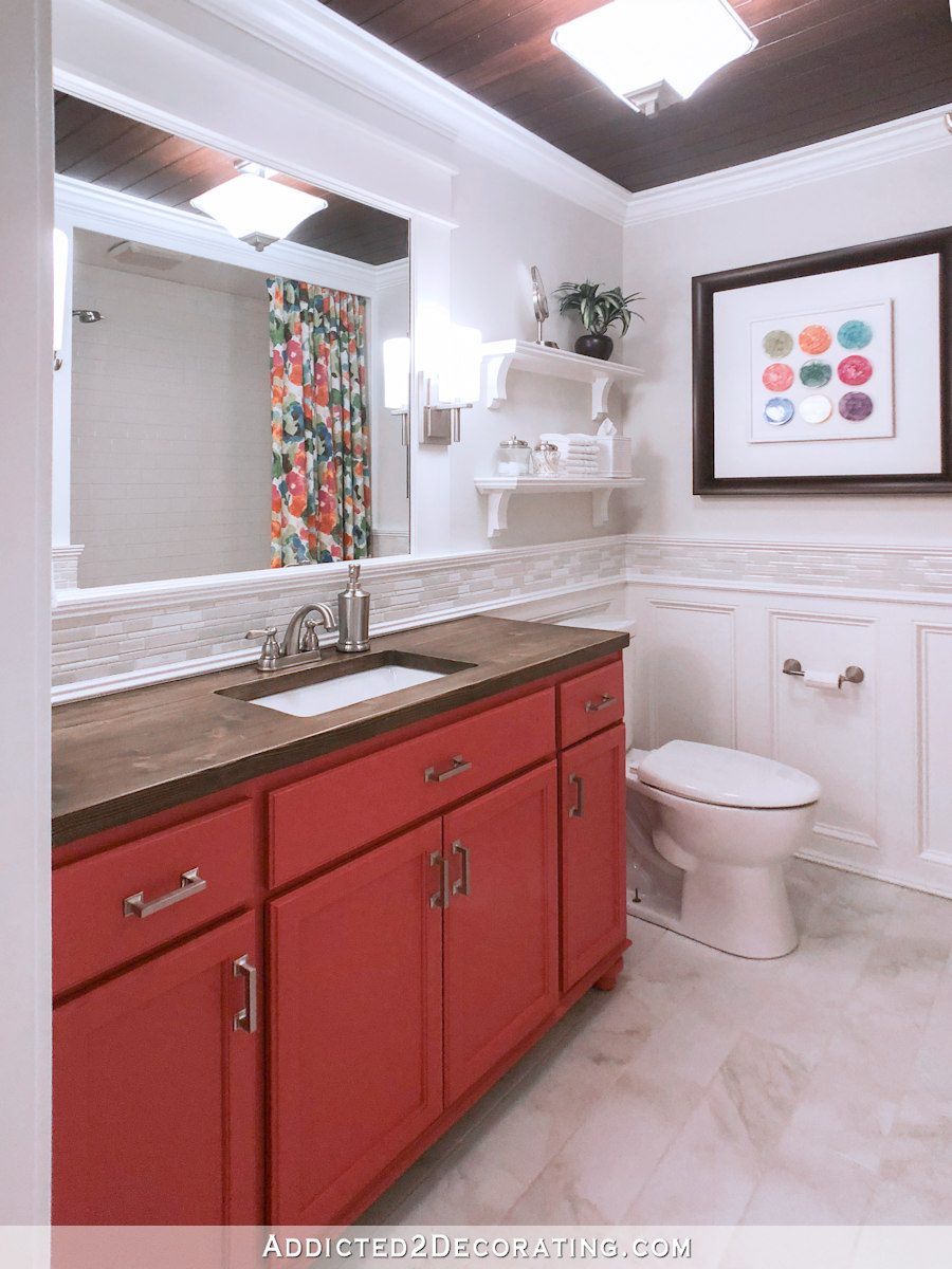
You can see more pictures on the before and after post right here…

Addicted 2 Decorating is where I share my DIY and decorating journey as I remodel and decorate the 1948 fixer upper that my husband, Matt, and I bought in 2013. Matt has M.S. and is unable to do physical work, so I do the majority of the work on the house by myself. You can learn more about me here.

Well I absolutely love the shadow box framed resin artwork, but that’s just me!
I absolutely love all the changes you made in your bathroom.
Maybe now what is not working with the new decoration is the mosaic tiles.
Hi Kristi.
I was 100%preparing to NOT like the framed resins, but when I saw the picture I loved them!
If you end up painting the tile there will be less rectangles? That would be helpful 😊.
I also remember you feeling this way about your living room wainscotting(many moons ago)…and then you took it all down.
Maybe its just to structured for your creative, free-flowing mind?
Kind of like how you didnt paint some of your cabinets teal in your pantry. Is it just too rigid and structured?
Anyway..i love the color in the bathroom. You will figure it out. You always do❤
What about putting the petris just like they are but in 3 in each of 3 rectangular frames mimicking the wainscoting or even the tile direction. They colors are perfect with the shower curtain!
Your big flower artwork now hanging in the music room might work there…
Unfortunately, that piece is way too big and won’t even fit on the bathroom wall. 😀
How did you attach the resin petries to the back of the shadow frames?
I attached the resin petries with high temp hot glue.
I actually like them…a lot more than I thought I would, actually. But my brain doesn’t mind all the boxiness. 🙂
One thought. What if you added curves of some sort to the paint job on that wall? Like a round circle or oval painted a slightly different shade or a different sheen behind the shadowboxes? Or a wave?
Definitely prefer the gray wall color over white any day! I have a very similar color throughout my house in the non-colored areas.
I like the petris, but I think in that space I would actually like them all mounted in one big frame better, or even some kind of glass or invisible/metal frame that lets the resin be the focus instead of the frames.
Or my idea of strung in groups of three with copper white, no frame
*copper wire
I, too, love all the rectangles. The symmetry makes me happy.
Love the grey paint color. Ties in so well with the tiles.. maybe the petris could work in three frames or one like Rachel said
They don’t look to me like a fail in that location. I rather like them there.
I love the petris! The only suggestion I would make, is maybe you should paint the tiles. I like the white walls and the gray wall, both look good to me.
I think a large, colorful vintage travel poster of Turkey or one of the other places you lived in or visited would look great in your bathroom! Here’s one I found of Istanbul: https://www.etsy.com/listing/243213476/istanbul-city-buildings-turkey-travel?gpla=1&gao=1&&utm_source=google&utm_medium=cpc&utm_campaign=shopping_us_c-art_and_collectibles-prints-giclee&utm_custom1=2a26227f-7497-4507-8b86-c9923876574e&utm_content=go_304499675_22746190595_78727425635_pla-106555092035_c__243213476&gclid=Cj0KCQiAm5viBRD4ARIsADGUT26BGbmBI3JsNrWi3WQ9pL9LqqrIou9ueW-SndDQEEfnQ3TQgVNhrewaApmiEALw_wcB
What a great idea!
I think you’re right about the petris there. A lot of white and not enough contrast. Even with the grey, it’s like 9 scanty circles in a sea of rectangles and squares. Maybe 1-2 framed big pics of your petri prints?
The Petris would look good elsewhere, maybe with the frames not painted white.
I don’t care where you hang them THEY ARE GORGEOUS!
I too LOVE the framed Petrie’s, but I absolutely understand what you are saying about too many angles. I look forward to seeing what you come up with for that space I. The future!
What if you did the resin petries all in one frame? So one big shadow box with one big raised area and the petries inside it in a grid pattern? It will cut down on the box-in-box effect and look like one big piece of artwork. To be honest, that’s how I thought you were going to frame and hang them from the beginning, as one big piece rather than 9 small pieces.
I don’t know what’s going on with the paint and lighting in there but once you put the gray color on top THAT seems to match the bottom white on the wainscoting. That’s just crazy! I do like the gray and it ties in with the tiles nicely but to be totally honest it doesn’t feel like you. I don’t have a suggestion for you, unfortunately. It all looks very muted with the gray walls and the gray tiles and the wainscoting looking gray too. Of course all that matters is that you like it!
You previously mentioned that you no longer care for the accent tiles. I wonder if you would like the petri artwork on that wall if you covered up the accent tiles with removable wallpaper or wood stained to the same shade as your countertop or ceiling. By the way, the petri dishes are gorgeous!
I agree, put them all in one larger shadowbox frame. That’s what I thought was going to happen also.
Hi Kristi. FYI Neither my sister nor I have received your emails for your last two posts. I will resubscribe, but you may want to check this out.
Did you check your junk mail folder? I changed companies that I use to send out my email notifications, so your email might be thinking it’s spam.
I haven’t been receiving emails either in almost a week. I keep checking your page for updates😊
Same here 🙁
Same!
When you said you were going to frame them, I actually thought they were all going in one big frame together. Would that work? I love them!
That happened to me as well… I just kept registering and finally on the third attempt it worked… I now get them all.
How about using one of the pictures/artwork you sell on your website? There are so many colors to choose from, and you already know you like that style!
There’s no such thing as a “fail”, it’s just another step toward success.
I actually like the white wall, even if it looks like a different color from the wainscotting. But, that’s just me! 🙂 The gray is nice, too. It’s a lovely gray.
I agree with you about the petries. I’m not sure if it’s too many boxes or if its that the boxes are so different stylistically from all of the other box elements on the wall. Regardless, I love them, but not in that location. I do think the idea of framing them together is a good one, would remove a lot of the boxes. Another idea would to make some smaller ones (medium and smaller, and even tiny dots) and make kind of an archipelago of resins. Have you seen the “The Islands of the Bahamas” marketing logo? It riffs on the actual layout/size of the islands, with a grouping of colored shapes/circles/teardrops that are meant to mimic the topography of the islands. See the upper right hand corner in the link below. Something less symmetrical with the resins might be nice, because the colors are gorgeous!
https://www.bahamas.com/
Hi Kristi!
I just LOVE the framed petries, the colors are the perfect accent to the beautiful fabric you chose to make the shower curtain! But, I agree totally about the accent tiles, to me they are very distracting and clash with the classic wainscoting & ceiling, i.e. the tiles seem a little too modern. As has already been mentioned, I would just paint over them if possible. Your site is my favorite place to find do-able, creative ideas. I’m constantly amazed & inspired by your artistic flair & excellent taste!!
Could you swap the resin petries with the spoon art over the mantle? Loving all the color in the bathroom!
My thoughts would be to paint the inside of the frame/box the gray and then the piece that the color is glued to would stand out. More dimension! The gray looks great on the wall!
I like to sew and whenever I change to a new shower curtain (I always make) I like to make a toilet seat cover to match. Your shower curtain fabric is fabulous and repeating it in a toilet seat cover would repeat the colors for continuity and spark. When I make the cover I like to quilt the fabric first to give it texture and make more wearable.
I vote for a single piece of art work on the wall.
Off the subject would you please share what tile you used on the wall-thanks
It’s this one from Lowe’s:
Elida Ceramica Crackled Linear Silk 12-in X 12-in Porcelain Linear Marble Mosaic Wall Tile
Love the petries. The colors are just beautiful. The only thing I would do differently is put them all in one large frame instead of multiple frames.
Funny you should say that. All the way through the frame-making photos, I thought it WAS one big frame to hold all 9 and was totally surprised to see there were 9 smaller frames!
Maybe because I’m a lab scientist but I think they look like art in the individual frames and would more resemble lab specimens if they were together. I’d love to see them that way to find out!
One more thought on keeping the petries in their respective shadowboxes would be to move them all together with sides touching but treating it as one piece. No wall would be showing but each would still be separate.
I feel that it is the tile that is wrong for your new colourful room. And knowing you, there is bound to be a way you can cover them up with something equally colourful. More resin maybe!
Firstly, the petries are gorgeous. Would framing them together in one frame be less busy and less geometric?
To my eye, the tile feature strip reads a completely different style and color scheme (very rectilinear, very modern, very greige) than the rest of your bathroom (organic rounded shapes,, traditional detailing and molding, exuberant colors). Have you considered getting a very thin strip of MDF or plywood (1/8 – 1/4 inch thick), painting it white like your trim and wainscote, and gluing it over the tile? I think something quiet there would allow your other multiple colors to become the focal point.
What if you made a circle, say 24 – 36″ diameter and mounted the petries in a circular shape? I agree you have too many “boxes” there. Of course I don’t know how you could make a circular frame, but maybe you could find one in a secondhand shop? I like the subtle gray, and on my computer it seems to pick up a pale, maybe mauve color in the curtain.
The framed petries are exciting and I think they look great in the bathroom. Do like the different wall color. But whatever you end up with, I’m sure I’ll like it.
I like it…How about brown or coral frames, then it’s not so much of the white trim squares and pulls in more from ceiling or cabinet?
Well, ultimately, you have to love the finished effect. I don’t have the background or experience you do, but 2 things immediately come to my mind: the griege tiles, color and shape, no longer fit the theme, and what about cutting a larg(er) free flowing curvy shape and mounting the petries on that. You could still elevate them to give more shadow box definition. I do love the grey. Never have been a fan of just white. Anyway, you’ll figure out something that you love and we’ll be happy with you. Keep those “brain juices” flowing!
I think they look lovely, but I’m sure it’s different in person and you certainly know what you like. (AND we get a chance to see some other creative process to fill that space! 🙂 )
Just a thought – what if the inside white piece was circular instead of square, then the frames could be a little smaller, making the petries look larger? You’ll figure it out! Love all the colors. Re the tile strip – I think the light colors look really nice by the way – would it be possible to paint just the larger ones with your accent colors? That would be a crazy suggestion for most of us lazy types, but you did a whole room with a Sharpie pen. Thank you for not only the shadow box framing, but a way to use the petries. Genius!
Oops, I meant paint the darker pieces in the tile strip, not the larger ones. Sorry!
I also thought you were making one big frame. Guess I just read over the dimensions..oops! I agree with so many here. The tile just isnt making it. Could it be painted the same as the vanity?
Definitely gray on the wall color. What about one larger shadow box frame with all the petres inside of it. I just love how they look with the shower curtain.
Hi Kristi. Looking at the last picture in the blog there are already lots of “rounds” visible (mirror, etc.) so would painting the tiles, or covering them up work? The petris match your shower curtain so well.
I just love your work…you have such a magnificent God-given talent!
To my eye, the tile is the element that doesn’t fit. I love the petries for their colors that harmonize with the snazzy shower curtain. They add interest without taking over. Would you consider putting them in a single frame to use them in that space?
(Sorry for my previous comment a few days ago that went off topic, Matt. I think you justifiably eliminated it. Sorry to have done that.)
Selfishly, I’d love to see a post and then a project on wall art that has round or organic shapes. I’m having a very similar problem in my own bathroom, which has quickly become what we lovingly call “a study in rectangles.” I’m not sure what artwork to add. Beechwood sculpture? Macrame? I’m stumped, and there aren’t a lot of ideas out there.
Funny, isn’t it that the issue of “too many corners” becomes most noticeable in bathrooms? I wonder why? Smaller space? Tile is almost always rectangular? Interesting…
What if the nine art pieces were in one large frame? If it is all the repetition of shapes you object to, would one larger box fix it?
Went back and read all the comments after commenting ,and I see that many others made the same suggestion as I did. I also revisited the room pictures and wonder if the box frame would show better if painted the ceiling color? I would be way too lazy to redo them, but I know you have no qualms about redoing a project that doesn’t meet your expectations. Looking forward to seeing your solution.
How about making more petri and using them to cover or replace the tile border?
Could the petris be arranged somehow to look like bubbles?
I love those petris tiles.. I visualized them in one round frame in a circle with one in the center….. I love the way you made those frames. You never make a fail, You just make us think up more ideas. lol
I love the gray! I love your petri resins! Maybe not framing them would work. Maybe in a circle? What ever you do I always am amazed and inspired! My freezer is going to be bronze this summer!
Can you tell me about the backsplash that is in the first picture in this blog?
Well, you are new, aren’t you? This has been the breathlessly-anticipated project that Kristie has been working on for the last couple of months. Go here: https://www.addicted2decorating.com/my-finished-butlers-pantry-remodel-before-after.html
and for more outright fab, just click on ‘My Homes’ at the top of this page. If anyone can make a silk purse out of a sow’s ear, it’s Kristie!
I like the resins there, can’t imagine that they would find a better “home” than in that bathroom with that particular mix of colors. To truly highlight the beauty of the resins themselves, here’s what *I* would do if they were mine: I would take a pane of anti-glare glass (or even acrylic or poly-carbonate would work, and would be easier/safer to cut), mount the array of resins on the glass (could even be oval shaped rather than square if trying to eliminate some of the angular geometry in the room, but I think a 3×3 array of the resins in a square would look fantastic). Then maybe put something on the backside of the glass that would allow it to “float” a half inch or more from the wall when it is mounted on the wall. (If working with acrylic rather than glass, might be easy enough to glue acrylic “sides” to the pane of resins that would allow the resins to be situated some desired distance from the wall to give the resin array some depth.) I am never sure in your posts if you are inviting or open to suggestions or if you are simply stating the current situation, so please forgive if you’ve already decided that the resins are to be in the individual frames that you have already constructed (which are quite lovely).
Love the resins, and love this suggestion about mounting them on an acrylic or glass all together. And the grey is great, too! Maybe do some more resins [2-3x as many] and maybe go larger, on acrylic, no frame, just your colorful resins!
But It really doesn’t look to boxy the way it is, to me. Very cool framing idea and easy!
You could try the petris again after you paint. They might pop just enough. It also might make more of an intentional graphic statement if you took down those shelves and just embraced the boxyness.
As a side note, something is just off about this bathroom – maybe the color of the wainscoting? Have you considered painting the wainscoting a bright teal/blue that is in your shower curtain?
Why not wait until the new paint color is on the wall and see how the petris look before trying a new art project. That small change in color may just pull everything together.
I love the petris on the grey. I think it will work! Can you maybe color some of the class tiles with stained glass paint or enamel to bring some colors into them? That would bring it all together. Just a thought.
Kristi, this is another ‘your house, your rules..’ but I love it with the gray color just the way you have it. I do hope you don’t remove the wainscoting. I drool over your millwork and would like to copy it in our retirement home.
How about another acrylic pour that looks like the ocean, or water at least?
I just love how they look with the shower curtain. Could u put a wide molding over the tile? I just don’t think the tile looks like your home. Its not colorful enough. I love the changes. I wish I had your energy.
Hmmm,,,,, seems like many think the problem is the tile. I agree it looks rather bland compared to some of the other elements. But sometimes that’s just fine. The wall doesn’t have a lot of color either. I believe it may just be a lack of balance in the room. The cabinet and the counter are very color saturated as is the shower curtain. Perhaps you need to change the frames to a wood tone or put them in one large frame but in wood tone.
Or, for goodness sakes, go back to this! But maybe a slightly lighter frame.
https://www.addicted2decorating.com/finished-bathroom-artwork-dining-room-rug-indecision.html
Yes! Great idea!
What about turning the frames so they’re hung as diamonds?
I originally thought you were going to make one box for all nine resins – would that work for you?
Hi Kristi
I LOVE the rectangles – but then I’m violently OCD – so everything must be square and even and leveled, and, and, and. I also like the off-white color you want to use 🙂
I think it all looks fantastic….but I always do think everything you do is fantastic…I like the originals and I like the redo’s…so I am no help at all…I just know whatever you do will look great!
I know you didn’t specifically ask for input from readers on this blog, but I’m with a lot of other readers in thinking certain elements are not working in here, but not necessarily the ones you plan to nix.
I think your curtain, the petris, and the vanity are absolutely perfect together. And they scream Kristi. It might be some other elements that you are not ready to admit need changing. 🙂 Would now be a good time to quiet the noise from us readers, take a step back, and figure out exactly what is your big picture in this room? Remember the entryway!! 😉
When I saw these resin pieces framed on the bathroom wall I immediately thought that they would be absolutely perfect in your studio on the wall over your desk adjacent to the wall of the wallpaper you designed. You are so creative.
I love the resin pieces! Maybe if you put them all in one shadow box? Your house is so awesome!
Chrysanthemum Mirror?
Maybe you can somehow incorporate the petris into a new boarder above the wainscoting. They would add color, depth, and texture to the boarder. Then you can put a beautiful colorful picture on the wall above with complimentary colors.
I love the look, you are so creative and the custom resin petries in the shadow box frames are beautiful! All the colors are so happy. This is only an idea, but would changing the tile to a circular pattern break up the line and add movement and luminosity? I thought of this because I was tile hunting awhile back and saw one that looked like bubbles, I think it was called something like snow-white glass and stone random circles. Anyhow, so enjoy following your your progress. Thank you for inspiring me to try design ideas that make me happy instead of always playing it safe.
Once the tile border is gone you will be happy with your design choices.