Breakfast Room Progress, Cabinet Paint Color Decision & More…
I feel like I’m moving at a snail’s pace on the breakfast room this month. It’s already the 9th, and I’m still not even finished with the trim. But that’s okay. I’m trying not to be so hard on myself, and just be glad about the fact that there IS actually some progress.
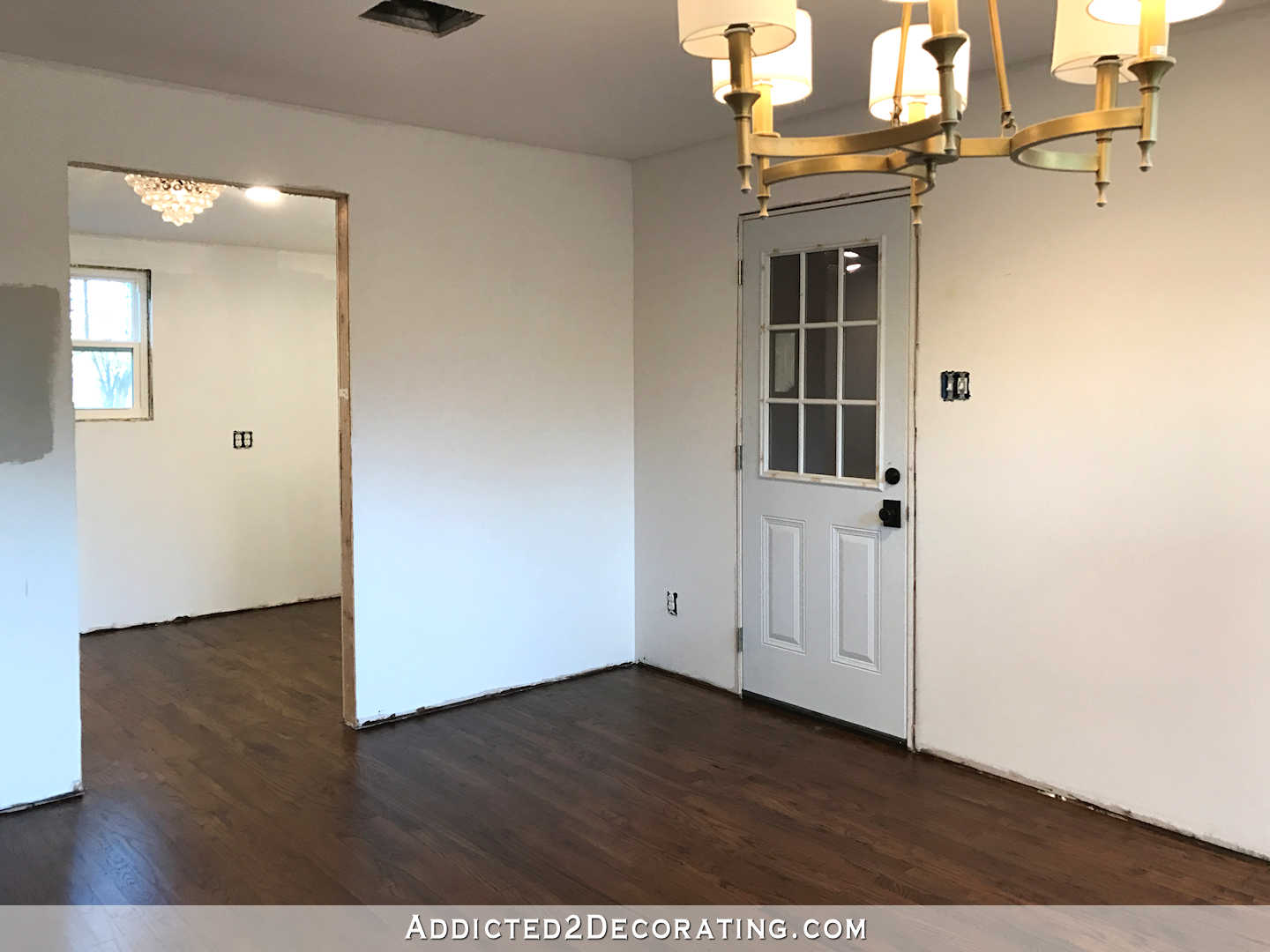
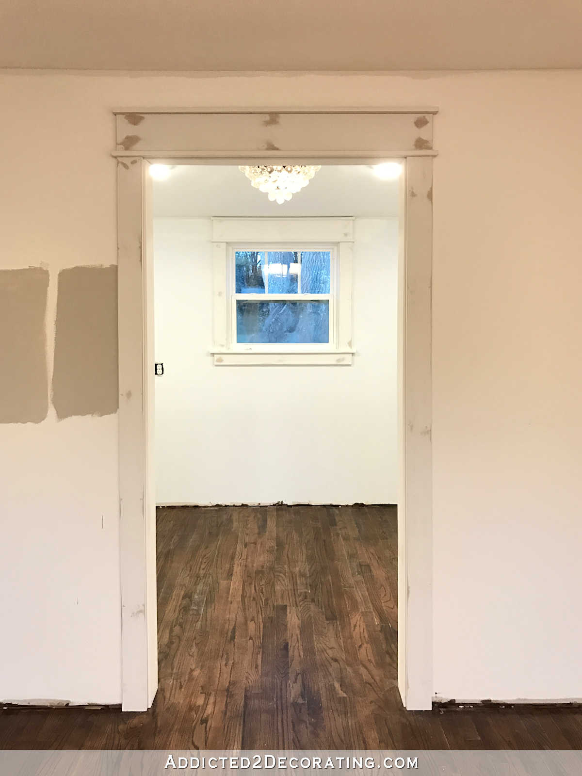
The first thing on my list for this month was to finish the baseboards, the trim around the windows and doors, and the crown moulding.
Well, I’ve decided to let my guys do the crown moulding. I’m done with crown moulding. I installed it in the bathroom, the music room, the living room, the entryway, and around the tops of my kitchen cabinets. I can do crown moulding. I’ve proven that to myself. But I absolutely abhor doing it. So from now on, I’m hiring it out. They’re going to charge me $160 (not including materials) to do the breakfast room and the hallway, and I’m more than happy to pay that.
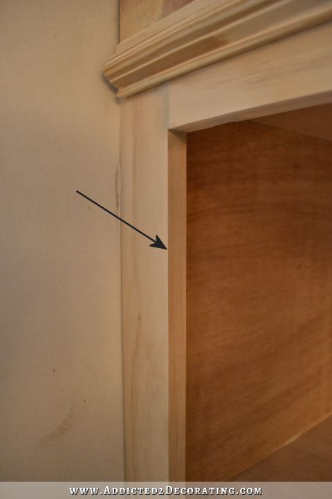
But as for the rest, well…that’s on me to get done. It’s super simple stuff, and I actually enjoy doing it. So far, I’ve gotten the pantry door, pantry window, and garage door trimmed out.
I shared details of my door and window trim, as well as seven different variations, in this post…
Fancy But Easy DIY Door Trim Design (Plus Seven Design Variations And How To Create Them)
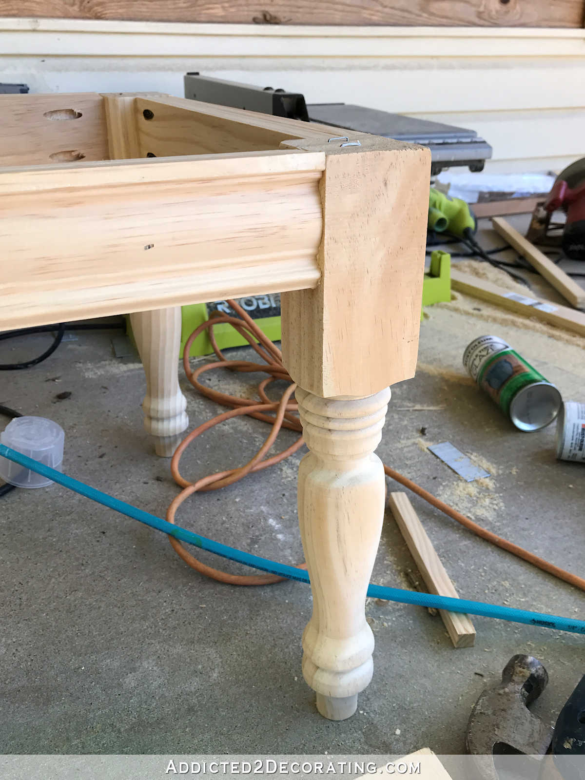
Obviously, it’s not painted yet. In fact, I just installed it, wood filled all of the nail holes, and sanded the nail holes. I still need to caulk and paint.
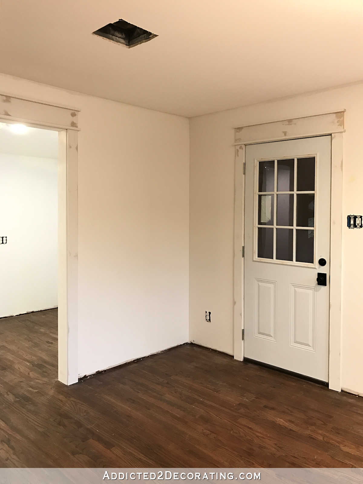
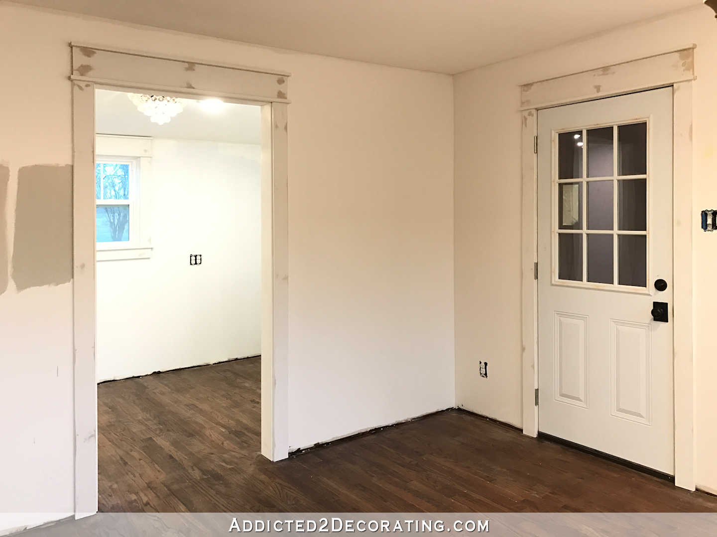
So today, I hope to finish installing the baseboards, and at least get all of the trim primed, if not painted. But before I can install the baseboards on the front wall of the breakfast room, I’m going to have to finish trimming out the bottom of the peninsula on the breakfast room side.
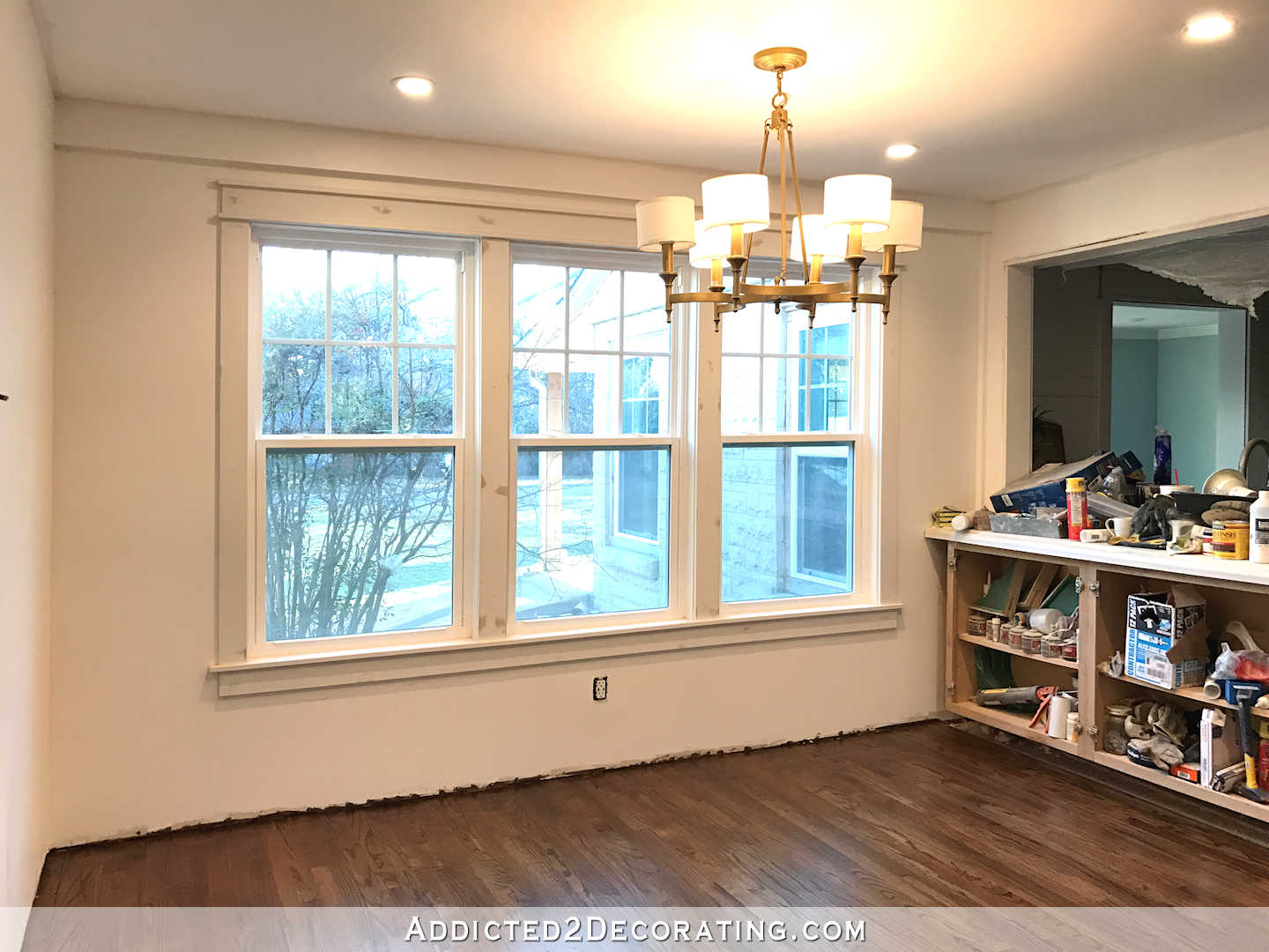
I’ve had a floating peninsula in the breakfast room for two years now (those cabinets are installed on the half wall that goes down the center of the peninsula between the kitchen and the breakfast room, which is why they don’t touch the floor), so it’s going to really transform the look when I finally get it trimmed out and it actually looks like it’s sitting on the floor. Anyway, I need that finished before I install the baseboard under the windows since the baseboard will butt up against the peninsula.
I love the trim stage of the room. That’s when it magically transforms from “under construction” to “almost finished.” And of course, paint will do wonders. I want to pick out a color that’s very light, but has just enough contrast so that the trim will show up. Which brings me back to paint color.
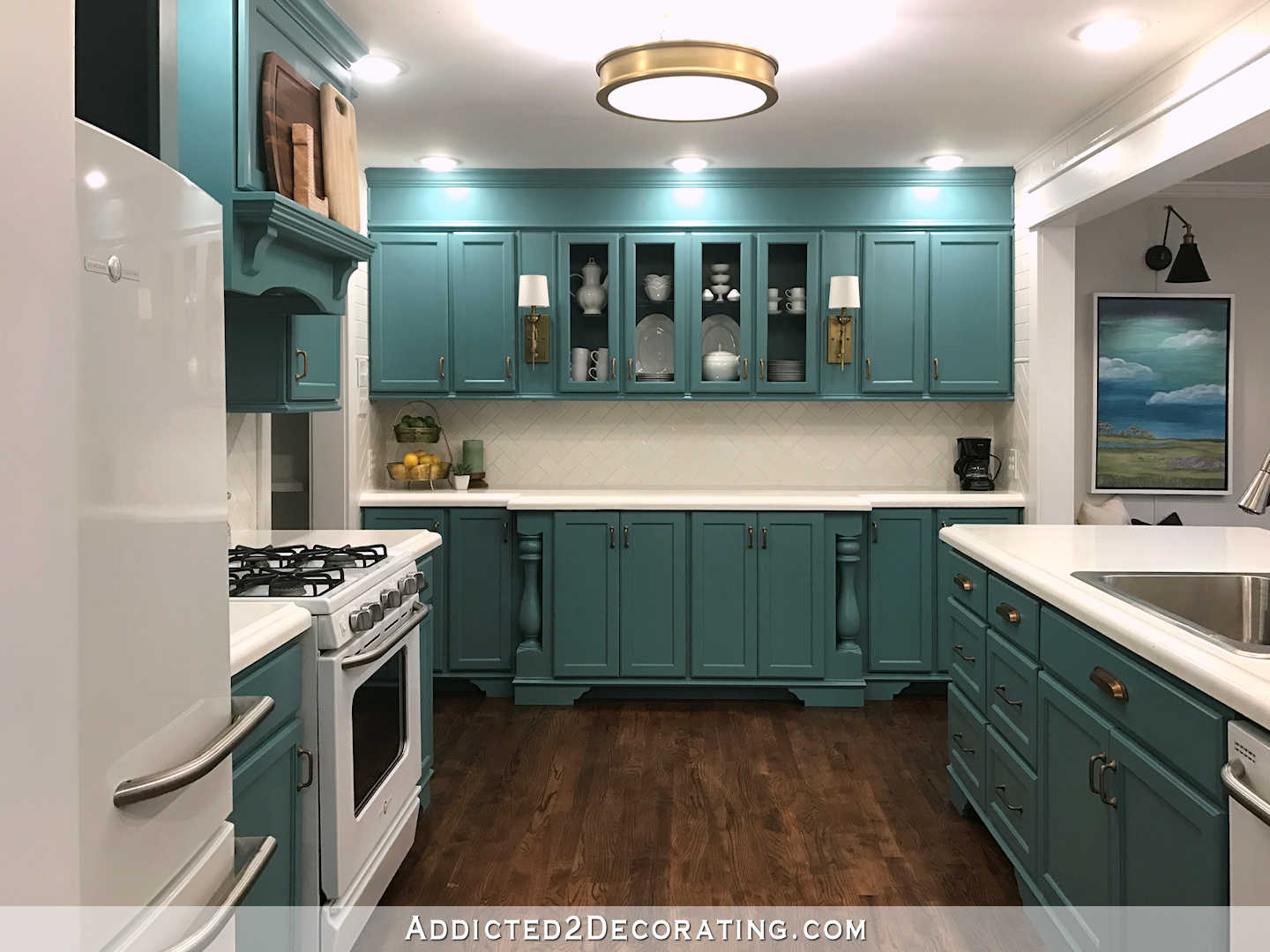
Many of you yesterday suggested that I finish the breakfast room and then choose a kitchen cabinet color, but my mind works just the opposite way. Since I know I don’t want white cabinets, and I also don’t want any kind of neutral color, I really need to know what color those cabinets will be so that this room can complement the cabinets.
Well, y’all nudged me in the right direction yesterday. I lost count of the number of people who said, “What about the condo kitchen cabinet color?” That color is Behr Hallowed Hush. It’s one of their old colors, so they no longer have it on a paint card, but they do have it in their computer system. I no longer have any of that paint left over, but the cabinets in Matt’s room are leftovers from my original attempt at installing cabinets in the condo living room, and they are painted that color. So I brought a drawer in to see how that color looked.

Yeah. It’s pretty much perfect. But I had already purchased a gallon of this color, because at some point about two weeks ago, I was certain this was the color. Then I started second guessing myself.
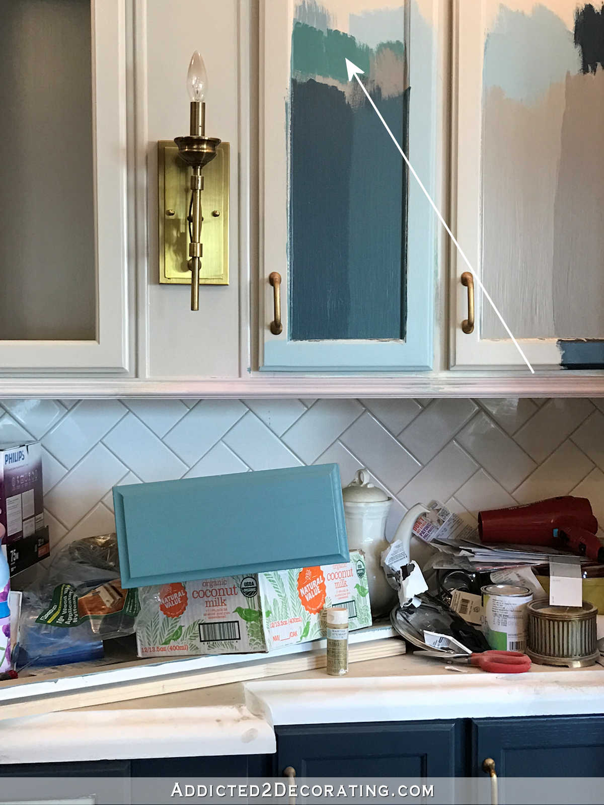
Well, Benjamin Moore Advance paint isn’t cheap, so I wanted to salvage that paint if I could. And those two colors aren’t that different — one is just more green and the other more blue. So I decided to just add some of the Gentleman’s Gray to the green color and see if I could blue it up a bit and make it close to the condo kitchen color.

Yep. It’s perfect. I mean, it’s not an exact match, but it doesn’t need to be. And it complements the living room drapery fabric beautifully. So, meet my new cabinet color, same as the old cabinet color. And you know what? I’m perfectly fine with it. It’s a gorgeous color, and it perfectly suits my taste and my need for blue-greens in my house.
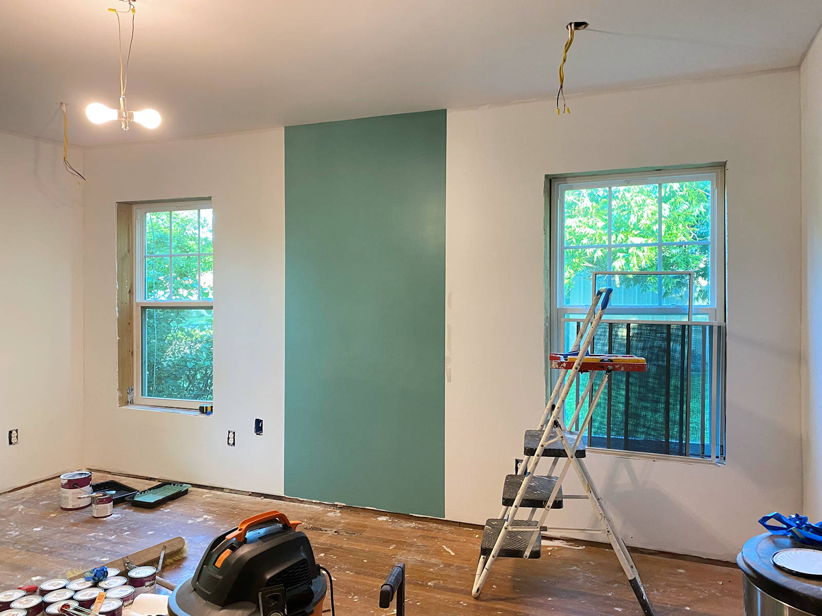
So now that that’s decided, I can hopefully find a wall color for my breakfast room today and get that room painted. You probably noticed that I already tried two colors. Both of those are a definite NO, but check this out. The walls in the room have already been painted Polar Bear, which is the white color I paint all of my trim. I chose that white many years ago to go with the white subway tile in the condo kitchen, and I chose it because, like the tile, it wasn’t a stark white. It was a warm white.
Anyway, of the two colors, the one on the right (next to the door trim) is Revere Pewter. Check out how dark it looks, and how much it contrasts with the white wall.
Is that not crazy? That paint swatch is just a few feet away from the kitchen cabinets that looked completely washed out and dull painted in the exact same color.
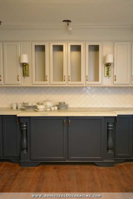
I chose it specifically because it looked like a medium toned khaki color, and I loved the contrast with the white. But somehow, all of that got lost when I painted it on the cabinets. It really is so strange to me. These areas are right next to each other. The kitchen has no windows and just gets sunlight from neighboring rooms, whereas the breakfast room has windows and gets loads of sunlight during the day. And yet, Revere Pewter barely shows up on my kitchen cabinets, while it looks quite dark on the breakfast room wall. I don’t understand it.
Anyway, that’s behind me, and I’m moving on to blue-green cabinets. As far as the breakfast room walls, I have no idea what I’ll do in there. I want something with just enough contrast so that my trim stands out, but not enough color to steal the show. I so desperately want to find a neutral that I like, whether it’s a super light gray or taupe or something like that, but I feel like I’ve been down that road so many times that I have little hope I’ll find something I like. I do know that I want white curtains in this room. I know that sounds a bit boring for me, and I might try to dress them up with some trim, but I want white. I’ve had my heart set on that for weeks now, mainly inspired by Michael’s lovely dining room over at Inspired By Charm.
And one more thing, I finally got all of my woven shades ordered! I went with the one on the bottom right.
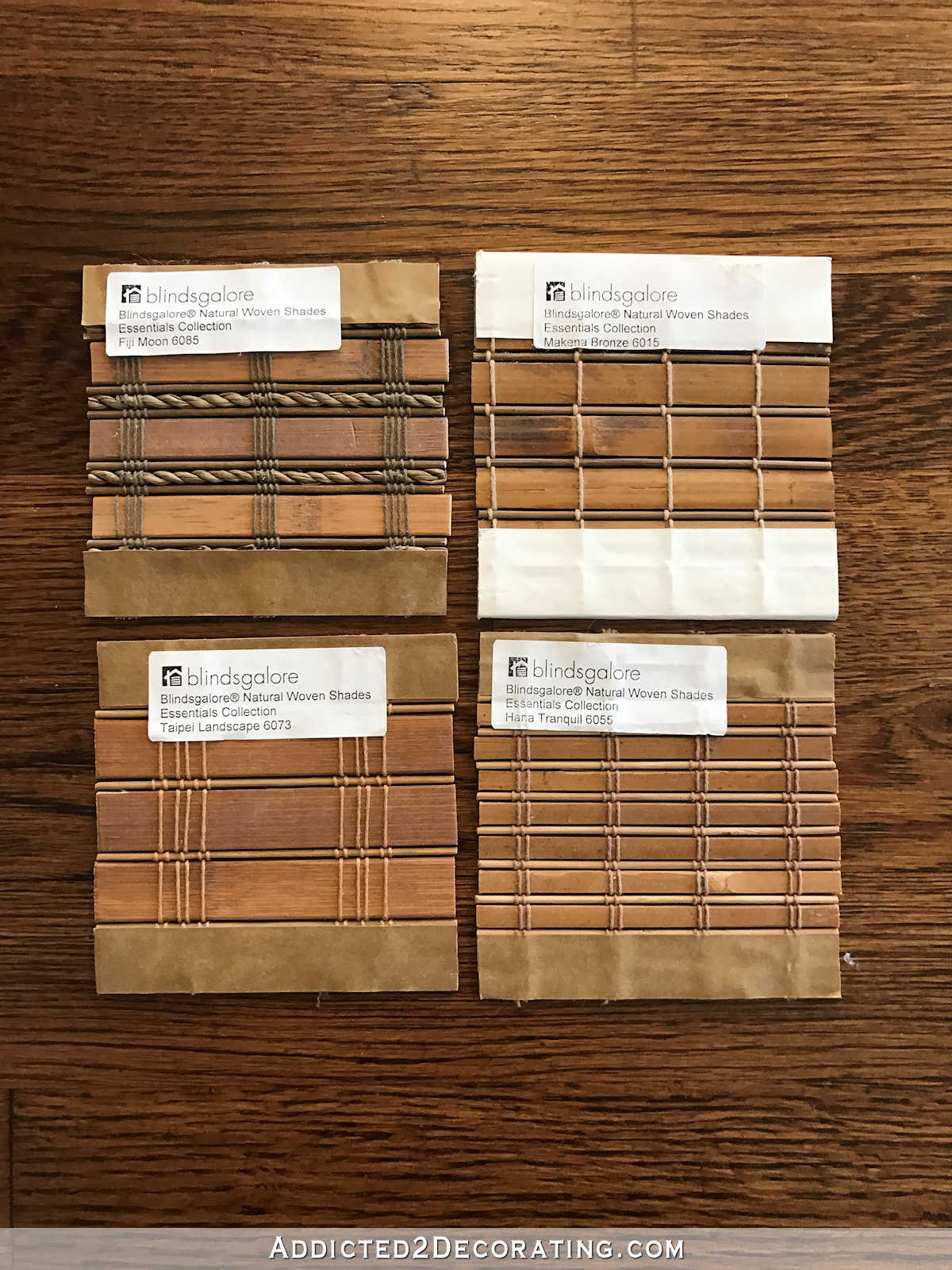
The top left was too busy and detailed for me. The top right is lovely on a small swatch, but do you see that one dark spot? Yeah, that scares me. I’ve seen woven shades that have those dark areas all over, and I don’t like the way that looks. I prefer a more uniform color. So I was actually going to order the one on the bottom left, but between the time I ordered the samples and yesterday, that one has been discontinued. So that left me with the bottom right. It’ll be 3-4 weeks before they arrive, so I already know that’s one thing on this month’s “to do” list that I won’t be able to check off, but at least they’re ordered. That’s progress.

Addicted 2 Decorating is where I share my DIY and decorating journey as I remodel and decorate the 1948 fixer upper that my husband, Matt, and I bought in 2013. Matt has M.S. and is unable to do physical work, so I do the majority of the work on the house by myself. You can learn more about me here.

So exciting! I think you’re making great progress!!!
(Will I be the first to notice the floors are not covered???? You like to live dangerously, huh? ;-))
Oh my goodness, I should have known I’d get in trouble for that. 😀 Actually, YES, I did cover the floors while working. I didn’t use the paper, but I did purchase a huge canvas drop cloth that covers almost the entire floor, and I had that down the entire time I was working. No tools or ladders touched my newly refinished floor. 🙂 And I only moved it out of the way this morning right before I took the pictures. It’ll go right back down today before I start working again.
LOL!
Have you ever tried that bam board stuff? I think it’s expensive but you should be able to reuse it. We’re having work done in our office and down through the hallway and is very durable and easy to walk on.
Look up Benjamin Moore Abalone, it is a great light neutral. Here is one picture I found but I’m sure you can look up and see many more. I’m thinking about trying it out myself. https://www.decorpad.com/photo.htm?photoId=92352
You never cease to amaze me with everything you do!
Check out Sherwin Williams Sea Salt.
I’m using that in my whole house reno. It’d perfect in every room and every light.
Yes! My sister used Sea Salt and I love it. I plan on using it on my kitchen cabinets. Light enough during the day and the looks a bit darker in low light.
I absolutely LOVE sea salt! I have it in my living/dining area and hall and it reads a very soft green with a hint of blue/gray. But it is another moody paint color – I tried it in a bedroom on the same side of the house with the same exposure and it looked like a dull muddy gray. I totally get where she is coming from on the unpredictability of paint colors!
I have sea salt in my living room/dining room and it reads on the blue side in my rooms. Funny how that blue/green pulls different colors in different lights.
I was going to say go with a very light color of the color you are going to paint your cabinets.
Can I ask why you didn’t paint the door trim before installing it?
It’s just my process. I always install all of the trim before painting it, with the possible exception being quarter round that goes right against the floor on the baseboards. But on the rest, I always nail it into place, then fill the holes with wood filler, sand those nail holes (which you can see in the photos above, where I sanded off the primer on the pre-primed boards), and then I caulk all of the cracks, then I prime, and then I paint. By the time I get all of the wood filling, sanding, and caulking done, it would have been a waste of time to paint prior to installation. Even if I paint quarter round before installing it, the only benefit is that I don’t have to paint right along the floor after installation. I still caulk where it meets the baseboards, and then paint that area after caulking.
I recall on one of your posts, you talked about the kind of wood filler you use as being the best in your opinion. Will you post what it is? Thank you.
Have you looked at the BM OC colors? Gray Owl works really well, although it changes color a lot depending on light conditions, another favorite is Horizon. On many occasions we’ve either upped the formula to 200% to get them to be a little darker (sometimes they can appear almost white) or reduced the formal if they’re feeling too dark in the space.
Love the progress and direction on the kitchen!
One more unrelated comment- if you really want the small soffit along the window wall to disappear, consider having them install the crown with a vertical backer piece throughout the room (a 1x with routed detail or perhaps an upside down baseboard) if the backer matches the height of the soffit, once it’s all painted white it should totally disappear.
Love the cabinet color. I think SW Agreeable Gray (a nice stone colored neutral) would go well with the floors, the cabinets, and the white trim and curtains. It goes grayish in darker corners and taupish in the light. Would you mind sharing where you get your shades and what kind you are getting (roll, pleated, etc)? I am doing those same shades on my windows but haven’t found a good source yet. I like the texture and warmth they add.
Kristie, check out Sherrie Williams, Wool Skein. I used it on the walls of my open floor plan home with white trim ( not stark white) and love it.
Great progress!! We just painted the interior of our house with Benjamin Moore’s Smokey Taupe (up one on the strip is Cedar Key and that was a contender as well). It’s not an overwhelming color but it stands out against the white trim. We tried the Revere Pewter and it looked blue everywhere we had a sample. Ended up using it in our basement and it’s the perfect grey. I really have a love/hate relationship with Revere Pewter. It’s beautiful everywhere I see it but it hasn’t worked for me in too many places.
I totally agree. Revere Pewter is freakin unpredictable. You really must try a sample before applying it everywhere.
I’ll be interested to see if white curtains actually appear in the final version of the room. 🙂 I love Michael’s dining room curtains, and they’re right up MY alley…but I’ve never seen you do something so relaxed and simple. Especially in curtains you seem to prefer a more tailored approach with heavier weight fabrics. I’m sure whatever you choose will be lovely, and I always enjoy the realistic roller coaster journey.
The IBC dining room walls seem to be a nice neutral…it’s Dior Grey.
Also, if you custom mix your cabinet paint…can you have more made to match? Or will the single gallon be enough to cover all? I can’t imagine you could mix another batch and have it turn out the same.
I was not one of the people who suggested using the condo cabinet color, but I definitely thought it! Glad you’re going with it.
Why not paint the breakfast room the same color as the front room?
I’m struggling with picking a paint color for my apartment myself! The colors look so different on the swatch and then on different walls in my apartment! It’s magical and frustrating all at the same time
https://househomehannah.wordpress.com/2017/02/09/home-color-conundrum/
What about the light green color you used once in the front room. Don’t remember if it was LR or DR then.
That’s what I was thinking also!
I had the same problem picked the perfect light beige for the bedroom and thought why not use it downstairs living room and kitchen. The living room was almost white and the kitchen it showed pink. Well what about the same color the living room is now as I love it. Well the kitchen showed it really dark. I learned every color changes in each room. It almost made me crazy. I had more swatches and samples trying to get what I liked. I understand your frustration. You have my sympathies.
Well, I checked out your trim ideas from before and pinned them to copy! You have SO many good ideas and I love that you provide the details of how the rest of us can accomplish them…well SOME of them, anyway!
When I can’t find just the right color with Ben Moore or SW or Behr, I will go rogue and break out an oddball paint deck, such as Pittsburgh Paint and I’ll find something new. Paint brands that I love but don’t use too much simply because they are sold in stores not convenient to me or a local store dropped the line but they can still make the color in another brand for me, are: Pittsburgh Paint, Pratt & Lambert, and Muralo (beautiful, 100% acrylic but no longer sold in my area, boo hoo!) What I do appreciate about BM, SW and PP is that all of them offer large sheet swatches that can be ordered online. Also, that whole issue with paint looking so incredibly different in different rooms can be frustrating, I totally agree. It’s all relative. Sometimes I’ll show people a green, let’s say, and show them how different that green looks depending on whether it is right next to a blue or right next to another green. But that Revere Pewter situation is crazy, you are right! Anyway, you know what you are doing and I’m all for your new cabinet color!
Great progress!! I would suggest trying BM Edgecomb Gray. I have it and love it. It is just enough contrast with my white trim, and is still very light. It is a great neutral…. not gray, not tan, the perfect neutral IMHO. I think it may even be the lightest tone on the strip with Revere Pewter, but I am not sure. Keep up the great work!
I love your trim work, so this part of the process is exciting for me! Question though: is grasscloth wallpaper out? what about your birds and butterflies hand-drawn wallpaper? I thought one of those was going into the breakfast room. Regarding finding a neutral, what about going back to the Benjamin Moore 2017 colors? The cloud cover color is a super light grayish and Benjamin Moore has “similar colors” like dune white, dove gray, and soft chamois that all seem like they might work. Only reason I’m suggesting Benjamin Moore is because of some other commenters that have mentioned that the bases used by each of these paint companies differ and so you may want to stick with the Benjamin Moore base, now that you used it in the living room. The other thing I was going to suggest is maybe going in another direction. I used Behr’s Coconut Twist in my guest room and LOVE IT. It’s this super light cream color. Online it reads kind of flat, but in my room it’s pretty sunny, very warm and welcoming, and so, so light but, it definitely contrasts with white trim. I also used a Behr color called Seaside Sand a few years ago and had the same warm, but not yellow results. Behr doesn’t make Seaside Sand anymore, but you can get them to look it up. I’m just suggesting that since gray-taupes aren’t really your thing… The other thing I was going to suggest was not trying to go neutral, but to go with a really light color, like you did in the living room. I think really light blues and teals and blue-greens are gorgeous with white drapes and bamboo shades. Just my thoughts. 🙂
I finally ruled out grasscloth just out of sheer frustration. The one that I really loved was on backorder for about two months. Then when it was finally supposed to ship, I called and was told that it was backordered again until March (I think) and even then, there was no guarantee. I’ve check out all of the grasscloth books and brought them home more times than I remember, and I just can’t find another one I like as much, so I finally decided to just give up on that…for now. I can always add it later if I find one that really works.
I also decided to rule out the birds and butterflies since most of that design is black, and I’m trying to steer away from so much black this time around. Oh, and Matt said he didn’t want it in the breakfast room. 🙂 He almost never gives me input on the house, so when he does, I like to listen.
I love it when you tell us the input Matt gives you! 🙂 We all (or at least a lot of us) have husbands with opinions! LOL! I’ll be curious to see how you incorporate that beautiful pattern somewhere.
I love the grasscloth, too. Maybe when you’re ready to do your office or after your ginormous add-on is done, you can use it in one of those rooms. Maybe Matt’s game room gets grasscloth! LOL!
One last thought that I had. In his comment yesterday, Justin had mentioned your backsplash grout color. I had mentioned it before, too, a couple of months ago when you first talked about redoing your concrete counters. I know it would be a ton of work, but if you regrouted in a grayish color it might add some nice texture to the kitchen. In person, I’m personally not a huge fan of subway tile with the gray grout, but I do think it looks nice in pictures. If you like the darker grout look, it might be something to consider.
Awhile back several people suggested you do an inspiration board to get an idea of how your rooms will all work together before having to re-do (once again) your main pieces. You probably did that for your clients when you were in business but don’t remember if you took those suggestions personally. It might be a good idea this time. Doing so would save you time and money in the long run. The most dominate color of each room would be the largest item that you put on your board and from there, scale the remainder colors in proportion to what will be in the rooms. When you finish a board for each room (living room, kitchen, dining room) you can look at them all together to see the flow (or not) between them since they are somewhat open to each other. Any of that make sense?
This would be a great idea for her.
I get where you’re going with this suggestion, but I think Kristi’s problem is how the paint colors read on the walls in her house. Design boards work in theory, but what happens when the paint color on the design board doesn’t “work” once it’s on the walls? I’m not asking to be snarky, at all. I’m not a designer, so I’ve not had to deal with that. How do designers respond when the paint color looks funky on the wall? Just curious.
Have you looked at SW Kiln Beige and Divine White as a possible choice. It was nice to notice I wasnt the only one that wondered why you didnt paint the molding before installing.. My painting skills are not very good so I painted the walls before we put up the painted molding. It looks great!
I’ve had good luck with Benjamin Moore Jute. Its warm and khaki-like. I found a picture:
https://www.pinterest.com/pin/350154939752703193/
Repose gray? I see that color on Pinterest all the time and it really speaks to me. I think it would look great in your breakfast room.
Used Repose gray on the guest side of my duplex. Love it. It is really light and a wonderful gray.
What about Benjamin Moore Classic Grey. It is just enough contrast with the trim while still keeping it bright and airy!
Silver Drop by Behr is a light grayish neutral – probably also not in the current paint chip set
I think you need to decide on something and stick to it. It is costly when you keep changing your mine. You will never get your house done if you keep changing your ideas.I am sure your husband is getting tired of it also. I am not writing this to be mean just think about it. Take your time to decide what you want.
Her design changes don’t bother me at all. I don’t bother myself with what she does with the money that we budget each month for work on the house. I love seeing her design process, and am always amazed by her creativeness. She makes my life very easy. After all, she understands what I am going through with my MS, and asks me if I am ok with her making changes to something before she does it. She always involves me in her decisions.
It’s nice to “meet” you here Matt!
I second that! Nice to hear from you Matt!
Awe nice to meet you, Matt! I love seeing you on here!
I don’t fully agree with Debra’s thoughts… I appreciate this blog so much because it fully shows how hard it is to make huge color and design decisions. I learn way more from seeing the thought behind the decisions… not just the final “perfectly” finished room.
Nice to meet y’all too. Negative comments never bother me. I am that chill. Never in my life did I consider that I would be married to someone who blogs for a living. Who knew? Whew.
Nice to “meet” you, Matt! I’ve mentioned before, on other posts, that I think it’s great how you and Kristi run the blog as a business, make budgeting decisions together, and are going to pay off your house so quickly! I hope that the negative comments regarding money and accessibility don’t bother you and Kristi too much. I think the regular readers understand how much of a team you are, both when it comes to finances and how each stage of the renovation meets your needs.
If Kristi finished her house we’d have nothing to read about.
Hi Kristi;)
I love the new cabinet colors you’ve chosen. I love following along with you:). I need some advice and I thought you may have a suggestion for me. I have a back door exactly like the one by the opening to your pantry. I want to paint it very dark gray blue or black. What should be done to the white trim around it? Leave it white like my baseboards and other trim or paint dark as well?
Thank you for your help!
Darla
Are you talking about the door casings? I’m leaving my door casings white, and painting my doors a darker color. Not sure what color just yet, but they’ll be dark. 🙂
Thanks Kristi!;)
Oh yaaayyy!! I’m one who “suggested” you use condo cabinet color, and you just proved it in your pics of the drawer and new mix. I’m sooo happy for you!
I have no clue for your wall colors, as I think that has to be seen in person, to get the TRUE picture of how the light changes in your house! But, I for one, can’t wait to see your final choice.
So funny. I painted a small section of upper cabinets, frosted glass insets, with exactly your condo color cabinets. I’m in love with it. That dark teal is a refreshing pop of color. I also painted the island base same color. The contrasting cabinets are BM Edgewood gray. My wall colors throughout the main house is revere pewter. About revere pewter…..it changes with different light! It changes with what’s around it. It took twenty samples on my wall before finally just going and trusting my decision with RP. Best decision ever. It’s elegant. Blends with everything. I did sample sea salt but it felt too baby blue in the hallway. I am however going to use it in my guest room. I used SW rainwashed for my master and it’s perfect blue/green at different times of the day.
Looking around my place I just realized how much I love blue/green/teal,palettes. Just like you!! Thanks for all your testing and trying because it cuts down on my guessing 😉
I had rainwashed in my last house for the master bath! It got tons of sun all day long, and I loved it! The bedroom was sea salt (which looked a bit blue at times!) but they complimented each other very well. I had planned on doing the same colors in our new house, then hubby said ” no more blue/greens in the master!” , so It’s now a pale tan. I plan to live with it until it makes me crazy, which may be about a year!!!
Correction. Edgecomb gray, not Edgewood gray. About rainwashed in my bedroom. It’s so peaceful that I want to spend all day in there. Last night was the first night sleeping in there since finishing it. Loved waking up to not only a finished room but a bright one!
Kristi, if you’re reading this……I love your choice of gray for your walls!! You won’t be sorry.
Have you considered mixing your final cabinet color with white for your breakfast room walls? You could go as light as you want and it would flow with your kitchen. When rooms are this open, I think the colors should compliment each other and not compete.
Are your lights in the kitchen fluorescent? That might explain the difference in how the paint color looks compared to the breakfast room sample.
Hi Kristie,
I want to say thank you for keeping it real. I love your thought process, and the way you re-do something until you get it that way you want. I’m visual as well and sometimes things don’t turn out the way I had in my head. I don’t mind re-doing things if I feel I can improve the design, color etc.
Keep plugging away Life is a journey, not a destination!! Plus if you finish everything, you won’t be able to share as much with your readers.
Check out B M Manchester Tan.
I do love that color you chose for your cabinets and think it will go great with your living room and eventually your breakfast room. I like the shades you ordered for your breakfast room, too. Not my first choice but I don’t live there, do I? LOL
I know you want a light, barely-there color for the breakfast room. What about a using the cabinet color as a base and putting a LOT of white in it? It would be blue tinted white and the woodwork should stand out. Just my meager thoughts.
I’m currently redecorating and my drapery fabric is a white background with teal and shades of blue from denim to royal/navy along with some light gray. I used Behr White Metal for the walls. The name is very misleading because it’s really a light gray. In some lights, it sometimes picks up a blueish cast. I wanted a true neutral without any hints of brown or taupe. So while it can look a little bluer than I wanted, I do prefer that to picking up any tones of brown. Since your living room curtains have teals and blues like mine, I wanted to mention the White Metal. It contrasts beautifully with Behr’s Pure White for trim. Someone mentioned BM Gray Owl. I also tried a sample of that but found it had a slight green cast. My sister (an interior designer) also used Gray Owl for a client and she said it read green, too. As you know, the color temperature of light bulbs can greatly affect the color. I went to all daylight bulbs because I prefer cooler tones to warm tones. http://www.behr.com/emailnx/viewFB/RXYF
I think I have a new strategy for when you’re stuck. Go back to what you had/wanted/felt in the first place. 🙂
Have you looked into Accesible Beige by sherwin williams? *swoon* it’s the perfect neutral color, really! Not too warm, not too cool. Looks great with creamier whites!
Kristie, I think you have accomplished a lot in February! The floors have really seemed to speed the process along to me. You amaze me with the knowledge you have on trim. I have used both SW Accesible Beige and Revere Pewter. I had read they were very similar. In my house neither one was “agreeable” to me. Recently I have used SW Agreeable Gray and it has given a lighter feel to my home. Whatever you do–it will be beautiful. I was glad to see Matt’s response. Very touching to read of his support to your hard work!
Please show us how you plan on lining your woven wood shade. I want to know how to do that.
Me too!
Wonderful to “hear” from Matt! I’ve often wondered if he followed your blog every day, and what his thoughts were when changes have been made – so refreshing to know that he’s so supportive of you, your blog and your creative genius! And I, like so many of your followers, love seeing the entire process – from the idea stage, all the way to implementation – it gives us inspiration and hope that we too can transform our houses to warm, beautiful, lived-in, beloved homes. And I really look forward to reading your blog – it’s the only one I follow every day. You make everything so real – unlike many other blogs that show us a few highlights, then the finished product. We want to see it, warts and all. 🙂 Looking forward to seeing how the breakfast room turns out!
Like the cabinet color! I saw the comment yesterday where you shared a picture of the drawer but didn’t take time to comment but I like!
That’s wild that revere pewter shows up so differently. I wonder if it’s that the wood is more or less porous than the drywall or??? I would NOT have guessed that was the same color at all. If you ever figure out the magic behind that, I look forward to reading what causes it.
Mark
Adding to the list of readers who have Agreeable Gray! In our house, we have Dover White (SW) trim and Agreeable Gray (SW) just because I was unsure which direction to go. Well, I love it. We have Warm White cabinets in the kitchen – looks good with those; Putty colored vanity in the Master – looks awesome; Wood floors similar to yours – looks awesome. It’s a barely there gray, with a hint of warmth, and I would do it all over again. We’d lived with Relaxed Khaki for 7 yrs. in our old house, and I couldn’t take any more “brownish” shades!!! Wish I could send you pictures!
I can’t believe that sample in the breakfast room is the same as the cabinets – they look NOTHING alike! And glad you found your cabinet color. ( With a little help from you friends!)
Just wondering if you considered adding white to the Revere Pewter for the light neutral you are seeking?
I love seeing your trim go up! It’s when the personality of the room begins to reveal itself. I think white curtains would look beautiful in there – airy and light. I love the color you chose for your cabinets. I have a consistent problem choosing paint colors – I seem to have no sense of how intense those colors will be in a large room with 4 walls (they look so perfect in their little 2″ x 2″ form). Sometimes I think choosing a perfect paint color is equal parts hard work and voodoo.
Ahhhh,, Revere Pewter. It looks beige in the windowless florescent lit break room at work and gray in my sunny southern den. Not loving it at my house.
Love your progress and your process:)
Based on what you’ve shared so far………I think you should also look at BM Intense White for your breakfast room. It reads as a warm/fresh neutral, slight green undertone. It changes with the light in the best ways and just enough contrast to white trim.
Can’t wait to see what color you ultimately pick.
BM edgecomb gray is the perfect neutral for my house. I have it several different rooms and love the way it looks at all times of day. I got the color idea from young house love and it looks great in pictures as well. I also love abalone but it’s more on the light gray end
Hi Kristi… can you get the Revere Pewter in either half or quarter strength? I’m not sure how that would turn out but it might be worth considering. Good luck with finding a colour that you like. 🙂
While renovating a new home a few years ago I was on a quest for the perfect light gray. I spent a small fortune on paint samples. After weeks of trial and error I found Polished Gray by Glidden. It had the perfect amount of depth for contrast with no purple or blue undertones.
I love the choice you made…I admit that the old kitchen cabinet color was my all time favorite..having said that…I think that it is such a strong and unique color..you would almost have to decorate around it..esp in the adjacent rooms…I love nearly all shades of green..except lime green or I guess its call chartreuse…blue paired with green..and or blue/green…you cant go wrong..your house is lovely and getting more lovely..thanks for taking us along..
I like the new cabinet color much better than the original green. It’s going to look gorgeous especially once the counters are refinished. Can’t wait to see what’s in store for the breakfast room. Now I have to revisit your posts on building your kitchen cabinets because I am almost ready to start custom trimming mine. (I am first painting the doors and boxes and adding new hardware before I add new line rail trim to the edges, a new toekick with feet, and built up the tops to the ceiling with crown molding.
So glad you’re going with the condo cabinet color (C3) for your kitchen cabinets as I was one of the many that chimed in with that idea! That color will be gorgeous in there.
When you mentioned the vast difference in the Revere Pewter between the breakfast room and the kitchen, I immediately thought the color change was due to the lighting (which is no mystery). Not sure what the color of daylight is in Waco, but here in So Cal it’s very blue/white during certain times of the year. The color of light in your kitchen appears to be yellow/white, and it appears to be more blue/white in the breakfast room. The yellow/white light in the kitchen must be picking up an undertone in the RP and washing it out. It’s too bad, because it’s a gorgeous color with those dark blue lowers. Is there a way for you to try figure out the undertones in the RP and try some other khaki-toned shades that would look in your kitchen lighting like the RP does on your breakfast room wall?