Random Decorating Decisions
Things have been moving along slowly in the breakfast room and pantry the last few days, but I’m making progress slowly but surely. Yesterday, I got the walls and ceilings primed, and the room looks so bright and beautiful.
But primed walls and ceilings mean that I’m ready to paint. And that’s where I’m stuck, because I’m still working on my whole-house decorating plan, and that’s coming along very slowly. I’ve got a few ideas, so if you don’t mind a completely disorganized, disjointed, free association-type post, I’d love to share some things that have been bouncing around in my head as I’ve been working on my breakfast room/pantry and dreaming of a decorated home. 😀
The entire plan has to start with my kitchen. I’ve already shared that I’ll be repainting my kitchen cabinets. Now before there’s any hand wringing over me doing a rather large project like that over again, let me just explain that even if I weren’t changing cabinet colors, I’d still want to repaint my cabinets. It’s been just over two years since I finished my kitchen remodel, and since then I’ve learned two things…
(1) The pronounced grain in the oak cabinet doors really bothers me. When I did the remodel, my kitchen was considerably darker, but since then I’ve added a doorway from the kitchen to the front room, and now I have a breakfast room with beautiful new windows. So my kitchen, even though it has no windows, gets a great deal of natural light, and that natural light bounces off of those cabinets making the grain in the wood even more pronounced. It’s actually quite ugly at times, so this next time, I’m going to fill the grain before painting. And…
(2) I learned the hard way that gold leaf doesn’t work well on kitchen cabinets, especially on the cabinets by the stove and sink. I put a clear coat over the gold leaf, but it didn’t really help. The gold leaf has completely worn off of some areas on those cabinets. So next time, I’m just painting.
Here’s a close up pic of the upper cabinet to the left of my stove where you can see both the pronounced wood grain and the worn gold leaf. I’ve tried other things as well — liquid gilding, gold paint pen, etc., — and they wear off on those cabinets around the stove as well.

So since I’ll be painting anyway, I’m also going to choose a different green — something a bit lighter, like a truer kelly green. Here’s the green I have now…
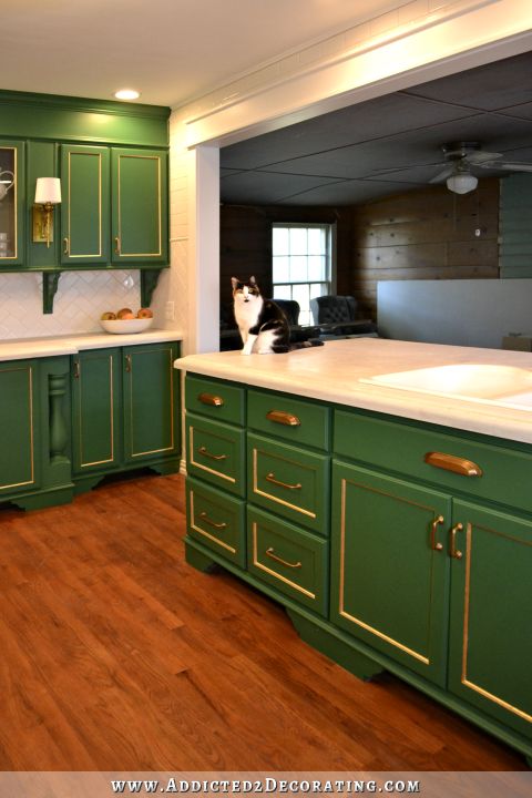
And I’d like something more like this…
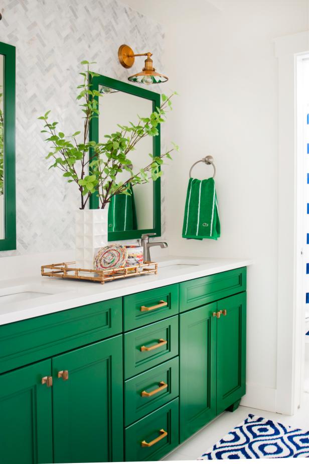
See how much brighter that is? And since there will be less of it (I’m only doing the lower cabinets in green this time), I think it’ll be beautiful but not too overpowering. The upper cabinets will be white.
And I have to admit that I’m really undecided on my countertops. Something needs to be done with them because there are a few issues that need to be fixed (more on that later). I do love black, but one thing I’m learning about myself as I work on the breakfast room is that I’m really loving the brightness of the room. I really do think black countertops would be prettier, and I keep going to this perfect kitchen in my mind…
But I also don’t want to chance doing anything that will suck any light out of these rooms, and once I stain those concrete counteretops black, there’s no going back. So that’s still up in the air.
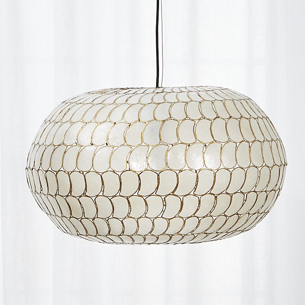
Anyway, about that pantry. Everything will be white — white cabinets, white walls. Light and bright. And I bought this light from Home Depot for the center main light that will show through the glass doors.
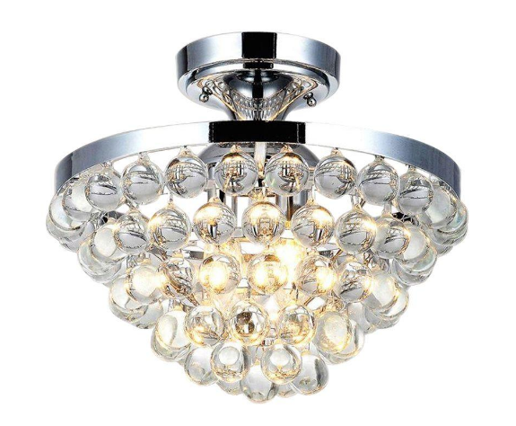
I’ve looked at that light for a while now, but never had a use for it. But now I do! I personally think it’s much prettier in person, and I think the sparkle from the glass will be pretty peeking through the glass pantry doors.
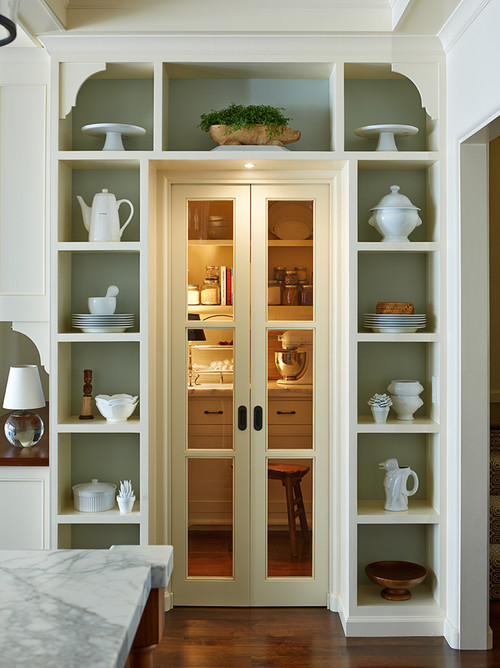
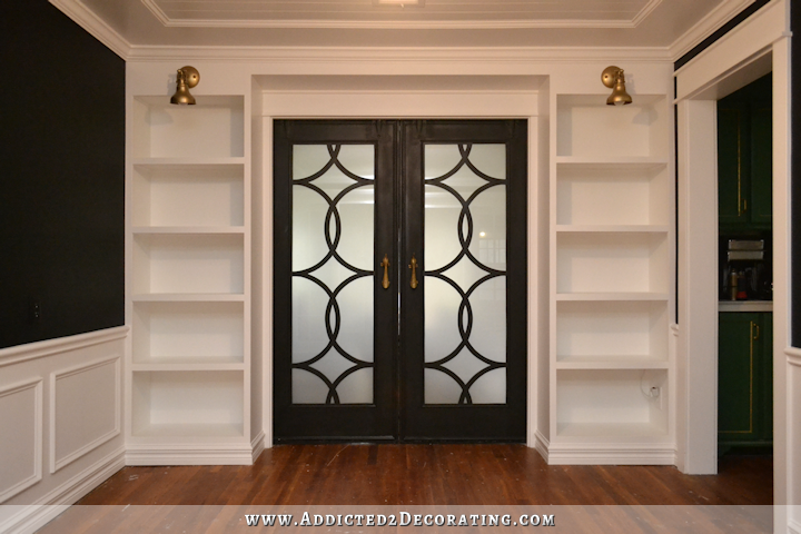
And speaking of doors, I’ve decided to make my own. Originally, I thought about purchasing bi-fold doors and using them as double doors, just like I did for the hallway bathroom. But I really want glass in these pantry doors. I keep going back to this image in my mind…
I considered cutting out the recessed areas on the bifold doors and adding glass. That’s certainly doable, but I do hesitate to make upgrades like that to hollow core doors. Once you cut into a hollow core door, there’s just a lot of filling that has to be done around the cut areas in order for the strength of the door not to be compromised. Again, it’s doable, but it just seems like a real headache to me.
I’ve looked at other various options, like purchasing two 18-inch French doors like the ones I used between the entryway and music room…

…but I’d rather not have so many individual panes like that. Then I realized I could make my own! I’ve already done it once when I made the black doors in the photo above.
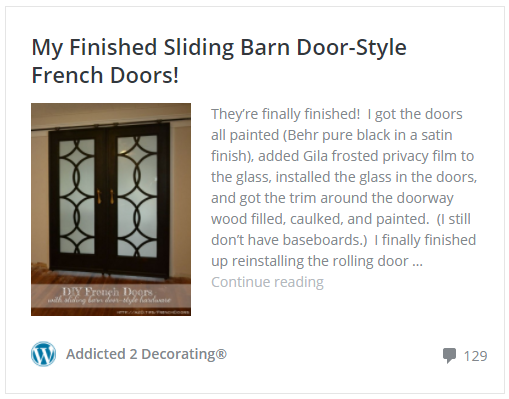
I made those from two of the old solid wood doors that were originally in the house. Well, I just so happen to have about six more of those solid wood doors, so I’m going to cut some of those down and use them to make my own single-pane glass doors for the pantry. They’ll just be a frame with one solid pane in the middle. No fretwork on these.
Now as far as the walls in my breakfast room, I’m still undecided. I’ve considered various colors, but again, I’m really loving how light and bright that room is with the white primed walls. I really don’t want to ruin that, but I also feel like I want something more than just solid white walls. I’ve dug into my blog archives to see what ideas I’ve entertained in the past, and two things stand out to me. First, I kind of wish I had saved the bird and butterflies design for the breakfast room. But it’s in my entryway right now.
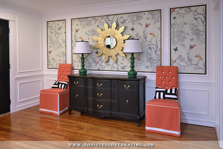
It’s just one of my favorite things I’ve ever done, and I’d love more of it. I love it in my entryway, but what a cheerful breakfast room that would make!
But even I, Queen of Do-Overs, can’t imagine painting over that entryway wall after all of that work, so that dream may have to die.
The second option from ideas past is this stencil that I purchased long ago.
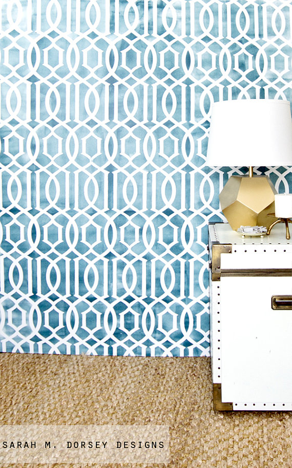
I’ve been hanging on to this, wondering if I’d ever find the perfect opportunity to use it, and this may be it. If I go this route, I’d do a tone-on-tone using matte and glossy paint, much like the design on this wall…
But I’d probably stick with the Behr Polar Bear white that I love.
So those are my random free-association thoughts about where I’m heading. And other than things like my pantry doors and pantry light, which are pretty set in stone right now, I still won’t make any other final decorating decisions until I have a clearer whole-house vision in my head…or preferably, on a design board.
So I leave you with this question…
Is it bad form to use the same “wallpaper” in two different rooms of a home? I’m leaning towards “yes,” but I want the answer to be “no.”
Update:
My pantry is finished! Want to see the entire project from start to finish? You can find every single post about the pantry build right here…
Or you can skip to the end and see how it turned out. Here’s a peek of the finished pantry…
You can see more pictures on the before and after post right here…

Addicted 2 Decorating is where I share my DIY and decorating journey as I remodel and decorate the 1948 fixer upper that my husband, Matt, and I bought in 2013. Matt has M.S. and is unable to do physical work, so I do the majority of the work on the house by myself. You can learn more about me here.

I don’t think it’s bad form. I get dizzy when I am in a house that has too many things going on. I love all your ideas…but I also like when there is something cohesive bringing a whole house together.
In the end, you gotta live there, no matter what we all think!
I honestly don’t know if it’s bad “form” to repeat a wallpaper you love but I don’t see why it’s any different than using a paint color throughout the house that you love. It’s not like you’re going to have it in every room and who cares if it’s what you, the homeowner, loves? You have to make it happy for you as you’ve told us so many times. 🙂
I agree with everyone else. If you love it, do it. I also like the idea of varying the design a bit…same technique but maybe a slightly different pattern or larger scale, maybe different (complementary) colours or bolder background.
From your kitchen peninsula, you will see every time you are cooking, think of the joy it will bring you!
Yes! I vote making your design in a larger scale, as Tamara suggested! Perhaps only 3 of the birds and frame them? Or none of the birds and butterflies, just the branches?
Exactly what I was thinking.
I totally agree! Repetition with some differences creates nice unity and flow.
I love Tamara’s idea oz the wallpaper in a massive scale. It reminds me of the mural you painted in the condo which I absolutly loved.
I think you just answered your own question. If you want answer to be no, then it’s no. It’s your house, therefore there are no rules. You should do what brings you joy. I think it would be beautiful to have a coordinating mural in th breakfast room. Do what makes you happy!!
yep i agree! I think it will be nice in bouth rooms and if you like and love it do it! I can not wait to see whats next!
What if you did the same technique as the entryway wall but a different design? I’m sure you and your Mom could come up with a variation on the same theme that’s distinct enough to be different but has the same “feel” to it.
Maybe Google some nature pencil sketch designs or something for inspiration for the Sharpie portion of it?
Also, I’d be careful with the white. Every time you get it in your head that you want something “bright and white” or “neutral,” you seem to always end-up unhappy with the blandness of it and you repaint it. I’m even betting you wont’ like the white upper cabinets. 😉
Sorry, but I lean to yes on repeating the wallpaper, unless it’s a very subtle one, like grasscloth etc. But that doesn’t mean you couldn’t do a small portion of the birds/vine, say 3’x4′ or smaller, IMHO.
I love that light fixture! I so wanted to get it for my house, but hubs nixed it. Guess he thought it was too “girly”! Shoot, I had to fight for a simple shaker style chandy for the dining area!
Love the glass door idea for the pantry too. While I think the green cabinets are not my style, I love that you are confident in using something a bit “out of the box” – that shows your individuality. As for the counters, what about a “wet cement” color? Not black, but it gives you that darker tone you like. The right tone would look cool with the green. I thought of black counters too, but man, they show every bit of dust and streaks,etc. And I’m not a fan of dusting constantly! When your kitty gets up there, you will fight cat hair too.
Lastly, I like how much light you get now. As for paint color, will you be doing window treatments that will drop the light down?
I have dark polished granite .( I hate) You not only have to clean it but kinda buff it with a cloth because of steaks. If you did a matte black it would be even more likely to suck the light out.
Very true. I think I mentioned before the black interior on my car? Forgive me if I’m repeating but it needs to be repeated. Black shows EVERYTHING. Even when it is freshly cleaned and you think you are done there will be a fuzzy or cat hair or something that you will be able to see clear as day and then…it won’t look clean. BTW, totally agree on black sucking the light out.
Who cares if it is in bad form? Who made those rules? I hate seeing some many houses decorated just alike – all the magazines show the same things – This is your home – do what you love – go for it – if someone doesn’t care for it, then they don’t have to do it in their house – . I love everything you’ve done.
I say go for it! It won’t be exactly the same because it was hand done, but will coordinate beautifully. Besides, it is your house, do what you love!
I love those black counters and really hope you go with them. I think with the upper cabinets painted white, the whole room will be so much brighter and the counters wouldn’t interfere with that.
I think the butterflies and branches wall treatment would look awesome in the breakfast room with the green cabinets. But I’m not sure about repeating the pattern throughout the house.
The stencil would be interesting for that room. As for using the same wallpaper in two rooms of your house, I’d advise against it. I’ve thought about the same thing before but have generally found a coordinating pattern to the one I already love to maybe have the same feel but different.
Can you post a photo of the gold leaf in your kitchen that has worn off, or of the wood grain that shows through in the right light? I’ve noticed that sometimes you mention things like that, things that aren’t working out in rooms that you’ve already sort of finished, but you seem hesitant to let us in to see those things. Process shots to the perfect finished room are good, but it’s also nice to see finished room items that haven’t worked out so well so we can all learn.
I just added a photo to the post showing the grain and the worn gold leaf.
Thank you so much for your posts on when things don’t work out so well. I would never have known about the paint wearing off. Your photos always make the kitchen look pristine.
You are my go to person for renovating techniques. The fact that you explain when things don’t work out is the very reason I follow your blogs!
Whatever you decide to do, PLEASE LEAVE the foyer as it is because I love it!!! I am wondering if there is something that would be a compliment to the what you have in the foyer–the same thing but somehow handled with a different aspect of it. Sounds vague, doesn’t it? Perhaps elements of it enlarged in different small panels–I don’t know exactly what I am feeling so I cannot put it into words. But I think carrying it over into that location would be beautiful. By the way, I cannot stand my black countertops–so be careful with that one.
I also love the foyer. It is such a welcoming first impression of your home!!
I love your bird “wallpaper,” and I don’t see any problem with repeating the design elements if you like it (plus, with a formal dining room, what are the chances that guests will spend time in the breakfast room where they would see the repeated pattern? Assuming you paint it on the wall not visible from the dining room through the kitchen). I also think you could adjust the design to look a little different; instead of using the light green background, use a light yellow or light blue. Instead of the birds being coral and green, what if they were just black and gray? If it makes you happy, find a way to make it work.
That being said, I have a tone on tone patterned wall in my house and I love it! But I agree with the other poster who pointed out that you don’t always like white. But you can always paint it over, right?
For the countertops, to get an idea for the feel of the stain, perhaps you could wrap your countertops with black butcher paper or something similar, and although it wont have the exact same texture of a stained countertop, it should give you an idea for what the room would look like with a dark countertop.
I think the wallpaper is gorgeous, and if you used it or a variation on it in your breakfast room too, it would look great. But it is a lot of work, so I’d advise making all the other changes you want to do first, then see if you still want to do the wallpaper since you seem divided on the idea.
I was just going to make these very same suggestions.
one thing to remember about black surfaces is they show EVERY speck of dust, crumbs, etc. If you aren’t one to dust daily, I would think twice about black countertops.
I’d love to see more of the birds/butterflies/branches! Go for it.
Do what you want – you and Matt will be living with it. And as you know, things can always be changed! Instead of doing it as a wallpaper treatment, why not do a framed piece that can be moved, perhaps to the sunroom when that is done, if you decide you don’t want it in the breakfast room. That way you still get to have it but don’t have to paint over it if it doesn’t work out the way you hope it will,
I agree on doing in on canvas so you can share it with a lucky reader if it doesn’t work out!!!
No! While I was reading your post, I thought, why not use it in both rooms? If you love it, use it! What matters is if you love it… Don’t worry about form… Drink red wine with chicken and white wine with prime rib… Doesn’t matter…
If you like it, use it. It’s your house
Can’t wait to see your new pantry! I’m loving your plan. Not sure how/where you were thinking of using the butterfly stencil in your breakfast room, but it seems pretty busy to use on a large wall or walls. I agree with the others that mentioned maybe come my up with a variation of that design. Something less busy would be my vote. I’d also love to see you paint you upper know kitchen cabinets white before you change anything else in there just to see how looks before you move forward on a new green or different countertop color. Always enjoy reading about what you decide!
I would say, please yourself. I love your hand painted wall and feel sure it would be beautiful in the breakfast room. I also love the other choice you made with the stencil. Whatever you choose, as long as it brings a smile to your faces, i’m for it. I have always believed in, to each his own… my personal choice would be, uh, sorry, I love them both, but would lean towards the stencil..
What if you painted out the birds and butterflies on the entry mural, and painted in some flowers or berries for a pop of color? That way it’s different without having to change the whole thing.
Kristi, why couldn’t take a particular section of your wall design and recreate just a smaller piece of it. A delightful but tasteful border….ceiling…chair rail height…or even some panels. With panels you could frame them out. Or actually put them inside of picture frames and hang them on the wall for art….I’m thinking for the breakfast room here. You could carry out a much smaller design that would coordinate with that and put it in the pantry, small doses, for a bit of color, without losing the overall bright/white/light effect.
I second Justin – do the same technique but different design.
As for the counters – paint everything else and then cover the counters with black fabric or black paper and see if you like it.
Just a thought- what about leaving the pantry and breakfast room just primed while you forge ahead with whatever’s next on your list? I have found it much easier to develop a cohesive plan now that our main renovations are done. It’s like I have room to think about the fun stuff now that the work is out of the way! Another option might be to just do a base wall color that would work with a stencil in the future. I always tell my art students, “Don’t overcommit too soon! It’s ok to ease into a drawing/painting!” Thanks for sharing with us; I love seeing your tremendous progress!
I agree about waiting. When we bought our house I also bought decor and furniture for each room. But we had lots of work to do because it was an old house. Now that I’m coming to the end of the process, my decorating style has changed so much that I can’t use most of the lovely things I bought way back then.
I don’t think repeating a design in another area is in poor taste – and as others have said, it’s your house, your rules. If you are concerned about the matchy-matchy effect (that would personally bother me, but again, your house not mine) not making you happy I have a suggestion. Paint fabric with the motif to use for roman shades/curtains/valances or chair covers. It will be different and it will be soft. You can then use the stencil geometric (so fabulous) on the walls and I bet the combination would be stunning. As for needing to rework the kitchen cabinets, I love the idea of white above and green below. Your sample photo with the dark countertop and green below is beautiful. I think it could be my ideal kitchen too. However, I am concerned that a plain bright green will not feel harmonious. I think your sample photo is so lovely because of the green/blue wash effect and the matte finish. Just my thoughts, obviously. As a dog and cat owner, a black counter is hell. I am constantly cleaning. I would never do this again. Go for a darkish lead color.
I love the idea of using the birds pattern on fabric. You could even have it custom printed with spoonflower and not have to deal with hand painting on fabric
I love,love the foyer stencil and think it would look just fine in the breakfast room. This is your home and you get to do whatever you want. Besides,who comes up with all these do’s and don’ts anyway. Your breakfast room is going to get a lot of use and that is a happy mural. Go with your gut and do it.
While I think it’s great to get inspiration from photos of other rooms, always remember that your room will never look just like that; and sometimes that leads to disappointment in what you have. It’s similar to going to the stylist with a photo of a hair cut/style you want. You don’t have the same hair or head as that person, so your hair will never look just like the photo. I guess I’m suggesting to choose what you like and be happy with your beautiful home the way it develops and ages over time. Personally, I feel more comfortable in homes that aren’t perfect. A little quirky or a bit worn create an energy that I like!
Kristi, I could hardly wait to see your post this morning. I love your front entrance and your hand painted wallpaper. To do again in the breakfast room would be nice but would maybe suggest you painting a large canvas with a colored background..different but the same. I would suggest trying a dark warm slate grey, similar to what you would find in soapstone for countertops. Black, although beautiful, will show every mark. That would be my concern and sometimes our design first choices, don’t always work such as the gold leaf on your cabinets. It is too bad you are already looking at refinishing them. I do like the idea of white uppers as I like less color in busy rooms like a kitchen and timeless. It is difficult enough to make design choices, but even more so with so many watching your every move. You have courage and tenacity. Go Kristi, I am cheering for you.
I like the idea of white walls in your breakfast room. An idea from Sarah Richardson whose designs I love usually adds a very light touch of light blue her ceiling color.
I like the idea of repeating the hand stencil as others have suggested. I feel the geometric one won’t be the right look. Will your pantry door be black to play off the counter tops?
Yep, they’ll be black. I’m doing all of my interior doors black. I love black doors. 🙂
Kristi, don’t forget how hard water stains look on black anything. If your water is as hard as mine is in Central Texas, you might want to rethink the black. The suggestion about doing a mock black template would give you some idea of how it would look overall. Your ideas are always great and you know just what makes you happy.
The subject of “light” surfaces once again. Whether natural or electric, light affects everything. This is a great lesson for all of us amateurs.
So glad you are repainting the kitchen cabinets. Never cared for the current shade as it seemed “dead”. Leave it to you to undertake the filling of the oak grain…what a job!
You are fortunate to have found something (Birds & Branches) that makes your heart sing. I see no reason why you shouldn’t repeat it elsewhere…but…I would change the scale of the design.
Personally I love the tone on tone Matte – Gloss stencil idea for your breakfast room walls, I think the gloss part will really add to the shine/light in the room. The new light fixture and your door idea for your pantry are certainly going to give it the wow factor! It’s very exciting seeing this room come together and I’m looking forward to seeing the pretty stuff you choose for it.
If you want the answer to be NO, then it should be NO. This is your house and its supposed to be surrounded by things you love, you like and you want. Aren’t the rooms supposed to flow to one another? What better way to do that than with the same wall color or wall paper. Throw caution to the wind, my dear!!
I once asked my husband to make some motion-sensored, pneumatic doors for my pantry and my utility room. I wanted a door that would automatically open as I approached it since my hands were always full when I entered or exited either one of these rooms. Needless to say, I never got them, but you might want to think about the ‘function’ aspect when designing your pantry doors. What kind of door is most efficient for your needs. Will you have two hands available to open two doors, etc. I love your blog and I’m inspired every time you post a new one! Keep up the good work, Kristie.
What a great idea! Wish I could use it. My pantry does have a motion sensor light, though. Which I absolutely love!
I am in love with the butterflies and birds stencil, I would plaster it everywhere! But, no, I think it would be perfectly fine to use it again. It’s only an accent in a small area.
I wouldnt use the same wall as your entry way. I didnt read previous comments, so if this was already suggested, I apologize. Did you ever think of using the behr white polar two-tone Finish? white polar matte with semi gloss white polar? I think that would be beautiful. It would give depth to the room and you would still have your brightness. I also have to tell you that I love that light fixture, I picked the identical one for my upstairs bathroom!!
Black counter top – please remember every crumb and bit of dust will show up. Black sucks all the light out
Maybe make a series of framed artwork from the birds and vines and hang them somewhere in the breakfast room? Just thinking out loud.
I vote for the “wallpaper” in both rooms! They’re not right next to eachother, and it’s not like it’s the entire room – just parts of the walls. You don’t have tons of wall in the breakfast room to begin with. I think this is a great way to bring your whole house theme together as well, making the common rooms all cohesive.
There are companies online that take your digital designs and print them into fabric. If you got a high res picture of your entry artwork you could have fabric printed to use as upholstery or window coverings and then do the subtle stencils on the walls.
If you wanted to paint the mural onto the wall it would be awesome also. No reason why you couldn’t do both, an accent wall with the mural and other walls with the stencil. Curves rather than geometric lines would look awesom with the curves on th mural.
I have always loved the idea of doing the birds wallpaper in the breakfast room. I think when you sit in there in the light in the mornings and see that pattern on the walls its going to make you smile. If you are unsure, this is what I would do. Rather than painting it on the walls, why don’t you paint the pattern on like three large panels and put them up on the wall. It won’t be as invasive as an entire wall painted, and if you really decide its not what you want then you could take them down and use them somewhere else or sell them. If you really end up loving it and want the whole wall to be painted then you could do that later too. I really like the thought of you using a darker blue on the furnishings with that wall pattern but I don’t know if you still intend to do that or not. Now the black countertops, I think when people don’t like the black its because dark does show every hair and all the dust, that being said, your countertops being concrete are not glossy and will probably not show the dust like polished stone countertops would. It probably will show hard water spots tho. Again if you have leftover board or paper you could paint the shade of black you want and lay over the countertops for a while and might indicate whether you like them. If you decide to stencil the breakfast room you might think about how all that blue is going to darken the room since you’ve said you are really liking the light. I too need that light, especially in the winter when its gloomy out. If Matt has to be inside a lot it will probably lift his spirits to have more light also. Again, I do end up loving most of what you do so I’ll be interested to see how this all pans out, so do what you love.
Since it is freestyle drawing, how about add a variation to the theme – maybe add a tree by a brooke? With the birds and butterflies. I think it would be beautiful and unique.
It is a very pretty wallpaper and I say use it again. To make it look different you could take one of the colors out of the wall paper and paint just the wall you are putting the paper on. I could see that making it look different but the same. Love your ideas!
I vote for the matte/gloss tone on tone. Birds just don’t seem to be breakfast room material to me. I think it would be a good choice for a more ‘disconnected’ room and not repeated in ‘public areas’. If someone comes thru the front door and goes into the breakfast room for coffee, lunch, etc, that’s all they are going to remember seeing. It’s certainly a beautiful design and I think perfect for the entry. If all else fails, ask Matt.
If repetition is a unifier… why would it be “bad” to use the same “wallpaper” twice?
I’m wondering if you can use your trellis stencil and instead of making it a different sheen… which looks fabulous… make IT a darker tone… or the wall a darker tone of white with the trellis stencil being white and paint a bird or butterfly here and there with maybe a little surprise of a vine with a flower and leaves to give a hint of what you have in the entry, still duplicating the essence of that look you love?
You really have a very elegant, yet comfortable look going. And the glass door for the pantry with that light is a fabulous idea.
That’s a really nice suggestion, Diane, about using the trellis stencil as the main wall design and then adding a simplified bird/butterfly motif over top.
I would finish the pantry. Do your build in the breakfast room & all the trim with white paint on walls. Re-do the kitchen cabinets and then look at your walls. You won’t have a lot of wall space once it’s all done if you think about it. I bet a whole new vision will come to you.
The picture with the black counter top has much darker floors than you have. I just remember you & the dining room table stain & your floor color. Like you said if you do them black there’s no going back. I would go ahead with your cabinet change but pot the counter tops on the back burner for a while. I think the black may show more too.
How about painting the “wallpaper” on canvas(es)? Or on a piece of plywood? It will give it a slightly different texture and look.
Kristi,
I love your entryway – it’s just beautiful – perfect. I agree with comments to finish the redo of the kitchen cabs before you decide on walls. Regarding the counter top – have you considered a dark grey? I have black granite (uba tuba spelling?) and it has some subtle tan/golden sort of flecks in it – which goes with my cream cabinets. I love it and have no problem with fingerprints, etc. Can you do a variation of the black concrete counter top by adding some subtle flecks of another shade in it? That would erase the fingerprints, dust, etc. I love white cabinets and would probably go with all white and do the color in a custom black/grey colored counter top. I would put the green color in accessories – but then I am always a two color personality:)
Love everything you do.
JoAnne
Using the same wallpaper again is fine but you hesitate because you’re too creative for that! You’ll find something that ties in better with your kitchen. The matte/gloss paint idea is beautiful, or you’ll find another paper. So many gorgeous papers it’s a headache to go through them all, but you can start with the line that made your birds.
I’m skeptical about the black counter tops, a cleaning nightmare, and agree with another comment about the ‘wet’ look concrete and trying that first. Your counters look great, and the change in cabinet color and all, well you might want to put that off for last.
On a side note, Ralph Lauren has beautiful and durable metalic gold paint (Home Depot custom mix) that wears very well. It sounds like your over it, but I love the way it looks with your knobs and it’ll tie the white and green together, for what it’s worth.
Sorry for getting so chatty but I’ve got an hour to kill at LAX – being here makes time fly! I love how your mind works and your endless energy!
I would never tell you what NOT to do because it is YOUR house and your taste. Except. Except in this one instance which is based on pure functionality of black counters. NEVER. AGAIN. While they (black quartz) look beautiful with my white cabinets, they drive me absolutely crazy every single time I see them in my kitchen. They never look clean. Ever. Two seconds after wiping/washing you see specks of dust. You see droplets of water. Everything. Please save yourself and don’t go this route. I so wish I had the funds to tear them out and go with a lighter color. Please think carefully about this.
Re: Cabinets – (From personal experience) As long as you have tons of light flowing into the space dark cabinets (Traditional dark mahogany in mine) and dark counter tops work great. Black (granite in my case) is NOT anymore dirt, dust or cat hair (3 cats + 1 dog) collecting. The black counter top does not show anymore negatively than any other type/color (it’s just a matter of preferences). The photo of your favorite kitchen with green & white with the black (mat) counter tops works and looks great. Your green choices is a surprisingly NICE change have all the other kitchens shown that are either all white, natural wood, neutral colors or the latest “gray” in many various shades.
Re: To “wallpaper or not to wallpaper”. I am a firm believer in going with my FIRST gut reaction to the decisions I make. I think you have that same way of thinking, one of a kind is a GOOD THING! The originality of the hand painted design showcased in the trim “frames” is distinctive (very YOU!) I think that it would be a good idea if you did several large PAINTINGS in nice (hand made?) frames that you could place on the breakfast room walls. You might consider “borrowing” from the “homemade wallpaper”. . . birds, butterflies, branches, leaves etc. And, since your mother and you are both artistic, I think, whatever you came up with would be just as original and distinctive as the entry wall. Remember, if you don’t like a pix you can move and/or change it out. (Like in your kitchen and bathroom?) ; )
Wow! to the commenter who mentioned motion sensor doors on your pantry! What a great idea!
I also second the commenters who suggest some kind of temporary black covering on your counters to test out the idea. Not very practical for the cooking you will do while the temporary stuff is on, but I would think a little temporary inconvenience would be worth it to help you with the long term decision.
I really like the idea of repeating the “wallpaper” design in the breakfast room. Not just because it’s such an awesome design and you love it, but I think it’s great to repeat some design elements and I’m sure you think so too – you’re just not sure about repeating this one! But even more than that – you are going to be spending far more time in your breakfast room than in your entryway – right? More time to see it than if it’s just in your entry. Also, I can’t imagine anything better in your entry, so I hope you don’t decide you can only have it one place and you undo it in the entry. Whatever you do, it will be beautiful.
I’m an interior designer and help others with design dilemmas like this a lot. (And I’m sorry I didn’t have time to read through all the responses, so if another designer has already shared the ‘rule’ and then told you why then please forgive me). How do you want this room to make you feel? Repeating design elements is good….it unifies a space and unity ‘calms’ us and makes us feel ‘good’. But too much calm can become boring. So why would you break that rule? Because you are not looking for a calm and peaceful or ‘boring’ room. Many people prefer some excitement in a room, that’s why they break the ‘repetition’ rule. But….too much contrast (no matchy matchy) can quickly go from calm to chaos. Only you know for sure how much contrast you need for the goal of this room. How much contrast do you love….A little, a lot or somewhere in between.
As I was reading this, my immediate reaction was “well what’s wrong with having the “wallpaper” in both rooms?” Especially since they are not next to each other! So sure, if you feels it would be good in the breakfast room, then make it! I don’t think there’s “bad form” in living surrounded by the things you love – it’s your private space anyway!
My vote would be a no but it’s your choice obviously. If you have any doubt would listen. We just did our small kitchen. Husband insisted on granite and we ended up with Absolut Black but had a leather finish, cleanup much easier.
I definitely think you can use the butterflies again! In fact, I love coordination and continuity between rooms…a common thread that ties it all together. That’s what gives a house that designer touch! You have a great sense of style…whatever you decide will be beautiful!
I like it when a theme, in this case bird and butterflies, or the black branches, is repeated in a house. So perhaps do a different version of your wallpaper in a second room.
I just replaced my black granite counters with white quartz. I couldn’t believe how much brighter my space looked. Best decision I ever made. So I would’t replace your light counters with black if I was you.
Lay sheets of black paper over your existing counters to get a feel for black counters. That may help in making your choice.
We are almost unanimous – change up the wallpaper in some way,and use what you love! A different shape, a canvas, all good ideas .
I had missed the post saying you were going to repaint . OH My! But now you’ve got me concerned because I have large built in oak shelves in my family room that I am going to have painted white. I’ll use Advanve paint by Benjamin Moore- but now I’m thinking maybe that texture will come though. How exactky do you fill in something that feels smooth?
Oak almost always has visible grain, even if the surface feels smooth. There are products made specifically for filling grain. I’ll be using a product called Timbermate wood filler, which can be watered down to use as a grain filler. I bought it on Amazon.
Kristi,
I think you need to go wall paper shoppping first before you make any decisions…..there are so many papers that will be just as enchanging as the butterflies…..keep looking and do not second guess yourself.
And I think it is not the best idea to repeat one pattern or fabric in another area when you have used it once already on a project…..in my opinion it looks pretty tacky and you ain’t tacky Girl!
I love the matte/gloss white trellis idea for the walls to keep it light & airy in your breakfast room. However, I also love your branches, birds & butterflies. I say combine them. I’m really drawn to the idea of putting them on canvas(es) & varying the scale. Maybe take your favorite 3 areas & blow them up, almost like looking out little windows.
Have to agree that I’d wait to see on the counters until the cabinets are where you want them. Those cheap plastic table covers (you know the ones for parties), would work great as a trial run on the black.
I love the idea of bringing your birds and branches into the breakfast room, but I think you might be happier if you painted them on large canvases instead of the walls this time – makes it a lot easier then you tire of them and want to do something different later down the road… And I like what someone else suggested – maybe go with a nice white on your walls and paint your ceiling a light blue – your room would be so cheery and bright – just what a breakfast room should be… And I also think you should steer clear of black countertops – they’re very pretty, but definitely not practical. You have better things to do than constantly cleaning your countertops – black, matte or not, shows everything! Can’t wait to see what you decide to do! 🙂
IMHO…Nix the black countertops, you’ll never settle for white walls or cabinets, vary the design in the mural as you are a unique personality, not cookie cutter, and the light fixture and door ideas are perfection!
I DID use the same wallpaper on two different walls in my Georgia house 🙂 There comes a time in one’s life when other people’s rules don’t matter — some questions simply don’t have a “correct” answer. Do what makes YOU and hubby HAPPY!
Question for you: Where did you get the hardware on your kitchen cabinets? Looks like what I had in GA but that was from Home Expo and they went out of business. I adore the SIMPLICITY and have not been able to find it anywhere else — from one who looked at 1500 exterior lights before finding the RIGHT one! My real name is Jewell.
I got them at Pottery Barn but it looks like they don’t carry them anymore. 🙁
I love your door idea for your pantry and what a cost saver. The light fixture is not my taste at all but if you love it – GO WITH IT! It will give you plenty of light and make those doors sparkle.
As for reusing the birds and butterflies in the breakfast room, I think its a great idea. It’ll be a cheerful place for you and Matt to have breakfast, coffee or whatever. If you are afraid you might not like it, could you paint it on 2 or 3 large canvasses so they could be removed? You could sell them easily.
Black countertops are very sharp looking as long as you don’t use your kitchen for anything. LOL A friend of mine has black and it shows everything. Very hard to keep clean.
I love Kelly Green – it’s bright and fresh looking all the time. White and kelly green cabinets will be very nice.
I think I’ve shared my $.02.
I think it would be fine.
I so love matching things. It brings continuity to everything! It’s a callback to great taste, I say! Go for it!
Yes — birds times 2!! It’ll be lovely.
I looooooooooooooooooooooooooooooove the green, simple ktichen. Gor.Geous.
I am going for a black and white kitchen in my house but oh my word. That green is just to die for. Maybe my kitchen island?
We’ve been doing free things lately. Like hiding our A/C to have slightly less negative curb appeal. http://wanderlustingbydesign.com/2016/10/24/ac-units-and-making-our-curb-appealing/
We just did our first white room, and I love it! ( http://www.ourcorneroftheworldblog.com/first-look-at-a-finished-mudroom/ ) I think white and kelly green would be a perfect combination!
I know I’m weighing in here late, but I have to agree with those who said that the “rule” about not using the same wallpaper in two rooms was made to be broken. I broke it (kind of), myself. I papered my petite laundry in a large scale silver and wheat on white whimsical paper and loved it so much I used the same design in the paper’s light aqua colorway on an accent wall behind our master bed. Both rooms make me smile every time I go in them. Sure, some people have noticed but, if anyone didn’t approve, they keep it to themselves (as they probably should). I say go for it!
Again, being a Johnny-come-lately, I looked through the comments to see if you had already answered this, but didn’t see anything. So here’s my question. How will you compensate for the sloped ceiling when you install the flush mount light fixture. I know you’ve got something creative up your sleeve, and I’m just nosy enough to ask.
I’m actually still working on a solution for that. 🙂 I’ll let y’all know what I come up with, though.