Coral Curtains?
Hmm, I don’t know… maybe some coral curtains?
I’ll admit it. I’m completely at a loss when it comes to draperies for my dining room. I have a vision for my dining table and chairs – black table with a stained top, green side chairs with black and white striped seats, and end chairs covered in brightly colored floral watercolor fabric with black piping and trim. I can see all of that clearly in my head. Here’s the photo I added to yesterday’s post for those of you who missed it.
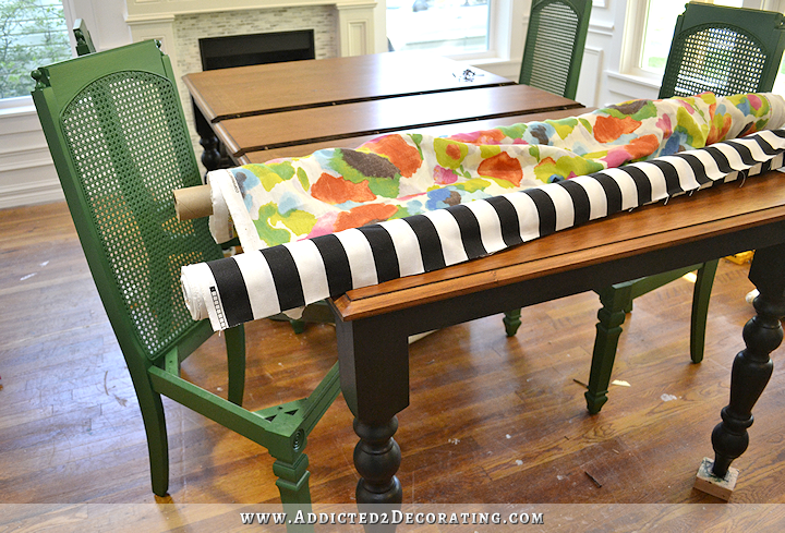
The only window treatment idea I actually got excited about was the black and white horizontal stripe idea. But those were so bold that I was only going to use them on the fireplace wall windows. Well, after several of you talked me out of the black and white striped draperies, I realized it was for the best anyway, because I really do want draperies on all of my dining room windows. And now that I’m using the stripes on my side chairs, I can’t go back to that idea anyway. That would be stripe overload.
Then I considered solid green with trim on the leading edge. But seriously, how much green is too much? With an entire kitchen full of green right next to this room, and now with green side chairs at my dining table, I think I’ve pretty much reached the limit other than small accessories here and there.
Then I considered solid black with a Greek key trim on the leading edge. That idea was safe and probably a bit boring. But a room filled with black draperies could end up looking very dark and heavy.
I’ve also considered white with some sort of colorful trim on the leading edge, or possibly some sort of colorful band at the bottom or top of the panels. But more white? That doesn’t really interest me. My entire room is painted solid white, and that’s enough white for me.
Several of you have suggested using the colorful watercolor fabric on the windows. I did consider that, but I’m afraid that it’ll end up being really busy — much more so than the black and white striped drapery idea. I did find one picture of a drapery panel made from the watercolor fabric on Etsy.
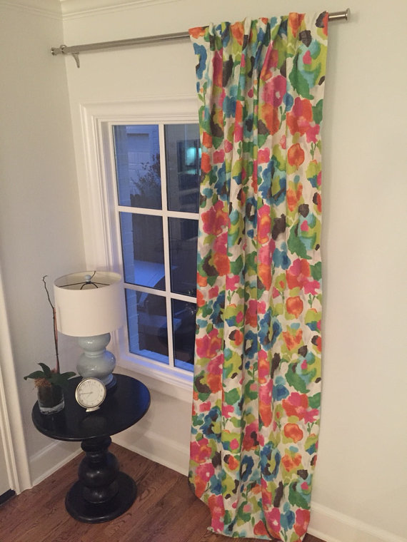
I think a single panel is beautiful. But I need four panels in my room, and the two panels for the front windows will be double-width panels. That’s a lot of pattern, and even as much as I love color, I think it might be too much for me.
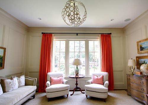
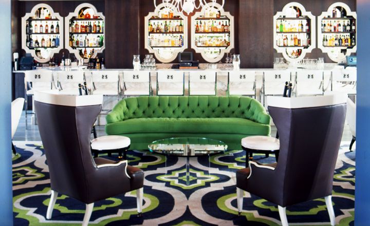
But the other day I came across a picture of a room with these amazing coral/orange curtains, and my heart skipped a beat.
I considered it briefly for my dining room, but convinced myself it would be too much. But then yesterday someone else mentioned coral curtains, and it got me to thinking about them again.
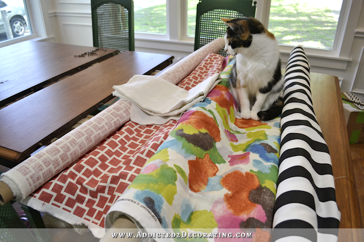
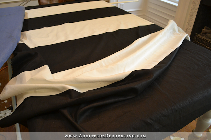
I remembered that I actually do have some coral-ish fabric in my stash, so I got it out (and woke Peeve, who was sleeping peacefully on fabric rolls on the table)…
That fabric is Robert Allen Cats Cradle in Papaya, and it just happens to be almost the exact color of my buffet on the entryway wall. Unfortunately, I only have three yards of it, and I need eighteen yards for my draperies. But that’s okay. If I go with coral curtains, I think I’d prefer a solid fabric like the one in the Traditional Home picture instead of a geometric pattern.
With this new direction in mind, I headed to JoAnn Fabrics yesterday to see if I could find any fabric. I found one that was the perfect color next to my buffet paint color…
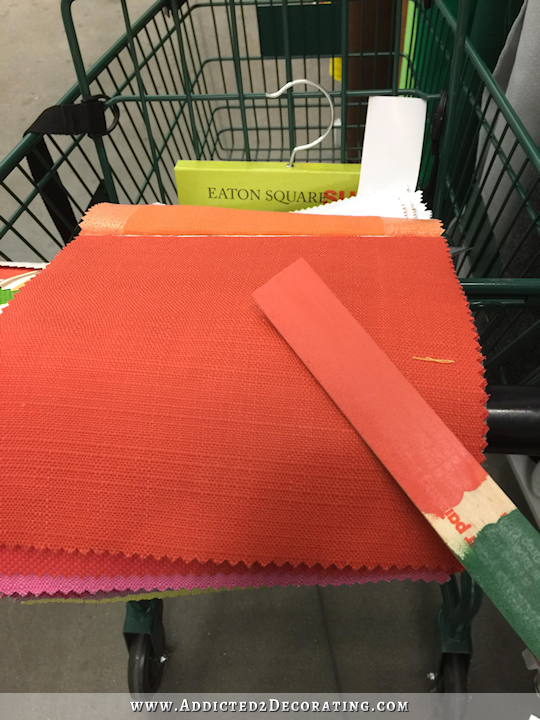
…and I loved the texture of it, but it was $50/yard. I’m not paying $900 for fabric. So I came home and got online, and I found a few that might work. I’ve ordered samples, so we’ll see if any of those will work out.
In the meantime, I think I really like this direction.

If the coral curtains don’t work out, then I’m really at a loss. This is a big decision not only because I need eighteen yards of fabric, which will more than likely not be cheap, and it’ll take me many hours to make them, but also because the draperies in this room will be very prominent, no matter what design or color I go with. I’ve already made one costly drapery decision in this room back when I decorated it as a living room, and I don’t want another costly drapery mistake on my hands. So I’m feeling a bit hesitant to just pick something and go with it. I want to be certain that it’ll actually look good when I’ve spent all of that money, taken all of that time to make them, and finally get them hung in the room.
So here’s hoping that one of those samples that I ordered will work out. If not, I’ll probably end up with black draperies. I hope not, but I really just need to make a decision and get this room finished.

Addicted 2 Decorating is where I share my DIY and decorating journey as I remodel and decorate the 1948 fixer upper that my husband, Matt, and I bought in 2013. Matt has M.S. and is unable to do physical work, so I do the majority of the work on the house by myself. You can learn more about me here.

If you use coral as your primary drapery, then use a bottom band of the watercolor – say 15″ – it will pull from the upholstered chairs, and draw in the green. I’m starting to think the black and white stripe (as much as I know you love it) may be the deal breaker. It’s perhaps too modern, too bold for this traditional room – at least when the stripes are so wide. A narrower stripe would be less “in command”. I’m facing a similar problem with my room, which I painted a yellowish green color I love, without consulting the drapes – I bought gorgeous drapes off Craigslist, and they’re floral, so I was counting on a bit of green in the foliage. Then I really looked at them. No, ma’am. No green at all. It’s more of a grayed down teal. But I only spent $50, and I’m still going to see if it will work. But fortunately, I am like you – not afraid to change my mind and try something new.
I love your idea of using the watercolor fabric on coral curtains, but on the sides instead of the bottom. I love the green chairs with the stripe. But I also am having trouble fitting it in with the tone of the room. Perhaps a band of black between the coral and the print on the curtains… I know once Kristi gets it all together it will be a beautiful room.
Sheila F.
I too like the idea of the watercolor on the sides. This will tie everything together nicely!
Sheila is exactly correct. Use watercolor fabric on inside and bottom of coral curtains and divide the fabrics with a black accent. It could be a thin strip of black or something even smaller like an interesting cording or black applica of some kind.
What a great idea!! I think the color of coral will be so beautiful on the room with the green and black and the buffet!!
How about using the floral fabric as the lining on the coral curtains ?
I love the coral with floral border.
OK – I went back and looked through old posts – and realized that there are two more fabrics still in play – the geometric lighter green and the black and white greek key. I hate to say it, but I think the green on your chairs should have been more the lighter green of the geometric and the yellow-y shades in your watercolor, and less the grassy green of the kitchen. I’m a terrible person to even say such a thing, aren’t I? I’ve read through some of the other suggestions, and I’m liking the narrow band of black to separate and set off the coral and the watercolor – and it will draw together the black pops from the rest of the room. I had quite forgotten that you painted the interior of your front door black. I love the idea of the chairs you intend to build being covered in the watercolor. I’d love it even more if the interior of the chair was watercolor and the exterior/backs were black. Then cut your stripe on the bias and use it for the corded welt. Then upholster your side chairs in the stripe. Yay – I’ve solved it! But do what your heart says. Your spaces are always amazingly gorgeous. I always drag my jaw around whenever you do a room reveal. ((Hugs))
Your idea is spot on! It would tie everything together perfectly!
I too, had suggested a band of color at the bottom of the drapes. I have done this when I cannot get the right length from places like overstock. I just buy the needed coordinating fabric and the extra length and make a few throw pillows for the room. It is a very custom look. It can also be done at the top or smack dab in the middle. As far as your fabric goes Kathy, why not find a fabric paint in a green that you like and very gently and softly paint over the grayish teal. You can even use watered down Annie Sloane Chalk Paint . I am sure you can find a tutorial on line.
H As ‘ve you considered plain linen curtains with bands of the stripe snd watercolor alternating on the edges?
Can you order or buy in a store a set of coral panels that are returnable, just to see if you will like them? Maybe even Bed,Bath and Beyond or Overstock would have something online.
That is a really good idea!! Just to get a feel for the color without any investment!
That’s exactly what I do when I’m not sure on a drapery fabric. I find some at a store that are close to what I’m considering, try them out in my home & then return them. If I like them, I order my fabric & make them myself.
I ordered a white Faux Dupioni Silk from Overstock that were $70 per 108″ lined panel and so fabulous. I kept them bc I didn’t think I could make for that cheap.
A coral panel from Amazon popped up on my screen 16$ definitely worth a shot
Yes, I had the same thought!
I agree with the post by Kathy in that the black stripe might be too bold. How about doing the seats in the colorful fabric and using the coral on the drapes. You get the smaller pop of color you were wanting without it being overpowering. I think you verbalize the struggle for so many of us who have limited means to redecorate, but know the look and the feel that we want…but sometimes aren’t exactly sure how to achieve it without breaking the bank with mess-ups. I think you are doing a fantastic job and look forward to reading your posts and seeing your progress. Good luck!
Just received the Ballard catalog the other day. They had lots of coral, and I’m pretty sure some solid coral drapes.
I LOVE the geometric print, coral fabric for your drapes!! I wish you could get 15 more yards of that because, to me, that would be perfect! I don’t think the black and white stripe material is too much for your room. I think it is going to come together beautifully. BUT…I’m not feeling the solid coral drapes at all. I think they will be too much. (look at all of the example pics you posted. all of those rooms are basically beige with a pop of coral color. your room is brighter than that. I really think it would be a LOT of coral to do all coral drapes! Just my humble opinion, though.) 🙂 I think the coral and white print would be perfect and would go with your other fabrics beautifully! Can’t wait to see what you decide!
I agree. I really like the coral geometric print fabric.
I agree too. I think the solid coral on both the front and the side windows would be overwhelming. But Kristi always manages to pull everything together in the end. Can’t wait to see the end result.
I like your thinking, Laniece.
For what it’s worth, I think going solid color is a great idea–especially with that watercolor going in the room, and I really like the coral. I didn’t mention the coral specifically in my comment yesterday because I got the impression you were looking at the entryway like a different room (even though it’s not really) and the coral dresser as a stand-alone accent piece. I noticed others were trying to get you to drag that color into the dining room. 😉
This may sound silly, but do you have a fair amount of leftover paint? Maybe you could paint some large sheets of butcher paper or cardboard and hang them (with painters tape) on either side of the windows just to get an idea what that volume of color would look like? Might save you a several hundred dollar mistake of buying the fabric. Also, couldn’t you sell some of the other fabrics you’re not planning to use to try to recoup some cash? Maybe even sell those drapes you made?
One more thought I had… What if on the front window, you didn’t do double-width panels? I realize they wouldn’t close. But if you needed privacy, you could handle that another way. Maybe blinds, or plain white retractable shades, or some of the fancier accordion shades that are mostly hidden when retracted. That’d let you have your cake and eat it too without quite such a large block of fabric. The drapes could stay open all the time (just for show) and you could just close the shades or blinds at night for privacy.
That’s a good idea! Kristi, you could also do a single panel of colored (coral?) curtains, with full-width sheers or plain linen behind them, to actually close for privacy.
I was also thinking that a bamboo or seagrass-type roll up shade or roman shade might be really nice on the windows, for a natural element. I have those on my sun room windows (came with the condo), but I love them and how they look!
I like the idea of coral drapes pulling the buffet into the room from the other side. What about still adding the black and white greek key leading edge? Or adding a band of the watercolor fabric just to the tops of the panels? I love your plan for the table!!!
that is exactly what i was thinking. coral curtains with a black and white greek key leading edge. could be very pretty and would tie in with all the colors
Do you (or your mom) ever use any of the professional decorator software programs like Dream Draper or Minutes Matter? They’re $$ BUT offer free 30-day trials.
If you’re feeling stalled you can plan your whole room out on your computer, pretty realistically, using your own fabric choices.
I do this a lot on my home computer…(NOT with the pro stuff, but I’m getting pretty good at cutting/pasting and editing with other software). Again, a little time consuming and not perfect, but less expensive and helps me because I “need to see it” to make decisions.
All the fabrics are beautiful, but I would be concerned about it all being too much. Notice all those pictures with Coral are paired with a color like black and white (similar to what you have but coral instead of green). What if you had a white drape with a large trim around the edges in a coral color? Its subtle but still calls your eye, it makes white draperies look plain and not too much white with the walls. Or, consider a black trim around the white draperies, or even green. I think if the print is in all your chairs and you add it to draperies AND/OR a whole new color added in a big way, you will make your room feel small and overwhelming. Using white drapes with a trim is an attractive alternative I have seen in many decorating blogs in a room with otherwise a lot of color or print.
I agree with this. I think white drapes with a wide coral trim around the leading edge and the bottom with a very narrow black strip of trim between the white or coral would be lovely with your watercolor fabric and black stripes on your chairs. Can’t wait to see what you decide!
I also like the option of white drapes with the watercolor fabric and or coral fabric sewn on as accent. I love the coral drapes in the pics but those rooms are all neutral. I would also use single panels on the front window because the volume of double wide may swallow the room and take up too much wall or window space. Roman shades for privacy. It’s coming together!
This was going to be my suggestion, as well! With a couple of other changes. A white or ivory linen would be lovely, but what about some texture? White doesn’t have to be be plain ‘ol. And the other thing is that I can really imagine the black and white stripe from the chairs also looking fabulous and interesting as roller shades on just the 2 windows that flank the fireplace. That’s because it could be too much to see it in every window but would look so funky and colorful right behind the 2 watercolor chairs. And then down the road put a nice big piece of art at the other end of the room that have all the colors of the watercolor fabric in it. My heart is pitter-pattering just a bit, so we must be on to something!
P.S. – Draperies could have buttons on the header, like this one, but in coral or black:
http://www.houzz.com/photos/296429/Living-Room-Detail-traditional-living-room-minneapolis
My last comment, I promise, lol. Or how about 2-toned? At first I thought it would be too many segmented things, with all the moldings on the walls, but then I found this picture and think something like this could work well for your space: http://www.houzz.com/photos/119456/William-Hefner-Architecture-Interiors-and-Landscape-traditional-dining-room-los-angeles
Betsy M., I just looked up those 2-toned drapes! They are SO COOL!!! The color combinations are endless! Green sheer and black linen…coral sheer and white linen…white sheer and coral linen…white sheer and black linen…white sheer and coral geometric… I LOVE them! I thought my houndstooth print drapes were “the bomb.com” until I saw these! 😉 (just kidding. I still love my houndstooth drapes! but, I’m gonna remember these for my next house!) 🙂
Laniece, I guess it never hurts to have a plan for a future house, lol. These are sometimes done in thirds, too, all gradiations of one color. That can be pretty sweet too.
I agree with Kathy above when she says that the black and white is throwing off your design. I love it too, but instead of the striped black and white, I think a black and white small circular design geometric (with black being the background and white the design) would be delightful on your chairs and a “thinish” coral and white stripe would make lovely drapes. Somehow, solid coral seems too harsh for the look you have going on. I personally think this would help carry over everything to the music room. But, I have loved watching your progression of thought and love almost every decision you have made and I know I will love your finished room! You have helped me refine my own decorating decisions and I am at least 25 years older. Thank you!
I love the idea of a black and white fabric design bringing in the design of the doors in the music room. You could even design the exact same pattern (smaller) on Spoonflower!
I love the coral idea in a solid. Why not do coral sheers or some lighter weight fabric? A dining room doesn’t have to have heavy drapes.
I agree with a previous post to buy curtains to see what you like and return them. Also, someone posted white draperies edged in black or coral and i think that sounds very pretty! You can never go wrong with simple white sheers (not closed) to give that clean airy look
I would get your chairs covered including the ones with the floral. THEN decide. I don’t think you can make a good decision and one will you will love to live with until that’s done first. I don’t know what you will choose, but I think you will end up being very surprised with what end up with.
Could you use the coral fabric in the same way you discussed using the greek key fabric, lining the sides of a white curtain panel? For me personally, it’s the green chairs that are discordant. I can imagine it all working with black chairs.
Decorating is such a jigsaw puzzle at times, isn’t it? I know you’ll figure it out and it will be amazing, as usual!
I was thinking the same about the chairs. You have a lot of color going with the coral buffet, print and green chairs just seem too much to me. Whatever you decide to do I know it will be wonderful!
What about pulling a blue from the watercolor print and doing a pop of blue. Then the buffet in coral would be the focal point of the coral.
I’m always in favor of blue because blue and green with pops of pink are my thing. I have two concerns with the coral curtains. One, when I look at the photo with the paint stick, the green and coral make me think of pumpkins and two, none of the rooms you show with coral curtains has even a single thing that’s green in them. The blue room with the coral curtains is beautiful so I think the right blue will look good with the coral dresser in the entry.
Just a further thought, what about the citrus green?
I love the inspiration picture but I think part of the appeal of those drapes is the very expensive looking fabric! This is tough – hard to know which way to go but I have confidence that you will figure it out.
Personally, I would ditch any use of the that multi-colored print fabric in this room. To me, it just clashes with the striped fabric and is too busy with all the colors going on. The green and coral furniture is already making enough of a color statement. I think simple in both design and color for the curtains will be more timeless.
I disagree! The watercolor fabric is my favorite element in this design!
I also love the watercolor fabric and like the idea of it on the chairs. I selected a fabric for my bedroom, a lovely fabric, but I put too much of it in the room and it was overwhelming. So I go for the citrus or coral drapes . . . or really any of the combinations suggested. But please keep that watercolor fabric!
For what it’s worth, maybe just take some time, step back, and live with the table and chairs for a bit before deciding on curtains. Maybe with some time to decorate and live with the new furniture, you will see the vision of the room differently. Sometimes we need to just “live with it” for a bit to find the best solution,m and ultimately what we want.
PS… the watercolor fabric is very pretty (agree too much for the room as curtains, but would love to see it used somehow)
I agree with putting together everything you have now and like. Then live with it while you work on your outside. It will be easier to come up with what direction to go with the curtains.
You have so much beautiful detail around your windows why not enhance them with inside mount fabric roman shades in coral.
I like this idea too. Especially if using with the watercolour fabric seat covering.
I like the idea of shades but maybe bamboo to blend to the table top. I agree that the windows are beautiful enough to stand alone with a shade for privacy when needed. You can always add drapes later if you decide you want them…
My way of working would be to get the chairs done and then let the room breathe for a moment. I’m willing to bet the draperies will just “come to you” then. I have never been able to put together all elements of a room simultaneously. I also feel that its the green chairs throwing things off. If they were black, I feel like you’d have more of a base to mix patterns off of. I think black chairs with the black and white striped seats and the watercolor covered wing chairs would be stunning. I think then, the coral curtains would be beautiful as well.
Love the idea of black chairs with striped cushions and floral arm chairs!!
This is exactly my feelings on the green chairs. I know it’s Kristi’s favorite color but it is still represented in the watercolor print.
I also agree. Black table and chairs with black and white striped seats. Then floral arm chairs. You have a big punch of color without it overtaking the room. And this allows you more freedom with the drapes. You could even do white with a strip of green to tie in the kitchen, or a solid coral is nice to tie in the entryway.
I know you are anxious to finish the room but I would do everything but the drapes and let it stay that way for a spell. Once everything is in there, then I could get a better picture of what would look good on those windows. Drapes are an investment,take your time. Less is always better. Too much sensory overload can be a eyesore and not the look you are trying to create.
How about buying some cheap, pre-made coral curtains, and hanging them to see if you like the general idea? You can then sell them or return them after you decide, and then make your own?
I agree with Arli. Buy some inexpensive panels to get the feel of them. Before you commit to expensive draperies, finish the chairs and table so you can see them all together, then make the decision. Live with the table/chair paint/fabric combos to see if they really flow the way you envision them. =]
Bed Bath and Beyond has 63″ coral panels for $19.99
Or, what about green drapes with a black and white Greek key banding on the edges?
If you go with coral panels, I’d definitely do them in a silk taffeta or dupioni (or faux version) to give the room a touch of elegance. I agree with Barbara H. — the appeal of the coral curtains is the luxurious fabric. The fabric content (along with the color/pattern) can make or break the room.
I too agree that the “wow!” factor of your inspiration picture is more than just the color, it’s the texture. I agree that you need to use a solid color as you already have two patterns in the room. I would look into coral silk dupioni or shantung for the drapes and just keep them simple so the elegance (I know you don’t want to decorate elegantly, but I don’t know what other word to use!) of the fabric shines without distraction.
I love the white drapery idea trimmed with the geometric coral. Consider a few throw pillows in the from coral to pull it all together. (I do worry about the weight of the fabric–lighter seems better.) Using boring white will also make your watercolor chairs really pop keeping it simple but elegant. It will be fun to see your final choice.
I like the coral for drapes, maybe as a sheer, keeping it light and airy in there, but giving some privacy when needed.
Kristi, I love that you give me the courage to change my mind, realize something isn’t going to work, and not feel guilty about it. Or feel like a failure because I didn’t get it right the first time. Thanks for the encouragement, just by being you. 😀
I love the white drapery idea trimmed with the geometric coral. Consider a few throw pillows in the coral to pull it all together. (I do worry about the weight of the fabric–lighter seems better.) Using boring white will also make your watercolor chairs really pop keeping it simple but elegant. It will be fun to see your final choice.
Absolutely agree☺
😋I have a coral linen sly bed fabric I’d love to give Kristi–it might even be enough to trim out her draperies and it’s a perfect “weight”.
In the photos the coral curtains are in rooms with not a lot of other colors,max I think I counted three colors all together in the pics.
How about black draperies with the watercolor fabric as an edge on sides and bottom?
Otherwise, why don’t you just leave that for now, finish the chairs and whatever else, then when it’s all done and set up, you can get a better picture of what you need for the draperies? Because that’s something that you really have to be 100% sure. To me, window treatments set the stage,it’s one of the first things you see when you enter a room, so…
I really like the coral geometric fabric, that would look awesome as drapes. Pity you can’t get more of it. I personally think the fabrics work together, but what’s throwing me off is the green chairs with the fabrics. IMHO, I really think having the chairs black would help pull everything together. Can you do some photoshop images with the different fabrics (like you did with the black and white stripe drapes before) and with the chairs green with the fabrics, then black with the fabrics?
Maybe you need to edit down a little bit. The black and white stripes don’t seem to have a connection to the painterly floral fabric you want to use for the end chairs. Use the stripes with a geometric, or use the floral with something less bold, and see how you like it. Your work always ends up really pretty, and this will, too.
have you ever checked out fabric guru.com? lots of drapery and upholstery fabric at great prices. they will send a sample.
The coral fabric you already have I think would be a better choice on your chairs. I still the black curtains w/trim would look very elegant.
Ooh, not THAT’S an idea!!!
Coral? PERFECT!
There is an app, “Colour Scheme” to help you with your decision – lighter? darker? complementary colour?
I’d make sure that the material is light, because there are lots of windows in your dining room. That’s a lot of coral in the room. You can always line the curtains with some sunlight blocker if the material is “too” light.
You are definitely in the right direction. I’d stay away from patterns (floral, tartan, polka dots, etc), except maybe more stripes if anything.
You have transformed that room. It is fantastic.
Can’t wait for your next post.
My go-to theory is always big expeditures should be in colors that read more neutral so that when I “redecorate” (which I do about twice a year), my color changes will be more minor expenditures. The way you change your mind (like me! :-/ ) you probably don’t want the draperies to be the focal point of the room. But trimming neutral drapes with color/print makes more sense. Trim can always be changed. And with rooms adjacent which are open to or viewed from this room, you want a more cohesive look instead of each room standing on it’s own or a funhouse of colors and prints. You seem to make things work in the long run, and your taste is more important than anyone else’s or any decorating “rules”; but since you are undecided, I thought I’d throw in my thoughts.
Or how about if you paint the chairs again in black? I know, I know, don’t hate me 🙂 It’s just that the black chairs were so booo-full! xD
I was wondering if you could buy pure white ready made panels and interline and line for a nice structure and hand; then add a wide leading edge maybe 6 inches wide of the Robert Allen Cats Cradle you have for the inner or outer edge of the panels? This would give you a designer look and also relate to the coral entry cabinet so the room looks more united?
So, I’m a big fan of coral curtains, but in my mind I had a vision of some sort of VERY SMALL print combining coral and white. Reason being, I think the white will break up the coral some and make it lighter/airier. Sort of like the coral fabric that you do have, but with a slightly smaller print. The solid coral drapes feel like they might be heavy given the size of your room.
These aren’t perfect, but are sort of what I had in my head.
http://www.artisticfabrics.com/in-the-frame-peachtini-678680-waverly-sun-n-shade-outdoor-fabric.aspx
http://www.modes4u.com/en/kawaii/p13714_coral-red-ring-pattern-cotton-sateen-fabric-Michael-Miller.html
http://www.dreamstime.com/stock-photos-small-ditsy-pattern-short-hand-drawn-strokes-coral-red-color-seamless-texture-hipster-style-web-print-fabric-image37163333
Or using a lighter weight fabric. Not sure.
I like the idea of ordering some that you can try out and return, if necessary!
Artistic fabrics is having a big sale right now
You know, I think part of the problem with the black and white stripe is that nothing else pulls the black in except the table. The watercolor fabric doesn’t (appear to) have any black in it. If the stripes were white and a color from the watercolor fabric–coral, the bright blue, lime green, that dark purple, etc, it might work a lot better and more cohesively. I personally think the dark purple would look fantastic if you could find it in stripes–it would tie in to the watercolor fabric but still be somewhat of a “neutral,” at least compared to the other, brighter, colors–but I know how you feel about purple! 🙂
You’ve commented, I think, that you like to have one fabric that brings in all the other colors, but unfortunately the watercolor fabric doesn’t have any black. I don’t think it matters with the black on the table, since it’s furniture and black is a neutral there, but I think that’s what’s throwing off the black and white stripes.
I agree with the person who said inside mounted woven woods to showcase all that beautiful trim work. That way you will be bringing in some texture and can do the chairs as planned. You do not need more pops of color in that room. Love the way you attack projects.
Agree with this!! Couldn’t find the comments to reply to. I think it’s leaning towards too many pops of color/statement pieces if you do long coral drapes. Someone else pointed out that in the examples, the other fabrics and colors are simple.
Also – the coral next to the green chairs might look a little Christmas-y :). All of the fabrics are beautiful, and the combination with the tables and chairs you have planned will look awesome. The tables and chairs are your statement piece and I’m afraid the drapes will compete.
I know that you have your heart set on drapes but I still think that Roman shades would look great in your room, I am basing this on the photo of your room as the windows look close together. I love the all white backdrop and the gorgeous moulding, which, IMHO should be a focal point so the Roman shades would allow that feature to really stand out. Since the windows look fairly close together I think that there would be too much fabric with drapes. I think the Roman shades in the pretty coral fabric you already have would look so good. Keep the black and white stripe on the chairs which contrasts nicely with the watercolor fabric and the pattern in the coral fabric would be so complimentary to both fabrics. With Roman shades the coral fabric would have high impact but not overwhelm. If you don’t have enough of the coral fabric for the shades add a band of another fabric (maybe simply white). So for what it’s worth that’s my opinion. I can’t wait to see the final outcome. There are always so very many possibilities in design and there is never one “right” one, the best one is the one you love.
Okay,okay! Hate me if you want, but in all honesty, as many have stated up above both the black and white and watercolors fabrics are really not doing it for many!
Why, and now I know you’ll prolly block me x*D but, why not nix both those fabrics,use them in the patio or somewhere else and set about new choices?
I also think the geometric coral you have is quite beautiful, you might consider it even though that would mean rethinking a lot else. But you’ve never been one to shirk from switching horses midstream so I have faith in you! *hugs*
Coral solid linen type fabric, light or tone on tone coral light weight fabric (as shown in one of the pictures the one that had more drape), and I wouldn’t trim the out with the watercolor fabric. The only thing I struggle with in the room is the black and white stripe fabric for the chairs and I think my issue is with how wide the stripes are. Now the coral fabric you have just added, that pattern in black and white would be striking. Or use the greek keyhole fabric, where the black lines are not as wide. Just my opinion. I just think the wide stripes draw too much attention, but agree that black and white is the way to go with chair covers.
Everyone has an opinion right!! The room looks great so far but I was thinking that maybe the green chairs, black table, coral buffet was maybe too much. (Especially if you throw in the yellow piano which will be right around the corner and, I think, all in view when you enter the house). Perhaps, paint the chairs black and using the combo of the black & white stripe fabric on the main chairs and the water color on the end chairs. Then go for it with the coral curtains (adding a band of black and/or the watercolor to the curtains) and using green as an accent for decor.
I also agree with someone up above that mentioned going out and purchasing a bunch of coral curtains that you could test out but also return. I think the beauty of the coral curtains in the other pictures is that it was really just a pop of color on an otherwise fairly neutral background. Your room will be far from neutral, which is great, but might not have the same effect as what you were seeing in the other rooms.
Last thing, what about a lux white curtain and adding an accent of the watercolor, stripe or just solid black either at the top/bottom/all around. I know your walls are white so that would be a look to play with but I love the look of crisp, white curtains. It lets everything else pop! If you did that maybe the green chairs would be o.k. as the table would become the focal point rather than the table + chairs + curtains.
It will come to you in time! Maybe just sit with it for a bit but it is looking SO BEAUTIFUL!
What about a flax-colored fabric for the curtains which provides neutrality but not an overload of white. would work with the floors and the table top. Then, use that gorgeous Papaya Cats Cradle on those curtains (bottom, edges or even the top) to pull that color into the room . Will provide pattern and texture and color but still stay neutral. All the best in your endeavors. What a joy to watch your efforts from afar!!!
Kristie, my brain aches for you. You have picked such beautiful things that just won’t weld together. My suggestion would be a fabric like the watercolor fabric but with more white background showing. You could still have the saturated color without it being overpowering. I think you considered this when you were considering walls in the music room. I’m not a fan of the coral because nothing pulls it together with what you have already done. Good luck.
I love the addition of the coral draperies. I think they will be perfect, not too formal, not too casual. And i like the idea one of the other comments had to add the watercolor to the sides of the panels. I just what what you have been doing in your home and love all the inspiration i get from you. Thanks
If you are concerned about the bright coral being too much, what about a softer, more muted peach/apricot tone? It would be in the same family as the coral buffet to complement it without being too matchy – matchy, and it looks like the water color fabric (at least on my screen) does have a small amount of softer tones in it. It would provide a look that is less high contrast than bold green chairs with bold black and white fabric sitting in front of bright coral curtains. I’m a huge fan of color, also, which is why I love your blog and style so much, but I tend to get stuck in the same dilemma of how much color I can use in one room before it starts looking overboard.
Not sure what length your curtains need to be but you could use a flat sheet in coral and hang them with ring clips.
http://www.target.com/p/room-essentials-easy-care-sheet-set-prints/-/A-16874032?ref=tgt_adv_XS000000&AFID=google_pla_df&CPNG=PLA_Bedding%2BShopping&adgroup=Sheet+Set_SC&LID=700000001170770pgs&network=g&device=c&location=9053011&gclid=CMfr35De1MsCFdhahgodIQsJhQ&gclsrc=aw.ds
Hey Kristi just one more thing about the Roman shade idea…you could sew a non-working Roman shades and mount and mount roller shades behind them that you can lower at night for privacy. I have to chuckle at all the comments. I follow a number of design blogs and I can’t think of any who elicit some many comments as yours does! I think that’s a great testimony to how engaging your blog is and it is so fascinating how we all like to interact with you. I laugh to myself when I give an opinion because I’m not a trained decorator like you but my love of interior design makes me put in my two cents worth. I read some of the comments regarding your fabric choices and I wholeheartedly disagree with those who question them. The black and white stripes look good with the watercolor fabric and the coral too. It all works beautifully together in my minds eye. To me it’s a fresh take on traditional. A nice mix with the furniture and fabrics and the backdrop of a beautiful room. The reason I like the Roman shade idea is because I think your windows are so pretty. I have a few windows in my house that have pretty trim and I have had drapes in the past but finally went with simple fabric shades because I think they look best that way. Of course, just my opinion.
I agree!
I think the pieces of your plan look wonderful together and I am eager to see it evolve. As soon as your showed the picture with all the patterns in the dining room and imagining coral drapes…. the first thing that came to mind was a clear blue wavy glass jug sitting on the table or on the mantle. This room is ending up very Kate spade looking!
I think you should get the whole room pulled together with art, rug, decorations, etc., before you decide on the curtains. It’ll help you see how everything looks together before making such a big commitment.
I agree completely. Why the hurry on curtains? Finish everything else, work on the outside or something else and one day you will wake up and know exactly what you want to do for curtains. Don’t stress about making a decision now because you do not have too. This room is really coming together nicely, don’t force a decision you may question later.
My only comment would be whatever you choose to choose a solid without trim. You would be adding too many patterns to the room otherwise and making it busy. I think the coral would be nice, not positive but it sounds ok.
I like the idea of coral drapes with a watercolor accent. I do think coral is a better choice than black because I would think that you need to have something to bring the coral buffet into the color scheme of the room. With green chairs and a coral buffet, I would think that without the watercolor fabric, what is to bring the two of the three main pieces of furniture together? But then i’m not a decorator … you should see my house. : (
Love your ideas and seeing where you go with them. Have you considered just a woven shade for the Windows…pulls in the color of the table top. Love the table and chairs…all the colors you have going on. If you have to have drapes I would like white with the Greek key edge….but that is me and not you. Can’t wait to see what you come up with.
I know I said before that bringing fabrics together in my home is what trips me up and I definately over think it- but the black and white just doesn’t go with the watercolor in my eys. If the stripe was the color of the coral or green I could get there but I just don’t see it with the choices you already have.
Love the table and chairs and you Will get there! 💚
Love the solid coral drape idea! You didn’t do color on the walls, so do it in the drapes. And the solid color won’t compete with the patterns from the chairs. I like this direction 🙂
So many opinions…here’s one more. Ditch one of the colors/ patterns. In one pic they show coral curtains, neutral furniture, and b/w chevron rug. IMHO, keep 2 you love, the print and solid coral or the stripe and solid or….you get the idea. Most fans say the stripe is the disconnect, but it doesn’t have to be. I also like the idea of 2 green arm chairs and others in black. In any event, work on the chairs and wait awhile for a decision on curtains. It’s a big investment in time and money.
I like the coral idea- it would be great if you could match (or dye) the curtains to be the same color as the sideboard in the entry side of the room. That way it would carry/balance the color around and connect in a cohesive way. I love it!
Ok, I’m like many others here. Finish your chairs and table…get it set up the way you want, live with it a week or so, and I think the drapes will jump into your visual mind at that point.
Love the fabric plan for the chairs!! That watercolor fabric is so pretty, I’m happy to see you didn’t forgo it. There are a lot of comments saying the black & white stripe doesn’t “go” but I think that contrast really bring interest to the room! You’ve had that colorway strip in mind for this room one way or another from the get go which tells me it’s something that really speaks to you & you should keep it. I would suggest some type of neutral linen drapes…I possibly remember that you looked at that once before, could you revisit that idea? You could easily pick up a set of ready made panels to test if you like it before you commit. Not white, more of a natural toned linen. It would give some good texture and contrast to the white walls but not be too distracting from the showpiece of your table/chairs. I LOVE lots of bold color but I think the coral may be a little much when you have a room full of drapes plus a large furniture piece like the buffet.
My heart skips a beat every time I get your email or post update on your progress. I love the coral curtains decision and can’t wait to see what you come up with next! Very much enjoying the journey.
The coral, green, black and white are beautiful together. It may be my computer monitor, but does the cat’s cradle papaya fabric seem a little “dusty” next to the floral? The photos of coral and orange drapes seem more pure colors. Does that matter in the scheme of things? When I scrolled down from your fabric rolls to the drape examples, my immediate reaction was–yeah! Clear, vibrant color rather than a dusty hue! Good idea! But I have to say that I am reacting to that as an artist and not as a decorator.
As far as the black and white chair seats go, instead of looking for a smaller print or different color for the seats as some posters suggested, why not do your wide stripes on the seats of a few chairs? Those kinds of seats are pretty quick to cover. Then beg, borrow, steal, or buy (for later return) some orange/coral drapes. Finally, lay the floral fabric over one of the chairs that will be upholstered, and live with the whole thing for a few days. It will either look fabulous, or you will need to tweak something–but I bet you will know what that is, just like you knew what you had to do to the light fixture.
Here’s a little mash-up I put together of your current ideas. Hope you can get to it! I didn’t know how to make the link “live.”
https://roomstyler.com/rooms/12843594/orange-black-green
The cats cradle is definitely more of a dull coral. I’m thinking a really saturated, rich coral dupioni silk would be preferable. And thank you for the photo! I love that you put my cat in it. 😀
Your floral and striped fabric goes together just fine with the black table and green chairs! Gorgeous! Please do not do white or black curtains. Definitely needs to be a solid from the floral. I love coral! If you love it, go for it. However, if it was me, I would go with the lime green in the floral. I know you said you have a lot of green, but the lime will really bring it all together. This color is a great all seasons color which will feel more fresh and less potent in the room. Good luck!
Another vote for getting things finished up without the curtains and seeing how it feels. Maybe even a not so fun project like cleaning up the floors. Live with the chairs at the table and the end chairs with some watercolor fabric draped over them to get the feel. The progress a little slowly. Do the endchairs as that’s something you’ve been really consistent on then see where they lead you.
So interesting reading about how your ideas are evolving in this room! While I really love the watercolor print fabric, in a dining room without a lot of upholstered furniture to soften things, I agree it could look too prominent and overwhelming, just like the black stripe drapes would have been. I love the idea of coral/orange, but I think the more coral hue would be best. Have you considered using coral linen for some texture? You could use an edging of the watercolor print with it. But if you do that, I’d like to see the chair seats done in the watercolor print to tie things together. Or check this out. It’s not expensive and I think it looks fresh and modern. Premier Prints Scribble Coral at fabric.com.
https://www.fabric.com/buy/0309245/premier-prints-scribble-coral?cm_vc=756b1813-cbc1-43b3-84bd-29889bf8fb7b
I liked the texture of the coral fabric you found at JoAnns. It would look great with the black and white Greek key trim on the edge. I never pay full price at JoAnns for fabric. You can get a ton of coupons and they will even text coupons to you about once a week if you sign up. I always have at least a 40% off coupon and that makes the curtain fabric more affordable. I agree with others that decorative side panels would be better for your big windows, then use a shade of some sort for privacy! I like the idea of the coral color at the windows and taking the green off the side chairs and going with black instead. Thanks for letting us all put in our two cents worth, but choose what you really love- whether anyone else likes it or not!!
Am I blind? On my computer the watercolor has huge “dollops” of black! I don’t know why people keep saying that fabric doesn’t have black in it. Is it navy blue and it just looks black on my computer? (I’m not being sarcastic. I’m totally serious.)
Also, I think the watercolor and the stripe will look great together! The stripe will be hidden under the table most of the time. So, we will only get a glimpse of it. It’s gonna look fabulous! 🙂
Lastly, I love the green chairs. Someone stated that you would have green chairs, a coral buffet, a yellow piano and it might be too much…I totally disagree. I think it will be perfect! It would make me happy to come home to those colors every day! (but, I admit I am a color person.)
Thank you Laniece! I see black in the watercolor fabric as well! I have to agree with those who advised living with the room for a few days. The perfect curtains/window covers/shutters (?) will come to you.
I haven’t seen these in person but Target has coral curtains. I’m sure they aren’t lined but it wouldn’t be hard to sew on a lining. (http://bit.ly/1MkX2Bs) At one point these came in coral and they were really nice (http://bit.ly/1pxmSb2) again, not lined but you could add a lining.
Oh, yes to coral! My house is painted mainly Naval and Coral reef by Sherwin Williams. Coral is sooooo much fun and will complement your green so well without being too heavy. It’s a spunky color you can dress up or down- it makes me happy everytime I see it. I wouldn’t put a band around the edges, I would let the coral sing. Instead, put a lovely watercolor over the fireplace or on the wall. Coral and green are also a sort of nod to the original time period of the home.
That’s my two cents. 🙂 I can’t wit to see what you come up with sweetie!
The color of these looks nice online, and they have thermal insulated lining. (http://bit.ly/1pHe4zP)
I actually think you should go for a luminous light green/chartreuse. Not quite as vivid as lime but along those lines. I like the coral but I think it will take over the room. In the lighter shade of green, I don’t think it will look like too much with the darker green chairs and kitchen. I also feel the lighter green would recede into the background and provide an accent, vs the coral, which would draw the focus to itself instead. Whatever you decide, though, I’m impressed at how fast you make all this happen, doing it all yourself!
I am not sure if someone as suggested this, but the coral fabric would look great on the chairs. In all the photos you posted had a very neutral color scheme going on, the color was the punch.
As for the curtains — Do you have white sheets? Why don’t you do a faux curtain combo with a white sheet and the black and white striped fabric or the colorful fabric. It will let you visualize the white curtains with both combos. If you have someone black you can do that combo too. No need to buy anything. I am extremely visual and have to do things like that to see how items go together.
Kristi – What did you do with the curtains when the room was your living room? At one time I think you said that you might sell them??? Would certainly like to know what you are going to do with them. Thanks!
I sense you don’t love any of this. In fact, the only thing I think you’ve totally loved so far is the black and white horizontal stripe curtain idea that you ditched. I think you need to get away from this and do something else. Cleanse your palate. It feels like you are trying to make something happen.
And then I’d try to figure out a way to make the horizontal stripe curtains work. Maybe a different treatment on the front windows. White sheers with shades? Celery green roman shades? Blinds? Shutters? There’s an answer and I’m sure you’ll find it!
You mentioned at the end that you “just need to get this room finished” that’s a telltale sign for me of frustration, which always results in my making a choice just to get it done that I regret later. I would put up white wood blinds or plantation shutters or some simple affordable white curtains, and finish the other elements in the room. Get your table and chairs set, put the buffet in place, maybe even get some art if you are inspired. Let the curtains marinate until you know exactly what you want.
If you are going to make the curtains, then you could have a solid color curtain to which you would attach a piece of the horizontal fabric in the middle of your panel – or at the top or bottom. This way if you go with the black, you’ll have something to breakup all that darkness.
I haven’t read all the posts, so this may have already been suggested……………….I love the coral fabric for your draperies…….what about using the coral geometric on the chair seats? And, possibly adding a bit of the geometric to the drapes. I’m afraid the black and white stripe just doesn’t fit in.
I even wonder if the green chairs should change to black. This would allow the table and chairs to be a bit more neutral…….you could always make a table runner or placemats with your floral fabric…….you could also add a pillow out of it on one of the chairs that will flank your buffet. Could you make a piano bench pad with some more of the floral?
My head was spinning reading many of the suggestions……..I personally would be overwhelmed! Good luck!
Hi. I’m a huge fan of coral. Such a happy color! All the walls on my first floor are coral :-). I love the idea of you doing coral drapes. Maybe use the watercolor fabric as tiebacks or form into a rope tieback to tie the room together. Love your site!
I was so happy to see that you painted the table black. I hate to say it, because I know you love your green, but I just can’t make myself like it for your dining room. Your green kitchen is stunning, but using the green in the dining room reminds me so much of a country style table and chairs set that was sold in a discount store in the ’90s, along with its matching baker’s rack. When I look at the green painted chairs, that’s all I can see and I don’t believe that’s the effect you’re going for.
I like the idea of a black chair with coral seats. I don’t think you would get much of a stripe effect on your seats with stripes that wide. I think the stripe would be better used on the drapes. Maybe, if you paint the chairs black, you could use green for the drapes and use the black and white stripes horizontally along the sides.
She did such a nice job on the table that I hate to mention that I still think the table is too country, though still better in black. Maybe if the whole thing was black including the top? I liked the unique style of the square legs of the original table. Not all six of them but maybe 4??? I can’t really wrap my head around all the styles that are going on and I’m a very much eclectic decor kind of gal. Like it or not, all that molding (I can’t spell it moulding-doesn’t look right to me) is so formal, and the sharp contemporary fixture is formal. Something isn’t quite coming together, there really is a lot going on. Think about it, caning (pattern), multiple bright colors, patterned fabrics, wood accent, molding, metal, tile, mixed styles, too many places for the eye to travel and not enough rest. I’m sure she’ll pull it off somehow.
Your head must be spinning now with all of these comments and suggestions! You have fabulous taste – I’ve followed your blog for a long time and I’m never ceased to be amazed at your creativity and use of bold colors! So my suggestion, as many others, is to finish your table and chairs according to your current plan, finish your floor, then install your rug, decorate your mantle, and finish up with your table centerpiece. Then, take a few days to look at the total picture, then make your decision on your window treatments. I’m like you, I feel like I always need to “finish” a room so I can check it off my “to-do” list, but find that pushing myself to make a decision has always cost me in the long run. More often than not, I regret make a hurried decision and have to go back to the drawing board. So, slooowww down. Live with your room, then make your decision by going with your gut… But having said that, I personally think that drapes of any kind would detract from your beautiful windows and gorgeous trim. I’d love to see you go with an inside mount roman shade – maybe a white linen for texture with some sort of black trim – but something simple and fresh – let those windows and trim be the focal point. But whatever you decide, I know it will be beautiful…
Have you given any thought to elegant valances and cordless top down, bottom up blinds?
I hope you will reconsider your idea of the different fabric seat cushions.
http://www.bedbathandbeyond.com/store/product/anthology-trade-sienna-window-curtain-panel/3256918?Keyword=drapes%2bcoral
~~~~Just an idea…..jen
Kristi, I am a neutrals girl at heart, but I love your boldness and your willingness to take chances with design, evaluate and regroup. My initial thought upon reading your post was that white linen drapes with something on the leading edges would be beautiful in the room. That would add softness but not another competing color or pattern. I am afraid that coral drapes, added to everything else you are planning, would be garish, and while dining rooms can be lively, they should not be chaotic. Something needs to stand out and something needs to recede into the background. In this room, the chairs and table are the focal points, and the windows, large and lovely, don’t need to compete.
It’s going to be beautiful!
Your Pet Peeve is a pretty girl.
Love your bold choices and marvel at your many skills. I think a solid drape color is wise if you go with the stripes and watercolor print on your chairs. I would hold off on the drapes until the upholstering is done since it will be a major investment in fabric/time. If you dislike your picks for the chairs changing them will be less time consuming than making a drapery mistake. You could probably test your chair choices by covering a couple chairs and draping watercolor fabric on the end chairs. Put your room together and live with your chair choices for a few days. If you are satisfied with those decisions, then trying premade panels in possible colors on the windows could help you make a final choice. Look at them for a while, check how they affect the light in the room and the mood. Then buy your curtain fabric and make your drapes. I know you are eager to be done( and I am eager to see it too), but you should take some time to live with your choices and let the room guide your selections.
Hi, I see the green coloured chairs as too rustic with the highly panelled room. Black with coral seats would give it a more chinoiserie style and the end chairs in black with striped fabric would give an overall dramatic look and highlight they are ‘head of the table’ chairs . I love your colour choices; its all very subjective as we can see from all the comments. But how you ‘see’ the room is what counts – I too love your blog and of course itch to put my own taste into your beautiful room – if only!! Like everyone I’m waiting for the final reveal. Best wishes
For me, if something makes my heart skip a beat, then it is usually the perfect choice. 🙂
I love watching your projects as they evolve, and I’m excited to see how this one turns out.
kristi,
i know you have some wonderful input and you exhibit great taste. here is just something to consider, do nothing, for right now. i find if i live in a room for awhile i get a better sense of the room. fyi, if you buy a large cut of fabric at joann fabrics they will take it back. i do not know about special order fabric. either way, it is always enjoyable with whatever you come up with.
I am not loving the green chairs with the black table either. I would love to see the chairs black with the stripe on the seat. Then the end upholstered chairs with the watercolor on the inside and the stripe on the back of the chairs. Are you going to have some seating in the music room? Maybe bring the watercolor fabric into that room as well, although the black stripe would be fabulous on a piano bench in front of your yellow piano! I feel like the three areas are parts of one big room and need to have some elements flow from area to area. I think you should delay the drape decision until you have the furniture all figured out. You are wonderfully talented and I know you will end up with rooms that are perfect for you and Matt!
Kristi, you’ve received a LOT of great comments and ideas! That said, I’d repaint the chairs black, use the coral drapes ( trim somewhere & your fabric choice) AND upholster your armless dining chairs in a green based fabric. You bought a great green print for drapery trim but I think(?) it had a more cream/beige-ish base? You don’t need the much green in the dining area ( the watercolor print also has greens), the current paint (on the chairs) really accents how the legs of the table and chairs are 2 different styles and not especially complementary. A color match would make them blend and seem intentional. Not being a critic but the green chairs seems to interrupt the flow you’ve already created. The coral drapes (with trim) would make a great counter point for that amazing buffet! No matter what you choose, I’m sure I’ll like it and my opinion doesn’t really matter in the end. LOL 😉 You have a real knack for making different styles work so I look forward to seeing your choices.
I should add, maybe leaving the caning green with green based fabric on the seats would also look great. 🙂
I love the idea of coral curtains however before I would buy the fabric and make curtains, I would order some inexpensive coral curtains from Walmart, hang them and if the color works for you then I would invest the money to make the curtains that you love.
I recently helped a friend decorate her new place. She needed curtains for 4 windows in her great room. We searched EVERY store, website, etc for 2 months and could not find the right weight, color, etc. Bought white curtains from IKEA. $20 for 2 panels, YES, $20 for 2 panels times 4 Windows, one bottle of Rite Dye and after hemming we have the perfect window coverings. They have grommets (yuck) but sometimes you have to give a little to get a lot! Just a suggestion from someone who has “been in the same boat”!
I would suggest finishing your upholstered arm chairs, then your drapes, and then your side chairs. The side chairs can always be repainted and the seats recovered inexpensively if you change direction. Do what makes your heart sing on your upholstery pieces and drapes since those are more costly and time consuming items to change. I love the idea of coral drapes. I’m sure you will wow us no matter what you decide! I love how you engage and value your readers–your blog is my absolute favorite!
I know the chairs with the table were such a fantastic deal, but I don’t think the green caned chairs are working with this room. At the very least, I cannot envision green chairs and coral curtains.
Here is my suggestion (if you have the stamina to read another comment!):
1. Replace the green chairs with natural wood chairs, stained. Cover the seats with the black and white fabric.
2. Go back to your original idea of two arm chairs. Use that idea with the back covered in a different fabric than the front (it’s a picture you keep coming back to, and I love it). Front in black/white, back in watercolor fabric. Nailhead trim for a metallic element.
3. Coral drapes.
4. Bring in the green with some accessory in the room, maybe a long planter box along the center of the table?
Good luck! Another suggestion is to empty out all of the unfinished projects from the room and step away for awhile. You seem to feel pressure to finish things up in here (why?), but I think it might be good to give yourself a clean-ish slate and just spend some time standing in the room at different intervals during the day (am I the only one who does this?) and give it some thought. The ideas seem to be coming at a frantic pace right now.
I didn’t have time to read all the comments, but how about the possibility of buying some drapes in the desired color, even if they aren’t exactly what you want. try them out to see if you really like that color, then return them. A no-cost way to see if that is the way you want to go. If you like the color, then buy the fabric and put the time into making them. Of course, you’d want to wait until you get the chairs upholstered and the other fabrics into place before trying out the coral drapes. I’m sure you could find something close to the color even if style was not what you wanted.
In a small room, having the drapery the same color as the walls (with maybe a coordinating band or accent to tie them to the furnishings) will keep the focus on the furnishings. Have you considered completing the dining table and chairs and THEN choosing the drapery color? Letting a room ‘grow’ naturally is often better than making every decision all at once. Patience, Kristi, patience.
Hi. Kristi.
After reading all 140 comments, it is fair to say that there are alot of opinions:)
I am not a fan of dark drapery. Love the geometric coral and white pattern fabric. Although, white with a trim would also be refined and beautiful.
I am up in the air about the chair color.
Am leaning toward black chairs, with a touch of green elsewhere. Sorry:(
Also echo others comments to step back for a bit…and something will come up!
Blessings to you.
I like the idea of coral draperies but I agree with a few others that the room might be tied together a bit better by using the watercolor fabric as a bottom or side accent on the draperies. I also liked the idea of buying coral draperies and trying them out for a week or two to see how you like them. If you don’t, return them and go back to plan B.
–>Pretty sure that JoAnns coral fabric is this one for only $8.95 that I used for a client in teal:
http://www.fabricguru.com/p-outdoor-fabric/tempo-sunsetter-woven-polyester-watermelon
–>That being said I think coral curtains are way too loud.
–>I again vote white pinch pleat with the leading edge Dwell Watercress (a.k.a. your music room door print): $17.95 @ fabricguru.com.
–>Finish your 4 upholstered chairs first (2 host chairs, 2 chairs by buffet). Those 4 chairs are an opportunity to really do some sophisticated fabric combinations.
–>Your head must be spinning if you made it through all these opinions!
Wow, so many differing opinions because we are all have different tastes. I have no idea what would work because I am a visual person so would need more things in place. I tend to buy things, too, to see if they would work, etc. I did send you a pic via Instagram just as another idea because you know, you haven’t had enough thrown at you. 😉 As is the general consensus, can’t wait to see what you decide because you always make it work!
Wow so many comments!!! I am in the paint the chairs black crowd. Just seems to make the dining table and chairs look more formal and allows them to match with any other color. The windows . . . what about white plantation shutters on the bottom and a valance or roman shade on the top. Just a thought. Whatever you decide will look beautiful and it’s your house, so do what you want! Good luck deciding and I can’t wait to see it all done!!
Love the plantation shutter idea. I just did some from JC Penney in my bedroom and ooooo, what a difference. I love using the loovers to let the light in and shutting them for privacy. And the price!!!! I think I got them on sale for $68.00 a pair and I had 2 nice sized windows. They aren’t as nice as my daughter-in-laws custom ones she paid $900 a window for but, no one can tell the difference but me!
I am not even going to read the posts. You have already taken my my suggestion and turned the table. The black table base looks much better and the greenchairs look good except for the fact that you destroyed the cane by painting it. If you remember, I had suggested bringing the coral into the room vai a floral pattern that you could use on your drapes and upsholstered chairs. Noneof the the fabrics you have chosen go with a traditional room. That black and white stripe is conempory, say irt for your sun room, same tingwhith that clownish water color. You seem to have a real problem picking out fabrics for a room,once you get your projects going. you have a white room. you can do most anything, but it must fit with the styley of the room. If not you will end up looking like a poor excuse for a DiY show, which we know you are now. Get someshelp from a decorator. Blssngs
Maybe it wasn’t the intention, but that all came out just a bit harsh. Kristi IS an Interior Designer
Who writes such a mean-spirited comment, and then puts “Blessings” after it? If you are the Mary Anne Looby from your comment Tuesday, you sure have changed your tune toward Kristi. How about some constructive criticism next time and, since you don’t have a “real problem” picking out fabrics, we all would love to see a picture of your dining room.
I am the same person, and I am nothing but honest. I my post praises Krisiti it is because she has done,IMHO,a good job. Sometimes she will take my advice. Other times not so much. The green chairs would have been nice had she taken the time to treat the cane properly. Cane should never be painted. I know a woman from upstate PA, actually, my father introduced me to her. She has officially changed her name to Diane A. Chair. She had a barn and workshop and traveled all over the Midatlantic states to shows etc. She was always working on a chair. Her goal was to find four or five students who were willing to come and live on her farm with her husband (banking exec), to learn the art of caneing, rushing and chair repair. She knew she was getting old,her only son was in college. All she could promise them was was warm bed, good meals, days full of learning and time off to see family, when they weren’t doing shows. I believe she got here appretices. Her only goal was to continue the work of the people that came before us. We were lucky. Everytime my Dad went to see Diane he took a broken down chair. He would also buy a finished one,often allowing me to pick it out. Poking around that barn, I had so many guestions. Why wasn’t anything painted? She turned to me and told me that painting rush snd cane is the same as commiting a sin. That stuck with me. Dinane is now gone, here apprentices live on with the agreement that they will only share the art with their own children. This is why I hate the green cane
That is a nice story but you still don’t need to be a jerk about it.
Great story, can you STFU and GTFO now?
Blessings
I just don’t understand people who make ugly comments to bloggers. Kristi did not require us to sign a contract that stated we would follow her blog for x number of years or else we would be fined or be put in jail. If you don’t like Kristi’s decorating style and that she doesn’t follow your advice 100% then maybe you should stop following her blog. Do you have a blog? I’m sure some of us would like to follow it and comment on what you blog about. You seem to have a real problem with your attitude and you also need to get help with your spelling.
Somebody’s mother forgot to teach her to be a nice person.
It’s incredible to read your posts from back when, say, she redid the bedroom in the condo, to now. You’ve become quite the bitch, haven’t you?
Nope, same bitch!
omg how edgy and bold my head is spinning from your sassiness omg omg i dont know how i can deal with this SASS
Hi Kristi, I know your walls aren’t painted green but I just came across this photo using black and white stripped fabric and a curtain panel trimmed in green. I thought it might give you even more ideas.
http://schellbrothers.com/listing/456/#&gid=2&pid=7
Yikes!!!
This is where I would probably give up! But I really love, love, LOVE the coral color. Right up my alley!!!
Good Luck!
Too many comments to read! I hope they’re complimentary – I love the coral drapes in that first photo, although some of what attracts me is the way the light picks up the sheen, the thickness with which they’re lined, and the English-style draping (I’m assuming they puddle). There’s something very appealing about coral and deep green together, and I love the B&W stripes. I’m assuming someone already suggested it, but you could do a slim black stripe on the drapes if you wanted to coordinate with the striped cushions and give it a tailored touch. Not much – just the width of a grosgrain ribbon.
Chairs= paint them BLACK
Drapes= WHITE silk/textured with maybe a black skinny ribbon at bottom hem…
Watercolor print as accent ( table runner/napkins/etc)
No need to be all matchy -matchy; sophistication comes from restraint.
I ran across this blogger’s page. She incorporates a lot of green/black/blue and other colorful colors into her home’s design. (don’t know if the link will come through)
http://www.dimplesandtangles.com/p/our-home.htmln.
I know your design choice will be fabulous no matter what direction you take. It always is!
I personally love the idea of the solid coral drapes, (but I LOVE coral). I’m not 100% sold on the stripe fabric with the other elements, but I’ll be interested to see how it comes together. Since there is a lot of pattern, I feel like the solid drapes in a solid color that ties in is the way to go vs. bringing in yet another pattern or introducing more of what’s there. If there’s too much of the pattern, it loses it’s impact and just becomes overwhelming. Others had a great suggestion to just order coral drapes to see what you think about the overall look, then return them and make your own if that ends up being the look you like.
Kristi,
Would it help if you spray painted some “mock curtains” (such as cheap shower curtains or something), hang them, then sit down at your table, day time and night time (especially night time when the curtains are drawn), and see how you feel.
You wouldn’t be happy if you weren’t “in the right colour”. I am a blue person, and I feel good with blue around. Luckily, there are lots of other colours that can tone down or up the main colour in the room.
I hope this helps you decide.
You are so inspiring!
For me, the problem is the green chairs. That shade is reading 90’s hunter green to me.
I also think with that beautiful watercolor fabric and the black and white stripe, it’s getting a little busy. I personally think it would look better if the chairs were painted black to match the table. That would tone things down a bit and let the fabric be the stars of the room.
Then I’d do the floral upholstered chairs at the head of the table, the black striped side chairs, and for curtains…. get your beloved green in by bringing back that green linen fabric for the curtains. You can add a leading edge either in the greek key trim you mentioned a long time ago, or just leave them plain.
Hi Kristi! First of all you have a great sense of style and whatever you choose for your draperies will be beautiful. I’m just putting in my two cents worth, but I’d like to make a case for white linen drapes? You have beautiful white matte walls and beautiful white satin trim so adding another layer of white in another texture just adds to the richness of the room. Classic and timeless. Oh, and use black wrought iron drapery rods for your touch of black. I can’t wait to see what you decide!
Coral is an excellent color for curtains because it can brighten up any space. Not only that, but it’s still light enough to give the décor an airy feel. Darker colors can make the room look stuffy.