Do You Pay Attention To The “Color Of The Year”? (And What Color Aversions Do You Have From Trends Of The Past?)
I’m not one of these people who waits with bated breath each year for Pantone and all of the various paint companies to announce their color of the year for the next year, but if I come across the information, I’m generally curious to see what they’ve chosen. So when Pantone’s Color of the Year for 2024 showed up in my email inbox, I was interested to see more.
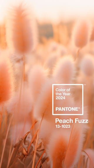
Have you seen their pick for the Color of the Year for 2024? It’s called Peach Fuzz.

What fascinated me about this color is that I didn’t recoil at the thought of peach. 😀 In fact, I opened up that email, and I was delighted to see such a happy, vibrant color. As one would expect from me, I personally think that we need more happy, vibrant colors in our homes. I think we need less of the all-white, all-neutral trend, and more color.


So with my love of color, what could possibly make me recoil at the though of peach? It’s because I’m a child of the 80s and 90s. I was born in the 70s, but I did most of my growing up in the 80s and 90s.

Who remembers decorating in the 80s and 90s? There were a few certain color schemes that dominated the entire world of decorating. There were the jewel tones — burgundy, navy blue, and hunter green. That was the popular color scheme that I gravitated to. But then there was also the country blue and mauve color scheme that was so popular, and then the peach and seafoam green color scheme.
I loved those jewel tones, but I don’t remember ever being a big fan of the other two. And yet, they were everywhere. They dominated kind of like the whole all-white, all-neutral farmhouse look has dominated for so long.
So after we started moving past those color schemes (I think that was some time around the mid- to late-nineties, but I might be a bit off on my timeline), I vowed never to go back. I mean, for 20 years after that, I couldn’t even hear the words “mauve” or “peach” or “country blue” or “seafoam green” in relation to decorating without my face involuntarily scrunching up with a look of disgust and disapproval.
I think most of us can relate to some extent, right? I’ve had people who grew up in the 60s and 70s tell me that they still can’t stand anything that reminds them of the harvest gold and avocado green trend that was so popular back then. Even beyond decorating, we can all relate to those trends that we vowed we’d never take part in again once they were gone.
There are some past trends that I’d welcome back with open arms. I was talking with a friend the other day about my newfound love for making beaded necklaces, and she said, “This reminds me of the twist-a-bead necklaces of the 80s and 90s.” Oh my gosh, I LOVED my twist-a-beads in the late 80s and 90s, and I’d love for those to come back!! 😀 I have to admit, I think 80s and 90s fashion was the best. And we can bring back big hair and AquaNet any day now! 😀
But when it came to decorating, I swore off of those colors (even the jewel tones that I loved), and I was convinced that I’d never want to see them again, and I’d certainly never decorate with them. So when I opened that email and saw that the Pantone Color of the Year Peach Fuzz, and my very first thought was, “Oh good! That’s very pretty,” I realized I am completely over my aversion, and it only took 30 years! 😀 Heck, I might even like a peach and seafoam green combination again, just as long as we don’t have to call it “seafoam green” anymore. Surely there’s a better name for that color.
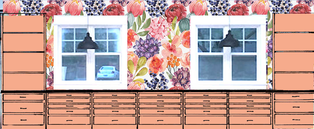
In fact, I actually considered a peach color for my studio cabinets.
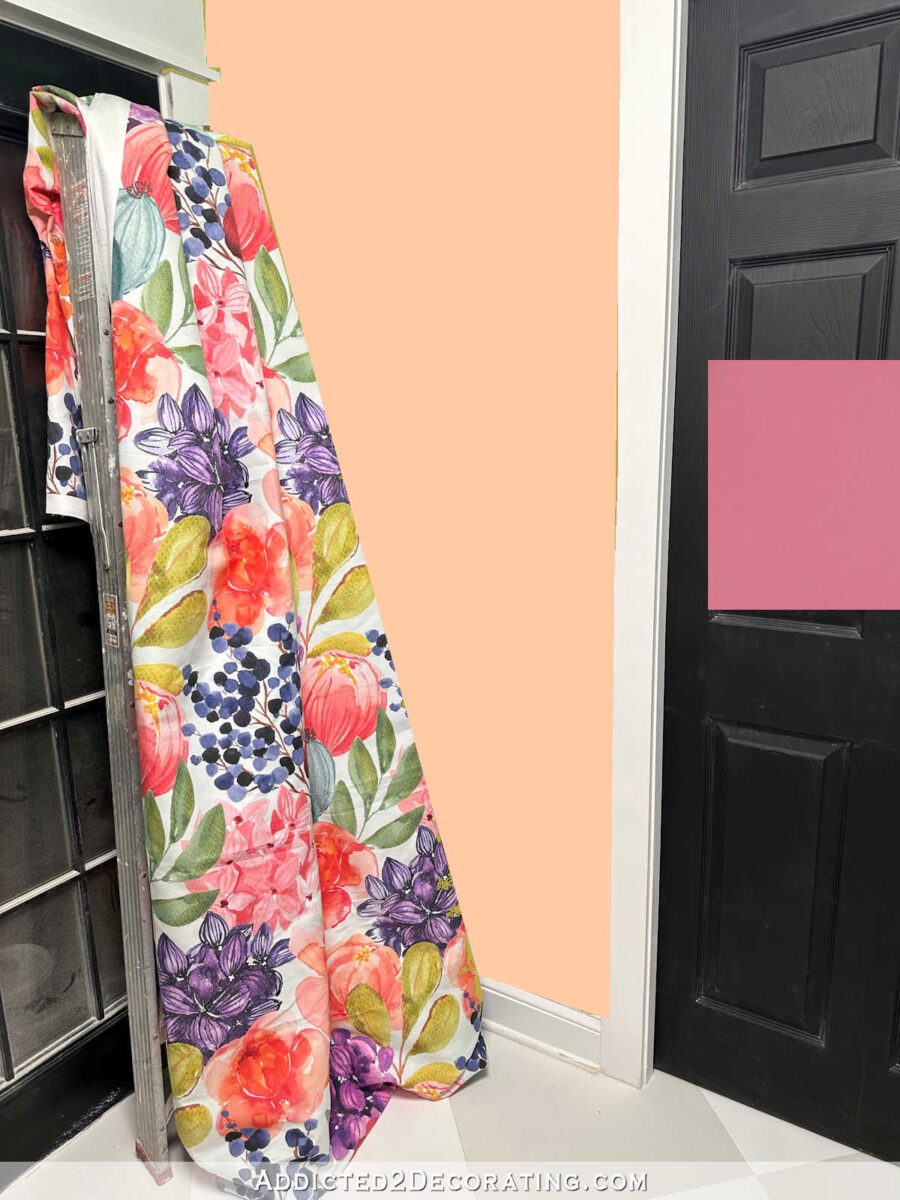
And then I considered a peach color for the walls in the back entry of the studio.
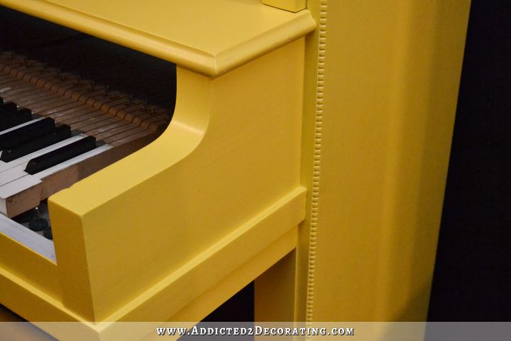
I also tried peach for the door color, and while it did give a real Golden Girls vibe, I was actually open to trying peach with the green walls!

And when I was staring at my paint swatch cabinet the other day (which I do pretty regularly), it struck me just how many colors I included in the peach family, while the pinks look pretty scarce.
So it looks like I’m completely over my aversion to peach. I’m glad that it’s Pantone’s Color of the Year for 2024, and I look forwards to seeing more of it in decorating over the next year. I’d love to find a way to bring some of it into our home. I think it would fit in nicely with all of my other colors.
I’m curious to know what color aversions you have. Do you remember those color schemes from the 80s and 90s? And after we moved past those, did you have an aversion to those colors like I did? Or maybe you’re one of those who swore you could never use harvest gold or avocado green again. Did you ever get past your aversion?

Addicted 2 Decorating is where I share my DIY and decorating journey as I remodel and decorate the 1948 fixer upper that my husband, Matt, and I bought in 2013. Matt has M.S. and is unable to do physical work, so I do the majority of the work on the house by myself. You can learn more about me here.
I cannot stand the 70ies’ combination of orange, yellow and brown. It felt so flat and dry then, and it still does in my mind. I’m definitely a child of the 80ies, too, gravitating to pink, purple, grey, black, esp in clothing, but sometimes even when decorating, though I wouldn’t want that very cool look of that decade to reign in my rooms anymore either.
Just mentioning Harvest Gold and Avocado Green gave me two pictures in my head…horrible appliances, and shag carpet in those colors! Yikes. And, You are totally correct…I still hate those colors. (But I did have some in my home way back then) I too like to see what the color of the year with these companies are, but I totally like or totally reject them regularly. I am always behind the trends. I am still wanting to go with grays while I just read beiges are coming back…I am SO SICK of beige. I don’t care…I’m going for gray sometime next year I hope. 😂 I love watching you enjoy lots of colors. I do love colors, but have input from others so I have to tone it down.
OMG…I was on that wagon too…orange, yellow and brown. I now hate that too!
I’m old enough to remember the sixties and seventies, and I will never, ever, however long I have left to live, use brown and orange, or monochrome black/white/grey.
My very first apartment that I had after college had a wallpapered kitchen, and it was those big 1960s flowers in brown, orange, and yellow. There was no way I could live with that, so I took it down and put up new wallpaper. I’m pretty sure the new wallpaper that I put up was a floral in burgundy, navy blue, and hunter green. 😀
I personally don’t like the colors harvest gold or avocado green so would never decorate with them. Loved the jewel tones back then and decorated with them. Would use them again. Not fond of mauve, peach. My tastes have changed a lot over the years but somethings like mustard yellow — NEVERMORE!!!
I’m still not over my aversion to the pale blue and pink trend of the 80’s. Like you I love color but not crazy about peach. I disliked green for many years both in clothes and interior design because I wore a green school uniform for years. I finally got over that and love green now.
My memory is that this color, paired with some kind of light green was all the rage in the early 80’s. Didn’t care for it then…. 😜
Exactly! We called it Seafoam Green, but I looked it up, and evidently some people called it mint. But that combo of peach and seafoam green was my least favorite.
When we moved into our home in early 2000’s it was a hunter green and bubble gum pink paradise… the boxes were not even all moved in before the paintbrushes and wallpaper remover were pulled out.
For those of us born in the 70’s this totally feels like our time to shine hahahaha incredible how fast trends (colours, styles) come back again… beats the walking to school up hill both ways.
This post made me laugh. I was a tween and teen in the 70s and I still can’t stand harvest gold, avocado green, or brown. Fortunately my mother, a interior decorator, didn’t care for them either so they never made an appearance in our home, only client’s. When I saw that peach though, I had the same reaction, yikes, the late 80/early 90s are back!!! Not that I haven’t seen some soft peach rooms that I liked but they leaned to the pink side. I think you’re right about it being associated with past design schemes but I think it’s also because I’m partial to cooler colors and blue undertones.
NO NO NO to peach, rust or orange. My mother decorated in those colors and I still cannot stand them.
I grew up in the 60s and 70s, with all the “mod” colors. When I and friends/relatives were getting married in the late 80s and early 90s, it was all those dusty pink and country blue geese with ribbons theme. You could buy almost every type of kitchen item, curtains, etc. featuring these. I could not stand it then, and would never use those colors or theme ever.
OMG, I had those too! I had many pieces, including the curtains, and just recently I found one gravy spoon with the geese! WOW…that was a long time ago! 🤣
I have two. Whenever I see a saturated blue with brown trim it’s like walking on glass shards. Likewise orange walls with brown cabinets, makes my teeth hurt! But don’t be too harsh on those who like a calm neutral palette; your cacophony of colors might do to them what asymmetry does to your brain!
We’re all different.
You said it for me! I’m done with the Tuscan colors and loved them for awhile, but I’m only calmed/pleased with a more sedate – though not completely neutral – color scheme. I like the comparison you made re color/asymmetry, makes sense to me. I love Kristi’s talents, use of color for her, and enjoy her creativity to no end. In fact, I’ve gotten many tools she’s recommended, like my Porter-Cable air compressor which I absolutely love. Yep, we are all different doesn’t mean we can’t observe and appreciate and admire other folks’ taste!
I LOVE, LOVE, LOVE peach! I had peach walls and even peach carpet in my bedroom from the age of 9 years old (1982) until my parents sold the house in the early 2000’s. I never did paint any of the rooms in any of my houses peach although I did paint one room a peachy orange once. I wish I had a room or area to paint peach in my current home. I may just have to find a space!
The only color I recoil against is mauve.
After a year of house hunting, I can no longer abide gray: gray vinyl plank floors, gray walls, gray tile, gray, gray, gray! It seems like every quickly flipped house has gray everything!
I still love the jewel tones (with dark wood), but I can’t imagine ever using that dusty rose-dusty blue scheme again. Kinda like wide pants/wide bellbottoms–I lived through that once, can’t do it again.
What a fun post! Loved reading the replies, too.
I get you on the grey and white schemes…I have seen House Hunters episodes where I literally thought the color on my TV went out because except for maybe one thing (i.e. a plant in the corner) the rooms looked like I was watching a bxw TV. It’s so strange to me to want everything that way.
The gray is just so insane. I think it’s finally ebbing but for goodness sake. It really spread everywhere. I blame Pottery Barn, haha.
Oh my gosh! Looking for a home in midtown Kansas City & every beautiful craftsman from the 20s has been gutted, woodwork (that they left) painted white, walls grey & LVP laid over hardwood. They took down walls & made the entire first floors open, trying to force a minimal open style on homes of 1200 sq ft that had gorgeous milling & woodwork.
It is very sad to see. It is rare to find one that has not been “updated”.
Carol! Your are my color loving-soul sister!!
I have never used PEACH OR MAUVE anywhere for anything in 86 years! And never will! I also will never use the 70’s gold and green again. I much prefer stronger colors like red, I have lots of it, and navy.
Ha ha! So the Griswolds had the deep jewel tones and their neighbor played by Julia Louis Dreyfuss had sophisticated, modern pastels, maybe peach and green. I love looking at the interiors in these Christmas movies, remembering when those styles were vogue
It is far too soon for me, I’m afraid. But I am finally okay with avocado green.
When i was a sophomore in HS. my parents let me pick out carpet and wallpaper to go into our new house. I already had a white (with turquoise drawers) bedroom set so LIME green shag carpet seemed perfect to me! (i still can’t believe they let me choose that color…the rest of the house was beige on beige). The flowered wallpaper combined all the colors i chose…plus a few more…and they even let me paint my shelves turquoise as well. I LOVED that room….and tho i veered away from those colors for 2 decades after getting married and setting up house…i have gradually added all of them back into our decor. Apple green, lime, turquoise, teal, red, pink, purple…..every room in our house has varying combinations of the colors that brought me joy in my teens.
Well, when you put it that way, I don’t dislike it as much as I thought I did. heh.
I still ask myself, what in the world was my grandmother thinking of with the avocado green and Harvest Gold and huge flowers on the walls and on the appliances? How was that ever attractive?
Our first home had dark green, gold and a bit of light green shag carpet!! Hated it!!
First thing to go! I liked pastels but have always need an accent of a brighter color with it. Finally, realized that I almost always gravitate to something in the red/pink color as part of our home decor. I love your pantry tiles, with the bit of purple, so I think I must like a “bright jewel” tone as an accent.
Not fond of peach with seafoam green! But for a time, we had some curtains in a bedroom that had a floral design with green-blue colors and a muted bright pink.
No white or gray for me, except for doors, trim and ceilings always trend to white for me. I’m excited that my peach bathroom is back “in” from 2005 hahhahahah
I have found myself gravitating back to wines, burgundy, purples on the red side and navy blue with tans and greys. I went through just about every color of the rainbow including pink, peach, mauve, powder blue, seafoam, etc. Now I feel like I am back in my comfort zone. I like the peach fuzz color, but probably won’t go back to it.
Harvest Gold and Avocado Green was everywhere in the late ‘60’s and early ‘70’s. I had matchy matchy green all over my house. I never went for the country blues. I don’t know why, but I just didn’t. When I first saw that color, I thought how boring. However when you posted the picture of the clouds, I thought how calming and peaceful. Good for a bedroom, but not for the woodwork. Stained wood would be pretty with that color of peach.
Whatever you do, it will be beautiful.
Have a great rest of the week.
Still praying that country blue will never come back lol
The jewel tones (but dusted up a bit and maybe faded a little), barn red, forest green, mustard yellow, burnt orange, Girl! I still love them! The world is just a prettier place when faded and dirtied up. 😉
Yessssss!
I’m an old redhead and those dusty/dirty colors rock.
Ha, when I was about 13, roughly in 1992, I had a peach phone and a peach comforter set. I told my parents that when I grew up I’d have peach decor for my house. I don’t, but I did love that look back then! I barely remember avocado green stuff, but it would definitely turn me off in decor still!
I despise the yellow and blue combo. My step mom re did our kitchen growing up and I will forever associate yellow with bad memories!
Been there, done that… childhood or my own homes. Pretty much ready to put certain grays on that list too. No going back. As I mature in my decor gravitating to what we like, PERIOD, regardless of trend. What ever makes my fella & I happy is what we want to look at day in day out
I LOVE peaches and olive greens together, and I am delighted that peach is once again in style. My aversion is the gloomy grays currently in vogue. How did the studio doors come out?
Lol lol. I was around in the “Sixties” and when I think of that time, all that comes to mind is the riotous explosion of psychedelic color everywhere, which I think you would have appreciated, Kristi.
My very cool mother allowed me to use Day-Glo hot pink paint and
decorate the white tiles of my bathroom. We used to paint OURSELVES
with these bright chartreuse and pink and blue paints when we’d go out for the evening. Peacock feathers, refraction discs, iridescent posters, and black lights to make the colors pop even more. Those were the days.
Meanwhile, I would definitely consider Harvest Gold and Avocado Green to be very dated, but GUESS WHAT I am really drawn to lately?!?
“Olive Green” and “Golden Yellow” or “Mustard”. Hahaha.
I will NOT be using Peach in my home even if it’s color of the year. Peach is for 🍑 peaches!
Slate blue and dusty rose were the colors in my kitchen in the eighties.
I loved it back then, but never again🙂
I love that peach fuzz color!
The only color I got very sick of during my life time is the olive green washer and dryer we bought in 1968. I was really glad when the washer conked out and we bought the almond color set.
Other than that I love all colors.
Honestly, I couldn’t care less about the color of the year. They are rarely colors I would use in my home at this stage in my life. I am a neutral girl through and through. I went through all those more colorful stages… been there, done that. Especially the mauve/country blue and the hunter green/burgundy. But now I appreciate the calmness of the neutrals. Color is wonderful in someone else’s home, but I find my boring home to be very peaceful. I definitely don’t need color around me. I even wear mostly black clothing! 🙂
Colour makes me happy.
I never got into the peach colors and likely never will. Just not my color! And although I LOVE greens, I tend to use them in accents/flora. But not mint/seafoam. Maybe it’s because of my aversion to peach and how it was often paired with peach. Or maybe it just reminded me of a hospital.
I’m surprised that you are contemplating peach. It seems so lackluster compared to your usual colors. I think you can see in the back entry mockup that it looks dull and drab. Something stronger like your coral seems more in the vibe of your home. But I applaud you for keeping an open mind.
Colors are fun! I’m young enough to appreciate MCM design. I used to dislike that 70s (ok, late 60s too) color combo of orange, brown and avocado green, but now like them in certain retro designs, but mustard, and brown with dark wood paneling? Never!
We had an orange 70s kitchen in our house and I remember liking it…maybe peach painted cabinets might’ve worked if you loved orange.
I do really like the color combo of avocado/blue/teal blue and mid-tone green that seems to have been popular in the mid 60s.
Seafoam green is meh, but I remember it and peach as an 80s kid. My aunt had peach carpet. My mom (in early 90s) had a formal room with jade green chairs with peach accents (dark seafoam?) and a fancy couch with a peach, light blue and light pink plaid…but everything matched nicely with the Persian rug in the room, so it looked more classic than 80s. Not as cool was the comfy couch plastered with powder blue and mauve flowers on cream. So 90s! I wanted to reupholster the couches but circumstances prevented that.
My favorite green is celadon, and a certain jadedite green (like a light blue green) that is so common on 1930s things I call it 1930s green. That combo looks very pretty with a muted peach or ivory, or coral pink…a combo that was used in the 1930.
Can you tell I’m a history nerd?
I like lots of color and pattern. Pastels for the br, bolder colors in LR, balanced with pale/white walls.
The grey/b&w trend is so blah except in certain instances and I wonder if today’s kids will groan at interiors with neutral rustic industrial farmhouse designs with “Live Laugh Love” as we groaned about 70s kitchens and country bonnet geese.
But I will admit those 1970s mushroom theme canisters are kind of cute.
I do look at the Colors of the Year, but rarely do I use them in my home.
As for the colors of the 80’s and 90’s, my home was filled with country blue and mauve…and my wedding colors were peach and teal green/blue. That marriage didn’t work out and my house caught on fire and burned the country blue and mauve rooms, so I haven’t decorated with those colors since and I don’t see myself using any of those colors in my home in the near future. 😊 However, you always seem to have a way to make colors that I may question look appealing. I tend to stay very neutral with wall paint colors and add color in my home with limited accessories, but I do enjoy watching your projects come to life through the use of color.
Wishing you and Matt a very blessed and healthy Christmas season!
I’m the same – born in the 70s – grew up in the 80s/90s. Our house had the harvest gold, avocado scheme (avocado appliances, and shag carpet in harvest gold and yellow — and wallpaper to match it all!) My parents remodeled in the 90s – and you guessed it… navy, burgundy and hunter green! Still not a huge fan of any of those colors.
But now my color aversion is more the brick red, brown (or muddy yellow), and green color combo, I call the ‘Kirklands’ combo. NO. NO. NO. NO. NO.
I’m 40 and my mom’s towels, as well as many of her sheets/bedding items, are all still “apricot and celery” as she calls her version of the 90s orange and green tones. I actually have always loved those two, both together and separately. Today we are doing cognac and sage everywhere, so the orange and green combo is still rocking. They are good colors for wardrobe/my personal coloring, so that’s probably why I have always approved!
Other colors may come and go but I’m permanently inoculated against Harvest Gold and Avocado Green. Just can’t stand them. The dark rooms of the 70’s – dark wood, dark upholstery – usually with pothos plants seemed warm and inviting back then. Now they just seem hard to see in. Bring me a flashlight please.
I’ve noticed lately that people seem to be moving away from succulents and back to houseplants that were popular in the 60’s & 70’s – pathos, spider plants, peace lilies.
Totally unlike you, I loathe pink! If I have to, I can deal with a “dusty rose” shade and that’s about it. The reason (because I KNOW you’re dying to ask) is that for the whole of my life (76 years so far) pink has been defined as a girls’ color. Packaging for females is almost always pink! I mean, really, what’s wrong with lavender, goldenrod yellow or some other pastel. I’m not generally a pastel person; bring a “autumn”, (and if you’re a certain age, you may remember that whole thing) I truly lean into the golds, the oranges, the rusts and the yellows. I also favor a nice avocado green and various shades of browns and beige. I know, you’re not a fan.
But I AM proud of myself for wearing reds again. It seems, growing up, whenever my mom bought me any new item of clothing, it was always red (because “brunettes look so good in red), do I naturally grew up hating it. Now I incorporate it into my wardrobe sometimes. Again, except for my nail color, I prefer a richer tone of red like wine, garnet, etc. than just red. I’m so eager to see what others have to say.
Peach Fuzz is not a bad color; I don’t consider it “vibrant,” but at least it is not grey.
I love deep, not greyed, non-watered down colors.Jewel tones make my heart sing.
If I never, ever see any shade of grey again, in or on any thing I will be so thankful.
It’s just my opinion, but grey is the color of death and battleships. Battleships and my dogs’ noses can be grey and beautiful, anything else is a horror.
I recently went in a large “upscale” furniture store, it was an ocean of grey, every piece, and every suite in the place was some sort of grey, each one more dead looking than the last.
My anxiety revved up and I could not get out of there fast enough,
“Grey” has a very negative, powerful and nasty effect on my spirit and mind.