Entryway Wall Progress
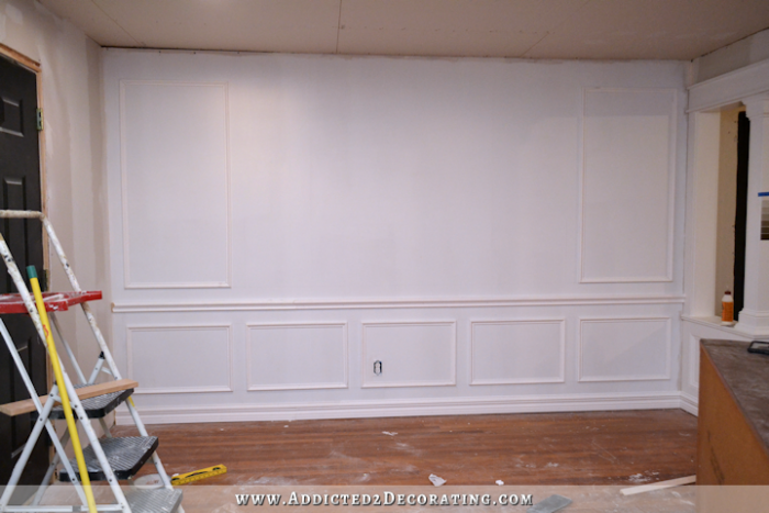
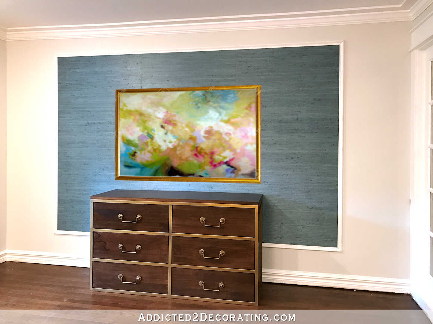
I’ve finally made progress on the pretty stuff on my entryway wall! I still have loads of sanding and mudding to do on the other walls (getting walls perfectly smooth, since I won’t be texturing, takes forever!), but I decided that I needed to take a day and work on something fun and pretty. It’s just what I needed to motivate me to get the rest of the drywall done! Here’s how the entryway wall looks so far…
And of course, I was anxious to see how the buffet looks against the wall.
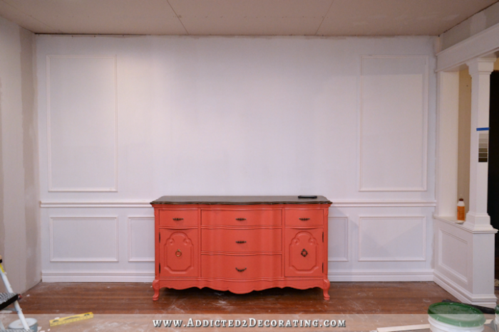
I haven’t done any wood filling or caulking on the trim, so up close it’s still looking kind of rough. And the wall is only primed so far. The wall color I’ll be using (Behr Polar Bear) is white, but it’s a much warmer white, so the wall is looking a bit more bright white than it will when it’s finished.
And of course, I can’t do my crown moulding until I get the taping, mudding, and sanding finished on the ceiling. In this room, I’m also going to try a suggestion that someone gave me several months back on another post where I mentioned drywall. The commenter said that drywall pros in her area no longer tape and mud the corners where the walls meet the ceiling if crown moulding will be installed. Instead, they use a caulk called Big Stretch. Caulking those corners sounds so much easier and faster than taping and mudding, so I’m going to give it a try. I found Big Stretch at Lowe’s.
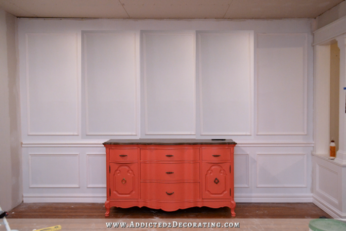
You may also notice that I only added the top moulding on the two outer sections so far. That’s because I haven’t yet decided if I want to do three sections to match the lower sections (as this poor copy-and-paste hack job of a mock up depicts 😀 )…
…or if I want to do one large section on top, like this…
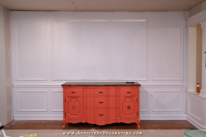
It would help if I knew exactly what I wanted to put on the wall above the buffet, but of course, I have no idea at this point. And as far as the moulding goes, I think either way would look really pretty. This example shows a larger section in the middle, and I like how that looks.
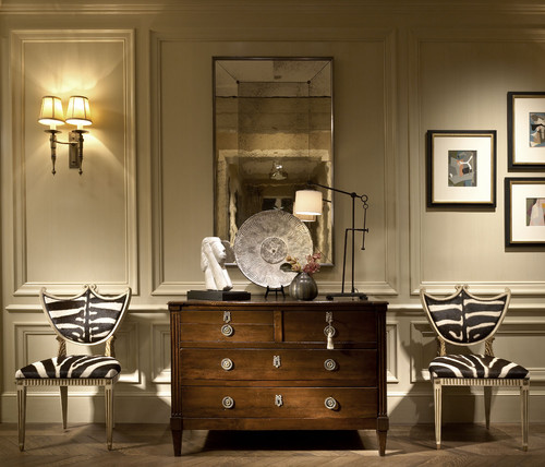
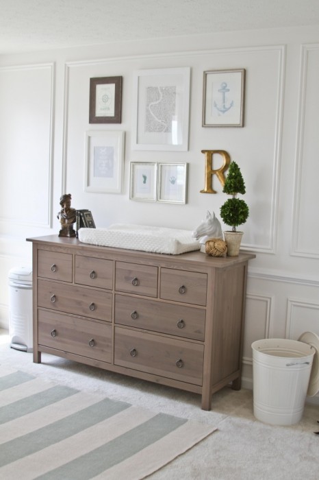
A larger section in the middle, like on the left wall of this bedroom, would allow for one large piece of artwork or a large mirror to be hung over the buffet.
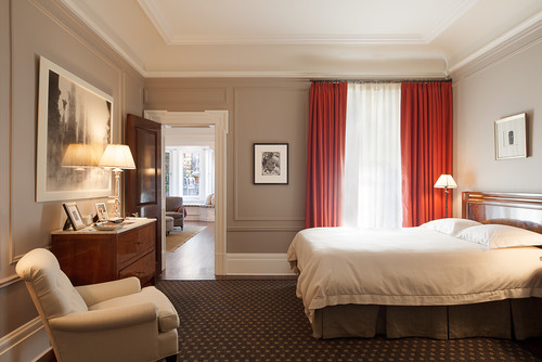 Traditional Bedroom by New York Architects & Building Designers Andre Tchelistcheff Architects
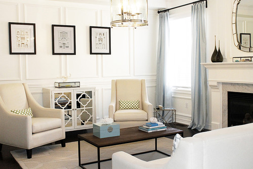
And here’s another example, although I don’t think I like the artwork to be quite so precisely custom-sized to fit inside the large section. Or I suppose they actually custom sized the moulding to fit the artwork.
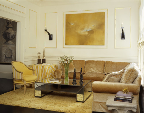 Eclectic Living Room by Tiburon Interior Designers & Decorators Jerry Jacobs Design, Inc.
I much prefer the size relationship of this artwork to the large middle panel.
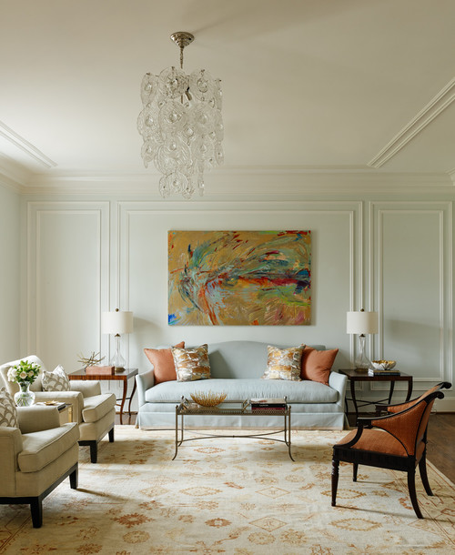 Traditional Living Room by Charlotte Interior Designers & Decorators Laura Casey Interiors
But the whole “larger middle panel” idea seems to be quite common, and since I have no idea what artwork I want to use right now, it would certainly be the safe way to go. And I really do think it’s beautiful.
But then I always come back to this picture…
 Contemporary Living Room by Toronto Interior Designers & Decorators AM Dolce Vita
For so long now, that picture has been my go-to inspiration pic for the whole-wall wainscoting/picture frame moulding look. And the designer of that room certainly didn’t let that picture frame moulding get in the way of hanging artwork! I’m not sure that I would actually hang mine on the moulding like that, but I could hang a series of pictures inside the framed sections, just like I did several years back in John and Alice’s living room.
So, three sections or one big section in the middle? That’s the question I need to decide on ASAP if I’m going to get this wall finished today.

Addicted 2 Decorating is where I share my DIY and decorating journey as I remodel and decorate the 1948 fixer upper that my husband, Matt, and I bought in 2013. Matt has M.S. and is unable to do physical work, so I do the majority of the work on the house by myself. You can learn more about me here.
I think that you should leave it one big section until you get the whole room finished and you get to the decorating phase. I can see you doing something really unique in that space and you wouldn’t want to limit yourself at that point. Once the room is finished you can always add the little sections if that is the decorating direction you want to go. As usual it all looks fabulous!!
I agree! One large middle section. The four same-sized ones seem busy to me and even busier if you hang art on them. I think one large middle section will give you more freedom for decorating/styling.
I agree too for all the same reasons
I totally agree!
I agree – one big section!
Me too! One big section!
Agree too!
This would be my decision, also.
I can so envision a lovely mural painted there to compliment your gorgeous buffet.
That is exactly what I envisioned as soon as I seen the options. Definitely leave it as one large section and then do something complimentary in the middle. A mural, large painting or even a wall paper.
I agree! One large section gives you eye a comforting resting spot. Love the wall and buffet so far!
I totally agree! 3 only, with the biggest in the centre. Great job Kristi!
I completely concur with the ladies above. Beautiful mirror or gallery wall behind the buffet would look awesome.
I like the large section in the middle and if later you want to do the smaller, you always can.
I like the large section in the middle. I think several panels gets a little too busy with the large piece of furniture against it. I think it would be stunning with some beautiful sconces on the outer panel and a show stopping mirror in the center panel. I always like a mirror in entryways.
I really like Carmen’s idea of the sconces and mirror. It looks amazing so far, keep going girl! We love your posts!
Ditto everything she said. Except maybe artwork instead of the mirror. Although, with the “wallpaper” design you have planned for the music room, artwork may be to busy.
-Marsha
The second choice!! I love how the larger section gives you the ability to place a piece of art (or an arrangement of art), in a significant area, where it looks like it really belongs. The larger section frames it out in such a perfect way, where as the frames hung up between the wainscoting ‘frames’ looks a bit off to me,,,especially on such a large wall!
I just love how it looks so far though! We too are doing this trim in our home, and are just falling in love with the beauty of it and how it just finishes up the entire look of the home!
“three sections” is better.
I love the one bigger panel in the middle. Very classy looking!
One big section in the middle. My mind boggles at all the possibilities you could do over your buffet. Large, cool mirror, art work, maybe a less full version of your birds and vines?
personally I like the large panel mock-up best but I’m also a very linear person so ?I understand the attraction of the 3 panels. I just envision an awesome mirror or big piece of art over that buffet…..
It looks really nice!
Yes, one large section in the middle. You have limitless possibilities that will come to you in the decoration part of this project. Your work is beautiful. Thank you for sharing. I get great ideas from you.
Definitely leave the large center I see a beautiful piece of art work or a glorious vase or lamp on that gorgeous buffet oh my there is so much you can do with leaving it large! LOL I am so happy that you took a moment to do something fun and pretty. Have a beautiful blessed day!
The larger panel in the middle makes the wall look bigger to me. Keep in mind how this wall will look with the long view of the music room. Seems like simpler will better highlight the spectacular things like the wonderful doors at the end of the music room. But you are “on site” so the best solution will come to you.
I like the larger section on the top. With the buffet placed the lower section doesn’t show the smaller panels so in my mind it matches! As usual, your DIY is amazing!
Love the buffet on that wall!!!! Wasn’t sure about the brightly colored piece of furniture ( I like the color, just not on a big piece of furniture), but it looks perfect! This is all so exciting!????
I so agree, loving the buffet!
i love the large section in the middle it also has the most versatility when choosing your decor.
One large panel will leave you with so many more decorating options–and that’s the fun part!
I too vote for the large section in the middle 🙂
Although the bigger panel in the middle is more common I think it will be less busy in a good way than the multiple panel option. Since you are so good at decorating, adding color and, the right accent pieces I am afraid you could be limited by the addition of multiple panels because you will start to fear the room is looking too busy at some point…the coral buffet looks awesome dead center there and I can see the warmer white on the music room entry way walls and am imagining the wallpaper in there and the green kitchen cabinet doors poking through he newly opened wall and wow, I can’t wait to see it all coming together!
Agreed.
Definitely the larger middle panel space. Much less busy and much more flexibility in what you can do with it when you get to the decoration stage.
LARGE SECTION! Lol it acts as a type of frame for the buffet as well. It also leaves so much changibility in what you hang above! So exciting to see progress! !!!!
Sheila F.
I vote for the one large panel. Good job, great inspiration!
Go large or go home!
well, it seems logical that leaving the middle as one larger space would be more versatile, and if you knew already that you were going to put a large mirror or piece of art there, then I would say leave it larger. Or even if you were going to do a gallery collection like the one in the nursery picture. But for some reason I really like the picture with the three equal sized sections. Like you, I might not hang pictures on the moulding itself, but that sort of art would look really good inside the sections also. I do think the larger space would look better with large art or mirror, so maybe you are right to leave it alone now while you decide. As usual, I am blown away by your talent!! and also, thanks for the tip about Big Stretch – we are getting ready to pull down some really nasty old drywall tape in a bedroom and not looking forward to more of the same. Sounds like Big Stretch and crown moulding is the way to go.
One large section in the middle. Looks wonderful and allows for more options with wall art. Everything looks lovely, keep on truckin’ along!
I vote for the big one. I really like the way the art looks inside of it. Your end products are always great though so Im sure either would be lovely
Awesome progress….what a difference…and my vote is for the same as others have said: leave the larger section in the middle…wow what you can do with that is just too wonderful to even begin to explore. Great job once again.
I think a large middle section would give you more options (large mirror, large piece of art, gallery wall, grid of smaller artwork…) but you have to go with your gut, Kristi! You know you always regret it when you don’t 🙂 Can’t wait to see how it all looks when you get done!
By doing only the exterior panels and leaving the open middle, I think you have had a premonition that your mom will do “the perfect” painting for above your exciting buffet!!! Oh! I hope that is the way it works out!
Ditto. One large panel!
While I agree the one large panel is more versatile, it is also more common. I find the three cental panels more interesting to look at so I find it more appealing. Your original inspiration pic is just stunning! Can’t wait to see what you do =:)
I like the flexibility of one large section, also love the sconces flanking both sides.
I am in awe of your abilities, I’m a diyer type of girl but I’ve never seen any woman (except maybe on tv) with your all around skills. Thanks for the inspiration!
I vote for one big section. With all the sections on the bottom of the wall and the curved detail and trim work on the buffet…. it looks really busy with 5 sections on top. Plus… you’ll have more options as far as artwork goes.
One larger section would be my preference, with art or a mirror (I’d love to see a big gorgeous mirror!) that’s appropriately scaled for the width of the buffet.
Definitely go with a large section in the middle. I would think it would be so universal that way! A large mirror, artwork or a collage o sorts. So neat! Love your buffet there. That will be a beautiful entry way!
One large section in the middle!! Even before I read through your whole post, I saw the first ‘unfinished’ picture and though “wouldn’t it look so nice with a big open molding up top”.
I like the large middle panel. Would live to see a mirror there to reflect light & dining room. The sideboard looks great there!
I really like the look of one large area and I can already “picture” an awesome statement art piece. You are doing awesome and it looks fabulous!
One large in the middle would give you more versatility when it comes to wall décor and it opens up the wall more. The smaller sections visually shorten its length by chopping up the expanse.
I would definitely go with the bigger middle panel… looks much better
Wow! I would have never thought to do a large square in the center and really like it. It gives the wall a feel that it is a focus wall ie makes a statement. I need to play around on pinterest more.
This is coming along great! The buffet color is stunning next to the wainscoting. I love it. I strongly agree with the others who said go for the larger section as the middle of your wall. If you subdivide it too far you are way too limited in what you can hang on that wall, and you run the risk of any art work or sconces looking too crowded in their spaces. Also, if you subdivide you will never be able to hang a large and striking art piece, mirror, or sculpture on that wall, so you would be limiting yourself too much.
You blow me away with your great taste!
Larger middle section. And I have to say it again. That buffet is the my all-time favorite piece you have ever done. It’s is magical.
Large middle section. Much better composition!
Bigger middle panel definitely. And the buffet is gorgeous!
I vote for the larger middle section, too, as it is more versatile and less busy – and it fits the buffet underneath perfectly! It’s great that you decided to do something beautiful and fun (don’t know if I’d call that fun :)) in between to keep yourself motivated!! It looks abolutely stunning already!
One big section!!! It is already starting to look fabulous!!!
Have you considered a richer type of red-coral for the buffet to make it pop even better? i just thought that the current color against the Behr Polar Bear seems less bright than I though it would from previous photos and more coral-peachy. However I trust that you will make everything in the room tie together perfectly!
I like that larger middle section option as well. It seems so solid and relaxing compared to the choppier rhythm of the repeating smaller frames. I think it gives that nice dose of texture while still allowing you to put a fairly colorful and complex piece of art above your epic buffet without crossing the “aaah–it’s all too much to take in” threshold. Of course, that threshold is certainly different for everyone, and I love that your home takes risks. Don’t feel obligated to do the riskier options all the time just because we know you have the skill to pull it off! 😀
Odd man out here. The top and bottom should be balanced IMHO. The examples shown either have nothing below the chair rail, or it is undetermined due to furniture placement. Once furniture is aside, it would be disconcerting to my eye to see it not match, and I actually prefer asymmetry.
I am considering doing the same, but only up to the chair rail. But on one wall I am thinking about adding stone. I have an L shaped living room/dining room and am thinking about doing stone on one dining room wall – would both in the same room be too much? I think so, but I’m curious what you would think.
I really like the three panels as opposed to the one larger panel on the entry way wall. I think it looks sophisticated!
I’m definitely on Team 1BigPanel as well! I liked the 4 smaller ones, but the one large one literally made me say out loud (in an empty house mind you lol) ‘That’s the one!!!’ . Oh and I am loving the color of the buffet as well!
It looks beautiful so far and I vote for one big section :-))
Wow! Great job!
I like both options – the large middle panel and the 3 smaller. However, it seems like your inspiration pic is the one that should lead the way for you. Remember how things turned out the last time you departed from your choice?
Anyway, your progress so far is beautiful…I live vicariously through you!
Have you come across anyone who has used recessed molding under kitchen cabinets instead of a back splash?
Tired of looking at my walls, but tile isn’t in the budget right now. Thoughts?
I’m going to go against most commenters here. I also hated the picture framed perfectly in the moulding – I think moulding should fade into the background as a beautiful kind of wall texture.
So I suggest 3 panels, and then put a giant picture or mural over all three. I emailed you a photo because I’m avoiding cleaning right now 🙂
Love the three panels! And I agree that you can easily hang something large over the molding. This said, I believe there is a much better balance over all, including the furniture, with the one large section. The three separate sections seem to over power the buffet table.
I prefer the one large middle – too busy otherwise.
If you’re still counting votes, my vote is for the larger frame. I think it’s more flexible art-wise and will give you the opportunity to create that “feature wall” look you originally wanted. It’ll also give you more flexibility to change the artwork over time, if you want, to freshen-up the room, without redoing the wall or trim.
Absolutely STUNNING! The quality of the work you do! You are such an inspiration! Thank you for doing what you do! Either option is beautiful, but I feel like the larger section would help “frame” your lovely buffet. Can’t wait to see what you decide!!
Omg, one big space, with a big mirror and some sort of sconces (not necessarily real ones, just two items to “frame” the buffet). A mirror would show your fireplace framed by windows, no? That would look so cool!
big big big! 😀
The larger section makes the wall look grand and clean. I think the the smaller sections get busy, especially with the architectural elements on the buffet.
beautiful either way
I also cast my vote for the larger middle section. The other looks too busy to me and competes with the buffet.
My preference is for the five panelled wall. I just like symmetry. And the buffet is in three sections too, not of equal size granted, but three all the same. It’s just right somehow….
you can always tell how tired I am by how little punctuation I use and the same with capitalization. I do love the wall with the bigger middle. My personal perferance would be a gorgeous painting, probalbly a persons face.but I thing in your situation a huge mirror (nothing gaudy pleas)will help to open up the space all the more. Do you plan to have sconces on the smaller sections? I know you are not hard wired for them, but you could get ones that plug in. I bought a pair about a year ago not really knowing where they would go but just loved them. They came up on a side pop up on my screen so I followed them. they are black and they are metal and they are very long, probably 30 inches with small white shades. They came hard wired, but I finally got around to taking them into a shop in town that fixes lamps and asked him to make them plug in with an in line swith. He did and I had him do the wires in white so they blend in better. I have not hung them yet, been having really bad back problems coupled with really bad doctor problems so I have not been doing too much lately. I plan to put them up tomorrow since I am feeling better. They will go in the master sitting room behind the almost white canvas sofa and on either side of a print of an old house and barn in a black frame with black and white ticking matte. If you are interested I can take a pic, or send you the link to the lamp place where I found them. I have seen almost the same ones at places like PB for upwards of $300. I paid maybe 100 each. Love how the wall looks with the buffett, are you keeping the floor bare in the entrance way? I cannot wait for the day that it is all done and your floors are all washed and clean and it looks like a magazine spread. Blessings
I think the bigger middle section would look nicer. This way you or your mom could paint a picture in there. Looking good Kristi..!!!
Since there would be an odd number of panels and you would have a space in the middle, I vote for smaller panels. To me, on your pic and on all the samples, the big panel looks like it is waiting for a big screen TV, even with nice wall art hanging there. However, I am not a decorator; I may even be the anti-decorator, so you probably shouldn’t do as I say. :-).
I love how this looks, Kristi! Not that you asked my opinion, but I would vote for one large center panel above the chair rail because this is a FEATURE wall, helping to create a sense of an entryway/foyer, and you will have one central accent piece of furniture there as an accent piece. In your “inspiration” picture, the narrower, evenly spaced panels make sense because it is not acting as an accent wall, it is merely a side wall, and there isn’t one central accent piece of furniture in front of it— just the two chairs and a side table–the fireplace on the adjacent wall thus remains the focal point in this room.
In your room, since the fireplace is on the opposite wall, the larger panel on the entryway wall helps balance the two sides, imho. You also DO want to have the two focal points–since you are creating the “sense” of two rooms–an entry and a dining/living room.
Please excuse me if I am repeating what others may have already said–I don’t have time to read through the other comments today, like I usually do!
Now for a question that has plagued me for years: what kind of molding are you using to create your panels–what is it called and where do you get it??????? I have been wanting to install panels like this under the chair rail in my dining room for YEARS, but every time I go to the big box stores and look in the molding dept., I can’t seem to find any thing that looks like what I see in photos, or in other buildings or homes. PRETTY PLEASE tell us, and maybe show us a picture of what the molding looks like!!!
(BTW–I am glad you are not texturing your walls. I know that texturing walls is very common in certain parts of the country, but not out here in the east where traditional paneled walls like this are common and were first used. After all, it is simulating painted WOOD paneling, which would have had a smooth texture!)
Phyllis, Kristi did a post awhile back detailing her most used trim and moldings. I believe she purchases most things at one of the big box stores, Home Depot or Lowes. Here’s a link to the post….
https://www.addicted2decorating.com/my-favorite-decorative-mouldings-trims-and-how-i-use-them.html
The one I used for the panels is the base cap moulding that I show in the post that terrillr linked.
Thanks so much for responding, Kristi and Terrillr! So it is base cap moulding! Surprise, surprise! I would not have guessed it! Some how I must have missed that earlier post about trims, or just forgot! Much obliged!
Phyllis
One large middle section. You can put there a gorgeous mirror and two sconces.
I vote for the three panels. I just like the way it looks to hang big pictures or mirrors over wainscoting. (kind of like in your inspiration picture.) However, one large panel will look great, too. 🙂
I too love the three sections of molding on top. Plus love the buffet centered on the wall. As for the artwork, my personal preference is to use a group of smaller artwork and or mirrors above the buffet in the large centered molding. Just a thought, since mirrors are a great addition to foyers, how about a collection of smaller antique mirrors above the buffet?
Thanks for the tip on “Big Stretch”, I will definitely use that! And, since you are finishing your drywall I thought I would pass along the following information (which you may already know) about how to seal drywall to prevent sound leakage. The code is for multifamily residential units however I have found that building to minimize noise transmission is always a good practice, especially in a home with all hardwood floors. I have included a link to the site that I copied the following passage from as it has a lot of good information and products.
“Fortunately, airborne sound leakage can be easier to detect; as one can do so by getting close to the wall, albeit on all fours and listening for the sound coming through the wall. You may need the cooperation of your neighbor by playing a radio next door so that you have a sound signal to listen for. The sound will become louder as you get closer to the leak. If the sound appears to be coming from the base area a solution maybe is at hand by removing the base to see if the gypsum board and the floor were caulked. If not, caulk it.
If the floor is carpeted, the baseboard will normally be positioned just above the carpet, in which case it is possible to insert a probe such as a long flexible knife blade. If the blade goes in more that about 3/8″ or if it hits something hard or does not come out with any caulking residue on it, there is a good chance the wall was not caulked as required by the gypsum board manufacturers literature.”
Excerpt copied from:
http://www.acousticalsurfaces.com/soundproofing_tips/html/multi_familybuild.htm
Love how it looks so far Kristi!!!! Wow.
Along with the other 87, I say go big:)
Kristi I like the one big panel over the 3 smaller panels. Very elegant.
I’m loving it like you have it. It screams large mirror to me, maybe not huge, with enough room on the sides for art/pictures. Bouncing light all back into the room, and who doesn’t want a mirror near the door to check ones self out before leaving, or answering the door! LOL! What ever you do will be outstanding, and we don’t have to live with it you do! It will be quite the focal point with that gorgeous buffet.
Larger in middle is my vote.
A larger one in the middle would look really awesome. You’re making great progress and the entryway wall is looking really elegant and stylish.