Four Paint Color Options For My Buffet
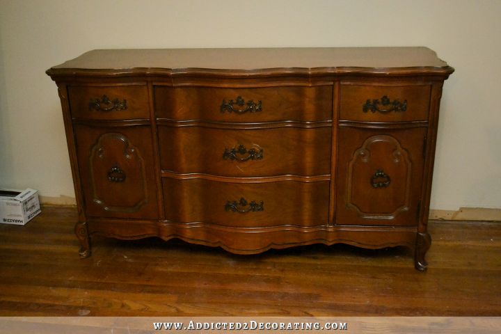
After working on my niece’s bedroom for five days straight (24 hours just over Monday and Tuesday alone), I woke up so sore and exhausted yesterday that I decided I needed to give myself a one-day break from building. I wanted to do something fun and relaxing, like paint my buffet, but by the time I got my tired and achy bones to Home Depot to pick out a paint color, it was already 3:00 or so in the afternoon. And on top of that, for the life of me, I couldn’t pick out a paint color. Here’s the buffet I’m working with…
I have the vision of how I want that entryway wall to look. It includes wainscoting painted in my favorite white (Behr’s Polar Bear) with a twist (more on that to come, but the whole wall will still be light and bright), with the buffet in front of it painted in a bold, bright, warm color. (I’m stepping out of my blue and green rut! 😀 ) But I just can’t seem to decide exactly what that color should be.
In the rest of the room will be black and white horizontal striped draperies (yep, I decided to put my stripes on the windows!), black dining table, end dining chairs with solid green on front and floral fabric on back, side dining chairs in white slipcovers with green accents, and a neutral and textural jute rug. On either side of this buffet will sit my favorite upholstered chairs covered in solid black with white piping.
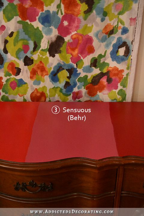
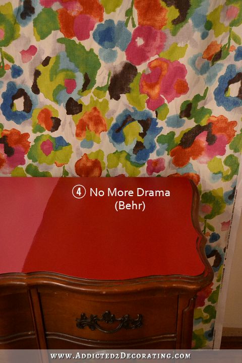
I tacked my bright floral fabric to the entryway wall behind the buffet, even though this fabric will actually be clear across the room on two of the dining chairs. So the paint color doesn’t really need to match the fabric, but I would definitely like for it to complement the fabric. And then I painted samples of the four paint colors I selected right onto the top of the buffet. I’ve narrowed it down to these four.
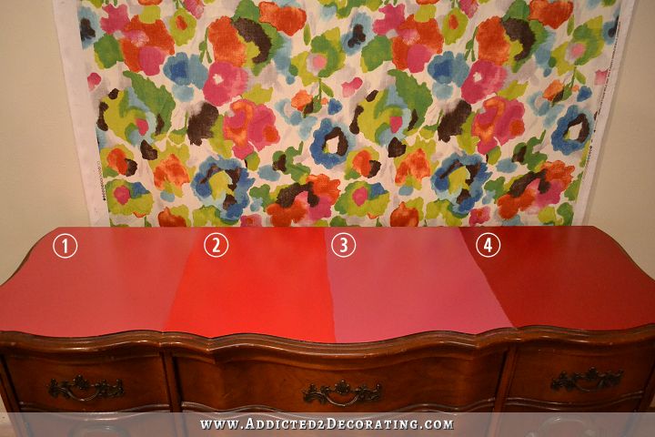
These paint colors are all Behr, and the names are:
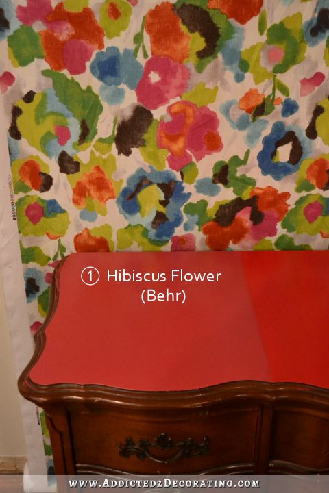
- Hibiscus Flower
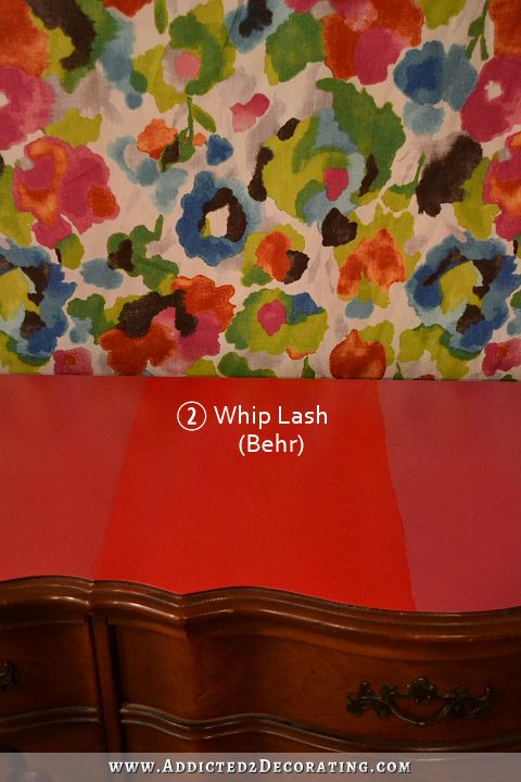
- Whip Lash
- Sensuous
- No More Drama
Hibiscus Flower is one of my two favorites, I think. But then again, I think I change my mind every time I walk by this buffet and stop to look at the colors. At some angles, it kind of looks “muddy” to me, and I want this buffet bold and bright.
Whip Lash scares me a bit, because it almost has a fluorescent quality about it. I want bright, but I almost think this one is too bright. But maybe not! I’m still open.
Out of the four, Sensuous matches my fabric the best, but it’s my least favorite. It’s bordering on purple, and colors in the medium to light purple family are my absolute least favorite colors. For some reason it doesn’t bother me in the fabric, but painted on an entire buffet would be entirely too much for me. So I think I’ve ruled this one out.
Just judging by the colors alone, No More Drama is my favorite. But as far as fitting into my vision for this room, I don’t know that this is it. It’s more of a truer red (just a slight touch on the pink side of red, but not much), and I just don’t know that red is what I had in mind.
So those are the options, probably with #3 Sensuous ruled out. So it’s down to #1 Hibiscus Flower, #2 Whip Lash, and #4 No More Drama.
Any thoughts or opinions? 🙂

Addicted 2 Decorating is where I share my DIY and decorating journey as I remodel and decorate the 1948 fixer upper that my husband, Matt, and I bought in 2013. Matt has M.S. and is unable to do physical work, so I do the majority of the work on the house by myself. You can learn more about me here.
I really like #2 Whip Lash. It looks the best with that fabric and it seems like it really brightens up that corner. The others look too muddy in comparison.
I vote for #2!!!!! It’s bright and cheery and a deep color at the same time. 1, 3 too pinky and # 4 too red. I also agree you should LOVE the color so if you are not sure, go get more samples 🙂
I agree I love #2!!
Me too. Definitely #2, no question. It’s the clearest and brightest colour. Yeah, it’s pretty screamy when you look at it against the other swatches but it will look spectacular when it’s done.
The others will look muddy or chalky against the black chairs and white wainscotting. Think how the natural linen was looking against your other fabric choices you were contemplating for your curtains or the beige stripes looked in those rugs.
I have to agree, as soon as I saw the samples #2 was the clear frontrunner in my mind. its so bold, paired with the beautiful pony wall, black custom doors with birdy handles, and the bold color in the kitchen it just really creates a bold cohesive flow in my mind. I actually think #4 might work too, but Whip Lash is the best in my opinion!
I’m a lover of bright colors, so I’m enthralled with what you’re doing with this space! I would definitely go with #2 as well. You’re brave with colors, and I totally think you could pull it off (plus, we all know you’re a super-pro about repainting something if you don’t care for it the first time.) The other pinks do look a bit muddy to me, and my first thought when I saw the line up was that the red seemed a little too “country” or barn red for your colorful plans. If the slightly fluorescent factor to #2 keeps bothering you, maybe you could go look again for something in that range that is just a hair less noisy. A coral pink buffet. You are living my dream! ;D
#2 for sure!!!!!! POW!!!!!!!!!!!!!!!!
It may be less bright in the photo, but Whiplash would be my choice. It really makes all the yellows and greens in the fabric pop, and I think it would compliment your bright green.
Dark red and green may verge into Christmas territory. Have you considered a happy yellow for the buffet?
That’s what I was thinking with the darker red color. Definitely not what I want. I’m really determined to stick in the red/pink range, though. I’ll bring in some yellows elsewhere in the room.
I think you need to try some other colors too beside the reds .
what about a green pulled from green chairs in dining room or from your floral fabric. Even staying with the black to tying in with dining table . I worry about too much going on .too many pops of colors here and there.
it is looking good
Love the buffet. Since none of the four colors feel ‘just right’ to you, maybe you should just get more samples. It’s a big piece and you should just LOVE the color, not try to make it work.
That’s what I was thinking too- Sensuous isn’t “right” but it is my favorite simply because it is the pinkest on my monitor and that’s what I’d go with- a bright fuchsia but not one that is this blue/purple. I do like the brightness of Whip Lash, however.
#2 – It’s so nice and bright which will look great as people first walk into your home plus it feels the most in-line with the design of your entry way. You make me want to repaint my buffet (which is currently yellow) 🙂
I love #4 (darker and more grounding)….I really feel #2 is too bright and #3 reminds me of a little girls dresser. I can’t wait what you decide to do, and I am waiting patiently to see this room finished…it is going to be gorgeous!!!
#4 is my favorite, too – for the same reason.
Me, too. I just love #4 especially because it is a strong red color.
I vote #4 too!
I like #4 too.
Count me in on #4 too!
Me too. # 4 would make that buffet look spectacular.
Agreed. #4 is gorgeous and actually looks really great with your fabric. How sexy would that buffet be covered in dark red paint?!?!?
#4 would be my pick, too. I know it’s hard to know the true color from a picture, but my thought is that with a light background that red may read brighter.
I went with 4 right away. Even though its tough to tell over the internet. It really makes it a solid piece of furniture. And if its ever moved away from that fabric, It seems it could stand on its own with that color. I also think it works well with the color pallets you tend to go for, even if you don’t usually go for red. Its not TOO red that, if you put it with the greens you loved, you’d end up with a Christmas theme. 🙂
4
I also choose #4 as my favorite. The other colors don’t “feel” right, but #4 feels just right to me.
#4 has a depth and richness to it. I vote no more drama. Personally I know colors distort on line but it appears to be the only match to me.
I love #4 (darker and more grounding) and I like #1 as well….I really feel #2 is too bright and #3 reminds me of a little girls dresser. I can’t wait what you decide to do, and I am waiting patiently to see this room finished…it is going to be gorgeous!!!
I LOVE the POP that 2 would bring to a room with lots of black and white! 🙂 number 1 is definitely too blah and 3 is mauvy. 2 or 4 from me! 🙂
#2! It will be and fun and colorful room, it can totally handle a little whip lash.
#4 is a safer bold color, so that’s my second choice.
#1 is a little too muted, at least on my screen.
I love what you are doing with your home, and I love that you aren’t afraid of color! I look forward to seeing it all come together no matter what you decide.
#2. Bright and cheery. And more like a true coral which I think it a great “pop”-y color
I thought you were going for more of a hot pink. 4 is too red and 1 is too grandma.
I’m wondering if your innate creativity might help. You’ve got 4 colors that are both similar but different, and you obviously like to play with color, so why not whip up your own color?
I would spend a couple of hours doing that and see what you came up with.
I actually considered doing that last night, but was too tired. 🙂 I might play around with some colors today. I really like Whip Lash, but if I could tone it down just a touch (not much, but just a little) or give it a deeper, richer look, maybe by mixing one of the other colors in there, it might be just right! I think I’ll try it.
I would mix #2 and #4. Honestly, I think that color would be perfect! #1 and #3 seem muddy. Good luck!
Love #2 Whiplash… it would be a beautiful punch of color in your room!
Have you tried to mix 1 and 2 for a custom color? Perhaps that is the answer if none of the stock colors ate exactly what you want.
I do like the idea of mixing some of these to see if I can find that perfect combination. I’ll try that out today.
Boy none of those are speaking to me, but of what you described for your room, I’d pick #2 Whiplash. Or try a new batch of swatches. Sorry!
#2 is my first choice and 4 second.
I immediately went to #1 & #4. However after looking at your fabric, I wonder how the light but bright green in your fabric would tie it all together. I know you said you were trying to get away from green or blue but the yellow green in the fabric is really pretty.
I looked at the first picture of all four samples together and #4 immediately spoke to me. The color looks rich and elegant. A great pop of color for the room. Eye catching but a little more restrained, less obvious.
Totally agree with #4 – it jumped out at me as being bold and elegant. It would look striking with the black and white chairs and the black/white curtains in my opinion. Whatever you choose will be amazing!
First choice #4 and second choice #2.
Definitely 2!!
#1 Hibiscus Flower !
I love the bit of muted color yet bright enough to give that POP your looking for. #4 is too Christmasy, #2 is too “orangy” on my screen and #3 is too girly girl pink ( would fit in your nieces room). IMHO anything too bright would be jarring to someone just walking into your home. I am sure whatever you do will definitely be perfect for you.
I was immediately drawn to 1, but I would agree, it is a bit muddy in tone. 2 would be my vote then as 4 is just too red, although a lovely color. I love the suggestion others have had of mixing a bit of 1 into 2 to tone it down a smidge 🙂
I vote for anything BUT whiplash.
I’m with you! I think it is too bright.
#2 Whiplash is my favorite. It was first to catch my eye.
#2- Whiplash!! It is bright, but I think it will really make a statement 🙂 . #4 No More Drama would be my runner up
My eyes went right to #2. I think it picks up the same tone in the painting.
I like 1 and 4, with #1 being my favorite. As much as I like #4, I think the brighter colors can sometimes look too “primary” and mor suited for a child’s room. That being said, there’s an exception to every rule and it’s only paint, so go with your gut and see how you like it!
I LOVE # 4!!!!!!
But I have another suggestion. Have you seen Velvety Merlot by Behr. I don’t know how to post a picture…but here is a link: http://www.behr.com/consumer/ColorDetailView/PMD-43
The link makes it little subdued but may give you an idea of what it may look like. This is the color on my dining room walls and rich and red but subdued at the same time. You need to see in person…. but Velvety Merlot is my absolute favorite color throughout my whole house.
LOL…I didn’t mean to say that I have it throughout my whole house. I meant that its my favorite color from all of the colors that I have throughout my house. I guess I got a little giddy talking about Velvety Merlot…which I knew how post a pic of my dining room. 🙂
#4 seems just right to me, but #2 would be me second choice.
#2 was my first glance first choice.
#1 Hibiscus Flower. I think it’s close enough to the pink in the fabric, but still bright & coral-y.
Whiplash is my favorite! It is bold & playful!!!
I’m partial to #4, No More Drama. But I’m also getting ready to paint my hutch a similar color and that could be why. Just out of curiosity, what type of paint will you be using to paint the hutch? What will hold up best?
Oil-based paint is more durable, but I plan to use Behr latex in a satin finish. I might put a couple of coats of water-based poly on top for added durability.
When I did our red cabinet, I used a satin-finish latex paint (because the guy at the paint counter recommended having at least *some* enamel in it for durability), but I wasn’t happy with the durability when I was done. I decided to try out a clear wax finish–just the plain Minwax stuff the guy at the counter kept referring to as “bowling alley wax,” not anything trendy like the ones made by Annie Sloan. I was very impressed with the durability once it cured and because I hand-buffed it, it didn’t change the texture much. We have a 3 year old child and she’s yet to scratch the paint.
My father used the same product over a few coats of lightly-sanded polyurethane on a stained maple piece and then buffed it with a drill-attachment buff wheel and you’d swear it was done by a professional furniture maker. It’s a little glossier than the hand-buff, but not anything like high-gloss poly.
My only complaint is that it does smell for quite awhile after you finish. Takes a couple of weeks, if not months, for that oily smell to wear off.
# 2 whiplash. Maybe leave some of the wood showing some where?
#4! Or navy. Which, then again, navy may clash with the black.
Hmmmm. I feel like you may need at least a couple more samples from the sound of things. My feelings are that out of these four that #1 is my favorite, but I don’t think the color is vibrant enough (you call it muddy, but yes, not saturated enough.) If I were you, I’d try and find a color like #1 but more saturated.
I saw this cute pink sideboard painted Salmon Pink. Might it be more what you’re going for? http://3.bp.blogspot.com/-IkEKmYo_ygQ/UaXocoV0w4I/AAAAAAAADdc/E3TUKqPbBZI/s640/vintage+nursery+13.jpg
Krisi, I love the example Ann Marie provided as that is more the color (like a raspberry) that I thought you were going for and is my favorite.. As for the samples shown, I thought 4 was too red, 3, too, meh. #2 is the one that kept getting my attention, #1 second, but kind of bland comparatively.
Love that color!! I might want something a slight bit more to the pink/red side. But that’s a good starting point.
Just had another thought. Rather than putting your fabric next to the bureau, put a sample of what the wall will look like behind/above it. That’s going to change your take on what color looks the best. Whiplash looks the best with the busy fabric, but if you have stripped walls and a lot of white it might be too bold and #1 or #4 might work better.
#4 was my favorite red, but after taking lots of pictures that don’t quite capture the precision of colors, I’m sure your very judicious eye will help you make another spot-on decision. (And let’s be honest…I can’t even make decisions for my OWN house, lol )
I think you’re answer lies in the green vinyl. Because the buffet is a backdrop to your chairs, which color will “play nicest” with the green (a question I’m sure you’ve already asked yourself)?
Then again…2!!! (See what I mean?)
For me, it’s #4, but I have a slight obsession with a nice dark red. It’s bold, without being garish. A true red, but a smidgen on the cooler side, without reading as pink or purple. It’s by far my favorite of this lot.
#2! How fun is that color!? I think once it cures it will tone down some of the fluorescent quality, plus you are going to have stuff on it (I assume), which will take it down slightly too.
What about Whip Lash with a top layer of something else? That way you could tweak it just the way you want 🙂 I also wonder how it would look in next to the green in your kitchen. I think it would be awesome 🙂
It seems like these colors with that beautiful fabric might be too much. Did you consider black? Black would be more grounding and would look good with the kitchen.
My dining table will be black, my front door is black, my draperies will have large black stripes, and the upholstered chairs on either side of the buffet will be black. I don’t think I need more black. I need color. 🙂
No more drama would be my pick. I also love how your niece’s room is coming along. She’ll love it.
# 2 or 4 are my favorites. For my husband’s sake, I’d probably end up with # 4. It also adds the most pop.
I know you don’t care if it matches perfectly or not, but have you considered having them just color-match it out of the fabric for convenience? The scanner they use only needs a spot about the size of a penny, so you can get really specific. I did this when we painted my daughter’s nursery. We had some Animal print drapes with a taupe background and I wanted to match the taupe exactly without having to wade through hundreds of shades of taupe and eyeballing them. I just brought the curtain in and they scanned it.
Also, I know you’re nearly and expert at painting furniture, but I highly recommend spraying it if you’re going to use red. Red is so hard to make non-blotchy with a brush and takes way more coats than you’d think are necessary. When I painted our red cabinet, I finally gave up after 3+ coats and used the Ball Jar sprayer and it went MUCH faster. I imagine floetrol will help too.
I like #1 the best
Whiplash! Love it.
I like#4. I think it grounds the other colors and it will be a supporting piece to balance out the boldness of the fabrics amd living rook
I think #2 meets your requirements best, but I would try mixing #1 and #2 to see what color that makes. When I let me eyes lose focus on the two side-by-side, I see a pretty cool color. CAN’T HURT TO TRY? You already have the samples.
Sadly, I am an oddball. I like #3. Ha! Then again, I also think you should go for orange in your fabric. I think the red/pink would look too christmas/girlie to me. A pop of orange over there and maybe some pink/red lumbar pillows on your black and white chairs.
#2. Only choice!
I’m drawn to #4 with second choice #2.
I like 2…it is going to be a bold piece in any of those colors and that one, to my eye on my phone, captures the boldness and fun of the fabric. It is hard to tell but would a coral work? I have seen one or two buffets in coral and it is lovely!
I love #4 with #1 a close second. I also love the idea of you blending and finding your just right color for yourself. There have been plenty of comments about it looking Christmasy but red is the perfect compliment to green and I don’t think that it will come off as Christmasy in the least with the patterns, black and white and the stripes. Also the darker grounded color of #4 will be great for accessorizing. It will be a pop of color without necessarily competing. Good luck and I’m sure whatever you decide on will be just right. It is what makes you happy that counts.
I think are looking for a color like #4 but a little less blue to it….the problem with me making any choice is what my monitor or iPad will show as color…..my choice would be 4 at this time though! Reasoning? Potentially going better with other patterns better than the other colors….can be uplifting and fun but also more elegant….have fun!
Black or # 2.
#4 seems the most versatile. #1 would be my second choice.
Number 1 is my favorite!
Me, too! Number 1 is #1 in my book!
I like #1 for the base and main part….but I think I like the idea of a striped top! That’s crazy for me but when I saw all the paint samples, I just thought, hey that’s cool! Esp if the colors were not super different, just different enough!
#4 first choice, but I hear you regarding the red v. pink look
#s 1&3 look muddy here, as you mentioned.
I didn’t like 2 at first but now I’m thinking that 4 & 2 pack the best punch.
I look forward to seeing your custom paint blends.
I like 1 & 3, but I found when trying to decide on paint colors, having the sample colors touching each other can warp how I view the individual colors. If the buffet is going to be in front of white wainscotting, maybe try painting a 1 inch strip of your white Polar Bear between each sample. It will allow you to view each color against it’s future back drop and not against another sample color that won’t be in the final room.
Great Idea!
Of these four choices I’m loving #2. I think it would be beautiful! However, I’m also a fan of the color orange and I see shades of orange in the fabric so was wondering what orange might look like on it or a pink that leans towards orange? Orange would also go beautifully with the green fabric you’ve chosen for the curtain trim. It’s just a thought! 🙂 Here’s one that was painted orange. http://www.designmegillah.com/2013/03/new-dining-room-buffet.html
Whiplash for sure. I do like No More Drama, but Whiplash would look so great with the floral fabric and black and white striped curtains.
You could always do an hombre paint technique, with the darkest red to ground it at the bottom, and then adding the other colors towards the top. I love the dark red and have seen some fabulous painted pieces in a that color of red. I know whatever you choose will look awesome and I can’t wait to see it. I have to hand it to you Kristi, you are fearless when it comes to building and color, and you rock!
Oh, Kristi – I wonder – is there something in the water in Waco? So much creativity there! And I have to say – I lurk a lot, but I am a huge fan, and constantly impressed by the sheer volume of work you knock out on a regular basis. Just wow.
As for your color question, I love saturated color. #4 does it for me. And as far as it seeming “Christmas-y”, frankly, I used to have a green, red, black, and white kitchen, and I loved after-Christmas sales, because I could pick up pretty linens and other things that would work in my kitchen for little to nothing.
I also think that the idea someone else shared about taking your fabric and having it custom color-matched is fab.
Kristi,
How about something with a little less drama? The fabric is beautiful and lines of the buffet are stunning! I suggest something more subtle for the buffet allowing the vibrant fabric and beautiful lines of the buffet speak for themselves. If you paint the buffet a bold color, it could end up competing with everything else that will be going in the room. A few suggestions for you…
http://www.burlapandlaceblog.com/2013/01/gold-dipped-tv-console.html
https://www.etsy.com/listing/130154183/portfolio-gold-detail-french-provincial?utm_source=Pinterest&utm_medium=PageTools&utm_campaign=Share
I would like to see them against the wall color as opposed to the fabric. I’m liking #2 and #3. With the black and white stripes, florals and bright colors, it is looking very Dorthey Draper to me and I love her work. You might want to take another look at some of her work. And a lot depends on what you do to the upper wall. I love the direction this going.
Thinking about the other accents you will have in the room, (the stripes, the black and white, etc) I would continue with the bold theme and choose #4. Anything else might look wishy-washy against all that drama.
I love #4, No More Drama!
I know what we see on our computer screens isn’t always accurate, but from what I’m seeing, I vote for #2! It’s bright, not muddy and seems to work best with the fabric.
1 and 3 look muddy in the pictures. Maybe they’re not in real life. 2 and 4 look more crisp/clear (less muddy), but don’t seem pink enough. They both seem too orange. I was thinking you wanted a strong, clear/crisp red pink. I think you need a pink with bluer undertones. My two cents!
#2
My first thought was hibiscus if you wanted a more muted color and definitely whip lash. It is shocking but in a good way. If you are going to be bold be BOLD.
Best wishes!
Throwing in my vote for Whiplash!
Someone mentioned allowing some wood grain to show through. Wondering if you’ve considered a colored stain. Bethany at sawdust & embryos recently used unicorn spit’s fuchsia in a project, and I’m wondering if it could achieve your goals for the buffet.
Product link:
http://www.unicornspit.com
Project link:
http://www.sawdustandembryos.com/2015/07/one-board-challenge-geometric-art.html
Number 4- hands down!!!! Having said that, what about the green? I think that would pull many of your rooms together. Just a thought! 🙂
#4…I’m guessing we don’t really see what you are seeing, but #4 appears to be such a rich color….my choice anyway!
Number 1 or Number 4
#1 and #2 I lean towards the most. But really I think a popped up shade of #1 would be perfect. And YES! you are going the right direction. A magazine worthy look for sure. 😉
#4 – rich-lush
I vote Whip Lash! It seems to fit your vision for the space perfectly.
Well if it was me. I like 4 best, but you could go with 2, and if it was to bright, rub stain on it and antique it very easy, to tone it down! Just my 2 cents!
Can’t wait to see how you go!
I am a redder the better person, don’t do pink, if I can help it.
Peachy is much better than pink for me.
my first choice was #4, then I read your statement , that you wanted bright, then for me it would be #2
I know you are stepping out of your usual blue/green, but Annie Sloan Aubusson blue is certainly a beautiful color and would go lovely with that fabric if you reconsider.
I was immediately attracted to #4. I pondered each one carefully, and still like #4 best considering all the other products you outlined.
You need drama girl—go for #4.
my first choice was #4, then i read your statement about wanting it bright, so then I would say #2
all pretty shades, but I’d love to see something more tangerine or orange to avoid too much Christmas or primary school shades. painting it is a genius idea for a pop of colour as people enter your home.
Hmmmm … I think you need a few more samples! As I think of 1 & 3 with solid black chairs, I feel they would end up too pink and #2 would be fluorescent! #4 is nice and would “do”. However, you didn’t say any of them “grabbed” you! None of them were the “it” color for you. I was wondering if there is a citron or chartreuse or yellow that could be drawn from the fabric. They always seem to look awesome with black as well as white and aren’t designated for any holiday, but can be used for any you choose to decorate for. I don’t know that your “blue/green rut” is actually a rut!
Well as soon as I looked at the paint samples I liked #4 the best. I think it has a rich but bright colorful feel for that kind of furniture…Well I know what ever you do it will be beautiful!
#4. No more drama
Really like #2 Whip Lash….plus it has a cool name, bwahahaaaa!
I agree with those who say to do your wall before making the final choice since it sounds as though you have your mind made up on that part. I’m not really over the moon about any of these paint swatches, but my iPad monitor keeps me from knowing for sure what they truly look like. In the end, I would more than likely go with a more medium to deep pink-ish (raspberry buffett:) and stay away from anything that speaks orange. I would have to know your plan for the wall before committing an exact color but believe it will balance out nicely with the cheery colors of your dining area. I have a pretty good idea of the over all look you want from the inspiration photos you’ve shared all along and I’m love’n it!
#4 The others would work, but #4 is the “classiest” color; you have made your house so simply classy, hence, making #4 my choice.
I like #2, Whiplash, even though I think you are spot on in detecting that fluorescent hint. I agree with the poster who said nothing seemed to “grab” you. And you’ve kinda spoiled us. That’s what we expect from you…unerring passion in your choices! But whatever you decide, it will be spectacular and perfect. I always love your attention to meticulous detail in all you do. Does this quality drive your husband crazy (like mine)? You are a woman after my own heart. Blessings!
I’m still hanging on for a rich pop of Burgundy – more like Behr’s Diva Glam or Glitterati. 🙂
Knowing all of the samples you have coordinate with the material and that the material and the buffet won’t be directly next to each other. I would move the fabric to a different spot away from the material and see if you opinion of the colour changes. Right next to the fabric I would choose #2 because it is bright and it stands out directly next to the material. However, if the fabric is away from the buffet the brightest option may be too bright and take away from everything else in the room. Your opinion may not change but it gives it new perspective.
Definitely veering toward #2.
I have almost the same exact buffet. It was my Mom’s. Have painted my chairs, but never got the courage to paint the buffet. Can’t wait to see what you do with yours so I can get some ideas and perhaps follow suit. I really do like #2 though.
I vote #1!! Not too bright, not too red. I’m not a fan of red, black and white all together.
#1
I think tone wise, at least on my monitor i would choose 1 or 4. However, maybe mixing two of them together will give you exactly what you want. Good luck :0)
I prefer #1 – I believe it will look less “muddy” once it is up against the Polar Bear (maybe you should paint a swatch on the wall behind the buffet to see??
Another vote for #2 — Whip Lash. Easily my favorite
No More Drama!
Bold, yet classic and grown up-ish.
And if you finish the room and think it needs to be something different, paint it! HA!
#2
#4 is definitely my favorite! I agree with Lori, the red is the classiest! Maybe shadowed with a little black around the edges?
i
I vote for Whiplash! Easily my favorite! Go bold on this one…it will make a powerful statement. And don’t overthink it. Paint can easily be redone. 😉
I’d Go with #1. The other three are too red, bright and too pink looking.
#2 = Favorite. On my computer it looks like it would look great flanked by the black and white chairs.
#1 = Close second. It seems like you want something bolder than this. But, to me this is gorgeous, too.
#3 = Meh. My favorite color is pink. But, this might look too “high school girl’s bedroom” if painted on that buffet.
#4 = Ick. This just looks boring to me. And, WAY too safe. And, it looks like you might as well have just bought cherry wood furniture. Just not enough personality IMHO.
No matter what, if you hate it…you can always repaint. 🙂 How fun!!! Your home is going to be gorgeous!!!
If you can read down this far, I choose #1. Not bright, not blah. And depending what you put on it for accessories, I think it would not over power anything. I just like it
I’m thinking #1 best matches your criteria. #2 (although obviously popular) seems too neon. #4 seems so dark that it will not be the focal point you desire.
Opinions are ike earlobes – everyboday’s got at least one! Browsing thru these comments would overwhelm me worse than picking out the paint color. Though my favorite color (since you asked!) is #4, YOU have to live with it. I would highly consider the style of the furniture piece as you decide. Traditional furniture painted in whimsical colors always screams DIYer with an itch to be “different”…but isn’t.
#2 – the others are just too dull and muddy looking. BTW the word muddy came to my mind before I even read it in your post above!
Love the richness of #4. Perhaps you could do a basecoat of black, then add the red, and do a very slight amount of distressing to show a small amoujnt of the black. I’m talking very very minimal distressing–just enouigh to pull out a small amount of black to tie in with the other black in the room, yet keep a classy look to the piece.
#2 is the only color that looks bright to me. Maybe you could tone it down with a glaze since you are thinking of using poly over it.
Have you thought about trying some orange red/ dark melon . That seems to be in the fabric and it looks so god with black . If you wanted to introduce yellow it would be complimentary . Italy not be your first choice but joy might be surprised that you like it .
Spellchecker sorry
I just think #4 would look so striking with the black and white chairs.
#2 for sure…………or add a bit of #4 to make it richer.
I say #4!
I’m very picky about colors I allow in my house and I ALWAYS have the paint store list out the tints in any color I’m considering. I like lots of light and color and don’t usually want black in wall paint so I always check for it. Also, it can be interesting to find out what makes up a color. I once painted a room in Sherwin Williams Urban Putty. It’s a tan/camel color. It was made of a combination of gold and magenta. It sure doesn’t read that on the walls! I would suggest that you ask at Home Depot if they would tell you what tints and how much of each goes into each color. Basically, you’ll be getting the color ‘recipe’. That may help you decide.
#4!!
#2 and #4 are my favs! Maybe if you mix them, it would be less loud and not as dark, a perfect combo!
I was going to suggest that too! If I’m not sold on any one color, I tend to mix two in order to get the custom color I want.
I think it should be a color that doesn’t match.http://www.houzz.com/discussions/3220807#15469091
I think it should be like this Johathon Adler Tray. Hot pink! No matchy matchy here but pow here.
I like #4, it looks rich and saturated and clean, on my screen anyway.
#1 and #4 are my favorites. People have commented about slightly toning down #2 but what about brightening up #1 with a high gloss paint?
I like #2 🙂
I like #2
http://www.houzz.com/discussions/3220807#15469091
Something like this color or the pink sofa!
I didn’t read the other comments so this might be repeat. I think you should put these things next to your kitchen cupboards and see which paint color helps compliment them. Maybe a silly idea and overthinking it, but I always dream of every room in my house kinda subtly coordinating together even if the items aren’t in view simultaneously.
RED! I love red! Maybe not this particular shade, but a rich red would be beautiful. Number 2 scares me too, & numbers 1 & 3 are too “girly pink” for my taste! Paint on, Kristie!
1
Hibiscus Flower is my choice. I love the second one, too, but just think it may be too much brightness on a large piece of furniture.
I like 1 and 4 the best. Particularly 1.
Thank you for sharing your visions and adventures!
Shari
No More Drama!! I love it. Bold and elegant!!
Honestly now are grabbing me. Either a beautiful salmon or a more vibrant raspberry would be my choice. I am drawn toward the greens in the print too, especially the lime.
Oops, *none* not *now*.
I think #2 is the most logical choice. It seems to pick up a tropical vibe and will work well with the fabric chosen, your drapes and play nicely off your green cabinets.
Love whiplash! So pretty, subdue but bold. I am not into pinks/raspberries/burgundies, but like the color of number 2-whiplash.
I say go bold. #2. However, I still like the idea of a raspberry color like the one on this link.
http://www.betterafter.net/wp-content/uploads/2014/04/magenta-dresser.jpg
Yes! This raspberry color would look fabulous and give Kristi that pop of color she’s wanting. It’s kinda the color I always pictured as she has talked about it. I hope she will give this one a look-see! 🙂
This one!!
This will be unhelpful, I know, but how about yellow instead?
Perhaps instead of red you should try something in the coral or orange family. I see those colors in the fabric too.
I like #4 the best, because the piece could stand on its own, if the painting where removed. as others have suggested. Whiplash (#2) would be my second choice. The other two are too muddy and don’t do justice to that lovely buffet. Good luck with whatever you choose!
You had me at WHIP LASH! Love that red and I think you need a strong RED to hold its own with the plan you have for the entire room…a muted red will would be lost with the vibrant black and white. Besides I am a RED lover!
I liked no 4 too, although if it is a too red, perhaps get another sample in a more berry colour? No 1 & 3 are too dusky and no 2 just looks orange to me.
I like #4 best.
I have a very hard time explaining how these colours looks to me, but I hope I’ll get the point to be comprehensible. Those pinkinsh ones look a bit crazy to me – and I think this is the first time I’m using the word crazy as something bad instead of as a compliment. If I saw a buffet in those colours I’d probably think someone ruined it, not that someone is making a statement (and keep in mind I absolutely hate this kind of wood furniture, so describing painting as “ruining” them is also a first for me). The dark red on the other hand, is a colour I can take “seriously”. That one does look like it’s a design, on purpose, a statement, not the work of an amateur. (I guess I’m talking about how these colours “feel” which is why I’m bordering on nonsense terms).
That said, I don’t quite feel any of these is the “perfect” colour, so I love the idea of mixing these colours to get more shades.
Well I think I maybe the one one but I love #3.
No More Drama gets my vote, but it doesn’t appear to be bold and bright like you indicated you want. If you’re looking something a bit more exciting, I think Hibiscus is the ticket. Whiplash scares me a little also. 🙂 Good luck, and can’t wait to see the finished buffet and room!
Number one. Loveliest with your green.
Whiolash is my first choice and second is No More Drama. I am sure whichever you choose will look fantastic.
I love #2 and #4. Either of these would be beautiful with everything else you discussed. No matter what you choose will be beautiful. I even think a bright orange or yellow could be cool!
I love #4 🙂
I like Whiplash and second choice would be No More Drama. But I think Whiplash will really complement the fabric. Good luck!
Keep looking. If your perfect color was on the buffet you would know it. I say try a few more samples….and I love the direction you’re going. Can’t wait to see what you choose!
I loved the idea of a raspberry colored buffet, #4 seems the most raspberry of the bunch.. But if you haven’t found it go back and try some others!! I’d hate to see you have to repaint in a few weeks when you changed your mind!
No more drama.. dramatic!
I LOVE WhipLash! If it was too bright for you once finished, you could always tone it down a bit with a darker glaze on top.
I would go with #4, but I actually have a can of that color sitting in my back hall ready to paint my desk and file cabinet. It’s a Sherwin Williams color called Candy Apple, but essentially the same color. I would want to see the solid green fabric near these colors as well — before I said yea or nay to any of them. #1 is a great color too, but I love #4.
As soon as I saw all the options I thought of # 4.
I hope you do a poll of these colors and the comments, how many went with #2 and how many went with #4 etc… Would be fun to know the percentage!
Whatever color you end up with I think the piping on the chairs should match it or be black.
#4 will balance well with the black chairs because it has depth. Remember that the fabric will be used across the room and not on the wall behind. Anything too bright & pink will look a bit like a bordello waiting room. Just saying
I think number 1 is the best suited color. 2 seems way too bright for my taste and it seems like a color I would get tired of real fast. 3 is a little girly in my opinion and would be great for a girls bedroom. Number 4 is too dark and as someone said above you could risk having a Christmas theme in your house with the green. So I think that out of the 4 colors number 1 is the safest bet that you would probably be pleased with long term. Ciao.
Going by the colour on my monitor #4 is my favourite. I find #3 a little too children’s room. I know you said you want to get out of your green/blue but I would really like that buffet in a green. No doubt you’ll mix the perfect colour for you.
I vote for #1! It matches the fabric and is something I think you could live with for a long time. #4 is also beautiful, but maybe a bit much on the long run?
if the red scares you, GO WITH THE RED. Try something out of your comfort zone, you won’t be sorry. People play it safe with color. Even though the room is full of color and pattern, that side of the room is far enough away to stand on it’s own. GO for it girl!
No more Drama for sure. Love the bold color and there should be a little red in every room. IMO anyway.
My first thought was “No more drama” then I it reminded me of Christmas with the green. So then I liked “whiplash” but I felt it was too orange. But then as I looked at three fabric I noticed the lovely muted orange in the middle of the red flowers! It would make such a wonderful Pop of color! So I am no help. I like orange! LOL. Big Hugs!
Sheila F.
so i am the minority i guess. i immediately liked 1 and 3. i can see your issues with 3 so i would say go with number 1.
I like 1 the best but whatever you choose if you dont like it you can always repaint
My favorite is #4, but I think #2 with black “antiquing” in the cracks to tone it down and accent the details would be gorgeous. By itself, #2 is too florescent for my taste.
Find your favorite green in the fabric, or the one from your kitchen cabinets, and then take its opposite on the color wheel. It may not match anything in the fabric exactly, but it will coordinate. who wants all matchy, matchy, anyway?
I fear there is too much variety and not enough unity in your design, so would recommend your painting the buffet something that ties in with the “big picture” design, such as the table. If you are really set on a red “pop”, how about painting the sides and/or insides of the drawers the red, so that you see it when you pull out a drawer?
#4 is my favorite, but I know you will make the right decision for you. You are an amazing designer.
#4 is definitely my favorite.
WHIPLASH!!!!! The scary thing is almost ALWAYS the right choice, that is WHY it’s scary, because you know it is the right choice but it is outside your normal comfort zone…. you wouldn’t be scared of it if you knew it wasn’t the right choice, right? right. Plus the flourescent-ness of it almost renders it more of a neutral, somehow. I don’t know why Kristi, it just does, LOL!!! Navy or black would be cool also, though… just sayin. 😉
#2
#2
#1 is a great match but #4 seems more you – you like those brighter colors!
I wouldn’t worry as much about the fabric, as it will be across the room. I would ask, which paint color do you like to see on the buffet? By itself. Because if you don’t like the color all alone, you won’t like it with the fabric. As for what I like, I would be inclined to match the tone with the green cabinets and choose a hue from there. My two cents.
#1 or #4
2!
Theresa has the perfect color. I love that she found a pic after my own heart. I would do that color in a heart beat and as some one said earlier pipe the side chairs in the same color as the chest.
I LOVE #2. I recently had a friend paint some shelves a really vibrant red, and the character it brought to the room was indescribable. The other colors feel dated to me, and I think having something vibrant in a room with black chairs and black and white curtains will help bring out some charisma in a room filled with neutrals.
#4 is my favorite
I’m going to disagree with the majority. I think #1 is the absolute best choice. I had picked it out as my favorite before I read the whole post and saw that you liked it best as well. If the others bother you for any reason, with just a portion of the top painted, I think it will bother you exponentially more with the whole piece painted that color. Follow your heart, Kristi!
I like #1. While #2 is definitely bright and cheery, as so many others pointed out, I believe the “muddier” #1 will exude the same qualities if allowed to stand on its own. And it will do so without the “neon” quality you pointed out. I typically pick a color that really grabs me and then find its muddy “sibling” to use as my actual paint color. Has never failed. Good luck choosing!
I love #4. It’s rich and grounding. I think it would be a nice contrast with the playful and bright fabric. Thank you for sharing. Toodles, Kathryn @TheDedicatedHouse