Fabric Samples For The Bedroom Reading Corner Recliner
A couple of weeks ago, I ordered ten fabric samples for the recliner that I want to order for the reading corner in our bedroom, and those samples finally arrived a couple of days ago. And you know what? All ten are beautiful! But there were a couple I could rule out immediately, and then some others that were fairly easy to rule out for various reasons.
But I’m getting ahead of myself. First, let’s go back to the mockup I did of the bedroom so we can all be reminded of the end goal for this room. And once again, I’ll remind you that the wood bed frame in this mockup isn’t what I envision our bed frame looking like. I just needed a quick and easy copy-and-paste bed frame from that specific angle, and that’s the best I could find.

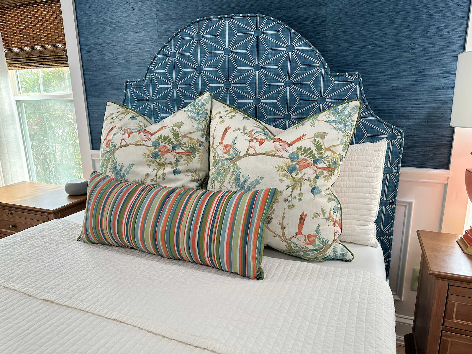
So yesterday, I laid out all of the selections I have so far for the room on my work table in the studio — the rug on the top left, the headboard fabric on the top right, the velvet drapery fabric on the bottom left, and the grasscloth wallpaper on the bottom right.

The other three fabrics are samples of accent fabric I may use for various things like pillows on the bed, although I may not use those exact fabrics. I haven’t made final decisions on accent fabrics yet, and I’d certainly want to add a teal to those colors to bring the teal onto the bed as well.

And here are those selections with the ten fabric samples that I ordered for the recliner. From left to right starting on the top row those are: celadon, platinum, spa, scuba, terracotta, peacock, blanc, mink, bloom, and coral.
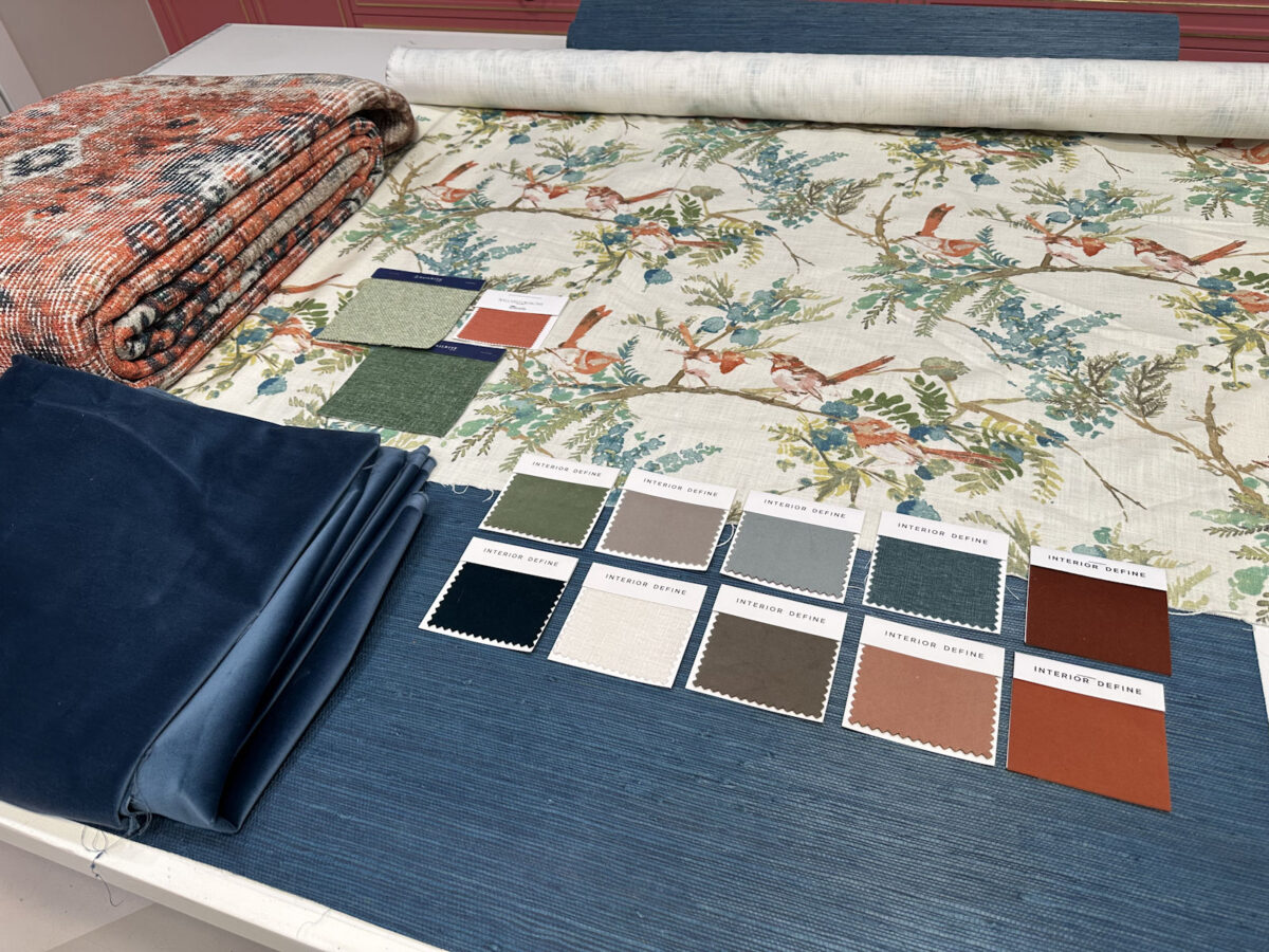
I immediately ruled out the darkest and the lightest samples. The peacock is a really dark teal, but I think I have enough teal. The blanc, while beautiful, would disappear against white wainscoting. I’d also be afraid of having something so light in color that would show dirt and stains easily.

So right off, I was able to narrow it down to eight samples.

I went back to the Interior Define website to view all eight of those colors on the Jude recliner that I plan to purchase (affiliate link). Here they are in order as they’re shown above.


Again, I have to remember that the recliner will go against the creamy white wainscoting with the teal grasscloth on the top portion of the wall. So the color I choose will need to contrast nicely with the creamy white and not the teal. With that in mind, I ruled out several more. Spa is too light. Suba is too much teal. Terracotta is too dark for my taste. Mink is too blah. And bloom is too pink.
That left me with three — celadon, platinum, and coral.

You can let me know what you think, but of those three, there seems to be a clear winner to me.

The celadon is actually the color I was rooting for the whole time. I was really hoping the green would complement the other greens nicely, and I think it does.
So I think I have a winner, right?
UPDATE: Since I don’t have a mockup of the reading corner in our bedroom, I decided to copy and paste the recliner in the coral and celadon onto the mockup I have of the headboard wall. Of course, that’s not where the recliner will go, and the scale is completely off. But at least it gives an idea of how each one would look with the selections I’ve already made.
Here’s the celadon…

And here’s the coral…

The chair won’t actually be sitting on the rug, although it may touch the rug just a bit. And now, after seeing these, I’m torn. I like both of them equally, I think. I might actually be leaning slightly towards the coral. Ugh!
The A2D Daily update for today:
UPDATE #2: I had requests for mockups with other colors. Here’s the terracotta:

And the spa:

And the platinum:

UPDATE #3: My mom made a good point (and sent a picture 😀 ). She pointed out that the room seems to be divided in two with the teal at the top and the orange/coral at the bottom. So adding a coral chair will just continue with that separation. She suggested in order to join the top teal half and the bottom coral half, I should consider using a teal chair and then adding a orange/coral and cream lumbar pillow, and maybe a throw, etc. She sent this picture…

That’s not an actual fabric swatch option from the Interior Define website. She just altered the color in Photoshop for illustrative purposes. The color on the chair below is the closest color I could find on the website. This color is called French. I just ordered a swatch.


Addicted 2 Decorating is where I share my DIY and decorating journey as I remodel and decorate the 1948 fixer upper that my husband, Matt, and I bought in 2013. Matt has M.S. and is unable to do physical work, so I do the majority of the work on the house by myself. You can learn more about me here.
I agree! For all the reasons you stated😄
Celadon
Agreed!
Agreed!
100% the green
I agree. Celadon!
I like both if your color choices but think the coral is the clear choice. The coral just pops. The celadon just doesn’t quite have the pizazz in my opinion. Bring the celadon over to the chair in a pillow as well as a pillow in the headboard fabric.
That was my idea too. My faves were the Coral and the Celadon. I thought I’d like the Celadon most, but that coral is brilliant. Put a green pillow on it. lol
Ohhhh, put a super soft celadon cozy chenile blanket-type thingie over the arm of the coral chair. 🙂
I have to admit that I thought the orange was too much orange. Now I think it looks better.
I think because the rug is so large, even though it is not going to be under the chair, your eye will go to it. It should factor in to this and I don’t think the green works, at least based on how my computer is showing the color of the rug. The dark teal recedes, so things your eyes are drawn to are the rug and the headboard…..
Definitely the coral over the green. And Ilove green.
Celadon is perfect!
I realize the color I am seeing on line is not as accurate as real life but I just think that green is too light. Yes you would be happy with it but think you will be happier with the coral color.
When I first saw all the samples I narrowed it down to two and coral was one of those two along with the teal color but then I realized it would not pop against the grass cloth background like the coral will.
GO BIG….GO CORAL!!!!
It has your name written all over it!
I really like the Celadon. The rug gives you a large swatch of coral so the Celadon chair ties the headboard, rug, walls, throw pillows, etc. together nicely in my opinion.
Yes, this.
Completely agree with the Celadon for the reasons Vivian mentioned. The coral just looks too “matchy” with everything else – at least that is how it comes across in the mock up.
#TeamCeladon
This bedroom is so different than anything else you have done. I am having a hard time visualizing the finished room. The headboard fabric is light and cheery and the walls and draperies dark and moody. Perhaps the coral chair will bring those two different vibes together. You always pull it off. I am excited to see the finished product.
That beautiful green was my immediate preference! It repeats the green in the headboard fabric, making the color pallet more balanced, nuanced and less predictable. You will have a lot of warm colors in your flooring, rug, lamps and the headboard so the green will keep it fresh, I think.
It’s celadon for me. I feel like there’s enough coral in the room already.
Coral all the way!
coral. adds a nice touch of brightness than the green, though i do like the green.
Celadon all the way! For me it was between celadon and terracotta. It is so peaceful and resting, the eyes can relax on it!
I agree–the celadon is relaxing–just the atmosphere you want in a bedroom!
I would like to see scuba in a mockup for a layered look.
Like the green myself.
Coral is lovely. Highlights the lamps.
Celadon!! It will bring the green from the headboard over to the other side of the room. It was also your first gut instinct color choice.
Although the green is so pretty with the headboard…..it doesn’t do anything with the rug. Coral — the definite winner in my opinion!
Team Coral. It adds the brightness that helps offset the dark blue. Bringing in green pushes it into a triad of color which confuses the issue. I would use green as an accent color with the main colors being the coral and blue. The green seems flat and the dark blue is also flat. The coral brightens everything up. Most of the rug is going to be under the bed so that diminishes the amount of visible coral in the room already. Maybe find a lap throw in a solid green so you can keep your legs warm in the next Texas Snowmageddon.
Love the green, too!
I agree, the Coral “sings” with the rest of the room. The Celadon just kind of sits there and looks lost. 😅
I loved the coral from the first minute but seeing the mock up I like the green because you don’t have a large piece of green like the other colors. I think it makes the headboard pop.
The coral seems too match-y to me. I vote for the green.
I like the green the best because it adds color and saturation balance to the flooring and the walls. The coral color is lost with the rug. I love how it is all coming together for you!
I have to admit I was rooting for the celadon . . . until I saw the mock ups on the rug and I quickly changed my vote to the coral!
Coral would be my choice.
Both are wonderful choices! As I was scrolling to your final choices, the celadon chair made the room seem “soothing, ahhhh, peaceful”. Then I scrolled to the coral chair which made the room “come alive and awakened”!
I can’t wait to see it all come together!
Dear Kristi,
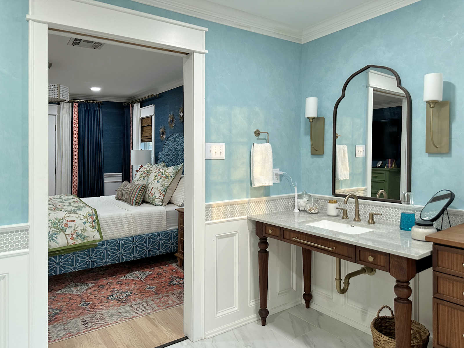
Keeping the bedroom suite in mind, the three spaces, I’d like to see the spa color in a mock up of your bedroom. Isn’t spa pretty close to/coordinates with your closet wall and cabinet color?
A lighter blue would also tie into the bathroom mural. I’m just trying to imagine the three spaces as a whole. Right now, to me, the bedroom is quite a bit different than the bathroom and closet.
Perhaps you have other items and accents that you are planning that will bring about a harmony and unity for the three, really four (foyer) spaces of your bedroom suite.
All your rooms come together beautifully in the end. I know you’ll get there.
Thanks for sharing the journey!
YHWH Bless You : )
Even if I put spa on the chair, it wouldn’t be visible from the foyer. There’s no way to see the chair and the closet at the same time.
I did a floor plan with all of the selections for the various spaces to show how they flow together. I think it looks nice. You can see it here: https://www.addicted2decorating.com/wp-content/uploads/2025/02/master-bedroom-suite-floor-plan-with-color-selections-clear-vista-in-the-closet.jpg
I was thinking the coral but was wondering if you are putting up coral drapes.
The drapes will be dark teal velvet.
I love the celadon as well, but based on the last picture with the headboard and rug I would go with the coral. Can’t wait to see it come together.
I don’t usually like neutrals, but in this case I like the platinum best for the chair. The celadon seems a little too light (in the pictures, at least) to go with the darker blues and the coral is too much with the rug. The platinum is a pretty neutral that is dark enough to be grounded and not compete with the walls or rug, but not so brown as to be boring.
The celadon would be calming, which I always like in a bedroom, and it would probably become somewhat neutral and take up less visual space (like a plant). Then add a nice back pillow with teal and coral. The coral would continue the secondary color of the room and connect with the floor. Not sure if it would equalize amount of coral with the primary teal color, though.
One thought, if you widen the shades and hang them under the drapery rod, you can keep them lowered a bit to hide the space between the drapery rod and window trim. That way your windows look taller.
Coral for sure. There is not enough green and the recliner in green just does not go with the whole color scheme
I would love to see a mock up with the terracotta. I like the coral but for me, and it is not my room, I would want a color that is a rich as thecurtains. Coral isnt.
Oof! Thats tough! There are so many beautiful colors to choose from! I know you said it’s too dark, but I wonder if the Terra Cotta would connect with the warmer, darker window treatment. Or another dark brown that is close to that dark element.
Then, the light colored wood of the furniture and the chair aren’t trying to fill the same place in the spectrum of colors. (I’m sure there’s a better way to say that, but do you know what I mean? They’re both a lighter, neutral-ish color in the middle of the spectrum, compared to the darker blue and white at opposite ends.)
Any chance you’d consider mocking up the darker chair?
I like the platinum, but then I like the mink too.
Team cora! The green kinda clashes with the rug. IMHO
Celadon 🙂
Personally, I like the green as it seems calmer to me and brings out the green in the headboard while complementing everything. The coral is too matchy matchy in my eyes. Whatever you choose will be beautiful, I have no doubt.
Celadon!!! I agree with your initial assessment. Celadon is the clear winner for me.
The coral disappears into the rug.
Your room is going to be so beautiful!!
I was team coral from the beginning! It’s lovely and works to balance the room.
To me, the celadon looks calming which is what you might think of for a bedroom and a calm space. The coral brings an energy and brightness to the room . . . and I love that too! You can’t go wrong with either one!
The coral is warm and inviting you in to sit, the celedon doesn’t pop enough to notice. Interested to see which you choose. There is certainly a “wow” factor with the coral.
Celadon is my choice!
Team celadon for me. There’s lots of coral in the room already that a coral chair might be too much. Go green and add a pillow made with the headboard fabric to tie it all together.
Agree, celadon makes headboard fabric pop! It gets lost all the teal and coral
Definitely the coral. The room pops with this chair. Can’t wait to see what you pick.
My initial choice was the celadon. But after seeing the coral, I’m liking that one too! Either one would look great. Perhaps which ever you choose, you could add a throw in the other color?
Definitely casting a vote for Celadon! I thought the coral was going to win at first, but seeing the chairs in your updated mockup the coral melts in with the rug. I know they won’t be that close together, but the green has such good contrast with the walls and rug!
Celedon for me- with an accent cushion made with the headboard fabric. I do like the coral, and know that it is for an accent chair, but I think there is already a lot going on with the texture from the grass cloth, the headboard pattern and rug. I think the celedon will be a calming cocoon to snuggle into and relax
Oops- celAdon…can’t go back and fix my typo!
Personally, I luv the Terra Cotta. The dark blue velvet curtains against the blue wall covering give a nice ‘weight’ to the room behind and against the lighter headboard fabric and rug, and I see the dark of the Terra Cotta as providing same weight balance further out from the bed and rug, and against the light wainscoting. (Hope I’m making sense.)
Coral chair, and add a good-sized lumbar pillow of your headboard fabric to echo that pattern across the room. Add a welt or cord to the pillow, of teal or green.
You have a lot of deep, saturated colors — coral chair will brighten up this otherwise featureless far corner of the room
Hi Kristi – love reading/watching your updates on your DIY projects!
Just my two cents – I was team coral until I scrolled down and saw the chair in TerraCotta.
The room will have a lot of saturated colors, and to my eye the Celadon color, while giving calmness, doesn’t carry it’s own ‘weight’ if that makes sense. And my eye went to the headboard and was trying to figure out if the greens go together.
I do still like Coral, and it brought my eyes over to the birds in the headboard, and then down to the run. However it competes with the stunning lamps which are ‘jewelry’ in the room and they should have their own moment.
When I saw TerraCotta, it gave me the warmth that I liked about the Coral, the weight to carry it’s own moment against the dark walls/curtains, and still relates to the rug and headboard, but doesn’t compete with them.
coral
Celadon, with a coral throw, ir a reading lamp with a coral shade.
The green one. It will be sitting mostly alone in the corner, with nothing around it to balance it, so I feel the coral would be too much.
But if you are going to have pictures over it, or maybe a small table next to it, I’d say consider those first as well, before the final decision.
in my humble opinion, the coral mockup makes the room so much brighter than the green. Love your mockups as illustration. Good luck making your decision.
This is actually harder than I thought. First I thought the green, then saw your updated mock ups and wow, the terracotta looks really good, followed second by the platinum. Aarrgghhh….so hard, but if I had to choose right now, I’d choose terracotta. It has a nice ‘grounding’ feeling to all the other colours to it.
They are both good but the coral is fabulous! Use the green for accents!
Celadon! That’s the one that was rooting for. The coral is lovely, but the rug has plenty of it already. Just my 4 cents. (Adjusted for inflation)
I agree with Mama Bear!
Either celadon or coral work. Celadon is restful, but not so great with the rug. The rug design is pretty dominant so it should be acknowledged for its degree of influence.
Coral is good with the rug — an easy choice, but to my eye, terra cotta offers the depth the room needs. (Terri already explained the conclusion I came to.) It seems to me that the headboard is the focal point of the room. The room has plenty going on, as is. There is no need to liven it up with a color (coral) that steals the thunder. So, if you choose terra cotta (I doubt you will. :)) and add a celadon throw and it would be perfect.
Realistically, you will add many decorative things somewhere else in the room: in accessories, or on the wall. The sleek look you are displaying to us will not likely be what you will end up with.
It was fun weighing in.
Celadon was my choice until I saw your Mom’s. Mock up and I really like that the best
Celadon, my favorite!
Relooked at mock up and the one item that seemed to throw off the “feel” and balance of the room was the drapery material. It’s too dark with the teal behind it, but in person it might look different. While it’s a beautiful fabric, it takes away from the light airy look of the headboard and the impact of the grass cloth
I think your mom is right! (Update #3)
I was all set to defend the Celadon, to avoid the “weight” of too blue or too coral. I feel like both of those colors are equally balanced, so I will therefore vote to bring in some green from the headboard with the Celadon. I would avoid the blue, because there is already a heavy weight of blue. I would have opted for Coral drapery, to contrast with the grass cloth, but I think that ship has sailed.
I very much see your mother’s point, though French looks like it’s a bit too blue with not enough green in it. If it doesn’t work out, I think the celedon looks fine and you can put a nice coordinating pillow with a teal throw on the arm of the chair.
I love the celadon, but given your knack for evolving spaces and the price of these chairs, I’d lean toward something more neutral. The platinum would make a lovely base for a colorful throw or lumbar pillow.
My clear choice was Caledon…then I saw French and I’m really attracted to that. It pulls towards the blue in the rug without being the same color and it also harmonizes well with all the other colors too.
Even after all the updates, I like the Celadon best by a long shot. The coral is too much like the rug/on the same field of view, and the teal or french blue is too predictably matchy matchy. Safe. The green doesn’t have that furniture store feel that the blues do! And it looks lovely with the existing colors. My 2 cents 🙂
I personally like your first choice of the celadon. Using the rule of three (repeat a color three times in a room) the teal and coral are each repeated three times already. Teal in the drapes, wallpaper, and headboard. Coral in the rug, lamps, and headboard. The celadon would give you another color way to use, and a transition between the top half being primarily teal, and the bottom being primarily coral. I’m no designer, so it is just an opinion. I think any of the colors will be beautiful, but my vote is for the celadon.
I agree with your mom!!! I instantly thought the green wasn’t the right choice especially because the carpet has no green but does have blue. The green in the headboard is too subtle and far away from the chair to create continuity. The orange chair is too matchy matchy. I really hope that blue works when you get the sample. The punch of orange in the pillow brings everything together!! And by the way I’m kicking myself for not giving my opinion on your closet color at once. When I saw the wallpaper you chose my initial thought was powder blue! I didn’t want to be a party pooper so I didn’t say anything at the time but I’m thrilled you came to that conclusion yourself. I’m so excited to see all these plans come to fruition! You’re amazing Christie and I love watching you create.
I agree with your Mom…however, it is not my room or chair and I also like the terracotta best! You have always chosen what is best for you and your rooms are beautiful. Good luck in your efforts to choose perfection.
I thought of the coral color right away, and liked how beautiful it goes with the lamps and rug, and how it woke the bedroom up. However, after your mother’s mock up of the color French, I really liked the sense of sereneness it brought into the room. I also agree with your mother about tying the 2 sections of the room together.
I liked the coral best too, but what your mom did was very nice too. I was thinking the chair is on the other side of the room, so it would be nice to bring that pretty coral color in over there too. I know – it is SO hard…but I will love which ever way you go. And it will be your sanctuary so that is what matters!
PS) I’m loving that chair and fabric—I sent for some samples too. If I wind up ordering do you get some credit. I would never have found that except for you!
My favorite is the coral!!!
I know I’m late to the party, but it has been fun reading the comments! I can’t wait to hear the totals, and almost wish there was some kind of a ticker to record votes. I have a hard time with colors, so usually just go matchy-matchy. Intriguing that 2 such different colors would elicit such strong reactions. Thanks for the insight to your decision process. Can’t wait to see the final. Aloha!
I was rooting for green but the darker coral got me with the rug, so that’s my choice unless you find a slightly darker green. Blues are pretty to but I think you need a pop of that darker coral. I’ll be over with my book to try it out.
Good luck.