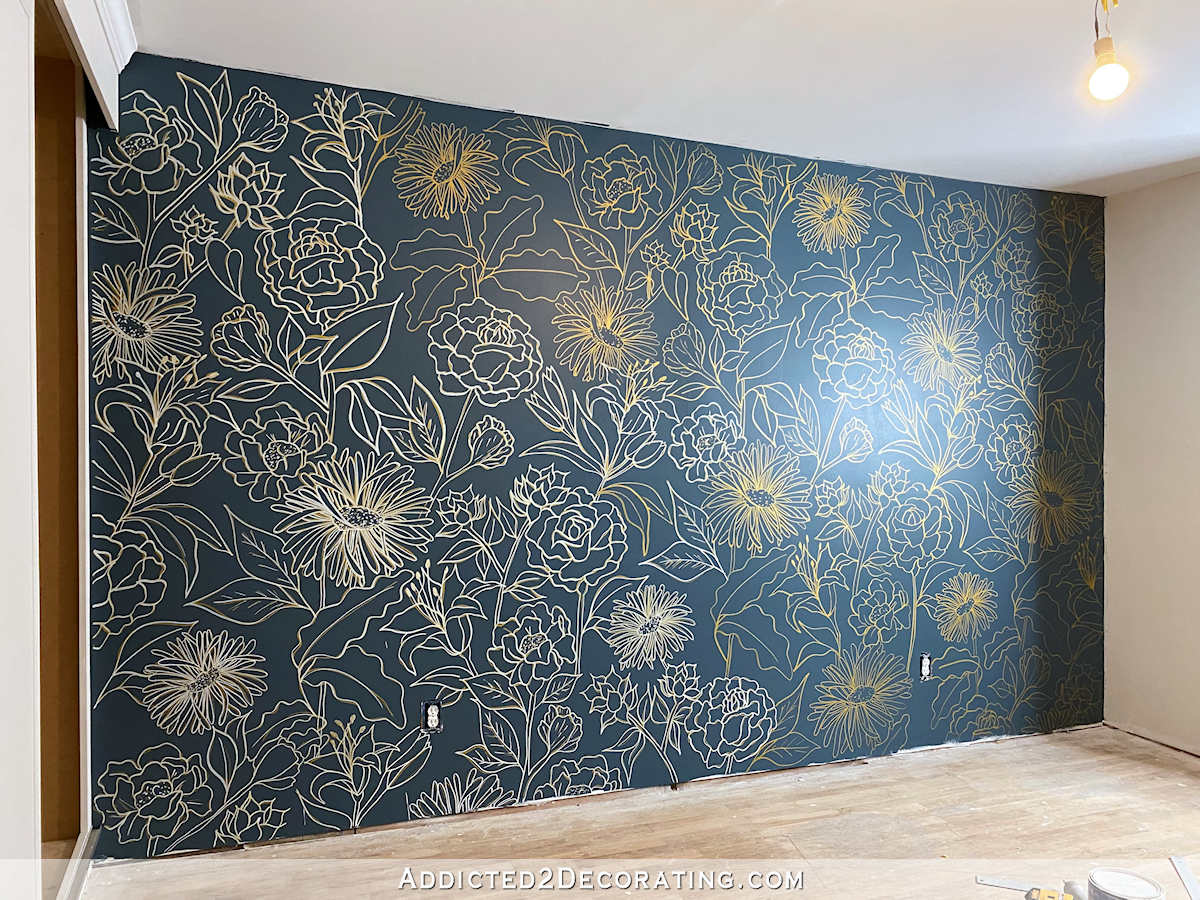
Guest Bedroom — Wallpaper Samples Arrived!
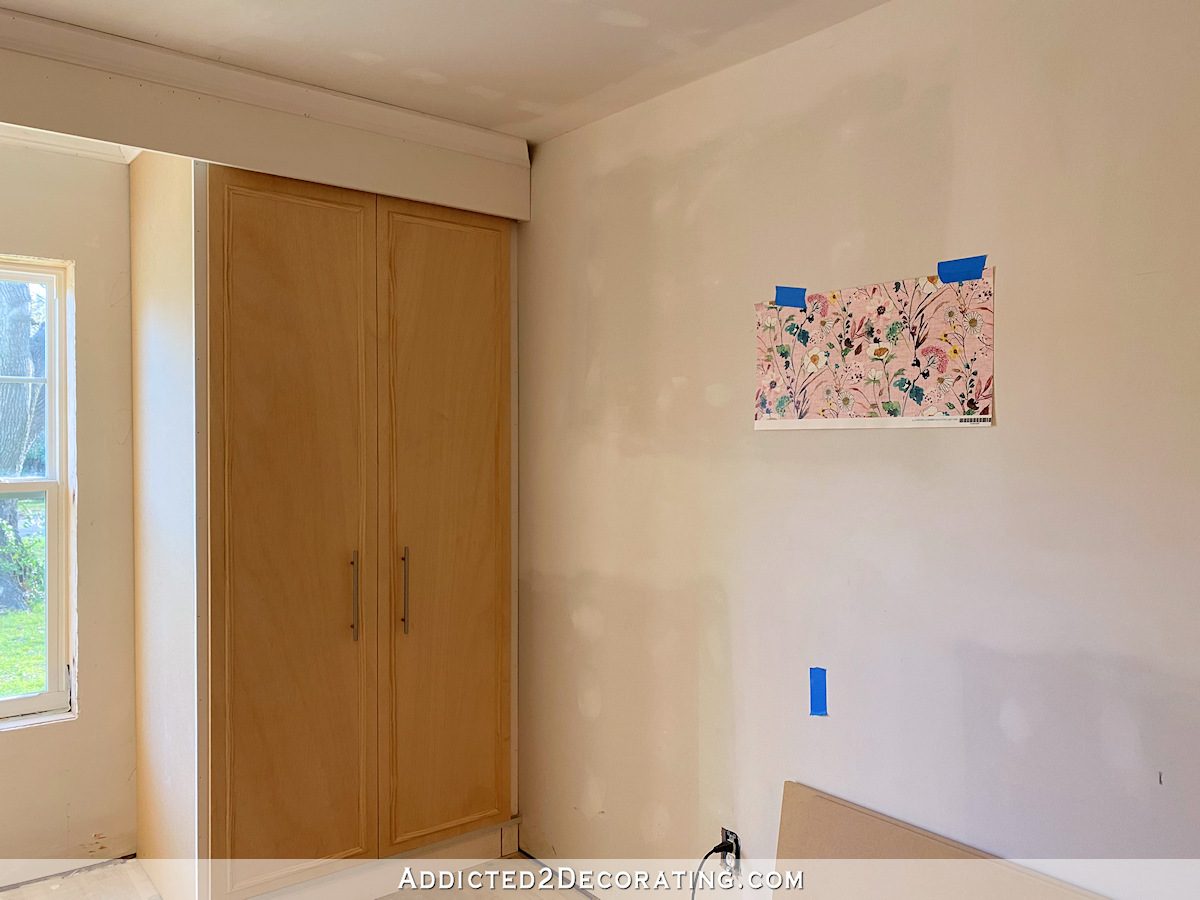
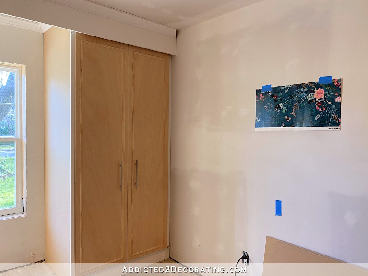
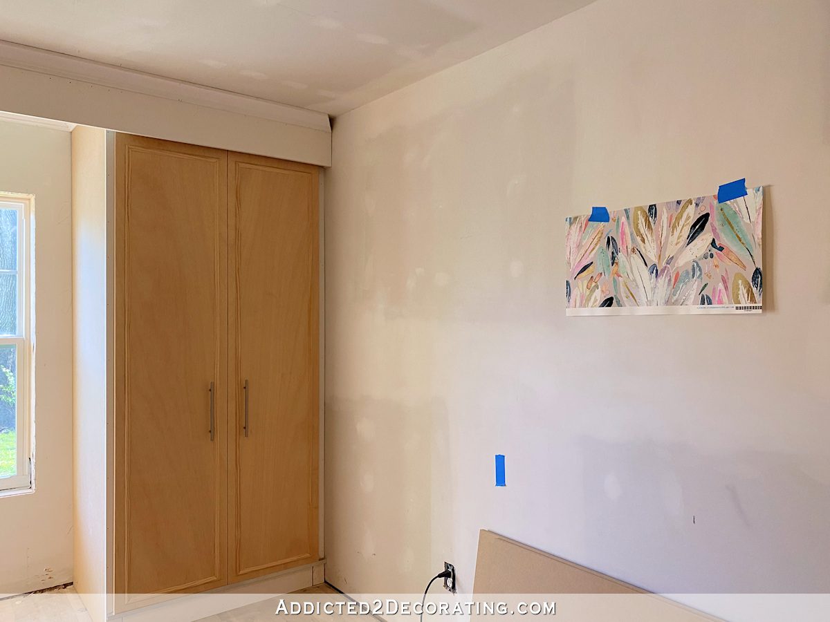
Yesterday was a very good day. First, I arrived at my mom’s house and inspected the cabinet doors and found that while some of them needed additional sanding (since the moisture raised the grain of the plywood), none of them were ruined. So I was able to start painting the doors yesterday! And then when I got home, I found two packages from Spoonflower on the front porch. My wallpaper samples had arrived!
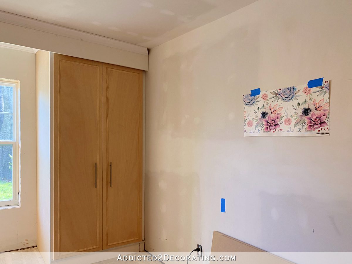
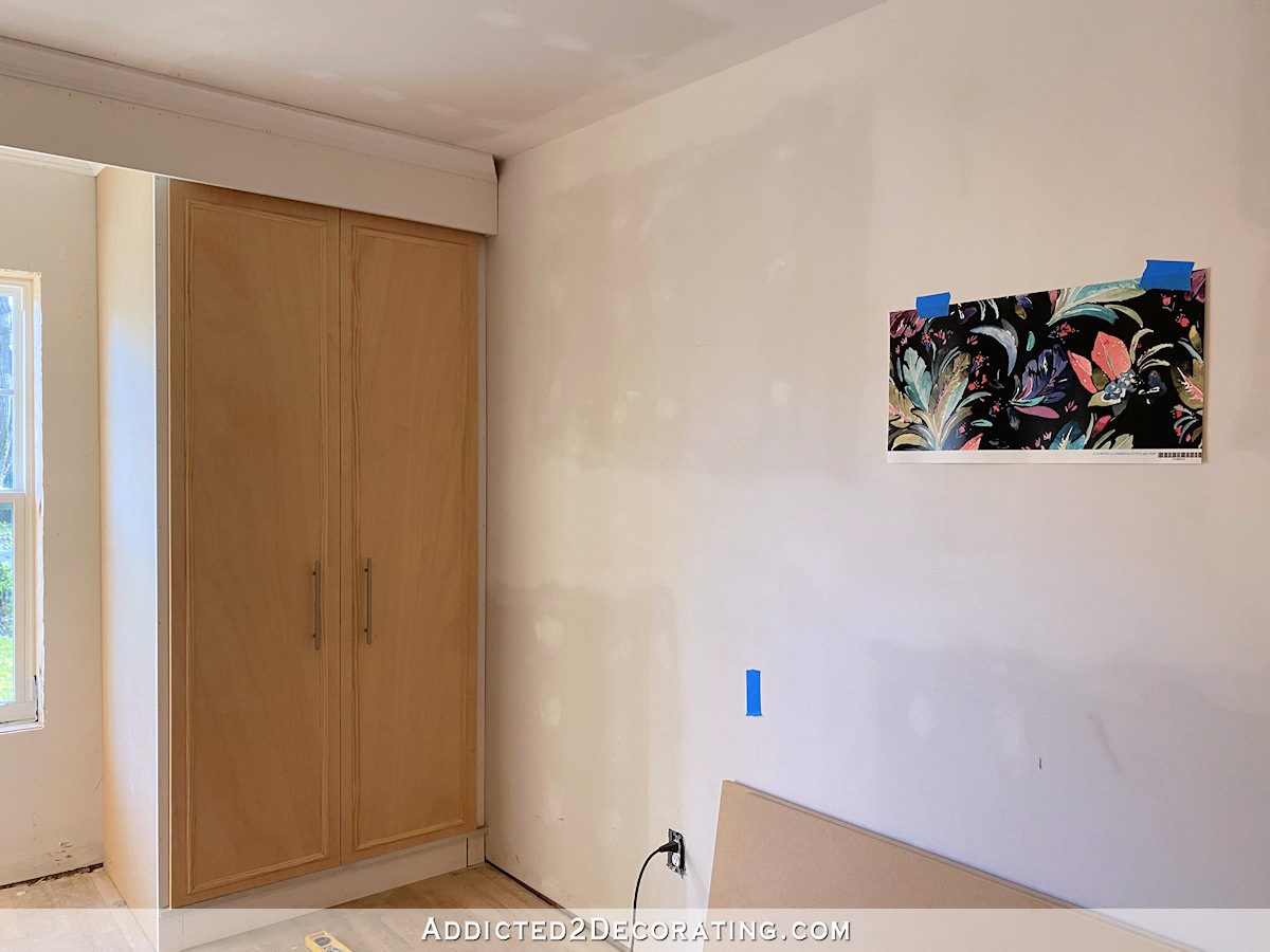
I put each sample up in the guest bedroom and took pictures. You really have to use your imagination because everything in there is still drab and unfinished. But I needed to these wallpaper samples before I could make a decision on the paint color. And as I considered each of these sample, I also tried to imagine (1) what wall color I would use in the rest of the room, and (2) what color I could use on the upholstered headboard in front of the wallpaper. So let me show you the samples I ordered.
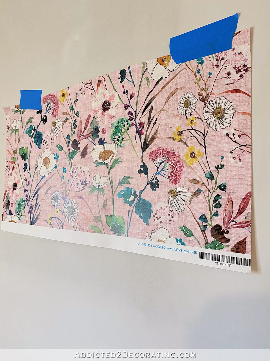
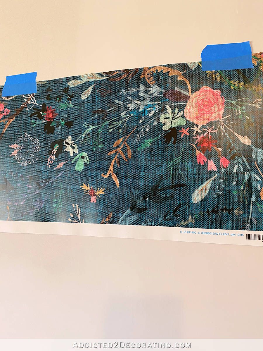
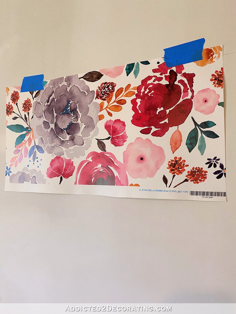
Verdure Wildflowers – Blush
Here’s how this wallpaper looked in the pictures on the website…
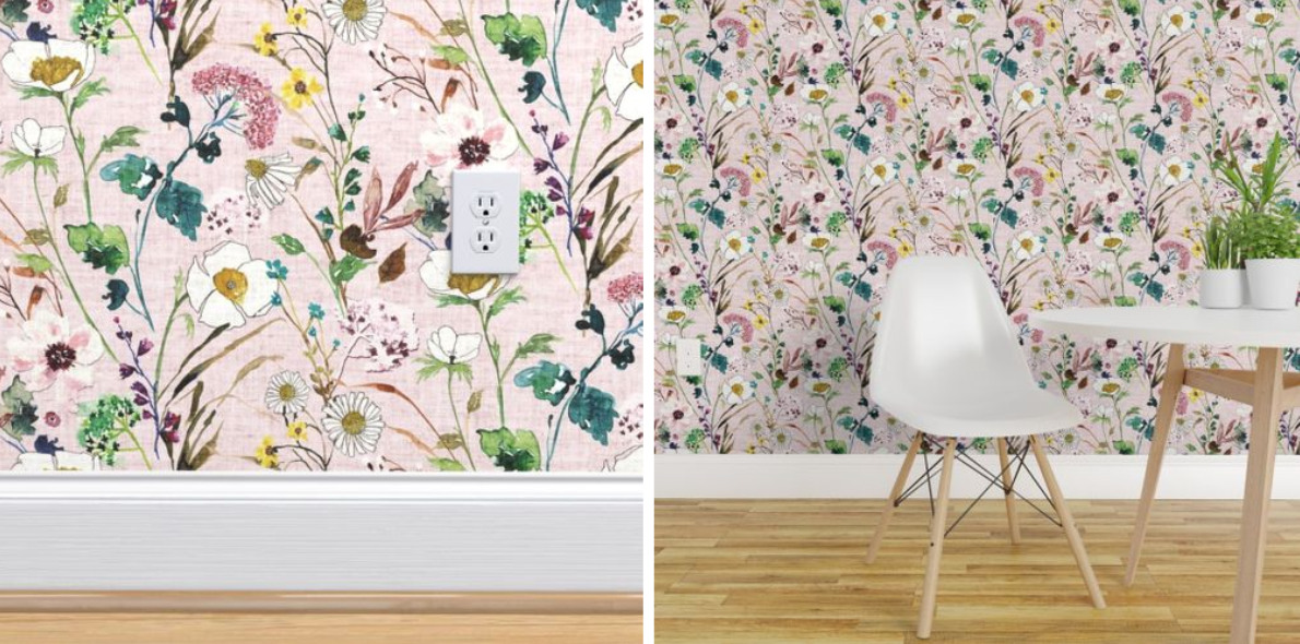
The actual sample in the room seems to have a bit darker background, so the pink is more pink than the pictures on the website.
And it has this gorgeous linen texture look to it that wasn’t apparent in the website pictures…
If I used this one, I think I’d actually paint the rest of the room a very soft pink, and I’d probably do the headboard in either the dark pinkish red color or the turquoise color.
Fable Floral – Teal
Here’s how this one looked on the website…
I thought that this one might be my favorite just based on the website pictures, but in person, I think it’s too dark.
Also, the website pictures made it look like it had a linen textured look, but in reality, it’s more of a heavy woven fabric look. I’m not really a fan of that particular textured look.
I ruled this one out immediately based on the texture, so I didn’t even consider the wall and headboard colors for this wallpaper.
IBD Falling For You
Here’s how this one looked in the website pictures…
It looks pretty identical in person and in the room.
I love this wallpaper, but I don’t think I love it for a guest bedroom. I think it’s the stark white background that makes me think it would be better for an office, breakfast room, or bathroom.
So I ruled this one out also, and didn’t consider wall and headboard colors.
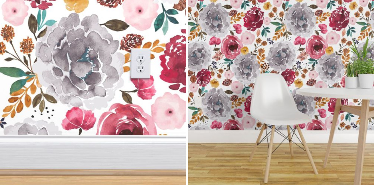
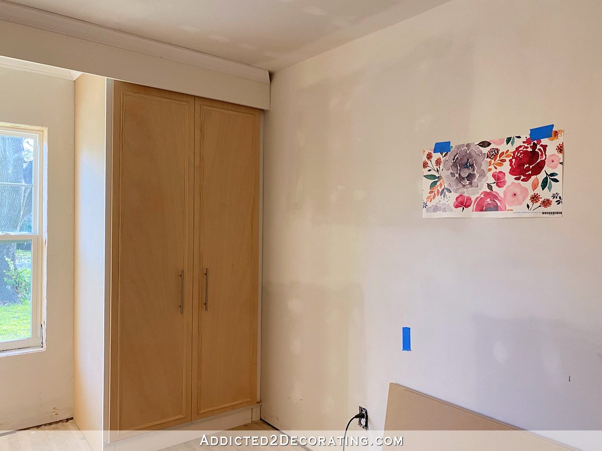
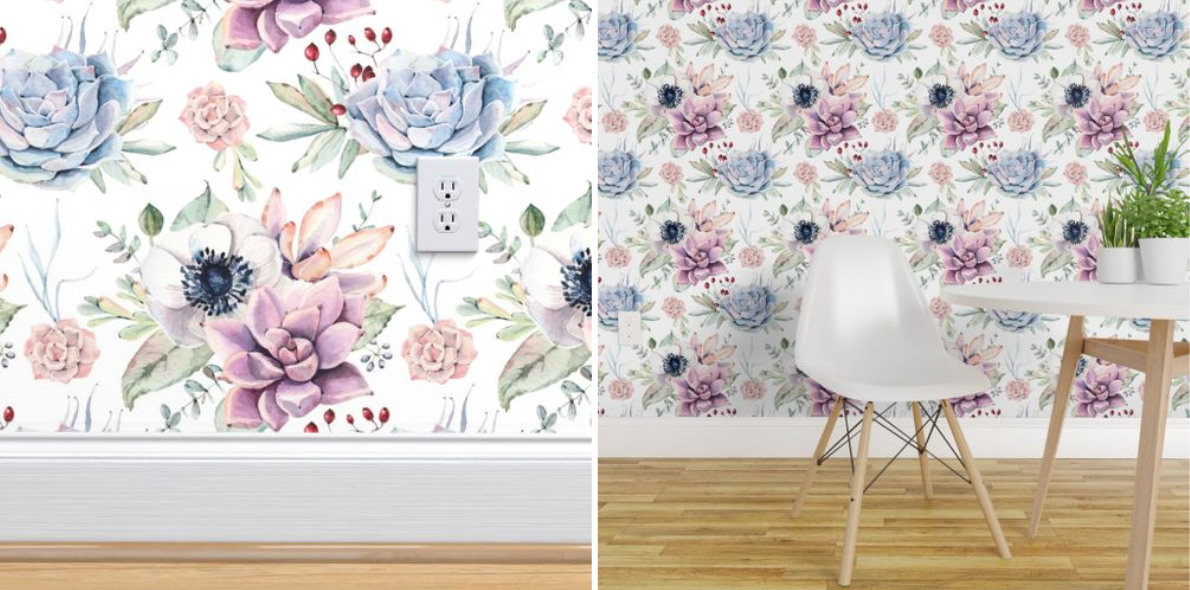
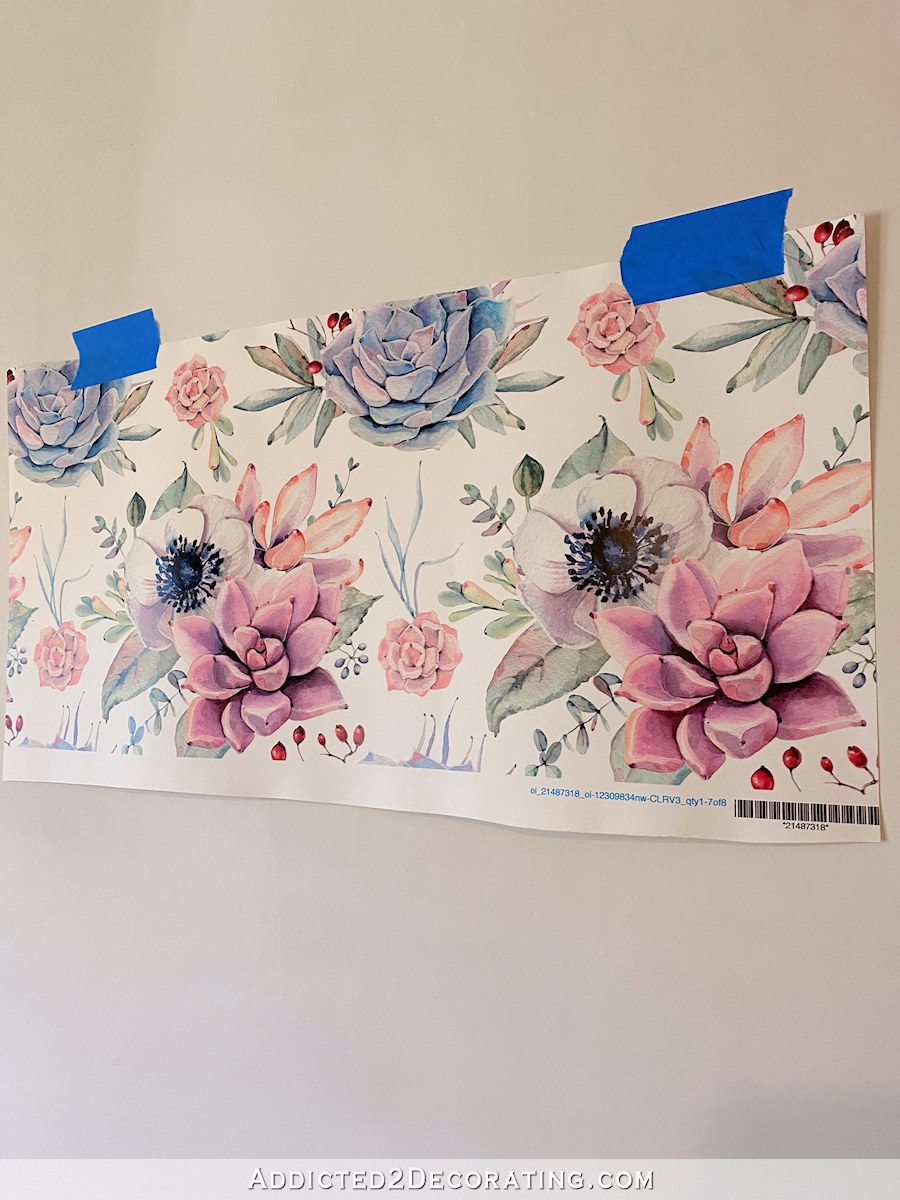
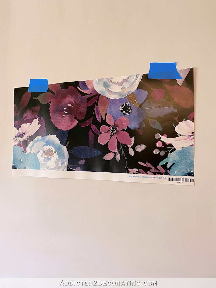
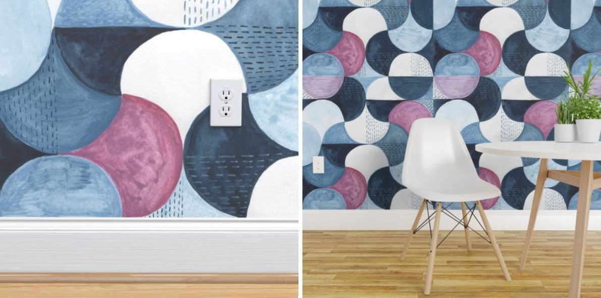
Watercolor Succulents and Anemones
Here’s how this one looked on the website…
And here it is in the room. The purples look a bit more reddish-purple in person, but the colors are gorgeous.
What I don’t like is that there are two pattern repeats per width of wallpaper. I’d much prefer a larger scale with one repeat per width. It also has a white background, which I think I’d prefer more in an office, breakfast room, or bathroom.
So I didn’t consider wall and headboard colors for this one either.
Feather Leaves Pastel
This was one of my favorites based solely on the website pictures…
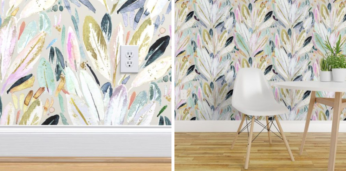
And in person, it remains one of my favorites.
I love that the background color is almost identical to the Benjamin Moore Classic Gray paint color that I have throughout our house, including on the striped hallway walls, the stenciled music room walls, the living room walls, and the breakfast room walls.
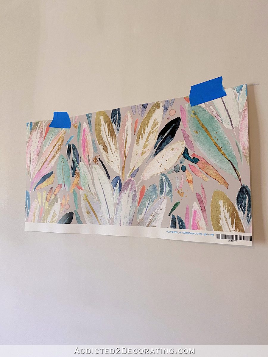
With this wallpaper, I’d paint the rest of the walls Benjamin Moore Classic Gray, and I’d probably use that really dark blue/teal color on the headboard.
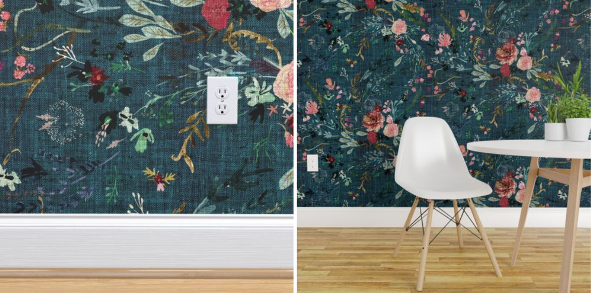
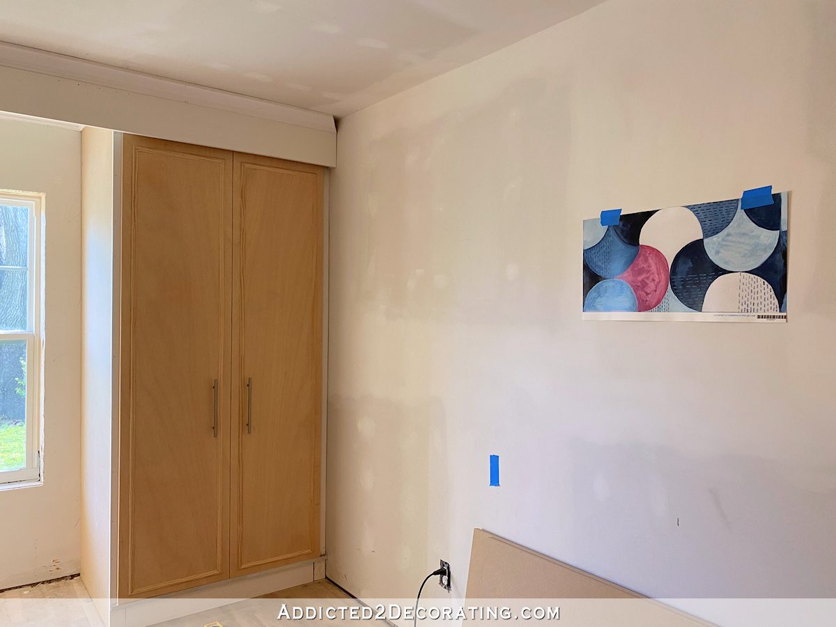
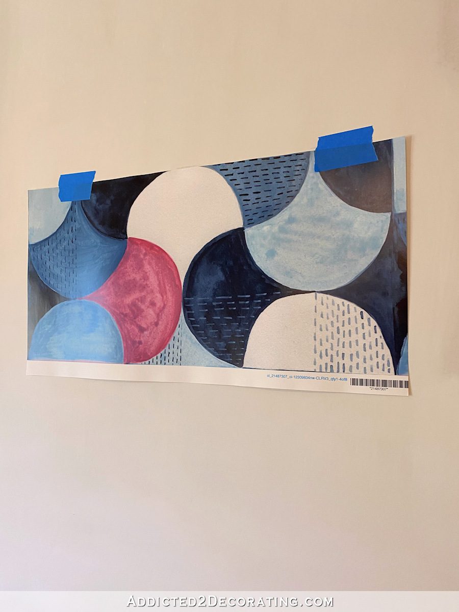
Moody Midnight Floral
Here’s how this one looks on the website…

And in person and in the room, it looks pretty much the exact same.
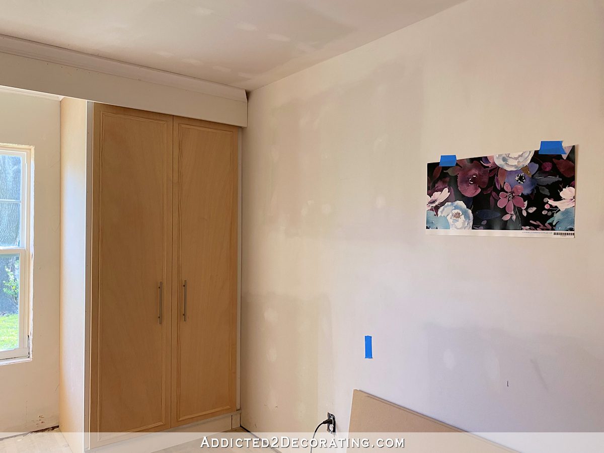
I love this wallpaper, but it seems like a departure from the rest of the house. It’s still in my top five favorites, though. Does a guest bedroom need to coordinate with the rest of the house? I have mixed thoughts on that.
If I were to use this one, I’d probably use a very light version of that bluish aqua color on the walls, and a darker version of that same color on the headboard.
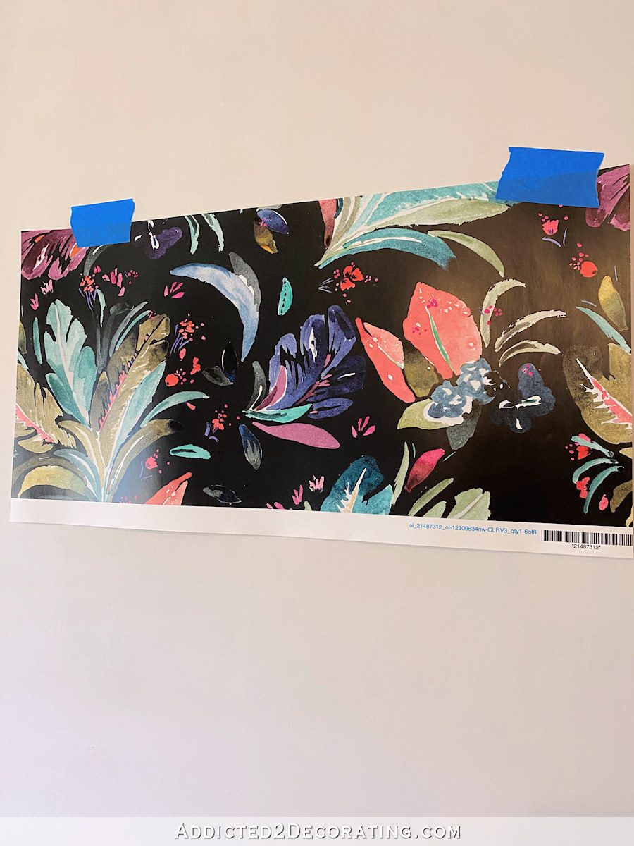
Hawaiian Leaves
This was in my top five wallpapers based on the pictures on the website…
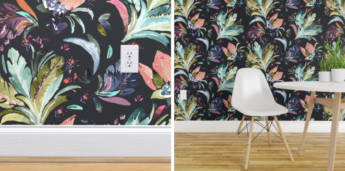
But in person, it fell flat for me.
I can’t really put my finger on exactly why I don’t like it, but I ruled this one out.
Chevron Blush Navy
This was one of Matt’s favorites based on the website pictures…
The colors look just a tad bit more saturated in person and in the room…
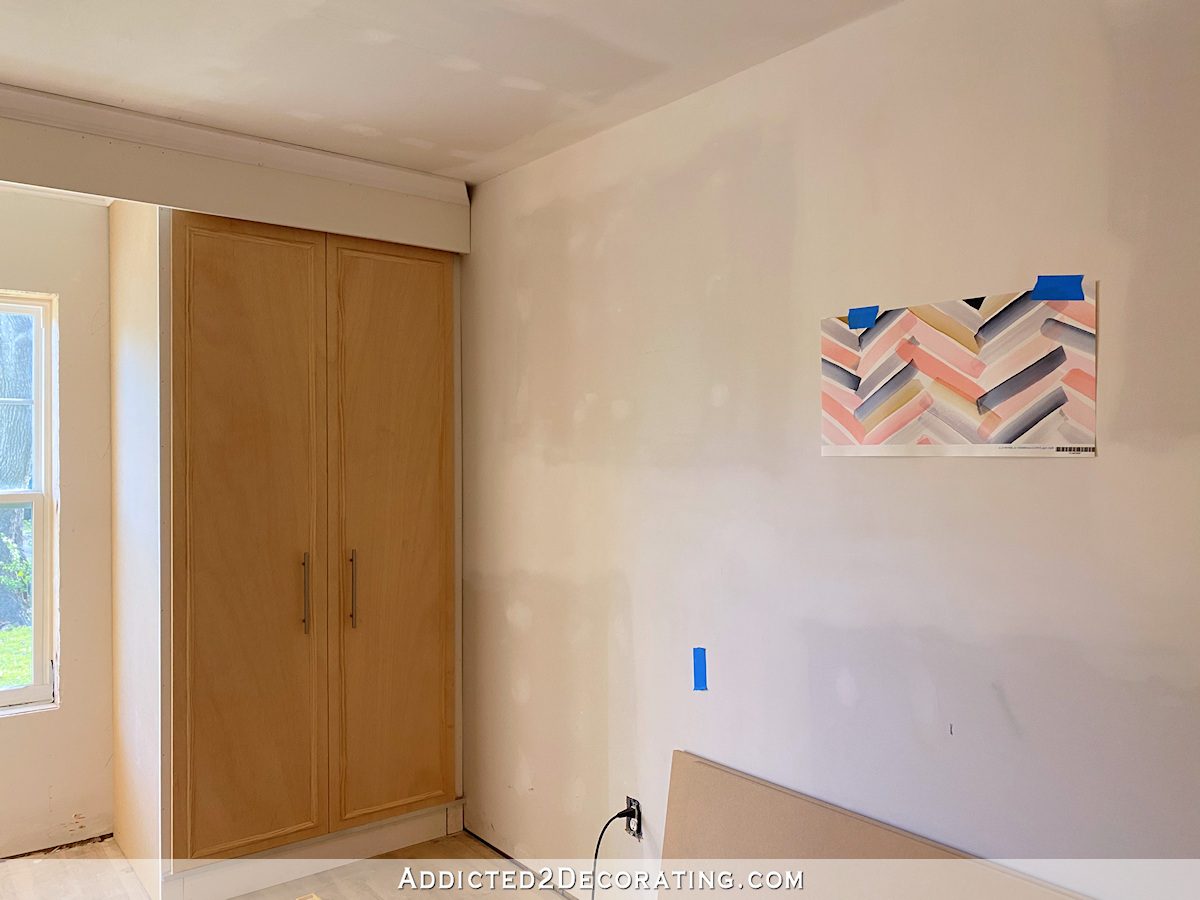
This one is in my top five.
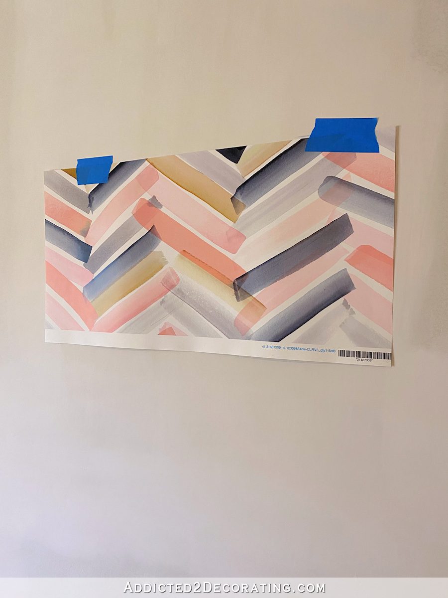
If I were to choose this one, I’d probably paint the walls in a super light pale pink to coordinate with the lightest pink color in the wallpaper, and I’d do the headboard in that darkest blue color.
Watercolor Pattern
Here’s how this one looked in the website pictures…
And here’s the wallpaper in the room…
It’s definitely darker in person. I really like this wallpaper, but I ruled it out for the guest bedroom.
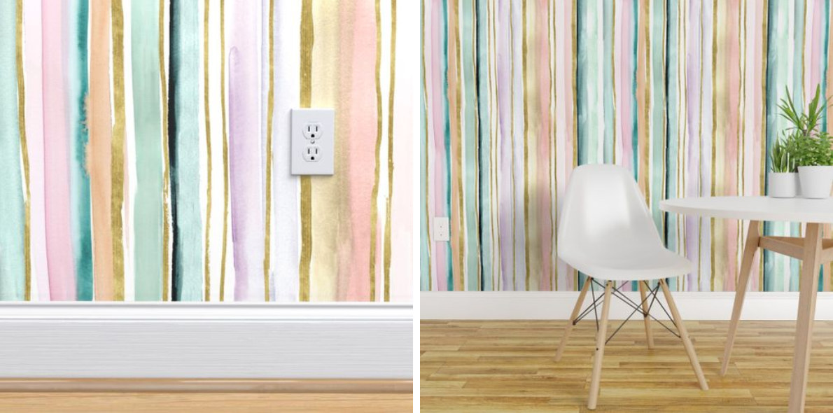
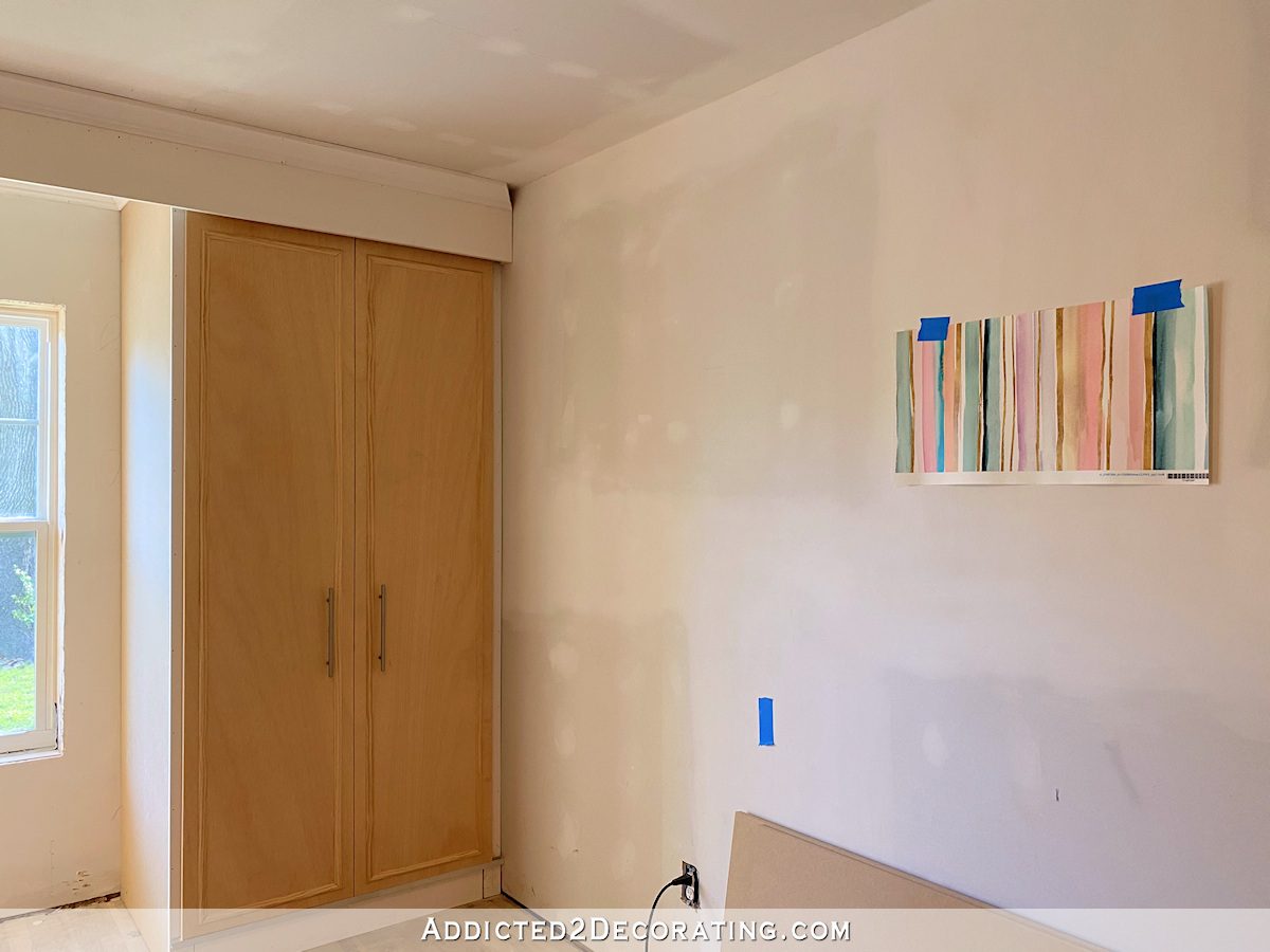
Daydream Stripe
This one was Matt’s favorite based on the website pictures…
And here’s how it looks in the room…
This is definitely a top five wallpaper for me. I love that watercolor look.
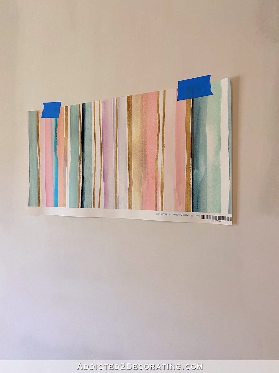
And it also comes in a horizontal stripe. I prefer the horizontal stripe to the vertical stripe. For some reason, the vertical strip seems more appropriate for commercial use, and the horizontal stripe seems more appropriate for home use. Don’t even ask me to explain why that makes sense in my mind. 😀 But ever time I see that vertical stripe, it seems like a commercial wallpaper to me.

With this wallpaper, I’d probably paint the walls a super light blueish aqua color, but I have no idea about the headboard color. There are certainly plenty of colors to choose from!
So of those ten samples that I ordered, these are my top five.
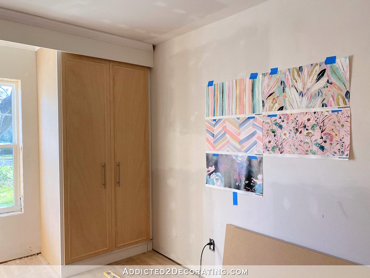
And from there, after hanging the top five up on the wall together, I was able to narrow it down almost immediately to my top three — the top left stripes, the top right feathers, and the bottom right flowers. The bottom left floral is so beautiful, but it does bother me that it seems like such a departure from the colors I’ve used in the rest of the house.
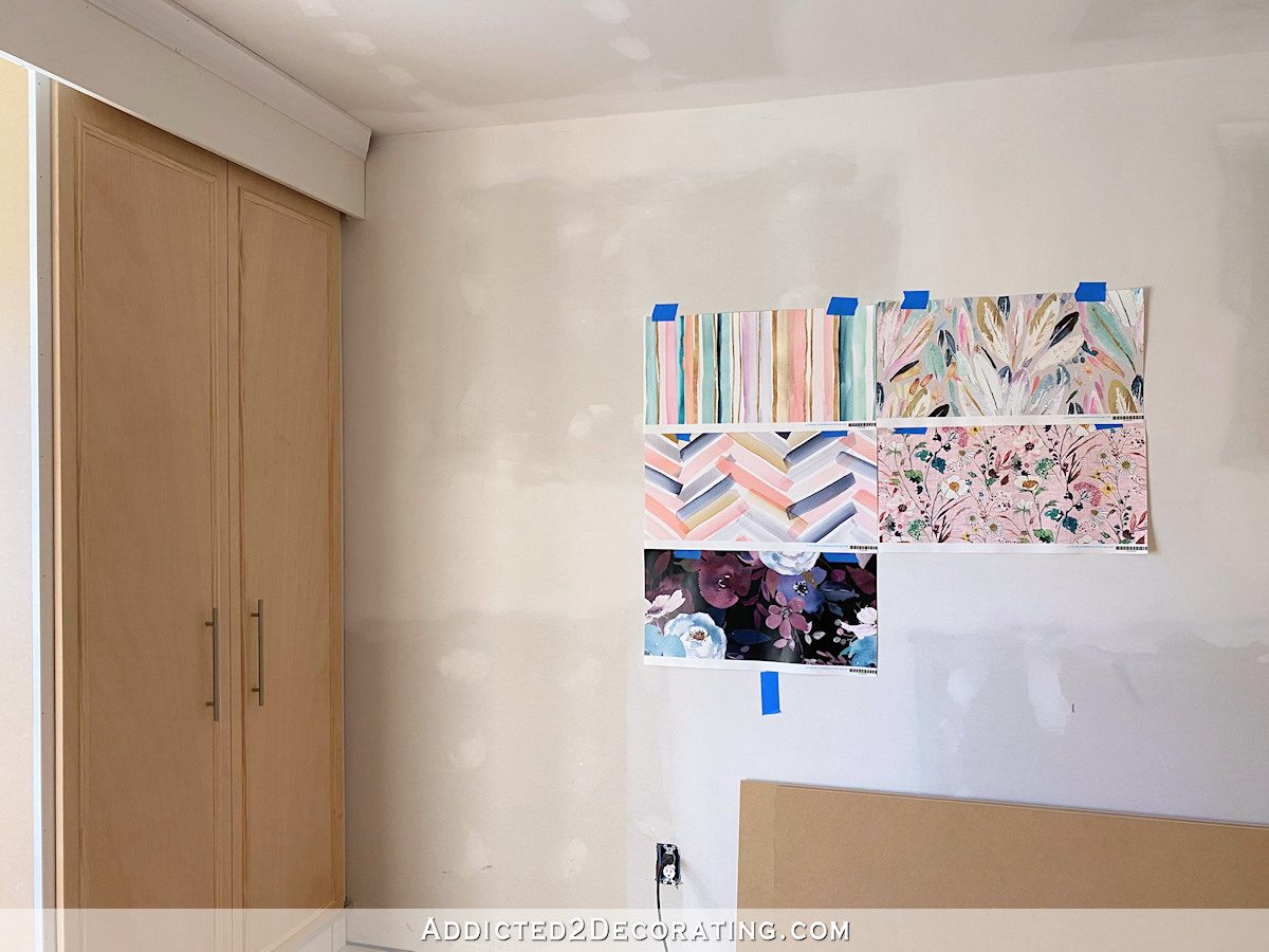
But once I narrow it down to those three, I can’t seem to narrow it down to my favorite. I love all three of those, and I think any of them would work. Perhaps it’s time to blindfold myself and throw a dart? It might come to that! 😀

Addicted 2 Decorating is where I share my DIY and decorating journey as I remodel and decorate the 1948 fixer upper that my husband, Matt, and I bought in 2013. Matt has M.S. and is unable to do physical work, so I do the majority of the work on the house by myself. You can learn more about me here.
I really like them all. I’m surprised how much I love the super dark floral, too. So pretty! Now i’m wondering if I should do that in my bedroom! Can I even consider wallpaper if my walls are currently painted with an “orange peel” texture? :/
Stripes or Feathers. The other one is to pink for my taste, but that is my taste. My other reasoning is that florals are predictable. Stripes and Feathers not so much. Good luck choosing, can’t wait to see what you decide.
I’m with you
Me too (the super dark floral). I didn’t consider the departure from the other colors in your house as it has the purple and pink you’re doing in the living room, and what looks like the blue of your cabinets in the kitchen. It’s sort of felt like it brought all the most intense colors in the house together and put it on a deep background. But you’re right that the overall impact of the dark wall is very different from the lighter background you have going on. Love them all. Great choices.
I like the feathers. They seem light and airy. Calm and serene. Cosy and comfortable. I would look forward to relaxing in soft warmth it exudes.
So fun!!! Whatever you pick will be beautiful! I’m leaning toward the feathers. It seems like it would lend itself to various other patterns (floral or stripes or any other pattern) and not compete. I feel like it gives the wall some movement too!
The feather one seems to me to be sort of halfway between the other two in terms of look/feel. Not as naturalistic as the flowers but still a more organic feel than the stripes, with interesting shapes.
I vote for the feathers.
Loving the Feathers Kristi, and Laurie and Krys’ thoughts about having the stripe as a fabric for pillows / cushions.
And a dark teal or dark aqua headboard will look stunning with it. Can’t wait to see which way you decide to go; but whichever …….. the end result will be amazing. Go you!!
The two on top seem to have a lot in common, color-wise. A person could use both, carefully, in the same area.
I thought the same thing & would love to see one pattern as wallpaper & the other as a fabric. Maybe as an accent pillow or throw on the bed.
Feathers. All. The. Way! I think the wall color with a dark teal headboard will be absolutely gorgeous!
I’m with you Maggie. I like Feathers with pale gray wall color and dark teal headboard. I like that Feathers is a bit more masculine than flowers, and it picks up the closet door color.
I disagree with using more pattern. The wallpaper is bold enough. That’s my two cents!
Feathers all the way!!!! For the same reasons as above
I’m on the feathers team too! Seems like the perfect fit!
I love the watercolor stripes. Is this going to be on a focal wall?
I think my favorite is the feathers one because it immediately said “Kristi” to me. So many colors you love to use in one great design! That said, the top 3 are all great so rest assured you can’t go wrong 😉
Hi Kristi,
All of these wallpapers are gorgeous, but the floral with the pink background is my favourite. You mentioned having either a turquoise or dark pink headboard. I think that would be beautiful. I love your style and look forward to seeing what you choose.
Have you considered a black upholstered headboard–would pop on any of your favorite wallpapers!
Hi Kristi, hard choice! Love the colors in the stripes but I instantly thought child’s room when I saw it, even horizontally. My absolute favorite is the flowers but not for the guest room? The feathers has the colors, the gender neutral pattern with that touch of black for class and masculinity. An opportunity for a few black accents? Also feathers are more original than flowers or stripes. In my humble opinion… whatever you pick will look gorgeous because it always does! 😍
Agree, feathers one all the way! Then the horizontal stripe, then the floral.
I love the first one as my favorite and the last one as my second favorite. I agree that the horizontal strips look nice. I don’t like any of those between 1 and last. But it is your home so go with what makes you happy.
Like them all but the feathers speak the loudest to me.
Well it looks like I know how I am going to do my home office come fall…. And I pick the feather option for you. It’s kind of stripe without being stripe and it goes with the rest of the house but is not duplicating anything you already have. Second pick is the flowers; I looooooved the mural you did in the entry way and may have shed a few tears when that went away. Would love to see a come back of some kind!
Oh my gosh!!! I LOVED that mural too!!!
Boy, you are spoiled for choice. I love the stripes turned horizontal but you have horizontal stripes in the house. I also love the bottom right floral but my favorite is the feathers. They are a far enough departure from the other patterns in your house but not so far that it doesn’t blend with the rest of the house. Besides there are lots of colors in that print to pull from if you want to change up your accent colors or wall color in the guest bedroom. I vote for feathers!
I really dont think your house needs a color theme, especially in a spare room.
Are you asking for input on the 3 papers you have choosen Kristi?
top right feathers hands down! The flower ones will make it look like an old lady’s bedroom. Second choice is vertical stripes. The more graphic chevron stripe one is not calming, pretty colors, but not for a bedroom.
I bet if you leave them up a few days, you will be able to narrow it down. Like you, those are my top three . I really like the linen texture look of the floral, I love the soft colors in the stripe and the airy feeling of the feathers. What about making a story board for each by adding paint chips, fabrics, and pictures of the type of furniture you would put with each? It would be fun to see how you would build on each one. On the other hand, I know you are busy with your mom’s project, so having time to fool around may not be in the cards. Which ever one you choose, it will be exciting and uniquely yours.
If I had to choose, I would go with the feathers. The pattern would hide any smudges down the road and yet it still has a watercolor look (my favorite paint tech.).
BTW, the reason you were seeing the linen texture or the heavier texture is because that was the fabric it was originally printed on.
Feathers
The floral with the pink background then paint the walls that same pale pink! I love it and think it would be smashing!
Feathers! And if you could get the stripes in a fabric it would be lovely on the window cushion. I would love to have either of the dark prints in my room. But then I love to sleep in a dark,moody cave! Lol BTW, I would love for you to decorate my cave! 😅
Oh my gosh!!! I LOVED that mural too!!!
I love all the wallpapers but my favorite would be the feathered one followed by the stripes.
one word— Feathers!
F.E.A.T.H.E.R.S.
Feathers!!! But damn, I like them all. I just see that being a fun guestroom paper and just look at all the classic colors you can bring in to decorate with that paper.
LOVE that stripe one!
Kristy. I think they are all you. Having said that out of the 5 I think the stripe is the best fit. I think you could go in many directions with it. It would be very striking on an accent wall
Easy choice! I vote with Matt. Vertical stripes, with any paint color except grey.
I would cry and cry and cry, and then have to be hospitalized if I had to stay in a grey room – even if one wall did have pretty wallpaper.
The feathers seem very commercial to me in scale. Id go with stripes or floral. Which would depend on the furniture you plan to use. If minimalist eg simple lines, I’d go with stripes. If more ornate, I’d choose the floral. It’s a neat modern twist on a classic design.
LOVE that floral one !
First of all I want you to know how relieved I am about your mom’s cabinet doors. 🤞🙏
Second of all: feathers, feathers, feathers! The colors are so you and will give you more options with the furniture color combination
I do like the Stripes but Hands down its the Feathers! Love it! Now where could I use it too!?!?!?!?LOL🥰
P.S. I mourn the loss of the mural, too.
Since it’s a guest room, why not find a grand old dark antique bed and stain the closet doors to match?
It seems a guest room could be more gender neutral…or not! 😊
The “feather leaves” print is so different from anything I’ve ever seen so that gets my vote! I also love the saturated ones with dark backgrounds but the prints themselves are indistinguishable from your studio print. I just love how unique the feather leaves are!
I would add that the stripes turned horizontally is a close second. I mean, they’re just stripes but for whatever reason, it’s a very fresh take on a stripe!
Feathers! It seems fresh & young & happy. I like them all & whatever you do will be fun & exciting.
I love the wildflowers (bottom right), but my favorite really is the dark Moody Midnight Floral on the bottom left. .
I love the pink flowered one. But it doesn’t go in my house (or yours, my opinion). The top 2 go beautifully with your house. The stripes a little more masculine. I like the feather one.
Feathers with Classic Gray.
I’m really liking the bottom left dark floral. Very striking! And the thing I really like about it is that it really draws you into it. The others seem a little too this or that for me.
So many choices! But I am very enthusiastic about your first two finalists. Feather Leaves Pastel, with BM Classic Gray and a deep blue/teal headboard. I can see it; it is Beautiful. And I think the wall color coordinating with other of your rooms is an added plus, besides being marvelous on its own. Also love Daydream Stripe, but in its horizontal orientation. That is what makes it for me. Good luck with your wealth of choices for a headboard hue. Haven’t been able to make up my mind about your third choice, if it looks too traditional…or not; but for certain, it is pretty. I know whatever you choose, it will be the basis for yet another fun and fabulous room. You have so many, and you just keep coming up with more ideas. Color me Envious.
I loved the floral ones. The first one and the 3rd of 4th one. I think you should do a room that should be a surprise (just my opinion). I didn’t think I would like them, but maybe I am waiting for Spring to arrive. I really love birds and nature to.
Another vote for Feathers!
Of those choices, I would have picked the same top three. I love the feathers, but I like the stripes a lot, too. The pink flowers are lovely, but a pink room doesn’t seem very tranquil to me. I loved the idea of having the rest of the room a pale blue/aqua – I can picture that being so restful.
You have birds throughout your home so the feathers seem very appropriate. Plus the paper is beautiful. Laying the stripe horizontal is unique and looks like a gorgeous sunset. Whatever you do will be perfect.
I vote for the Stripes and the Feathers!!!
I didn’t really like the feathers the first go round, the Hawaiian leaves was my favorite, but with the close up of the actual sample paper, the feathers are my new favorite.
I love the stripes. It seems more ‘calming’ for a guest room. I have been looking at Spoonflower for a paper for my foyer, so I am excited to see you can order samples! When you order the length for the paper, how do you figure in a pattern match, for example, on the floral?
I am Team Feathers all the way!!! Love the tie in with the gray background and still a touch of the watercolor and colors you love and still fresh and modern. Love it with the gray stripes from the hallway😍
1. Feathers 2. Stripes 3. Pink Flowers ! That’s my choices as well! I know whichever one you pick will turn out gorgeous as usual! Can’t wait to see which one you choose 😄
Feathers all the way. Interesting and restful.
The feathers are a breath of fresh air. They make me want to fly.
I love he dark flowed one. I’m crazy but I had some in my last home. It was completely different from my aqua,mate, blue and white that was everyplace in my home.
I did the headboard wall, got fabric like it and had a bedspread. It had a flounce in the green. No the whopper, I had horizontal stripe cafe curtains made fo the bedroom window , plus a shower curtain. Took the dark color and had a swag made for the bedroom and put a higher rod in the bathroom for a outlet swa. It was breathtakingly beautiful. I would have it now but the whole things were stolen along with loads of other things, when we moved here.
I have to admit when a seamstress recommenced the cafe curtains in the other color, I thought she was off her rocker. Everyone that saw it fell in love, too. I would send pictures but they got stollen, too. But we will survive. I am actually looking for cabbage rose print fabric and wall covering in burgundy, green, and whatever to try something similar for my bedroom, now.
I never write on sites but this ht my heart.
WOW – so sorry Fannie. That is just so wrong. Turn it into a positive, and enjoy picking some things that make your heart happy again.
Definitely the stripes in either direction! The others are too busy and don’t give me a good feeling of relaxation that a bedroom should have.
I would say the top two because the floral seems too feminine for a guest room. The two on top are suitable for either male/female guest. Just my opinion.
Feathers
I would say floral or feathers. I think stripes remind me too much of my childhood bedroom! 😂
All are beautiful! The dark moody floral was my very favorite, followed by the top 5 pink floral. Can’t wait to see what you and Matt choose!
Feathers, then floral, then horizontal stripes. All gorgeous.
The feathers scream Kristi to me, but I have to admit I love that dark moody floral so much I am going to order a sample myself. Is the spare bedroom off limits from Matt’s “no pink” rule?
I thought I’d ask my sweet 94yr old mom, with dementia, what she thought of the wallpaper choices. She was a huge fan of wallpaper and I grew up with it all my life. She was so creative and even covered the wall outlet covers. When selling her home for her, I had to remove wallpaper from a small bathroom. Kristi, you would’ve loved that paper. Green foliage with gorgeous pink plumages birds. That little room took me days to remove it.
Anyway, I thought she would pick the pink floral pattern because it reminds me of “old lady” (sorry) paper. To my astonishment, she picked the FEATHERS! Apparently she still has style and class 🤗👍🏻
Stripes or feathers! I do love the chevron but being an old person with vertigo, my head would be spinning!
Feathers!
Love the top two, enjoy your top 5.
For me they are so lovely for a guest and I think they would create a beautiful environment for any guest while still expressing YOU.
Have you decided on the bedroom cabinet color? Is it white, and I missed it? My fave is the pink floral, although I’d actually love it to be on a headboard.
Kristi – such nice choices! I think the feathers are my favorite too. It seems to have movement and I think will make the room feel open. Also, I love that very light green in some of the pattern – kind of a mint or soft natural green. It would seem like you have lots of colors to choose from – and even a beautiful gray.
pink floral all the way! love it!
with the texture – me too
Loving the Feathers Kristi, and Laurie and Krys’ thoughts about having the stripe as a fabric for pillows / cushions.
And a dark teal or dark aqua headboard will look stunning with it.
However, I’d go for a greyed off, soft tealy aqua for the walls, not grey as I think grey might deaden the wallpaper feature wall. Just my thoughts 😊
Can’t wait to see which way you decide to go; but whichever …….. the end result will be amazing. Go you!!
PS) I am SO HAPPY that the cabinets doors were OK, and moving forward!
I have to say, I love the two on the right side, in no particular order. I love that the top one has the linen look to it, but I really like the feathers a lot too. I know whichever pattern you choose, the entire room will end up looking sensational!
Feathers!
The feather one for sure. It was my favorite in the lead in photo, then won again when I saw it with the other top 5 choices at the end of the post. I like the pink background flowers but for my daughters, not for a guest room. Watercolor Stripes are too linear for me.
I don’t know why but I’m crushing on pink for 2020. It’s so out of character for me, but it’s real. So I really like the pink flower print.
I’d choose the feathers one — it’s a unique pattern, the colors are right, and it seems very ‘you’! I ink it’s a great choice for a guest room!
Sorry for the typo — that should read “I think …”
Loving the Feathers Kristi, and Laurie and Krys’ thoughts about having the stripe as a fabric for pillows / cushions.
And a dark teal or dark aqua headboard will look stunning with it.
However, I’d go for a greyed off, soft tealy aqua for the walls, not grey as I think grey might deaden the wallpaper feature wall. Just my thoughts 😊
Can’t wait to see which way you decide to go; but whichever …….. the end result will be amazing. Go you!!
Wow – I can’t get over how different some look in “real life”! You didn’t ask so I won’t vote, but I totally agree with the person who said leaving them up for a few days will help you choose. When I was considering what I myself would like, I really liked the dark moody one at the bottom – but after seeing it on the wall, felt the scale was just too big for me, and I wanted more of the background to show through. So many choices! Have fun picking! Really looking forward to seeing your Mom’s kitchen, and I’m so glad the doors were OK. The rain and wind have been hitting us, also. I am seeing rain in crazy spots, too!
FEATHERS!
My favorite from beginning has been feathers. It’s different from other stuff in house, but still cohesive. And fun and colorful without crossing the “I’ll be sick of it quickly” line.
All are beautiful and will look great!
And if you do go dart route, video it!! 😂
My favorite two are the horizontal stripe and the feather wallpaper. I like that they are the same colors you have used around the house but are different patterns than what you’ve used before.
I know what you mean about a “commercial use” gut reaction. I keep getting wallpaper samples (not Spoonflower) that have gorgeous patterns but the textures just say “dentist’s office.” I can’t even explain it…just a feeling.
I wouldn’t presume to choose for you but I really love the dark floral. To me, it’s almost a reverse image of your studio wallpaper…if that makes any sense.
I feel like you could create any of the watercolor options by hand and create whatever repeat you wanted. Just a thought.
My vote is for either the stripes or the chevron. I love the softness of the colors, and the geometric design. It counters the floral wallpaper in your studio nicely. Can’t wait to see which you choose, lol.
Feathers (mature to me, soft and relaxing) AND the stripes for accent. Youhave great color and combination taste. I am still reorganizing, Marie Kondo way 😉
Didn’t like the Feathers when seeing it in the picture, but a close up of the actual sample really got me hooked. I love it. One thought I have is how feminine a lot of the patterns are. As you are using it in the guest room..not all guests are female. A few patterns would make a beautiful little girls room, but a grownup brother might not be as comfortable sleeping in flowers and pink walls. He might feel less like a welcome guest and more like he was inconveniencing the real owner of the room. With a quick change in bed linen, the Feathers can go either way. A bonus is that it also shows your wonderful sense of color.
Love the pink floral! I need it in my own home. It seems a bit ‘40s, beautiful!
Up close the feathers is pretty. On a whole wall like in the website pic, the repetition of that one dark blue feather would drive me batty. I think the other two lend themselves better to a whole wall of repetition. Whatever you do will be gorgeous and original!
Perhaps reserve the Daydream Stripe (Matt’s favorite) for the master bedroom. As for the others, it rather depends on how much of the wall (paper) will be visible after adding a headboard/dresser.
I like daydream stripe and feather leaves of pastel. Frankly I think Matt should make the final decision and since he likes the chevron wallpaper and the stripes I would chose between the designs that Matt likes. He seems to prefer the more masculine looks.
Stripes and feathers are my faves for sure. They just seem to suit your personal style the most, from my perspective. I like “Rebecca’s” idea for letting Matt select the paper instead of throwing darts. 😉 That would be a fun thing for us as readers to see his involvement just a bit in a room he’ll be spending a fair amount of time in until you do the final bedroom build. Great choices Kristi! What a fun decorating project! AND praise God that your cabinet doors didn’t get ruined! Whew!!
I’m on Team Feathers. The background color matches your house colors, the colors in it are fabulous, and it looks to be the easiest to hang. I like the larger pattern too – I tend to choose wallpaper based on viewing distance, and the pink one strikes me as a paper I would want for super close viewing. Tbh, I actually like the stripes best, but hanging horizontal stripes is perfection or death (or death from frustration), and I wouldn’t wish that on you.
Late to the game so pretty sure you’ve made a choice! I narrowed it down to the feathers though there were several I liked.
“For some reason, the vertical strip seems more appropriate for commercial use, and the horizontal stripe seems more appropriate for home use. Don’t even ask me to explain why that makes sense in my mind.”
…Because 1993 called and it wants its Doctor’s Office vertical paint stripes and splatters back along with matching honey-oak trim and teal woven waiting room chairs.
*chuckle*
Yes! That’s exactly right! I can see it in my mind’s eye right now. 😄
I love the feathers (top right sample) for your guest bedroom wall. It just looks like you and the colors are so, so pretty. Since these are from Spoonflower you could use one of the others as a fabric. I think the chevron, that was one of Matt’s favorites, would look beautiful as a cushion cover for the window seat you plan to build for the room. I think I remember that you were planning a window seat?? If I am making that up, which is possible, shams for the bed or a folded blanket at the foot of the bed would be lovely. I totally agree with the vertical stripes seeming commercial. It also has a bit of a dated look to me. I love the colors but can’t shake the feeling of my grandmother’s guest bathroom with matching pink toilet seat cover and wrap around toilet basin rug. Whatever you decide, it will look beautiful and totally you. You are so talented and creative. Love your blog! Thank you for all the inspiration!
I love the feathers!
I think you can use the top two together in the same room.
When you gave us the choices a couple weeks ago, the feather one was my absolute favorite…and it still is! And I remember thinking when you showed that striped one…that sure would be prettier if the stripes were horizontal! 🙂 So, either of those are the clear winners for me. #1 – Feather, #2 – Horizontal stripes
Whatever you do i know i will LOOOOOVVVEEEE!
if you need help – my 2c worth … feathers or stripes.
You LOVE stripes and you don’t have feathers anywhere else in your house.
knowing how you love to try new things. you already have florals and a bit of chevron in other parts of your home xx
Good luck with the decision 😉
I like the feathers! Glad to hear that the cabinet doors weren’t ruined – you finally caught a bread.
a BREAK!!!! Aaaah! I was surprised by how much more pink the first one was also. I would have liked it, if it wasn’t so pink. Not that I don’t like pink, I just like it better as the soft pink on the website.
Horizontal stripes and a coral headboard 😍🥰😍
Feathers, then floral, then horizontal stripes. All gorgeous.