Hallway Bathroom Update: Back To The Drawing Board For Shower Curtain Fabric
I have a few irons in the fire right now with the work I’m doing on the front porch, and the studio project waiting in the wings. (The weather has turned bad now, and will be for a couple of days, so I’ll be focusing on the studio today and possibly through next week.) So it’s possible that you’ve forgotten that I’m also planning some changes to the hallway bathroom.
That’s not really a project that I’m champing at the bit to get started on. The front porch and studio projects are priority right now. But I do want to have everything I need for the bathroom updates so that when the front porch is finished, and I’m eyeball-deep in the studio project, I can use the bathroom updates as my “I need a break from the studio” project.
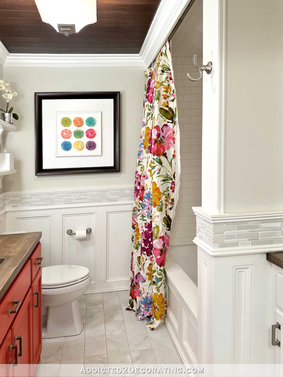
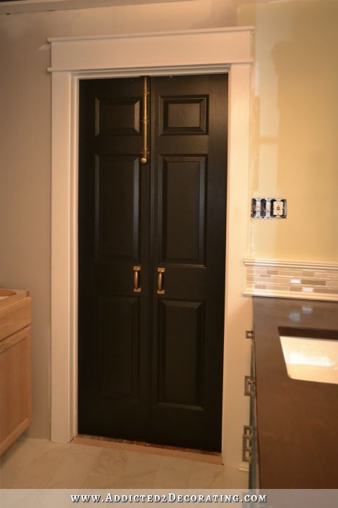
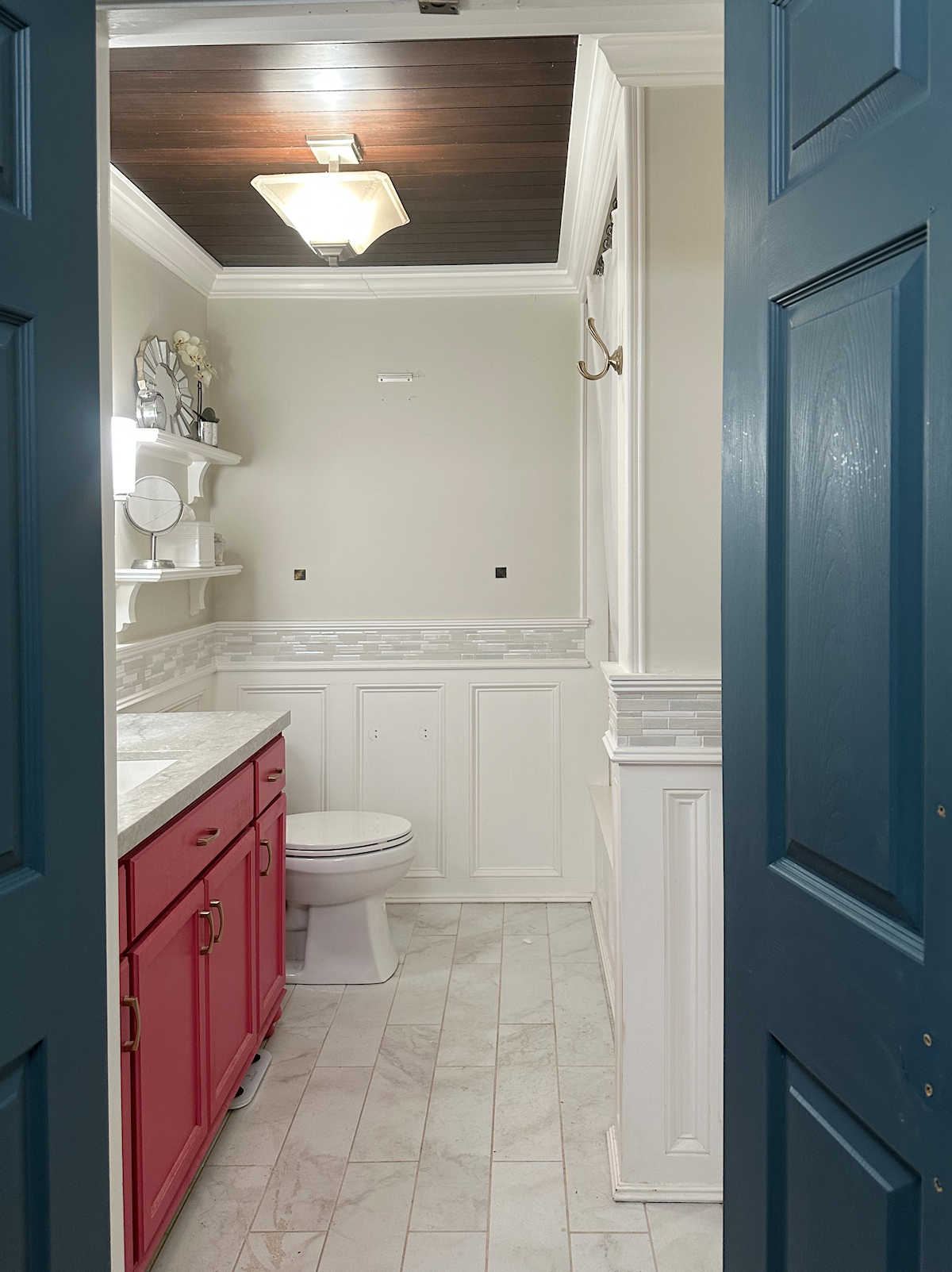
Here’s what the bathroom looks like right now…
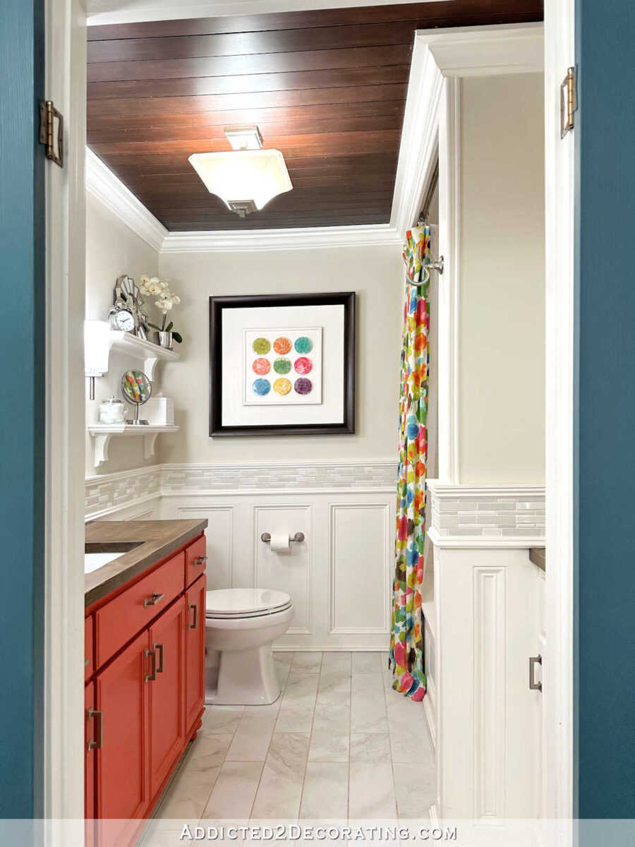
I’m still working through all of the updates I want to make, but I know for sure I want (1) a new shower curtain, (2) a new vanity color, and (3) a new countertop.
I had already decided on the shower curtain fabric. My plan was to use the same fabric that I used on pillows that are in the purple chairs in the living room.
That fabric is one of my all-time favorites. I have some on hand, but not enough for a shower curtain, so I planned to buy more. That’s proven to be an impossibility. The fabric has been discontinued, but I thought for sure I could find some remaining stock somewhere. But I have scoured the internet for more of that fabric, and I just can’t find any. I’ve found it listed at two online fabric stores, and I’ve placed an order at both stores, only to receive an email from both stating that they actually don’t have any of that fabric in stock.
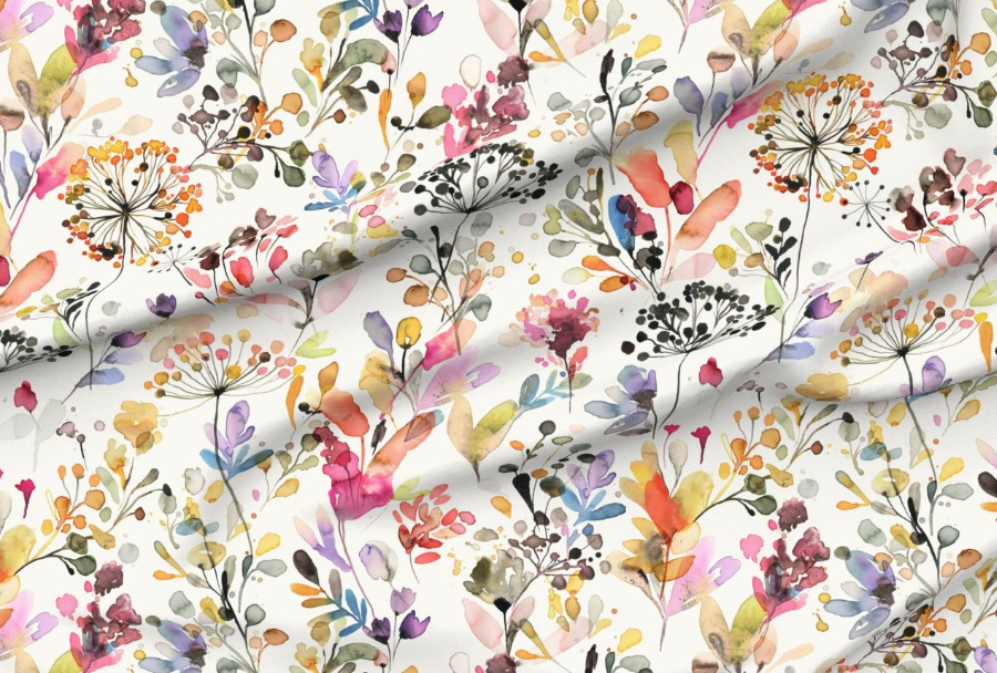
So I’ve been forced to start over in my search for the perfect fabric. I believe I’ve found some great contenders, though. I came across one particular designer on Spoonflower who has several different watercolor floral prints (watercolor florals are my favorite), and some of them are in colors that would work perfectly in our house.
*This post contains affiliate links.
This first one is my favorite. I do wish the print were a little larger (y’all know I like BIG flowers), but I think it’s very pretty just as it is. The colors are perfect, and I would have lots to choose from when selecting a new vanity color. It’s a happy, colorful fabric without being childish, which is always a hard balance to strike.
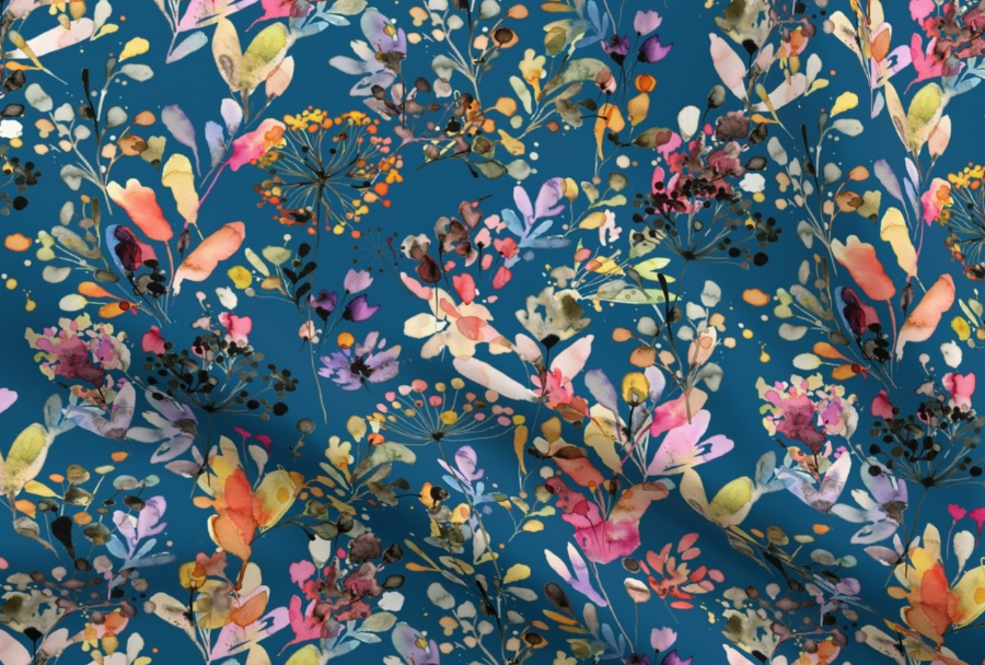
This next one is the same design in a different color. It would be perfect for our house as well, although I knew some you might say, “Too much teal!” 😀 Never. One can never have too much teal.
I really like the lightness and airiness of this next print. The flowers look delicate, which seems nice for a bathroom.

And finally, this coral floral really struck me. It’s available in other colorways, but this one was my favorite.
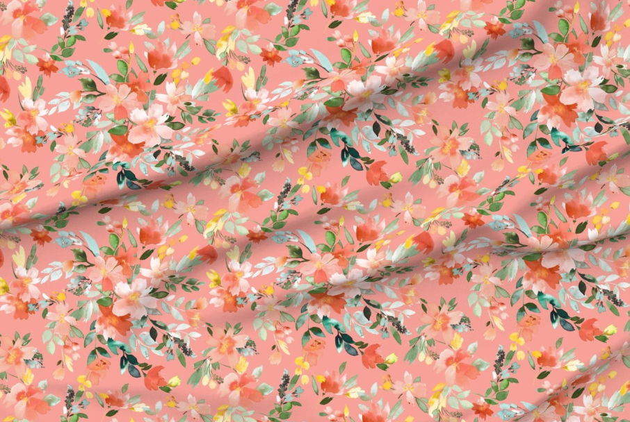
So if I had to choose right this moment, I’d probably go with the first one, although the one with the teal background is a very close second.
In other news, I did get the new flower sconces.

Now the task will be to figure out how to make those sconces look like hand sculpted plaster like the other very expensive flower sconces that I really wanted but couldn’t justify purchasing because of the price. I have a feeling that some air dry Sculpey clay is in my future.
So for now, my priority is working on the front porch when the weather is beautiful. On bad weather days (like today and tomorrow), and after the front porch is finished, I’ll be focused almost exclusively on the studio until it’s finished. But I know that during that studio project, there will be days when I just need a break from the studio, so I’ll have these fun little bathroom updates that can keep me busy.

Addicted 2 Decorating is where I share my DIY and decorating journey as I remodel and decorate the 1948 fixer upper that my husband, Matt, and I bought in 2013. Matt has M.S. and is unable to do physical work, so I do the majority of the work on the house by myself. You can learn more about me here.
If the first one is your favourite and bigger flowers would be better, it could be worth a shot to contact the designer on Spoonflower to see if they’d be willing to do a larger scaled version for you? This one doesn’t have any extra text in their profile, but I’ve seen many designers on there that welcome people asking for different scales (or even colorways sometimes).
Not sure what you plan to do to the sconces but you might like to use the clay called “form flex” available on Amazon. It stays flexible so you are able to manipulate better. Love all those new fabrics!
How about using the fabric you have as a wide stripe with a solid fabric to make it more of a custom look. I really like the fabric you have. More work for sure, but might take the look up a bit too.
I agree! Add a solid and perhaps a border. I could look lovely.
Sheila F.
Does the teal one clash with the bathroom doors or is it a perfect match? Maybe it’s meant to be?? I love the first one too though!
Did you source your sconces and I missed it? Cannot wait to see your transformation.
That teal/blue one is fabulous! I say go bold! It would be perfect in your house.
I love the first two choices! I think the teal is beautiful and would not only add more color to the bathroom, but tie it into the hallway. Of course, it would also depend on the color of the vanity as the bold color alone in the room may look unbalanced. Excited to see what you choose!
Ilike the Spring Grasses with white background. I think a darker curtain would not give a light airy look and the room seems too small to be amenable to a dark curtain. I also think the other 2 choices would be ovempowering. You seem to gravitate towards light and airy with a darker highlight such as the guest bedroom which is beautiful but also a much larger room.
I like the first one best since you can’t find THE fabric. That is disappointing too. That happens to me all the time when I dig out older material to use on quilts and I never have enough. I like the scones too.
What are you going to do when you finish the porch, studio and bathroom?
Is it possible to use the company that made your wallpaper to make the fabric for you.? If there is a copyright issue you could change it slightly so not to infringe. If that company doesn’t do fabric, I’m sure there has to be one out there that does.
If you love the fabric you already have, then possible option is to combine it with a solid. Use the print on the top and have the solid 2/3 for the bottom. Add trim in between, works like a charm. I did this in my guest bath for the same reason.
I prefer the first one. The similar colors but different scale of the flowers is a plus. The one with a teal background is a distant second. The other two puzzle me: you already know you don’t like those warm colors to dominate.
I agree! Add a solid and perhaps a border. I could look lovely.
Sheila F.
PS. Have you tried Ebay? I have gotten discontinued fabric from there twice.
Hands down–the first is the winner to me. I just think the teal would be waaay too dark in that smallish bathroom with no natural light, and I can’t really put my finger on why, but I personally don’t like the other two fabrics. Sad you can’t find the original one, though. Maybe a reader bought a whole bunch after seeing on your blog, realized they aren’t going to use it, and will sell it to you 😉
Please reconsider the Spoonflower fabric. I recently did a major project for my son and SO with Spoonflower fabric and it was dreadful. The printing is not well done. The fabric is very stiff and unyielding, even after washing. The colors were meh. I know that they paid dearly for their fabric and it was not a great sewing experience (and I have been sewing for 55 years.)
If you want a larger floral print, please go to Fabric-store.com. They originated their store with linen fabric and are now producing larger cotton floral prints, which are lovely. Their quality is excellent as is their customer service. I think you will be much happier with them than with Spoonflower. I am not a shill for either company; I just have a bit of experience in this area.
What is the name of the fabric that yo love but do not have enough of? Who is the mfg?
It’s called Paint Palette, the color is Punch, and the mfg is P. Kaufmann.
I know your anguish over not being able to find the fabric you wanted. I waited too long to order one yard of the PERFECT fabric for my project and it was discontinued. I’ve looked on eBay and Etsy thinking surely someone must have one yard leftover from their project. I like all of the florals you posted. The first is my favorite.
Too bad about the Paint Palette fabric; I really like that one. Of those you showed, my preference is for the Wild Grasses with the white background, very pretty though it doesn’t have the real pop of Paint Pallette. If you want something bolder, how about Swavelle’s Glenburn Peony or something from bluebellgray? I know bluebellgray is in the UK but you’re not in a hurry so…
For your sconces, I’d practice on some plain sheet metal by spray painting a white primer and then top coating with plaster of Paris, lots of thin coats, sanding in between, until you get the look you want.
Did you see or try this link? https://www.etsy.com/listing/718637988/100-linen-floral-curtain-panel-in?gpla=1&gao=1&variation0=1169058358
Supersleuth Judy! Maybe the seller would consider selling some yardage?
This is the Paint Palette fabric in Punch made into curtains. Apparently not much left, but perhaps enough for you.
Wow…I really like them all. I don’t think you could pick a wrong one. An exciting change is coming! I think it’s great that you will have something else for in between when the studio either can’t be worked on, or you need a break. And it won’t take that long to change the color or the vanity, or make new curtains…
Happy Easter to you and Matt, and family.
Try adding some layers of drywall mud to the clay after it dries — another blogger I saw made a lamp like that, and it turned out amazing! She did hers with a bunch of thin layers and sanding between so it looked like ceramic when she was done, but I feel like leaving it on a bit heavier will add a more authentic plaster look than clay alone.
My favorite would be #1 with my second choice #3. I like the lighter background, but that’s just me 😋 I know it’ll turn out beautiful whatever you do…..it always does.
The first fabric is really lovely.
Don’t u get tired of redoing your work? It seems as soon as u finish a project your going back to change something.
Perhaps you missed the name of my website. And FYI, I haven’t done anything to this bathroom since January 2019. That’s over four years. So no, I don’t go back and change something as soon as I finish a project.