How To Resize And Frame Canvas Artwork
My new living room artwork arrived last week, so I took some time out from working on the guest bedroom yesterday to resize and frame the new canvas artwork.
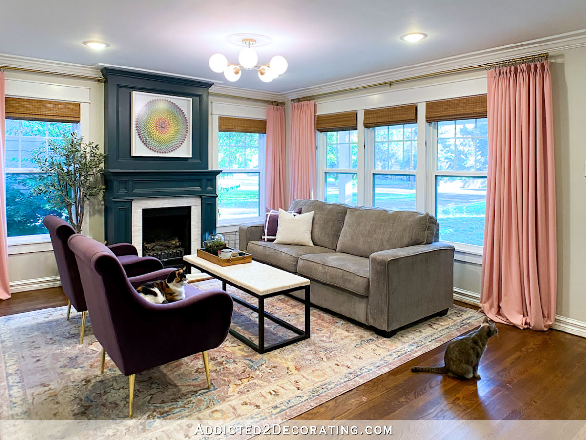
I purchased this amazing piece called Displacement by Scott Naismith. It’s so beautiful and colorful, and it looks like it was painted to go in my living room. But unfortunately, none of the available sizes would work in that inset area over my fireplace.
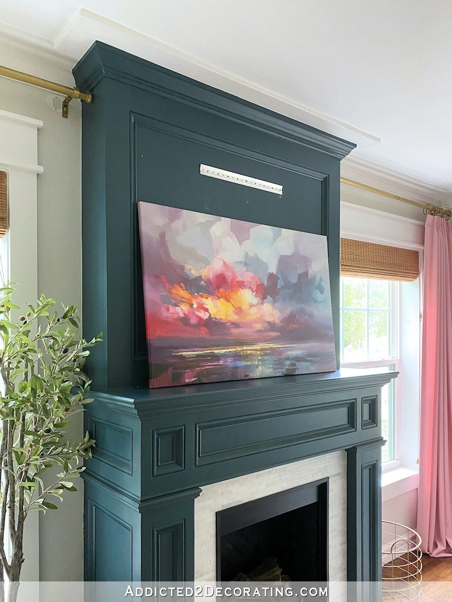
So I had to resize it before I could frame and hang it above the fireplace.
If you’ve ever done a wrap-and-staple project of any kind — a headboard, a dining chair seat — then you can stretch a canvas. The canvas is just wrapped around a wood frame and stapled either on the edge or on the back.
This one was stapled on the back…
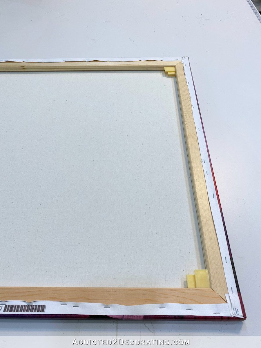
So I just used a small flathead screwdriver and pliers to remove all of the staples.

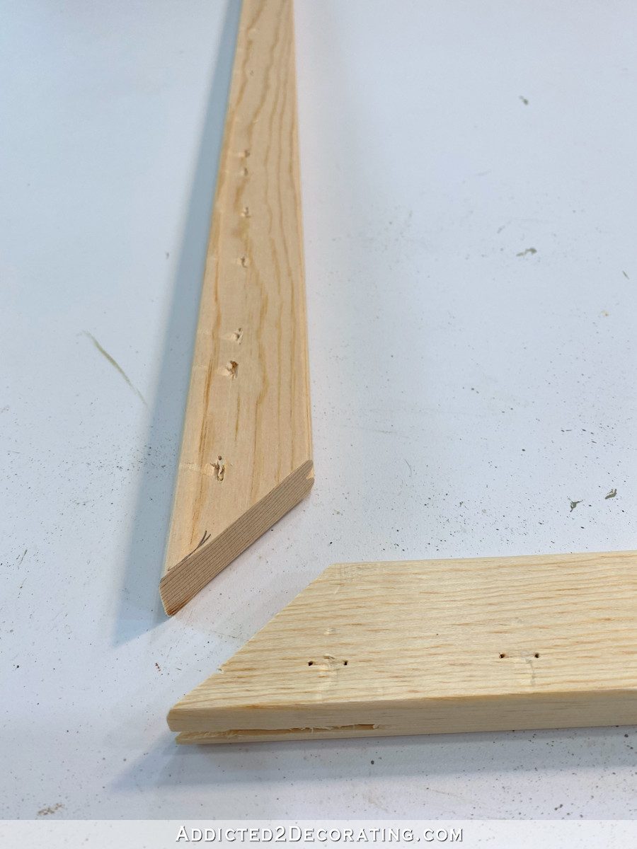
I removed the canvas completely and set it aside so that I was just left with the wood canvas stretcher frame. And since I was keeping the original height of the canvas and only narrowing the width, I removed one end piece from the canvas stretcher. These pieces actually came apart very easily.

This was a factory-made stretcher, so it has these fancy joints on the corners that fit together like a puzzle piece…

And of course, being a DIYer without the fancy machines, I didn’t have a way to replicate these fancy joints.
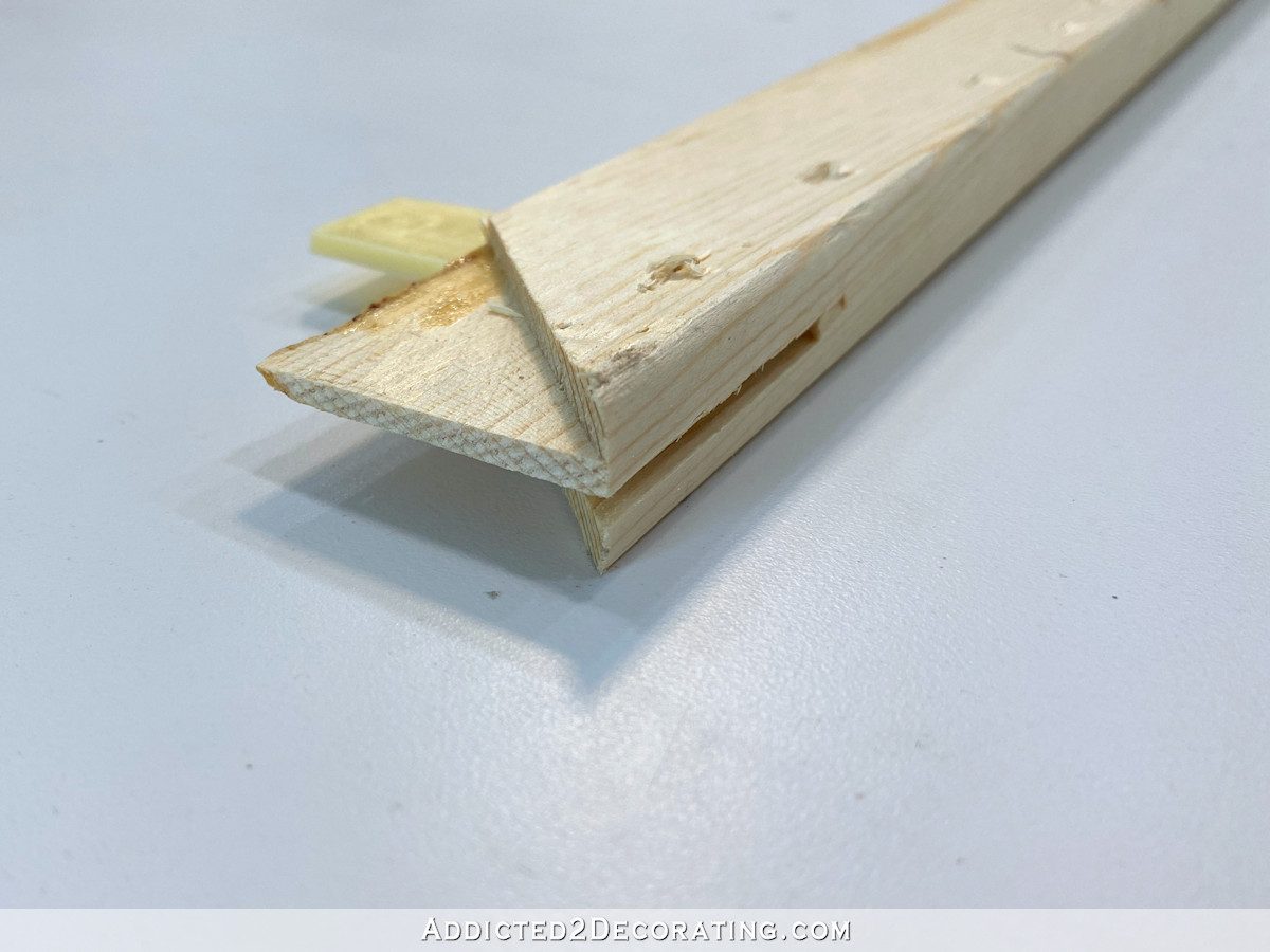
So after measuring and marking the top and bottom pieces for the new width, I just used my miter saw to cut regular 45-degree mitered corners on both the long pieces (i.e., the pieces that I was cutting down for the new width), and also on the end piece. Of course, I kept the end piece the same length, but I just cut off those little fancy joint extension pieces. So I was left with pieces that looked like this…
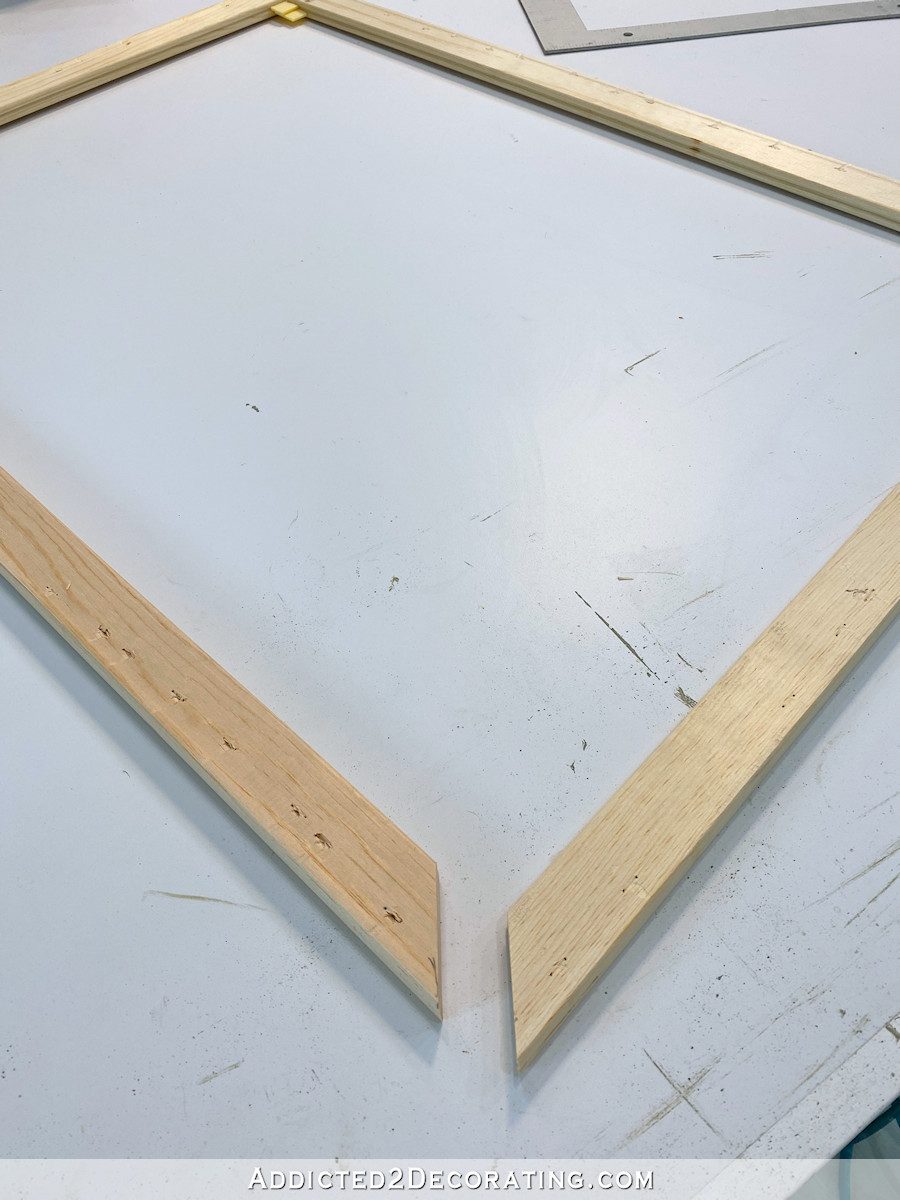
Then I used some wood glue on those ends before putting them together, and I use my framing square to make sure everything was square.
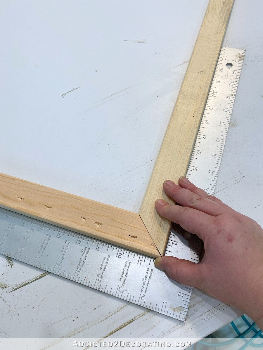
And then I secured it with some staples.

I stapled those corners together on both sides. So after I did this side on both corners, I flipped the canvas stretcher over and stapled the corners on the other side. Then I left it for about 30 minutes to let the glue dry a bit before moving on.
Then I was ready to staple the canvas back on the stretcher. Since I kept the original height of the canvas, I started by stapling on the top and bottom. The canvas had creases in it from having been previously wrapped and stapled, so there was zero guesswork as to where it needed to be wrapped and stapled.

And with the top and bottom wrapped and stapled, that made wrapping and stapling the sides very easy. I just did a little tuck and fold on the corners, and then pulled and stapled the sides.


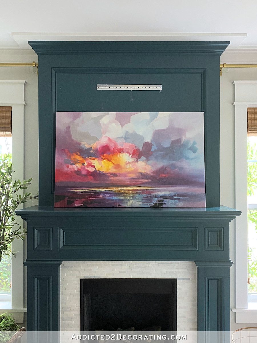
Now I had a piece of canvas artwork that not only looked like it was painted for my living room, but also looked like it was custom sized for my fireplace.

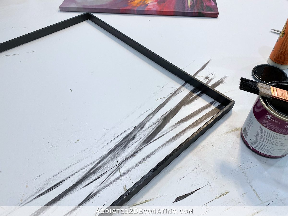
To frame the piece, I started by using my table saw to cut some pieces of lumber to 1″ x 1/4″, and then I sanded them smooth using 150-grit sandpaper on my 5-inch rotary sander.

Then I measured and marked the pieces so that they would fit around the outside edges of the canvas, and used my miter saw to miter the corners. Then I glued and nailed the pieces together using 5/8-inch 18-gauge nails.
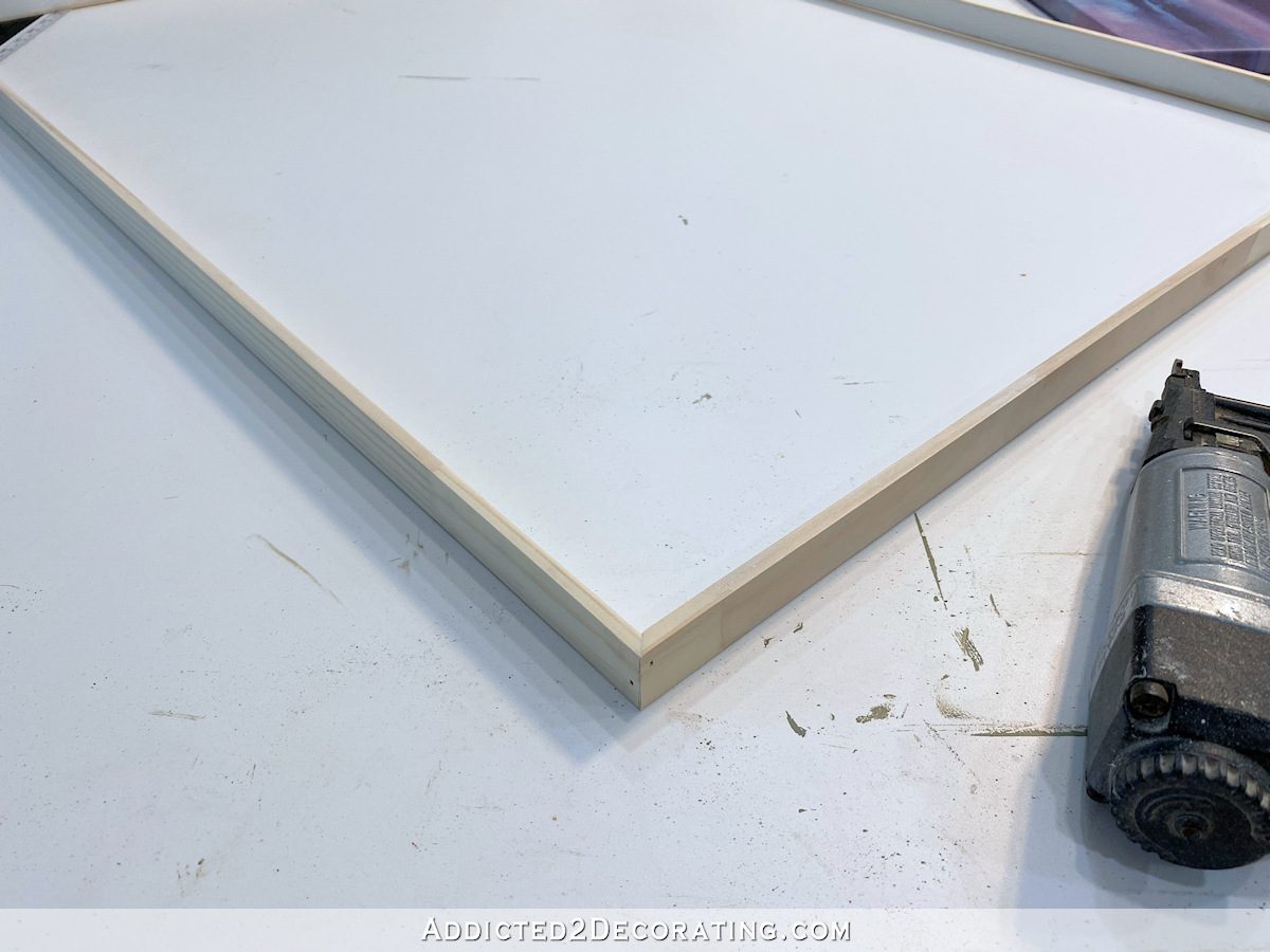
I did a quick fit to make sure it would fit around the canvas, and then gave this frame two coats of black paint, letting the first coat dry completely, and then sanding it smooth with 220-grit sandpaper before painting the second and final coat.
Tip: When you want to purchase black paint (as in, true, deep, solid black paint), don’t go to the paint chips and select a color. Just like whites, there are hundreds of shades of black. For a true, deep black, just go to the desk and tell them that you want solid black.
When it was dry, I slipped it onto the canvas.
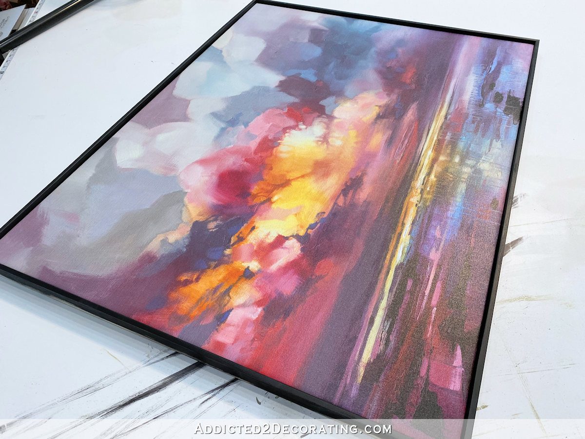
The pieces bowed out from the canvas in the middle just a bit, so I used those same small nails to secure that frame to the canvas stretcher by placing a nail right in the middle of each side.
And here’s what it looked like at this point…

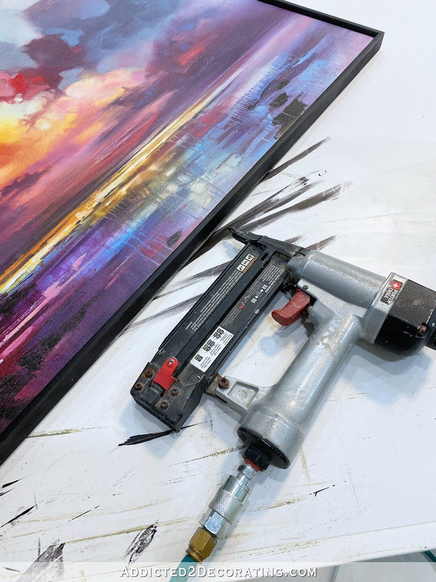
And finally, I cut four pieces of 1″ x 2″ pre-primed lumber to attach around the outside of the black pieces. I painted the inside edges (i.e., the sides that would lie flat against the black pieces) using Behr Polar Bear (my go-to white for trim and all the things), and then nailed these pieces on using 16-gauge 1.5-inch nails, and making sure that I nailed them on low enough so that the nails would go through the canvas stretcher.

Then I caulked the corners and nail holes, and painted the top and outside of the frame with two coats, sanding with 220-grit sandpaper between coats.

And here’s the finished piece, resized and framed. I’m generally a huge fan of simple white frames, but I may actually end up changing this frame color. I’ll leave it white for now and see how I feel about it as I put the rest of the finishing touches on the room.
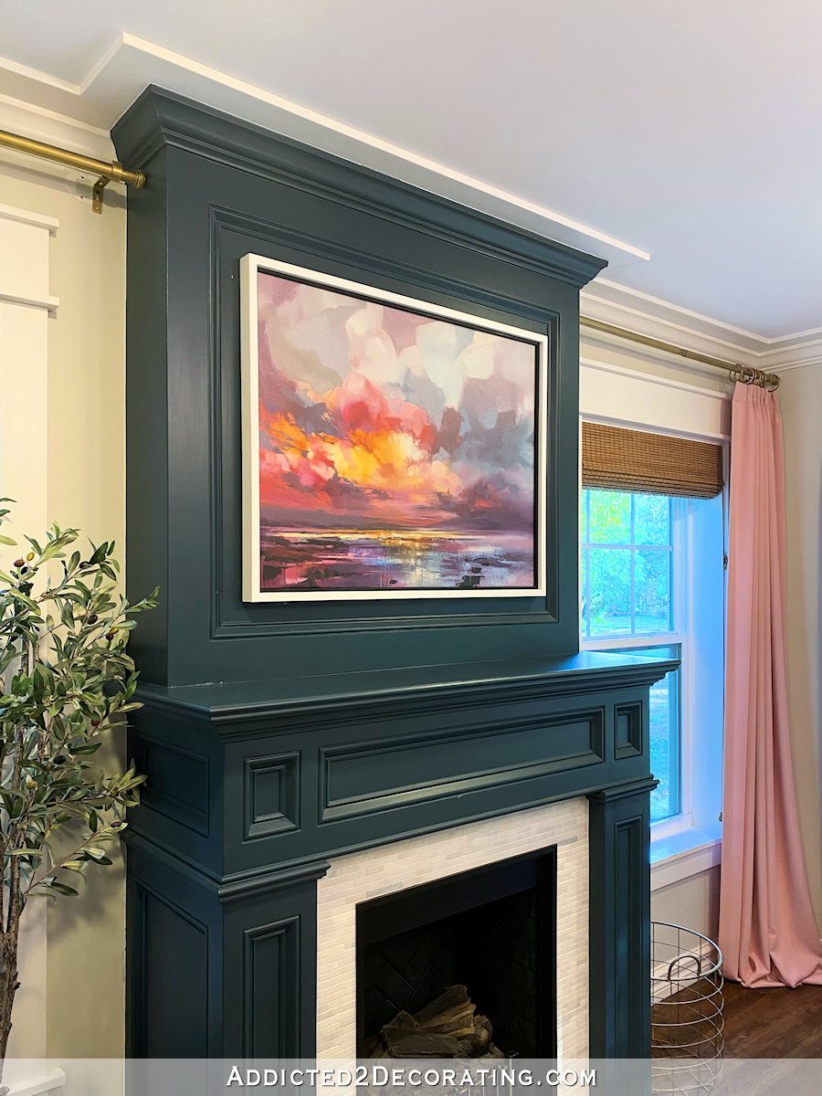
But the main lesson here is that you shouldn’t stop yourself from getting something that you absolutely love just because it’s not perfect for your home. There’s often a way around it, and with a few basic DIY skills, you can have that thing that you love AND make it perfect for your home!

Addicted 2 Decorating is where I share my DIY and decorating journey as I remodel and decorate the 1948 fixer upper that my husband, Matt, and I bought in 2013. Matt has M.S. and is unable to do physical work, so I do the majority of the work on the house by myself. You can learn more about me here.

The white frame takes attention away from the art. Something other than white? The black looked stunning. I realize it won’t stand out as much against the fireplace, but not sure that it has to. It’s a beautiful piece, but the eye goes right to the white frame (even brass or gold and black or an aged silver and black).
I have to agree with Deb.
You may use the color of your curtain rods for the frame.
I like the white on the frame; it balances out the white tile around the firebox.
You could not be right-er about this picture being made for your room. Like your pillows, it perfectly pulls all the elements together. I don’t say this as someone who knows what she is talking about, just as someone with eyes.
Also, sometimes it’s crazy how people rule things out that they could make fit with a little creativity. As usual, you did not disappoint! Great tips, Kristi!
Is there anything you can’t do?!! Well done!
Apparently not. 🙂
Perfect for the room. I agree the white frame does seem a little jarring. I swoon every time I see the curtains. They make the room
I am in awe of your talent. I’m pretty sure there is nothing that you can’t accomplish.
I love the painting and it looks amazing above your fireplace… but the white of the frame is just too bright for the more muted but string tones in the painting. When I look through the photos of your framing process, the painting just pops when I look at the photo of where it’s just the narrow black frame. I think I would personally have just left it with that narrow frame and not done the outer one at all, but I think it would also look excellent if you painted the outer frame black.
*strong tones, not string tones. 🙄
I love it!! I might even check it out for my house, but in your room it’s such a perfect fit.
Also, I had to laugh when the recommended link below the article was titled “My Final Above the Fireplace Artwork” – from 2014 😂. Glad you aren’t afraid to keep tweaking, it keeps things interesting and I think you’re on a great path for this room with these colors!
You were so right on getting this painting. It pulls all the colors in the room together and is a soothing scene to look at. Thank you on showing us how to size down a painting. As for the frame how about a muted metal color, gold or bronze might look nice.
Love the print! It certainly ties everything together!
I agree with you…the white takes the focus away from the wow.
How about the wood tone of your beautiful coffee table?
To get a post 2 days in a row is a TREAT!!!!
You can do anything! Great job-thanks for the confidence building- “We can do this” !
How wonderful that you could make it fit for you. I remember reading a post on another blog by a woman who had previously worked buying art for a high-end design firm. She was also a proponent of resizing to make it work for you. Of course the artists in comments were aghast!
I don’t hate the white but I think gold would be better. I always like the subtle texture and variation that gold leaf gives a frame.
Love the artwork, but I knew I would. Not sure either about the white framing, it seems rather bright. I am thinking of a natural wood or a slightly tinted wood tone would be softer. Nothing darker than the tones in your roman shades. The fireplace color is just too deep for the white, and the art is outshone by the white.
I like the white frame. I think it goes with the white on the fireplace below. I love how the colors in the painting tie in with both your furniture and drapes.
I like the art in it’s smaller format better than the original. I thought the right side which you did away with was a bit muddy in it’s color and technique. It was good to see how you redid the stretchers but just so everyone knows, they are available at local art supply stores or national ones like Dick Blick as well as Hobby Lobby.
I’m withholding judgement on the white out frame because we’re only seeing a closeup photo and not how it presents in the entire room.
I’ve done this with docs (our marriage certificate that is an odd size) or things like vintage postcards by scanning and printing a different size and then framing under glass. The bonus is that the original isn’t exposed to light but kept safe in an acid-free box. I also liked a print for my daughter’s room but it was slightly the wrong shade of blue. I opened Word, made a large box, filled in the box with a light shade of the right blue, then printed this out on a transparency that I cut and placed over the print but under the glass. I guess if I knew how to adjust color on a digital scan then I could do that (or pay someone on Fivverto do it), but I had the transparency on hand and it took one minute to do. Just some more ideas.
Great tutorial, Kristi! Once again, you amaze me with your talent and vision!
And the picture is beautiful in your room. Perfect, made for Kristi’s living room! I also agree that the white frame distracts from the artwork. Someone suggested using the color of your curtain rods. I think that would look awesome. But I also think a wood tone the color similar to your roman shades would be so pretty! Anxious to see what you will decide on in the end!
I happen to like the white. It compliments the white surround on the fireplace opening and balances the top and bottom.
Finally, a clue to what make your nail gun is: Porter Cable!!!!!!!
Oh, yes! I’m so sorry if you’ve asked me that before and I didn’t answer. I have the little pancake Porter Cable air compressor, and I bought the set that comes with the compressor, 16-gauge nail gun, 18-gauge nail gun, and the staple gun. This particular staple gun isn’t the best for upholstery projects, but it does come in handy for projects like this.
I’m so happy I found Addicted 2Decorating. Missed you tons when you needed a breather
I definitely agree on gold for the frame. It would look very nice with the painting and the black inside frame.