My Bathroom Wall Decision (Plus How I’m Saving Money On 35 Paint Colors)
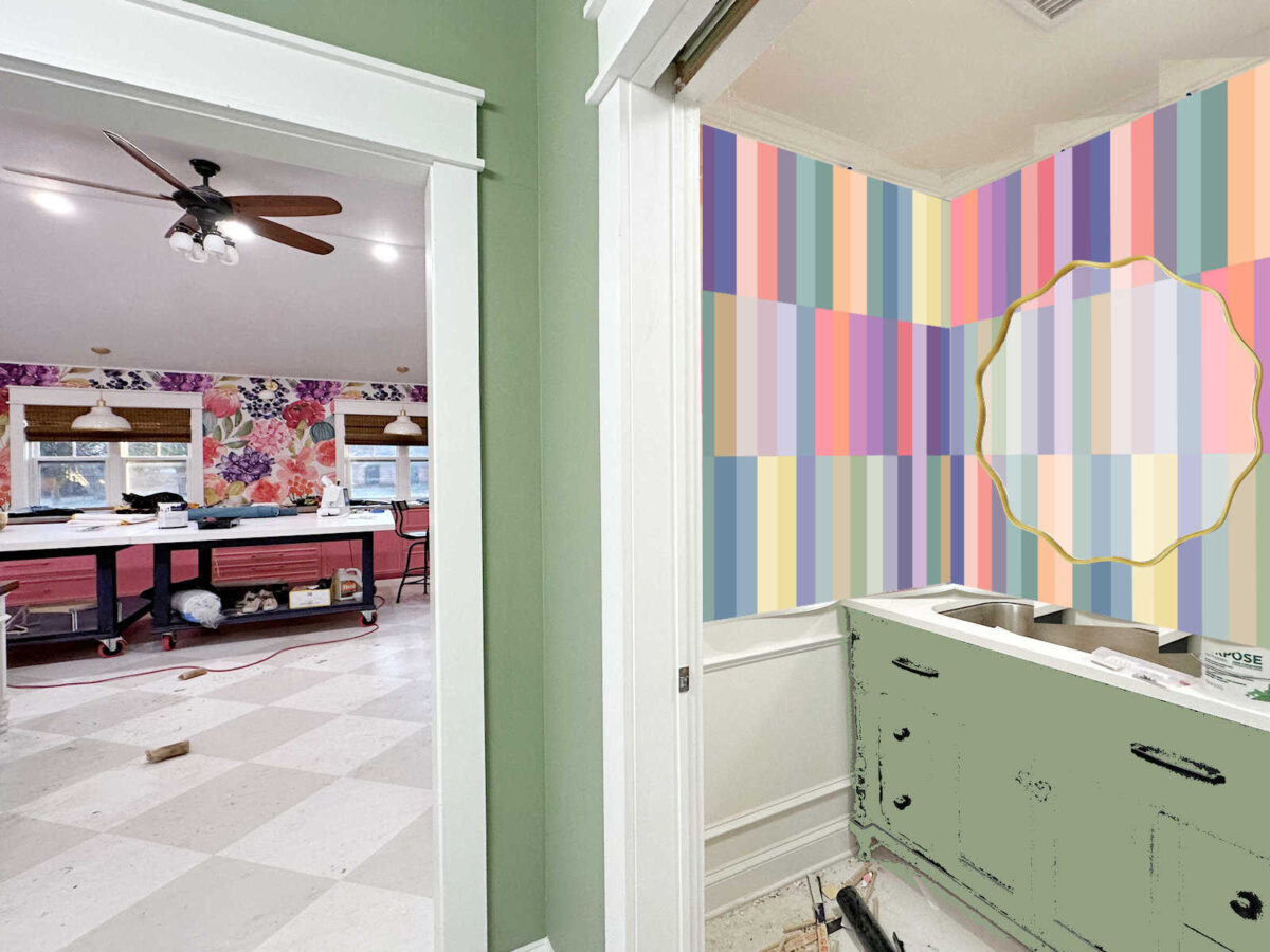
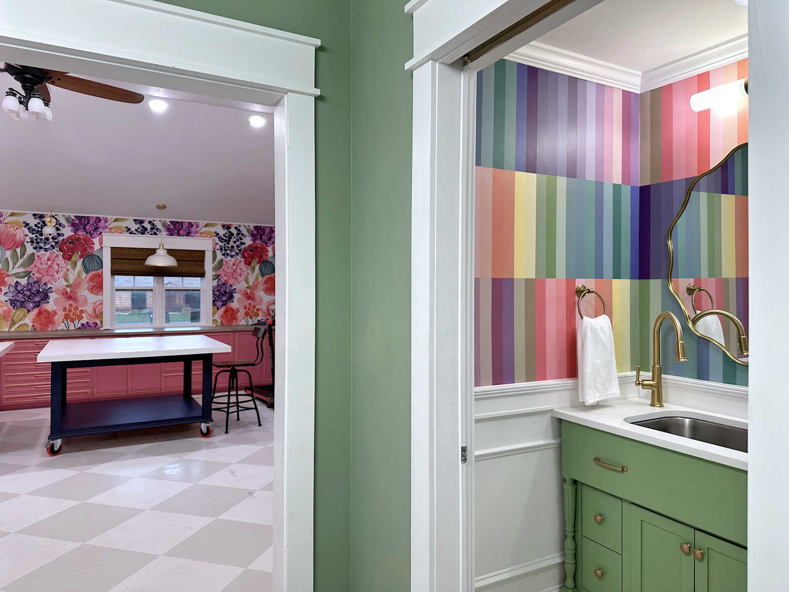
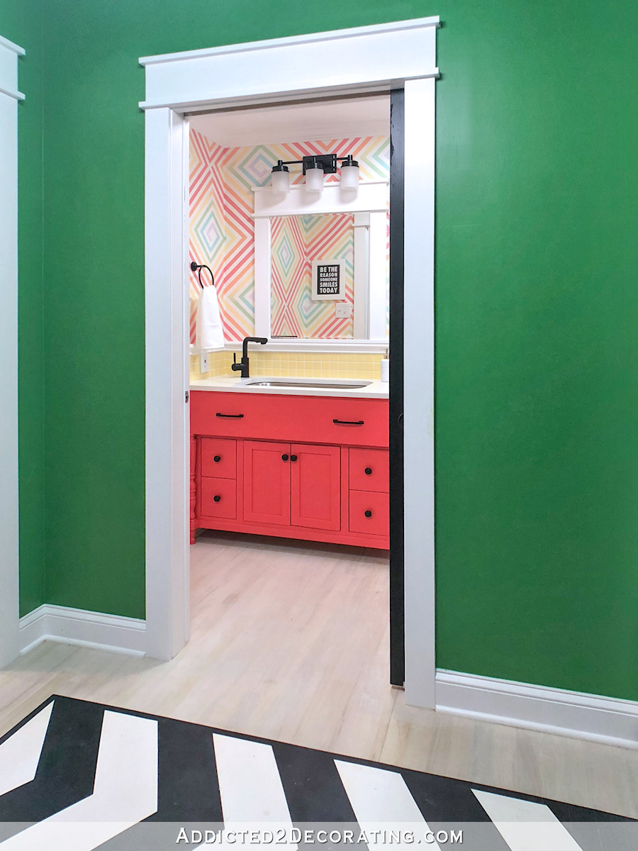
As you can tell from the title of this post, I’ve made my decision on the walls for the bathroom, and I chose one of the painted designs. It really came down to the wallpaper with the trim in the corners and the vertical striped design. Those two options were so close in my mind, not because I liked them equally, but because the wallpaper would have been so much easier. But I really liked the striped design better.
So in the end, I flipped a coin. I literally let a quarter decide the design of the bathroom walls for me. Heads, wallpaper with trim. Tails, stripes. And tails won. So I’m gearing up for a lot of taping and painting, and I’m aiming for something that looks like this…
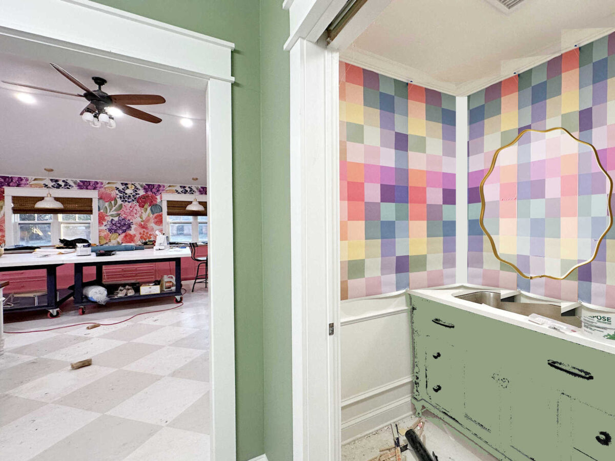
It was very interesting reading through the comments on yesterday’s post. What really stuck out to me is how people perceive color differently based on the design. There were a few people who said something like, “I like the vertical striped design, but I would like them better if you use the colors of the squares. Those seem like softer colors.” That’s not anyone’s exact quote, but it’s the general thought that several people expressed.
Interestingly, these two design have the exact same colors. I used my photo editing software and copied the colors directly from the square wallpaper and dropped those colors into the stripes. But for some reason, when those exact colors are arranged into stripes, some people perceived them as being different colors.
Anyway, that’s just an aside, but I thought it was very interesting.
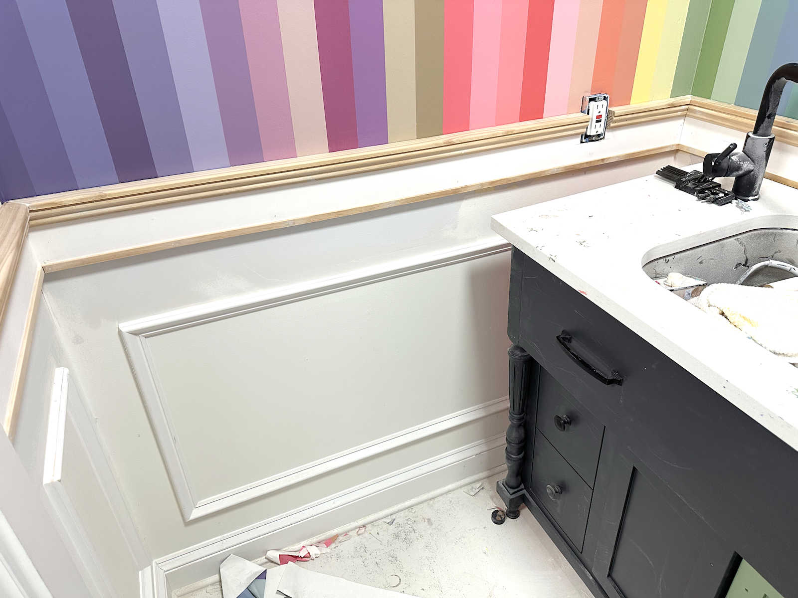
So after the coin made the decision for me that I was going to be painting the design on the wall, I almost grabbed the wallpaper and headed out the door to Sherwin Williams to buy all of the paint. But then I had a moment of clarity before I even got out the door. One repeat of this wallpaper has 35 different colors in it, and I want to use every single one of these colors. But at $11.99 each, those 35 paint samples plus tax would have come to just over $450. That’s way more than what I wanted to spend on paint.
I decided that the only way this would work is if I buy a few colors and mix the rest of them myself. I’ve had plenty of experience with mixing my own paint. If you’ll remember, that’s exactly what I did when I painted this cabinet in my studio.

I did NOT buy 72 paint samples for that cabinet. I bought the main colors, and then I did a whole lot of mixing, testing, re-mixing, and testing again to get the rest of the colors.
And now I need to do that again for the walls in the bathroom. So I took one repeat of the wallpaper and started grouping the colors together in color families. I ended up with 10 different groupings. And then for each group, I chose the single color that I’d actually need to purchase to use as the jumping off point for mixing the rest.
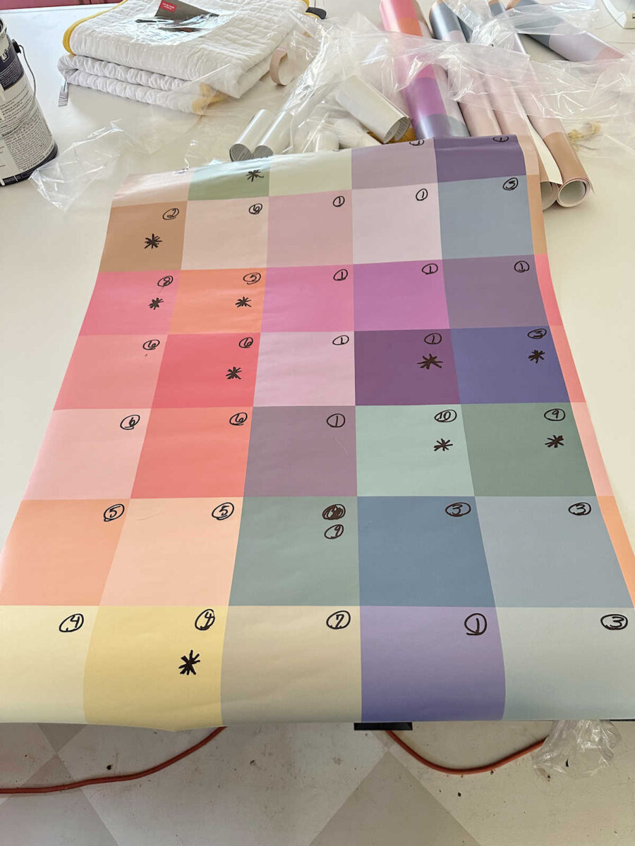
I know that picture is kind of hard to see since I couldn’t get the wallpaper curls at the top and bottom, so here’s a better view of how I grouped the colors.
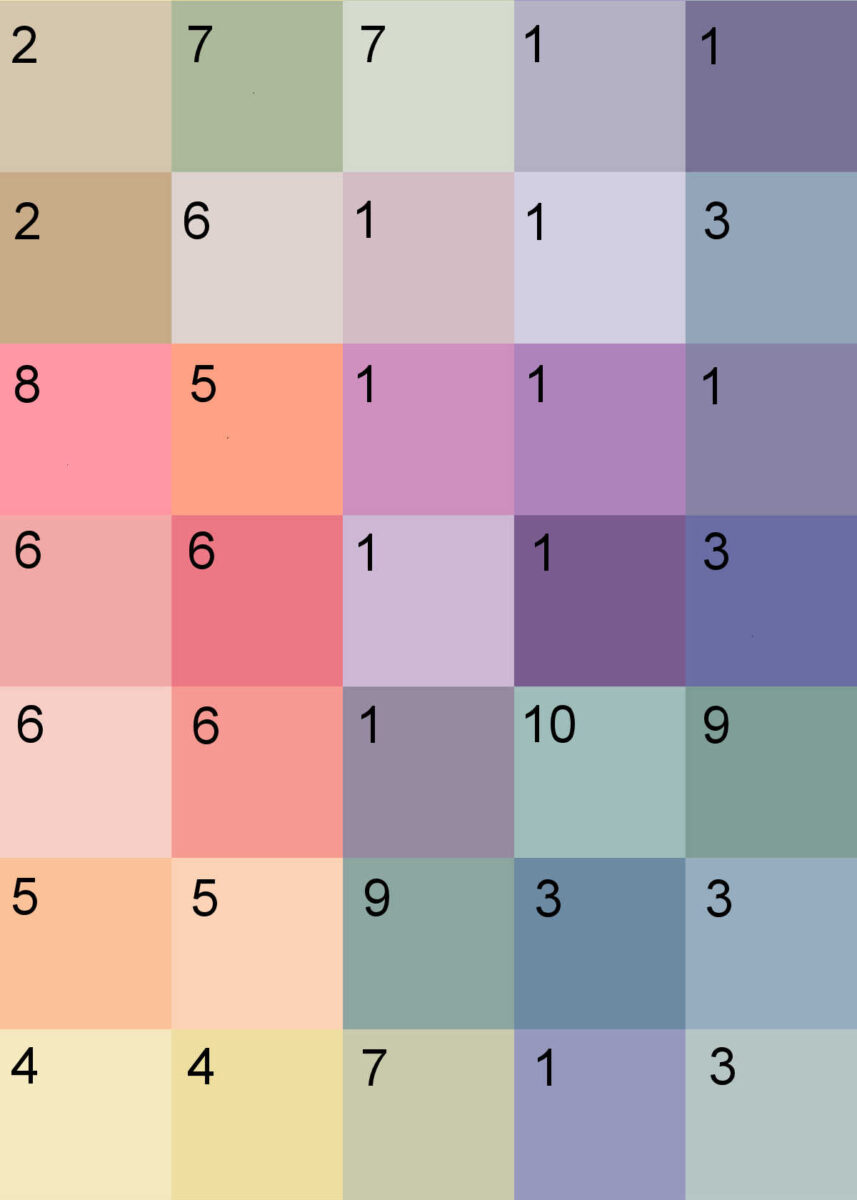
And then here are the colors that I decided to purchase.

So how does this work, exactly? I’ll give an example. For the colors in the purple category (and there were a surprisingly large number of colors in this group), I’ll start off with the first one, obviously. The second color looks like the first plus white. The third color is the second color plus even more white. The fourth color is the first color plus blue and maybe even a touch of black. The fifth color is the fourth color plus white. The sixth color is the fifth color plus white and black. And on and on.


I know you’re probably looking at those colors towards the end and thinking, “There’s no way those are even in the same family.” They’re a little different, for sure. But that second-to-last color will be the first color plus white plus a little pink, which is one of the colors I purchased. But all of the colors above will have some of that original purple in it, and then they’ll be mixed with a combination of white, black, and other colors to get to the final color.
The purples will be the most difficult. Some of them will be very easy, like these two. Obviously, the second one is just the first one mixed with white and possibly a tiny touch of black. Or maybe no black at all. I’ll have to see as I go.


I also grouped these together. I realized when I put this grouping together on my computer that some of these colors look different on screen than they do in person. On screen, that last one doesn’t look like it belongs in this group at all, but in person, it does have some purple in it. But obviously, it also has green in it as well. All of these colors, in person, have purple in them.


This one is pretty straightfoward…


This one is pretty straightforward as well.


This grouping will be pretty easy, but you can see that by the third color, I’ll need to introduce a bit of orange, which I have from the grouping above.


The second color in this grouping will require a tiny bit of yellow, which I will have from a previous grouping.


This is another color that doesn’t really read correctly on screen (at least not on my screen). From the screen color, it looks like it belongs in a previous grouping. But in person, it’s much clearer, so I couldn’t get that color from the previous coral grouping. But it will be used as an undertone for a couple of colors in other groupings.


These two are also pretty straightforward.


And then this is the final one, which also may look on screen as if it belongs in the previous grouping. But in person, this color is too clear (i.e., not grayed down) to come from the previous color, so it had to stand alone. But I’ll also be using it as an undertone in a couple of colors in previous groupings.

So that’s how I went about this whole process of deciding which colors to purchase, and which colors to mix myself. I ended up buying ten of the colors from the wallpaper, and then I also bought a white and a black to use for mixing. That saved me a lot of money going from 35 samples to 12. But before I can even get to painting my walls, I have a lot of measuring, marking, taping, and mixing to do! It’ll be a fun, color-filled weekend. I need to find a really good podcast to listen to. If y’all have suggestions, I’d love to hear them! I love true crime podcasts, but none of the gory stuff. 😀

Addicted 2 Decorating is where I share my DIY and decorating journey as I remodel and decorate the 1948 fixer upper that my husband, Matt, and I bought in 2013. Matt has M.S. and is unable to do physical work, so I do the majority of the work on the house by myself. You can learn more about me here.
I’m certain that you checked the paint you already have which would have saved you even more. Have fun with your colors this weekend.
I didn’t because all of the samples I have on hand are Behr, Glidden, and PPG (all from Home Depot), and they’re various types of paint and various sheens. I wanted all of the paint I use to be the same brand, same kind of paint, and same sheen.
Did you think about creating a wallpaper version of the vertical design? And then doing the frame out method that you mentioned you would do if using the square wallpaper? That’s where my mind went, since all of the work to paint the vertical design sounds so hard to me. But I know you don’t mind it as much as I would!
I didn’t. I really want the design to wrap around the corners without interruption.
Have you considered not making the stripes equal to each other? It might be fun to have them all skewed about, wider at the top on one, then next to it narrower, etc. repeating the random widths and even lengths? I would free-form, even overlap edges, toss out the taping! Just a thought!
Would it have been cheaper/easier to order wallpaper in your design?
No, wallpaper would have been much more. But it also would have gotten me right back to my initial problem — wrapping a very linear wallpaper design around the corners. So I would have to install it with trim in the corners, which I really don’t want to do.
Somehow I KNEW you would pick the hardest, most time-consuming choice! There really was no point in asking us , was there? LOL! We long timers here can almost read your mind in the way you write your posts! The choice you are leaning to is written about so much more deeply, as you are trying to convince us, and the other choices barely have a mention! HA! Maybe you don’t even realize this, but it’s almost obvious to me! Have fun taping and mixing, I’ll be waiting to see the end game! (if I could do a heart emoji, it would be here)
How do you determine how much paint you need for each color?
I just guess. 🙂 I won’t need much of each color. Since I’ll have 35 stripes, I think the most stripes I’ll need to paint with one color is 6.
I am excited to see your finished colors! It sounds like it will be a little tedious but also kind of fun! Dateline has done several true crime podcasts that I have really enjoyed listening to. I think each story has its own series. Some of the titles are Mommy Doomsday, The Girl in the Blue Mustang, The Thing About Pam, and The Thing About Helen & Olga. I don’t think they are very gory, but they are very interesting!
Thank you! I’ll check those out. I keep forgetting about Dateline! And 48 Hours. I think they both have YouTube channels, too. Their episodes on YouTube are about 45 minutes to an hour, I think. I’ve listened to a couple of them recently, and they’re very interesting.
These two are interesting true crime podcasts. Happy listening!
The Coco Berthmann Story
The Wedding Scammer
Thank you! I’ll check those out. The Wedding Scammer sounds interesting!
I had the same thoughts about the stripes seeming bolder than the squares. I’m sure that it is all about how they are grouped. Our eyes see color based on what we can compare them to. Doing random squares gives much more opportunities for different contrasts. I’m sure you’ll come up with a stripe sequence that pleases your eye. Thank goodness for your ability to use the computer to “try” these out.
Did you make mock-up view, yet?
I just have the one at the top of this post. It won’t be long stripes. It will be stripes that are 1/3 the height of the upper walls.
I’m so glad you explained why some colors weren’t with what appears to be the natural grouping. I was wondering! Can’t wait to see how it all turns out!
I look forward to seeing your finished product. I tremble at the amount of work ahead of you. You definitely have FORTITUDE! Hats off to you!
I love(d) Southern Fried True Crime, but last I heard she had surgery, and did okay. But she hasn’t released a new episode in forever. Anyway, I liked listening to her podcasts.
Thank you! I’ll check it out.
As a long time artist l love mixing colors. I can use acrylic paint because it gives me migraines. Weird l know. So l only do oils and water color. I know mixing oils to get a certain color is a lot easier for me than mixing acrylics. I really had a hard time helping students mix acrylics as l really didn’t do much of it. BTW l love the stripes a lot more than the squares. Plus you have squares in your studio. Good decision.
I honestly think you will like the painted version much better in the end. I think square wallpaper and square paint design on the nearby painted cabinet might have been too much of the same. And you can adjust as needed — because no room is 100% square. And with such a colorful design, you can make some “mistakes” and adjustments as you go without it being obvious to you. I look forward to seeing the results.
As someone who paints infrequently, I get this 100%. You can make most colors out of a set of cool primaries and a set of warm primaries, so I understand your reasoning – much thriftier!
You mentioned you liked listening to things you can learn from, and the most interesting audiobook/podcast I’ve listened to has been the nonfiction audiobook The Light Eaters. Truly some of the most fascinating stuff I’ve ever read. The part about the vine being able to imitate a plastic plant blew my mind. Hope you give it a try.
Thank you! I’ll check it out.
Your eye for color mixing absolutely amazes me. I can’t wait to see! I love a tedious project, too, lol.
Too bad you don’t have the paint left from your cabinet in the studio. That turned out so well.