My Color Palette & A New Wall Color (Feel Free To Weigh In!)
This week, I’ve had a few people suggest that I choose a new wall color, such as apple green, and it occurred to me…I don’t think I’ve ever really shown y’all the direction I’m going with the whole color palette in my living room/dining area/kitchen. Perhaps if I showed you that, then you would understand why I will NOT be painting my walls apple green or any other color. Yellow is the color.
My main motivation for yellow walls is that my little condo is dark. Even with the two large windows in the living room and eating area open all the way, they let almost no light in. This is because the walkway for the second floor shades the windows and blocks any light. So, since yellow is the brightest of all the colors, I want yellow on my walls. However, I’ve decided to change the SHADE of yellow that I have on my walls (more on that later).
But first, the color palette. I just want this place to bring a smile to my face when I walk in the door. I want to be surrounded by happy, cheerful colors. Here’s what I’ve selected:
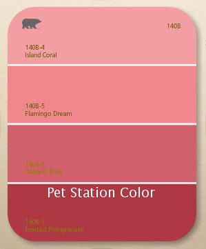

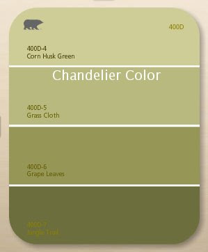
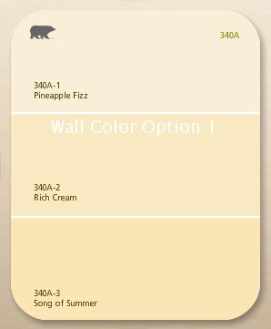
(Keep in mind, those color swatches are never accurate on your monitor.)
That color palette was the inspiration for my decoupage I did on the top of my dining table:
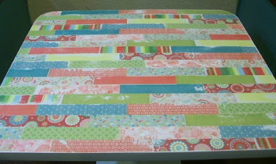
So that’s the direction I’m going. I know it may seem a bit bright or busy for some of you, but I’m just trying to learn to let go a bit…be a bit freer in my decorating, and not so bound by “rules”. I want a cheerful, happy, vibrant space that I enjoy living in. I want the complete OPPOSITE of anything I’ve ever had before, which has always been neutrals, earth tones, greens, dark reds.
I’m tired of earth tones. And I got incredibly tired of my home looking and feeling like every other home I visited. It’s my job to visit other people’s homes and help them make it what they want, and for so long, I felt like I was listening to a broken record. I’d ask, “So what color palette do you have in mind?” And inevitably, each person would look at me, a twinkle in their eye, as if they had come up with an incredibly unique idea, and then say, “Well, I was thinking about going with earth tones. You know…browns, greens, and then some dark reds.” Uugghhh…And then I’d return to my home, filled with earth tones, browns, greens, dark reds. It got to the point that if a new client suggest a different color palette, it would almost bring tears of joy to my eyes. And immediately after the meeting, I would call my mom and say ecstatically, “You’re not going to BELIEVE this!!”
At this point in my life, I’d rather feel like I’m living in a candy store than surround myself with more earth tones, greens, and dark reds, like I’ve done most of my adult life–and like everyone else seems to want to do. I just want something different. I’m just ready for change. (Wow…I kinda got on a soapbox there. **climbing down from soapbox**) 🙂
So that’s it…that’s the inspiration…that’s the direction I’m going.
BUT…I do think that the original wall color I chose for my walls is a bit too gold for my taste. If you read this blog regularly, you’ll remember that I’ve mentioned it several times–that in pictures, my walls always turn gold. Well, perhaps that’s because this shade of yellow has a more golden tone to it than I prefer.
So, yesterday I went to Home Depot and picked up a couple of samples of more muted yellows. I definitely want yellow, but perhaps a creamy yellow, rather than a golden yellow.
Here’s what they look like on my wall. I painted the samples on three different areas.


I’m definitely leaning towards Option 1. It’s still yellow, without being gold. Option 2 just seems more like a cream color than yellow, and it doesn’t contrast with my wainscoting as much as I’d like.
The two in the kitchen don’t really look that much different, but that’s probably because I didn’t take the time to prime the wall first, so the muddy taupe color is showing through on both.
Even though I’m leaning towards Option 1, I’d still love to hear what you have to say if you’d like to weigh in!! But regardless of the final decision, my walls WILL be yellow. 🙂
Add to: Facebook | Twitter | Digg | Del.icio.us | Stumbleupon | Reddit | Blinklist | Technorati | Yahoo Buzz | Newsvine


So strange. They all look green on my monitor. 🙁 Guess I won't be able to give an opinion.
Jenny
I agree with you on all accounts- Option one is what I would go with.
You and I must be on the same wave length. I am bringing color into my kitchen (a big stretch for me) and I painted my main living area yellow, to help bring in the sunlight, however, mine ended up too gold-ish and I am hoping to tone it all down in the next year or two – btw love the table top, very cheery.
I can't tell much diff on my computer where option 1 and option 2 are concerned, but I can definitely tell the difference between the current color and the new options. I like it a lot better. More creamy, buttery instead of banana laffy taffy. I think it's an excellent move. Cheers!
Can't see the colors too well on the monitor, but I just did my dining room in Hawthorne Yellow (Benjamin Moore) and I think it meets all the criteria you describe. Check it out.
The color palette is great! Good luck!
It's really hard to tell a discernible difference on the computer between the options.
I'm a fan of the yellow too, and in our last house every single room was some shade of yellow except for one. My favorite was Benjamin Moore #924, a creamy buttery yellow that was like subdued sunshine and never looked garish, even at night.
Happy painting!
Oh by the way I posted about the HHGTV home give-a-way also. Wouldn't it be fun to win.
Cheri
Does chocolate brown look good on walls?-Kate