New Living Room Drapery Fabric and Color Palette
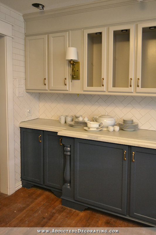
I’m so glad that most of you loved my new kitchen cabinet colors just as much as I do. There’s something so welcoming about those colors that just say “home” to me.
So with that in mind, I’m ready to share more of my plan with you. I spent the last three days sorting through fabric options, shopping for furniture, and having so much fun finalizing my plan for these rooms. I already had a general decorating plan and knew the direction I was heading, but actually finalizing decisions has been so much fun. And it really is amazing how much easier this has been with my new kitchen colors! It’s like I no longer come up against a roadblock with every decision I try to make.
Anyway, first up is my new living room drapery fabric.
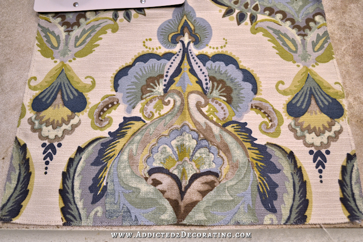
I tried to adjust the color to get it as close to the real thing as I could. It’s not quite there, but that’s okay.
Here’s the picture of it from Fabric.com (they actually don’t carry it anymore), and its not right either. The background is definitely not this stark white.

So it’s probably some happy medium between those two. But you get the idea, right?
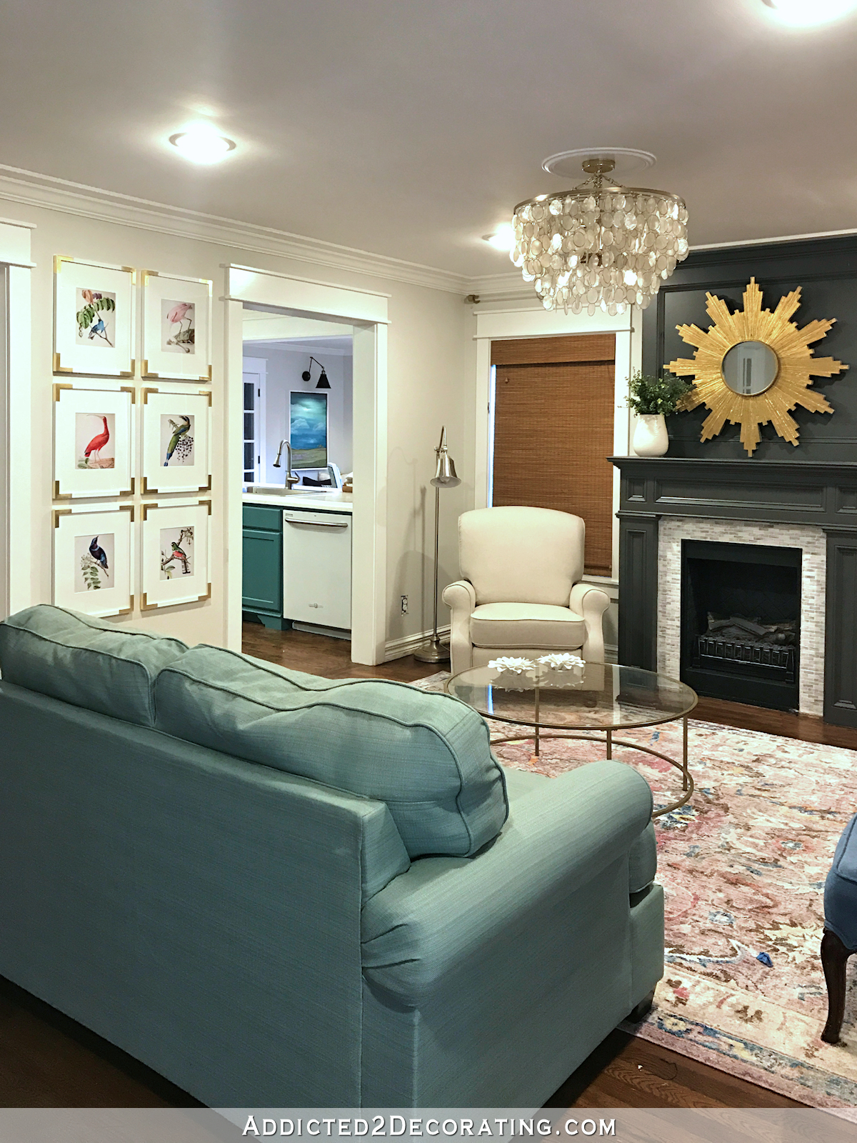
The background is a beautiful creamy white, and it has all of the colors that I love — dark blue, light blue, green (although not quite the green I was hoping for, but I can work with it), purple, teal, etc.
And here are some accent fabrics that I picked up from JoAnn Fabric that complement the drapery fabric beautifully.
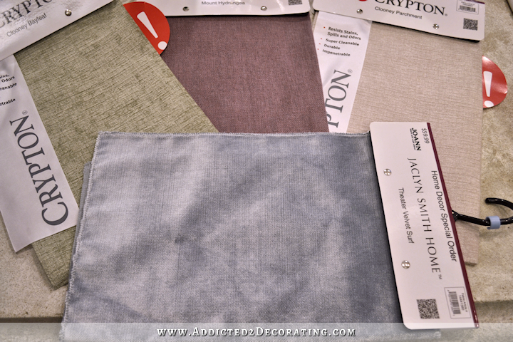
The green and white are both Crypton fabrics, and the purple and blue are both Jaclyn Smith Home fabrics. I absolutely love the look and feel of the Theater Velvet, and it comes in several different colors. I just picked up the light blue because it caught my eye and went beautifully with the drapery fabric, but I’m sure there are other colors that would work as well.
My sofa fabric is still up in the air, because I’m still sorting through different sofa style options, as well as three different furniture arrangements that I’m considering for the living room. And yes, the furniture arrangement will determine the color of the sofa. 🙂 I’ll share more on that later, because I need to clear out the room, get out my roll of painters tape, and start marking off different furniture arrangement options to see which one will work best. Once I know for sure, that will determine not only the style of sofa I want, but also the color. But again, more on that later.
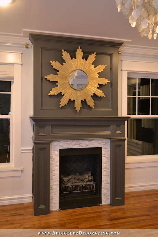
And here’s the general color direction I’ll be heading towards for…well…everything. Everything from wall colors, accent furniture, accent fabrics, accessories, etc.
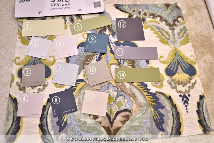
Those paint chips are: (1) Behr Flowery, (2) Benjamin Moore Iceberg, (3) BM Galveston Gray, (4) BM Porcelain, (5) Behr Rejuvenation, (6) BM Antique Pearl, (7) BM Smoke, (8) BM Gentleman’s Gray, (9) BM Venezuelan Sea, (10) BM Rockport Gray, (11) BM Revere Pewter, (12) BM Shadow, (13) Behr Box Office, (14) Behr Pesto Paste.
Some of those colors I’ll definitely be using. Others are just more for inspiration for accents and accessories. Obviously Gentleman’s Gray and Revere Pewter are in my kitchen. I have a definite plan for Galveston Gray and Rockport Gray. I also have a definite use for Iceberg. And then for another project, I’ve narrowed it down to Porcelain and Flowery.
So my house will definitely be colorful. But it’ll be a more subdued, relaxed, comfortable (for me) colorful. And I’m ready for some calm colorful in my life. 🙂

Addicted 2 Decorating is where I share my DIY and decorating journey as I remodel and decorate the 1948 fixer upper that my husband, Matt, and I bought in 2013. Matt has M.S. and is unable to do physical work, so I do the majority of the work on the house by myself. You can learn more about me here.

That is exactly what I noticed right off that these colors you are gravitating to now are more calm and muted colors. It surprised me. I always thought you were drawn to bold colors because of your green kitchen cabinets and painted piano! 😊
Love that fabric and the direction you are now headed. Of course that’s because you are in my color wheelhouse!! Cannot wait to see all these colors in your rooms.
I think these colors are soft and lovely! AND… and this is a big and…they will go with your living room mural—which is perfection:)
What will you do with your black and white striped curtains, and that AMAZING CHAIR YOU MADE BY HAND?
Love the kitchen too. It is so peaceful and serene my eyes smiled.
I really don’t know what I’ll do with them. I had thought I might use the chair and draperies in my office, but now I’m not sure. If I can’t find a use for them, I can always sell them.
I was going to ask the same thing!
You’re new color pallet is exactly my cup of tea! I just adore it!! Many of these colors are throughout my home, just not completely (as of yet – work in progress! I love just blues, with bright greens, purples, and greys). But I’m just in love! I’m so glad you repainted the kitchen (while I loved it, and that’s the time that I started following your posts religiously. But it did seem as though it was difficult to work with!). If I had the guts, I would paint my kitchen cabinets just the same as yours, but as is they’re pretty much the color that your upper cabinets are. I have antiqued gold cupboard pulls (similar color to yours, just more of a worn look), and I wouldn’t have even entertained the idea of silver or black. Too modern/sterile looking for my taste. I’m excited to see the velvet couch. I’m not a velvet fan myself but it’ll be beautiful! My next couch I want to be corduroy 😀 Cannot wait to see everything come together! This all really speaks to me and I’m sure will inspire many of my own designs in my home!!!
Love the Pesto Paste
My first thought when I saw your fabric choice was “Ooh La La”!! Your color pallet selections are both beautiful AND stunning!
I love your color choices. Mine were very similar, but decided on the spur of the moment to go with rich pink walls in my library because I never had pink in my house like that. Well, now I know the reason!! While I’m still ok with it, I wish I had done a soft sea foam green blue. I won’t ask my hubby to repaint it cause he’d say no and I really don’t blame him! The shelves and trim are white so way too much work. I’m a bad painter so I’ll enjoy it as it is! So, keep making good choices.
OOOOOHHHH so great! Love it! I will miss the green kitchen…loved that too, but this is far more beautiful..and regal ..in style and color. You are motivating me…
Well, you basically have my color palette, if you substitute rust for the pink! Of course I love it.
Looks like everything is coming together!! So happy for you!
I LOVE the new colors of your kitchen, and it has such an upscale look now. Athough the green ones were super nice, they demanded immediate attention. The blues and creams are quietly waiting until you turn around and see them, and then gasp as you think “what loveliness!” And they will enhance what ever accessories you add. I really like those curtains and look forward to seeing another room as you continue your journey.
Love that expression from you…….
You’re ready for “calm” colors……..
Can not wIt dear one!
Sorry, I missed some blogs. Is this for the living room turned dining room at the entry door in the front or a new living room?
Lynne…….it’s the same room…..started out as the living room, then turned into a dining room, now she’s changed back to a living room.
Yes, my decision to turn it into a dining room as a big misguided. 🙂 That room clearly wants to be a living room.
I knew you would eventually gravitate back to the condo color palette……I know it’s not the same colors, but the softer colors really remind me of your condo colors.
I think my monitor must be off a bit, because the Revere Pewter looks the same color as your cement counters (a bit dingy) and I know that’s not the case, because I have seen the paint chip for Revere Pewter and I really like it. Looking forward to seeing the complete project……hopefully 😉
ps…..is there any way we can see pictures of your niece’s completed bedroom?
Ooooo 🙁 I wish I new what my living room wanted to be (you walk into it at the front door just like yours). It’s been a baby grand piano room for 20 years and I wanted to make it a dining room, too. I would try but it’s $300-$400 to have the piano moved to the walkout basement. Hate to be wrong then want to move it back.
I had the same thing! What was supposed to be a dining room was also my baby grand piano room. I really wanted a dining room so paid to move the piano across the house to the living room. It does fit there, and I love having the actual dining room, but I do miss my piano room.
Love love love your new color palette! It’s so current, so welcoming and calm. This is going to be an even better room than the one you were evolving before. I think it’s awesome.
Beautiful fabric and color palette! So glad you are having fun!
love these colors – oh dear have forgotten where your living room is now located
It’s just inside my front door. The living room and entryway are just one big room. For several months now, I’ve been trying to turn the living room into a dining room, but it just wasn’t working out, so I’m turning it back into a living room.
Such wonderful choices in my opinion- love the fabric!
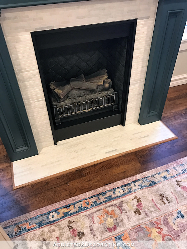
The fabric is similar to the original fabric in that room.
Wow! That fabric is really beautiful. It sort of reminds me of what you used to have in the living room except the pattern is bigger and the colors are a bit different. I love all the paint chips except #6 (pearl) because it really is such a feminine soft baby pink. I cant see exposing poor Matt to that. So it looks like repainting your kitchen cabinets may have solved your problem with the whole-house scheme. Apparently the inability to match the green was causing all the mental blocks when you would get started on a project and then you couldn’t finish. Well these new colors that you picked up will look terrific and the colors just flow into your kitchen colors.
Evidently my colors are off, because the Antique Pearl is actually a very light lilac color. No pinks for me. 🙂 At least not in these rooms. I love pink, but if I use it, it’ll be in my office.
I LOVE your new direction and colours and I look forward to seeing these rooms unfold. LOVE LOVE LOVE!
Everything about this new colour palette is so much what I love. It is calming and will be a happy calm environment to live in,for a long time. Absolutely love it,the fabric is so Beautiful.
Love the fabrics and the new paint colors! Great choices!
Kristi you are an answer to prayers. I have fabric that is old but using it anyway for budget and budget. Thanks for all the color chips! I am going to find the color chips I want to use through the house just as you have shown. I think if the colors blend with colors in fabric they will work. Thanks!
Mark Hampton said “no matter the design style, hold true to the colors you love.”; and your choices are very similar to the condo! Good girl for staying true to who you are!
I absolutely love the fabric and all the colors…….they seem so you and can’t wait to see this new vision and color palette come to life in your house! Now this is getting really super exciting!
I cannot believe the difference the new cabinet colors have made in the “look” of your kitchen. Even though the uppers are now a light color your tiling seems to be brighter. It’s a very elegant look without being formal. So looking forward to all the coming changes in the LR.
Kristi,
I love the new plan and colors. I love that the colors will flow through the kitchen and living room. I thought the black and white drapes were striking, but I think you would get sick of them after a while. It’s going to be beautiful.
JoAnne
Really love your new color palette, how will that affect your mural in the entry and your buffet and chairs?
They won’t make the cut. 🙁 I’m okay with the chairs leaving. The mural is one of my favorite things, so it will be moved to a bigger area where I can have more of it (and by “moved” I mean that I’ll paint over that one and redo it in another area) and the buffet is moving to the breakfast room. I think. That’s the plan, at least, but I don’t think I’ve measured yet to be sure it’ll fit. I guess I need to do that!
love the new colors – sad about the mural – it’s probably one of my most favorite things you have made. It’a a shame you couldn’t repaint the birds in more deeper colors, to blend in withe the new pallet.
My BIG question,,,,what about your bright yellow piano?
I could repaint the birds, but I just don’t want the mural there. The piano will need a new color.
Re: experimenting with furniture layout options.. I cut out furniture dimensions from rolls of brown paper. Might have to tape 2 sections together on some pieces. But makes it so easy to shuffle things around. Usually can pick it up @ office max type stores.
I love it! I love those colors also, especially in concert with one another. Gorgeous!
Kristi, in love with the new kitchen cabinet colors. Fabric for curtains is lovely. Where can I find it? Name? Can’t wait to see how the living room turns out. Keep the sneak peeks coming.
The name is Swavelle/Mill Creek Stupendo Orion. JoAnn Fabric has it, but for some reason, they’ve given it a different name — http://www.joann.com/smc-designs-upholstery-fabric-conductor%2F-orion/14435895.html
As insane as you drive me changing things more then some people change their underwear….I do love the blue much better!!
I absolutely love this palette! I’m a total blue/green girl and I just finished painting the last room in my main floor Revere Pewter. I know I want to work in a navy and moss green and this gives me some great options to work from.
Thank you for having the courage to just be you and do what you want. I follow your blog because I enjoy every single thing you post and I learn a lot. I appreciate you!
I have “iceberg” on my bedroom ceiling and used there it is so light I may paint over it a little darker color because it comes off as white.
Great choices, you are really on a roll. Things are truly coming together and have quit fighting for attention. Beautiful!