Sneak Peek Of My New Kitchen Cabinet Colors
I finally finished painting the wall of cabinets this weekend, so even though I still have a VERY long way to go before the entire kitchen is finished, I thought I’d share a sneak peek of the colors on that one wall.
Both colors are Benjamin Moore, and I’m using Advance paint in a satin finish, and I’m painting everything with a brush. I don’t really know what the issue was last time I used this paint, but I can tell you this time I love it. I’ve always preferred painting with oil-based paint because it glides on so beautifully and the brush strokes practically disappear. Well, painting with Advance is as close as I’ve ever gotten to the performance of an oil-based paint in a latex. And no paint conditioner is required. It goes on beautifully straight out of the can, and dries very hard.
Anyway, here’s a reminder of how the cabinets looked before the new colors…
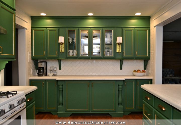
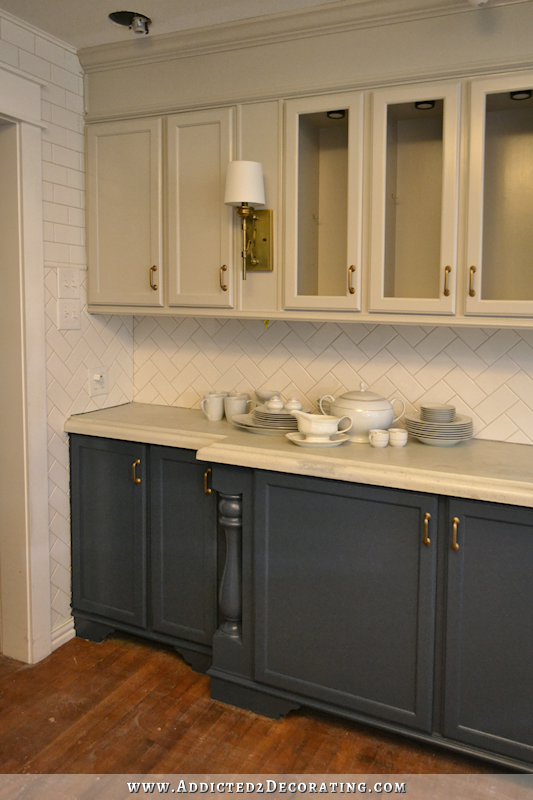
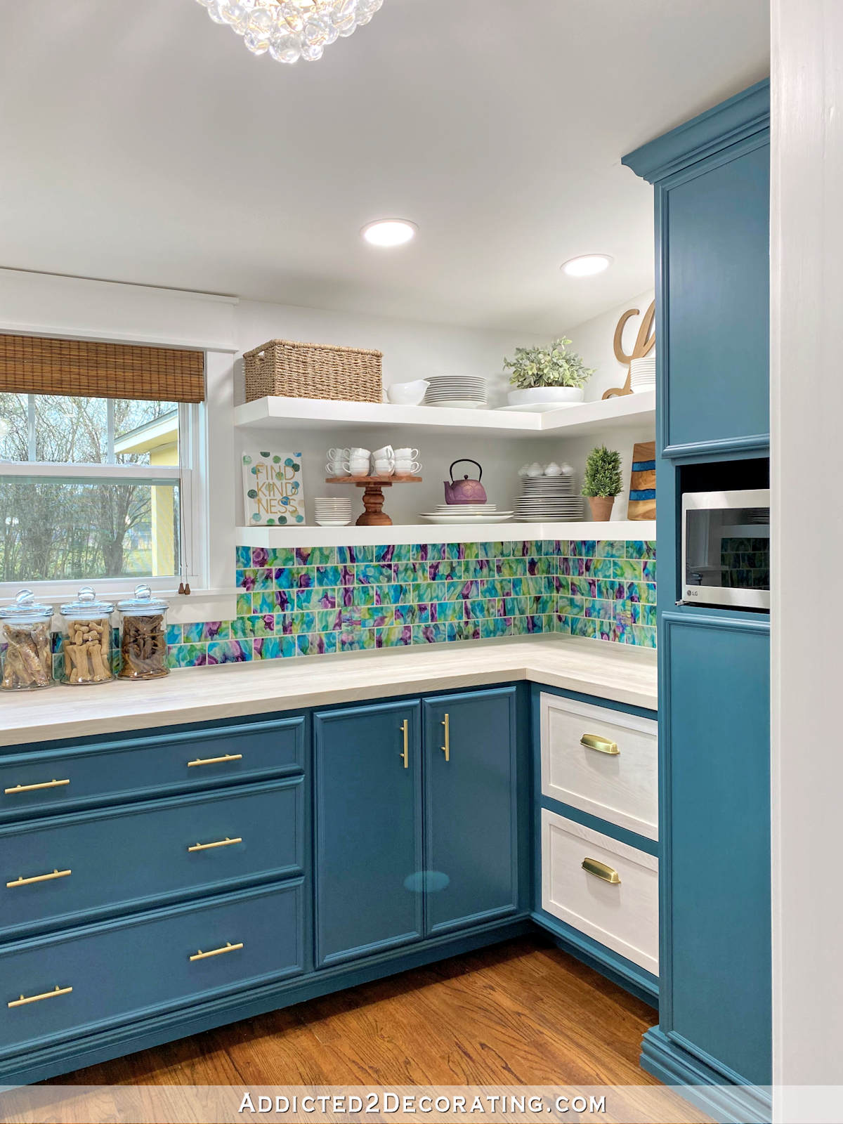
And here are the new colors: Revere Pewter on the upper cabinets, and Gentleman’s Gray (which is a very dark blue) on the lowers. You’ll also notice that I removed the corbels, and I won’t be putting them back. I think I’m just craving simpler, cleaner looks now.
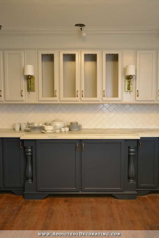
That countertop color looks even more drab now, so you’ll just have to imagine it with its new whiter and brighter finish on it. I also managed to break one of the glass door inserts, so that’s why none of the doors have glass in them right now.

Obviously I have lots of details to finish up, but I’m really excited about these new colors. While I loved the green kitchen, it just demanded to be the center of attention and refused to play nicely with the neighboring rooms. These colors are beautiful but subdued, and will complement the neighboring rooms beautifully.
Now I’m even more anxious to get my countertops refinished. (Click here to read more on that, if you missed it.) That drab color is depressing.
Anyway, my goal is to get the rest of the cabinets painted by the end of this week. That might be a lofty goal since Thursday is Thanksgiving, but I’m gonna give it my best shot.

Addicted 2 Decorating is where I share my DIY and decorating journey as I remodel and decorate the 1948 fixer upper that my husband, Matt, and I bought in 2013. Matt has M.S. and is unable to do physical work, so I do the majority of the work on the house by myself. You can learn more about me here.


Perfect… I love it so much…
I think it’s beautiful as well!
Very classy! I love it. Can’t wait to see it all finished.
Very classy look.
I’m a long time reader but I can’t say I’ve ever commented before… I LOVE the new colors. So beautiful!!
That is absolutely stunning! It looks very elegant and the added details show up beautifully! Have a wonderful week making your vision come to life!
Gorgeous. Really, really lovely. I know we have different tastes (I have small children so I value calm in my home environment while you appreciate a bit of pep) but I think the counters harmonizing with the uppers is serene, and makes your white crockery pop.
Absolutely fabulous!
I love it. Having never cared much for the green but appreciated how much you paid attention to detail. This is more complementary to the adjoining rooms. Bravo for you!
GORGEOUS!!!! I’m so glad we finall fiquired that out😉 Ellen
I love those colors together and they look great with the subway tiles, as well.
Beautiful, how could I have doubted you, I had wanted white on the top, but that gray is stunning!
Absolutely beautiful without overwhelming the senses. Even the countertops look good – in the pictures anyway. I think because the top isn’t showing too much. The edge of the countertops blends nicely with the cabinets and walls but I have a feeling in real life it might not work quite as well as it does in the pictures. Anyway, I love the new cabinet colors.
I thought the counter color went well with the uppers too. Maybe a similar color with the new counter material.
Ok- That settles it- I’m gonna paint Something with revere pewter and gentlemen’s gray!
they look FABULOUS~!!! wow what a difference
This is going to look amazing with white countertops! Love the colors
Kristi, this is absolutely amazing! Can’t wait to see finished and with the counter done! I think you made exactly the right choice!
This is gorgeous. Low drama, high class. Congrats.
A long time coming, but am enjoying your thought process!! These colors are just beautiful, elegant and classy are words used and I agree.
This is truly stunning. It looks like a completely different kitchen. Well done.
Love it! When I looked at the green kitchen all I saw was the green. Now when I look at it I notice all of your attention to the details. Perfect choice!
OH my. They look so much better. LOVE
Love it!!! Looks so elegant!!!
So elegant and much more serene. I like the blue much better than the green!
The colors are so beautiful together! I’m sure you will, but report back in a year or two on how the Advance paint holds up.
OMG – I don’t usually comment because I mostly love everything you do. But, I have to say that the color combination is fabulous, and it will be just perfect – your impeccable good taste really shows through with the cabinets. It truly looks like an interior decorator (you) knew how to do something really tasteful, without being something you see everywhere. I could not envision this myself, but seeing it done blew my hat off!! Just fabulous!! I want to be you when I grow up (I am 70 now)!!
I loved your green kitchen, it was different and beautiful. I was leary when you chose this new theme but it is beautiful. Very classy! I cant wait to see your finished product.
Dale I was gonna say the same thing. I loved the green for how “out of the ordinary” it was and how “center stage” but I do understand that it would be hard to get all the other rooms to be cohesive together. I wasn’t a huge fan of the new color choices as well but I am more than happy to eat my words (see what I did there, eat…kitchen lol) because it looks beautiful and I to can’t wait for the finished masterpiece.
This is gorgeous. Congrats
I have followed you for some time and this is absolutely beautiful! I loved the green….but, this is just WOW! Classic.
Looks great! Can you add larger images of your pictures? Clicking on them provides an option to add to pinterest. Really wish we could see a closeup.
I’ll add some larger images when everything is finished. I don’t do that on a regular basis because it slows down page load times. But yes, I will when it’s done. 🙂
Stunning. Just stunning.
I’m a long time reader, back from when you painted the couch! This is the second time I’ve commented. I really liked the green kitchen, but you are right about it not playing nice with the other rooms. I love many of your ideas and hope to implement some at my house.
When comparing the two pictures, I noticed that the pot lights were not on in the new picture? One of the things that made the green picture look so good was the lighting. Do you have plans to change it? Just wondering because I thought you did a fabulous job the first time.
I’m keeping them. I just removed the trim, which caused the bulbs to dangle there, because I’m about to paint the ceiling. (Yes, I realize most people would have done that first. 😀 ) And with the bulbs dangling there, they turn into bright glowing suns in photos. I’ll try to get much better pictures, with all of the lights on, when everything is finished.
Kristi…Are there/were there holes in your subway tile…where the corbels were?
Nooooo…I didn’t drill holes because I wanted the option to remove them if I grew tired of them. I nailed and glued them to the underside of the cabinets, and then adhered them to the tile with construction adhesive, which will scrape off very easily with a razor blade.
Looks great!! Love it! I’m a little disappointed about how your sconces don’t stand out much now, though. Maybe different shades?
Yeah, they definitely need something to make them stand out more. They look a bit drab now.
It looks grand!!
Am I right in assuming you used a primer to be able to use a latex over oil paint? It is a perfect compliment to your cabinet design. Are you going to do something different with the glass?
These were never painted with oil-based paint. I used the same Advance paint last time, but the sheen drove me crazy, so I added a topcoat of water-based polyurethane in a matte finish. To repaint this time, I just sanded them a bit by hand to rough up the existing finish, and then painted right over. But if they had been painted with an oil-based paint/stain/poly, then I would have first used Zinsser oil-based Cover Stain primer to prime everything, and then after sanding that smooth, I would have used the Advance paint over the oil-based primer.
 
I’m not doing anything different with the glass. I just need to order a new piece since I broke one.
Hi Kristi,
We have found that even though they shake the paint when mixing it, the additives for sheen settle to the bottom. This will result in an undesirable sheen. So be sure to give it another good stir before using. LOVE the new colour(s) and yes, I love using the new BM paint Advance
Your kitchen is looking serenely beautiful with the new paint colors, Kristi.
This is gorgeous! I love this new iteration of the kitchen, and squinting a little I can imagine the countertops brighter white. So elegant and effortless looking. And I think I like the new color scheme much better with your white appliances too. A great choice, Kristi, and so worth the extra work.
Stunning!
I love how your creativity takes a shift and boom! everything comes out fabulous once again!
Love it so much more than the green! Classy and adult!
Looking forward to seeing the rest!
Classy & calming. Looks beautiful. A very classic neutral type look that will complement the rest of the house. I still would try painting the hardware black and painting the sconces black. I think that would really give it a punch. But it looks beautiful as is. Just a thought. You continue to amaze us with your energy and tenacity to “get it right” for you and how you want the look and feel of your home. Great job . . . as always!!
I have to disagree. I think the brass is so elegant and very now. Black would be lost on the Gentelman’s gray and lend a whole different look. More industrial vs. elegant. I think brass pairs perfectly with the whole look of her house.
I definitely agree–you must keep the brass.
Oh my goodness! That is beyond fabulous. Great job! I can’t wait to see the rest of the plan. This is so much more YOU!
Classy! That’s what my Hubby said when peering over my shoulder!
Love,love love!
Looks fabulous…
Mourn the loss of that fabulous green kitchen. My personal favorite anywhere anytime! How close is the color of bottom cabinets to the original dark color in living room? BTW, this new kitchen is shaping up as lovely too.
It’s not close. Those walls were teal (i.e., lots of green in them compared to a true dark blue), and the cabinets are a true deep blue with not a hint of green in them.
Love it!!!! So beautiful.😊
Not to over use the word “stunning”, but this is – – – STUNNING! I didn’t care for the green but admired your sense of adventure. I also never even noticed the details of the turned posted built into your cabinetry when the cabs were green but the way the light hits the curves on this dark blue now is, well- just stunning! The finish on the paint looks like silk. The revere pewter color is perfect too. Just gorgeous, really! Can’t wait to see more!
Kristi, that is absolutely gorgeous! I don’t know what else to say… it’s simply stunning. I cannot wait to see the whole kitchen finished!
I loved the green but always thought it belonged in different house, it just didn’t seem to “fit”. I LOVE LOVE the new colors. Can’t wait to see the finished product.
Oh,let me count the ways… that i love these new colors as well as the clean lines of taking away the corbels! You did a beautiful job and i know the project will only get better from here!
Love the colors. your hardware stands out so much better. They look great with the colors. I really want a closeup to see how much of the grain got covered up. Pictures please!
WOW! I really like this color combination.
Absolutely, beautiful!!!!!!! Love so much better than the Green.
Crap, I hope you are happy! Now I have to paint my kitchen! 🙂 It looks so nice!
Honestly, I’ve been wanting to paint my kitchen cabinets for a long time. One night a few years ago I mixed up some paint and turned the formerly white, white walls into a lovely light yellow. But the cabinets are custom (i.e; made by the original homeowner) and they are stained. It was probably a very natural light color to go with the white tile backsplash, the green countertops and the former ivy theme wallpaper border and curtains from the late 80’s or early 90’s. But over the years the finish has yellowed and is now an orangey yellow pine. The other weird thing is there are no knobs or handles. So I did buy the cutest clear cut glass knobs, but we have yet to install them.
I debated for months now about painting and as much as I’d like to, I think I’m not going to put in all the time and effort because we hope to sell our home in the next few months. I’d also have to re-do the countertops and I think it is just too much investment for something the new owner will likely want their way and change anyway. But you’ve given me awesome ideas for our next place!
(Note: I do plan to install the glass knobs because I already have them and I think something is better than nothing.)
P.S. have you seen the Glidden color of the Year? Byzantine Blue. I need to see it in person because every monitor makes it look different, but it is so rich looking.
I thought I loved the previous color, but this new color scheme made me let out a sigh of relief when I didn’t even know there was an issue! lol! It’s BEAUTIFUL!! SO in love with this, glad you are too! 😀
The space looks so much bigger now!
The green was fine…..different and very you I thought….but this my dear spills class……I adore your choice….the grey is beautiful…and the cream so eloquent …….LOVE THIS!!!!!!
Love it so much, words escape me! I loved the green, but felt it was more suited to a New York apartment than a Texas rancher. This combo is what I would say is flexible to almost any home. And I am glad you removed the corbels for this design. Before I even saw the changed colors and saw the “before” photo, I thought the corbels may not work with the new paint. Your brass still looks great here, but yes, you may want to change out the shades. The finish came out looking like butter, great job and great paint!
I need to go back and see your tiling post. I’m getting ready to tile the kitchen backsplash and range hood area, and am trying to figure out both layout and where to end the vertical run at the hood. Thought about going all the way to the ceiling, but cabinets end about 1 ft. below ceiling, and I think it will look weird. Don’t want to tile in that 1 ft. space above cabinets.
Have to agree that tube new colors are fab! Glad you simplified by removing corbels too. I think the sconce shades would look awesome with a punch of color/pattern/texture. So excited to see the rest come together! !
Kristi, did you spray paint the cabinets or brush paint? The finish seems flawless, like spray paint.
I brushed them.
I read most of the comments and I don’t think I’ve heard the word “classy” more times in my whole life! But everyone is so right- it is classy, beauriful and all the rest. I definitely like the gold hardware with the new colors, and has been said, think your white appliances look just right in this scheme.
I may have to wait until you’re finished, but as of now I have to say that I preferred the green. With the corbels. My five cents for what it’s worth. 🙂
Loved the green color but now, this is absolutely beautiful, fantastic, etc. Love your blog…it is always interesting!!
That Gentleman’s Grey is gorgeous!
Gorgeous!
Looks great. I like the new colors much better.
So Kristi, did you strip the cabinets or did you just paint over the green? And did you use the timber mate or did the brushed – on paint fill in the wood grain? Did you use a little roller to roll out the brush strokes?
I really liked the green cabinets but I like this new cream and blue gray color scheme just as well. I think they are both about equal but if the new color scheme will allow you to get your thoughts together on decorating the breakfast room and the living room/dining room, then by all means ……
I have no creative ability at all when it comes to decorating so I just enjoy watching what you are doing.
Since they were finished with water-based products previously, and I was using latex paint this time, I just gave them a light sanding with 150-grit sandpaper (by hand) and then painted right over the the existing finish. No need to strip them. I did use the Timbermate on all but the four outer doors on the lower cabinets, and that’s because I ran out. I’ve ordered more for the rest of the cabinets, because I do believe it makes a difference. Brushing the paint on also helps since the brush pushes the paint down into the grain and fills the grain. I also did two coats of paint and sanded between coats with 220 sandpaper, which also helped to smooth things out. I didn’t use a roller, just a brush. The Advance paint is amazing and levels out to really minimize the brush strokes.
Just wondering, did you add the Floetrol to the Advance paint? I think I might have some kitchen cabinets to paint in my future!
The “new” kitchen is beautiful, and I can’t wait to see the finished version.
Nope, I used it straight out of the can. I asked the guy if I could use Floetrol in it, and he urged me not to. I was skeptical that it would look good without it, but was pleasantly surprised!
Kristi….you’ve done it again and simply wowed us! I loved the green kitchen, but in the end, I agree that it wasn’t playing too well with the other rooms, it was taking all the attention of the centre stage, but these new colors really take the cabinetry up another notch and make your cabinets look even more stunning and classy! Well done, love this color combination!
Lovely! I’m so glad you did this! I had debated doing some of our lower cabinets in a shade of blue, but chickened out and ended up painting everything using Sherwin Williams’ Simple White, which strikes me as pretty close to the Revere Pewter you used. It’s so nice to see what the combo with the blue and the subway tile looks like in case I get more adventurous and want to change it up someday!
I have been following your blog for a while now. First time I have made a comment … I love the new colors on the cabinets. So classy and timeless!
oh yes yes yes – plainer, less is better
Love the blue tone! But I’m conflicted about the Revere Pewter with the white tile. It doesn’t seem cohesive but I’m sure you’ll pull it all together….
I agree. Maybe it is just the lighting in these photos since she doesn’t have the pot lights on like she did with the photos when the kitchen was green. It might also just look different on my monitor than it does in real life. I love the color of the bottom cabinets, though and want to paint something with that color. That is a truly beautiful dark blue!
They are pretty, but no where near as striking as the green.
Oh my gosh!! Love, love it! I have a room in my home home painted the revere pewter. I also painted my kitchen and bathroom cabinets in the advance paint but different colors. I started following you when you were talking about the green cabinets. I loved them but I really love it now.
Wowza Kristi, oh boy, you did a great job. Classy to say the least, looks like a new kitchen. Love your colors and can’t even tell the counter tops look bad. Bravo Bravo! Don’t worry about your timeline, enjoy Thanksgiving, eat some turkey and so on. GO COWBOYS!
Happy Thanksgiving.
Many ahead of me have already used this, but…..ABSOLUTELY STUNNING !!! I loved the green, but this is much more elegant.
The green was gorgeous but never said “Kristi” to me. This screams KRISTI” from the mountaintops!! I love it- it retains its elegance but adds a more welcoming homey feel- which is what I love about your style- that mix of elegance and warmth.
Looks beautiful, LOTS of hard work !!!!
Great choice on the grey (blue) base. Adding a three pane glass to your cabinets would lend nice to bringing that grey upward and tie in nicely as well! The pane strip would be super easy to make and install. Marble on the counter – will look amazing with the colors you chose!
Sweet! It looks so rich. Kristi, how are you feeling about the revere pewter now that you have it on? I went out and bought a sample of it. In my daughters house it does change color with changing light. Do you still feel it’s more light khaki? It looks perfect on your cabinets 😀
I really love it. I wasn’t sure that I would, but I wanted to take a chance on it. There was just something about white uppers that didn’t really appeal to me. I’m so glad I took the chance. With the dark blue, it really does look like a really light khaki to me in my kitchen.
Hi Kristi,
I know another reader asked this, but I didn’t see that you replied. Did you use the grain filler? and are you happy about the end result? Looking forward to seeing an up close “oak grain” shot.
BTW, Love it!!!
I did use the grain filler on all of the upper cabinet doors, and the two big middle doors on the bottom. Then I ran out, and didn’t want to stall the project, so I went ahead without it on the four outer doors on the lower cabinets. I do think it made a big difference, along with brushing the paint onto the doors. Spraying just seems to accent the grain, where brushing really pushes the paint down into the grain.
I’m okay with the lower outer cabinet doors without the grain filler because they don’t get direct light on them as much. The two middle doors had very deep grain in crazy patterns, so I’m very glad I had enough to do those, and I do think it made a big difference. I’ve ordered more for the rest of the cabinet doors. It doesn’t get rid of the grain completely. In order to do that with this type of oak, I think it would take several layers of grain filler, primer, and paint, with lots of sanding between each coat. I didn’t want to go to that much trouble, as a little bit of grain showing through doesn’t bother me. I’m very pleased with how mine turned out. You can still see a hint of grain, and you can still see that they’re wood and not MDF or melamine, but the grain isn’t so in-your-face anymore.
I adore those colors together!!! In fact, I like the top color so much, that if I weren’t renting, I would be tempted to stop what I was doing and paint my cabinets!😀 (My old cabinets were boring white.). Great job! Have a great Thanksgiving 🍂🍁🌻!
Well, the gray family will be paying a visit to my kitchen soon I love this kitchen! I enjoyed it when you painted the green, but this is beautiful, Kristi! Bravo!
Wow! I loved the green kitchen, but I think I like these colours even more
I really like this! My daughter’s kitchen walls are Revere Pewter and they look a lot darker. Did you lighten it?
This color is so interesting. I used it full strength on my cabinets, and it looks pretty light. I also painted a sample of it on my living room wall, straight out of the same can, and it looks WAY darker.
Beautiful!!Love it!
very elegant looking!
LOVE the new colors! 😍 What a timeless, sophisticated centerpiece for your house!
I am so glad you said, “it just demanded to be the center of attention and refused to play nicely with the neighboring room”. I’ve made some decisions NOT to add something to my home, because of being “too bossy” and my friends look at me like I have a third eye! But I know exactly what you mean. It may be something beautiful (like your green cabinets) and something we love, but at the end the of the day, if it doesn’t play well with our other ideas…..something’s gotta give. Good job. The new look is really lovely.
Hi Kristi. I loved your green cabinets, but I like the change, too! “It is a woman’s prerogative to change her mind,” is a saying I used to hear a lot and it is so true. You are fortunate that you do this for a living and can change whenever you want to—lucky you, LOL! You will never run out of things to blog about that way, ha ha! (And we, your faithful readers, are so glad!)
I just wanted to comment that ADVANCE paint does have real alkyd’s (synthetic oils–all oil paint nowadays is really synthetic alkyds) in it and is considered a hybrid (an oil in a water base), not a latex (which is a commonly used misnomer ,as no water -based paint really uses true natural latex anymore-they are really all “acrylics”–but I am sure you know that.) That is why Advance brushes like an oil! It is a good thing that you did not choose a white for your cabinets with this paint as it may eventually yellow slightly in a room without any direct sunlight because of the alkyds/oil in it!(though not as much as a conventional oil/alkyd paint. I am about to paint some bathroom vanities myself and did lots of research about this (ok, I obsessed about it and totally “geeked out” about cabinet painting info online and called companies, paint stores, etc !) I narrowed it down to to Advance vs. Cabinet Coat. I decided to go with Cabinet Coat because I am using a white paint and also because Advance can be slow to fully cure and harden (like a true oil!) If I had seen this post before I bought the paint though, I would be tempted to try the Advance because your finish looks gorgeous and like it was sprayed professionally. Did you find it drippy at all? How is the smell? Thanks.
No, it wasn’t drippy at all, and I don’t think I only had one run, but it sanded away really easily before the second coat. And it does have a slight smell to it, but I didn’t find it to be an offensive smell at all. I actually like the smell. 😀
Beautiful! You continue to inspire me.
I’ll admit it, I tried really really hard to love the green kitchen, but it just isn’t in me!! I’m a blue girl through and through and I am totally in love with the new colors. It. Looks. GORGEOUS! Crap Kristi!! Now I want to repaint my cabinets! PERFECTION!
The new color scheme really lets the details shine. I never even noticed the lovely sconces before because the green took all the attention, but now they really pop.
I really like the change. I just painted the outside of my house revere pewter and love it! I had my island painted blue, but I was disappointed the painter bought my paint at Sherwin Williams instead of Benjamin Moore. He said ‘paint is paint’. I disagree. He bought a satin and now the paint is chipping off. They sanded, primed and then rolled the paint on with flotrel (not sure if spelled right. It looks almost like a flat paint and shows every little thing. I am thinking about maybe putting a matte varnish on it. The man at The Benjamin Moore here in Waco told me to bring cabinet door over and they will help me figure it out.
Love, love, love it. I appreciated why you did thd green and thought it looked amazing, but these colors will be more versatile and will coordinate with the other connected rooms. Question – did you take off the doors and hardware? How do you paint both sides of the doors without dining up the side that is laying down? I’m sure you have some tricks up your sleeve. You seem to make painting look effortless. Thanks for sharing with us.
Yes, I did remove the doors and the hardware. I always paint my doors while they’re lying flat because gravity helps those brush marks to smooth out as they dry.
I always begin by painting the back side of the door with two coats of paint. Then I let it dry overnight. Once dry, I put down a piece of butcher paper (I buy the widest I can find) and place the door right side up on the waxy side of the butcher paper to paint the front with two coats of paint. When that’s dry, the door lifts off of the butcher paper very easily without sticking at all, and the smooth, waxy surface of the butcher paper won’t mess up the door at all.
Awesome idea to use butcher paper. I never would have thought of that. Thanks again.
OMG! I haven’t read any of the other comments, but what can I say? It is gorgeous! I can’t say I ever loved the green, but I LOVE this! I am painting my cabinets a light and dark gray/green, so while I love green the bright green was just too over powering. I really love the new colors!
Good bye beautiful green kitchen! I will miss you! Now to see what new beauties you design and how it all comes together. Love following your blog, Kristi!
You are inspiring. Love, love, love what your have done!
Without a doubt! This is up there with the best redo you have done. Well done! I’m in love with it.👏
Kristi, is your dinnerware from Turkey?
Yes! It is! I love it, but those tiny little coffee cups have never gotten use here. 😀 I think they’re adorable, though, and the look great behind my glass cabinet doors.
That green was striking, but I could spend much more time in this kitchen… Like! <3
Kristi, you amaze me with your ideas and i envy your ability to change colors and schemes without batting an eye! That being said, please, please don’t change your beautiful handpainted wall in your entryway!! It makes such a statement upon entering your home 💚
I love it. I thought the green was a showstopper, but this is even better!
I have a question though.
Someone else may have asked this already, I haven’t read each individual comment. Seeing that the dishes you display in the cabinets with glass are almost the same color as the top cabinets I’m wondering if the backs of just those cabinets might be better if they were painted the blue also, or would it be too much? I guess you could take a piece of cardboard, cut it to the size of the back of one of the glass cabinets, paint it blue and put the dishes in front to see if it helps them stand out a bit. Not trying to cause more work, I guess I am thinking the dishes will not be seen or look “lost” being so close to the color you have painted the uppers.
I agree, the dishes will get lost on that light background. I’m actually planning on using some of the leftover grasscloth from the breakfast room on the backs of those cabinets. Unfortunately, the grasscloth is backordered until Dec. 7th.
Oh! That will be awesome! I should have known you have all this under control. It is amazing how much bigger your kitchen looks with the lighter cabinets on top!
Were the cabinets originally painted with oil? If so, what did you do to prepare them for a latex overcoat that would bond?
They were painted with latex. But if they had been oil, I would just sand by hand with 150-grit sandpaper, prime with an oil-based primer (Zinsser Cover Stain is my favorite), sand with 220-grit sandpaper, and then paint with latex paint.
Thanks for the input.