New Studio Wallpaper Design (And A Few Other Updates)
Things have been slow on the studio front over the last few days as I’ve been working on installing the rest of my outlets and switches, but I did finally get the back entry light fixture wired up so it actually has power now. I was so excited to see it turned on and show y’all what it looks like, but ugh…I have such a hard time getting good pictures of lights when they’re turned on.
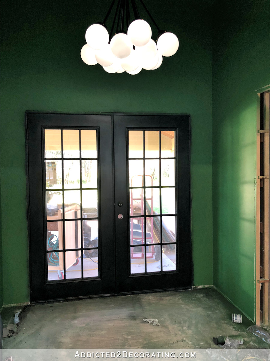
I don’t know why the picture shows dark areas on the globes. 🙁 You don’t see those when you’re actually standing in the room. So, booooo.
Anyway, that circuit is now all wired up and working, and my sweet mom came over yesterday and scraped the overspray off of the glass on the back doors. It looked like this before she started…
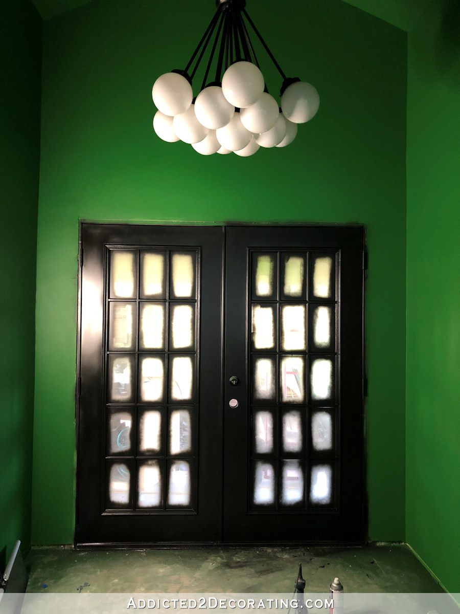
And now it looks like this…

I can’t wait to get some pretty white trim around the doors! That’s going to look amazing against the green walls and the black doors. But I can’t do trim until I at least put in the second layer of subfloor, and it would be preferable if I could also get the flooring installed.
And while my mom was working on the doors, I had a guy over here to remove the ceiling fan, reduce the length of the downrod, and reinstall the fan closer to the ceiling. Remember how low it was?
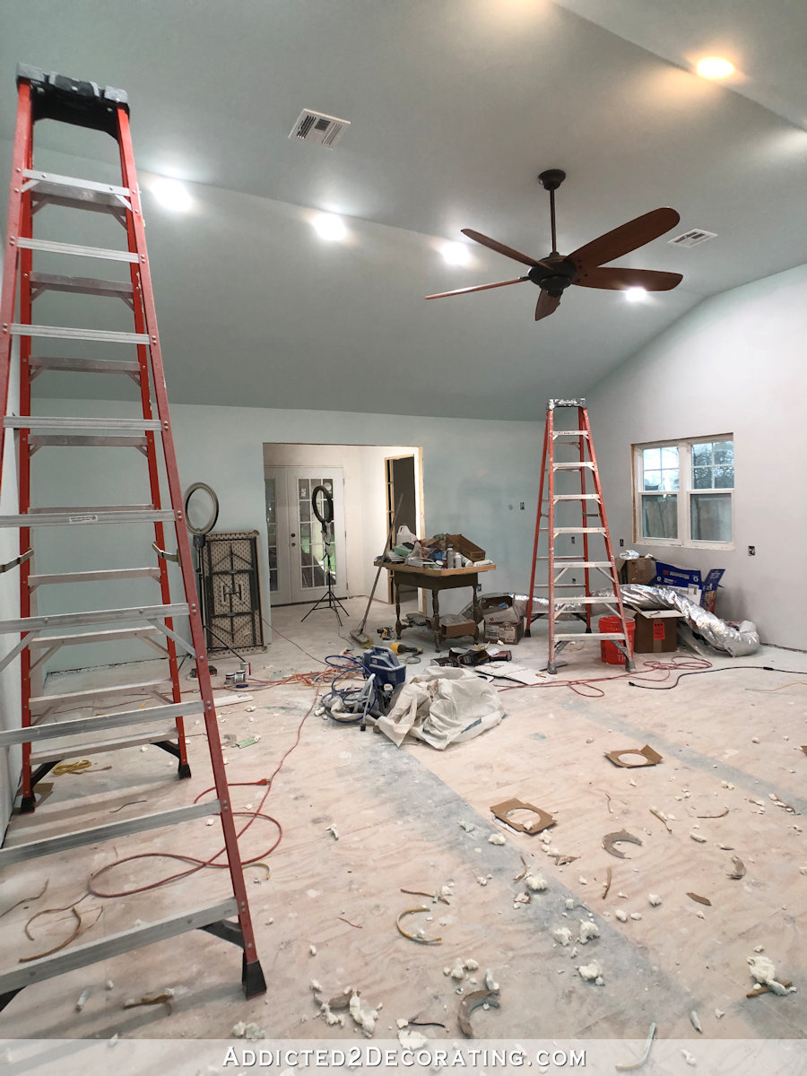
Well, now that sucker is hugging the ceiling.
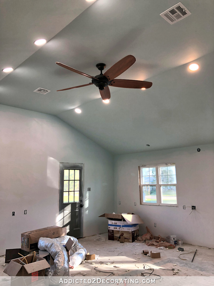
I think it looks so much better, and while I was afraid that it would drastically cut down on the air flow, it doesn’t seem to have affected it much at all. That huge 68-inch fan still pushes quite a bit of air, so I think it’ll be really comfortable in there during the heat of the summer.
Now my question is…to paint or not to paint? Ever since a few of you mentioned the idea of painting the fan to match the ceiling and walls, I haven’t been able to get that out of my mind. I don’t really like the fan as it is with its oil-rubbed bronze finish (that’s just not a favorite finish of mine), but it was the nicest big fan I could find locally, so I went with it.
But the idea of painting it to blend in really intrigues me. Should I? I mean, that’s one of those things that can’t be undone, kind of like painting brick. Once you pull that trigger, it’s done, and you have to live with it. So I’m hesitant, but intrigued.
Anyway, to the main point of today’s post. I got my wallpaper sample with the edited design. If you’ll remember, I decided to change the background color on the floral design so that instead of being white, it would match the light aqua color on the walls and ceiling. I also ordered a much larger sample so that I could see an entire pattern repeat. I arrived yesterday, and here’s how it turned out…

As you can see, the background color that I chose is just a touch darker than the wall color. I can’t decide if that’s okay, or if I need to edit it again and order a new sample. Ugh. I hate wasting money on samples.
Here you can see the new larger sample with the blue background and the original sample with the white background.

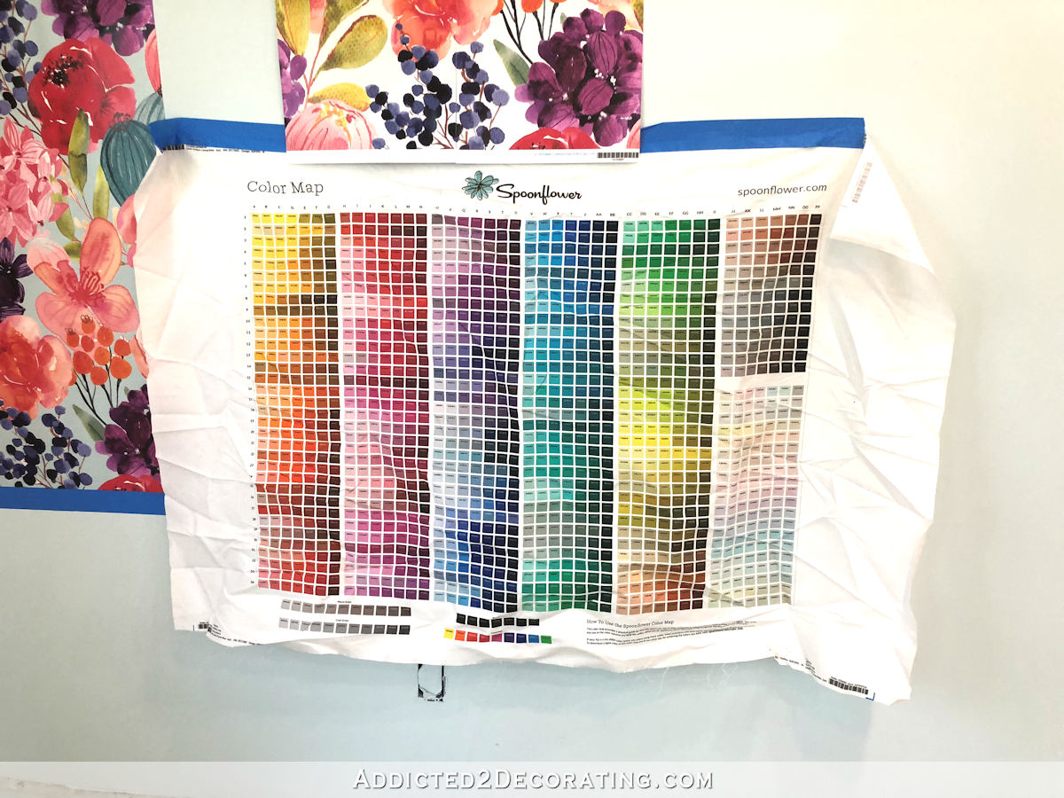
I definitely prefer the blue to the white, but I’m just not sure if I should go with this one, or lighten it just a touch. I thought I was choosing the exact color, but the Spoonflower sample chart has such tiny samples that it’s pretty much the same thing as choosing a tiny paint sample and trying to imagine it in your entire room. Here’s what their sample chart looks like printed on fabric…
So anyway, I haven’t quite decided yet if I’m going to just go with it or edit it again. I’m going to continue looking at it as the lighting changes in the room throughout the day.
As a side note, I think that color chart is so pretty that I’m thinking about framing it and hanging it in my studio somewhere. I think it would make an interesting piece of artwork.

Addicted 2 Decorating is where I share my DIY and decorating journey as I remodel and decorate the 1948 fixer upper that my husband, Matt, and I bought in 2013. Matt has M.S. and is unable to do physical work, so I do the majority of the work on the house by myself. You can learn more about me here.
In the photo with the two samples side by side, I thought it looked great. But in the photo with the color sample chart, the paper looks too blue, and not aqua like your walls. At least it does on my tablet.
If you’re questioning it, I think it’s worth the cost of another sample. Better to pay a little more now than not be entirely happy with the finished product over something you’re already unsure of. I’m OCD enough, I’d have to lighten it, but I also realize that since it’s covering the entire wall, odds are good, you won’t REALLY notice the difference.
I LOVE the wallpaper though, and kind of want to try to make one myself now! And I’m super intrigued by the idea of the painted ceiling fan. I selfishly hope you try it just so we can see how it turns out!
I’d lighten the background color. I’d leave the fan as is for now.
I am a huge fan of the green, black and white! The floral paper you designed is fabulous, but
I would go lighter on the background. To my eye, the current color muddies the purples. But that is just my opinion and my eye over a computer screen. LOL.
I agree with you Joy. I believe the blue dulls the beautiful colors in the wallpaper. Personally I’d go with the white which would complement the white trim.
I agree.
I agree – its a fresher look. As for the fan I think the question is do you want it to be a feature or fade into the background ? Personally i think u want the focus on the wallpaper and artwork not a fan detracting from that.
I agree with Coleen and Rachel as far as the fan goes. IF you are asking what we all think about the background color of the wallpaper, then I agree with Coleen and Rachel on that, too. However, you do you, and it will all be fine!
I agree too.
I see I’m not the only one who thought all the beautiful colors in the wallpaper were dulled down by the blue background. 🙂 It lost some of its wow factor to me. As far as the ceiling fan, could you open your picture in a photo editing software and color the fan to get an idea how it would look. Not sure I would like the fan painted the same as the ceiling. Maybe use the fan as a decoration piece and paint it a contrasting color instead?
Lighter is better!
I think the blue background looks great on the photo. I also think it adds a very nice touch of depth to your overall wallpaper design!
Lighter! It doesn’t have to exactly match your paint, just coordinate. The lighter the blue, the more the other colors sing. As for the fan, I’m sure you know this is a decision to make after the room is done. 🙂 And I LOVE the light!
If you wanted to recoup your sample costs, you could probably sell those pieces. Alternatively, make pillows out of them? Or do like the color sample chart – frame and hang in another part of the room.
I love Laurie’s suggestion of making pillows out of those fabric samples! I also love Kristi’s idea of framing the Spoonflower’s color chart sample. I’m currently working on quilts so everything I see, I wonder if I could make it into a quilt LOL!
Fabric samples? I thought these were wallpaper samples. They can still be framed though.
Where the wallpaper meets the wall, in the corners, the paint is usually darker because of shadowing. I think the background color of the wallpaper is perfect for that application. I love all the color!
And I don’t think I would paint the fan. I like the contrast and once you get everything else in that room it’s not going to stick out so much. I think white fans are kind of boring
I agree with Trace – you aren’t going to have this slightly-different color on the same plane as the walls, so I don’t think it will be as noticeable. Try pushing the sample over to the corner and looking at it that way in the different lights of the day.
I was going to say the same thing. When it meets at that corner it will always look slightly different no matter what. I like having a bit more saturation, so that it won’t be so washed out with the beautiful coral cabinets. On the ceiling fan, I’d wait. Since you’re using the marble look flooring and all of the woodwork in the space is going to be painted various colors, having a bit of warmth from the natural wood might be a needed balance in the space.
I so agree with Trace! I think the color will be wonderful when you get it all up, and I don’t think it’ll be that “in-your-face” once the cabinets are installed and painted.
I also agree with leaving the fan as is. We painted one a long time ago, hated it until we could replace it. I’m afraid that’s what you would end up doing with this one.
I’m in agreement with this group! Leave the darker color and wait to paint the fan. I do like that idea, though.
Hi talented Kristi,
I love watching your studio project progress! The colored background on the wallpaper is really pretty. If you decide to do another adjustment to it perhaps consider adjusting some of the green leaves to a green that matches your green walls in the studio entry to connect the studio entry green with the pretty featured wallpapered wall.
Also, if you decide to go for it on painting your ceiling fan and you end up hating it remember that you can always purchase a new fan so you don’t have to feel like you are stuck with it for life, you don’t have to be.
This space is going to so exciting for you to have, I am so excited for you to have this beautiful space for you to have!
I love it…It does read a little moody, like a grey day…but that could be my screen.
I like the white background because I don’t think the feature wall with the wallpaper has to match the color of the walls. It just needs to work together and the white is more universal so if you still like the wallpaper, but later want to change the wall color you’re not so tied to the background color.
I agree.
You are probably gonna hate me for this Kristi – but I think you should leave the wallpaper with a white background because I feel the aqua background sucks the life out of the flowers – and it reduces the watercolour quality of the original design.
The aqua background makes the flowers look like they were cut out and pasted on a coloured background rather than being painted on white paper because you can still see white through the translucent and transparent areas on the flowers but the ground around them is different.
I don’t think there is anything wrong with having a white background on the wallpaper and having the complementary aqua on the other walls, especially because the aqua is so pale.
I agree. I like the white background for the above mentioned reasons. I also agree with leaving the ceiling fan alone until the room is complete, then make a decision. It’s going to be a beautiful room any way you do it!
Carswell – That is so funny, because I thought the blue background made the flowers look more life-like. I guess every eye will see it differently! 😊
Do you have an old ceiling fan that you could paint to see if you like it that way without doing it to the new one? That way if you don’t like the way it looks your not stuck with it.
That wall paper is a big commitment, I’d bite the bullet and get the sample. You’ll be happier.
The blue does make the pinks sing in the paper. It’s lovely!
So much pretty to look at! The light looks amazing, definitely a show stopper. As for the fan I don’t think i have a photo of it but we had a white and brass fan in my daughter’s nursery and I spray painted the brass a fun bubble gum pin. I loved the way it turned out. The blades were white and the parts that held them on were pink and the filter cover for the motor was pink. Maybe a touch of color on the fan instead of just plain white. Your wall paper is beautiful. I love the big bold pattern. From the photos on my monitor the white background actually reads closer to the wall color than the bluish one. I would definitely go lighter and more green or just leave it white.
Stephanie, that’s how my monitor is reading regardless of which way I tilt it!
Since your wallpaper will be going corner to corner (right?), I don’t think think you’ll notice the difference because paint colors tend to change during the day and evening. Of course, it may look totally different in person than it does on my screen. I love the difference the change in the background makes in the flowers. I also love the idea of using the sample colors as artwork.
Ceiling fan blades are usually reversible right? Try painting the back side and reinstalling before committing. Then you could spray the bronze fixture either a silver metallic or with the same blue ceiling paint. Now I need to search pinterest to see if it’s ever been done!
Yes, just paint the blades for now. When all the pendant lights are installed you might love it. The wallpaper is wonderful!
I’m pretty solidly on the keep-the-background-white bandwagon. As many others have already said, in the photos at least, the aqua background dulls the beautiful, bright colours of the florals.
Sorry, I didn’t mean for my comment to end up as a reply to yours! I was trying to scroll to the end of the comments on my iPad, and must have tapped on a “reply” button. 🙄 And I tried to figure ouy how to delete my comment, and I don’t think I can.
I agree. Leave the fan colour until the rest of the room is done. It might look awesome in black.
I know you obsess over details and it usually shows but I don’t think the green background is important. The white background will look great with the white woodwork. As someone mentioned the white background is more versatile should you ever want to change the green walls. Not that you ever change your mind!
I haven’t read the comments, so my .02 may have already been input as to painting the fan blades: remember that any weight added to those blades may affect the air flow and also the motor speed, which in turn could cause eventual damage to the motor.
Love the green with the white globes. Everything will look so amazing once you add the white trim around the black door.
Not too sure about the background color in the wallpaper. I think the white background looks so fresh. I would leave it white. As for painting the ceiling fan – I agree with Suzan about doing a test paint on old ceiling fan first. I know you can always replace it if you hate it, but then who wants to go down that path when you can practice on an old fan.
I personally like the white background it makes it pop more on my phone the blue looks dirty to me but who knows
I painted my fan blades black because I hated the wood look now they look great kept the brass downrod
Diane at In My Own Style painted a ceiling fan. So it can be done
If it was me, I would not paint the fan. But obviously, it’s your space. You do you. I hate wasting money on samples too but I’d rather pay money on a sample than buy a whole wall’s worth of wallpaper that is not the right color. I would lighten it up– you want it to match so make sure you do what you want now and don’t regret it later!
even aside from the paint vs background debate…Just looking at the sample on it’s own, the background seems to suck light. I’d definitely try lightening it. And as almost every other comment has mentioned…you’re very detail oriented I think it’ll drive you batty. AND custom paper has to be a significant investment…it’s worth the sample fee to ensure you get it right.
I love everything you are doing! The green, white and black is one of my favorite combinations. On my screen the blue background seems to muddy the pattern colors compared to the white. This surprised me. Maybe lighter would change that or white might let the pattern shine best.
please don’t paint the fan!! In my humble opinion, you need that touch of black to tie in with the black doors. I personally think the pale blue background just takes away from the beauty of the florals. The white looks so clean and fresh and really makes the other colors pop. I hate to use a negative but can’t think of another word except “dreary” for the blue background.
If you’d ask me, I would go with a lighter background in the wallpaper, as my monitor makes it look rather dark – but I’m pretty sure that you can decide this so much better as you stand in the room with the samples and the blue walls! What I meant to suggest was to cut out the little squares with the blue colour that might be the right ones and put them directly onto your painted walls to decide – only then you cannot use that chart as a piece of art anymore, bother… I’m pretty sure that you will come up with the perfect solution, I just felt like commenting today, sorry if that is no real help…
Btw, you have an amazing mom, I was already dreading that cleaning process on your behalf, how sweet of her to have done this for you!!!
I definitely agree. No paint on the fan!! I don’t like paint on everything. And the white background looks much nicer to me.
hmmm, Pam, I’m not so sure about the fan – I would be tempted to paint that, too, to blend in better. But I would leave that decision until the end of the decation to see whether the fan as is really disturbs the room’s look or not (as I would dread having to get it down, paint it, and get it up again :)). About the wallpaper: I can imagine that with a light blue background, not necessarily the white one, but as I said: it’s really a question of seeing it in the room as the screen might be making it far darker as it really is…
I’m no help on the background color. I like both.
But using the color chart as artwork…yes. I have always loved the Sherwin Williams commercials when the use the paint chips to create a picture. I’d love to have those pictures to frames! SO many shades.
I can send you an old fan to test!!! 🙂
I really prefer the white background on the wallpaper. Anything else will dull the contrast with all those beautiful flowers. Also, since you’ll be using white trim to contrast the black and green, I think the white background will compliment that look better. Also, if you ever choose to change your wall color, you’re stuck with the blue in the wallpaper. The blue makes it look muddy or dirty.
I love new light fixture! It looks gorgeous against the green.
Photoshop the fan to different colors. . . I would lean to painting it black, white, or the ceiling color. 🙂 With my monitor, the wallpaper reads a gray toned background.
I’m not a fan of the dusky background – at least on my monitor! It hasn’t mattered much which way I tilt the monitor, it takes away from the freshness.
Hit enter too fast. If you do want to keep the blue background, definitely lighten up!
First, I think, just from looking at the wallpaper color on the computer screen, I would definitely get another sample with a lightened tone. The rub here is “looking at a computer screen.” They are usually not a precise reflection of a true color. Only by looking at the color “in the studio” can you really see the overall effect on the room. So I think that’s going to be your call alone. However, in my mind, it’s worth the extra expense for another sample to ensure you feel really comfortable with the final color. Personally, I would like something that falls between the two samples.
You talked about painting the fan to match the ceiling and walls, but would it have to be an exact match? You could stay in the same color family, but go darker or lighter, or both, if you preferred. I love the suggestion to try painting a fan that you might have laying around, or even getting something really cheap from a second hand store to practice/play with so you get a very accurate idea of the effect it will have. As usual, I’m sure that whatever you decide, it will be beautiful. and more importantly, it will be you! As my husband used to say, “onward and upward to greater glories.” You go, girl!
Some really good points have been made here and I guess I am repeating a few of them. I know you said you really preferred the aqua background but I think that there is always the distinct possibility that you may want to change things up color-wise down the road (LOL). If that becomes a reality then the white background would be the better choice $$ wise and would also play off nicely with the white trim.
If you hate the bronze finish (it looks black on my computer screen) you could always just paint the housing black to match the rest of your lighting/door and leave the wood for now.
(BTW, I painted my bedroom fan to match the ceiling about 5 years ago and there have been no problems as far as the motor is concerned)
I think anything you decide on will look beautiful.
On my monitor, the color in the paper background is very much like the wall, and I think it looks wonderful with the print. It just seems softer to me. I think you will love it. We have the exact same fan – very large for a very large area. I think it might be good to leave it until you can really see if it needs to be changed. You might like the contrast! So far, everything is looking great!
Love your colors for foyer and the chandelier but I would have a white ceiling. It seems so dark in there, needs more natural light or something!
I have a couple of thoughts on the wallpaper. I love the background in aqua color and think it looks fine as is, especially since it will be covering one entire wall and will meet the other walls in the corners. I don’t think a tiny difference in color is going to be very noticeable at all. My second thought about it is that while I love it in that color, I wonder if later you will want to change the wall color in the rest of the room and then, it might not fit in with whatever color you change to and the white background would have been better. That’s the conundrum. As far as the ceiling fan goes, if anything, I would paint the metal parts and down rod black to match the other lighting fixtures in the room and definitely not white. I think white would stick out like a sore thumb. You could paint the blades black, too, but if you have other wood tones in the room, they will complement that.
Whatever you decide, it all is going to be lovely! I love the choices you’ve made and everything is coming together just beautifully!
I know you didnt ask for input on the wallpaper. But if you had I would vote for the original white background. To me the colors appear more vibrant in that sample. On the fan, if it was me I would wait until the rest of the finishes are in, and then decide because by then the answer will probably be obvious. 🙂
Kristi, the wallpaper is spectacular. I like both, but as stated earlier ,the white background really pops. I painted my ceiling fans in my bedroom and I am happy. They blend with the walls and I think it looks better. Blades are not expensive (I don’t think lol) so if you aren’t happy with the painted blades I don’t think it will be a big deal. Having said that, I think you will like them better painted.
You’ve probably already made up your mind about the wallpaper background, but I’ll weigh in—remember this is only what I would do based on what I’m seeing on a small phone screen, but I would go much lighter with the background, maybe a couple shades of the aqua. Just enough to keep the background from being stark white since that was what you didn’t like. On the fan, I’d wait until everything was finished before deciding,, but if you did want to paint—I’d paint the blades the color of the ceiling—where they would blend into the ceiling.
When I first saw the entry light I thought “Yeah, it’s nice.”, but seeing it on is a whole new ball game. It looks like a big billowy cloud. I love it!
Fan blades should not be painted. It changes the balance and is impossible to fix. I would also be wary of painting the motor. I actually think the dark color looks good. The wallpaper with the blue background looks better, less stark, with the blue walls.
To me, the darker background gives the flowers more dimension -as if the background was receding and the flowers were forward. The white background gives a much flatter look. Perhaps the lighter aqua would do the same. I really like the darker background.
Funny how different people see different things! To me, in the wallpaper, the bright colors look muddied/grayed when printed on the aqua background and don’t pop like the white background. But again, computer screen vs being there. As for the fan, can you tape up some white/light colored paper on the blades (provided you don’t have to actually turn it on down there in Texas LOL) just to get an idea? The foyer with those bubble lights looks fantastic!
I would lighten the background, or leave it white. Do the fan blades have another color on the reverse? The hardware almost reads as black up so high, so that will coordinate with your black pendants, but the blades could be lighter.
Great idea to frame the color chart!
Ok, my 2¢. On my computer, the blue background makes the flowers look much more life-like. Maybe it is my mind seeing the sky behind them instead of a wall. The color emboldens the flower colors, it does not muddy them at all.
As for the fan, which parts are you thinking of painting? The blades? The casing? All of it? I don’t have an opinion (good thing, huh) because I am not sure exactly what you are thinking.
BEAUTIFUL rooms!! This is so fun to watch!! Thank you.
P.S.
As far as the sample goes, get another sample. Remember, be careful not to be “penny wise, pound foolish.” (Love me some Old Wives and their Tales.)
Frame the color sample!! It is gorgeous!
I’m done!
Kristi,I have painted and wall paper ceiling fan blades for years and it has never hurt the way they worked. I love the white background on the wall paper. I actually think you would be happier if the walls had been left white with the blue ceiling . You are a very special decorate r ,so do what makes you happy. I absolutely love that pantry.
I’m not crazy about the blue background on the wallpaper – it dulls the flowers and seems muddy with a gray hint to me. (At least on my screen) I like the white background better. Now if you could just have a “whisper” of blue in the background, it might be okay, and I think maybe just a tad more of a yellow tone in the blue also to brighten it. But I know what you mean about getting yet another sample. DO frame that chart! Great idea, and it might come in handy too!
I’d get the sample, it takes less time and is cheaper than ultimately redoing the entire wall because it’s slightly off and it drives you bonkers.
The framed color chart is a great idea and will come in handy when you are looking at color options.
I’m blank on the fan, I guess I’d want to see someone’s else do it first and how that looked.
I am so partial to this ceiling fan. We had it in our last house, and often I was cold with it on! That being said, I would wait on painting it. What readers can’t see is how beautiful the fan blades are—both curve of the blades and the wood grain/color. And I know it was kind of costly, (but that’s a relative statement.). Sigh. I never thought I would be so partial to a fan! 🤣
I’d say go lighter. Maybe it’s not necessary to order the sample.
At last, something about which I can offer some comments from my own experience! We live in a hot humid climate so if a room is occupied, the fan is on, for pretty much 9 months of the year. We have had three painted fans. Two have been shockers! The leading edge of the blade cops a beating and the paint bubbled and peeled in a few short years. The only one to have stood the test of time is the one painted with car detailing paint. Expensive but it can take the punishment. 27 years and stilll going strong. Funnily enough, that fan was painted brown to give some contrast to a room, the rest of ours are now ceiling white in colour.
Given your vibrant colours and dark light fittings, I recommend putting the option of painting the fan as the last item on your job list. Evaluate when everything else is in place. You don’t want to be doing that job twice!
Oh and definitely lighten the background of your wallpaper … let your beautiful florals zing! I can see a commercial future for that paper …. it is glorious!
Go for the new sample and have it be the way you want it.
Perhaps you could use the old samples as the backing for a bulletin board or shelves or drawer liners?
I feel like the background hue is subtle enough that it doesn’t have to match perfectly with the walls, but I love it so much more than the white background! I wonder if while you are considering playing with the background color and ordering another sample…maybe you could try to adjust one of the greens in the wallpaper to match the back entrance green and see if it makes it too matchy-matchy or if it works.
The blue background dulls down the paper to me. You lose the vibrancy of your colorful paper. Is that what you want? Are you trying to tone it down ? Why is painting the fan irreversible? If you hate it, can’t you jutst paint it again?
More 2 cents from the peanut gallery here! I would get the color background you want. You have a very discerning eye and to not want to spend more $ on another sample is just foolish. Get what you envision. No surprises here!
As far as the ceiling fan I would leave it OR if you really need yet another project , perhaps paint it all black? Black would be a neutral in the room and coordinate with the back door and the flyer light fixture. But shouldn’t you have painted it before you put it back up? As in it would have been easier to spray paint it all before it went up after shortening the down rod? Me and my big ideas…Sorry!
I like the white background of the original sample. It will go with your white trim. My vote on painting the fan is No, No, a thousand times no😊no one really notices a fan. If it looks cheesy when painted, then it’s ruined.
I like the blue background on it’s own but it changes the once neutral greens into sage blue green dominance. This would be ok to me if you did not have such a true green entrance. I think the white background might be the best bet if you do not tweek the greens. I am afraid that even the lightest blue will still give the dominate overall appearance blue green and nothing To tie one room to the next.. Of course all of this relative to what you love and makes you smile when you see It. Ceiling fans seem to recede when all furnishing are in the room. And in hot Texas you will probably be running the fan most of the time so blades may not be noticeable. I hope you find your perfect medium here because it can be a costly mistake to live with. I know you have looked at it from every angle imaginable so no comment on moving it around. Good Luck
I really thought the blue background was a wow, but thinking while reading comments,what if you want to change wall colors? Go with your gut. Everyone and every computer sees these colors differently. I would leave the fan alone until you finish room then decide.
Why not leave the fan base the color it is, and paint the blades white? And if you think that the background color of the wallpaper is too dark now, won’t it look even darker after you get it up on the wall?
I prefer the white background for three reasons… it appears “brighter,” if you want to change wall color later on you won’t be married to the existing color because that is tied to your wallpaper, and (like someone already commented) the highlights and cutouts in all of the flowers are pure white (and not the blueish background color).
I would also wait to paint the ceiling fan because you never know what color you’ll want to paint it until the room is almost finished.
I hate the blue background in the wallpaper. Eww! Maybe if it were more pale? Just a hint of color. The white is crisp.
I love contrast…
Just my 2 …
I luv, luv, luv the wallpaper….but find the pale blue dulls it down. I love your use of bright, vibrant colours…and prefer the white background. I know whichever colour you chose…it will be gorgeous!!
I just did this exact thing- wallpapered one wall with painted cabinetry to match the background color. My spoonflower sample ended up not being big enough for me to gauge the colors, so when I put the wallpaper up I was shocked and thought the background was too bright next to the paint color (and it was), however I just decided to go with it. Because I’m not tearing down wallpaper and buying more. By the time I got all the built in shelving over it, it looked great. I actually like that the wallpaper background is deeper than the paint color. Gave it more dimension and it’s not overwhelming once everything is in place. Just my experience.
From the title and the thumbnail, I thought you had changed the wallpaper to the Spoonflower color chart! I thought wow! What a funky wall covering for a studio!
In the photo of your partially painted wall the color looks like a light aqua. In the photo of the wallpaper sample next to the orange cabinet mock-up the wallpaper background color looks gray. Is the orange leaching out the blue, or is it because of the lighting in the room? I realizes monitors can play tricks with colors, but I am looking at these photos on the same computer…
It’s the lighting. The sun was streaming through that front window and washing out the colors.
I agree with some of the others. I wouldn’t paint the fan.
I like the wallpaper with a white background. ( if you’re dead set against white, I’d edit to lighter) It ties in with the white trim, and the light fixture. You didn’t paint the vents in the ceiling, so why paint the fan to blend? Your eye would still go to the white. If you paint the fan, I’d go white ( maybe high gloss)
——-frustrated decorator
Here are my opinions, but, as always, ignore us and do what you think looks best!
1) I like the fan as is. I think once you get your black lights in there, the fan will coordinate well.
2) As much as I love the aqua paint color (and I LOVE IT), I’m now wondering how this aqua is going to flow with the green entryway. I’m thinking it might be best if you limit the aqua to the ceiling and go with white walls and a white background to the wallpaper.
3) Even if you don’t pain the walls white, I prefer the wallpaper with the white background. To me, the flowers don’t pop nearly as much with the aqua background.
Love the wallpaper but I agree with most, the colors don’t pop as much with the aqua background. My biggest concern is not how it looks with the aqua on the walls as how it will now look with the cabinetry.
As far as the fan goes, that is something you can always decide on after you finish the room. I would leave it at the moment.
But hey, I’m just a person who loves reading your blog and not a designer, just a designer wanna be!
I’m a member of a few custom fabric groups and recently, someone liked a panel so much, they wanted it as art for their home. So they used ModPodge and glued it to a stretched canvas. You could do the same if you didn’t want it under glass. Just an option.
I adore your wallpaper. If it was in my house, I would do the white background because I would be doing white trim to make sure light bouncing around (due to lack of and size of my windows). Glass must have been very expensive in the late 70s 😊 and builders were scared to use it and they (the builders) also didn’t balance one window wherein, furniture would be easy to place.
You are in your studio and see the true shades of color on your walls, etc. You have to work in there. I think the wallpaper would go with anything you chose.
Are you still going to paint your ceiling? Please don’t tell me you did…if so, it is a lot lighter blue than I thought it would be or just like that on my computer (so ignore this comment).
I already painted the ceiling. 🙂
Could they send you a couple of non Barbie sized samples of the blue family you are looking in? It seems like with you mentioning them in a few of your posts read by thousands of people, they could play nice and overnight that and a sample.
Also, why not paint the fan to match the entry way light? Black hardware and white blades?
Lighten the aqua. Love the aqua so much more than the white. Aqua background with coral cabinets…..BE STILL MY HEART 😍😍😍
So Kristi, what did you decide you want for the wallpaper background and the ceiling fan? I am so excited about your new studio for you to enjoy working on all of your projects!
So Kristi, what did you decide you want for the wallpaper background and the ceiling fan? I am so excited about your new studio for you!