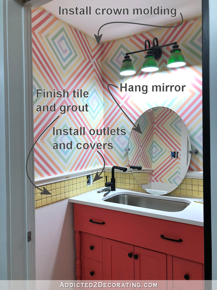
Half Bathroom Wall Design Options
I’ve had bathroom wall design options on my mind for the last few days. I’m not quite ready to actually start on the half bathroom walls, which is a good thing, because I’m still undecided on the direction I want to go.
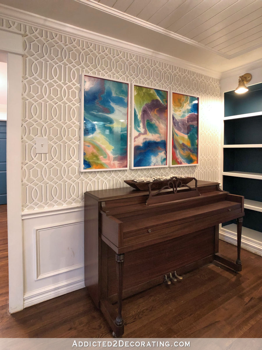
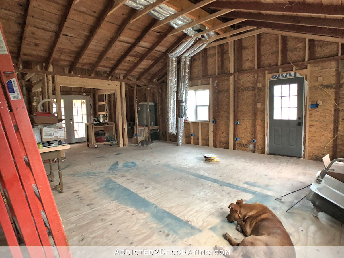
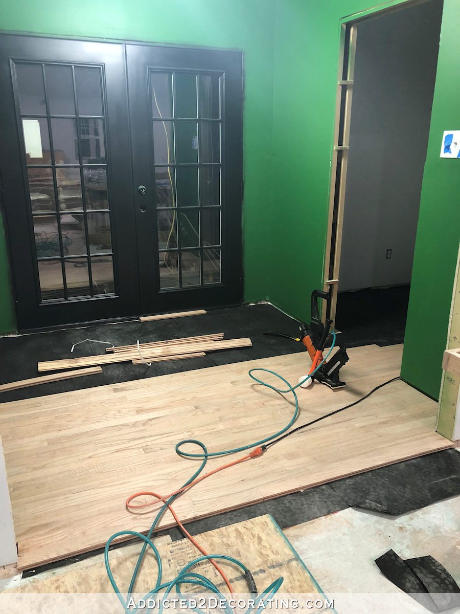
I’ve been working on getting the subfloor installed in bathroom and back studio entry so that I can install the flooring, and then finally get some trim installed in the back entry. I’m so anxious to install the white door facings and baseboards against those bold green walls and black doors.

But of course, I can’t work on stuff like installing subfloor without my mind wandering to the pretty stuff. And right now, I’m stuck on the bathroom walls.
The other day, I showed y’all a design that caught my eye on Instagram, and while I do love it in a small dose, I’ve decided that something like that on a larger scale would probably be too much. I’ve seen similar designs (like this Cole & Sons prism wallpaper) that looks amazing in small samples, but then I see it on a large wall or in a whole room, and about 75% of the time, it has a dizzying effect to me.
So maybe I’ll come up with a way to use a design like that in a small dose somewhere. I do still need a pendant light over the office desk area, so that might be an idea. But I’m going to go with something a little tamer for the bathroom walls.
I still want the walls to be very colorful, and I want to use the same colors that are in the floral wallpaper that will go in the studio.

But I want a linear or geometric design in the bathroom to counterbalance the floral design in the studio.
So I’ve narrowed my options to three, and of those three, two would require a stencil. I know I swore up and down that I’d never stencil again after the music room walls…
But I think I’m far enough removed from that stenciling experience that I’m just crazy enough to tackle another one. And I also think that if I can do the stencil before I install any crown molding, window/door facings, or baseboards, then the job will be so much easier.
So I’ve narrowed my choices down to three designs. This is the one that wouldn’t require a stencil…

Obviously, I would use different color, and I don’t really care for the dotted design. But I do like stripes, and I like the idea of using varying colors for each stripe.
The second option is this honeycomb wall stencil…

If I could combine that design with the colorful gradient effects that one of my favorite artists is known for, I think I would love it.
And the third option is this fishscale design…
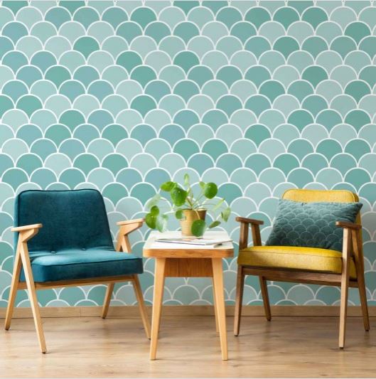
Okay, I know. That one really isn’t linear or geometric. But the simple repetitive design has the same effect. And I could see it also done with some gradient colors with a beautiful outcome.
So those are the three choices. I do want to stick with one of these, because I’ve spent way too long already thinking about the walls in this small bathroom, and it took me a while to narrow down the options. I may not be able to make a final decision until after the entryway floor is finished, since that geometric design might influence the wall design in the bathroom. But this is the direction I’m heading.

Addicted 2 Decorating is where I share my DIY and decorating journey as I remodel and decorate the 1948 fixer upper that my husband, Matt, and I bought in 2013. Matt has M.S. and is unable to do physical work, so I do the majority of the work on the house by myself. You can learn more about me here.
Fishscale is lovely.
I like ombre done well. Check out Design Manifest for a gorgeous tile kitchen backsplash.
https://www.designmanifest.com/beechwooddriveelegantkitchen
Love the stripes too😁.
I love the stripes!
I think the colorful stripes/dashes would be great for contrast to the floral- the other two are OK but they echo the overall roundish shape of the flowers and feel rather trendy shape-wise to me.
I am in total agreement with Julie. Love the stripes. Colorful and just a bit different from what you see everywhere that makes one stop and take notice.
Same. LOVED those stripes for these very reasons.
Stripes! With the floral – wonderful combo.
I would choose the stripe because it is such an unusual design !!
The stripes are cool looking but they kind of remind me of the Matrix movie. (haha!) Love the honeycomb but really any option you decide upon is going to be lovely. So love all your creativity and gets me out of my “play it safe” mentality in my own home!
LOVE the honeycomb!
I think each could be interesting! The stripes with the floral feels the most classic to me. The honeycomb and fish scale both have more of a MCM vibe to me. I love MCM, so it would work for me, but it doesn’t really seem to be your vibe. Will be exciting to see what you choose!
Fish scale, stripes and not the honey comb, that one would give me a seizure for certain!😜.
Progress looks great
I like the stripes, and although I’ve never seen this type of design before, I also like the semi solid dotted look. I think it would compliment your floral paper without being a completely stark contrast.
What is MCM? I’ve been jaded by Instagram and can only think of “Man Crush Monday” haha!
Whatever it means, I agree with Theresa that the stripes vibe best with the floral! They would provide a great way to pick up several or all of the colors in your floral wallpaper!
Mid Century Modern
I don’t know if anyone answered your question, but MCM stands for Mid-Century Modern, in this context, anyway.
Mandi at Vintage Revivals did a honeycomb/hexagon ombre wall for her daughter a few years ago. She outlined each hexagon with wood pieces.
https://vintagerevivals.com/diy-honeycomb-hexagon-wall-treatment/
https://vintagerevivals.com/diy-honeycomb-hexagon-wall-treatment/
Sorry, didn’t realize I copied the same link until after I hit post….
https://vintagerevivals.com/pink-and-red-honeycomb-wall
My goodness, that homeycomb/hexagon ombre is amazing!!
I like the scale of vintage revivals’ honeycomb design. The scale of the one Kristi showed was, to me, a bit dizzying, but it may be due to it being a single color. I like the stripes, in the colors of the wallpaper. My least favorite is the fish scale. That one seems dated to me. Trying to picture the flooring design along with all three of these, and the stripe may be too much with the floor. I wonder if some sort of lattice design might work? It would “play well” with the floral, but the floral isn’t really going to be in view of the bathroom, so I don’t think it should factor in, except for the colors. And the green entry already doesn’t show up in the wallpaper, so the bath should coordinate with the green, in my opinion. Sorry if I rambled, I’m just thinking out loud and putting it down.
I went back and looked at the flooring design you liked, and I’m wondering if any of these wall options will be too much together with the floor. Personally, I would just paint, and if you want some sort of pattern, I would do something in a narrower stripe running vertical, keeping a subtle pattern to go with the flooring and the bolder green entry color. Maybe stripes of the rose/pink/orange colors. But I know you like more “POW” so I’m just putting this out there! Sorry if I’m no help!
I really like the stripes with the new twist. It’s bright and fresh and would really complement your floral wallpaper! While I like the honey comb too, I wonder if you would be cursing yourself while you were doing a gradient/ombre paint job . . . . it seems like a lot of detailed work, even in a smaller quantity.
Fish scale!
Love the stripes! I would like to know more about that paper. Manufacturer, for instance.
It’s linked. 🙂 You can click the image or the link below it.
Well…I am a huge mermaid fan so I’m biased. I love the fish-scale design and color. I am wondering about the impact/flow of coming in off the hallway/room. Is it just off the area with the green wall and black door? If so…will you consider gradient color that includes incorporating a bit of the green then moving to a more teal or lightening to a more soft tone? I’m sure you will choose something delicious!
Looove the stripes! Would that be wall paper? Otherwise, it looks like it would take forever to paint all those colors in different points of the wall.
I can’t to see what and how you do it.
Can’t wait to see! Is what I meant to write. Lol!
I really like the 3rd one, I know it’s a stencil but the good thing is if or should I say when you decide to change, it would be much easier to just paint over it instead of having to remove wallpaper!
Fishscale! Definitely!
The first one is awesome!
I’m casting a vote for the stripes.
Stripes or fish scale because I think the honeycomb is too close to what you did in the music room.
I’ve wanted to do a ombre hexagon wall in my dining room for a while now, I just need to find the time, so my ‘vote’ is for hexagons. Something like thistlewoodfarms.com did (https://thistlewoodfarms.com/diy-ombre-hexagon-wall/). Maybe instead of the pops of orange, you could use the wallpaper to give it a tie in to the other room? Or that might be too much.
The fish scale looks too “Little Mermaid” to me. You see that design on so many things for little girls. The honey comb or stripes definitely.
My preference? Stripes, fish scale, and nix on the hexagon. My take on the stripes for you? Agree on lose the dots, but in some ways it’s a little bland overall. I can see you in there with your handy marker defining the lines, adding shadow and depth. I do think you’d make it look smashing with your color choices. The fish scale is both soothing and exciting. Again, I can see you doing some outlining/defining, but the colors could be really striking. To me, the hexagon just doesn’t fit somehow, although I can’t explain that precisely. I see another opportunity for some custom wall paper, if it’s in the budget. If nothing else, some samples might be enough to give you a really good idea of whether you want to jump in whole hog with one of them. Whatever you decide, it will be a beautiful piece of the whole picture.
I love the fish scales, but I think that for your room the stripes would be even better, as they would go very well with a whole lot of colours whereas the fish scales might then be too busy. I personally like the dotted areas in the stripe design a lot, but that would be hell to do by hand!!
Hi Kristi, I like all of these designs but think I like the fish scale best. I love to stencil and can’t wait to see how this project turns out. Following! Cheryl
Oh my, I thought of chicken wire fencing and then people mentioned honeycomb and had to go back and look.
The first one makes me dizzy!
Love the honecomb. Wonder if you can use a stencil that has a larger honeycomb pattern so an ombre effect has an even greater impact. (Less to stencil too!)
Fish scale seems too youthful.
Hexagon kicks my vertigo into overdrive.
Stripes are my pick.
I’m sure anything you choose fabulous!
Stripes; you love stripes.
I was thinking stencil before you said it (I know, wrote it.) I really like the one they used on the powder room in Frugalfamilytimes.com but that one only has a couple of colors. I know it’s a lot of work and your other room was daunting but a powder room is small and I just love the notion that I can just open some paint and get rid of it when it no longer “sparks joy.”
I love the stripes. Perhaps there’s a way of combining them with the gradient effect as I agree her art is stunning.
I really like the honeycomb. However, I’m a fan of just color in this case, no pattern/design. You have lots of lovely colors and designs and patterns all over. I think it would be more balanced with a break- just color/decor/ art. Just my 2 cents. 😉 Regardless, you do YOU!!! I enjoy watching your progress!! 🙂
I always love honeycomb (and bees) and think it would be a natural complement to your floral paper in the studio. Have you ever thought about making the honeycomb lines in gold?
I’ve been mooning over fishscale tiles in bathrooms for months, I love that one the most. I’d also love to see the honeycomb in “white” with random patterns of colored honeycomb from the colors of your wallpaper making up 30-50% of the combs. I’d do patterns of caffeine and chocolate chemistry myself. lol
I like all of them but I would be concerned trying to match up the honeycomb one. It would drive me crazy trying to get it to lined up perfectly each time, it would definitely cause me a ton of stress to get it just right. But you are very talented maybe you could pull it off!!
Stripes. Me personally, I hate fish scales. But again this isn’t my house 😋 but with fish scales or hexagon for that matter, how will that work with black and white tile floor? I can’t picture it. I love stripes with floral though, so I guess that’s why it resonates with me 🤷
When you originally shared your inspo image I imediately thought of the Cole & Son paper you linked to, or the Cubiste pattern from Osbourne & little: https://www.osborneandlittle.com/cubiste-w6896-w6896.html?swatch=3274 I love both, but not entirely sure I can see them in a room?
I did find this – perhaps a marriage of your inspo, plus your desire for a linear, geometric
with gradient colour? https://www.osborneandlittle.com/zirconia-w6760-w6760.html?swatch=3503&
Hi Kristi, I like the fish scales, but is there any chance of having you do the resin coated tiles again? I loved those in your pantry and was really hoping that you’d do more of those in that half bath. The shape of the tiles could be whatever you want. I’m even wondering how the resin would do on top of colored tiles, or if the resin colors would even show? Best of luck on your decision. 🙂
Oh, Kristi, the strips are fantastic. They are fresh, new and not something anyone is going to see every where else.
Not to mention the joy they would bring
I can hardly wait to see what you come up with in the end!
I love the broken stripes in the informal way they are in the inspiration photo. I think the dot sections are what make it fun and different, but I could see those swapped out for solid and still look unique. I like the honeycomb, but I feel it’s fresher in the larger scale octagons of some of the examples that other commenters posted. I am not a fan of the fish scales. That seems too cutesy and a bit dated. However, I’ve yet to see you not pull off whatever you decide on!
Sorry but I’m not loving any of them. The stripes seem rather bland next to the floral paper, when I scrolled down to the next one I thought chicken wire before I read that it was honeycomb and the scales, well they’re just not doing it for me. What about doing a large scale version of your herringbone lamp but in the colors of your wallpaper?
I’m editing myself because I went back and looked at the post where you showed the sheets of watercolor before cutting them and that’s how I think you should pant the upper walls with maybe a wainscotting at the bottom.
Fishscale <3
In order of preference: stripes, fish scales, honeycomb. As someone already said, it looks like chicken coop wire! But mostly, I wanted to tell you that we watch Property Brothers on a regular basis and the ceiling lamp shown above was just on t.v., except with clear bulbs. So, there you are!!! You are not only, apparently, on trend but you may be ahead of it!!!!
Hi, Kristi!
I love the honeycomb pattern. You could paint the wall one color and then ombre the honeycomb color as it moves across the wall.
What kind of paint do you use when painting doors? Also, when you painted the french doors pictured in this post, you just sprayed and then used a scraper to clean up the overspray?
Thanks for your help!
I’m really looking forward to seeing how your studio progresses!
I generally use latex paint for doors. My new favorite for exterior doors is Benjamin Moore Grand Entrance paint. That’s what I used for both of my coral exterior doors. For interior doors, I generally use Behr latex paint in a satin finish. But for these doors, I used Rust-Oleum black spray paint. I’ve never, ever done that before, but since I don’t have flooring installed yet, it was so easy. And then my mom and I just scraped the overspray off with a straight razor window scraper.
When I was painting my interior doors black a couple of years ago, I couldn’t get the regular latex paint to coat properly – streaks all over the place. After sanding the paint off for the third time, I got so frustrated, I marched into Home Depot and bought a bunch of black spray paint and finished the job. It always felt like a dirty secret until hearing you did the same thing! I’m so glad I asked! I’m selling the house, so I have to go back to white before I put it on the market. I’m so excited for this project (can you sense the sarcasm?). I might just buy a bunch of white spray paint. It works, so why fight it?!
Thanks so much for responding! I love your blog!
I think a deep, rich purple either wallpaper or stencil would go well! Don’t getting too busy in the half bath … have a small space where clients can “rest” from multiple colors if this is the bathroom they will use.
Have you seen this? Saw the colors and thought of you.
https://society6.com/product/gilt–glory-colorful-moroccan-mosaic_wood-wall-art