Pantry Door Color, Breakfast Room Curtains, and More…
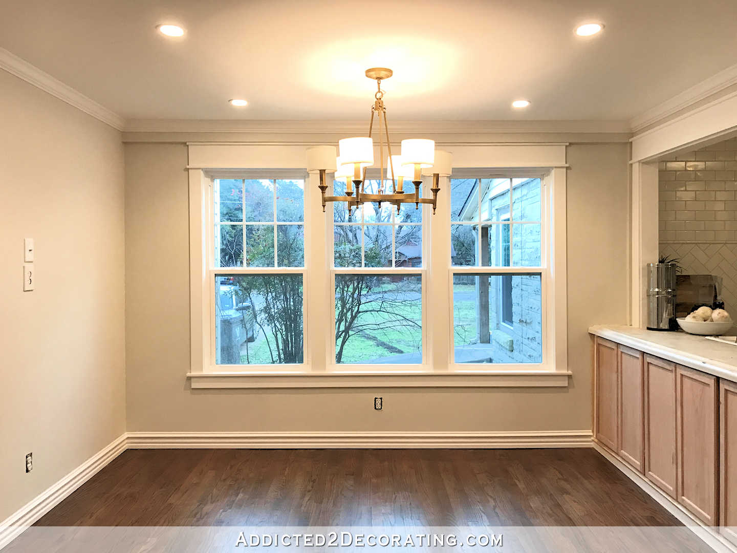
I got all of the trim adjustments finished on my pantry doors yesterday, and today I’ll be ready to prime and paint the doors and touch up the paint on the trim and walls. They now looks like real French doors. The big gap between the top of the doors and the top door jamb is gone…
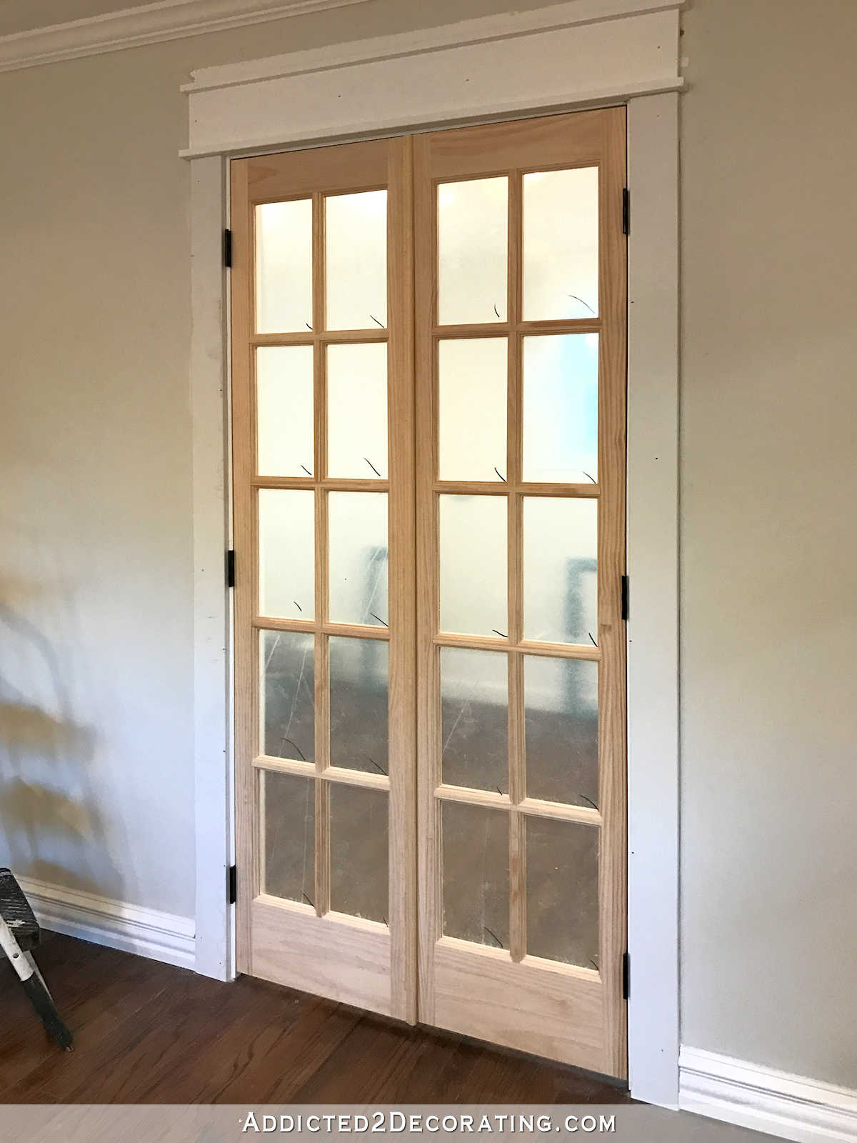
I know some of you were confused about how I was going to get rid of the gap, and I did take pictures of the steps I took. But I’m going to wait until the doors are actually finished and then do a post with all of that info.
In the meantime, I’m having a hard time deciding on what color to paint the doors. My plan was to paint all of my doors Kendall Charcoal, but I’m having second thoughts about painting these charcoal. Would white be better? And if I do these in white, then should the other door in the room be white as well?
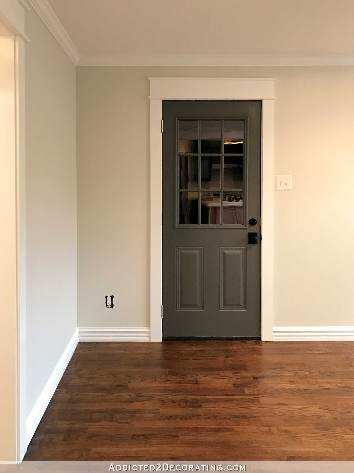
Or should I just stick with my original plan, paint all of the doors Kendall Charcoal, and move on?
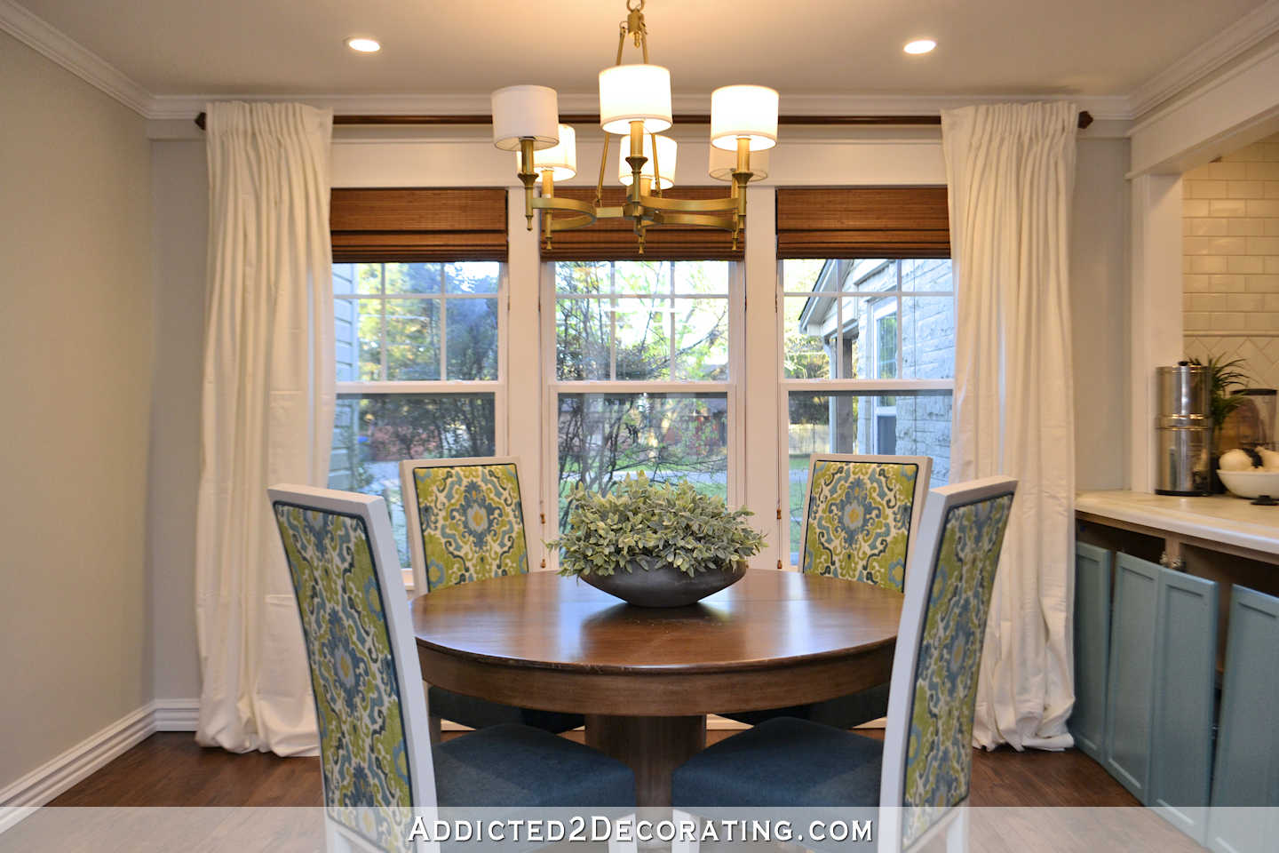
Anyway, I was feeling quite unmotivated yesterday, so I made a deal with myself that if I got all of the adjustments done on the door, and got everything ready to prime and paint by today, then I could hang my new breakfast room curtains.
Yep, I have breakfast room curtains. And yep, they’re store-bought, ready made curtains. From IKEA. I know. I’m shocked as well. 😀
Every time I looked up “white draperies” on Google or Pinterest, I kept seeing posts about how awesome IKEA’s Ritva curtains are, how the fabric is quite substantial, and how they have a pretty texture. And I have to admit, they looked great in pictures. So I decided to take a chance. Heck, at $24.99 for a package of two panels, it wasn’t much of a gamble. I bought two packages so that I could have two panels for each side.
I literally just took the out of the packages and hung them. No ironing, no nothing. I already love the softness they add to the room.
And by the way, someone yesterday asked me if I could line up my painted cabinet doors along the breakfast room side of the peninsula just to get a glimpse of how that’s going to look. So there’s a little peek of what my teal peninsula will look like. 🙂
But back to the curtains. I won’t be keeping them like this, but they’re good enough for now. The curtains have tabs on the back where the rod slips through. It probably looks better on curtain rods that are thinner, but it’s a tight fit on the 1.25″ diameter curtain rod I chose.
And I also don’t do puddles. Puddled curtains are like neutral rooms to me. I can appreciate them in photos, but I can’t live with them. 😀 My cat would sure love them, though!
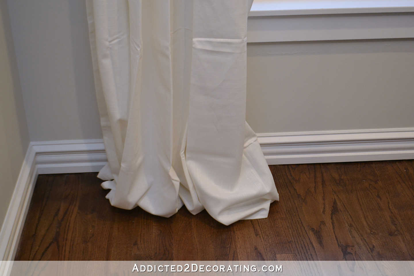
I bought the 98″ length, and I have eight-foot ceilings, so you can see how long they are.
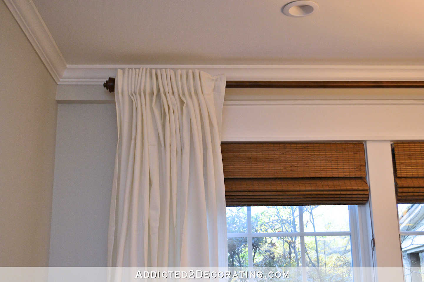
I also don’t like hanging curtains without a return (i.e., where the curtain panel “returns” to the wall on the ends so there are no gaps between the panel and the wall), and this is a perfect example of how returns give a much more polished and professional look. Standing in the kitchen at my dishwasher, I currently see this view…
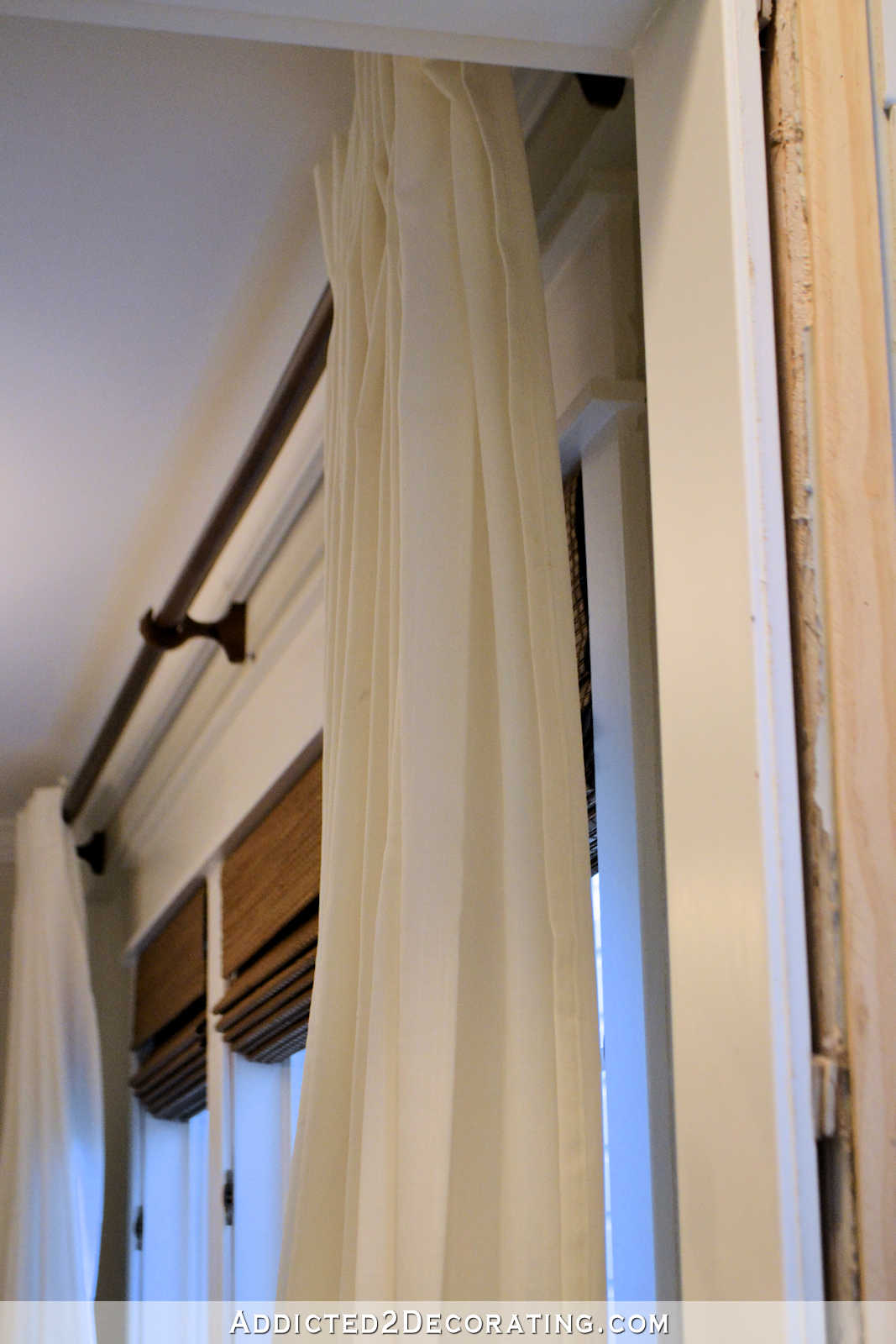
…with a gap between the wall and the curtain where I can see the trim, the window, and the shade from behind the curtain. That’s not a good look. If you want more info on how to hang your curtains with a return, I explain more here.
When I decorate the breakfast room (as soon as I’m done with this month’s goals!), I’ll be making some significant changes to the curtains. I plan to pinch pleat the tops, hem the bottoms, and hang them on drapery rings with returns on the ends. That will give me the tailored and polished look that I prefer. But in the meantime, I’m really enjoying the softness that these curtains give the room, even in their untailored, puddled, straight-out-of-the-package wrinkled state.
So if you’re looking for good, white, ready-made curtains, I highly recommend these. They’re not stark white. They’re more of a creamy white, which I think is very pretty. The fabric is a medium weight, and not so thick that it blocks out the light completely. So if you want them to block out light in a bedroom, you’ll need to attach blackout lining. But for my breakfast room, I actually like how the light shines through a bit. (Solid white curtains are the only kind that I can tolerate light shining through. And I don’t just tolerate it. I actually really love how it looks.)
Now I’m feeling more motivated to get my list done for the month so that I can get my curtains finished! 🙂 First things first…I need to decide on a color for my pantry doors.

Addicted 2 Decorating is where I share my DIY and decorating journey as I remodel and decorate the 1948 fixer upper that my husband, Matt, and I bought in 2013. Matt has M.S. and is unable to do physical work, so I do the majority of the work on the house by myself. You can learn more about me here.

The pantry doors and trim look amazing! I love it! As for color, I can’t help you there. My gut says white but they are your doors and I’m sure you will figure out what you want.
I was skeptical about the drapes at the window but they do soften the look of the breakfast room and look very pretty as is. However, for a breakfast room with quite a bit of traffic, I agree with your plan to hem them and add your other touches.
I love your Kendall Charcoal colored door, I think it adds interest. I would do the same on the pantry doors. I love your curtains too! Going to be so pretty when you are done! Almost there!
LOVE! The white curtains are stunning and will be fabulous with the hem/pleats/rings. As for the doors, my initial thought is white. Since they are on the same wall as some of your cabinets, the two may compete if you do the doors gray? Also, once you add colorful items in the pantry to show through the glass, the white will set them off nicely. But I know that whatever you do will be beautiful. Can’t wait to see!
Looks great and love the sneek peek at the peninsula. It’s going to be fab.Xx
Your room is so beautiful!! And it will look even better very soon.
I have used Ritva panels in all my guest rooms. They work really well and are easily enhanced with trims. One suggestion for when you finish them is to add drapery weights to the hems. (Bought in sewing notions department). It really works to make them hang nicely. Great job so far in the breakfast room. My first thought on door color would be white. I don’t think they need to be the same color as long as you are treating all of your interior doors the same. I consider the charcoal an exterior door currently.
That was my thought as well. Treat any exterior doors similarly and all the interior doors the same and I think it will look great.
Agreed.
I’m a firm believer in drapery weights, but instead of buying them at a sewing store, I use heavy washers from my local Ace Hardware and sew little pockets for them, and attach to the back side of the drapes.
White for the pantry doors to allow focus on your beautiful displays inside the pantry. I believe you mentioned wall hangings or color of some kind on the walls either side of the doors. Charcoal doors would give the eyes another place to land and in my world would be too much.
I so enjoy your adventures and wait impatiently for the next post. Over the weekend I realized, “I’m addicted 2 Kristi’s posts.”
Ditto Nell!
Double Ditto from me too to Nell & Sandy!
I was actually thinking the teal would look pretty and tie the rooms together, but I agree with what Nell said – the color would give the eye something to focus on instead of looking through to the pantry. My addiction to Kristi isn’t so bad, but I feel I must read all the comments as I have already learned so much from other people’s experiences, also!
Aloha, Tenney
your breakfast room is looking amazing. i have never bought IKEA curtains but I hear good things from people who have. PS- not that it matters but the charcoal gray is fabulous and gets my vote.
Try the doors grey…if you don’t like it long term, repaint. 🙂 I don’t think it would look weird if the doors were different colors though. Since they’re different styles and clearly have different purposes I don’t think it would look odd for them to be different colors.
The curtains?!?! Never in a gazillion years would I have thought you’d go with Ikea curtains! Glad you like them though and got such a nicely gratifying addition to the room completed. I’ll have to check them out for my living room. I think I would want to edge them in navy though.
“Never in a gazillion years” was my attitude about them at first, too. 😀 But looking at pictures of them on Pinterest wore me down, and I’m so glad!
Love the curtains. Often wondered how to get pole top curtains to make that turn. I don’t like it either and it does look unfinished to me as well. So I will be following your link in a bit. All our curtains/drapes are on drapery poles and that always bothered me.
I think the doors should be all one color, especially since they are in the same room, but that’s just me. I painted all our doors espresso and personally think they should all match colorwise throughout, unless you are trying to hide them, like a utility door. I think it would make them Pop (and I hate this word and rarely ever use it,lol) . They are such pretty doors and blending them away just makes no sense. I think if the walls were dark, then white doors make sense, but since the walls are light, the doors will disappear in a way.
I may have to drive an hour away and get me some of those curtains! I love the look they give. What is the width you bought?
Okay, I”m gonna go out on a limb and probably against everyone else, but here goes; looking at the view opposite the pantry, I see the wood tones, teal/blues, white, and gray/blue walls. I think you need to bring the wood tone over to the pantry side. The doors? Future shelving? Furnishings? I don’t know what all you have planned (I know you mentioned artwork) for that side, just thought I’d mention. Having said that, as long as your items repeat, I would say doors should all be the same, whether it’s gray, white or something else. It’s looking SO good already!
I think the panels are 57″ wide, which is amazing for ready-made curtains!
maybe try ordering them online? Or, are you like me- ONE WHO MUST FEEL IT FIRST!
Nope, I’m on that same limb Marianne, charcoal please. ;o) I think the fact that the pantry doors are so different is what will make them truly stand out if painted charcoal, and that I like. As well as bring a little more warmth. The room is really shaping up great Kristi.
The door trim turned out very nice. I would paint them white….if you don’t like it you can always repaint!
I love those curtains! I have several pair and love their versatility…..you can hang them on the rod pocket; hang them as you have done using the pockets on the back to give a “Pleated” look or use rings. I use them in our MBR Bath. I actually went outside at night to see how much you could see through them and they are perfect for the privacy I was looking for. I wanted mine to be a touch more white so I washed them the first time with Clorox and it was just enough change to work with my other fabrics in the room. The price is great! The first pair I bought I found in the bargain bin for $10 a pair….because they were missing the tie backs that come with them. Your trick for the return is great and I will be buying some eye hooks soon!
Oh, I’m SO GLAD you said you’re going to hem those curtains to remove the puddles – yay! They’ll look great once you do all you’re going to do to them. (You’re right, they look nice now, too.)
The doors? I’d go charcoal like the other doors. They’ll look great that way, I think and will be very cohesive.
I love reading all about your progress – I’m in awe of you!
I don’t feel qualified to weigh in on the door color issue 🙂 I just wanted to say that the breakfast room is shaping up beautifully!
The curtains will be great when they are hemmed and you make your magic on them. When we bought our current home, the guest room had a set like this. Just an FYI (because you will probably do this anyway), but sure to wash them because THEY WILL SHRINK. I love the charcoal doors, too!
The curtains will shrink A LOT. Mine shrunk at least three inches so make sure you wash and dry them before you do any changes! Ikea is now my go to for curtains, even if I do need to hem once home.
I second that!!! Mine even shrunk more after a second washing and drying.
Yes! I think mine shrank about 8 inches😣. Time for me to add some trim to them!
What would it look like to stain the pantry doors the same as the table? Aren’t they across from one another ? It would be adding a little more warmth of the wood. Just a thought, maybe it wouldn’t work at all.
ohhh I like the idea of them being stained! But if not, I do not need see a problem with them being white. Because the two doors are SO different I do not think it would be weird. I would try the white, see how it feels. You can always change to charcoal after.
I would think the pantry doors, with all the glass, could be treated more as the windows, on the opposite side of the room, rather than as a door, so the polar bear white would like nice. I think the charcoal might compete with the decorations. But I’m anxious to see! 🙂
I know it wasn’t one of choices for the pantry doors, but I think a color that coordinates with your chairs or the teal would look great! But then, I’m not known for my decorating skills. 🙂
I think the pantry doors would look really nice stained like the table. I know, a designer I’m not! lol Everything is looking beautiful. Good job!
LOVE the curtains! They have been on my radar for my living room for a while now and after seeing them here I’m going to get my order placed. I also LOVE your original plan to paint all the doors the Kendall Charcoal color. I know your planning some built-ins on both sides of the doors that I’m assuming will be the same white color as your trim and I think the Charcoal color on the doors would add some interest! Can’t wait to see what you decide!
I mostly “lurk” on your site. Today is a new day! If anyone, anywhere, needs confirmation of the merits of “just get out there and do it” then this picture today of your (mostly finished) transformed breakfast room is that validation! It is lovely and functional and glows with the love and sheer hard work you have put into it. All of your spaces in your house are all that and more, but somehow for me THIS room is the most impressive. thanks for sharing the experience!
BTW, go bold or go home. Paint the pantry doors charcoal!
I would paint the pantry doors white. But I like everything white. I guess the only reason I would consider doing them the darker color would be because your music room doors are dark. Otherwise, I think they are more like a part of the cabinetry inside and not so much a ‘door’. I wonder how it will affect the view through the door when it is all done. Will the dark mullions on the French doors contrast too much with the view into the pantry? Will it make them stand out against the cabinetry inside? That would be my issue. How I looks in the end with the pantry finished inside.
If you want to see into the pantry, paint them a dark color. If you want to see the doors more than the interior of the pantry, paint them white. It is a trick of the eye that you will see past a dark color to what is outside a window but your eyes will focus on a light color frame.
So pretty, Kristi! I love the way the room is looking. The centerpiece on the table is really pretty too.
I honestly think the charcoal will look nice and make your doors more of an anchoring feature on that wall drawing attention to all the work you’ve put in the room. Initially, I was concerned it would detract from the glass but seeing the back door I disagree. I think mirroring the look you have already achieved on the backdoor would actually take both up a notch! I vote charcoal!
You could paint the doors white and if you don’t like it go with the Kendall gray. Lot easier to paint over white. I’m thinking the gray may be too heavy for that room. The white plays nice with the kitchen.
I normally don’t say anything, I also think that it’s easier to paint over white if you don’t like it.
I think white would be good because you are looking through the glass and the pretty in the pantry should be your focal point.
Paint the inside doors white and the outside ones the other color. Could you stick an eye hook on the side wood of the pole? That way you can put the curtain hook there.
I also bought curtains from IKEA but I bought the blue print ones. They had tab tops but I used iron on tape to fold them over – I don’t like puddles either so I really folded them. I absolutely love the way they look in our living room. The room is painted pumpkin so the blue really pops on the two picture windows. I am going to try your return trick but the both sides are blocked and no one can see them. I want it to look professional, thanks for the hints. You are doing a wonderful job, keep up the good work.
This room is so beautiful already! Love these colors together! And the centerpiece is perfect.
Right now my vote is for white pantry doors. They won’t conflict with the items you are trying to show through the glass. They you can continue your cabinet colors from the kitchen into the pantry, with maybe a stained wood countertop to bring back in that natural wood look.
Anyway you do it, it will be great! 🙂
Kristi, I’m so grateful for today’s post! Because I hemmed the IKEA curtains for my office (which beforehand formed puddles :)) about 8 months ago and never got round to hanging them up again. But I just now did it and am so glad (and it took about 10 minutes on the ladder…)!! So thanks for your inspiration!
I would normally always urge you on to paint the pantry doors grey, cause I love the colour on the other door. But yesterday I actually went to your music room post and counted the panes on your French doors there to be sure they look the same as your new pantry doors 🙂 I guess, painting them white would tie both sets together? But I urge you not to repaint the wonderful grey door to your studio if you decide on white for the pantry doors. It is totally ok to have that in another colour (particularly one as gorgeous as this)….
It’s all lovely!
Nice! The room is really starting to come together. It looks so bright and sunny and a great place to enjoy a meal.
I love the teal! If it were me, I would paint the pantry doors the same as the trim. The door to the garage can remain the gray. I prefer my interior doors white like the trim but you can mix it up on the exterior doors. But whatever you do is sure to look lovely. I can’t wait to see the kitchen reveal in the new color. So much better than the bright green to me.
Imagine looking through the charcoal doors to the white pantry – it would be the perfect framing!
It looks amazing and you are an amazingly talented gal!! Love, love, love it all!! What about your table centerpiece? Hard to tell if it is plants in a bowl or what. Would love to hear about it. And what Matt thinks. 😀
The breakfast room looks sooo pretty! It’s really coming together. I love the softness that the curtains are adding too. Questions: If you hang the curtains from rings, will it ‘lower’ the height of the panels? Could you just leave the curtains hung with the tabs and simply cut a slit at the ends to allow the rod finial to go through and have a return? Last question: where is Peeve in this photo??? I missed the little furbaby!
When hung from rings, the top of the curtains will be just below the curtain rod, so it won’t be much lower. I really prefer the look of rings, so having them a couple of inches lower is a reasonable trade off for pretty rings. 🙂 I kicked Peeve off the table when I was fussing with the centerpiece. She came back after I took the pics, though. She love sitting on the table and looking out the windows.
Sounds like you need to make a kitty perch near the windows, lol!
Everything so far is absolutely lovely! How about painting the garage door and the pantry doors with the same color you are using on the kitchen cabinet doors? I think that would look fantastic!
As I have watched this beautiful transformation unfold, I keep visualizing the pantry doors in charcoal. I think it would look amazing and unique. Everyone has white doors! 🙂 Whatever you choose, it will surely be gorgeous. Also, I am heading to IKEA for those curtains soon. Thanks for the tip.
Ok, I’m going to order the curtains today. I’ve been searching for white ones for my wall of windows in my now Hale Navy bedroom. So wish I could use the acrylic rod, but definitely plan to close the curtains at night. Will you saw you panels together? Going to follow your lead completely. As for the doors, I feel the French doors should be white. They aren’t like any other door in the house, with the glass, so I would treat them more like the windows. You can always try the charcoal later.
Yes, I’ll be sewing the panels together. It’s not really necessary since it’s easy to hide the edges in the folds. But since I’ll be doing the other sewing, I may as well take a few extra minutes to sew them together.
So glad to hear you’ll be sewing the panels together. I hate fussing with two panels on one side of each window, especially when one plans to open and close them regularly. Can’t wait to see the tutorial!
My gut says white for pantry door. I like that it would match your other French door…but I couldn’t resist trying a stain to tie in the woven wood blinds. No matter what, you always make it beautiful.
I also love the charcoal interior doors but feel like the entry doors stand alone and won’t compete with another color. Have fun!
Quick question, do you find it easier to give advice than to make decisions about your own home? I sure do!
Decorating other people’s homes is FAR easier than decorating my own. I struggle so much with my own home, wrestle with every little decision, and second-guess myself at every turn. I never do that when decorating for others.
This is looking so good! Love the Ritva curtains, love the teal on the cabinets. Love the charcoal on the one door, but not feeling that on the French doors. Seems too much dark when you want to go lighter and brighter in that room.
Wow, you sure hopped on that door project, it looks great! Curtains are going to for sure bring the softness you desired, so nice. My vote on the door colors would be to ask yourself what your goal is with your decor. Are the doors to be focal points as your eyes lead through the rooms? Because they will for sure be places your eyes will stop before progressing around the room. You’re the one that gets to decide your goal.
The room looks so beautiful! Loving how it is all coming together.
I see others have already commented that these curtains shrink A LOT when washed, so make sure you do that before you go through all the work of pleating and hemming them. I’m in the white doors camp. To me they are more like windows than doors. If I could ask a favor, can you PLEASE install 2 working light bulbs in that pretty chandelier? It is driving my OCD bonkers! 😜
LOL! I was wondering how long it would be before someone commented on my lack of lightbulbs. 😀 It drives me crazy, too. But every time I’m at Home Depot, I forget to pick up more! I’m putting them on my HD list right now so I won’t forget again. You’re welcome. 😀
And while you’re at it, as another somewhat OCD person, I’d humbly request that you straighten all the shades so they’re all perfectly vertical. That’s what’s be driving me nuts! 🙂 (The room’s looking great!)
I like the Kendall charcoal gray doors. It provides a contrast. I did not know that it was called “pubbled” when the curtains hang to the floor. I don’t like that puddled look either.
I’ve never commented before but I had to chime in on this! I bought four panels of these exact Rita curtains for my bedroom and pleated them at the top and added drapery returns as well!No one can tell that they’re Ikea and not custom and I have gotten many compliments on them. I think you’ll be very happy!
The room is pulling together so nicely!
My first thought was charcoal on the pantry door, because I like for all my doors to match, but if you have built ins around it that are white, then white might look cohesive. Again, charcoal might pop too. LOL
I was also shocked at the quality of some of the IKEA curtains and drapes as well. I had used some at our previous house and took them to be hemmed properly (I had neither the room or patience to attempt). The lady who hemmed them was also surprised at the quality of fabric for IKEA. I’ve seen some people buy the panels just to make pillows and other accessories. I also really love the price for TWO panels and the fact they stock the longer lengths. Everywhere else tends to top out at 83″ or something with anything longer being a web order.
The room looks amazing!
Paint them white first, then if you don’t like them, go over in charcoal. It’d be easier than the other way around, IMHO.
I love the charcoal to the outside, but the French pantry doors look more like windows to “the soul”, and I’m afraid they would stick out like sore thumbs. But, it’s your house and I know it’ll be beautiful when you are finished.
I gave up on making curtains a couple of years ago, when I went shopping for fabric, couldn’t find any thing I loved, and the prices were sooooo high!! Even sale/clearance fabric. On way home I stopped at a store and found something that was “just fine”, on sale, plus I had a coupon, and they ended up being less than HALF of what it would cost me to make them. Since then I have needed curtains for 3 room and bought them ready made. Same goes for clothes. Used to make my own years ago, but I can find so much cheaper on sale than what I could have made them for.
Love, love, love the choices you have been making! Breakfast room, gorgeous! Living room, love the paint/fabric colors, gorgeous! LOVE your floors. You’re in a good place girl. Keep focused and everything will be perfect!
For the french doors… How about the same color as your cupboard doors?
Everything is coming together nicely. Regarding the door color, ask yourself if you want the doors to stand out as a feature in the room. If you want them to stand out, go with the contrasting color. If you want them to blend in, stick with white or the wall color.
Paint tge pantry doors to match the trim, just like in all the pictures you like. leave the door to the garage grey. That is completely different because it is an exterior door.
It’s all looking fantastic!!
Thanks so much for purchasing the Ikea curtains! I’ve never done store bought… but we just sold our house with all the window treatments. The thought of making 8 creamy white panels again just wasn’t getting me excited. These will be perfect to personalize AND they come extra long for my 10′ ceilings! I was so excited that I already ordered.
I didn’t read through all the comments so someone else may have suggested this but what if you stain the doors to match your table? That would balance out the wood tones in the room. I love how your room is looking. Fantastic!
Some IKEA curtains have this ribbon that let you hang them differently without seeing. If not, you can buy a length of that ribbon to sew on. They have these hooks (that work with thier rings) that let you put in pinch pleats in. I say go charcoal for now and look into matching the pantry cabinet color when that descicion is made.
Kristi, I found this video on YouTube about 5 different styles for hanging Ikea Ritva drapes. https://www.youtube.com/watch?v=PRfQLuAB_Ts I didn’t watch it with the sound on (I’m at work!) but she showed the back of the curtains at the top and they appear to have lots of options for styling them. She’s got lot of comments about how helpful her video is, so it may be worth a look.
My opinion would be to leave your half glass door the grey and paint your pantry doors the same as your trim. We actually have stained wooden main doors next to painted bedroom doors and the contrast is nice and helps distinguish between main doors and secondary doors. Your dining room has such a soft inviting look with the colors you’ve chosen. Nice job.
My vote is for the Kendall Charcoal. I love the contrast it creates with the white trim, and I think it will focus more attention on your beautiful French doors. I am generally one to like the contrast as I have the same door trim, but my doors are finished to look like stained wood. I’m sure which ever route you take will look beautiful. It’s coming together nicely. I like the monthly goals you are setting for yourself. I think it keeps you motivated, and is easier for your readers to follow the progress. The smaller attainable goals don’t feel as daunting, and if you decide to take a few days off, you don’t feel as if the whole plan is shot!! Carry on!!!!!!!!!!!!!!!!
When I first began reading your blog, you had so many plans and I wondered how you were going to get it all done. Your persistance and ability to envision the changes you want is inspiring! Whatever will you do when you complete your changes? I know, there’s always my house, if you don’t mind traveling to Chicago! Lol Great job, Kristi!
I’ve made so many sets of draperies for my home. But recently I bought a set of white rod pocket sheers for my living room. I folded over the top edge, added some buckram, & sewed in euro pleats at the top. Euro pleats are much easier than pinch pleats. No hand sewing required.
It was so easy!
BTW…I used your sewing tutorials in the past & they are so helpful. Thank you for those.
I’m not sure what Euro pleats are. Are those where the pleats are sewn together at the top? Two pleats or three? The ones that are three pleats sewn together at the top are the ones I call Parisian pleats. Those are my favorites, but for some reason, I always revert back to the standard pleats. I don’t do any sewing of pleats by hand, though. My machine has a setting for sewing the pleats together, and it powers through all of those layers of lining and fabric. It’s awesome!
Kristi, I need to buy a new (or maybe used) sewing machine. Would you mind sharing what machine you have?
Yes, Euro pleats are sewn together at the tops. And you can do double or triple folds/pleats. I usually do double because the pleats get too thick for my machine to handle.
I tried doing regular pinch pleats once. I thought they turned out pretty good. But I had to hand sew the pleats together. Once they were hung, the pinch was not exactly in the same spot on each pleat. I’m sure no one noticed but me. But it bothered me. So now I always do the Euro or Parisian pleats.
Hi Kristi! I am loving your new breakfast room! The curtains will look awesome when you finish them the way you like. Like you, I am not a fan of the puddling… not with animals (or grand kids!) in the house. As far as the door paint color, I love the Kendall Charcoal. It isn’t as stark as black (although I have seen many black doors I love) and I actually think it would look great on the pantry doors! The contrast between the charcoal color and the white is just so pretty. But I also love the look of all the doors in a house painted in a dark color. Our master bedroom is painted in Kendall Charcoal and I think it is a gorgeous color. However, whatever you decide in the end, I know will look gorgeous!
Oooh. Love how the table looks now with the blinds and wooden curtain rod behind it.
I like the contrast of the Kendall Gray color for the pantry doors, but they’d probably look just fine white too. I dunno, I see so much white and faux French everything in other blogs, I think I just prefer more color. I know I really like the black doors in your other room.
I feel like pantry doors should be more “special” than other doors for some reason. What about painting them a fun limey green that pulls from your chair fabric?
It all looks so wonderful, Kristi. You always amaze me. Put me down for “white” on your Frenchie doors. You can always go charcoal later if you get bored with the white. Either would look good. I love that centerpiece on the table, and wish it were on MY table. What is the greenery in it? Did you make it?
The concrete bowl and the sage bushes are both from Magnolia Market. Unfortunately, I bought them during their huge warehouse sale, and bought the sage bushes for $12 each. I only bought two, and I need about five to fill the bowl. But now they’re back at regular price which is $38 each! Yikes!
I am really enjoying your journey. I love the french doors and the trim. I think that the picture with the table and windows is so restful and peaceful. But my question would be where do you want your eyes to go when you walk into the room? If you have grey doors will the eye want to go there or will it be white and blend in. I guess what I am asking is where does your eye go when you walk into the room and where do you want it to go. Do you want it to focus on one thing or just enjoy the whole room.
This is my 2 cents because that is just how my train of thought goes.
I agree with you, Janet.
I vote for Charcoal on the doors – I think the color of the door should match the door in the room. Also, just like your barn doors in the music room, the darker color will draw the gaze to the door and serve as a frame to draw the attention to the pretty shiny happy pantry.
I also love the wood tones someone mentioned before (the shade and curtain rod are killer together) and agree that SOMETHING in a wood tone is needed on the other side of the room
Two words…just beautiful!
Love the curtains! My vote would be for white on the pantry doors – think of them as window, not as door (because of the panes, because of the light, because they’re opposite your windows). I don’t think you need the contrast there. I’m loving your beautiful wood floor so much it seems a pity to hide it beneath a rug. Maybe wait a bit before going ahead with that plan?
Thanks Kristi for humoring me and moving your teal cupboard doors to the dining room…..I LOVE THE COLOR! It will be beautiful when you get it all painted and put together! Loving your white curtains too. Not sure what I would do with the doors to the pantry but I’m sure whatever you decide will look great! It’s always fun to check-in on your progress.
We are brain twins as far as drapes are concerned! I like the look of puddled drapes – in pictures – and only as long as they are a silk or linen or cotton, something sumptuous with trims and *a lot* of puddle, and plenty of room around them, not crowded against furniture. Otherwise, they will always and forever to me just look ill-fitted, like someone didn’t measure correctly. I’d never be able to have them in my home though, my cat would instantly shred them, also, my slight OCD means I can only appreciate them in pictures and would *have* to end up hemming them! Also – THE RETURN! MUST. have. the return! I, too, only appreciate light coming directly through white or very light colored drapes, so lining is a must, either something moderate, or blackout. My mom is such a drapery snob, she always has beautiful, tailored, custom-made drapes in her home that look like they came out of a design catalog, so I’ve always been very picky about how drapes look. Glad the Ikea ones are working out for you, they look lush and breezy. I know you’ll make them look even more perfect when you get them customized for your room.
The room is looking BEAUTIFUL! LOVE the teal cabinet door color. For the pantry doors, by gut also says white, and if you don’t like it, you can repaint them the gray color, which is a *gorgeous* color. I would think it’d be easier to go from white to gray if repainting, not the other way around?
This room is looking so pretty! I can’t wait to see what else you do with it. You must feel sooo accomplished with this room. Love it!
I Photoshopped the pantry door in four colors: white, charcoal gray, brown stain, and teal (the last two were suggested a few times by other readers). Hopefully this will help everybody visualize the options before giving their suggestions.
I don’t think the pantry door has to match the other doors in the house; I’ve seen several pictures of accent-colored pantry doors, and I think they look great.
So what do you guys think? I was leaning towards the gray color, but I really love the brown stain, too.
http://i243.photobucket.com/albums/ff142/mdbse5/4b882f9fb3056b5137099b7d25f3fb02.jpg
I thought seeing the photoshopped pics would make it easier for me to decide. I think it’s made the decision harder! 😀 I like all of them! I didn’t expect to like teal, but I LOVE it! And that stained wood is gorgeous. Obviously I like the charcoal since I have it elsewhere in my house. And the white just looks so clean and fresh. *Sigh* I just don’t know.
Can we see a dark charcoal mimicking stain option? Like maybe overlaying the charcoal opaque?
My vote is for stain matching your table, but if paint you must, just prime them and live with them and see if you don’r like the white, best.
You know you are going to have the garage door be your office door later, and may want to change it to an interior door color, soon, so I’d either go with white or stain on those beautiful glass doors.
Love the curtains, but wash them several time to be sure of the shrink before the hemming.
What ever you do will be fab so can’t wait!
Would you be able to wait to paint your pantry doors until after the pantry is completed? I think once that happens, you’ll have your answer on the door color. A little Photoshop with different door colors with the completed pantry could also be really helpful.
Brittany (comment just above) did some Photoshop magic for us with four different paint/stain options. She left a link to the four options.
Wow, they all look great! This would definitely be a tough choice for me.
Love, love, love how everything is coming together!! I’m no designer…but…how about painting the French doors white…and then…find the color in your chair fabric that is least represented and use that to paint your pantry cabinets. I like it when doors recede…letting the focus of the room be your wall artwork. Thus…I’d paint both doors the same wood trim color. Are you wanting to “focus” on what’s behind the garage door or rather your pretty breakfast room?
I looked at this again and an idea hit me! Stain them dark to almost mimic the charcoal but preserve the warmth wood adds to that side of the room. Just a thought! Can’t wait to see your plan