Pantry Options – Cabinet Paint Colors and Countertop Stains
I had such a hard time getting started on the pantry yesterday, and by the time I actually did get to work, I only had time for finishing up the countertop installation. The task seemed so simple. I just had to install that last row by the wall. No problem. I’d just use the table saw, rip them to size, and glue them down. Quick and simple, right?
Wrong. As with everything else in this old house that isn’t straight, square, plumb or level, that back wall wasn’t flat. So I couldn’t just rip the boards for the last row on my table saw. Nope. I had to scribe them to the wavy wall and cut them with the jigsaw. I had never scribed a board to a wall before, so I had to first watch a few YouTube videos to get the process down, and then it was a matter of trial and error. Such a pain.
Anyway, when I finally got that frustrating and tedious job done, I declared that I was done for the day. I wanted to focus on pretty and fun things, and stay far away from any more projects that required power tools. So I decided to play with some stains and paint samples instead.
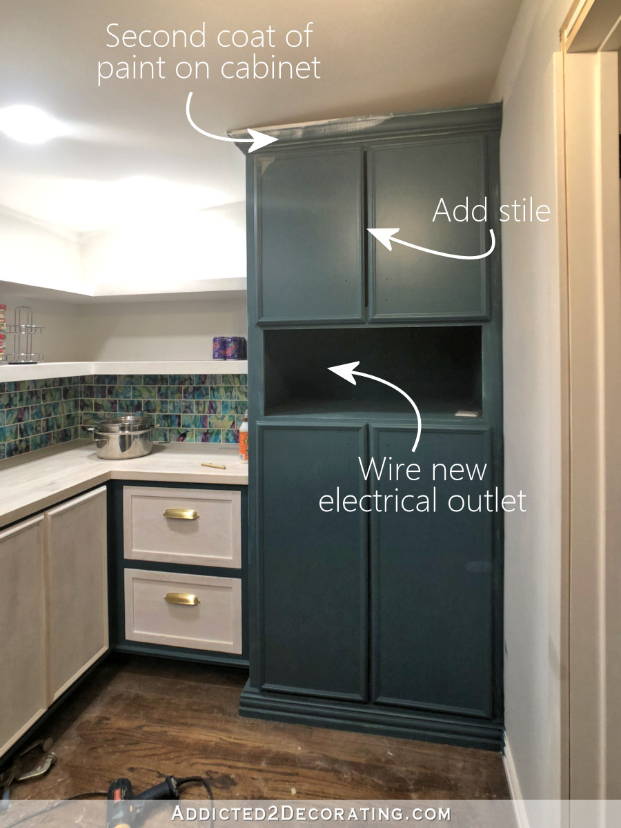
As far as my cabinet color goes, I’ve been going back and forth between green and purple. I was initially set on purple, then I started thinking that green might be better. But now I’m back to purple. My reasoning is that dark purple gives me color, but it doesn’t fight for attention. It kind of fades into the background as a secondary character and allows the brighter and more colorful characters (i.e., the tiles) to be the star of the show.
Green, on the other hand, is an attention-seeker. Unless I went with a really deep, dark green (which I generally don’t like), there’s no fading into the background for green. It’s bold, up front, and in your face.

It’s just too much. So I’m back on the purple bandwagon.
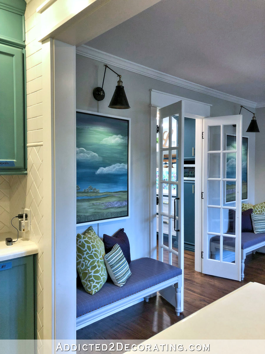
I also tested out the same dark teal that I have on my living room fireplace and entryway wall. It’s glorious, of course. And I’d choose it in a heartbeat except that the purple looks better from the breakfast room.
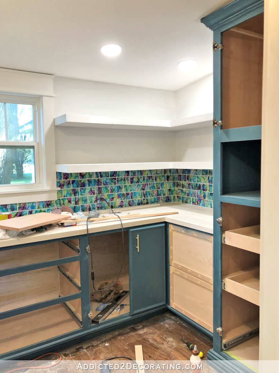
I also tested out some options for the countertop. I just used whatever I had on hand to get a general idea of the direction I want to go with this countertop before I start buying new products, so I started by just using some dark walnut stain on a few leftover boards. Now keep in mind that none of these boards have been sanded, so they’re all still very rough, which affects how they take stain. But you can still get the general idea.

Ummm, yeah. The straight dark walnut stain is a hard NO for me. I love my darkish red oak floors, but that’s just way too dark for a countertop in a tiny room with one small window.
So then I brought out the Minwax Whitewash Pickling stain to see what that would do.
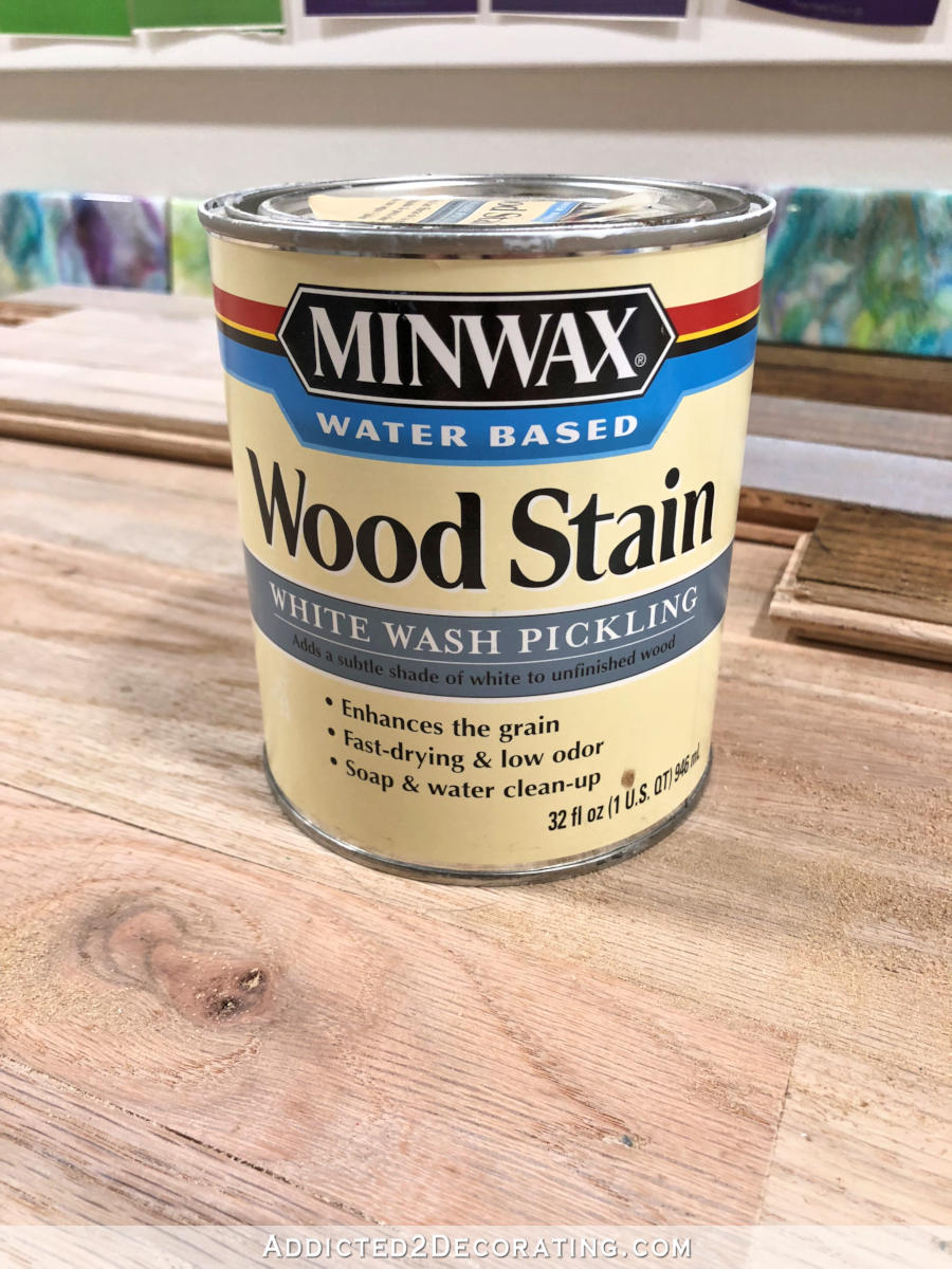
First, I tried it on the boards I had just stained. You can see the one stained board with one coat of the white pickling stain on it, and then the other just below it with two coats of the white pickling stain over it. Of those two, the one with one coat of the pickling stain is my favorite.
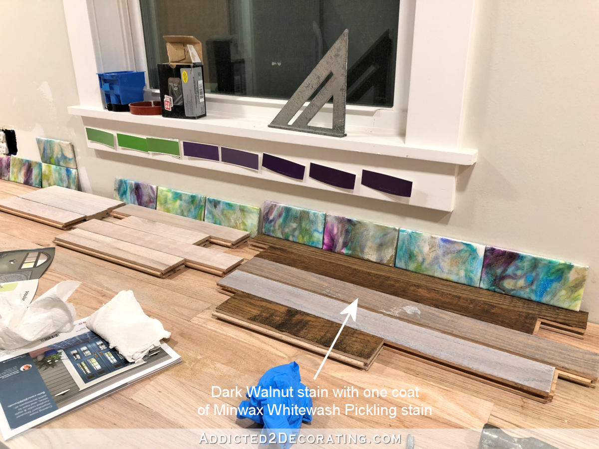
It’s light while still maintaining a bit of warmth from the stain.
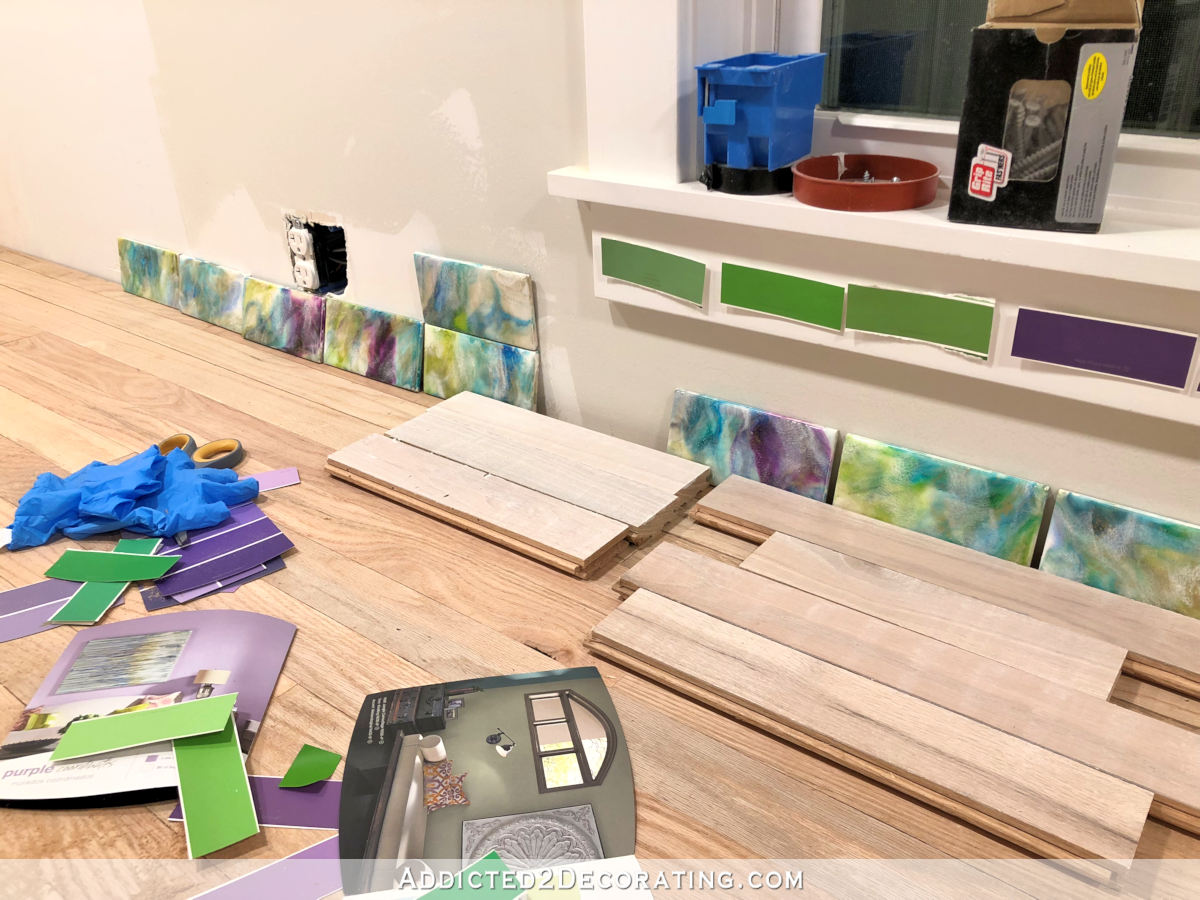
And then I tried using only the whitewash pickling stain by itself. I tried one coat on a few boards, and two coats on a few others.

Of those two options, my favorite is one coat of white pickling stain. It brightens the wood while still allowing it to look like wood. The two coats seem to basically hide the fact that there’s actual wood under there.
But one characteristic of red oak is that unmistakable pinkish/orangish undertone that affects every finish you put on top of it, whether it’s just a clear coat or a stain color. So after doing more reading, I’ve decided to try to bleach the wood before staining or topcoating it. That’s supposed to help reduce or eliminate that pink/orange undertone, and since I love trying new things, I’ve decided to try it out. Bleaching wood is actually something I’ve been wanting to try for a very long time now, so I figure this is the perfect opportunity.
I couldn’t find any wood bleach locally, so I ordered some on Amazon, and it’ll be here tomorrow. I can’t wait to test it out and see how (and if) it works. I can just picture my dark purple cabinets with a light wood countertop (with no pink or orange undertones) and my colorful tile backsplash.
Update:
My pantry is finished! Want to see the entire project from start to finish? You can find every single post about the pantry build right here…
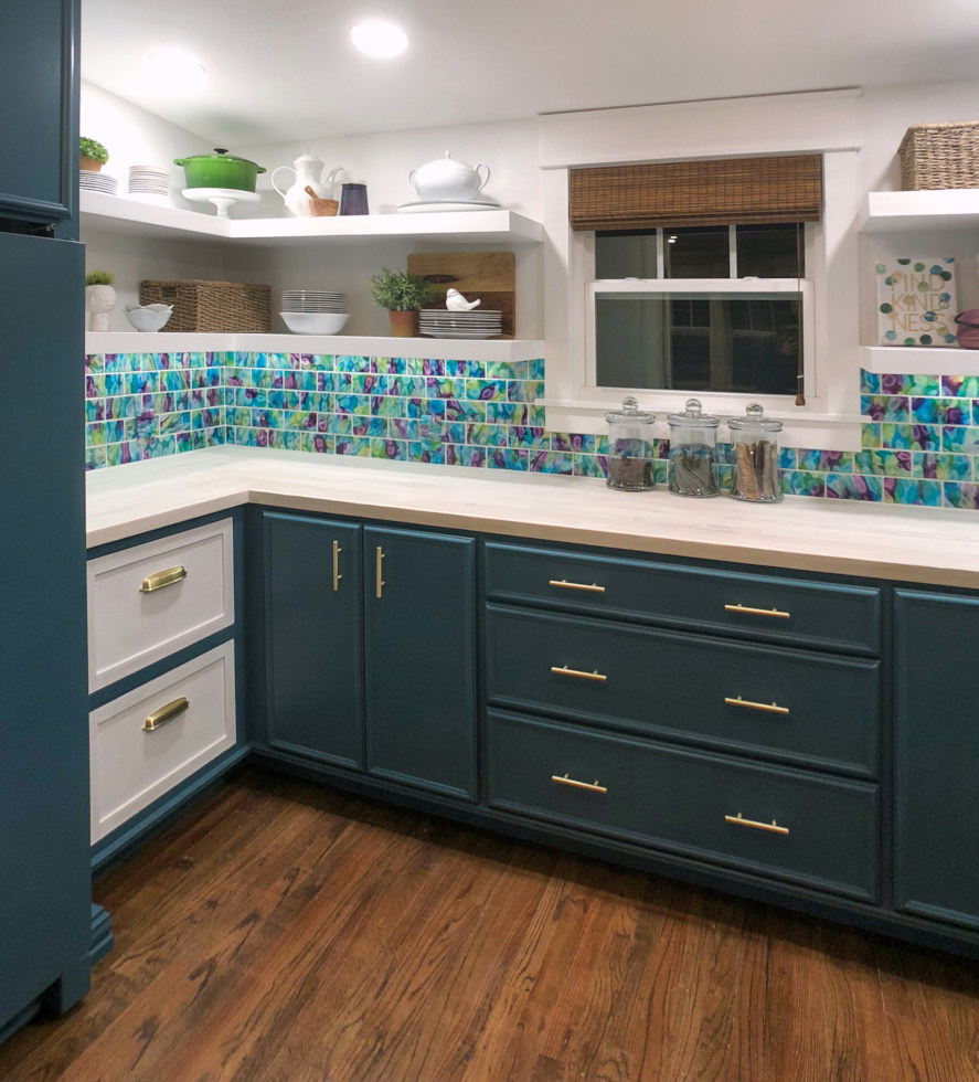
Or you can skip to the end and see how it turned out. Here’s a peek of the finished pantry…
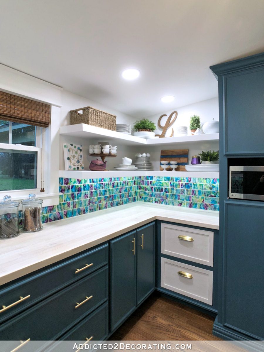
You can see more pictures on the before and after post right here…

Addicted 2 Decorating is where I share my DIY and decorating journey as I remodel and decorate the 1948 fixer upper that my husband, Matt, and I bought in 2013. Matt has M.S. and is unable to do physical work, so I do the majority of the work on the house by myself. You can learn more about me here.


Can’t wait to see how bleached red oak looks! I’ve got a stained maple dining table I need to refinish again, want it lighter and not too yellow, and bleaching was something I’ve definitely considered. However given my small and interrupted by children free time, I can’t use the real 2 part wood bleach and have thought of the pinterest diy straight bleach option which has its own drawbacks. A light layer of that pickling stain is a third think! It’s still good weather and I need to get on this project before much longer LOL.
I vote for purple. It will compliment the breakfast room colors and allow the tiles to be the shining star. Love what you’ve done so far.
I totally agree with this choice. Green paint looks drab and doesn’t show the beautiful colors well in the tiles. I also think it will go nicely with the purple credenza & teal colors of the breakfast room. I can already see the paintings you did outside the doors of the pantry. It’s absolutely poetic!
It is going to look fabulous. I do love wood with that pickled, whitewash finish. I wanted to tell you that I bought Rustoleum wood stain at my Walmart here in Houston. I also did not like the Minwax stain products and I remember a long time ago you mentioned you could not find Rustoleum brand. It is far superior to Minwax. Good Luck!!
Interestingly, Home Depot has stopped carrying Minwax stain and now only sells Varathane (which is RustOleum). Evidently I wasn’t the only one who hated Minwax. 😀 The RustOleum is so much better!
I think you’re on the right track. I’m back to liking purple. And, it looks like you have a good plan for keep the red tones of the wood in line.
Don’t make any more “smooth sailing” comments! You know those always come back to haunt you!
I would think that the tiles give you plenty of color. I think you need to keep other colors to a minimum in this room.
Love the light, one coat of pickling. My question, is why would you not like the pink undertones of the Red Oat, if your going to paint the cabinets purple! I think that would be gorgeous together, and I’m not a pink or purple person[ turquoise is my color]
I had a friend many years ago who had her kitchen cabinets done in very light pickled red oak and they were beautiful. Brightened up the whole kitchen!
For what it’s worth, any time I’ve tried pickling stain, it had a pinkish undertone, no matter what the wood was. Have you tried a watered down paint in a gray or brown tone? I’ve done that with wood before. The water seems to pull the (paint) color into the wood, then when the water dries, you just see the color and wood grain. I’ve only done this on craft-type projects though, so IDK how it would be on a large surface. Maybe also try a pale brown (tan) paint too, or even white! The tan might have that pink undertone too. I have seen videos on bleaching, but not tried it. Love the green (I’m a green person) but I think you’d be happier with the purple.
I did our box-car siding in the sun room ‘pickled’ too. I couldn’t afford all that stain so just used watered down paint. Worked like a charm and MUCH more affordable. I wondered about using a contrasting tone to cut down the pink too. You are a color specialist so I’m sure you have thought of everything!!
I love your tile! If you’re still unsure of the purple, have you considered the gray you have (had) on the cabinets in your bathroom (may be a powder room)? That might look lovely with your pickled stain. It’s just a thought! Whatever you decide, I’m sure it will be great!
I’m on the purple bandwagon also. But I do have to ask, have you considered white cabinets? That would allow your pretty tiles to really take center stage.
Sorry, I have never pickled anything.
I love the purple too! As a dyeing colorist, if you decide to go with a dilute white paint to allow the wood to show thru, try adding a few drops of a medium green paint to it. Green and red are complementary colors. the few drops of green ought to cancel out the red tones of the wood and take it more to the brown tone. definitely try it on a scrap first.
Ya!!!!
I don’t usually express my opinion here ’cause I don’t usually know myself, but I have say I agree with the dark purple DEFINITELY!!! Not sure about the countertop, but I think I like the light wood.
It’s looking fantastic!!!!
I really like the darkest purple, kind of an eggplant color. Are you going to paint the cabinets first or finish the counters? For me, the paint color is a more important choice that, once done, could completely change your mind on your countertop finish. The same goes for the reverse, so for me, I would have to decide which is more impactful, the paint or the wood. I’m sure you’ve already thought of this, you don’t seem to miss any details! You never cease to amaze me .
I’d like to install the tile backsplash, then make a final decision on the cabinet color based on what the tiles look like in the actual room. Then I’ll finish the countertop based on what looks good with the tiles and the paint color I selected, and then I’ll finish by painting the cabinets. At least that’s the plan right this minute. 🙂
I wasn’t even thinking of the title which is the boldest element and of course should come first 😊 Not at all surprised you gave a plan!
I was about to suggest using something with a green undertone if you decided to try diluted paint but then saw that Crystal Griffith has already suggested it.
However, I was working with a woman a couple of years ago who was purchasing a home with red oak flooring and she just disliked that red undertone so much. A wood refinishing company bleached them and it was a success! so I have high hopes for your experiments tomorrow.
I can’t WAIT to see this completed project. As my mother used to say, it’s going to look “yummy”. Those rich, jewel tone colors are breathtaking! I too, am a fan of the deep purple…so irresistible!
First of all, I LOVE your blog and have been following and commenting on it for years. I also looked for an email address on this page and on facebook – the facebook link is broken- because I wanted to ask you privately about something on your site. I didn’t want to just put it out in cyberspace to avoid generating additional emails from others regarding my question. I promise its nothing bad, just something I have noticed recently and I wanted to ask about it. Thanks so much for letting me ride shotgun on your Addicted2Decorting journey. Have a BLESSED day!
You can email me at [email protected] 🙂
Walls ain’t straight in a new house either ;-). We had our house built in 1985 and have several wonky walls. One in the dining room that I didn’t notice until I put a chair rail up. The wall is so wavy I had to use plastic molding since wood wouldn’t conform to it. Plus none of our studs are 16 inches on center so replacing molding is a frustrating challenge. Oh well…you really feel like you’ve accomplished something if you have to sweat your way through it.
I think purple cabinets will be gorgeous especially playing off of your teal kitchen cabinets. As an outlier I like the darker stained wood, it’s so warm looking but I’m sure whatever you choose will look great. Are the walls going to be white?
I’m planning for the upper open shelves, the upper parts of the walls (above the 18-inch-high tile backsplash) and the ceiling to be white. I do love a warm stained wood, and if I could find a light to medium brown without the red undertones, I think that would be gorgeous.
This is such a good idea using flooring for your counter tops and I have been studying the photos because I have a counter top I want to make. I do have some questions.
1. It doesn’t look like you will have any overhang, at least not in these photos. My mom had granite counter put in her kitchen and they didn’t leave an overhang and it was horrible trying to wipe crumbs into your hand or a waste bin. She always to me she wished she had paid more attention when they were installing.
2. With no overhang it looks like you butted the counter up to your cabinet face fame, so the edge of the face frame board is showing from the top. Are the cabinet face frames red oak? How will that work with the stain?
I have an island I built but can’t afford to buy a granite top or butcher block. Now, it just has some large floor tiles as a top but I had to use a wood trim to cover the edge of the tile. The lip on the trim is so annoying to try and clean around. This is my fall woodworking project.
Love love love the purple. So happy you are staying with that. I was afraid a green would clash with your kitchen as it has a more blue-ish tone to it on my screen. Can’t wait till you’re finished and we can see the whole thing. I love your tiles as well!
I was thinking this as well!
It’s coming together beautifully!
Have you thought about making your own stain (vinegar and steel wool)? I’ve tried it on pine with its yellow underdtones and it can turn out a nice browny grey depending on how long the stain develops and how many coats you do. The grey tones might complement the purple you are choosing without being too grey.
It’s all looking so great! Just can’t wait to see it all finished!
It’s so annoying when you don’t have straight walls. I moved into my brand new house in March and the walls are terrible. Had a BIG problem in my upstairs bath where I was doing a paneling project and in my pantry with my upper shelves. I’m still waiting for your cabinet making instructions (and free time for me) to tackle my lower cabinets in the pantry. After reading this post, I’m dreading the countertop because I already know my walls are not straight! I am going to do a rustic wood plank countertop, so I guess the jigsaw will get a good workout on that.
I understand the problems with older homes. I live in a converted 1 story summer cottage. if someone wants to used the bathroom I just tell them ‘it’s uphill on the left”
I’m super interested in the wood bleaching as well! I have a beautiful maple desk that I bought at an auction, but the stain and clear coat have turned a honey orange over the years. I want to strip it back to the beautiful buttery color of the maple. I had never heard of bleaching wood before, but I could see this working to achieve what I’m looking for! Your counter tops sound like they’re going to be amazing. I hope it all works out as you see it in your design vision.
Definitely the purple/plum/eggplant. I agree with you–it’s glorious, and it will provide a peaceful view from the breakfast room.
What poly would you use to finish counters like these or a dining table? Something durable and can stand up to damp glassware, etc?
Purple for sure, I think that color will allow the tiles to be The Star.
I’ve owned brand new homes and very old ones…and not a single “plumb & true” wall in any of them. I did see ONE wall that was perfect, in the home of one of my former neighbors, it was papered in a large geometric pattern. After chatting (all the while looking at the wall) I exclaimed, “That wall is absolutely square – the only one I’ve ever seen”! Her husband came out of the kitchen, beaming, and thanked me for noticing (he built the house himself). ONE wall, in at least 50 years…so…don’t be so hard on yourself!
I loved the wood panel with one coat of the white wash on the unstained piece, too. And though I love the dark purple color that you’ve used, I think I’m rooting for a white cupboard treatment because of two factors. One, it’s a small room and the purple will look extremely dark in a small room especially since there is no natural light that will hit the front of the cabinets. The window is coming from behind. And two, I love, love, love your resin tiles and think that they would look spectacular with white cabinets and the bleached counter top. The breakfast room has so much color and I think it would be beautiful to see the splash of color from the tiles through the French doors. I think that any color on the cabinets would drown out or complete with the tiles.
And to clarify….I loved the final version of your front entrance wall so I’m not afraid of color. *wink*
Am I the only one who likes the stained counter top wood? To me, the stain and the tiles look rich and bold together and seem to pair well. I feel as tho the visual of tiles stick out too much when paired with the lighter, pickled wood – like a stand alone feature. I would want a seamless blend of elements working together to make a whole beautiful unit and what I see possibly happening are three separate beautiful units (tile, counter top, cabinets) that together, sort of remain separate rather than flow one to another. The tiles are the star, the rest the supporting cast, not co-stars. Wish I could explain myself better. Im no expert, just sharing my thoughts. You will make the best choice for you.
The pantry, I want one! Everything is looking great. I’m thinking since the wall tiles are so colorful, I might consider a light or white cabinet. If it’s too dark, in my opinion, it may look very bottom heavy. Of course I don’t have the design background that you have. No doubt I’ll eat my words when it’s done. 🙂
I have never heard of scribing boards with a jigsaw to make them fit a wavy wall. Do you have any photos of what you did and how you installed that last row? I think that would be interesting.
One thing I might suggest is creating your own stains using General Finishes wood dyes. They have green , red , black , etc . I am sure they have some. Instructional videos. If they don’t maybe YouTube. The have fantastic products but I am not sure they have a ready mix stain that would work. I have seen the Franciscan monks use the General finish wood dyes for the beautiful pieces they sell. Just a suggestion for a different path. I have used wood bleach many times to take out water , ink stains and remove too dark stain in wood but never to change the natural color of it. Good luck i’m Sir it will all be lovely when you are finished. Also although color is not my style i’m Loving the tiles and purple . Looks good in the planning stage.