Q & A — Details Of Rose’s Wainscoting Design
Rose is trying to create a unique wainscoting design in her dining room, and is looking for input on the details. Here’s what she says:
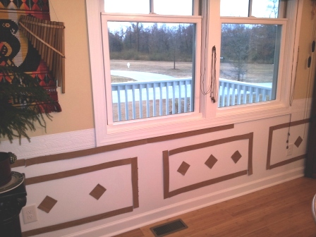
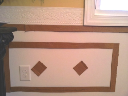
I have created a mock up for wainscoting using cardboard.
I don’t know whether to paint the bottom portion of wall SW Ivoire (like the top) where the white wall is now, or leave it white. We will have the picture frame wainscoting painted white, and in the middle of the wainscoting, place three 4×4 inch bronze colored tiles. (They have an edge around each side to be used as a stand alone tile piece.) These tile pieces would match the oil rubbed bronze light fixture and ceiling medallion.
The other strip of cardboard below the white wallpaper boarder would represent chair molding. Would it look funny to have the chair molding that low, or should we raise the wallpaper border, and place the chair molding where the wallpaper border is now?
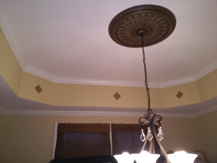
Also, would it look funny to place these same bronze tile pieces around the bottom part of the tray ceiling.
This is in the dining room.
I would greatly appreciate your opinion on this.

Kristi’s Suggestion:
First, let me just say that when I read “wallpaper border” (before seeing the photos) I was ready to beg you to forgo the wallpaper border. But then I was pleasantly surprised to see that the wallpaper border you’re referring to is a beautiful anaglypta. Anaglypta will never go out of style, and is perfect for use in a traditionally styled home.
My suggestion would be to paint all of the wainscoting white, but I would definitely incorporate the anaglypta border into the wainscoting, and make it look like it’s all part of the wainscoting design.
In order to do that, I would put a smaller (but still substantial and decorative) moulding below the anaglypta border, and then put the chair rail above the anaglypta border. That will give it more visual weight, and make it look more like an architectural feature rather than just a wallpaper border.
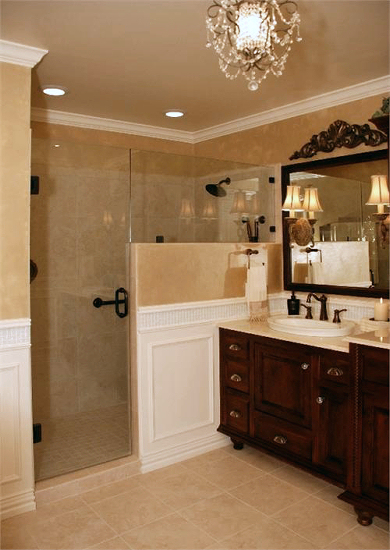
I couldn’t find an example of what I’m talking about, but I used a very similar concept in my mom’s bathroom remodel. I wanted a traditional wainscoting in there, but I also wanted to add a bit of sparkle with a row of glass tiles, so I incorporated the tiles into the wainscoting between two pieces of moulding — a smaller moulding on the bottom, and a chair rail on top.

So I would suggest a similar treatment for your anaglypta border. Again, the addition of the moulding on bottom and on top of the border will simply elevate it from “wallpaper border” to “architectural detail” and give it more visual weight and more importance in the room as part of the wainscoting design.
As far as the bronze tiles, I personally would leave those off. I do understand wanting to incorporate the bronze from the chandelier and other metal items in the room, but I think having metal tiles attached to to the wainscoting will look like an afterthought. If they could actually be inset somehow, that might be different, and it would look completely intentional (although still not needed, in my opinion). But having them stuck on top of the wainscoting…I just can’t picture that having a professional, designer look to it at all. But I could very well be wrong about that! 🙂

Addicted 2 Decorating is where I share my DIY and decorating journey as I remodel and decorate the 1948 fixer upper that my husband, Matt, and I bought in 2013. Matt has M.S. and is unable to do physical work, so I do the majority of the work on the house by myself. You can learn more about me here.
Agree with Kristy’s suggestions. The wainscotting will be beautiful with her idea about the chair rail, but I would leave the tiles off. That’s all your eye will see.
I rather like the idea of the bronze tiles! Would it look better if she left off the WAINSCOTING, and just did the trim designs with the bronze tiles?
I agree with Kristi! And I love the added detail on the lower part of the tray ceiling! Great Ideas!
I would put the chair rail moulding above the anagypta border with a smaller moulding below it, just as Kristi suggested. I think it would make the border look more architectural. I would also paint the entire wainscotting white. I’m having a hard time visualizing the bronze tiles in the completed project. I would install the mouldings and paint, then try the tiles to see how it all looks.
If you already have the tiles and they don’t look right on the wainscotting, what about attaching them (3, 4 or 5 depending on how large they are) to a thin piece of wood and framing it out creating an art piece to hang on the wall?
Kristi is right on track about using molding on both the top and the bottom of the anaglypta wallpaper border, otherwise it just seems to be floating and not part of the architecture. I feel she’s also right about nixing the tiles. It would start to look to craftsy.
But everything else looks great. Good luck.
I agree with Kristi. Molding above and below the border, paint all molding and wainscoting white, and do not add the tiles. I think they would date the room very quickly.
I agree with Kristi. If you put the chair molding on top of the border and a smaller piece of molder under the border. I think that would make the entire thing look like one decorative piece. I’m not a fan of the bronze tiles. It seems to take away from the elegance of the room and make it look too busy.
Kristi, your advice is spot on! The bronze tiles are too small and really do nothing for the overall look!
I would either make the top piece under the chair rail smaller about 1/3 the size to 1/2 the size. I feel it will look more in proportion. I WOULD KEEP THE BOTTOM PART OF THE BACKGROUND WALL WHITE TO HAVE OF THE TOP HALF OF THE WALL COLOR SHOWING A NICE CONTRAST with the upper part of the wall.. Then it will match the widow trim etc which looks more historically correct. Even though this is a new application. If you go cream I feel it will look more like a after thought or a new added look. It’s best I feel to always keep the whole home somewhat cohesive for the timeless look. Enjoy ! Kev P.S. Sorry about the font change, lol I’m not yelling.
Kristi, I wish you had a edit key like they have on Houzz to correct possible typing mistakes or grammar. Or maybe just delete the comment all together. I love your Blog ! I enjoy it more than Houzz That I use to be on quite a bit. Houzz has become to commercial and unfriendly at times over the past couple of years. Like a online trade magazine. You think outside the box and prove going with your own personal taste in designs & colors is always best no matter what the trends and there for is more timeless. A truly well designed finished room. That reflects the homeowner. Not a Trade magazine that is so redundant. Thanks, Kristi
Hi, I too think your chair rail shoul be above the border. Kristi is right about adding a smaller trim below the border. It will make itmuch more substantial. If you are truly trying to make your walls look like wainscoting, then, yes, you shouls paint it all white. If you are going for a look of picture frame molding, I think it is best to keep the wall the same color both up and down, and keep all of your trim and woodwork white. I am sorry to say I would nix the tiles. While the look may be unique to your style,, from a design point it would be considered kitchsy. You don’t wan’t that.
Well, I’m right there with the majority. I love the Anaglypta border and I think it would look great with molding above and below it. As Kristi says it will be more like an architectural detail than just a border. And I am so sorry but I really don’t like the bronze diamonds. If it’s about bringing bronze in like the medallion I would look for another way.
In agreement with Kristi on all points. I really like Shirlee’s idea of creating some wall art with the bronze tiles to tie in your chandelier.
I guess I’m the only one who like the diamonds on it.
I agree about the chair rail. I also agree about nixing the tile work. I have never seen anything like it. I’ve moved several times and have looked at close to 2000 homes for sell. If I saw those tiles in a home, I would think OMG. I think decorative accents could be incorporated elsewhere. I know the bronze tiles are pretty. I have them in my kitchen backsplash. These tiles are not right for a dining room
Oh my gosh…Kristi, your Mom’s bathroom is extraordinary. When I renovated my bath, I avoided glass tile but the way you incorporated it is so subtle and beautiful. Do you think I could do something similar in my kitchen?
Of course! That would look beautiful, and unique, in a kitchen. 🙂
I agree with leaving off the tiles. Not sure your space is large enough for all of the embellishment. I also would suggest you see if you can somehow center your design under the windows. It looks a but askew not lining up with the window shapes/lines. Don’t know if you’ll be adding draperies but consider the fact the wainscot revealed between the draperies will not be centered and in Essence ‘cut off.’
Sometimes adding too much embellishment can look busy.
And yes to painting it white.
Wow, Kristi, your Mom’s bathroom is outrageous. I love that you incorporated some vintage pieces of furniture (or at least they look vintage). I’ve got lots of vintage pieces I’m not sure what to do with. You keep adding more projects to my already long list.
I agree with Kristi’s suggestions.
The “tiles” are kitchy, and don’t enhance your dining room, but rather detract from the overall elegance of it, imo.
I agree with Kristi on all counts. I definitely would not use the tiles there. If you have enough of them maybe you could use them to make a lamp much like Kristi’s Watercolor Tile Herringbone Table Lamps or maybe use the same idea to make a vase or something to set on the floor to hold a plant. I would only use bronze in accessories, not on the walls.
I love your ideas. I agree about the chair rail. I really like Shirlee’s idea of creating some wall art with the bronze tiles to tie in your chandelier. I know the bronze tiles are pretty. That would look beautiful, and unique, in a kitchen.
I agree with Kristi, nix the bronze tiles, less is more. You have a lot going on with the wainscoting. It will look great!