Six Inspiring House Exteriors (and My Potentially Shocking Final House Color Choice)
For the longest time now, I’ve had my heart set on a non-neutral color for the exterior of my house. I’ve had my eye on either light yellow (which I tested out on my house in this post), and then I thought about a really light bluish aqua color (like the house at the end of this post).
But when I couldn’t decide which one I liked better, I decided to go to Houzz.com and just search “painted siding exterior” and flip through as many pictures as I could, as fast as I could, and see just which ones grabbed my attention.
I was actually a bit shocked at the results of that little experiment. It wasn’t the blues or the yellows or the greens that caught my eye. It was the grays. Yep, gray.
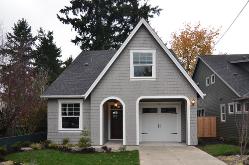
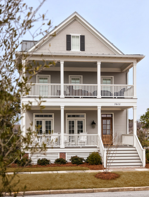
This was the first one to grab my attention…
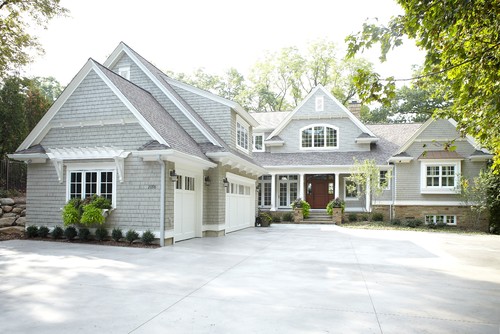
I loved the combination of the gray siding, bright white trim, and barely-gray stone. And then I saw this one…
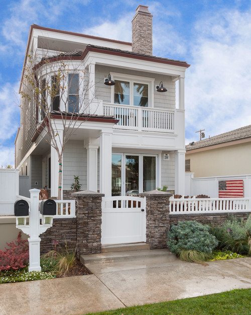
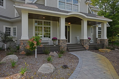
And then this cutie…
The really light gray houses appeal to me more than the darker ones, like this Benjamin Moore Seagull Gray…
And this one with Sherwin Williams Silverplate…
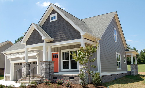
And of course, the two-tone gray house with the bright orange door caught my eye.
Gray used in interior decorating is a new thing for me, and even now I can only use it minimally (like the absolute lightest gray I could find for my breakfast room and living room walls) and combined with lots of color.
But gray on exteriors has been a favorite of mine for about two decades. In my early and mid-twenties, I always dreamed of having a light gray house with white trim, black shutters and a red front door. So when Matt and I built our first home in Albany, Oregon, right after we got married, and he asked what colors I wanted on the house, I knew exactly what I wanted. And I got my gray house with white trim, black shutters and a red front door.
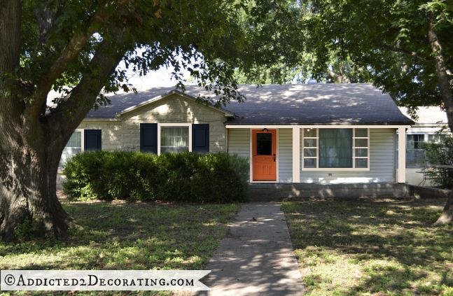
So I’ve decided to go with gray siding (and stone!) and white trim. I’m not quite sure if I’ll go with black shutters this time, and I’m about 99% sure I won’t do a red front door. Right after we bought this house, I did a few different mock ups, and I remember this one being a crowd favorite on my A2D Facebook page…
And it’s still a favorite of mine with the coral front door and the really dark midnight blue shutters, so I might go that direction this time.
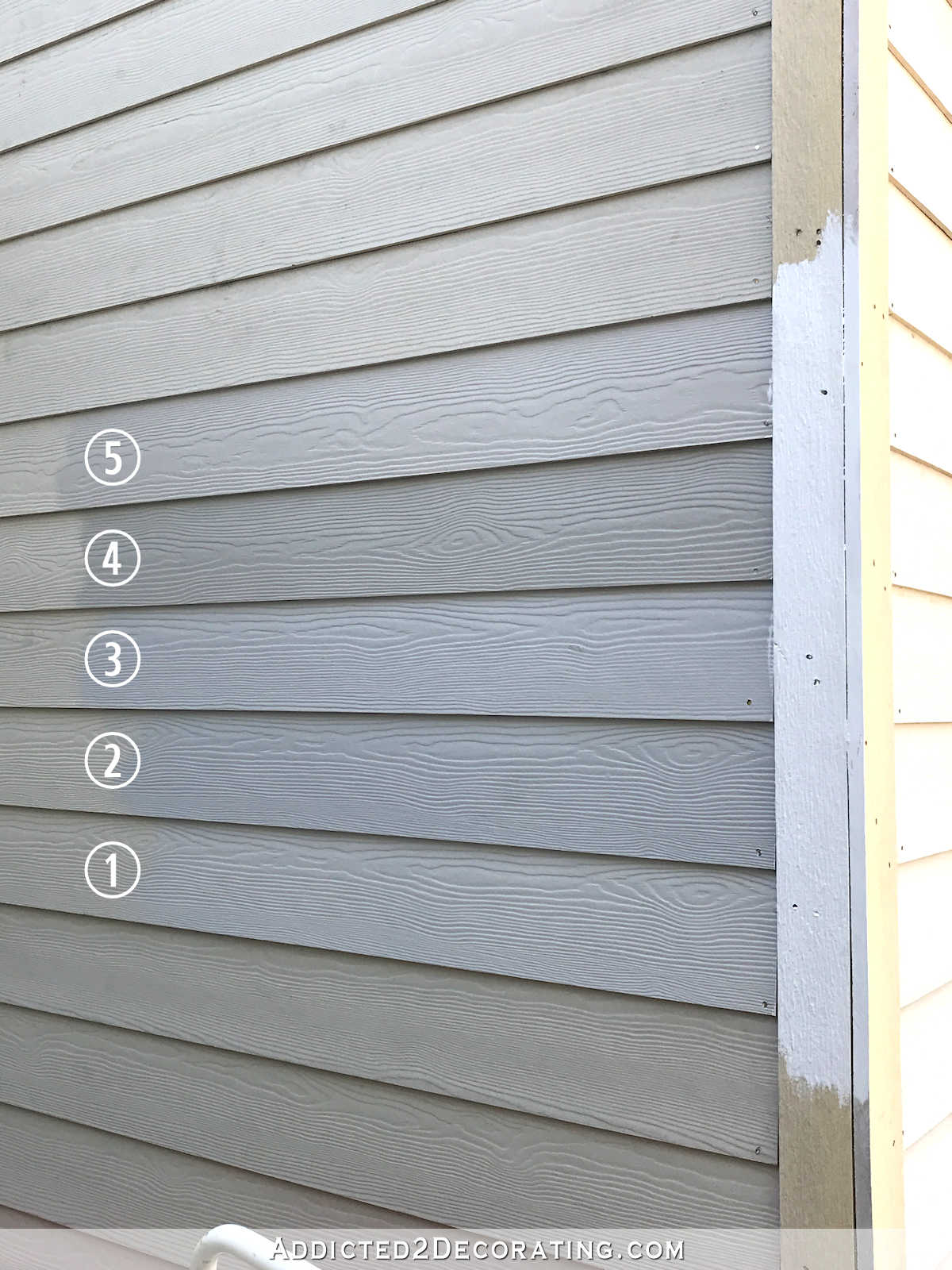
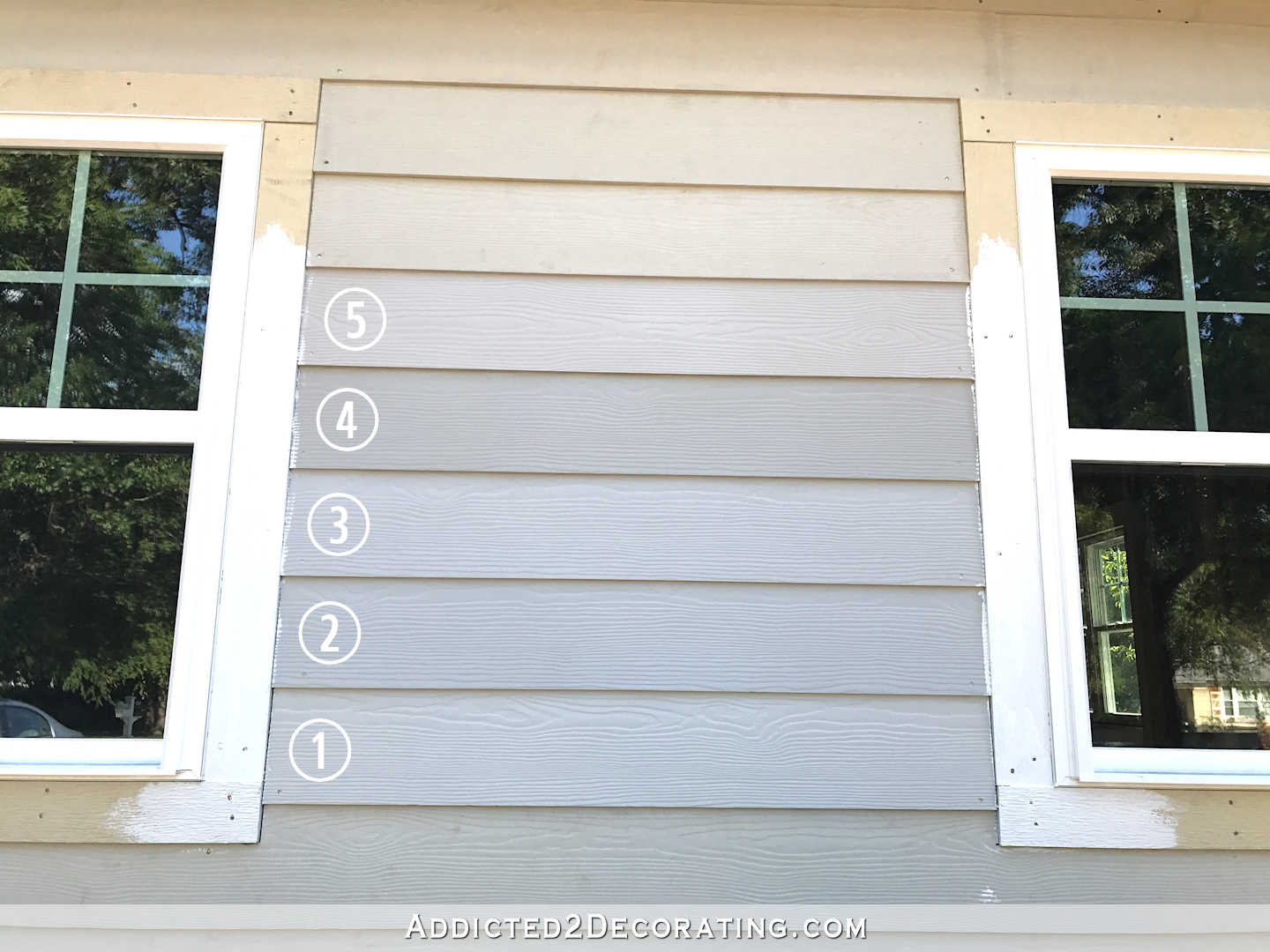
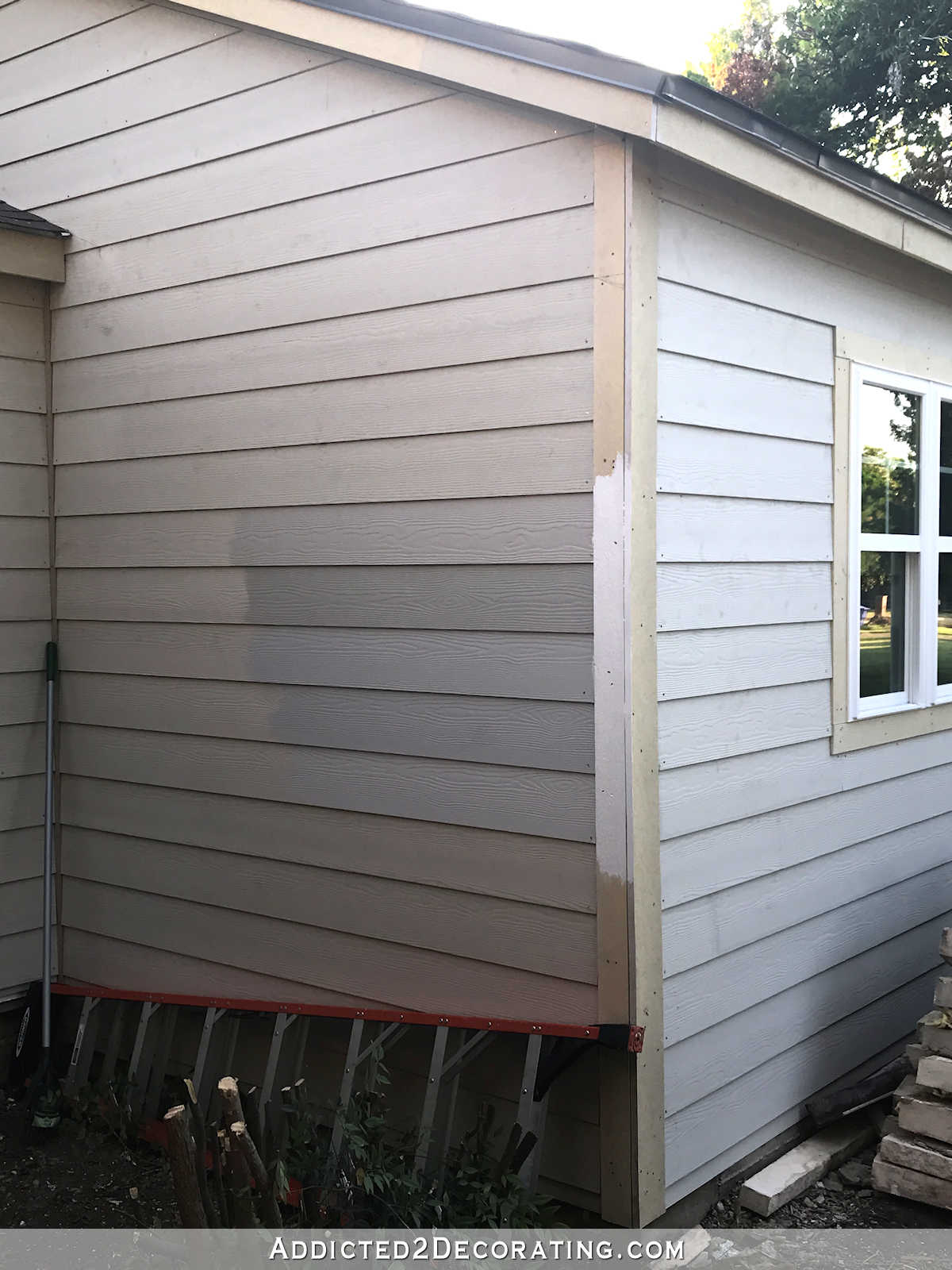
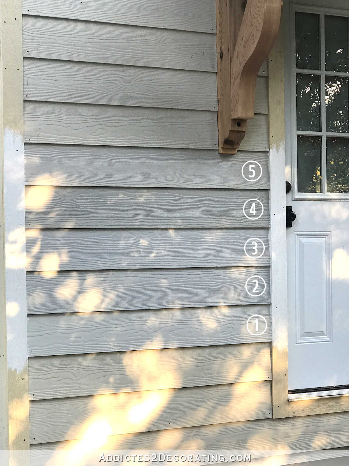
So I headed to Sherwin Williams to look at grays. I started out with a stack of about 25 gray paint chips, and quickly narrowed them down to my five favorites. I chose (1) Repose Gray, (2) Silverplate, (3) Knitting Needles, (4) Mindful Gray, and (5) Colonnade Gray. Here they are around 5:00pm on the breakfast room side of the studio next to the trim color, which is Extra White (i.e., Sherwin Williams’ base color).
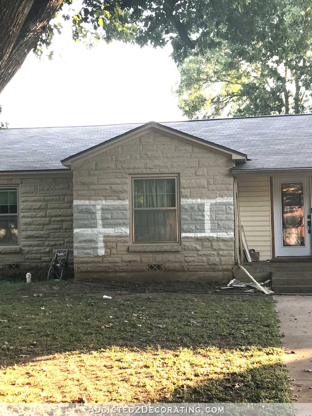
I had a favorite almost immediately, but I also wanted to see them on the front of the studio…
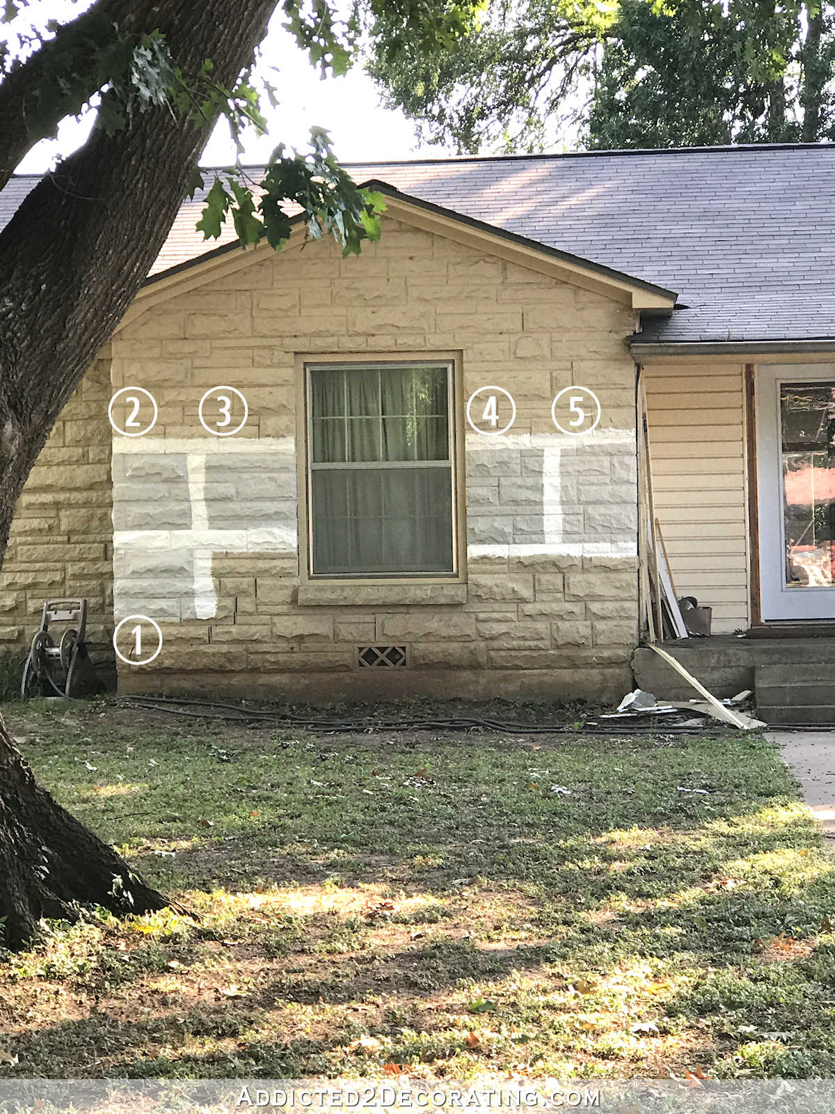
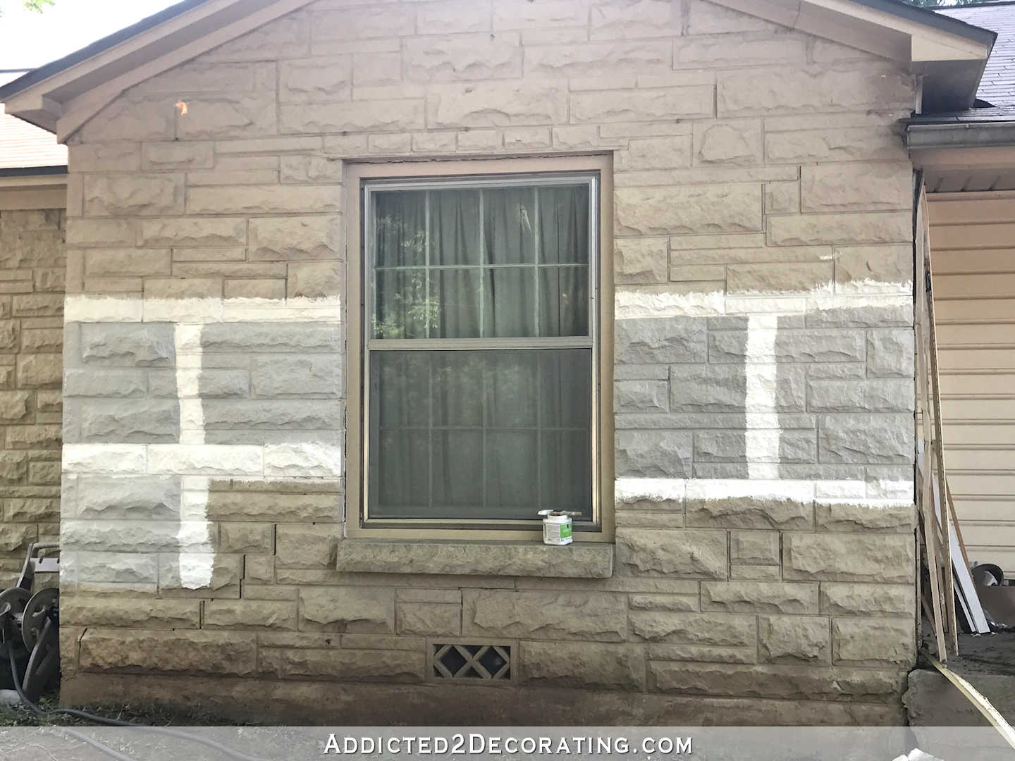
…and on the stone…
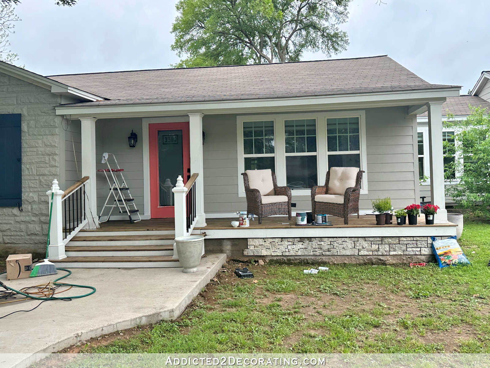
(Forgive the mess. The siding is being torn off of the front porch right now.)
Here’s a closeup of the colors on the stone in the 5:00pm-ish light.
Then I waited a couple of hours and took a few more pictures. This was around 7:15pm on the breakfast room side of the studio…
…and on the portico side of the studio, which is always in the sunlight and hard to photograph…
…and on the stone…
I narrowed it down to Mindful Gray (#4) and Colonnade Gray (#5) immediately. The other three just looked cold and steely to me.
Here are a couple of examples of Mindful Gray…
And this is Colonnade Gray…
Of course, while you can get a general idea of the color in a photo on someone else’s house, it’s hard to get an idea of the exact color in a photo since the appearance depends on so many variables — lighting, time of day, trim color, etc. So when looking at pictures of the colors on other houses online, I was mostly interested to see how well the color contrasts with white trim. On the samples on my own house, I tried my hardest to pay attention to undertones in different lighting throughout the day.
By the end of the day, I was leaning towards Mindful Gray (#4).
Repose Gray (#1) is too light and cold, Silverplate (#2) has blue undertones to it, and Knitting Needles (#3) has blue/purple undertones, so those three are definitely ruled out.
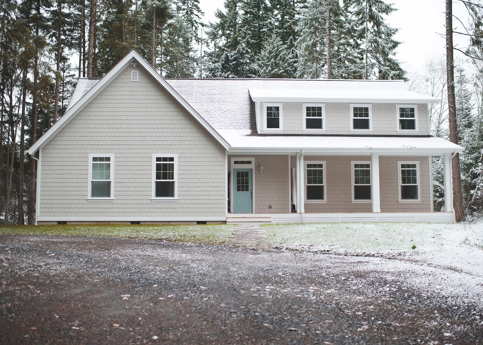
Colonnade Gray (#5) seems to have red/pink undertones in the late day and early morning light, so I’m pretty sure that won’t work. Although I’ll admit that I do love how light and fresh the color is, and I really like it with the aqua front door in the photo above.
So it looks like Mindful Gray is my choice. Sound good? 🙂 The fun part will be finding the right shutter and front doors colors that bring some color to the exterior of the house. But that’ll come later.



 via This Sweet Reverie


Our house is painted in one of your final choice. I am thinking it’s Mindful grey and I love it. We don’t have shutters and our trim is not quite white.
MINDFUL GREY WAS MY CHOICE FROM THE BEGINNING ON ALL SIDES OF HOME! Not too blue looking at all. It has a warmth to it the others did not have
I was leaning towards #4 immediately, so excellent choice 🙂 Just curious though, does this mean you plan to paint the stone instead of taking it back to white?
Yep. I’ve decided against sandblasting the stone, at least for now. So I’ll be painting it. I might try to do some sort of very subtle multi-colored paint technique to make it look more like natural stone, though. I’ve been saving my favorite pictures of stone that I find, so I’d at least like to give it a try before settling for a solid color painted stone.
I love gray in all things. I immediately went for #4. I hope one of the ways you are looking at is making it look like different colors of stone. You are awesome by the way. Love fallowing all you do.
My kitchen, entryway, living room and hall are Mindful Gray. I LOVE it. Wouldn’t change it at all. Perfect gray color. Go for it!
My kitchen is also Mindful Gray, and I second the love. It is truly gray without veering green or purple — in that space. I loved it so much that I painted our bedroom the same color, which is on the opposite side of the house and doesn’t get as much light, and I hated it! I couldn’t believe it was the same color. I’m glad you’ve done the legwork and looked at it in all different lights, because it truly seems to shift, depending on the space.
Who makes Mindful Gray? Love the color!!
Sherwin Williams
I love #4 too! It was the color my eye went to in every picture you posted.
Mine too!
Same here!
Mindful Gray was my first choice, made immediately and confirmed in the following pictures. It looks like a true gray to me.
My eyes were drawn to #4 immediately. I believe Mindful Gray will turn out beautifully. I’m so excited for you and can’t wait to see the final results.
I was hoping you picked #4 from the first picture you posted of the samples. Will you be painting the house yourself?
Well, that’s the plan right now. I have the paint sprayer for it, and I’m pretty sure I can do it. But I’ve never painted a house exterior before, so if I start and feel like I’m in over my head, I’ll hire it out. But I’d really love to save that money and use it on the inside of the studio if I can.
Really?🙄 After all the projects you have tackled, painting will be one of the easiest! I know it feels overwhelming, it’s a whole house after all, but my suggestion would be just commit to one side at a time. If you schedule a few days per month it may not feel so daunting. You know you can so do this!!
You tackle projects everyday that I would never have the nerve to do. I have painted three quarters of my house by myself when I was single and it was easy. I didn’t have a sprayer, therefore it was a bit tedious. You got this!
Please Please Please give it a try and write a post! My house is a 30’x30′ square, one story. On the front, it has two different types of brick, white tile siding, tan concrete foundation, and bare concrete steps. Too many colors for such a small facade! I want to paint the whole thing one color in the fall, so a post would REALLY help me 🙂
#4 and #5 were my picks too, but I liked #5 better. However, seeing it on a house, I could see how it would look peachy!
I painted the outside of my house with a paint brush 😀 That’s been years ago though. You can do this.
my picks were #2 and 4. No reasons, just that they looked good in every light setting.
I too thought 4 or 5 would be a good choice – ❤️ both colors:) I want to repaint my house as the tan (from 10+ years ago) has turned a gawdawful pinkish tan from the sun. I will have to keep your colors in mind – can’t wait to see the finished product😃
Kristi, I just painted my upper half of the kitchen in Sherwin williams silverplate (lower half is briht white wainscoting) and everyone is complimenting me on it. You are right, it looks different in different homes. Mine does not show blue at all but a pretty silvery gray. I think mindful gray is beautiful too. I love the gray trimmed in white. So classy and clean!!
Ugh…where were you and this post when I painted my rental 3 weeks ago and chose Repose Grey? Loved it on interior walls, but was MUCH too light outside. My immediate choice was Mindful Grey (#4) too. I wish I’d have chosen that color! 🙁
The mindful gray is a favorite of mine, too. Have you thought about painting the stone another color on the same gray palette, maybe something shades lighter. Or, a gray with a little brown tone like the stone on the fireplace on the first picture in your post. I think it would look “Wowie Zowie”.
I was thinking the same thing. It would be interesting to see a photo shop of that.
I was thinking the same thing except having the stone a darker gray as contrast. Either way (contrast or all the same) I’m sure it will look great!!
Suggest you watch your roof color
Her roof looks purpley-gray- not the easiest to work with but sort of hard to tell in these photographs. Good point, as the roof is a fixed element that needs to be taken into account when choosing exterior color.
every picture i said #4 – glad you picked that color – it looked the best. Can’t wait to see the final product. Are you painting on vynl siding?
No, it’s not vinyl. I’m getting rid of all of the vinyl, and replacing it with Hardieplank siding, which is a fiber cement material.
My eye went to #5 every time…. but it’s not my house 😉 Wish I had spent more time considering ours when we painted it a couple years ago… don’t much care for it now… 🙁
I picked #5 every time, too, b it #4 was close behind.
Girl, you are thorough! Mindful Gray was my choice as well since it’s the best contrast IMHO.
I love that Kristi is choosing the colors for our house. I am colorblind. In fact, I can’t tell the difference between colors 1, 2, 4, and 5. Only #3 looks different to me, so I choose that one. 😉
I am blown away by how much better the stone looks painted gray. Beautiful choices in color with the grays! You are going to love your new and fresh looking home once it’s done. I love the choices you are making, once again…
I was torn between 4 and 5, so good choice 🙂 I’am looking forward to the result, as I love grey houses with white trim, too! Have fun with the project – and if you don’t, let somebody else paint it, if it’s affordable…
LOL. I always seem to pick the opposite of the things you prefer. I was immediately preferring 1,2,3 and ruled out 4 and 5. 4 and 5 read as greige with more beige/tan undertones to me. But I know the greige colors are popular now and people seem to gravitate towards them. I have repose gray and love it.
#4 stood out to me in every single pic so I’m thrilled to know it’s one of your final choices! Gorgeous with white trim!
YAY! Mindful Gray was my fav from the start. Can’t wait to see the whole house exterior color scheme!
#1 or #4 are my favs. Maybe darker on the house and lighter on the stone.
But, it’s funny that none of your decisions would be mine and then I like your decisions anyway because you seem to reason through them like I do for my projects.
Good luck!!!
Can’t wait to see the final decision up and done! 🙂
I liked that one too. It’s going to look pretty, but sophisticated at the same time. Plus it won’t date as quickly as yellow or blue might.
Perfect choice!!! The soft gray will allow you have fun with color in other places
(door, shutters, plants and garden decor.)
I’m so glad you aren’t going with yellow!
Love a gray house! I have the paint sitting in may garage now just waiting for the weather to cool down (108 here today:(
We’re going with (SW) African Gray on the body of the house, Web Gray for the shutters, Naval for the front door and bright white trim.
Anxious to see how yours turns out, hoping I love my choices as the paints already purchased!
Yes! I absolutely love the direction you are going. #4 every time but oh, how I love it with the aqua door. Just a hint of what is waiting inside. Go Kristi
I’ve used mindful gray, it’s one of my favorite grays.
My daughters interior is Mindful Gray and I was hoping that was your choice. Very very pretty- and it’s probably lighter in person than on my screen. I think you’re going to really like this! I had to switch from my phone to my computer to do your post justice
I loved #4- it stood out without being washed out or weird undertone. 😀 We have more of a greige and darker greige 😉 I jokingly called it Mushroom and Stool… 😉 It’s actually very pretty and very PNW, especially with the shake siding detail on the front. complete with cream trim and a chili pepper red door. 😀 Honestly I only chose it because of the door color. Silly, probably but since we were dealing with pre-set color palettes and HOA restrictions- and the colors I wanted was already taken I chose red door. Meh. I still love the door though. 😀
#4 was my favorite as well right off the bat…good choice!
#4 was my first choice! It’s beautiful against the white, the others had too many undertones this one just looks gray not pink-ish or purple-ish. Awesome choice! 😀
My instant choice was #4, the others are just too pale and washed out looking. I think you made the right choice. It will look great with a bright white trim.
I am so glad you liked 4 and 5! Oddly I had an advertisement at the bottom if my screen that had a Coral background (a little darker but still coral) I pulled the samples to it 1 by 1 and the first three just washed out next to the coral! 4 was my favorite until the late evening photos. There it seemed to turn to a concrete color. But that could just be my screen. I truly love the color combination. Gray is timeless and you can change the color of a door easily and cheaply. And with landscaping you bring more vibrant color! Great choice!
Your big color samples are SO helpful in illustrating “how to select a color”. I couldn’t see the undertone in Colonnade Gray until the last photo (Sweet Reverie)…the area under the porch looks pink on my monitor!
Wowza! I LOVE a gray house! In general, the only color I don’t like on a house is green. Not because I don’t like green, but because I like for the house to stand out against the landscaping and a green house tends to blend in (unless it’s a beach house). I loved the idea of yellow for your house, cottagey and cozy. But, I love gray. The gray, with white trim, black shutters, and a red door has long been a favorite of mine. And, the gray, with white trim, midnight shutters, and a coral door is a great, fresh take on that. Personally, I gravitated toward the darker samples (#2 and #4), but I don’t think you could go wrong with any of them. I do agree with the advise to watch your roof color. In the mock up that FB readers voted on the roof looks black, but in some of your pictures from yesterday the roof looks like a silvery-gray. So, I can’t really tell how that fits in. I’m betting your keeping an eye on that, though! Good luck with the painting, although I’m thinking you’ll wait till it cools down some?!?! Please don’t paint in the heat of August in TX!
The only way I’d paint in August is if I paint just a little bit a day in the early morning hours and/or in the late evenings about an hour before sunset. I might try that, or just wait for cooler weather in September.
They all look lovely. I generally do not use gray because it seems so depressing to me, yet I also sided my house in gray with white trim and blue shutters and doors. It really pops. The house was all white with black shutters when we bought it. It was boring and none of the architectual features were enhanced. Now all the windows look more prominent and we added shutters all around even on the back which can be seen if coming up the street along the side of the house. I never regretted going with the gray even though I’m not a gray color person either.
#4 was my favorite as well. I actually think I’ve used that color in my house. I’ll have to look on my paint cans. Love it. It’s going to look amazing. I wonder how much it would cost to remove my vinyl siding and use the hardi plank?
In the first photo, #4 was the one right off the bat. The more photos you posted the more #4 was the one. I think it will look fabulous with the blue shutters you mentioned. Love following your work/progress.
Number 4 as my favourite right from the first photo onward, great choice!
I love gray for a house color. You can’t go wrong with it unless you take it into charcoal territory. Someone near me did that and the results were not pretty. It looks like a warehouse. I especially like a warm gray with white woodwork and black shutters.
I was drawn to number 4 from the outset. I too love a gray house with bright white trim, it’s always very classy looking.
I’m so glad you chose 4. In all the pictures, even before I read your final choice, I was thinking that 4 was the perfect warm gray. Not, too blue, or green, or brown. I know you’re just starting to embrace gray, but I LOVE gray. My favorite is a warm gray house with white trim and black shutters, and then a bright pretty door. Good choice!
Picking #4. However my home has been Boothill Grey,with Pinto white on cedar planks for 29 years,from Behr.
I love it as much now as when we built this house..”…….it has just a touch of brown in it I believe.
Anyway,love grey on exterior of homes,good luck in picking the right color for you and Matt.
Oh,forgot………..I went to Lowes and bought from their paint returns stack and painted my door a rusty coral,or maybe a little darker towards a cranberry maybe,anyway very cheap to experiment with LOL!
My back hall is Mindful Grey and it definitely makes the white board and batten POP! It is the truest gray and has worked with every color in the seasonal pics I use, and is amazing with black and white.
Kristi
I like the grey you picked. Question: are you going to paint the porch cement too? If so in the same color or darker/lighter.
Grey with white is such a good color for landscaping.
Bobbi
I’ve been considering a few different options for the front porch. If I do go with paint, I’ll probably do a design in two or three colors. I saw a checkerboard (or harlequin) design on a front porch that was beautiful. Since mine is temporary (i.e., we’ll be extending it eventually and going with wood instead of concrete), I might try something fun like a painted harlequin design for now.
That might be fun while you wait to redo it. I love the wooden porch idea. I was thinking if you painted it to go darker.
We painted our house a colonial gray 5 years ago with white trim, and dark blue for shutters and front door (I have no idea the actual names of the colors) – we hired out the painting, as we have aluminum siding that looks like vinyl and it needed some extra attention. Our painter did everything by hand, including the washing and sanding. He used Sherwin Williams paint – he indicated that spraying the paint would void the fading warranty (which I believe means excessive fading as most exterior paints to not have a warranty against fading) because it thins the paint. It didn’t really matter to me as he was $2000 less expensive then the other quotes we received and he did an amazing job!
Like everyone else, I was with #4 from the get go.
Please forgive me if I read the posts to fast and missed it, but what is the siding material made of (that you’ll be painting)?
If it’s vinyl, does it require a primer of some sort? That’s cool!
The new siding is Hardieplank, which is a fiber cement material. But if you have vinyl and want it painted, Sherwin Williams has a paint (or perhaps it’s just an additive) specially formulated for painting vinyl siding.
Mindful Grey was my fave too.
P.S. I always smile when you mention living in Albany, Oregon as that’s where I live. ☺️ Right now the whole valley is going crazy planning for the Solar Eclipse this month. 🌞🌚🕶
I loved Albany! We lived at 2852 Mt. Vernon St. in Albany. I think the subdivision is called Lexington Estates. It was a fairly new subdivision at the time, and we had that house built about four months after we got married. Sweet memories. 🙂
Kristi, I liked your choice the best. It’s going to be pretty.
I used Repose Gray in my living room…and it took on a blue undertone. I’ve tried SilverPlate in the past and it really has a lot of blue undertones. I used Mindful Gray in the man cave in the basement and love it with the white trim color I used (Snowbound)! It is gray…no undertone and not cold at all… and I get a lot of compliments on it! I think your house will look beautiful painted that color…and a coral colored door…Amazing!! I can’t wait to see the pics when it is finished!
#4 is my favorite as well.
Would be perfect with a bright orange door (which I have on my house)!
#4 is a great choice. I couldn’t detect any undertones in it.
Yes! Number 4 Mindful. I usually like most of the choices and have a hard time picking a fav but I liked 4 right off the bat. It seems warmer. And even if a bit “darker” it still seems to draw you in and not depressing looking as dark gray can sometimes be. I guess there is a reason Mindful is so popular!
OH MY! Oh MY!!! I’m so excited as if this was MY very own home!!! I’m so pleased with the choices you’re making!!!! YAY!!
We use Mindful Gray on our interior walls throughout our entire house, and it is practically perfect in every way!
Mary Poppins paint! 🙂
YES, YES, AND YES! My first pic too.
Mindful Gray!
Kristi,
I loved #4 from the first photo on. Great choice. Since you may paint the stone various colors do you want to use mindful gray as the base color for the stone or as an accent color on the brick making it look like you selected the body of the house paint color (mindful gray) from the stone.
Just a thought.
Diana
I’ve been thinking about how to do the multi-color stone technique. I think I might want to use the Mindful Gray as a midtone on the stone since it’s not really dark, but not really light either. I’ll probably choose at least one gray that’s much darker to work in, and then layer on some Mindful Gray along with some much lighter grays. This is one of my favorite stone pictures that I’ve saved, and I like how the overall effect of the stone is lighter than the stucco on the house, and yet there are definitely some dark areas on the stone: https://www.houzz.com/photos/8279544/Whitehaven-Phase-1-contemporary-exterior-ottawa
I really think they all look pretty much the same and I think the grey stone / grey siding is going to really look good. I agree that #4 is probably the best but they are all very similar.
BTW I am not getting your e mails anymore I have to check the website every day!
#2 and #4 stood out to me in every photo. I too would like to suggest the stone be a different shade from the siding. For one thing, if it’s lighter, that pesky mold won’t grow on it as quickly. I wish I could share our shutters we had made for our house. We get compliments on them all the time! Wonder if I could do it thru Pinterest? Although the picture I pinned no longer shows a link, so I had my husband build a mock-up for our builder so he would know how the subtle trim went on. I have an aversion to anything but wood shutters, so I opted to not use vinyl ones!!
Okay, I shared it to you on Pinterest.
Hmmm…I don’t see it. But I’m not great at using Pinterest. You can always email me! 🙂 [email protected]
Hope you got my e mail.
What an appropriately named paint! You are most definitely mindful of every choice you make!
I was excited to see Collonade up there! Not very often that one makes it on anyone’s list it seems. Ive done many rooms in Collonade, just to be out of the norm, since most people Ive come across choose Mindful or Repose. Collonade does look sharp with white trim though! Not to try to sway you because you have the vision and if you think Mindful is the winner then Im sure that is what it should be, but just wanted to throw my 2 cents in there. Collonade to me acts like BM’s Revere, which you have had recent experience with. So if you think Revere would be a nice choice on an exterior please reconsider the Collonade! Good luck either way it will be Gorg!
I agree with choices but paint the stone a different color to contrast the siding, make it pop more. You don’t notice it when all the same color.
As soon as you put the colors up there without even thinking I was drawn to #4. I love it Great idea. Cant wait to see the finished product.
I’m sitting here hoping this isn’t the dining room table all over again. 🙂
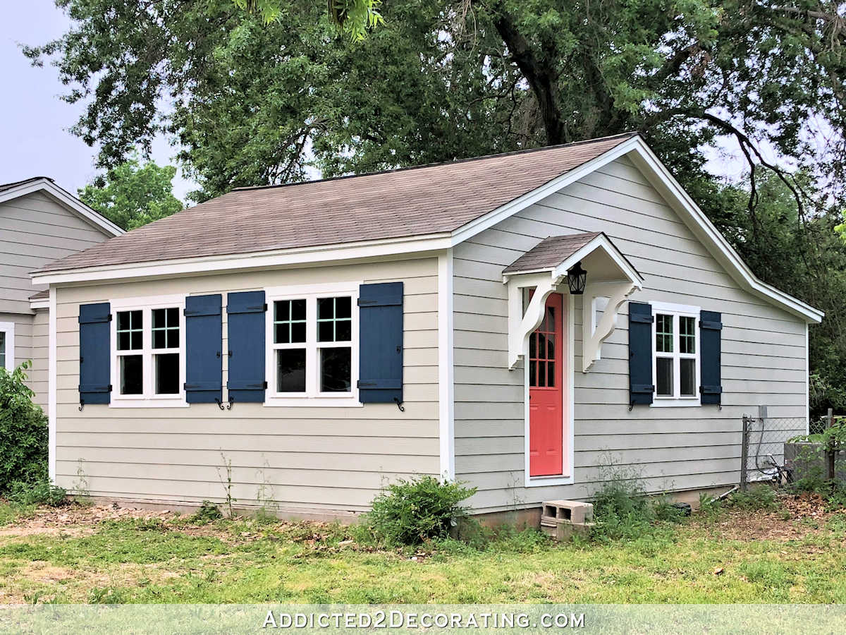
Oooh! I just realized your brackets came in and are on the portico. Look great!
I really think any of those colors can work out. If you have done your homework with lighting, time of day etc, then you really know which one you’re drawn to and it should work nicely.
Yes… #4 Mindful Gray was my immediate choice. It has more depth to it.
I was totally drawn to 4 and 5 with 4 being my top choice. I let out a little squeal when I saw your choices. haha
My house is grey with white trim. Ours is steel siding though. ha
And painting a house with a sprayer….cover the windows and go to town. Easy cheesy for the woman who strips her house to the studs and has the sub floor ripped up to the point dirt is revealed under the bathroom. Are you kidding me!!!???!!! The only reason you will need to hire the paint job out is that it will be too easy and you will be completely bored!!
Absolutely #4! It is a very peaceful and neutral gray and a coral or orange door would look fabulous with it. The only thing… I can’t quite figure out what your roof color is…. and that is super important to consider.
Count another vote for #4 for sure! Love the idea of doing a two tone- maybe #5 for the stone, or vice versa? ? And I absolutely LOVE the pic with the orange front door. Personally i would never choose it myself (wish I was that daring) but when I saw that pic all I could think was “shut the door”! That color is so, so—unexpected and unpredictable and therefore so, so YOU! Love the navy shutter idea too. You never cease to amaze. Are you ever at a loss of what to do for very long? I think not! Way to go Kristy! As usual, perfection!
You always come up with gorgeous choices. I’m sure this will turn out beautifully. Eager to see how you do the stone to look like stone. I’m wanting to do my own fireplace, update from 1989 pickled mauve bricks to natural looking stone bricks. I’m sure your techniques and results will be great inspiration.
Will share advice once given me that may affirm your color path. I once wanted to paint my house yellow. I eventually settled on Sherwin Williams parchment instead. The SW manager had a heart to heart with me about how certain colors fade, yellow was one of them that goes off quickly. He knew I didn’t want to tackle the job more then necessary. It was good advice. Looking forward to your door color choice. Wish I had Hardie siding.
Best of success in the painting chapter!`
Yes!!! I liked #4 th e best too! Can’t wait to see the finished project!
Yay for Mindful Gray! I saw it and immediately said, “THAT ONE!”
Kristi,
#4 was my first choice as well.
Would you mind posting the picture or sending me an email that Marianne sent you of her shutters?
I am wanting to build new shutters and would be very interested to see hers.
Thanks
Jackie
Here’s a pic of the shutters: https://www.pinterest.com/pin/53198839327602524/sent/?sfo=1&sender=53198976756744577&invite_code=2c4f0608774e4c21abf3ab6f8ee48f1a
Hah! In every single photo, #4 stood out as being by far the best to me, so I’m glad it’s the one you picked. Coral door ad midnight blue shutters seem colorful but tasteful against the grey. 🙂
HAHAHA! I was going to say the exact same thing as the above commenter. I continued to look at #4 the whole time as well. There is something more rich about it, maybe that is why it stands out! Good luck…we have sherwin williams Duration on our house too. Great paint! Our color is Rare Grey …ha! Their greys do look amazing!
I LOVE Mindful Grey! If you’re still thinking of doing dark blue shutters with coral door, look at Benjamin Moore’s Hale Navy and Coral Gables. It’s one of my FAVORITE color combinations!
#4 was my first choice with #5 being second, but really it wasn’t close in my mind, #4 all the way. #5 is just a bit to light and I don’t think you will get a great contrast of the gray with the white. I have made that mistake before and the whole house just looked washed out.
I preferred 4 and 5 from the first picture. Have you thought about taking the Mindful Grey to 75% to make it just a bit lighter? Might be a happy compromise.
I loved #4 in all of the photos and was thrilled when I saw it was your favorite too! Our house is gray and I love it. We currently have white trim, dark red brick, and a black front door. Our previous home
had gray siding, white trim, navy shutters, and a navy front door. Can’t wait to see your home transform!
I know this is an old post but I am searching gray exterior paints and came across it. Did you post photos when it was done? Mindful gray jumped out at me right away too and it is now on my own short list.
https://www.addicted2decorating.com/my-freshly-painted-house-exterior-sherwin-williams-mindful-gray-exterior.html
Thanks for this excellent review of the grays for the exterior of a house! My eye chose #4 instantly! I am in love with the grays and I think I will use Mindful Gray with white trim and the door color from Behr “In the Moment”.