The New & Improved Final Studio Wallpaper Design
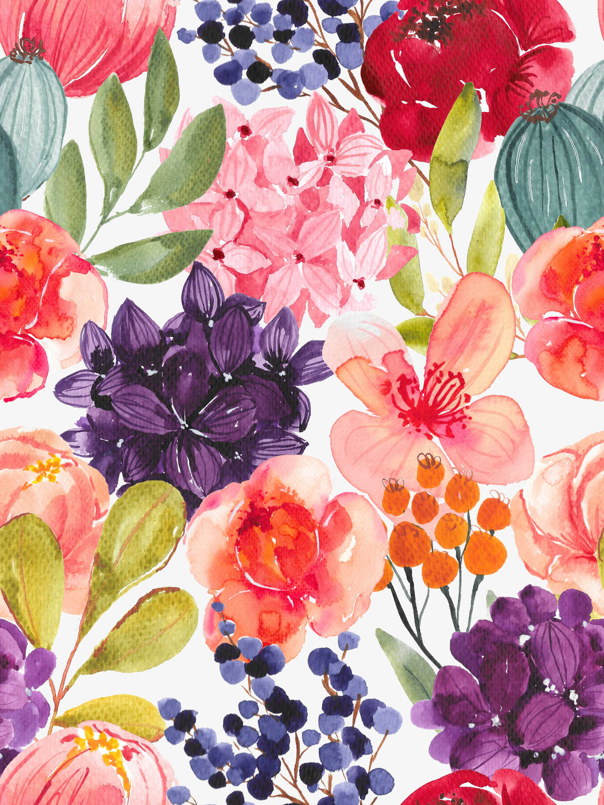
After I shared my issues with the current studio wallpaper with y’all a couple of days ago, my mom (a Photoshop genius) volunteered to help me get the wallpaper just right. After reminding her that the wallpaper was going to go in my house (the house of someone who loves lots of color and pattern) and not in her house (the house of someone who’s not so crazy about lots of bright colors and pattern), I handed the original wallpaper image over to her to see what she could do with it. Here’s the original wallpaper image.
If you read my last post a couple of days ago, you’ll remember that it was mainly the dark purple flower that I had problems with, but that red flower was also a bit too much for me.
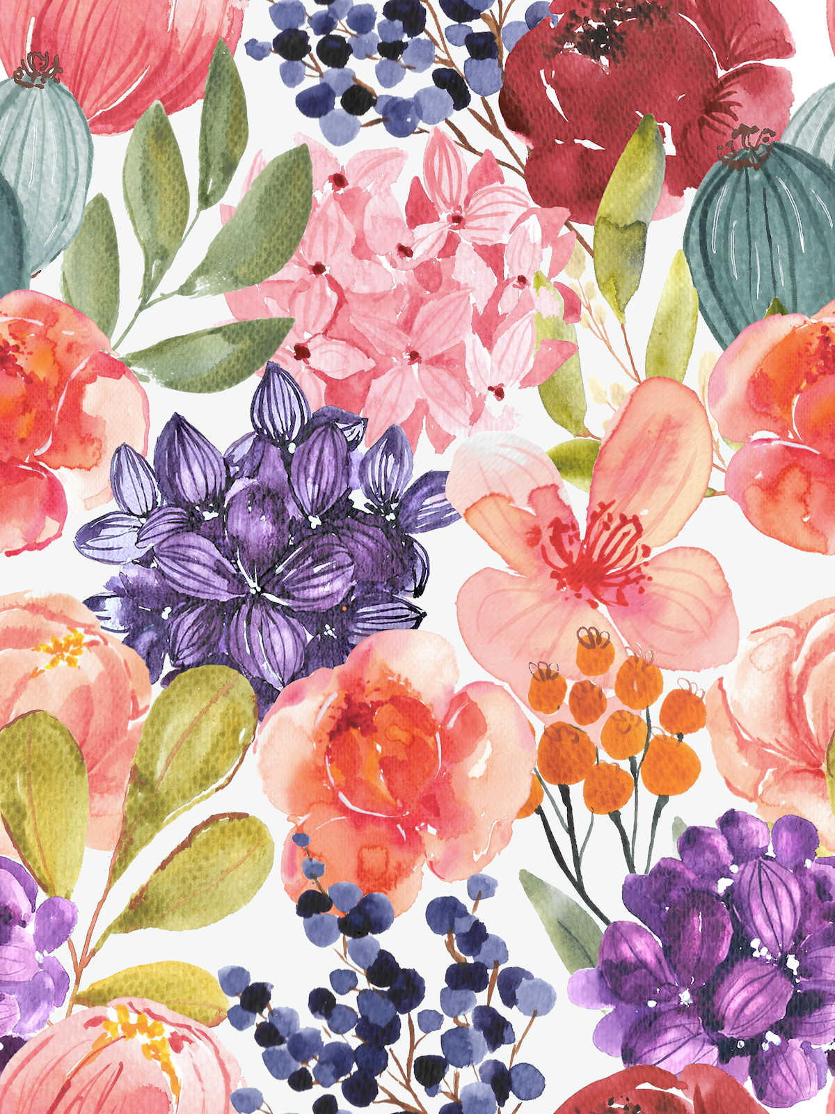
I really love the changes she made. She didn’t change it so much as to drain all of the life out of the wallpaper, but she did tone it down enough so that none of the flowers look like they’re glowing. And she did an amazing job at taking that one dark purple flower (the one that turns into a dark purple splotch when standing on the other side of the room) and adding some lightness and definition to it so that it won’t turn into a dark purple splotch.
Here’s the new and improved wallpaper:
So here’s a look at the two side-by-side, with the original wallpaper on the left, and the new and improved wallpaper on the right.
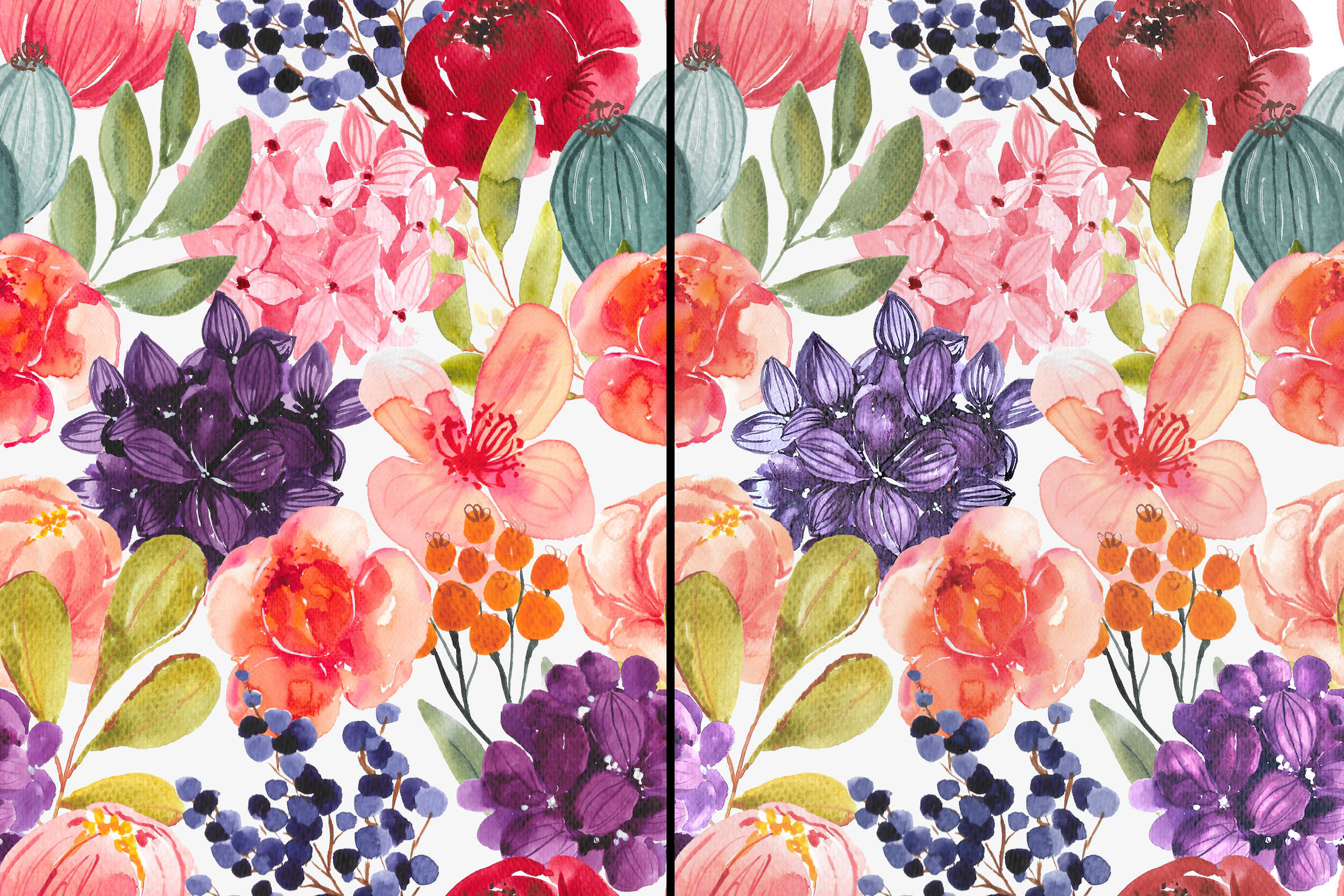
It’s still colorful and fun and vibrant, but I think the new one will play much nicer in the room.
So that you can see the difference, here’s the original wallpaper in its current size on the actual wall…
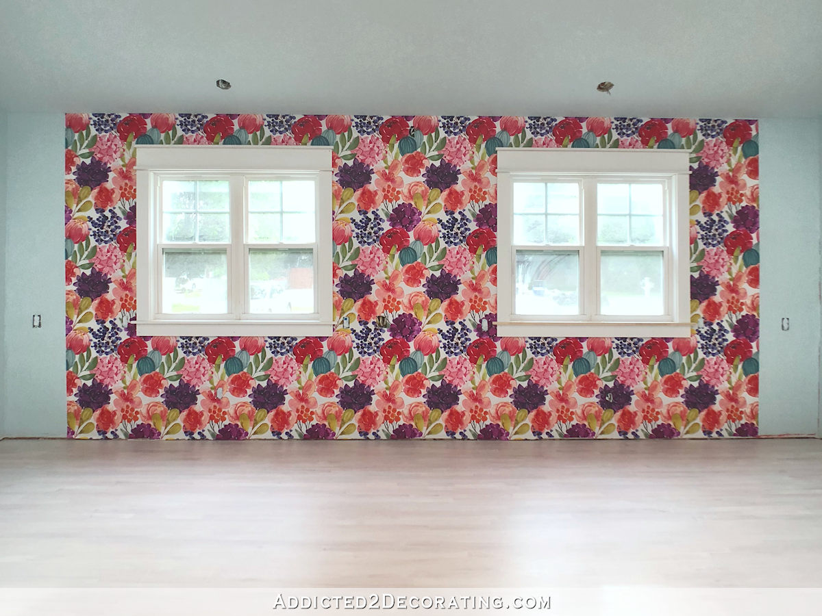
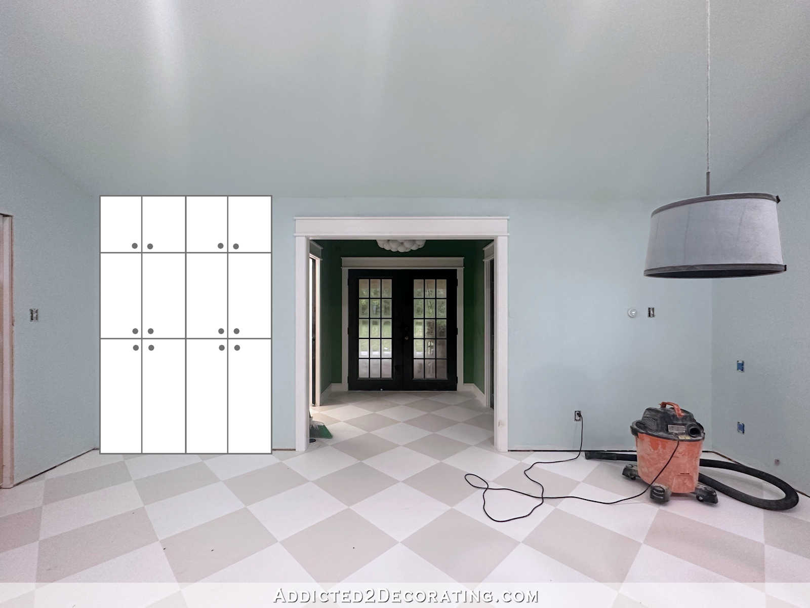
Here’s what it looked like on the mock up I did back when I was considering IKEA Pax cabinets, but the wallpaper is an actual photo of that wall…
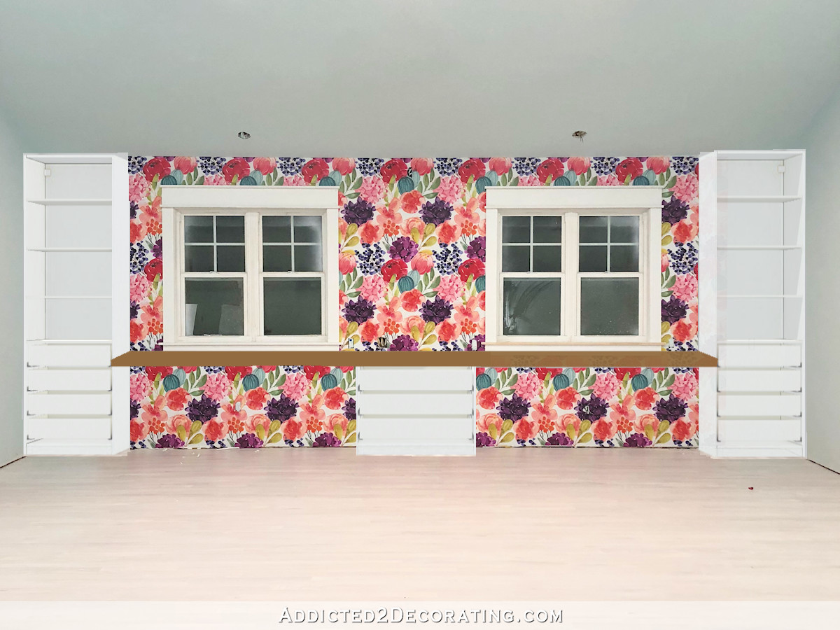
And this will give you a pretty good idea of what the new and improved wallpaper would look like on that wall in that same scale.
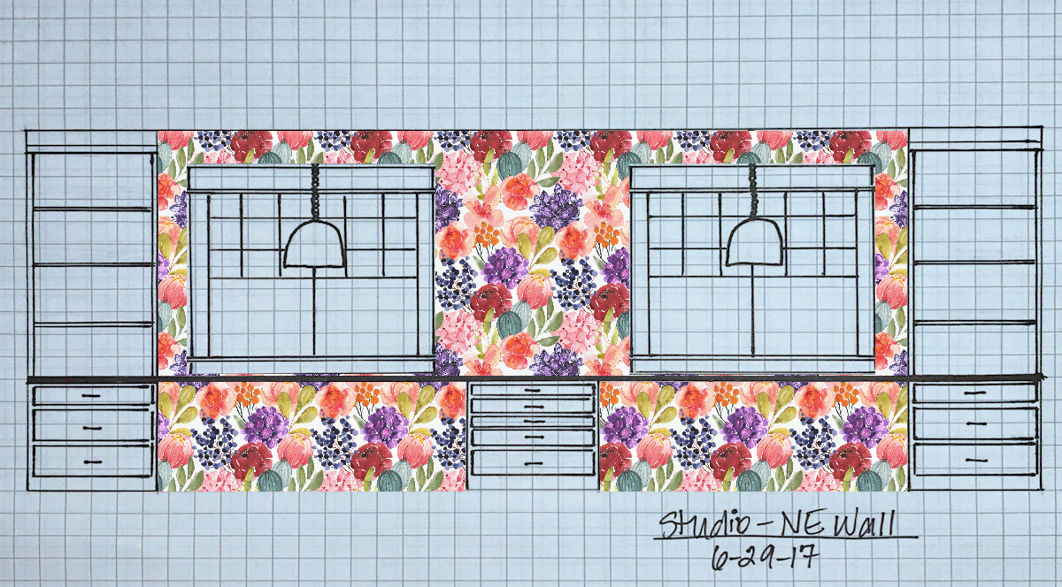
It’s such an improvement, but as I was doing that mock up above, I kept thinking that it would be so much better if the flowers were bigger. That way (1) the flowers would be plainly visible from across the room, and none of them would turn into blotches of color when viewed from a distance, and (2) fewer repeats of the design would be visible, so the design wouldn’t look as busy.
I did a mock up using larger flowers, and….I LOVE IT!
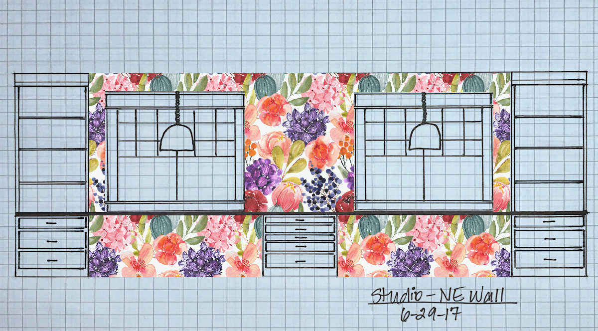
I had actually wanted a design with the larger flowers from the very beginning, but I didn’t know of a place that would print such a design since it’s more of a mural and not your standard repeatable wallpaper. The only place I knew about where I could upload my own image is Spoonflower, and they only offer repeatable wallpaper printed on 24-inch-wide wallpaper. That means that the image you upload to Spoonflower will be repeated every 24 inches. That makes it impossible to upload and print large scale designs that don’t fit neatly into a 24-inch-wide repeat.
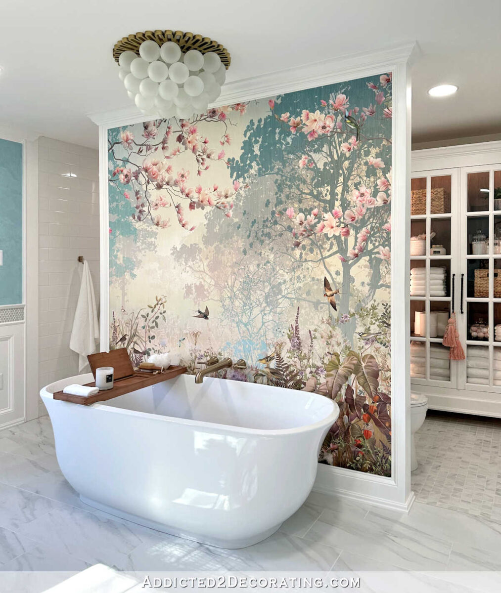
But in the time since I designed that original wallpaper and now, I’ve discovered my favorite wallpaper mural store — Photowall. That’s where I got the mural that I used in our recent bathroom remodel…
And they allow you to upload your own image, and they’ll print a mural from it. That means I won’t be bound by the 24-inch repeatable width of standard wallpaper, and I can make the design as large as I want it to be.
So that’s the plan. I have my image with the new and improved colors, and now I just need it printed much larger than the original wallpaper.
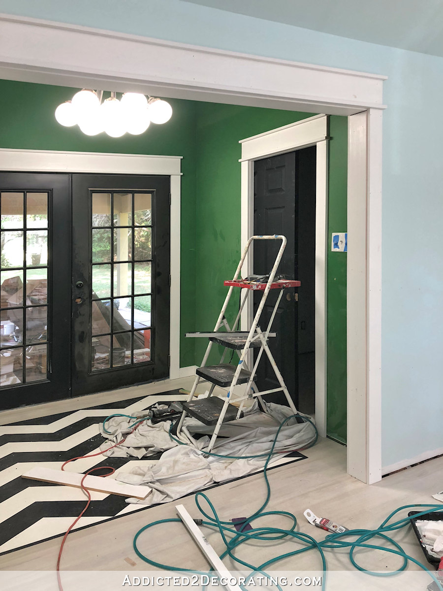
I also need to decide if I want to put the new design in the back entry. Regardless of what I decide, the green is going, as is the black and white design on the floor (that’s a firm decision, but more on that later).
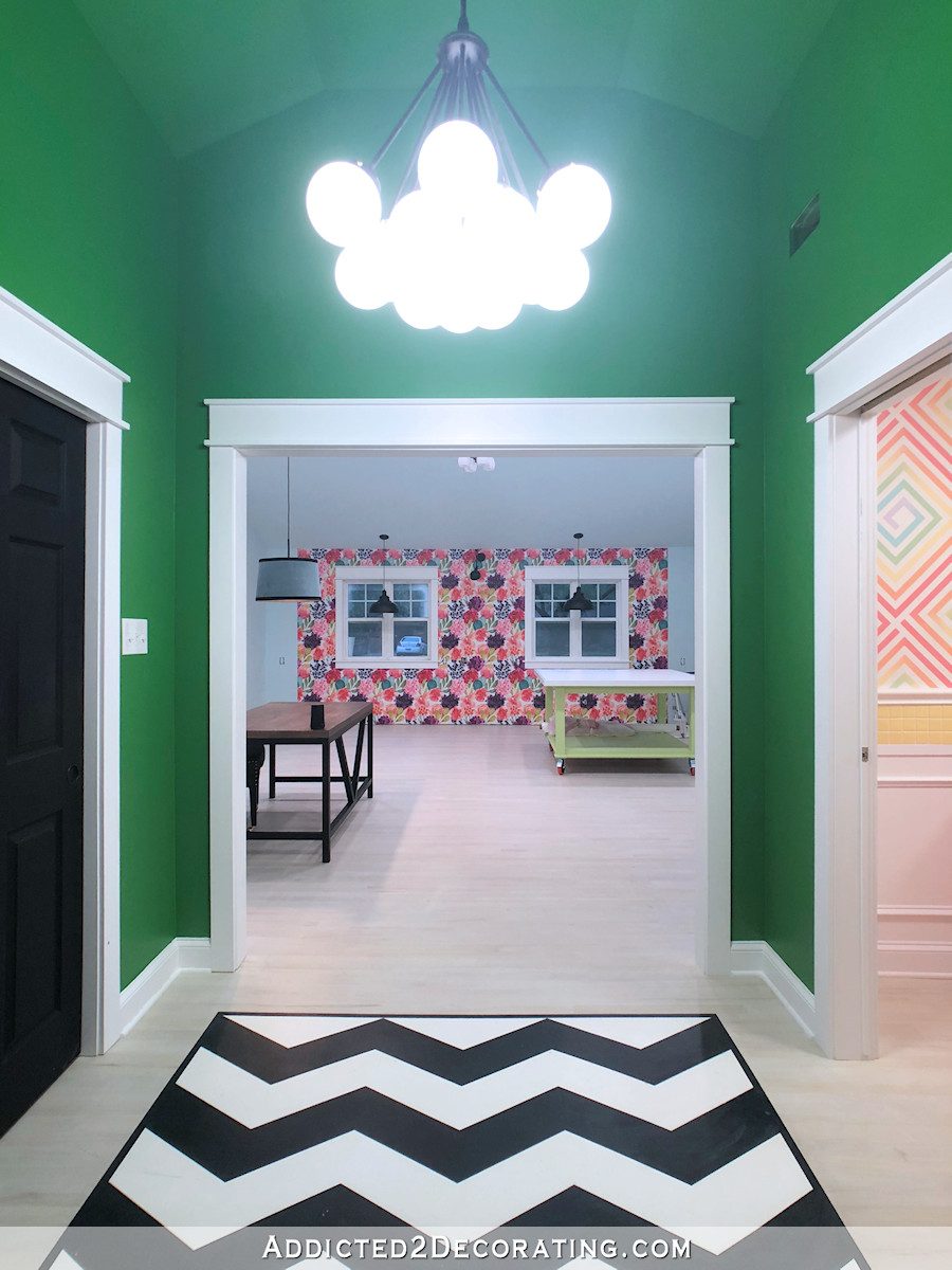
But I just can’t decide if I want to carry the floral mural into the back entry, or leave those walls a solid color.
If I don’t do the mural on the walls of the back entry, I might have the design printed on fabric, and recover my desk chair with that floral fabric to bring the floral design into the “office” area of the studio. I came across this picture yesterday from Rifle Paper Co.’s Instagram account, and absolutely love this floral chair. I can image a desk chair covered in my bright floral pattern.
So I’ll probably play around with the size of the flowers on that wall just a bit more to be sure I have it exactly like I want it, and then I’m going to order the mural for that wall. I don’t need to make a decision on the entryway right now. I can always order that later.
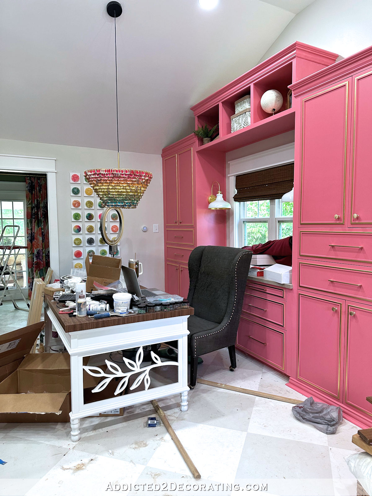
I still haven’t nailed down the entire design for the studio and half bathroom, but things are slowly starting to come together in my head. I hope to have an overall plan to share with you very soon.

Addicted 2 Decorating is where I share my DIY and decorating journey as I remodel and decorate the 1948 fixer upper that my husband, Matt, and I bought in 2013. Matt has M.S. and is unable to do physical work, so I do the majority of the work on the house by myself. You can learn more about me here.
Looks great. I think the red is now jumping out a bit so maybe some little white touches to add definition? I noticed that the photoshop of the wall almost eliminates them completely but what if you have a whole row up top and it just makes them more prominent?
Until you showed the wall from the back entry I hadn’t noticed how much the purple stood out. The toned down purple and red don’t hit you in the face. The larger scale is really pretty. I’m glad you’re changing the green, but that is somewhat because I am not a fan of such a hard green color.
Ooh love that floral chair!!
100% yes on the larger flowers.
Me too…!!!
Love the larger scale of the wall paper. My biggest issue with most prints is the repeat. I work as a dance costume designer and we have to be really careful about the prints we buy or develop. The red flower is still throwing it off for me a bit maybe it needs to lean more to magenta or fuchsia, add a little more blue and brightness to the color. Any chance you can add a side by side image with a sliding bar?
I agree with you about the red flower, it seems a little too autumn in its coloring and stands out to me now. Agree with brightening it up a little bit!
I like the larger version with color changes. The original bothered me with the flowers in a line across the wall. Always excited to see your posts and enjoy your decision and work progress. Also, glad to know you are human and actually discuss your mistakes and thought process. Keep it up!
So glad you mentioned that – I found myself fixated on the line of certain flowers across the wall as well. Never really saw that originally, but the larger version is so much more pleasing!
And yes, I too appreciate that Kristi changes her mind, and adjusts all the time until she is happy with the finish. Sometimes I’m stuck thinking I shouldn’t change my mind and redo.
Wasting funds, or adding sanity…hmmm.
I love the “new” wallpaper very much, and using it on your chair would complete the room. However, standing in the hall, you can see the wallpaper in the room to the right and it doesn’t enhance the new paper. I think you should leave the green in the hall.
I agree! I think the new WP will clash with the bathroom paint design. Be way too busy. I would consider painting the entry way a color that is common to both the bath and the WP. With all the colors in each, odds are that there is at least one common color! LOL
Personally, I love the blk/wht “rug” on the floor.
LOVE the larger flowers. Maybe since the entryway is transitional and channeling into the room, you could play with a reversed contrast drifting seed mural that ends in the explosion of blooms.
A great improvement with the wallpaper! I like the idea of putting it on the entry walls too, plus the fabric on your desk chair – would make a repeating motif of three places for the impactful wallpaper. Glad you’re making progress on your studio!
Larger = beautiful!
The new and improved wallpaper is great. I still think the purple and the red need to move into the other flowers, but that was a concept I learned in painting class that might not apply to wallpaper. Here’s a thought, for the chair or other wall, maybe shrink the size of the flowers and see how that plays out. Thank you, as ever, for sharing your thought process. 🦋
Why dont you try using paint marker first to lighten that dark purple flower ?! You’re good with that. Save money and time.
I have my heart set on larger flowers, so playing around with paint markers would be time wasted when I know I still wont’ be satisfied with the outcome.
Oh good! I was hoping you’d move away from the “repeat” paper. The bigger print is lovely!!!
100% yes on the larger flowers.
Love the larger design! ( see Ponderosa and Plaid on IG, her powder room off her new kitchen has enormous flowers!) I still think the purple and red flowers are a bit too saturated, but I have no thoughts as to how to avoid that. (Someone suggested tying those colors into the other flowers, so maybe that would work.) If you should decide to use the same in the entryway, I wonder how it will work as you wrap around the corners? You will need to be extra level and plumb with it or the flowers will climb the walls. Dying to know what the black and white floor will become!
Now I see red splotches. Sorry.
The purple needs to go, it still stands out too much. But it just maybe me.
The new design looks amazing no, and not in your face ,,,
The larger design for the wallpaper is great! The chair is perfect, I just know I would not be able to keep it pristine! Good Luck!!!
I love the larger flowers. The previous version the flowers seemed too much in rows. The lighter purple is very pretty, too. However, I would love to see a version where the background wasn’t stark white. A creamy color would be pretty. Or a pale pink background and changing the lightest flower to a creamy color. I think this would help your white trim and cabinetry to stand out and it would help the purples and reds to be less dominant. And with all the colors, it would definitely still be very “Kristy.”
LOVE the larger size on the paper! The purple flowers always called a lot of attention to the repeat for me, which I really dislike in wallpaper. I cannot wait to see the new paper up.
Please take us along for the removal of the previous paper too…I wanna see how that goes.