What Color Should I Paint My Walk-In Closet Island?
Well, I didn’t get a single thing done in my walk-in closet this weekend. It’s a holiday weekend here in the U.S., and for a change, I put absolutely no pressure on myself to get things done, and I did so with zero guilt. I spent my weekend sitting at my desk in the studio (my favorite place in our house) updating the house tour page on my blog. So if you want see all of the befores and afters of every room in our house in one place, or get paint color info, you can check out that page.
And I hadn’t even planned on being here this morning. Since it’s a holiday, I had planned on spending this holiday sleeping in, followed by a nice breakfast and maybe watching a movie with Matt. But I was awakened just before 6:00am by loud thunder, bright lightening, and loads of rain pounding on the windows as a thunderstorm rolled through. So I got up and went back to my happy place.
I’ve officially become a morning person, which is so strange. All of my adult life, I’ve been a night owl. I could stay up until 2:00am or later and had a hard time making myself to go to bed. Then morning would come, and I’d struggle so much to get my day started. But over this last year, I’ve learned that my favorite time of day is actually early morning, before the sun comes up, when the house is dark, the neighborhood is quiet and still, Matt is still sleeping, and I get an hour or two at my desk, with Cooper curled up at my feet, while I sit under the soft glowing light of the pendant light above my desk. I actually look forward to it every single night when I go to bed. Who have I become? 😀
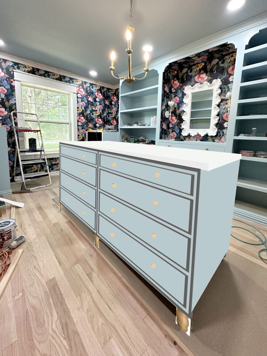
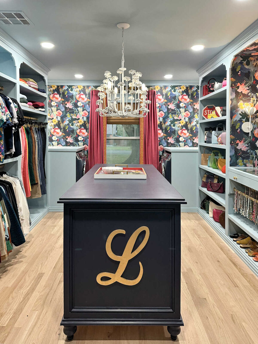
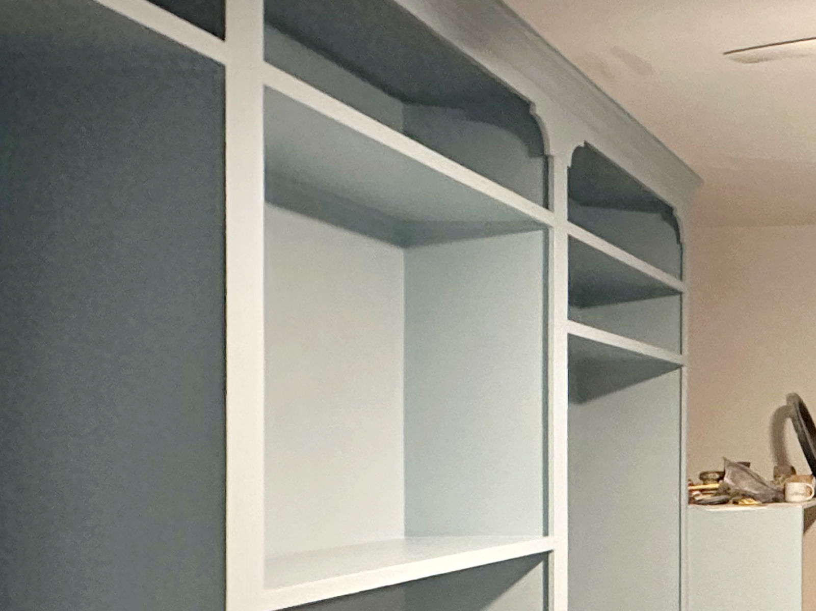
Anyway, this morning during those dark, quiet hours at my desk, I played around with some different colors for my closet island. I had planned on painting it the same color as the cabinets — Sherwin Williams Billowy Blue. I even bought the paint for it since I had run out of paint while painting the cabinets. But several people have suggested painting it an accent color.
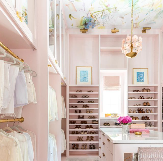
At first, I kind of recoiled at the idea because I thought an accent color would compete with the wallpaper. But this morning, I started considering it more seriously simply because I think it might actually highlight the wallpaper rather than compete with it. So using my photo editor, I picked out some colors from the main large flowers in the wallpaper and tested them out on a very rough mockup of the island.
First, here’s what Billowy Breeze would look like. Ignore the gray outlines. I literally used a line drawing of the island for the mockup. The actual island won’t have any gray on it.
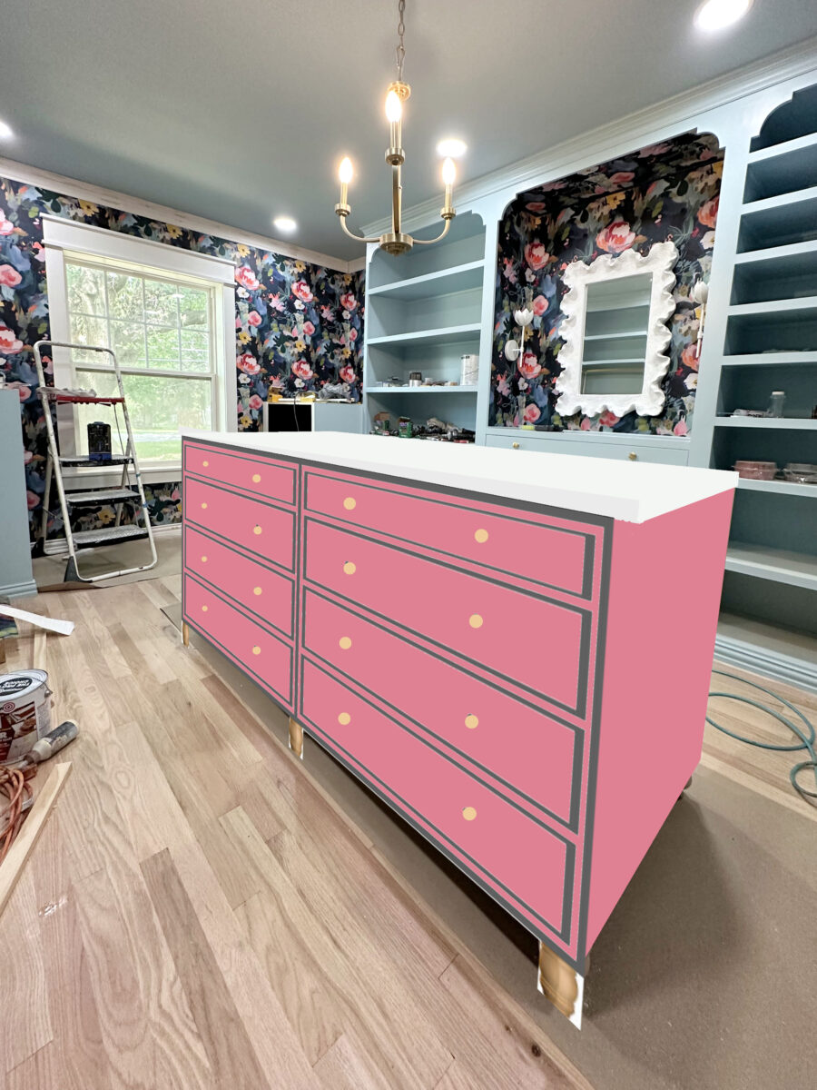
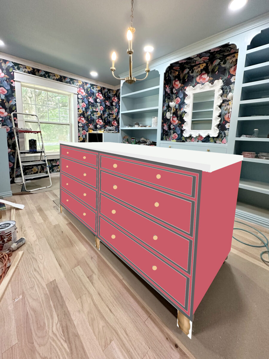
But here’s a sampling of the colors that I picked out from those large pink flowers. First up is a pink that looks like it has just a touch of purple in it…

Next is a pink that’s a little more prominent in the wallpaper.
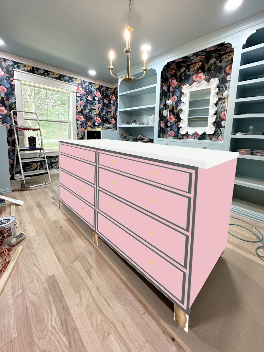
And this is the most prominent light pink in the wallpaper.
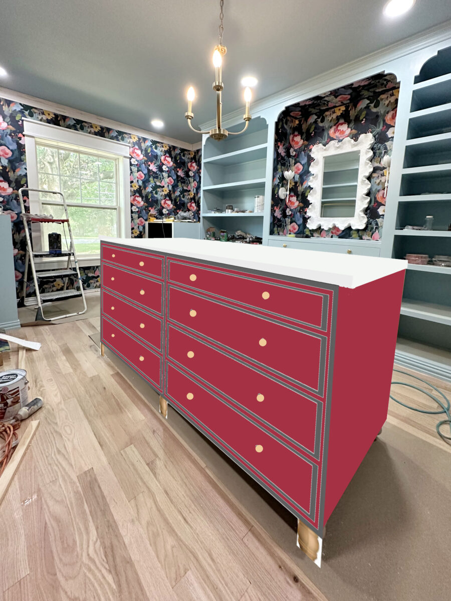
But then I decided to try the darkest pinkish red color from those big flowers.
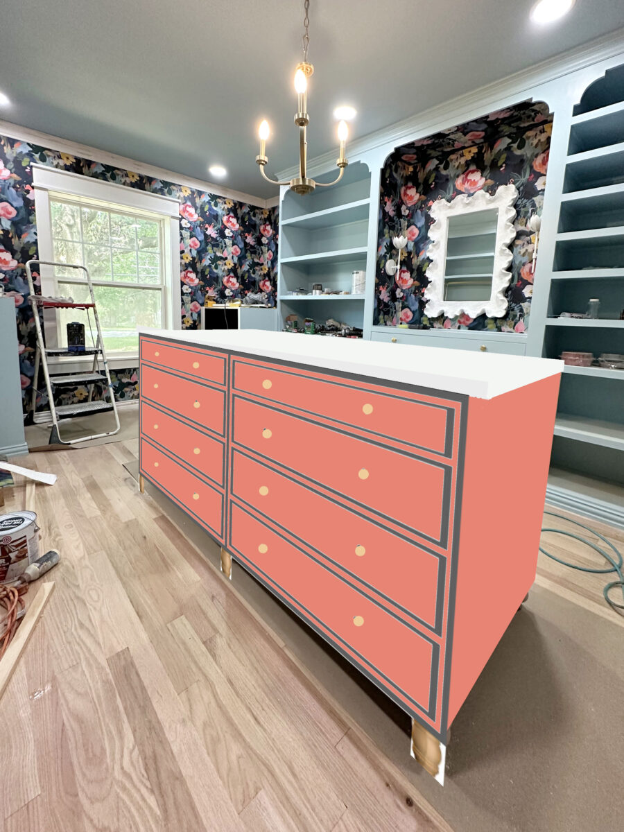
This one is also from the center of the big flowers, but it has a touch of orange to it.
This is the coralish/orange from the big flowers, but it’s probably my least favorite since it seems to fight with the pinks. And the pinks are the most prominent colors in the wallpaper.

And here’s a lighter version of that color, which is also from the big flowers, but isn’t as prominent as the pinks.
I don’t know, y’all. I may love an accent color after all! And since this is a walk-in closet, it doesn’t have to be too serious, right? I can have a little fun with it. And of course, it’s just paint. If I don’t like it, I can always go back to Billowy Breeze. Should I try out one of these accent colors? And keep in mind that the countertop will be a faux marble, so it will be mostly white. And then I’ll have the white flowery chandelier above the island. I think I’m leaning towards an accent color now!
Here’s a side-by-side view of the Billowy Breeze and the accent color that’s probably my favorite.
What do you think? Should I stick with Billowy Breeze? Or should I have some fun with it and do an accent color?
UPDATE: I should have anticipated that many people would suggest the dark blue of the wallpaper background. I’d love that! I did try it out, and it’s beautiful, but it’s not an option.
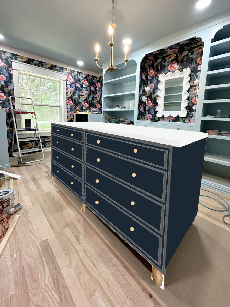
I’ll be the first to admit that that’s absolutely gorgeous. But here’s the deal. The foyer just outside the closet doorway will be teal, and those will clash. I selected this wallpaper because it has the dark blue in it (which will match my washer and dryer) as well as some shades of teal sprinkled throughout to bridge the dark blue and the teal. But I still want to keep the big blue items separated from the teal foyer.
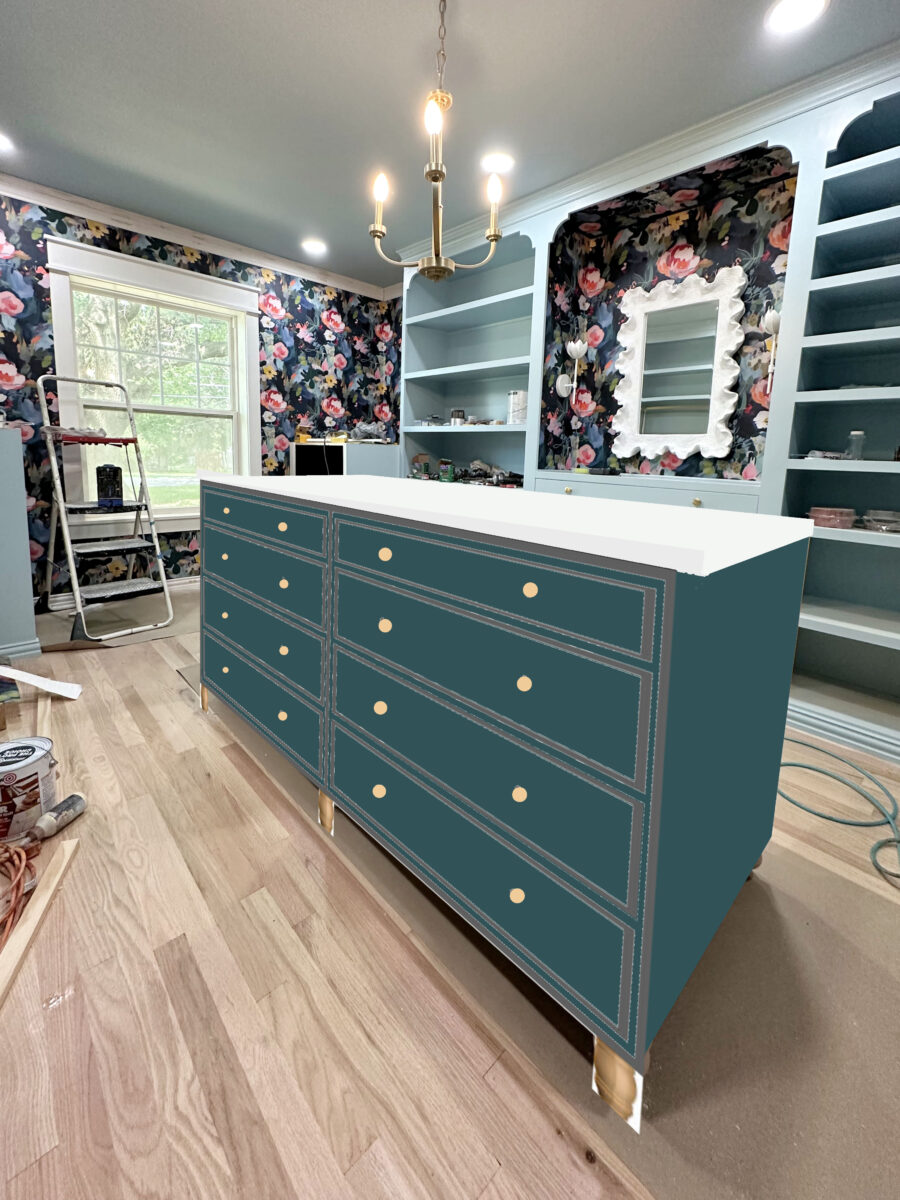
So that pretty much rules out painting the island dark blue, which will bring the blue right up to the teal foyer. But it also rules out painting the island a dark teal, which would also look gorgeous, but which would bring the teal right up to the blue washer and dryer.
And since my washer and dryer are blue — only blue with no hint of green in them — in my mind, the blues and teals need to stay separated with some distance.
Perhaps there’s a dark blue out there that has just a touch of green, but not so much green that it actually looks teal, so that it will still look good with the washer and dryer, but just enough green in it that it won’t clash with the foyer grasscloth wallpaper. Maybe that color exists. But that might be like searching for a unicorn. I can try though!
More About My Walk-In Closet/Laundry Room
see all walk-in closet/laundry
room diy projects
read all walk-in closet/laundry
room blog posts

Addicted 2 Decorating is where I share my DIY and decorating journey as I remodel and decorate the 1948 fixer upper that my husband, Matt, and I bought in 2013. Matt has M.S. and is unable to do physical work, so I do the majority of the work on the house by myself. You can learn more about me here.

I unexpectedly like the darkest pink. It feels like you already have a lot of orange/coral, but maybe it depends on the sightlines.
I agree. The dark pinkish red is more sophisticated than the pinks. Although as I started reading this post, I thought go with the dark colour of the wallpaper.
If you do, I’ll bet you go back to the blue. The wallpaper is no longer the highlight of the room with the other colors. You may as well have just a stripe since all of the attention will go to the island with pink or orange. I vote for the blue!
I agree that painting it an accent color makes the island the star of the room instead of the wallpaper (or future chandelier). But I do really love it! If you wanted to paint blue but keep the pink for you then consider painting inside the drawers or lining them with wallpaper? Perhaps make the bottom on one side open shelves instead of drawers and use pink paint or baskets?
Love the pink in the second photo of pinks. It’s vibrant and happy!
I love the idea of doing the island in an accent color! The first pink (with a touch of purple in it) is my pick. I think it’s the right tone and intensity of color to complement the closet cabinets/shelves and the wallpaper.
Hmmm…at first my knee jerk was, no! Lol…but then I saw the lightest pink and thought…that’s not bad at all! So my vote would be that, which is a little shocking to me. Next would be the darkest pink, really don’t like the corals at all.
Yes, I agree with the palest pink. It doesn’t compete with the wallpaper like the other colors.
Ditto!
I agree with the lightest pink
What they said….the lightest pink.
Stick with the blue. Once you get clothes in. There will be a riot of colors and too much competition. Calming is better and won’t compete with your wallpaper
Spot on !!
This! Keep it blue. The clothes, handbags and jewelry will bring in more colors that will need the calming background color to keep it from looking chaotic.
Sheila F.
Have you considered painting the island super dark navy, to match the darkest color in the wallpaper?
This was my thought too! Keep it consistent with the blues, but let the real “colorful-ness” come from the wallpaper.
Ditto!
Ditto!
Me too!
Ditto!
Yes, first I posted Billowy Breeze, but think this would be a good alternative and still not detract from the wallpaper
I like this idea a lot!
Kristi, I would like to see what it looks like in the darker blue that is in the wallpaper flowers.
Stick with the billowy breeze pleeze
If you really want an accent color, I’d go with one of the darker blues. Even though you can’t see the studio from here, I have pink cabinet fatigue. I’m just not feeling it here. It definitely distracts from the wallpaper.
For once I’m going go with not choosing to add another colour. Go with the blue.
I think you are going to have more than enough going on in there once all your clothes are in place and I feel the wallpaper is all the accent you need.
That said – I agree with the suggestions that if you feel you need an accent to try the dark blue in the wallpaper rather than adding a pink or coral.
While I see the fun in the pink colors, I still think the matching blue works best as it doesn’t become such a focal point. I also think it creates what I like to call visual chaos in such a lovely, serene space. No right or wrongs, just personal preference. You do you!
Agree with those that suggest trying a dark blue! Let’s just see what that might do???
I agree…how about try a dark blue? Love the idea of an accent color. I like the 2 darkest pinks as well.
I love that you took some time to enjoy the weekend, it’s important to recharge the batteries. All the accent colors look amazing, but why not take the background color of the wallpaper and do that, it will make the island feel like it is seamless and if anything, it will make the room feel larger, and it is a great color. Whatever you chose will be great.
Cheers to you and Matt and the Fur Gang!
Of all the pink options, I liked the same one you did… but I would still choose Billowy Breeze. As others have said, I would like to see a mock up with the island in navy. Love marble with navy!
I say blue or the dark navy. Would you see the island as you see the bedroom.? It seems pink would fight the Orange in bedroom
I like the most prominent light pink. Or the same blue as the rest of the cabinets.
Yes, they’ll be seen together from the foyer, so that is a consideration.
I definitely like the idea of the island being a different color. I like the first pink or the third pink best because they are closest on the lightness/darkness scale to the blue. I’m pretty sure you wouldn’t choose the lighter pink. The colors that are a lot darker than the blue make it look washed out. Looking at the photos of the space, the coral in the wallpaper it doesn’t stand out as much as the pinks so the coral paint doesn’t seem to belong. I’m glad you took some time off over the holiday weekend!
Please wait till you get the window end complete before you make a color decision for the island. Whatever you do with the blinds will make a difference in the decision to add an accent color or choose to match a dark color such as the darker blue from your wallpaper or the color of your washer and dryer. Once you bring in your clothes, purses and shoes you are going to have a lot of colors.
After reading the comments, I too would like to see the background color on the island before making a choice. Seems like a good idea!
100% Billowy Breeze or a darker blue.
If pink, the lightest one keeps focus on the wallpaper. I find the other colors very distracting. I would love to see navy/some more blues too.
I agree that I would love to see one of the darker blues in the flowers in the wallpaper – not necessarily the background color, but darker than the cabinets. Or, maybe a green or a yellow?? You already have coral and pink cabinets in the house. Dark blue would be stunning without taking away from the wallpaper. IMHO. lol!
I like the accent color idea although the brighter colors seem too strong against the softer blue. The first pink seems to match the blue in intensity while the second is too pale and the others are too vivid.
Would it be too much to paint the body of the cabinet that pink and add accents to it in the main blue? I am thinking of decorative motifs on the drawers and doors and/or floral stencils? As I have said before, why make it easy, eh?
I do like most of the colors minus the oranges. But i agree with others, it may be a lot once you have the closet filled with your items and seems to take away from the wallpaper.
Billowy Blue. Or maybe the dark navy from the background. I agree with the comments that the pinks will take away from the star of the show. It’s just paint though, like you said.
I think one of those first two pinks would look great.
The lightest pink! Remember that you are going to have an amazing light right over it, too!
Personally, I prefer the blue, but if it were to choose one of the colours I would choose the darkest pink. I still prefer the blue, as someone said above an accent colour would compete with the wallpaper instead of highlighting it. There’s already the chandelier that’s going to be the star of the center of the room.
If you’re gonna go pink then your first pink (2nd picture after the Billowy Blue) BUT What about a darker blue?
I would go with the soft pink. Same depth of color as your soft blue. Love accents.
I think there is plenty of the blue of the cabinets and ceiling. There is already a pink/coral in the studio. Why not go for the dark navy color of the wallpaper and let the florals of the wallpaper be the pops of color? The navy basically acts as a neutral.
While a pink isn’t bad, I prefer keeping with the color drenching and painting the island cabinet Billowy Breeze. This will better show off the colors of your handbag and shoe collections and your clothing.
Accent color !!! I love the deep pinks!
I know whatever you choose will be beautiful, but there is something about that light pink that I just love in this space! I’m looking forward to seeing your choice.
Stick with the Billowy Breeze! It is so beautiful!! The other colors are pretty as well, but seem to distract from the pretty wallpaper.
I would stick with billowy breeze. With all the added color from your hanging clothes and clothes that will be on the shelves I think the continuity of one color is nice. 😊
I like the idea (I think) of painting the island another color. However, lighter colors draw the eye so the pinks become a focal point. What about a darker blue… a mockup of that?
I love the blue, quiet and lets the wallpaper be the focus.
I like the idea of almost a reverse accent color, since the Billowy Breeze is already not the Polar Bear of the other millwork in your home. So maybe one of the darker shades of blue from the wallpaper, or even the dark background color. This is probably more work than you want to do at this stage, but a faux stained-wood effect (darker than the floors) could also be nice—I love darker wood tones with a light marble.
I think your coffee table top turned out amazingly well, but I would be worried about the durability of the same effect in your closet, if you’ll be sitting heavy laundry baskets on it or anything similar, or even just the scrambling around on it you might do to work on the chandelier or change a light bulb. You could also think of the top as the top of a large piece of furniture (especially with it having feet) and paint it whatever color the rest of it is painted.
I really thought accent color would be my answer but the colors you showed us just don’t do it for me. They all seem kind of “cold” for lack of a better word. The blue you used for the cabinets makes ne feel like I’m floating in the sky. The pinks don’t have that warmth. I think you are trying to hard to match the paper. Try to find a warmer pink. And just for fun, have you thought about the dark blue of the paper. With all the lighting you have I’m thinking that would be stunning.
Pink accent color!
No, leave it BLUE, you are messing up with your beautiful wallpaper design!!!!!!!!!
These are fun ideas to try. You’ll make a good decision and as you said it’s just paint.
I would prefer continuing the blue. The size and position of the island already makes it dominate the room. And I love how the blue looks with the new flooring color.
I like the Billowy, the wallpaper is busy and colorful. The pinks/coral color is too much. I love your studio colors it isn’t that accent colors are great just that the blue is so calming and relaxing 🤷🏻♀️
Personally, I like the darkest pink best. But it is YOUR closet. 🙂 Thanks for the response on the washer and dryer. I should have know you had a plan. 🙂 Have a great day today. Hugs, Kara
I think my favorite is the lightest pink! I also wondered about doing a two-toned effect with one of the orange-y colors and pink, maybe with the trim being one color and the drawer faces the other.
Billowy Breeze, please.
I think the pink is taking all the attention away from the wallpaper. Like my landscaper says KISS (Keep it simple stupid). And in reality he is usually right. I go for the blue and let the pretty wallpaper be center of attraction along with all the pretty white decor.
I’m team blue. To me, the pink/red/orange colors give the floor a pinkish tone and make the space look smaller. But you should absolutely do what brings you joy!
I like the cupboard billowy blue or if you want to paint it try the wallpaper background black.
I love the pink! It brings a touch of whimsy into the area, whereas I feel that the billowy blue makes it feel too serious.
I think once you add your clothing, etc….it’s going to be hugely different…I’d stick with the Billowy or maybe the navy background of the wallpaper.
I agree with you on the medium pink accent color! Go for it, if you don’t like it, you can always re-paint, lol.
No to the accent color for sure. I think white would be the best, blue to match the second best.
I agree with the accent color you chose, the blue just seems like it takes the life out of the room while the coraly pink brings in a breath of fresh air.
I love both! The blue seems calm and serene. It makes me feel relaxed and say “ahhhh.” The accent is more energizing and makes be feel like “let’s get this day started!” With your love of color, I’m guessing the accent will be your favorite. 😊
On a side note, how did you become a morning person? I’m the stay up until 2:00 kinda gal but would love to be more of a morning person!
It started out of necessity. When Matt and I woke up at the same time, he was needing my attention and help immediately, and then I’d feel like I was running behind getting my work done, feeling anxious, etc. So out of necessity, I started getting up two hours earlier. I hated it at first because I was having such a hard time going to bed earlier and waking up exhausted. But over time, I’ve shifted my schedule, and now I actually look forward to getting up early! It has become my favorite part of the day. I NEVER thought I’d be one of those people! 😀
I like the idea of an accent color, and particularly like any of the pinks (not the corals). I really like the pink that looks like it has just a touch of purple in it.
I’m glad you took the weekend off, everyone needs to take a break occasionally and you have been hitting it hard this year. That said I hope you stick with Billowly Breeze or maybe the dark blue from the background as others have suggested. The pinks take away from the wallpaper instead of accenting it and I don’t think you ever wanted your island to become the focal point. The pinks (assuming you have excluded the corals completely) don’t seem to be a complementing value to Billowly Breeze. Billowly Breeze feels calming and almost a neutral from which your wallpaper can take center stage. And at some point your clothes, purses, jewelry and shoes will be adding color and texture. The pinks feel almost overwhelming. Your closet, whatever you decide will make you happy, and that’s all that matters.
You will woman!
Go with the accent!!!
*wild* not “will”
I love the idea of using a different color on the island. I actually like the very first pink you used (with the hint of purple you mentioned). To me, it complemented the wallpaper. I think it also complemented the paint color – likely because that hint of purple means there is a hint of blue as well. To me, the other colors were just more jarring (when comparing with the entirety of the room – their lovely colors on their own). The other colors – even the lighter ones – stole all the attention as opposed to complimenting the rest of the room. But you do you and pick the one that sings to you. (And BTW, your decor in the house is definitely “cohesive;” you spend hours and hours picking the exact right color for your projects and getting the opinions of others to make sure it is!)
Why not move the washer n dryer in before picking a color for island? But if you want a vote in order my least favorites: all oranges, red, pinks, corals.
You must be new here. 😁😁😁
I was going to say the palest pink, because it is the same intensity as the blue closet built ins and doesn’t out shine them OR the wallpaper.
I still think that could work (or using the same blue as originally planned) but I love the idea of adding fun color to the shelf lining or drawer interiors !
Personally, I would keep it blue. Since there are no closet doors, you are going to have a lot of clothing, shoes,purses, and jewelry with all kinds of colors showing, so to sort of quiet that down, the blue will soften it. Just my two cents-
I vote a darker blue. If that’s not an option, I’d keep the same blue as the cabinets. Whatever you choose, it will be beautiful.
I would complete the room and move my clothes and things. Then I would decide which color looks best.
I love that deepest pink red color. It looks so rich to me.
I never would’ve picked it with the dark floors but I love the way it balances out the dark blue of the wallpaper and contrasts with the light floors.
My vote is the Billowy Breeze.
Dark blues and gold/brass are my colors. However, I understand the situation with the teal in the foyer. That said, I love your wallpaper and any accent color draws my eye away from it. Billowy blue is my choice unless by some miracle you are able to find the perfect navy to go with your grass cloth in the hallway. It is always fun to see the options.
I love the color in the “side-by-side” picture. Thats probably my favorite. But I love the idea of an accent color. I just know itll5be beautiful when finished.
Fat fingers… 😁😁 sorry for my typo.
My least favorite is the Coral Orange.
I love all the rest. They all go very well with the paper. Each has its own feel. How do you want the room to feel. Gracefully elegant, energizing fun, mellow, calm etc.
Both the blue of cabinets or the pink in side by side pics work. But remember your cabinets are empty. Try photoshop clothes in – that will dramatically change the look. You need a place to rest your eyes and the island is the place to bring that cabinet blue back in.
There are going to have lots of other colors when your clothes are in the room so the amount of blue you can rest your eyes on will be less. I think painting it the cabinet blue instead of adding another color would work better.
Pale blue island for the win! It looks expensive and elegant.
My thought is you do not have the colors or energy of all your clothes, shoes and accessories represented in these images. The animation of another large color seems to take away from the other elements, which are lovely.
Matching blue!
I am in favor of one of the first 2 pinks! The one with a touch of purple helps bridge the pink with the blue or something. It looks good lol
Billowy breeze is beautiful!
We probably won’t agree but I like billowl breeze
Personally love the billowy breeze, I like it matching, however………..maybe try and find that unicorn blue – I bet that would look awesome x
Billowy Breeze <3
Hands Down… Billowy Breeze…..!
Billowy breeze is and has remained the best. If you must change it, the dark navy. if you want to be dark and gothic.
Keep in mind that this is a closet that has yet to be filled with all of your things of many different shapes, styles and colors. I would recommend the matching blue for calm continuity that will not compete with the rest of the contents.
What about white? I know that you don’t gravitate towards it but it might just be the rest your eyes need so the wallpaper remains the star. Just a suggestion.
I like the way the darker blue gives weight to the center of the room. Take a look at Benjamin Moore Wast Coast 1671. I’m not sure if it would work in your closet but I have it in several places in my home and it looks great with greens, teal, navy and pink.
As I see it:
1. Got plenty of blue already. It makes me sleepy.
2. No pink. Pepto-Bismol belongs in the medicine cabinet.
3. No oranges! They are sticky and drippy when you peel them! No pumpkin either! You’ll just set the house on fire with the candle inside it!
4 The dark, almost, red from the center of the flower looks stunning.
I vote for staying with the original Billowy Breeze. Although I really like the accent colors you’ve chosen, I keep imagining your closet with all of your clothes, shoes and handbags added into the mix. 🙂
I would stay with the original Billowy Breeze. Although I really like the accent colors you’ve chosen, I keep imagining your closet with all of your clothes, shoes and handbags added into the mix. 🙂
Looking at the different colors, I think they compete with the beautiful wallpaper and the focal point of the section with the mirror. I realize you love color, but would you consider a wood finish similar to the floor with an interesting trim? This would be similar to the effect you have in your master bathroom.
I was going to say navy, but you said you didn’t want that. I really like the billowly blue like the cabinets.
Your clothes, shoes, and accessories are colorful choices. So your storage solutions make a nice backdrop for the purpose of this space, which is to house a lot of disparate items in all colors.
The wallpaper is the star of the show. I hope you will be able to imagine the variety of colorful additions that you will store and display and decide to stick with the blue you already have so as not to chop up the visual effect.
Billowy breeze is and has remained the best. If you must change it, the dark navy. if you want to be dark and gothic.
How dark is the teal? I don’t think blue and teal clash because they’re analagous colors. You could lean in to that part of the color wheel and use one of the greens from the wallpaper, perhaps a darker tint to contrast with the cabinets. In the end, it’s all about your bliss, but mine would be a dark blue like Hague Blue or a darker green with an olive tone. I really like the idea of an accent color and something dark really makes the wallpaper pop.
Stick with the blue of your cabinets. That makes the dresser look like it fits in the closet. The pinks, reds, oranges, look garishly out of place. Your colorful clothes will bring in accent colors along with your purses and shoes.
Have fun deciding.
The same walnut as your master bath would look amazing. Keeps things cohesive and has an elevated look to it. Alternative that would look equally rich would be keeping it the same as the other cabinets and do a walnut top.
I LOVE the pink island. Go with an accent color. As you said, if you get tired of it, you can always paint it!
What causes you to think that a very dark blue/navy would not look good close to a teal? That is the only color I would do on the island if I HAD to choose a contrasting color…
the pinks/corals really draw the eye from the rest of the sublime wardrobe you’ve already worked so hard on.
The wardrobe is truly fabulous in the Billowy Breeze because it allows all the lovely details to shine like jewels in a curiousity cabinet. The colors in the wall paper, the purses and shoes on the shelves, your hanging clothes, the marble countertop and knobs, the light fixtures, etc are all such a lovely mix of intriguing detail = all these are your carefully curated art pieces…you haven’t any need to add a contrasting island color for design interest.
You have already talked of color drenching with the Billowy Breeze – continuing that in the island keeps the eye delighting in the beautiful details throughout the wardrobe…
1000% agree with this comment, Patrice. The accent color on the island drew my eye to the island entirely. It was all I could see. The Billowy Breeze blue matching the rest of the room allows everything else to shine.
The pink is nice, but definitely detracts attention from the wallpaper.
I would either go with the Billowy Breeze, or with a neutral base (white or light gray?) and maybe hand paint a few large scale flowers or something inspired from wallpaper design, leaving plenty of negative space so it adds interest without completely stealing the spotlight.
Whatever you decide to do will be gorgeous. Can’t wait to see it!
Couldn’t edit my last comment so I will add it here:
I loved some of the original closet wallpaper inspirations that you were considering, with the big, beautiful flowers (or colorful designs) on the white/neutral backdrop. It’s kind of what I was envisioning, but pulling the design elements from your beautiful wallpaper. I know you aren’t typically a fan of white/neutral cabinets, but the adding the design element (perhaps just to the front facing side) would be lovely.
Be careful of having too many focal points in a room. Your eye won’t know where to land. An interior decorator friend once told me that most rooms can handle only 1 ‘star’. Everything else needs to be the supporting cast.
ok i know i will LOVE whatever you choose – you always nail it.
but YELLOW!!!! Blue and yellow are so utterly gorgeous together and that lovely soft pretty, sunny yellow in the flowers i think could really pop with the white counters and light fixtures.
at lease please let us see what that would look like?
I’ve not been a fan of the blue…anywhere in the walk in closet. I loved the pink…but it is your home – and you love it. I was happy to see pink was an option for the island – it is still my favourite.
I love the pinks! Started o suggest that a while back, but didn’t. The orange is just wrong on my phone which is always a guess as to actual color.. l know you always pick the best. I like the pink that’s on the same tone level as your blue the best.
Please stick with the blue cabinet color, as others have said another color takes away from the wallpaper and there will be plenty of color from your clothes, handbags, etc…..I did like the walnut idea that someone had too.
A light wood just darker than your floor would look very sophisticated
I have to say I dislike every pink option. The pink (or coral or rose etc) island and blue walls immediately look like a nursery to me. The only options I’d like would be white (gasp!!) like the mirror and trim, charcoal to echo the dark parts of the wallpaper, or more billowy breeze. The end (if it were my home, which it definitely isn’t).
It’s all so beautiful but my vote is for whatever color you have in the side by side comparison.
Before I even looked at the pics for some reason I thought purple. It doesn’t look like there is any in the wallpaper, but is there something in the purple family that might compliment the wallpaper or is that too much introducing a new color. No matter what it will be beautiful!
billowy breeze
Lots of possibilities. Have you considered using the pink color of the cabinets in your studio? You obviously like it, and it seems like it would fit in.
I would stick with the blue of the perimeter cabinets. Remember all of the colors that will come into the room when you bring your clothes and purses in. They eye will need a place to rest.
On second thought, if you want the island to be different than the perimeter, what about doing the walnut veneer again there? That would look sharp with the faux marble counter…..
Your thoughtful exploration of color options for the walk-in closet island is both insightful and inspiring. The way you considered how each hue interacts with the wallpaper and overall design showcases your keen eye for detail. It’s a testament to how small changes can make a significant impact in a space. https://sydneypaintmasters.com.au/
I actually love the color of the room already and since it is full of colors with clothing, etc., it will look very calm. The dark blue looks very nice, and the lightest pink is my favorite accent…but it will still be a lot with all the colors of the items within the closet. I dislike the corals/oranges…just too much with everything else. IMHO
The yellow from the wallpaper would be my pick, actually, as much as I love pink. 🙂
I agree, the darkest true pink (not the reddish pink) is the way to go!