A New Plan, A New Wall Color
My previous plan for the dining room just didn’t work out. So I spent quite a bit of time this weekend trying to figure out where things went off the rails and how to get things back on track. On Friday, I spent quite a bit of time just getting inspired by designers who aren’t afraid of color. Mainly, I asked myself WWJAD? (What would Jonathan Adler do?) 😀 He and I have very different styles. Where he leans modern, I lean traditional. But I’m always so inspired by his use of color. He definitely loves color at least as much as I do, and probably even more.
So after clearing my head of my original decorating plan for the dining room, getting tons of inspiration from Jonathan Adler and other color-loving decorators and designers, and assessing where my plan went off the rails, I came up with a new plan. And then I got busy.
My new plan starts with a new wall color. I never wanted a room with all white walls, so how I ended up with the second largest room in my house being painted solid white is a mystery to me. Somewhere along the way, I forgot what I wanted, and let myself be talked into something that just isn’t me.
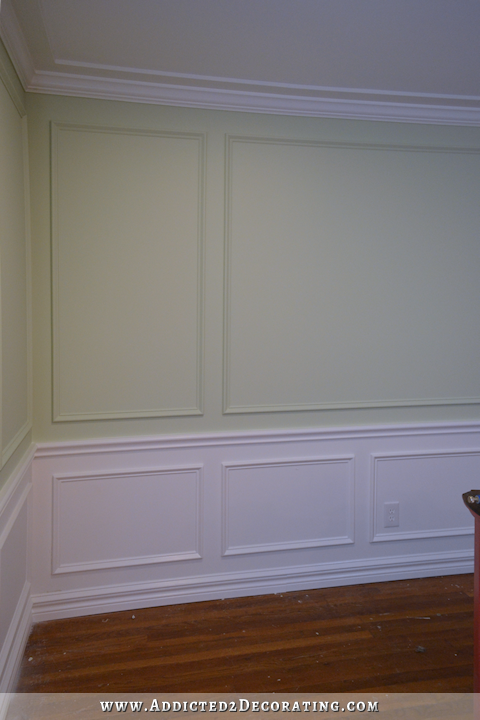
But now I’m back on track, and my walls have some color. I used Behr Feng Shui. Here’s what the color looks like on the Behr color tool online.
That’s actually pretty close to what it looks like in person in my house during the brightest part of the day. But this morning before the sun came out, when I took these pictures, it looked a bit darker.

I really love this green because it’s light and fresh, and it has no red undertones. I also like that it’s a light green without looking like a pastel that belongs in a child’s room.
I wanted to include this picture so that you could see it on the big entryway wall, but the color looks a bit more pastel in this picture than it is in person.
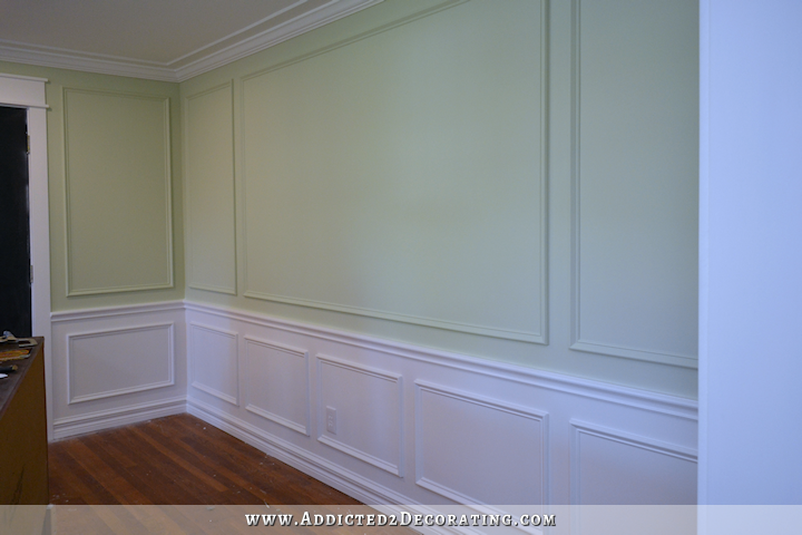
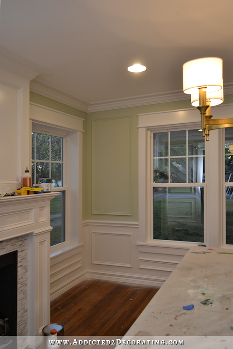
This is probably the closest to the true color (at least on my monitor).
I can’t even express how to you how refreshing it was to get color on these walls! It literally felt like a breath of fresh air to me. It felt like life was breathed into the room, and the air felt lighter, cleaner, and crisper. I’m just not a white walls kind of person. I knew that. Heck, I even wrote a post about it. And then I did it anyway. I’m not sure why I expected things to go smoothly when I started with a canvas that just wasn’t me, and I knew it wasn’t me.
Anyway, I’m back on track now. I have a totally new plan (actually, kind of new, kind of old). I’m not quite ready to share details yet. I want to let the new plan kind of incubate in my mind for a bit, free and safe from any outside influence or opinions. 🙂 But I’ll share other bits and pieces this week.

Addicted 2 Decorating is where I share my DIY and decorating journey as I remodel and decorate the 1948 fixer upper that my husband, Matt, and I bought in 2013. Matt has M.S. and is unable to do physical work, so I do the majority of the work on the house by myself. You can learn more about me here.

I’m glad you were able to take some time and get the other “voices” out of your head! Back to you and what you know you want/need. Can’t wait to see this come together.
Very nice, It is very refreshing. Do what you love and do not worry about other opinions. Remember opinions are like noses, everyone has one. Looking forward to the new old design. Have a wonderful day in Texas. We are still getting snow flurries in New Brunswick, Canada
We are too! In northern Nevada 😀
Getting it too in SLC, Utah
On a different note, the green is gorgeous and might be making an appearance now in my home. I too wasn’t a huge fan of plain white walls and it didn’t seem to bring out all the moldings. Great job Kristi….can’t wait to see where you go from here!
Looks beautiful!
Thank goodness! I was wondering how long you could stand the plain white walls! The color is beautiful.
Kristi I don’t think you could pick a green I wouldn’t like. I was a Crisp Celery fan too, this is lovely! I have had that chip in my house too.
Love. Love. Love.
I remember wondering why you went all white, as it didn’t seem you. I liked the white, but this is even prettier.
Wow — I really love that color! It can almost read as a neutral, yet it is bright and vibrant and fresh. I have a pumpkin-colored room that I’ve never liked in my house — now I am strongly considering this color instead.
I am interested to see what you do with your Jonathon Adler inspiration. I think YHL tried to achieve an Adler-inspired look, and sometimes it worked, but a lot of times it didn’t quite get there. You are so detail oriented and thoughtful and I am really looking forward to how things turn out!
Looking good! I’m such a read the last page first kinda girl, so the suspense is killing me! But I think the room fits better into your house now. I was a little afraid that the boldness of the room last week made your finished bathroom seem out of place.
I am in love with that color and the way it plays off the white. Very lovely. Good design decision, the green was.
it looks fantastic! I have loads of white walls in my home and love the few ones that have colour, so I guess with me it’s a question of daring to use colour. you have always been my hero in that respect so I’m glad that you chose this colour which Ii was in favour for all the time! I’m curious about the repercussions this is going to have on the other colours for that room, but I’m quite sure that a typical Kristi room is what you’re heading for now again 🙂
Wow! Beautiful color! Love it! I’m surprised at how fast you decided and then painted them! 🙂 Girl you work fast!!! 🙂
Ya know…I was kinda surprised also when you painted those walls white! But maybe it had to be that way in order to ‘see’ what was really needed.
Can’t wait to see the rest of the ideas, this is quite the journey and I’m loving every minute of it! Although I think you may not be so much…jes kiddin’ 😉
It’s going to be beautiful! We’re with ya woman! x*D
Ditto everything Lillian said! :O)
Bingo! That is just lovely!
Looking like your room now, absolutely lovely the colour and now you will so content. 😄
I was waiting to see what you decided ! It’s funny – I really liked the white even though I have no white walls in my own home. But the green with the white still translates as fresh and clear. Can’t wait to see the fabrics !
Sorry to see the white walls go, but glad you are happier with the green. Is this green a “tone” of your kitchen or a very different hue? Would like to see a picture of your doorway into the kitchen with the dining room walls also in view.
I made sure that I picked a green that complemented the green on my kitchen cabinets. Or at least, I does to my eye. 🙂
I like this much better! The white walls always seem so sterile to me. But I love color…I also collect Jonathan Adler Christmas ornaments!
Kristi,
I know you love all the helpful and insightful comments you receive here and on your blog, however, more than once you have been hijacked by someone else’s vision rather than your own. You have impeccable taste. Sometimes we have a inspiration hiccup and rather than being influenced by others perhaps it would be best to just take a time out. I don’t always agree with your choices but then this isn’t a project by committee, it is your home. Stick to your own vision and do what makes you smile. Do what makes you feel serenity and happy to be there. Heaven knows you and your husband spend so much time there you should be completely at peace. Even if it were pink and purple polkadots, it is what makes you happy. Even when I don’t agree with your choices I learn from your work. It inspires me to do things on my own and most of the time it turns out so stunning and I couldn’t see it before you finished. I don’t mean to sound like I’m scolding you or criticizing you, it’s quite the opposite.. I want to help empower you to trust your own instincts and vision.. You Go Girl.. You Got this..
It is a beautiful color. I can’t wait to see what your plans are for the rest of the room.
Absolutely LOVE the color. Good move
I am in love with this room!!!! I cannot wait to read your next posts.
I was surprised when you decided to do a white room. You are a color person and those walls need color. You are not a black and white color person either, I think that is where things are not working for you.
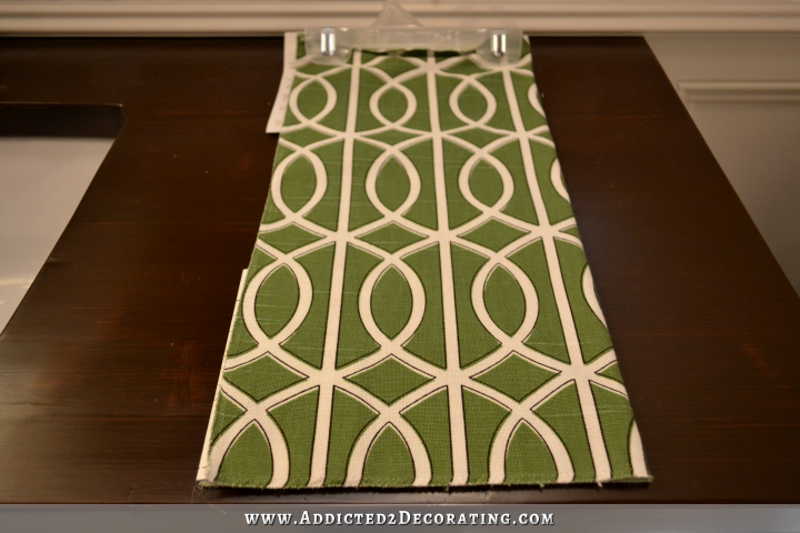
I love this green! I can’t wait to see how it looks with whatever fabrics you choose. I’m secretly rooting for the water color fabric. I can’t wait to see the end result!
Though I sure hope that awful black/white stripe fabric gets moved to the fire pit! Sorry but it has blocked my creative flow for this room since I first saw it!
So, Kristi, you must be a very powerful channeller (internet not included). This weekend, I did pretty much EXACTLY what you did. Though not white, and definitely not my choice, I tackled what for me is a fairly daunting task of changing the paint scheme in my dining room. I’m not very brave when it comes to choosing colors, I let go of my fears and let my heart lead me. When it was done and dry, I looked around elated and excited…and I couldn’t wait to get up this morning to see what it looked like in the sunlight. While my home is fairly plain and simple compared to the beautiful work you have done, thank you so much for the inspiration and the doses of courage you dole out! Y
You. Go. Girl.
Yay for color!! Yay for going with YOUR gut!! And yay for keeping a few secrets for a fun surprise later!
I Love the color, it makes the trim pop! I can’t wait to see what you do next.
Surprising how adding color to the wall “toned down” the formality of the room. Very pretty shade of green.
The color is beautiful in your house. Your walls look great. Very peaceful. I have loved all of your choices, even some you end up changing.
But, I have a question. Why do you have your switch plate outlined with trim?
I find it disturbing.
I love the trimmed out switch plate!
You are just amazing….. I have never come across someone who is as talented as you are… I love your posts and look forward to them!!!
One question…… what paint finish do you use on your walls……. flat, satin, etc? I love the look of flat, and it is much easier to paint with, but some say never to use it. Would love to know your feelings on that….
Love the green above and white below. Can’t wait to see it with the mix of fabrics.
Beautiful! Looks like you are on the right track…now I can envision color and patterns without them being as dominant as they were with the white walls. I too, couldn’t imagine you keeping the white walls. They were gorgeous and elegant but they weren’t you. You always bring in other elements to add that elegance.
So glad you are never afraid to change your mind. Every time you do, I think why? It was good! And then you do it and I think, ok, got it. She is so right! And now it is awesome, not just good.
Keep going!!!
Kristi you even paint like a professional..!!! No mess any where…Looks good on this end..
Beautiful shade of green. Crisp and clean. I know your finished product will be gorgeous.
In the Behr color tool room picture, what is the dark (grey maybe?) color on the fireplace wall?
I love that combination and would like to put the colors in my file for my next house! 🙂
Beautiful! Absolutely love it and can’t wait to see your gorgeous coral buffet next to that color on your hallway wall 🙂
This suits you more, I think. I rather enjoy watching your process of arriving where you want to go, although I’m sure it’s much more stressful for you than for your readers. 🙂 It’s all going to look beautiful in the end.
Perfect.
Glad to see you feeling that you’re on track for the room. I’m waiting expectantly for it’s complete transformation. 🙂
Love it! Hubby and I have lived in our home for 30 years with faux wood paneling. He loved it, I had lived with it for as long as I could stand it! Talked him into getting the living room, dining room and kitchen painted. YEA!!!! My color is very near what you picked and I LOVE MY GREEN Rooms and Kitchen Cabinets!!!!!! You go girl……….do as you please…………not what someone else thinks you should do! Can’t wait to see what you have in store for us next!
So pleased to see your post this morning and to see that you got your vision and clarity back Kristi. Although I am not normally a fan of white walls, I did like yours a lot and thought they looked gorgeous with all the trim work, but wow, with the green color on them now, they are really stunning!! The suspense you are keeping us in with the rest of your vision….is so exciting! Can’t wait to see what you choose.
Beautiful color! I love the contrast and how all of your trim detail & the gold on your fixture no longer get lost. Its amazing how you can transform something great into something greater! I love your creativity and my jaw drops at how much you are able to accomplish from day to day. Please come help me!! LOL! You are my DIY Hero!! 🙂
I had to look at this color again. I already commented once, but I just loooooove it. I may use it in my house at some point. Then I reread the comments and was a little surprised at how mean some of them sound. Icky side of this blogging methinks.
I love it. The green color on the walls improved your beautiful room by 1,000%, (in my biased opinion!)
After living in military barracks, dorms, and military housing for umpteen years…basically 1983-2008, I swore I’d never have a “white” or “neutral” room again.
Every room in my house is painted a different color. Three are three greens, similar to yours, one room is is lilac, one is ox-blood red with “camel” trim, one is sunshine yellow – and I’m not talking “butter” or “creamy” yellow. It’s YELL-ow.
In style? Not.
Any ‘grey’ anywhere? Not as long as I live!
But each room makes me happy every time I walk in to them.
I knew it! LOL when I saw your post today. It looks so much more like you. . My painting friend says, “It is like a rubric cube. Change one thing and a few more things need changing or it all falls into place!” Thanks for sharing your rubric journey!
I would be sooo tempted to paint that black entry door white if that room were mine!
To me, black just doesn’t relate well with pastel shades.
It’s like there is a struggle between the feminine and masculinine, colour wise.
Your green walls are so pretty, you could probably put up two folding chairs and a card table and I would be like, “That’s the most beautiful dining room in the world!!!” 😉 Seriously!!
I have never been a fan of green walls. But, I think you just changed my mind! Absolutely gorgeous!!! 🙂
I had a feeling the white would not last long with you. I too am not a white wall person. I’m struggling in my mind now on what colors I will choose for our soon to be built home. We’ve been rather safe forever, but I am so tired of Khaki walls! I’m leaning towards greens or corals. Ideally, I would like a buttery yellow, but I know I would hate it after six months! Decided I need to wait and see how the lighting is in the house before I make any decisions. I look on Pinterest and all I see is gray, which to me may as well be white! So boring and lifeless! Don’t understand the trend for gray at all.
So excited to see what you’ve dreamed up without all of our input! Float your own boat girl!
Glad to see you are back on track and I love the colour you chose. It’s fresh and almost reads as a neutral and a bit unexpected, but not to those who know your love for green. That paint choice is perfect! Can’t wait to see the rest!
This is one of my fave color. I had it in my kitchn sun room dining room when we lived in WI years ago and had an English Country Wicker Vibe going. The people that bought the house still have the color on the walls! So yes this is uber classic! Love it. Love it. Love it!
Thank you, thank you for getting rid of some of that white. I guess all white can be pretty if you’re a minimalistic modern type of decorator but I don’t think you are and I was disappointed when it looked like a blizzard went through your room.(Live in Iowa don’t really like to see all white.)
Oh, Oh, I love this color. Your are a smart girl. Can’t Wait to see more!!!!
Thanks for adding the color to the walls! You can really see the amazing details of all that molding framing out your room.
ha ha, I did question the white walls too! After reading your blog for several years now, it really surprised me. But this color is very crisp and clean. I can’t wait to see your revised plan!
Ooooooooooooooooo! I like that shade of green! (Generally, I’m not a green girl but this one is subtle but making a statement). Can’t wait to see where you are headed.
This looks kind of like pistachio….I love it! Very pretty & fresh. Not sure if you are aware of this designer, but I love her use of colour & whimsy. http://www.peppermintbliss.com/
I can’t wait to see it when it’s done… The black legs will look nice against the green.
Hmmm, I like that green! It’s not grayish, or yellowish, or bluish, but a nice crisp light green; I’m going to have to keep it in mind for future reference 🙂
Ahh, much better. Can’t wait to see what you do with this. =) Looks great so far! (Although, I have to admit, I’m a huge fan of nursery colours lol)
It’s going to look beautiful! I’m anxious to see where you go from here. I admire your for your ability to redo and move on. I would be crying my eyes out and just live with it. Funny, I knew you would change it! I could not see you going with white. BTW, your writing often makes me laugh out loud! I really enjoy your fun personality! Thank you!
Wow- you get to work so quickly, Kristi! The green looks so beautiful and highlights your gorgeous, high-end trim so much more than painting everything white did! I’ll bet it really highlights your fireplace, too–you will have to show us a picture of that! Do you find that your room feels “bigger” now that you have visually changed the proportions by painting the top 2/3 a different color?
Love it! I, too, was surprised when you painted the walls white initially since you’ve previously stated you weren’t a fan. I just figured you had changed your mind. As always, I admire your tenacity in getting a project done and your energy to start again when you change directions. If I am not thrilled with a color I picked, I am too lazy to do it over. Looks very pretty and I am glad you are “feeling it” again. I am not a fan of white or gray walls either. 🙂 Can’t wait to see the direction you are now heading. Cheering you on from afar…
I am very happy you decided to put color on the walls, I hate white walls… it is never an option for me anyway… This being said, I have to admit, I am not a fan of the green that you choose,, I think the pastel color clashes with the color of the kitchen, buffet and piano. The colors you chose so far were very saturated and this one seems to me like something you would find in an retirement home or an hospital. I would have preferred a darker color. sorry…
As soon as you posted the white walls, I thought “yep, that won’t stay.” And as you were struggling with the rest of the design, I figured the walls would change soon. Glad to see you found your way back. 🙂 But you gotta try things you might not like to find the thing you do, so I hope you don’t feel badly for trying. I look forward to seeing where you end up. 🙂
I love the look of the table!! What model of Critter Sprayer do you have? Are you happy with it? Thanks!
I have this one: http://amzn.to/1q07CnQ (that’s an affiliate link 😉 ) I love it! Just be aware that it’s not for big things, like walls. It’s for painting small things like chairs, dressers, etc.