Backsplash Tile Experiment #2 (Much Better This Time!) – Resin and Alcohol Inks
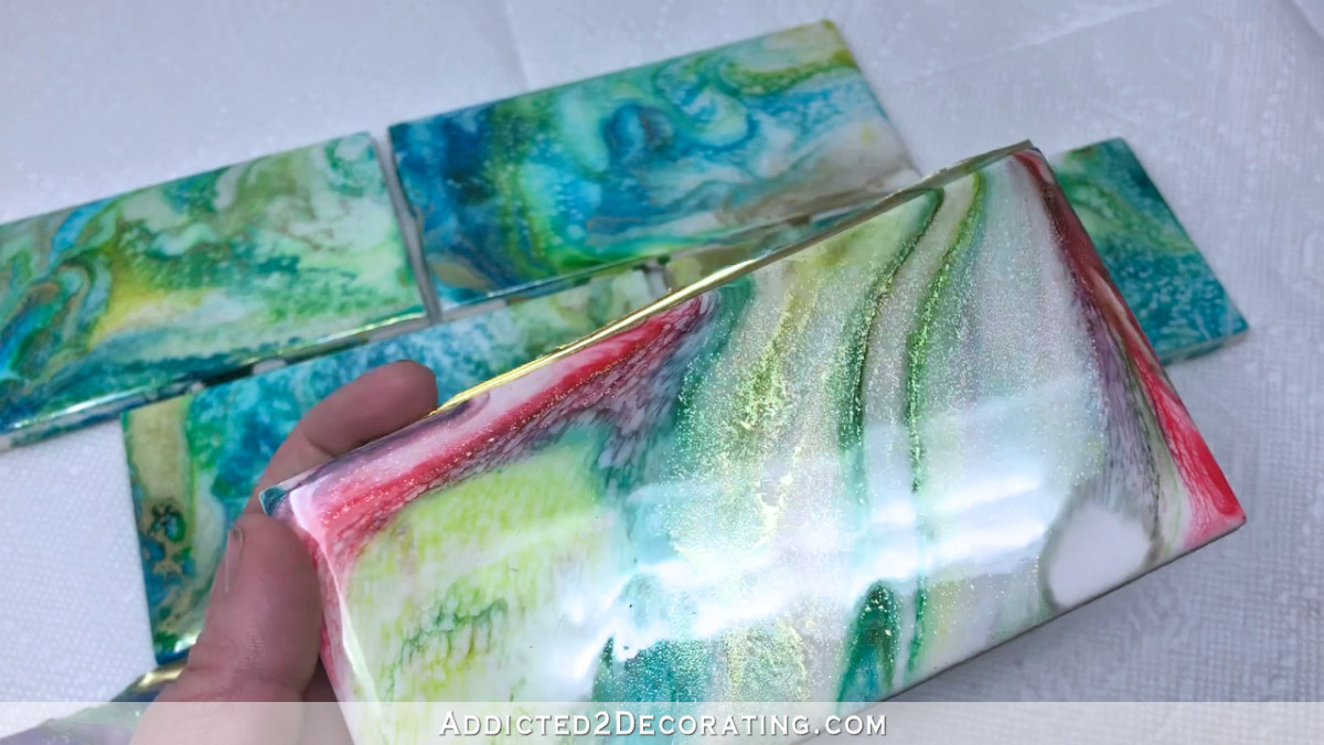
Y’all, I spent all afternoon and evening yesterday doing more experimenting with tiles and resin. And this time, at the suggestion of several of you, I tried alcohol inks. After many, many tries (and fails), I finally got my technique down where I could get fairly consistent results. I tried several different color combos, but I did more turquoise, teal, green, white and gold than any other color. Here’s how they turned out…

So basically, I covered each tile with clear resin, dropped about 12 drops of alcohol inks in random colors and random patterns onto each tile, and then used my heat gun to mix, mingle and marble the colors together.
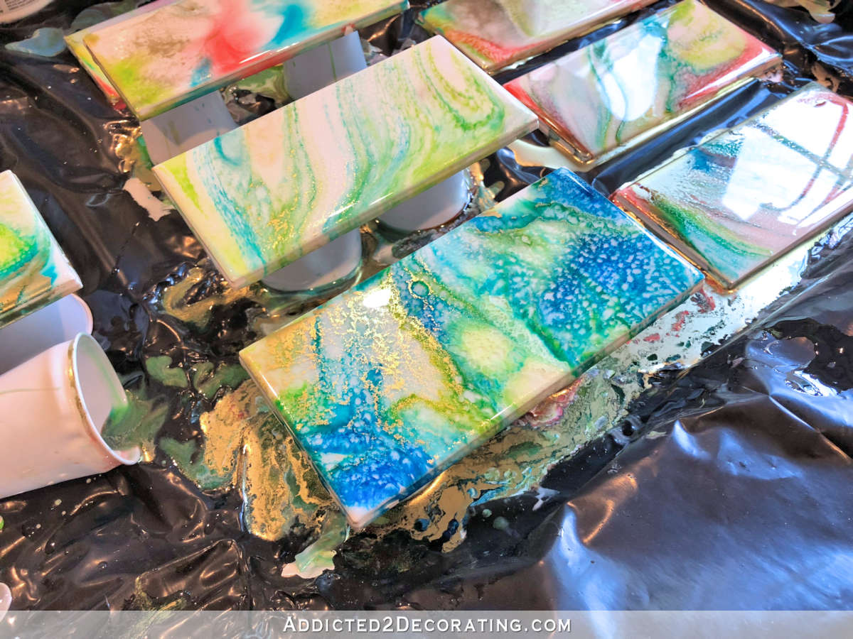
This process definitely created a more interesting look than the resin and latex paint combo that I showed you yesterday. The colors are more vibrant, and the alcohol inks naturally create more visually interest patterns.
And I wish y’all could see them in person. The gold is absolutely stunning when it catches the light.
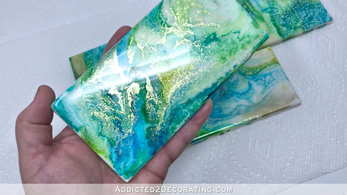
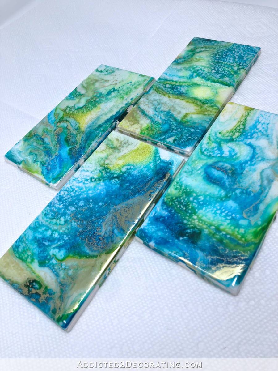
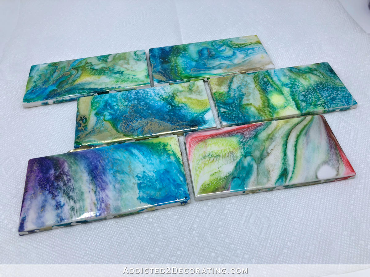
And here are the four in the turquoise, green, white and gold colorway along with one of the turquoise, green, purple and white, and then one of the turquoise, green, white and pink tiles.
Those didn’t turn out quite as nice as the green and turquoise ones becasue I did those before I “perfected” my technique (which still isn’t perfect, but it’s getting there).
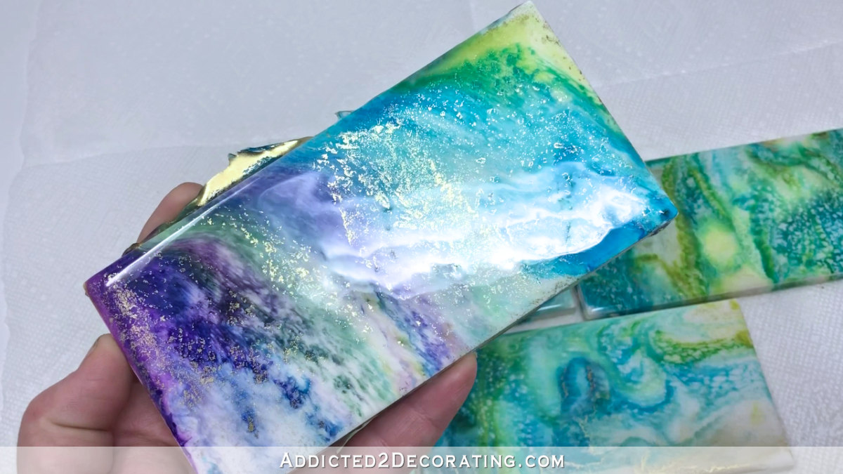
So now I just need to decide for sure what colors I want to use. I’ve definitely ruled out the ones with the pink. Since these tiles will be seen through the doors of the pantry, I feel like pink would stick out like a sore thumb. But my breakfast room is teal, green and purple, and it’s right next to my teal kitchen. So I feel like either of the other two tiles would work. So what do y’all think? Add the purple? Or stick with the turquoise and green alone?
Anyway, I’m so glad some of you suggested the alcohol inks! For some reason, it didn’t even occur to me to try those.
And if you’re wondering whey I’m spending so much time on this, it’s because I’ve signed up to be a guest participant in the One Room Challenge, and it starts Thursday. I need to get all of my decisions and purchases ready to go for my pantry because I plan to hit the ground running on this thing. I’m giving myself until the end of the day tomorrow to finalize all of my decisions. And since I’m going to need over 200 tiles for the pantry, this is going to be quite the undertaking.
UPDATE:
After hitting “publish” on this post, I decided to try another test with teal, purple, white and gold — no green. Y’all, this just may be the winning combination! I absolutely LOVE this one. I love it more than the teal and green, which is strange for me, because those are my colors. But just look how gorgeous this is! It’s still very wet in this picture since I literally just did this about five minutes ago, but it’s resin, so it’ll look pretty much the same when it’s dry.

Update:
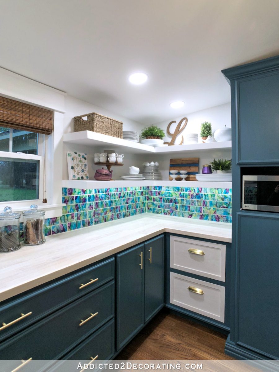
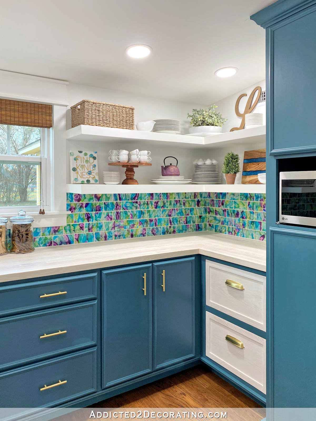
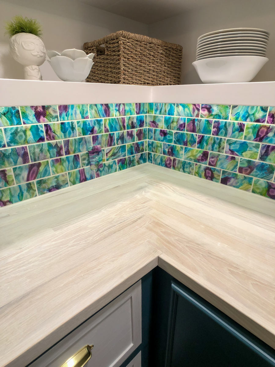
My pantry is finished! Want to see the entire project from start to finish? You can find every single post about the pantry build right here…
Or you can skip to the end and see how it turned out. Here’s a peek of the finished pantry…
You can see more pictures on the before and after post right here…

Addicted 2 Decorating is where I share my DIY and decorating journey as I remodel and decorate the 1948 fixer upper that my husband, Matt, and I bought in 2013. Matt has M.S. and is unable to do physical work, so I do the majority of the work on the house by myself. You can learn more about me here.
![Breakfast Room & Pantry Progress [Video]](https://www.addicted2decorating.com/wp-content/uploads/2016/08/breakfast-room-progress-August-2016.png)

oh, baby those are pretty! Purple, all the way!! I like that the purple one has a lot less green, as well. That color green, unless used in plants or grass, always reminds me of Monster Energy drinks! Haha, they’ve ruined it for me 🙂
the more I look at them- the green and blue ones look like topography maps and the purple one looks a bit like a space map/image. they’re just so pretty!
Teal, Purple and green and they are absolutely gorgeous.
These I like. Yesterday’s, not so much. Love your creativity.
Completely agree. These are beautiful, but I do like the one with green in it. 🙂
Oh my god Kristi, those are BEAUTIFUL!!! I have to say I LOVE the green blue and gold ones the most, but the purple is also very pretty. Maybe you could set your tile up near the pantry wall and stare at it from the breakfast room to see if you can tell a difference.
Love the green, turquoise, gold combination. These are stunning. The colors are so much more vibrant than the ones you posted yesterday. Love these!
Stick with the green and turquoise. I feel like those are your signature colors and you will always stick with those in your decor. Somewhere down the line you might want to swap out the purple for something else and you won’t want to be stuck with it in your tiles. You can use any accent color you want. Plus… less is more. The more colors you add, the busier the tiles look.
These are so much prettier. I love the addition of the gold. It looks like the alcohol inks also solved the problem you had with the paint drips on the back of the tiles.
Totally agree!!
I agree with this, but my heart loved the one with purple.
Same. You could always add a purple accent that brings in a different texture.
Oh, those are stunning. I’ve read your blog for years and this is the first time I’ve commented, I love them that much!
I think the turquoise and green for the pantry—something about the more monochromatic color scheme just gets me. And the pops of gold—love.
I wish I had some solid reason for why I think you should use the turquoise ones (my college drawing professor and advisor: “the next person who says ‘I like it, it’s pretty’ during critique is gonna get thrown out of class! Tell us WHY you like it.”) but I’ve got nothing. I like them, they’re pretty. 😀
I think these are stunning! The difference really is remarkable, the latex seems so dull and muddy in comparison… I think I lean toward green and blue without the purple PERSONALLY, but I have no doubt that whatever you choose will be beautiful! I can’t wait to see them installed!!
Purple.
Since I love teal and purple together, I vote to add the purple in.
I think that not all the tiles have to have each and every color. You could add purple to a few tiles, but not all, same with the gold, or green, or whatever you choose. They are turning out awesome and I can’t wait to see what you decide.
I agree! I actually quite liked the photo with all of the tiles you did sitting next to each other and liked that they all could go together even though one tile had pink and one tile had purple. It adds visual interest that way and places for your eyes to travel, if that makes sense? If they are all the same color way I think it all blends in too much.
I also agree! If I had to choose just one colorway, I’d probably do the green/blue/gold. However, the green/blue/gold/purple combo blends really well with the g/b/g ones. It might make a really cool mosaic to have a few different color ones as well. Someone else commented that you could try propping them up in your pantry to give you an idea of what it would look like from a distance. I’d do that too. These are gorgeous! Can’t wait to see how it turns out! 🙂
I really like how the alcohol inks have turned out for you! And if it were me, I’d be using all the color combos, as I think a hint of that ‘pink’ every now and then in a large project would be a very nice surprise kicker.
Well, here’s my two cents: I think that purple is your personal trend. You’re liking it, but for a long while, you had serious doubts about purple. I think your affection for it will wane. But you have ALWAYS loved green and blue. Tile is pretty permanent, although honestly, nothing is really permanent. And I think that, while the purple is pretty, I think that the blue and green with gold says Kristie more strongly than the third color. Love the alcohol ink effect!
Totally agree………..No purple.
I agree, no purple. It is a trendy color, and you may tire of it.
Could you not do both? The occasional pop of something different might add the crazy visual interest you love so much. 🙂 it’s a blue and green “base” with a splash of a teal and purple tile to keep it just eye-catching enough for your need for LOTS of color.
However, either one looks awesome. Good luck with the project!!
Yay you’re really starting to get there. I do like the ones with some purple in them. I think it is a natural one to continue the blues. Not so sure about the pink though, but seems like you are using coral elsewhere so even though the color doesn’t exist in the breakfast room or kitchen it does exist elsewhere in your house. Too monochromatic might be a bit boring. Maybe that is why I’m really liking the addition of the purple.
Not much help as I think you can’t go wrong with any of them. Since you are using the same colors for all could you do predominantly the teal and green, but add a few tiles with the purple? Would they be able to blend here and there? Or would it be too obviously different for the sake of having purple. (my sake of having some purple)
Absolutely STUNNING! I LOVE them all, even the pink. LOL I vote on Adding a bit of purple, if you dare!
Love these new tiles, but no purple in my opinion.
Wait a sec…
Now with the updated version in purple…absolutely gorgeous. I take my earlier comment back!
Were you able to solve the drip problem? Or was this step just an experiment on color and style?
This was just an experiment with alcohol ink, but as far as the drips go, I think I’m just going to let the resin drip on the back, and then cut the drips off with a razor blade. Either way I go — whether I cover it with some sort of tape and peel it off after it dries, or if I just let it drip and cut the drips off — it’s going to be work. But I feel like just doing extra work after with the razor blade, rather than before AND after with the tape, is a more efficient plan. And it sounds a whole lot easier to me since I really just need to cut away the long drips that will get in the way of the tile lying flat against the wall. The smaller drips don’t need extra attention.
I have no clue if my suggestion would work, but could you put, an oil, or say, petroleum jelly, VERY THINLY on the back edges to help release the bond? Would need to be washed off good before mounting them on the wall, so they would bond, tho!
These are stunning, and the touch of purple sets the colors off, IMHO. I’m dying to try this! Wow! what fun! The pantry will be to die for, I know!
I’m not nearly as daring with color as you are. I think I’d like a lot more white on each tile, then maybe a little purple here and there would be okay. They are beautiful and will be stunning in your pantry!
I love them all but I would choose the turquoise and green.
Can you attach a pic of the view to the pantry again?
I don’t think I have a current one, but I’ll be including lots of pictures in my Thursday post — the first post for the One Room Challenge that I’ll be doing as a guest participant.
Oh my goodness!! I LOVE the One Room Challenge! Will this be the first time you’ve committed to doing one? I can’t WAIT to see what you come up with!
I love it, too! I look forward to each challenge wrapping up, and then I make an afternoon/evening of looking through every single post of every single official participant and guest participant. But yes, this will be my first time participating. I generally resist time limits placed on me from outside sources (which is why I almost never do sponsored posts 😀 ), but this time I think I can actually do it. I sure hope so! At least I won’t have the pressure of being one of the official participants. As a guest participant, I’ll really just be disappointing myself if I don’t finish.
I just have a question. Once you install the tiles, will you be able to remove just one tile and replace it. Or does the resin make that task harder? Okay a comment also. The last one is absolutely beautiful. Then you could add pops of your green in other ways in the pantry. I am not as adventurous as you in diy but I like to dabble in crafts and home decor, but find myself always second guessing what I am doing so I feel your indecision but on a much smaller scale. Your work is absolutely stunning (color choices) and you inspire me. Keep up the good work.
The tile will be installed with thinset just like any other tile. It won’t be easy to remove, but that has nothing to do with the resin.
Stunning! I love the greens, blues and gold but think you need just a hint of purple to break it all up and add interest. Love the tile with the purple, but in my opinion, it could be a lesser amount of purple.
Whatever you decide, it will be gorgeous!
I like the tile with the purple but after all kiddo – this is your house – your kitchen. What speaks to you?
So excited you’re doing the ORC!!!! I look forward to them every year!
I like the teal/gold ones…
OMG, they are so beutiful
They are all beautiful but the last ones win thee prize. It is so fun to see your creativity!
I LOVE the blue, teal and gold! I also like the purple, but in very small doses. If you cover the left side of the tile that has purple in it, that’s how I would do the purple. Just that small hint of purple is enough. The blue/teal/gold reminds me of the ocean washing onto the sand, with the foam when the water hits the sand! And the inks are more “fluid” than the paint was. OOOH, I can’t wait to see!
After I hit enter, your update came up….. I kinda like a “hint” of the green in it, but if you love the updated one, you do you! I promise I won’t object! LOL!
These are gorgeous!! The latex was dull and muddy by comparison. For me, less would be more and I would exclude the purple. But, that’s not generally how you approach things. 🙂 Also, the color of your cabinetry and the lighting would also be factors to consider when deciding to include or exclude the purple and pink. I’m sure you’ll come up with a gorgeous plan.
Gorgeous! Love the end result. The depth shows up even in pictures and the gold is particularly striking!
Ohhhh! The last combo is definitely the best. They are all gorgeous, though. Using the inks makes the tiles almost glow, and is definitely better than the paint. I’m excited that you’re signing up for the one room challenge, too, I’ve been waiting anxiously for a long time to see how your pantry would turn out. 😄
Sorry, I am zero help when it comes to the colors. They are all beautiful! But it’s coming up on hunting season around here and dear hubby will be distracted. This is the PERFECT time for me to do a new backsplash! Off to gather supplies……
So pretty! I love all the colors. Some of them look like they should be framed and used as art. 🙂
I agree! I actually quite liked the photo with all of the tiles you did sitting next to each other and liked that they all could go together even though one tile had pink and one tile had purple. It adds visual interest that way and places for your eyes to travel, if that makes sense? If they are all the same color way I think it all blends in too much.
That last one, the update one, is my winner! Love that combination. Can’t wait to see what you do, and so excited to see you in the ORC!
Wow, Kriti, those are just GORGEOUS! I love ’em all, so no help in choosing colors from me, but I look forward to seeing them done. They DO look like little pieces of art!
the last tile you posted…wow, you aced that one. love the colours and looks so Caribbean with the turquoise waters. I do like seeing a little green too. you are so very talented and is a new experience for me to see this. good luck
AMAZING ! i LOVE them !! mostly the teal green blue ones, but your last one without the green and with purple I also love! <3 great idea to really bring your personality into your home in EVERY aspect! I want to do this now but I don't really have anything to tile lol.. i also love teal/green =D
Would love to see a video on how you did these. I LOVE the touch of purple!
I love what you have done to your home. It’s inspirational.
I’ll definitely do a video when I get everything finalized and start making the actual tiles that I’ll be using.
Those tiles are gorgeous! I love both color combos!!!!!!!!!! I can hardly wait to see your ORC. I know it will be great. I’m so glad you tried the alcohol ink – that gold makes the tile look like a million bucks!
Love them both! Can’t go wrong with either one. You amaze me!! Great work!!
These are beautiful! I can’t wait to see them as the pantry back splash. I like the latex ones, but didn’t feel like they 100% lived up to your inspiration, this has I think surpassed it!
blue and green with a little gold
Wow. These are so pretty. I love them. I missed this – are you doing the whole backslash with these, or just an “accent” part of the backsplash?
It’ll be the whole backsplash area (ie, the space between the countertop and the bottom of the first upper shelf) but not the whole wall.
I love these! The gold addition is perfect. My only question about the purple addition is. Have you always loved purple? I know Teal is a standby color for you and always will be. And I adore the purple in your home. But, if you ever tire of it will you regret the purple in your tiles? I suppose knowing your detail to everything you may just replace the backsplash if you tire of it. I admire your drive to do things perfect for you! I am so excited to see this fabulous pantry come to life!
Sheila F.
I think the first batch you did in today’s post are the best. The blue, teal, gold tiles. They look beautiful. I think those with pink clash, and the purples also do not match as well. But on the whole, today’s batches look much more professional than yesterday’s.
I’m glad I came back after lunch because that updated version is just gorgeous! That one definitely has my vote! Don’t you have a printed set of geodes somewhere in your house (I think hallway)? This version reminds me of a slice of a very precious stone!
(I’m sorry they all remind me of such literal things, haha!)
Love them all but favorites are first & last one. Love the Caribbean sea look. I don’t know how you’ll chose but it will be beautiful. Can’t wait to see ORC.
Well, you know I’m going to vote for purple! The latest one you did is stunning!
Wow! Your last option pictured really nails it I think, but I like the turquoise and green one too. Best of luck in the One Room Challenge!
The alcohol inks are so clean looking so that is definitely the way to go. I like the purple. However, I also agree with the suggestion to have some of the colors (except the pink) in all or most of the tiles. I’m afraid of it becoming boring with the just the teal, green and gold. Regarding the ORC, I remember seeing it on TV years ago but obviously am not familiar with it recently. Is it still on TV (which channel)? Your pantry is going to be awesome, Kristi!
Coleen, The One Room Challenge can be found here https://www.oneroomchallenge.com/
On Wednesday, the featured designers post their progress in redoing one room. On Thursday, the guest participants post their progress. For 6 or 7 weeks, they update their progress weekly, headed to the final reveal. It’s always a lot of fun to follow along and see the end results.
Thanks for the heads up! I appreciate your thoughtfulness.
WOW!! Positively gorgeous! Reminiscent of an ocean swell dappled with sunlight!
Ahhhh! You know when you eat a bite of something really, really amazing how your whole body goes Mmmmm? It feels like that but with my eyes! These are so beautiful! I didn’t want to say anything negative about the ones yesterday, but I thought they looked a little like mold and bruises. These, these are stunning and beautiful and make me so happy and also really, really want some. I can’t say enough how much I love these!
Colorwise, I too like the idea of mixing in some different tiles, but if you want them all the same, I agree that your go to colors are teal and green, and you might regret putting in too much purple inside your house. But, wouldn’t it be so fun to have some of these in your studio bathroom or as a backsplash along your studio counters in fun, bright colors? Imagine it with coral and purple and teal and orange! Could be fun.
Absolutely gorgeous!! Love the combo you decided on, it’s so beautiful! Very impressive work!
Another stunning result! Love IT!
The one with the purple and a hint of green is my favorite but they are all pretty. With the first picture I was thinking no on the gold because it looked muddy but in some of the others you can see the gleam. I liked the ones using latex but wow, the inks really take it up a notch. I may have to give this a try and do a tray bottom or two.
Yes! Taking out the green and adding the purple is stunning!! So glad you tried that at the last minute.
You can’t lose no matter the choice. All of them are beautiful!!
These are AWESOME!! All of them! Totally what I was envisioning…yesterday’s were pretty, but not what I expected.
I think you are good with either the green and teal or the teal and purple (not green, teal, and purple, though). I personally like the last (teal and purple) the best, but that is because I love purple 🙂 I only wonder…for so long you didn’t like purple, but you have ALWAYS loved green and teal. This is a pretty permanent install, so just make sure you’re going to want the purple long term if you go that way. If you decide no on the purple and teal, please ship me the unused tiles!!! LOL
I am sooooooooooooooooo excited you are doing the ORC !!! I always wondered why you didnt…
And I LOVE the last tile option you made : teal, purple, white and gold — no green. I think it’s perfection in form of a tile. Can you please tell me what gold you used ? We use alcohol inks, but have yet to find a gold one that as pretty as yours !
My friend just covered her outdoor table with alcohol ink/resin tiles. Its gorgeous ! All the colors in the rainbow, though.
I have a feeling this pantry is going to be AMAZING. Good luck ! 🙂
I’m using Jacquart Pinata Rich Gold alcohol ink. I’ve learned that the key is that you literally have to shake it well before EVERY single time you use it. It’s the one color that separates quickly as it sits, so if you pick it up and use it without shaking it, the results won’t be great.
I am looking forward to the “how to”
Yes! Gotta have a splash of purple! LOVE THEM!
I just had to comment to say these are absolutely beautiful. Your pantry is going to be awesome, I am jealous already, lol!
I gotta say I was not a fan of the first experiment that you did yesterday….boy did that change for today’s post. This second experiment turned out looking so professional and elegant. I think you found the winning formula and colors.
Love them all. You will make awesome choices of that I’m sure. Looking forward to the end result.
Best wishes on your “challenge”. You are one industrious person, I’d be too lazy to do that much work on a pantry. That’s silly of me as we often spend so much time in our work spaces, even something like a pantry. Why shouldn’t they be spectacular.
I wish I could get the “be practical” chick on my shoulder to shut up!!!!!!
I am surprising myself with the green because I don’t generally love green. (Working in a hospital with green wall tiles for many years created this aversion). I’m impressed by them all, but the 4th photo of you holding that particular tile is my particular favorite. It’s light, airy, cheerful & makes me smile! And although I love purple, I think it would take away those attributes that are appealing to me.
But, I know whatever you choose will be amazing & I can’t wait for the reveal!
Loved the one with PINK! Maybe could play around with pink, gold, green! Add that punch to a separate,but connected room!!
Gorgeous!!! I can not decide …love the purple(almost deep blue) and love the green.
I agree..no pink.
Beautiful Kristi!
Eager to see the ORC!!!
Gorgeous! You’re killing me here……I wish this idea had been around when I did my kitchen! Your creativity knocks me out.
My opinion: blue/green/white/gold.
Ooooh, that update is gorgeous! I love the gold on all the options so much.
Personally, my eyeballs went all heart-shaped at the ones with the hints of pink, but that’s just what *I’m* drawn to lately in my own decorating. For your pantry next to the kitchen, I think you’ve nailed it with the purple (I can see how it’ll glow next to those paintings that frame the door) and teal and white. It’s gonna be so pretty!
Stunning! and even more remarkable that they are DIY. I love both…but after reading the comments referring to longevity, what I would do is the green/turquoise on the wall and a big tray with the green/turquoise/purple layed in the bottom. you can lean the tray against the wall and add a couple purple accents here & there but you’re not married to it. although i can’t imagine ever tiring of either choice.
I LOVE all of these…like I want them in my house immediately, lol. Absolutely beautiful!! Can’t wait to see the final project.
So beautiful! I do like these more than the latex (though those were nice in a different way). These are definitely more vibrant. and I LOVE the gold in them. Whatever you choose, I hope you choose something with the gold included.
Good luck!
Now, these are stunning! I love them so much more than the ones from yesterday, although those were beautiful, as well. These just have that something extra that the others didn’t.
I like the blue, purple, gold, white and a little green. I like the green added but maybe just add a little less and see how that looks. While I do like the one without it, the blue and green look so great together that I feel it is just missing something. Or you might try the blue, green, gold and white and just add a little purple instead of a lot and see how that looks? I’m torn between the green and purple. I think you need to do some with both and just alter the amount of each and see which you like best with the blue, gold and white.
Beautiful job!
Muuuuuch better than the latex. Gorgeous! If you like the last one best, go for it. Personally, I’m partial to the green ones you made, even though I’m not a fan of green. 🙂 Looking forward to the ORC!
Turquoise green white and gold is my vote. So excited that you are doing the one room challenge!
Last one is the winner, as you know. Thanks for the info on the fridge. Yes, they are no longer making, which is probably good. I don’t need new appliances and would be sorely tempted. Love your home.
Absolutely stunning! My fav is the last one, but I love all of them. What a cool technique!
These are fabulous! 😍 I’ve played around with tiles and Sharpies but never knew how to keep the ink from scratching off. I so want to try this.
We recently used silicone to put up some of our subway tiles, I totally recommend this so you don’t risk damaging your beautiful tiles.
SIGH.
just
SIGH.
I adore purple so I will always love anything with purple in it. I love this technique. I think even I could have a go at something similar. They look like loads of fun to create too. So much inspiration here.
My vote is the blue, purple, gold. Though I love the one with the green as well as the purple. Glad I’m not the one trying to make that decision.
I love the paint tiles but these with the alcohol inks are absolutely stunning. I like the turquoise, green and purple combo the best – bold and beautiful. Perhaps a touch of gold would look amazing, as well. I can’t even imagine how pretty that is going to look when people look into your pantry and spot those. Wow!
I absolutely loved the last one without the green in it! I think maybe it was because it was a little lighter and had a little more white in it. All are gorgeous!
You gotta update this post for the “final” decision that you posted on Insta. Or do another post. 🙂 Love it! This is going to be BOLD and totally stand out in the one room challenge!
I love the update one! They’re all pretty, but that one is stunning. I can’t wait to see what you do in the pantry.
Oh my! I just saw your IG. The winner is amazing!!!
I apologize in advance if I’m feeding your addiction to RESIN ALL THE THINGS while you’re on a schedule, but after seeing these tiles I would really love to see them backlit…as in applied to glass, formed into a box, and set over a light. I remember a few years back you made a square mosaic lamp using shiny painted cardboard ’tiles’, so imagine that but with resined glass…and with another light inside the lamp base.
Suggestion for drip removal try sharp tile nippers (or a tool with that beefyness and form) lay tile on a grippy surface and “nip” the drips off. Also wear gloves and eye protection, if it goes right, the resin drips would fly off like a clipped toenail…. if you need something razor sharp and can get in closer maybe a cigar cutter would work for long drips.
Wow! I am SO impressed by these tiles! My favourite colour combo is the teal/green/gold/purple with the purple in smaller quantities as an accent colour. The last tile is great too but I like teal and green together.
It has been a long time since I have done any diy projects so this may be a really stupid question. When you grout the tiles do you have to use the method of smooching the grout all over the tiles and pushing it into the groves between the tiles and then wiping off the tiles, or can it be piped into the groves and thereby limiting the scratching of the tiles?
You could do either way, but the important thing is to use unsanded grout. Sanded grout would definitely scratch the tiles.
That last one wins for me hands down but anything with turquoise and purple gets me every time.
One suggestion though for newbies who want to use alcohol ink on tiles is to do them with inks only, blowing the colours to get the effect you want. If you don’t like them a bit of alcohol will clean them right off. You can keep trying different ideas to get them just as you like them, Use a spray fixative to set the ink and then add resin to the to finish the ones you like the most. It is a lot cheaper than using resin on a tile you may not like the look of in the end. They dry so quickly you could likely do all 200 in a few days and then resin them in batches.
I tried it that way, and the look is very different. I find that the ink is very difficult to work with by itself. The resin act as a carrier for the inks, keeps it wet and movable for about 30 minutes (probably a bit longer) and really allows you to move it and get it just like you want it. The resin also gives it a perfectly smooth and shiny finish that you don’t get with just the alcohol inks. It’s definitely cheaper without the resin, though.
Gorgeous, gorgeous, gorgeous!!! Obviously, it’s the purple, teal, white and gold that just screams “Kristi” from the housetops! The teal and green would be beautiful in your studio half bath if you had enough to go around the sink. You have to be one of the most creative people I’ve ever encountered 😘
Unique and gorgeous hand painted tiles…….Kristi style. Just perfect for your pantry! I’m loving that you’re doing the One Room Challenge for your pantry. What an exciting way to start the last quarter of the year! Go Kristi.
Awesome, pantry.