Testing Five DIY Resin Tile Ideas For Our Master Bathroom
Y’all know me so well. 🙂 Some of the comments on yesterday’s post about our upcoming master bathroom remodel made me chuckle, because while y’all were suggesting that I try to make the perfect teal resin tile, I had already been busy at work in my studio trying out a few tile ideas.
I haven’t yet hit on the perfect idea, or the perfect teal color. But I did test out five different ideas, and I found one idea (quite by accident) that I absolutely love.
If you want to see all of my resin tile tests on video, you can check that out here…
Having trouble viewing that video? You can check see it on YouTube here.
So I tested five different ideas. The first three were very similar to the ideas I tried (and ended up going with) for the pantry remodel. I made my own tiles for that room, and this is how they turned out…
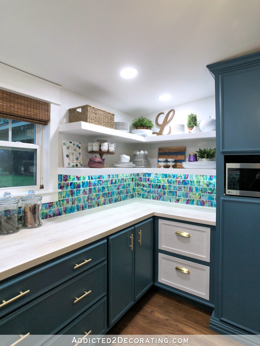
If you missed my pantry before and after, you can see it here…
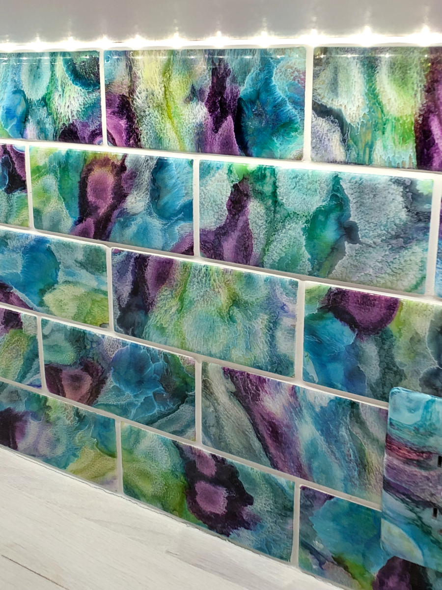
For those tiles, I used blues, greens, purples, and white. They turned out crazy and colorful and bold, which I absolutely love, but they also don’t cover a whole lot of wall. I don’t know if I could handle that much pattern on an entire wall. And for our bathroom, the tile is going to cover one large wall, plus it may be used as accents in other places as well.
So I don’t want anything too crazy for the bathroom. I mainly want to stick with teal, with possibly some white thrown in there as well.
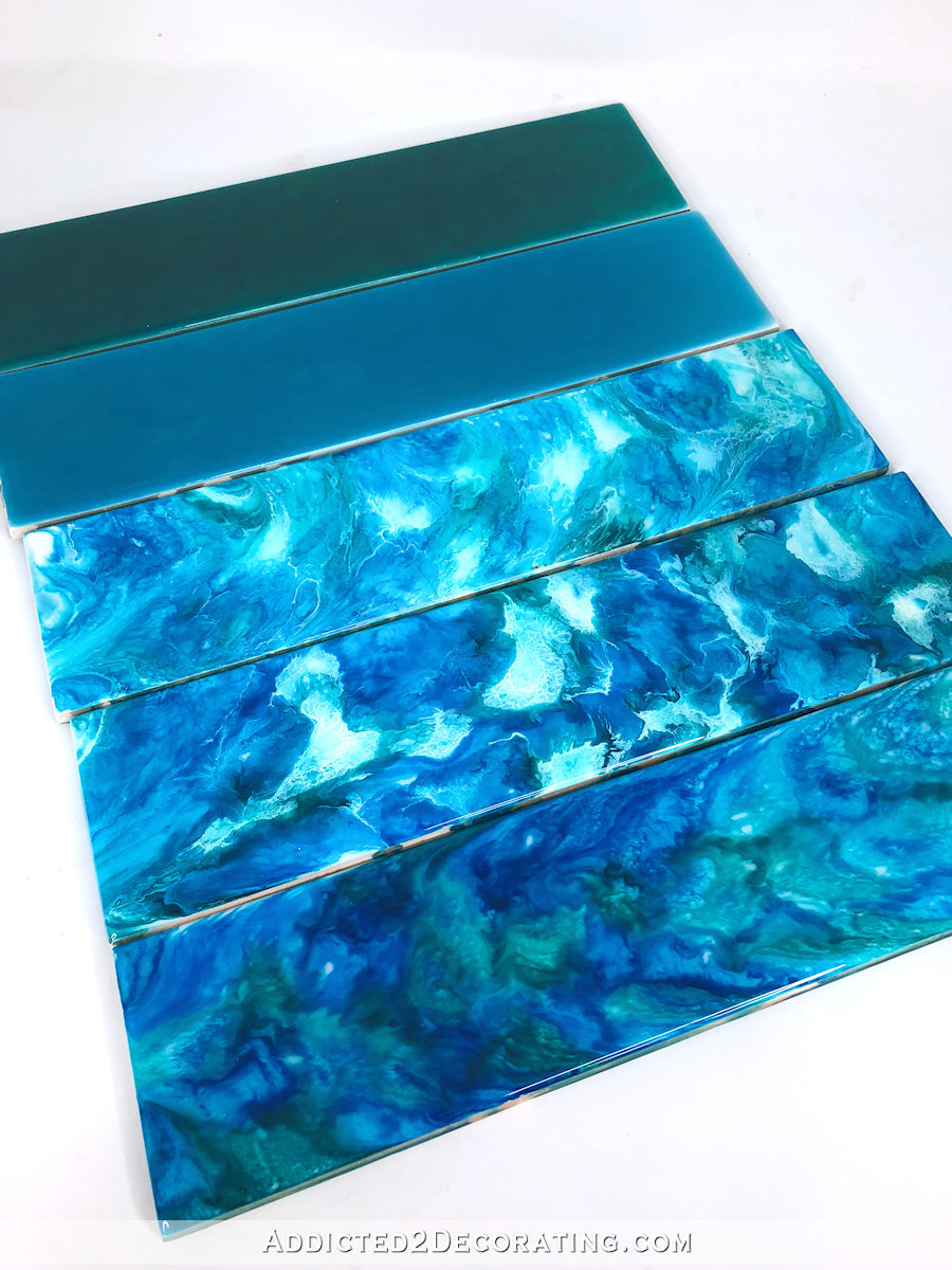
Anyway, here are my five test tiles…
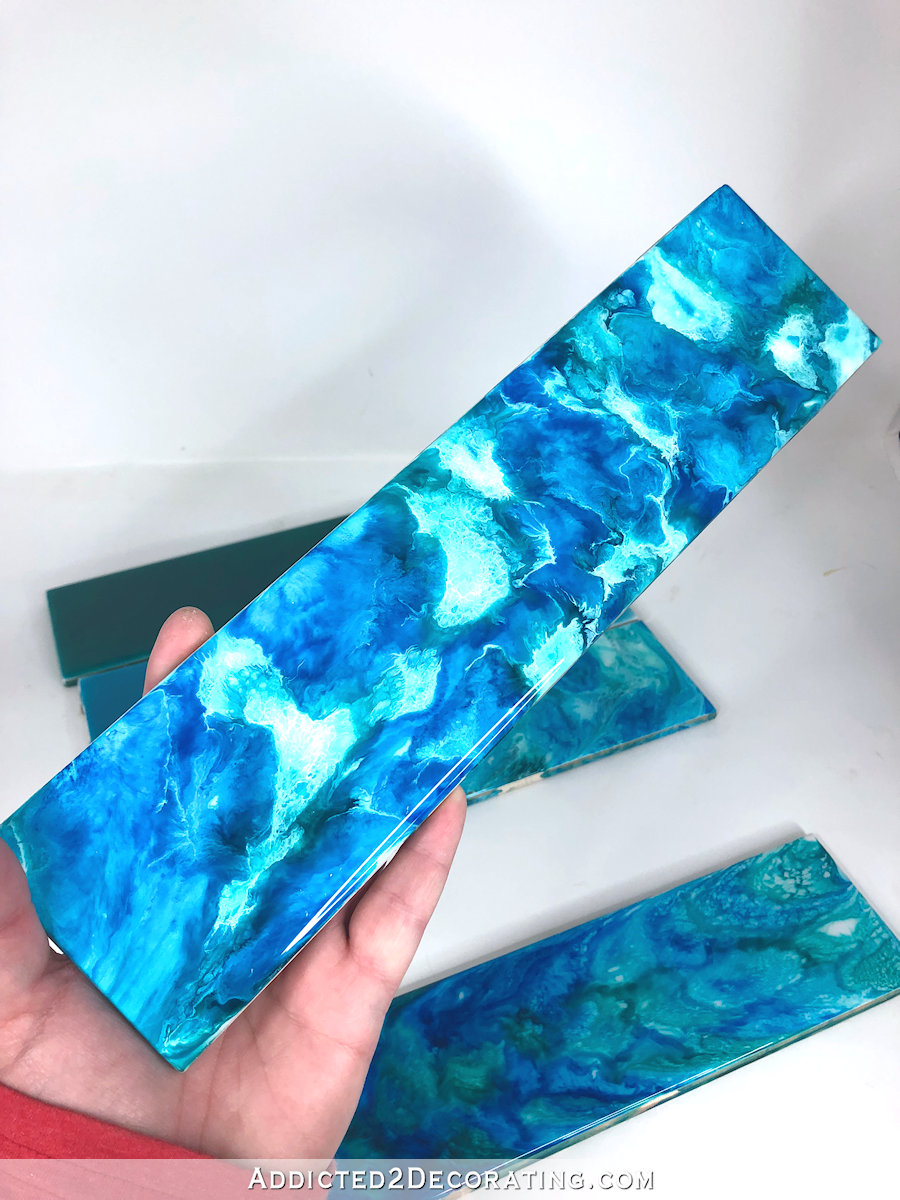
Resin tile test #1 – Blue alcohol inks dropped onto clear resin
For the first test, I used five different colors of alcohol inks in every shade of blue and blue-green I had on hand. (In the video, I said I used six different blues, but evidently I was using two bottles of the same color. 😀 ) The colors were:
- Pool (Ranger)
- Mermaid (Ranger)
- Sailboat Blue (Ranger)
- Turquoise (Ranger)
- Baja Blue (Jacquard)
I spread the clear resin over the tops of the tiles, and then dropped the alcohol inks onto the resin randomly. I wanted to cover the entire tile with drops of alcohol ink.
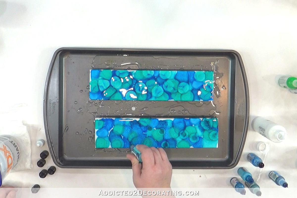
I failed to put those on a level surface to dry, so the inks kind of slid towards one side. But I actually thought the effect was pretty when the directions of the tiles were alternated. Obviously I’ll take more care to level the tiles if I decide to do this for the bathroom.
Anyway, here’s how these turned out when they were dry…
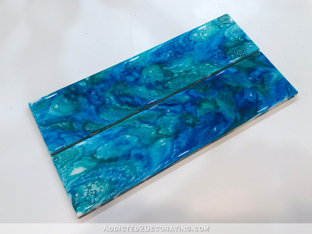
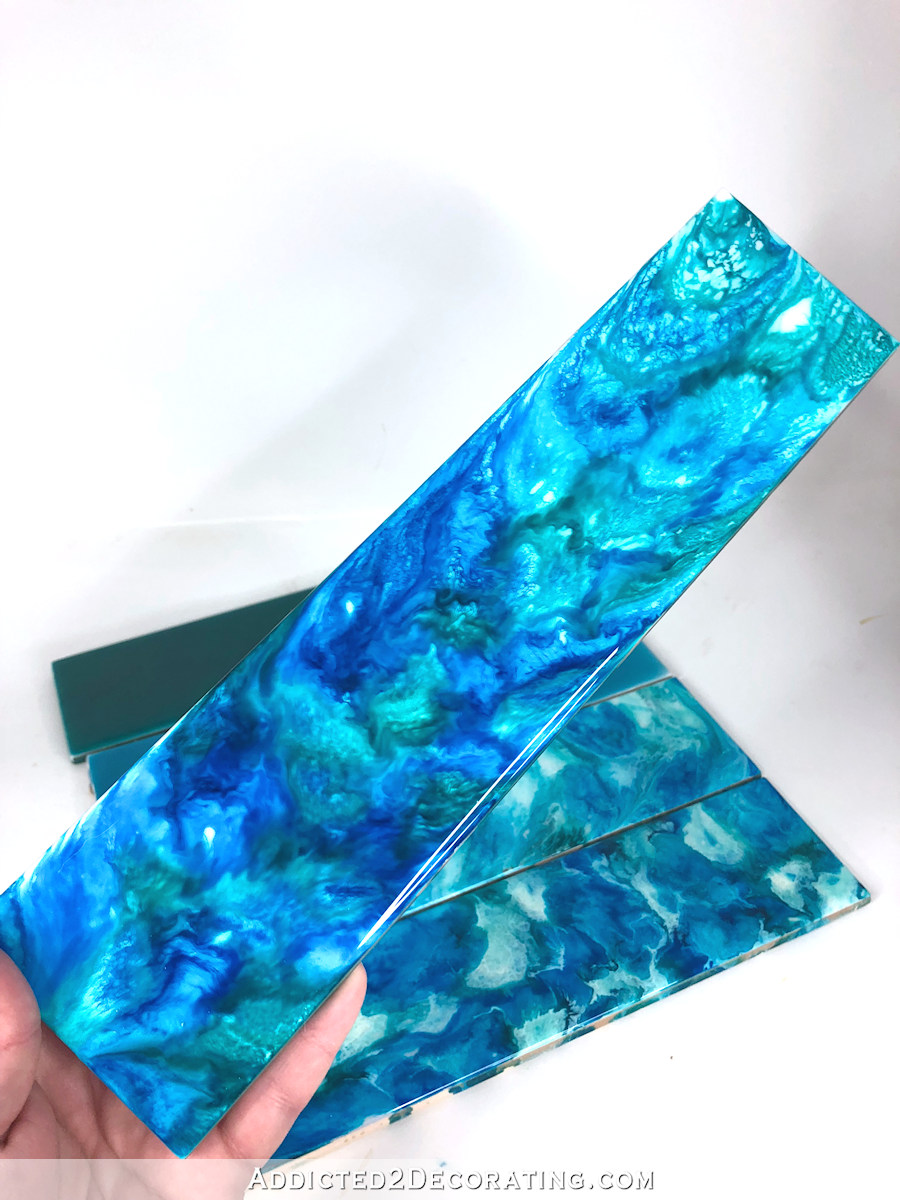
I realized almost immediately that the colors weren’t quite right. There’s way too much blue and not enough teal in these for my taste. So I would probably need to mix my own teal or see if I can find an actual teal in another brand of alcohol ink.
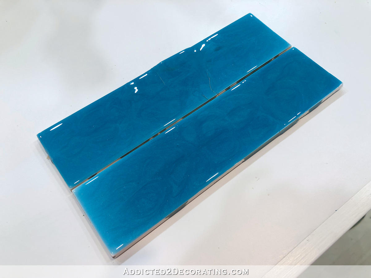
Resin tile test #2 – Blue alcohol inks and white dropped into clear resin
For the second pair of tiles, I used the same colors as above. But this time after dropping each color onto the tiles, I topped each drop with a drop of white alcohol ink.
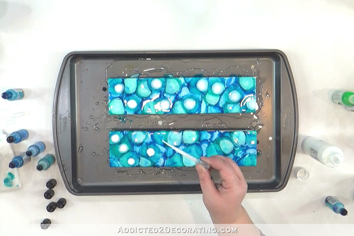
And here’s how these turned out…
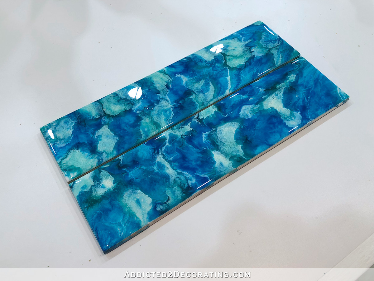
Of the three tests with the alcohol inks, these were my favorite. That’s not surprising, since these are the most similar to the pantry tiles, and obviously I love those.
The white gives it some excitement, while the simple palette of all blues gives them a more subdued look than the pantry tiles.
But again, those blues are too blue for me. I’d want them to be more teal.
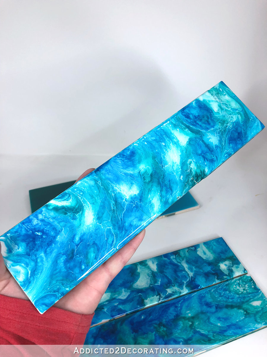
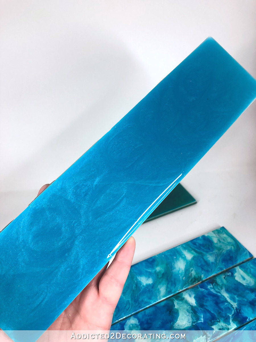
Resin tile test #3 – Blue alcohol inks dropped into clear resin and topped with white
For the third pair, I once again used the same blue alcohol inks as above. But this time, I put all of the blues on first (just like test #1), and then added white to the top once all of the color was on.
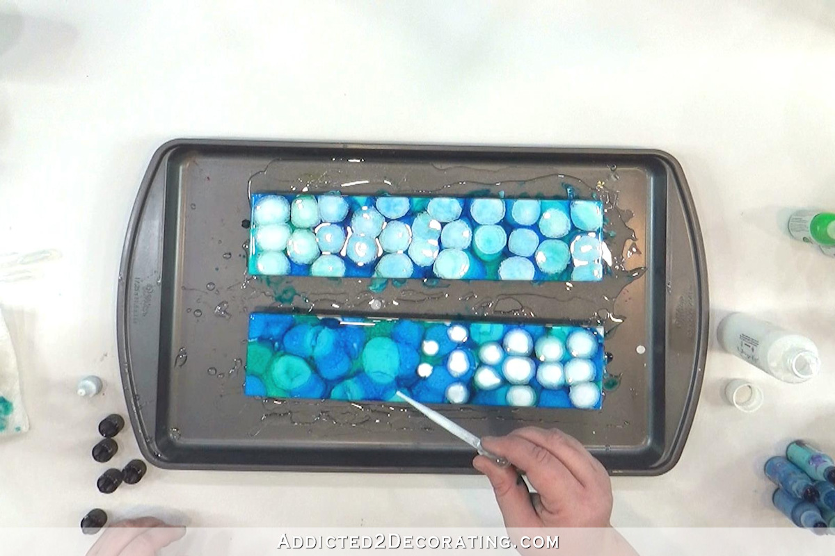
I also used a stir stick and heat gun to swirl and marble these colors together. Here’s how they turned out…
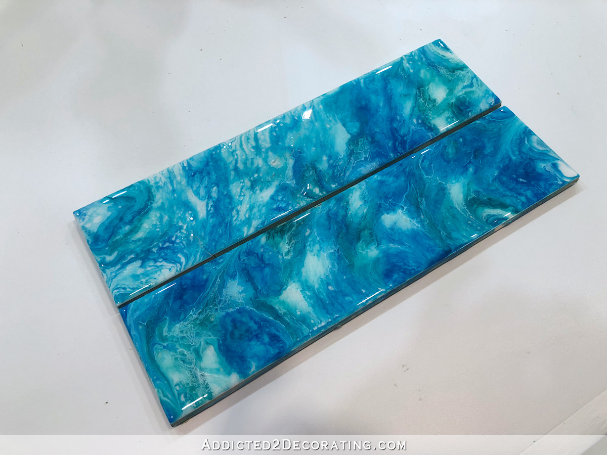
It’s pretty, but I don’t love it. But I can’t tell if it’s the marbled look that I don’t particularly like, or if it’s just that the colors are too blue. But as they are, they’re just okay for me. Nothing special, though.
Resin tile test #4 – Resin tinted with green and blue pearl tints
For these tiles, I used ArtResin tints in Pearl Green and Pearl Blue. I had never really used these tints before, and I wasn’t that impressed. I was actually pretty shocked at how much tint was required to get the depth of color, and even then, the color was still way too light for me.
And here’s how they looked when they dried…
I did end up liking the subtle color variations in the tiles, but I didn’t like the pearlescent look of the tints. And the tiles were way too light in color.
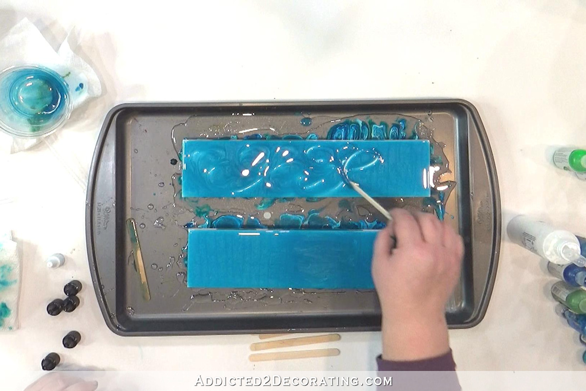
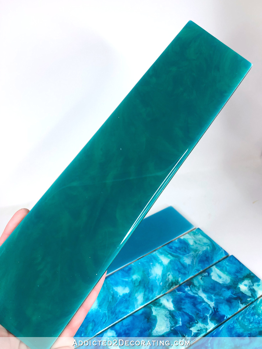
Resin tile test #5 – Resin tinted with green, blue and turquoise tints
For the final pair of tiles, I used ArtResin tints in green, blue and turquoise. But right off the bat, I mixed in way too much green, and then struggled to get the resin to even appear a little bit blue.
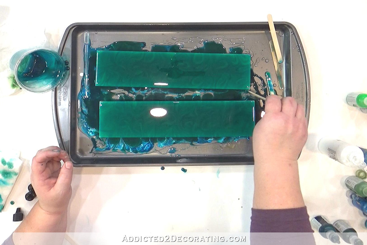
I ended up mixing more blue tint into the little bit of resin I had left, poured it on top of the green, and then swirled them around together.
This was a happy accident, and actually ended up being my absolute favorite of the five. While the color was way off, the effect of the two similar-but-different colors swirled together was just stunning to me. And I also loved the richness of the color, even though it was the wrong color. 😀 If I could get a bluish teal this dark and rich with those subtle swirls, I’d be ecstatic.

So while I didn’t find the one, I think I did narrow down the look that I’d love for my bathroom. Of course, there are entire weeks between now and the time this remodel starts, and y’all know how I change my mind. 😀 But it’s fun to play and dream and create.

Addicted 2 Decorating is where I share my DIY and decorating journey as I remodel and decorate the 1948 fixer upper that my husband, Matt, and I bought in 2013. Matt has M.S. and is unable to do physical work, so I do the majority of the work on the house by myself. You can learn more about me here.
I really like tile #5 in the dark green. To me a bathroom is supposed to be a haven and the action in the other tiles would be too intense for me. And, I like that it’s so green. That feels more relaxing to me than blue. BUT, you do you! Right?
I also liked the comments about laying a tile rug into the floor.
Super exciting!
I also love the dark green of tile #5. I would really like that in our bathroom when we remodel. It’s so calming and serene.
While I agree that the teal (#4) you tried isn’t dark or intense enough yet, I definitely think that’s the best look for an entire wall. Plus, the pantry tiles are so unique – I’d hate to see the same basic idea in another room. I also think more solid color tiles would give you the feeling of the inspiration bathroom. There’s plenty of ways to add in accent colors in a bathroom without having multi-colored or patterned tiles. A dark teal with a bunch of crisp white sounds divine in a master bath!
Beautiful! When you get the colors perfected, this is going to be perfect for a full wall.
Teal tint with subtle drops of white swirled in?
I would be curious how this method would hold up in a wet and soapy environment, particularly the cleaning methods to get soap scum, etc off of walls in a shower. Were you intending this to be in the shower area or just as an accent in dry areas of the bathroom? I’m also curious if there is a tile company out there that works similarly to the company you used for your studio wallpaper. where you could upload or send your perfect sample and they would create it for you. The amount of tile which could be needed in a bathroom would that size might take a REALLY long time to create. Just some thoughts. For what it is worth, I really like the last one too – subtle and saturated with color and interest.
***I would be curious how this method would hold up in a wet and soapy environment, particularly the cleaning methods to get soap scum, etc off of walls in a shower. Were you intending this to be in the shower area or just as an accent in dry areas of the bathroom? ***
I was wondering about this and whether the resin would survive the kind of cleaning necessary in a wet area of the bathroom. Even the ostensibly dry areas in a bathroom are subject to moisture through steam.
Regardless, the sheer amount of tile you would have to create even for one of the drier areas (the wall behind the vanity area or the tub) would result in extreme boredom for me. I would look for other avenues to indulge my creative impulses.
What about Fireclay Tile? They have a large quantity of colors, even teals and aquas. https://www.fireclaytile.com/subway-tile/colors
Beautiful recommendation. Simple and elegant. Thanks, Julie.
I love your work wish I was as brave as you they are all beautiful . I love the colors in number one.
I love the #4 tile and wondered about adding some gold in it similar to the gold in your pantry tiles. I can’t remember if you said what met al accents you were using in the bathroom. I can’t wait to see what you come up with!
My thought exactly – while reading I kept thinking, please, just a few drops of gold!.
Now that’s more like it. I can’t wait to go along for this ride. It will be stunning and personally perfect!
#2 or #3
I really like the last two, calmer versions – I guess for me, the first marbled versions would be way too busy in the bathroom where I’d mainly want calmth. I love your tiles in the pantry, but to me there they are different as I wouldn’t need a relaxing atmosphere in this type of room. I’m really glad, though, that you take on the challenge of customising your tiles, because this is what you do, right? and what I love your blog and you for 🙂
I like the solid colors for a change the others look too much like the pantry. Find the right color an make them solid colors!
You can use mica powder to tint resin. You don’t need a hole lot of it and it works really well.
I like the subtle swirl in the 5th option, it’s elegant! I would imagine the other patterns would be quite busy if you did counter to ceiling tile!
Not sure if you’ve thought of this, and I don’t remember where I read it….Warm colors in a bathroom will do wonders for your complexion, but cool tones typically bring out flaws like circles under your eyes or little veins. I know we don’t design bathrooms around how good we will look in them, but it doesn’t hurt! 😉
Also, another example from Fixer Upper (because I’m an HGTV addict) https://magnolia.com/our-show/episode-06-the-safe-gamble-house/
She used teal all over the house she did for her sister…I LOVE the tile in the kitchen, it’s such a pretty size and shape. The bathroom looks close (maybe) to the color you’re going for- I don’t particularly like the rugged profile of the tiles…pretty color though!
Burning question; will resin tiles “hold up” if used on properly prepared (Kerdi/Schluter) shower walls & pan???
I think the green color would actually look fabulous. It reminds me of the Kelly green kitchen inspiration photo you posted years ago. I think that color would be amazing with the brass fixtures.
The tiles make me think of a Vincent van Gogh sky.
I like the more “solid” looking tiles, especially if you are doing floor to ceiling. Are you locked into using that size tile? I wondered if you have considered the large tiles ( I think they are maybe 7-9″x 24″ ???) I think it’s a much more modern look, but not too modern.
Some if these tiles remind me of a serving tray that I saw recently. It was a few different colors of teal and turquoise with white streaks running through it like marble.
Curious about lighting in this space. How large are the windows and what direction do they face? What overhead lighting will be used? We recently remodeled our MBA from a very dark Venetian plaster to a light beige textured paint, keeping the same black granite, gold fixtures and wood cabinets. Even with the floor to ceiling window, it’s so much brighter and welcoming now. A space that really starts the day bight and cheery.
I have a question? Do the starting tiles have to be white? You have always used white but do they have to be white? I wonder what you could come up with if the base doesn’t have to be white?
I love option #4, it reminds me of the sky on a sunny day.
I love the top three tiles in your last picture up against each other. In that pic they seem to compliment each other.
Tile #5 is so beautiful!