Fireplace Makeover (Plus My Paint Color Trial and Error)
After reading every single comment that y’all left, and considering every bit of input that y’all gave me about my fireplace, I finally made a decision about what I wanted. It was clear that the dark gray wasn’t working…
The #1 suggestion was to paint it a lighter gray with purple undertones. I considered it. I really did. But I kept having flashbacks to this awful misstep…

Wow, that was horrible. So when it came down to it, I just couldn’t bring myself to do more gray. Heck, I’m still having a hard time adjusting to a gray vanity in my bathroom (as several of you predicted). I certainly didn’t want to put a color that I’m still not sure I even like on something so big and front-and-center as my fireplace.
I actually fell into the camp with those of you who liked the drama of a dark fireplace. The gray wasn’t working, but the dark factor actually works for me. I really considered purple, as in, a really dark, velvety purple. I tried a sample of some that I had on hand (Benjamin Moore Shadow, I think it was), but it was purple overload. With purple as the predominant color in the rug, purple curtains, and a purple fireplace, it was just too much.
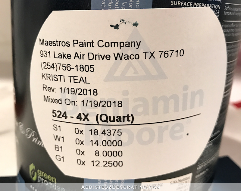
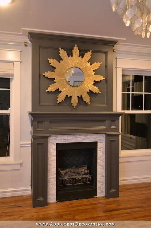
So the next natural choice was teal. Really dark teal. I had some Benjamin Moore Gentleman’s Gray on hand, which is more of a true blue, so I mixed a bit of green in it (some sort of Kelly green that I had on hand) to make a beautiful, dark teal. Then I had it color matched at Benjamin Moore. Here’s the formula for the paint color I used.
FYI, this is the same teal that I used on my sample board as an exterior shutter color option. 🙂
My initial plan was to try an idea that several of you had to just use color from the mantel down, and then paint the upper part the wall color, and the crown moulding the trim color.
I was so excited about that idea. It would give me the best of all worlds — the color that I so enjoy, and the perfect contrast to the light recliner that sits by the fireplace, while keeping the top light and bright. In my mind it worked, and I was certain that I would love it. So I got to work and got one coat of paint on all three sections, and…
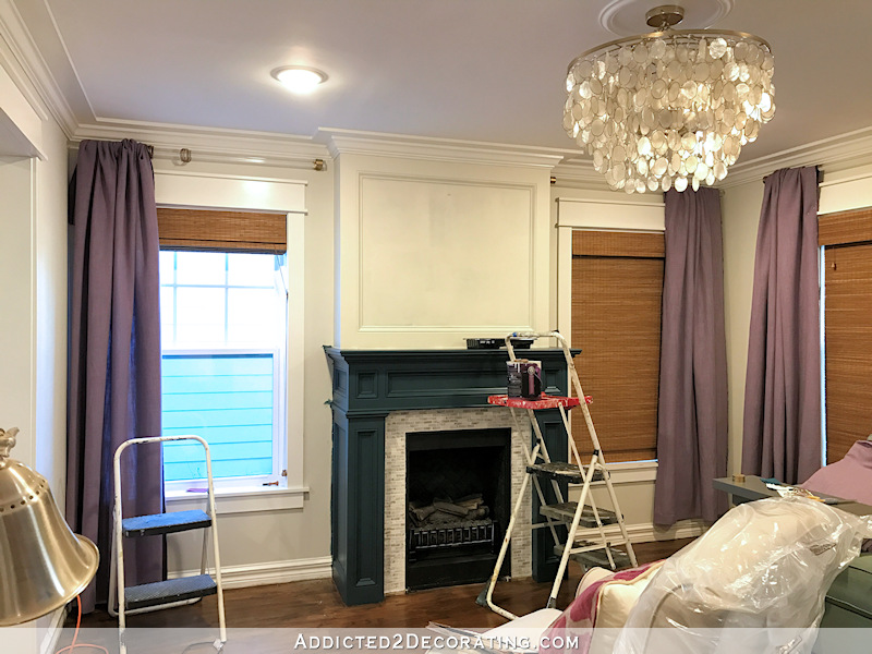
I hated it. I mean, I really hated it. I hastily threw those lengths of drapery fabric over the rods to see if that helped matters any, but it didn’t. I just hated it. (I really can’t say that enough.) But hey, at least I tried it so that I would know for sure! What I saw in my mind was definitely NOT what was happening on the actual fireplace.
But I absolutely LOVED the dark teal color. I had been wondering just how I was going to bring teal into this side of the room to balance out the big teal grasscloth wall just opposite the fireplace on the entryway wall. Well, this was clearly my answer — a completely teal fireplace.
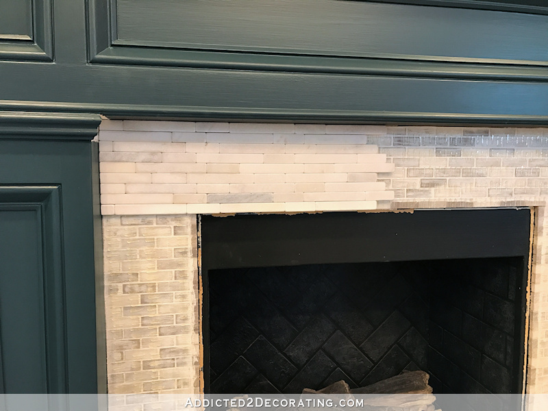
So I got the whole thing painted teal, and then decided I wanted new mosaic marble tile on the surround. And then I decided that this fireplace is never going to look real without a little hearth of some sort.
I tried the hearth idea before, but I built it up on a piece of 3/4″ plywood, and it was just too thick. And my goodness, that tile was busy! I was so disappointed because that tile was so much lighter than that right out of the package, but it turned dark as soon as I grouted and sealed it. I made a couple of bad decisions on the original fireplace.
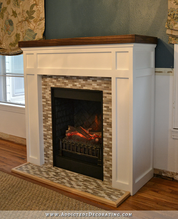
So this time I not only used much lighter, brighter marble tiles that were more uniform in color, but I also placed the hearth tiles directly on the floor rather than placing them on a plywood platform. So rather than being over an inch off of the floor like the original hearth, this time they’re only 3/8″ from the floor. I also framed the hearth with oak quarter round (instead of pine trim like I used last time) and stained it the same color as the floor.
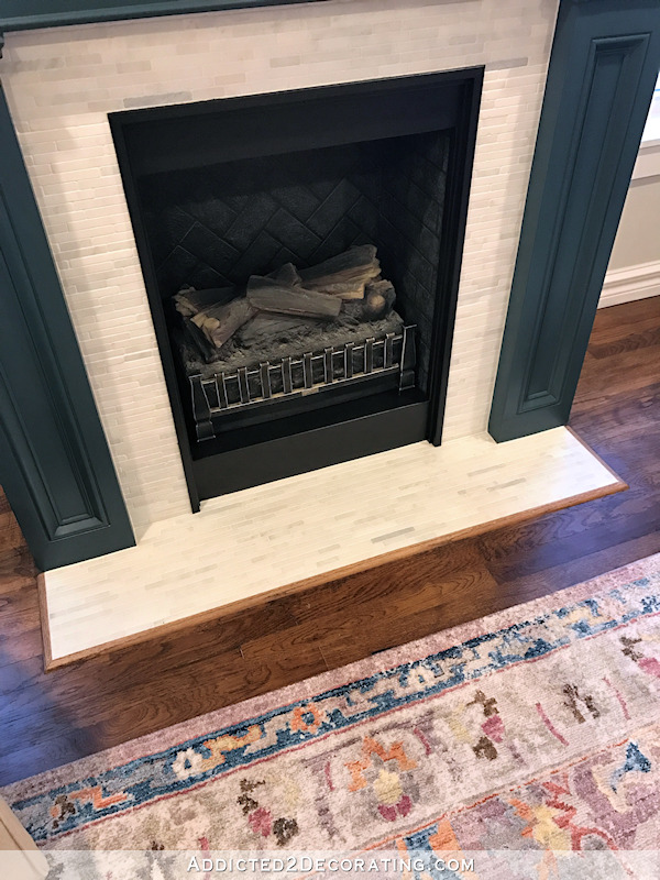
And on the fireplace surround, I installed the new tiles directly over the old ones.
I did the whole thing using SimpleMat Tile Setting Mat, which is basically a double sided sticky sheet that you use to adhere the tiles. I needed eight square feet for the fireplace and hearth, so one box did the trick.
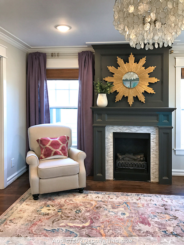
So here’s how the whole thing turned out — my dark teal fireplace with new marble mosaic tile surround and hearth…
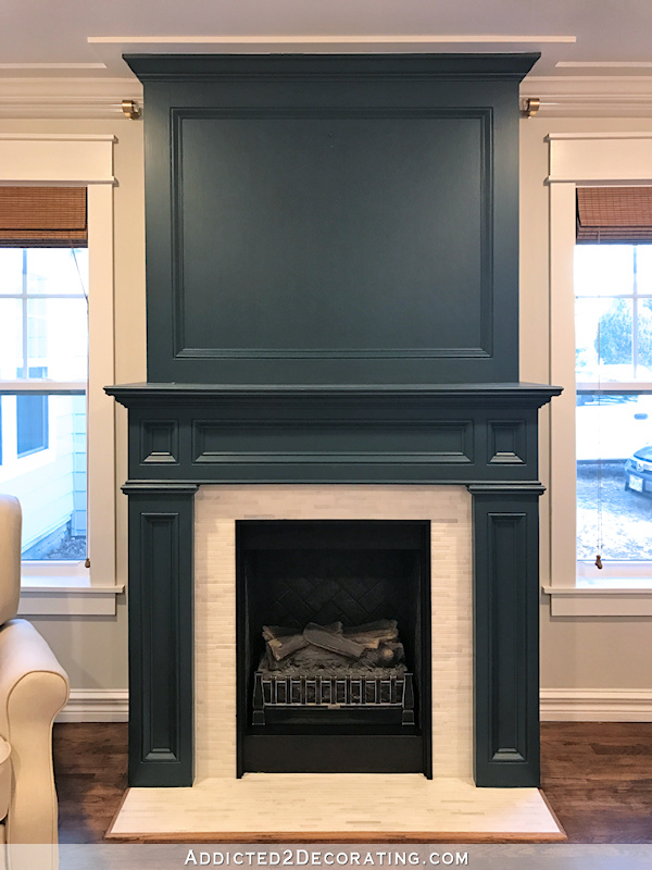
This is the picture that I took of it last night when I finally got all of my project mess cleaned up…

And here’s how it looked this morning in the early morning light…
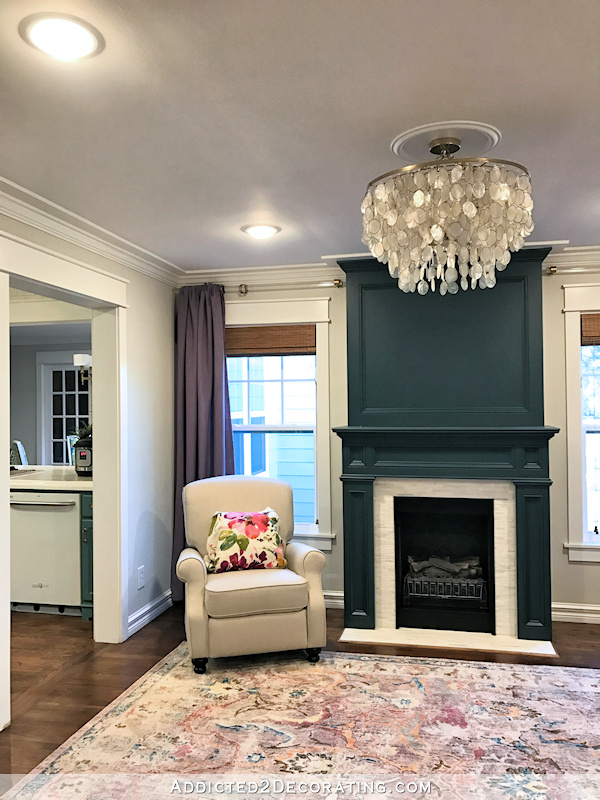
This teal makes me happy. And I love how it balances out the teal grasscloth wall that’s just directly opposite the fireplace. The room feels more balanced to me now.
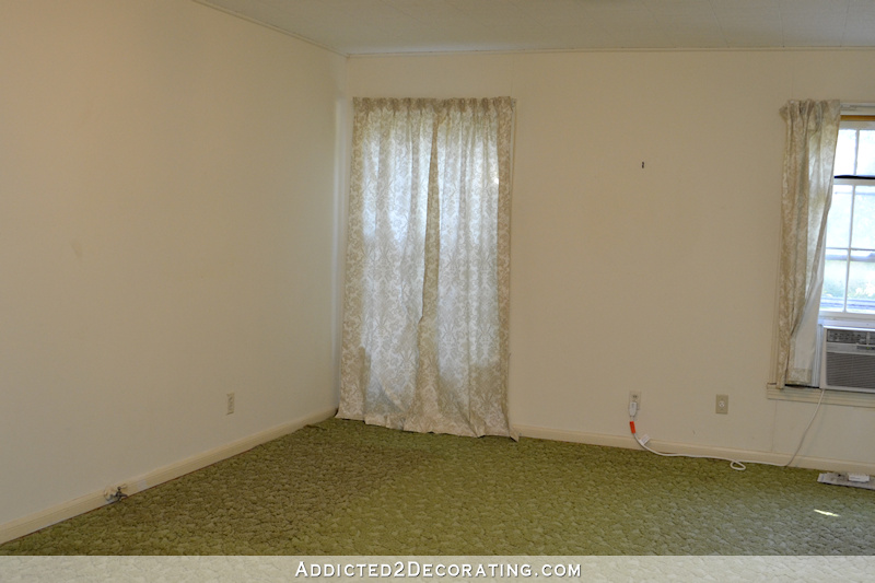
And because I’m all about the “before” pictures lately (I’ve had so much fun going back and looking at those these last few days!), here’s how this corner of the room started out…
In other news, the trim for my new drapery fabric arrived, so I have everything I need and can get started on them! I’ll probably wait until a rainy day to do that. But today is supposed to be sunny and warm, and my brother is coming over in a couple of hours to help me get started on the front porch. I’m very excited because I think the sagging roof is actually going to be an easy fix. I hope to have some progress to show you tomorrow.

Addicted 2 Decorating is where I share my DIY and decorating journey as I remodel and decorate the 1948 fixer upper that my husband, Matt, and I bought in 2013. Matt has M.S. and is unable to do physical work, so I do the majority of the work on the house by myself. You can learn more about me here.

I always loved the old fireplace but agreed it needed a change when the room changed. This looks incredible!
Homerun Kristi! It’s beautiful!
Yes! That’s it!! Well done I love it!!
DIITO
Love it! Please put the mirror back. I love it over the FP.
I agree!!! Put the mirror back!
I also agree. I really liked the mirror up there against the dark wall.
I vote for the mirror too. I love it and with the new paint color, it will be beautiful.
I had mentioned a teal fireplace awhile back! Yay! The changes (teal, new surround, hearth, and removal of the sunburst) all help a lot. Much more cohesive now. If you wanted to bring the sunburst back, I think you could, but only if you pearlized it a bit. For some reason the current gold looks a little heavy to me next to the light fixture and the rug.
Can’t wait for you to get started outside! You’re made so much progress out there. It’s time to make it a place you love to see when you drive up.
Regarding your bathroom, I know you think I’m crazy, but I still think really, really, really soft peachy-pinks are great for bathrooms, because they are great for complexions (when you look in the mirror). What if you did a super light peach-pink on the walls and a darker version of the same color on the vanity? Just an idea? 😉 😉
I love that you keep going. If you don’t like something, you change it and change it again, until it’s exactly what you want. That takes courage. And strength. I liked the grey, but this is gorgeous. You go!
Energy!!! It takes a lot of Energy!!! LOL! I love the new fireplace. I wish I had half the energy…
It sure does ! Where do you get it?!
I’m not in love with the purple curtains. Maybe it will be better when you work your magic adding depth and character. What do I know…I still haven’t finished my poly on pine floors from a year ago. I’m currently sitting in the back yard with the rescue dog I picked up last night. He needs company right? Ha ha.
I agree. Too often we see the before and only the perfect after from designers and bloggers. So I would always wonder “what’s wrong with me for changing my mind.” Kristi shares it all with us and shows us every change she makes until SHE is happy. Honestly, she is amazingly talented and if she can change her mind about a design decision, then the rest of us that are not as talented can change our minds also.
LOVE IT!
When you mentioned going teal I thought “No! Enough with the teal already!” But I have to admit, it looks great! It’s dark enough to read neutral with just a hint of the blue-green color. I was imagining a teal like your kitchen cabinets. This is much better. And the hearth is a huge improvement! It never really looked like an actual fireplace without it. Now it looks like it’s been there forever. Great job!
Perfect
It’s you…
Perfect.
“Kristi Teal.” Ha, I love it! The new color is gorgeous and the tile really pops! I’d love to see overall photos of the room with all of the new furniture.
It’s a big improvement all the way around. Just go back now and look at that greenish-grey. The color is very pretty and is nicely reflected in the rug. And, the new tile is beautiful. That being said, it’s different than what I would choose, but isn’t it nice that we aren’t all clones!
I miss the sunburst mirror!
Oh my goodness, this is it, this is ‘the’ color for your fireplace! I loved the dark grey, but now with your new curtain fabric, this new ‘Kristi Teal’ color is absolutely perfect, together with the new tile and hearth. Awesome job Kristi. Well done!!
Looks great! I’m two for two on suggestions. LOL
Instead of the mirror, I think you need a piece of art that has some purple in it. It will act as a bridge between the purple drapes and the rug and tie that whole area together.
I agree.
You know, I almost commented in the original post that I liked the teal splash of paint you had on there that you said to ignore. And since I love teal, I almost suggested you go that way. Well this is just stunning. I think it’s my favorite project ever. And I’ll be copying that teal paint color you can be sure.
I felt the exact same way! I kept thinking, I know you want me to ignore the teal but I CAN’T!!!
Wow, that looks really good!
A couple questions .. How does that teal look with the teal on your kitchen cabinets and with the ones you painted in your hallway? Also, will you do just a single panel on the windows that flank your fireplace or two? My vote is one.
I personally think all of the teals flow nicely together. My cabinets are much lighter than the fireplace (obviously) and my hallway doors are quite a bit lighter as well, although they look pretty dark in the hallway. But I think they all complement each other.
I still haven’t decided on the draperies. I’m going to try both ways (just by pinning the fabric up there) before I actually start sewing. The thing I like about one panel is that it at least leaves one side of the top window moulding visible. And I love my window trim. 🙂 But to my eye, it looks more balanced with two panels on each window. It also makes the room look more closed in, though. So all that to say…I don’t know. 😀
I vote for one also.
Another vote for one curtain. I’m not going to say, “You should,” but in a narrow space, I think two curtains would cover too much window, but that’s just me. I love this paint color and this version of your fireplace! Is this the original gas insert?
It’s actually an electric insert. 😀 We used it the first year we had it. That’s the year we didn’t have any heating in our house, so we warmed our house with space heaters…and this electric fireplace. But I haven’t used it since then for heat. I do turn it on periodically without the heat — just the flickering lights for the effect.
I’m in love !
Oh my gosh I love it!! I seriously didn’t know what you were going to do but this is perfection!! Way to go Kristi!
I’m on the sunburst wagon…please try it and send us a picture! Great job on the fireplace. I love it!!!
*sigh* it looks really awesome! Great job and great choice…love it
Love the teal! Love the tile! Love the hearth! Simply amazing from the before picture! I love your blog!
I did not think I would like this but its beautiful! And I like how you made your own paint color too! So neat!
Looks awesome!! Super outcome here, better than light gray I think even if you had liked gray. The hearth is beautiful.
What kind of paint did you use from Benjamin Moore and what sheen?
Oh my goodness, I used Aura in an eggshell sheen, but please, please DO NOT EVER use Aura on cabinets, trim, doors, or anything else like this. I absolutely love Aura for walls. It’s amazing stuff — one coat and done. But for something this large that I painted with a brush, it was a nightmare. It gets sticky so quickly, so I’ve got brush strokes everywhere. Thank goodness it’s eggshell sheen, so they don’t show for the most part.
If I had to do it again (which hopefully I won’t do for a very long time), I’d use Benjamin Moore Grand Entrance paint. It’s their “front door” paint, and it’s actually what I used on my front door. I always think paints like that are a little gimmicky, like it’s really no different from anything else, but it’s just a way for them to label it as something special and charge more money. But I decided to try it, and I LOVED it. It goes on so smoothly, it stays wet a good amount of time so that you don’t get brush strokes, and it’s just so easy to use. If I could go back in time, I’d gladly pay the few extra dollars to have my dark teal mixed in the Grand Entrance paint.
Thanks for the reply! I have a door project this summer and I will check out the Grand Entrance paint for sure!
Very lovely!
Love the new fireplace color, and LOVE the rug. Sadly, I am not a fan of that chair, pillow or draperies. It is like “Architectural Digest meets Target/Wayfair”. Just my opinion.
The draperies aren’t sewn yet. Right now it’s just lengths of fabric draped over the rod, and they look like cheap shirred-on-the-rod curtains, but I can assure you they won’t look like that after I sew them. And the floral fabric is just draped over the pillow form just so I could see some color on that chair.
Ouch.
I love it! It is beautiful!! I cant wait to see the gold starburst on it. Btw, i’m one of the culprits who feels that vanity color will be changed at some point! Lol
Looks great!
Love, love, love the fireplace. That blue is fantastic, perfect for your space and can picture the balance it brings from the grass cloth on the opposite side, love it. Its also a lovely back drop to your chandelier.
While you wait for a rainy day, before your purple drapes are completed……what about trying white cotton sheers???? (On rings that match curtain rod metal) Seems like it would keep the room light and airy and tie in with the trim and curtain rods.
Thanks for sharing your space, projects, creativity and process. It’s a fun journey, thanks for letting us join you.
I’ll stick with the purple. 🙂 White curtains just aren’t me. My white curtains in the breakfast room are the one thing I really don’t like about that room. Every time I go in there, I dream about some colorful and/or patterned fabric on those windows. I know most people love “calm” and “neutral” and “matching” and loads of gray and white, but I’m just not most people. Through this process I’m learning more about my own taste, and what I’ve discovered is that I almost can’t have too much color or pattern to satisfy me. I like colorful, and even rooms that border on busy. 🙂 I know it’s not for everyone, though.
Can’t wait to see how you pull it all together, you always bring that little extra something to your projects. Especially love the music room black pen touch you added recently.
I have white curtains I just put up in the den that I’m not sold on yet either, but I’m waiting to see once the whole room is completed…..so I understand your feelings on your breakfast room. However, in my living room I have white cotton sheers that I love because they don’t read as a true white, just add texture and softness.
Once you get the little “courtyard” in front of your breakfast room windows landscaped, you may feel differently about the green-trimmed white curtains. With colorful plantings in place you may appreciate their framing of the lovely view outside. Patterned curtains will distract the eye from the view.
Looks great. The surround tile is a big improvement — but I never would have thought of it because the tile you had looked nice. It is so nice for you to share your thinking process to help us all become more flexible in our problem-solving! Thanks!
Whoa, Nellie!!! Gorgeous!
Love it! That marble changes everything! I had voted for all white bc it was too busy before…but now I see it was that tile that was busy! And the teal balancing the grass cloth pulls it all together! 😸
The teal shade you created is beautiful and it pulls the color from the rug very well. Choosing to reface the tile with a whiter marble look was the best idea and the hearth is fantastic. So glad to see you finding your way. 😉
Supreme results…Kristi Teal…I know you are wanting window balance and just received your trim yea! Are you running down the panels with the trim? If so I think the one panel on either side of the mantel showcases the trim, panels and show lovely windows when pulled to the side. I think the two panels instead of four will tie the whole wall area as one cohesive space. Love the lilac now with your choices.
I agree, Linda Southworth, about the trim being showcased best with one curtain on either side of the fireplace.
Absolutely gorgeous!!! I wasn’t crazy for the gray at all. I’m just not into gray. But this….. Oooolala!
Holy sh** I love it! It flows so awesomely (is that a word??) with the kitchen cabs!
My poor husband, I’m now inspired to make over our fireplace…
Kristi,
I love your use of color! I would never criticize your choices and decisions with your home but when you chose the dark grey for your fireplace it made me sigh a little. I was dreading the bland grey takeover of your vibrant home. You were my last color holdout in the white/grey washout all the other home blogs seem to be going to. The fireplace makes me smile! Thank you for taking risks and do-overs. Thank you for sharing your home and your love of color.
I also despair at the gray trend and am so glad you embrace color. While I love teal, the fireplace isn’t me…yet. You always win me over in the end.
I agree about the washout in almost all blogs. When I look at all the design Instagram accounts I follow, it just seems to be a sea of white and gray! We’re hoping to retire in AZ at the end of 2019, and I’m thrilled with the idea of decorating in colorful Southwestern style.
I am so in love!! Teal is one of my favorite colors so in my mind you can’t go wrong with it. I love the way is brings out the teal in the rug also.
Looking forward to seeing the progress you are hopefully making on the outside.
Joyce
LOVE it! Plus I love the second pillow covering (more design) than the first pillow in just the pink (ish). It just seems to work better to my eye.
Looks great-especially like the marble tile! Would you suggest the BM Grand Entrance paint for furniture as well?? I have several redos waiting……thanks!!!
If you have a piece that you need to paint with a brush, I do think the Grand Entrance would work very well. Of course, if it’s something with a top that you’ll set things on, I still love the combo of a cheaper paint (like Behr) with Floetrol added, and then topcoat with General Finishes High Performance Topcoat in the sheen of your choice. I love the matte finish. It’s a bit more work, but for durability on surfaces, you can’t beat the General Finishes topcoat.
Thanks so much for responding, Kristi! I like the GF topcoat as well, but have been curious about the Grand Entrance paint. We’ll definitely have to try that on our front door!
So happy you stayed with a dark Color! And this one is perfect! And the tile change is perfect! I like the one panel curtain. But I know I will love whatever you do.😁
I really liked the old fireplace but this one is very nice, as well. If you’re happy, we’re happy!
SUCH AWESOMENESS & PERFECTION! Kristi Teal is gorgeous & the white marble is to-die-for! I do love the starburst, BUT I feel that it competes with your gorgeous light fixture & it’s always appeared just a little too big for that spot since it overlapped the moulding in some spots, in my opinion. Maybe just an art piece instead OR how about nothing at all. Is it mandatory to have anything hanging there?
PS…The coral front door is fabulous! And I may be alone in this thought, but I’d like to see the Kristie Teal on the shutters!
I really like how it turned out so beautiful. I love how it picks up the color in the rug.
When I look at the gray fireplace with the star burst, everything is blened in and you don’t see all of your wonderful trim work. I was wondering if you had considered painting the rectangle just a shade lighter to show a little more dimention? Thanks
Your teal grasscloth really needed that teal fireplace. And the purple curtain look wonderful with it.
Loose those curtains.. It takes away from your beautiful window frames..
Wow that looks fantastic!! Isn’t it nice when it finally clicks.
Please explain the simplemat you used. Have you used it before? Reviews on the size you used are 5 star but the reviews on the larger box has 2 stars.
Love the purple and teal thing going on! Beautiful choice.
WOW!! This really looks stunning! I am so happy you decided to keep it dark. It looks fantastic and will complement your whole house now. That teal is the perfect color too….PERFECT!
I like it. The teal is a good contrast to the lilac drapery, and as you said, balances the opposite side of the room. Glad you built the hearth too, it brings realism to the fireplace. I would probably have just painted the fireplace the same color as the trim, but you’ve brought it to life and made it the true focal point by painting it teal. Good eye, Kristi!
Looks AWESOME!
You must have forgotten about using paint conditioner (Floetrol)? Gorgeous end result anyway!
I initially tried it right out of the can, and when I saw that the paint was getting sticky too soon to eliminate brush strokes, I did add Floetrol. It didn’t do any good at all. I was shocked.
I wish I was as brave as you with colour, I love it. It commands attention.
What a great idea and execution, Kristi! The teal is beautiful. So is the new tile. You know the choice of that rug is the winner for me. It sets the mood of the room. Each thing you add pulls a color out of it. I would love to see a piece of art that you love for the fireplace. Just today, seeing the light fixture and the mirror together struck me as too much. I concur with several, two panels per window might crowd the space.
Okay, a little story for you. I made you famous at a paint store today. I live in Macas, Ecuador, a city of about 25,000 in the Amazon area. So, I went in to get some paint–the color choice is a bit daring– for a three-drawer cabinet in my living room, which will be the focal point of the room. The owner has a dead-eye for color, which he hand-mixes. No computer help. So, I said, “If the color doesn’t work, I can always change it.” Who does that sound like? (Actually, I have an idea what I will do if it needs doctoring. A glaze over it, but that’s another story.) He looked at me really funny, since here no one gets very inventive with paint. I pulled out my iPAD and to show him and his wife and other customers, what you are doing. He was so impressed with your skill, talent, and ideas. He wants to see your finished room.
Oh my goodness! I love that story! 😀 Thank you for sharing my blog with them! And I hope your paint works out perfectly. 🙂
oh, this really looks like you (and I mean that in the best way possible!!) and the colors are all so pretty together! Great job with the color selection!
You are so brave with your color choices. Good for you. I hope you make a painting(or your mom) that pulls both colors together. They seem to be looking at each other as if they just met!! You need something to tie them together.
Kristi, what happened to the beautiful landscape painting that, if memory serves, your mother painted? Would it work over the fireplace?
I do still have it, and I want to find a place to use it. But I have an idea for a piece of artwork that I want to make for the fireplace that will be light and bright with lots of color on a white background.
That is what i was thinking. That you should make the art! I am still waiting for you to sell some art, I will be first in line. I really like the entrance trio you did, I would choose fall colors for mine.
I love this!! What a great choice! Your living room is divine!
This really looks great. When I read that you were sticking with a dark color, I was bummed. I thought the dark gray with the purple was so heavy looking. That all changed when you pulled the panels to the outside wall. I love that. My vote is to keep it simple with 1 panel/window.
Kristi, your home is gorgeous! I’ve refinished a few pieces, but my paint often ends up being sticky. How do you put so many layers of paint on a piece and not have it feel sticky or look like it’s been painted too many times? I’m terrified of that, “This kitchen is 50yrs old and every family that lived here painted it a new color. No wonder the cabinets don’t close,” look.
Haha! I know what you mean! I’ve often thought that by the time I’m finished with this house, the square footage of the rooms may have decreased just simply from the number of layers of paint on the walls. 😀 So far, my fireplace is fine, but even as I was painting it this time, I thought to myself that I need to slow down the pace of repainting it, because eventually, I’m going to have to strip it before I add more paint. I have no idea how many more layers it can take before I get to that point (I imagine the crevices in the moulding and the inset panels filling up with paint), but I’d rather not find out. 😀
I love it now! If you hadn’t done the new tile and the hearth I don’t think it would have looked nearly as good though. The whole thing is perfect for your home! How does it look with the kitchen since the doorway is right there? I was thinking you might have gone back to black for it but was happy you chose teal and black didn’t factor in. I wonder if the gray would have been better with the new tile and hearth, it makes such a big difference.
I personally think it looks beautiful with the kitchen. Last night after I finished it, I sat on my loveseat in the living room, and just took in all of the colors and patterns. I loved it. I hope to get a picture (or a few) for y’all that shows everything together. As far as the gray goes, I still don’t think it would have worked even with the new tile. It would still have that dark green undertone that just didn’t work in the room. And I’m glad, because I love the teal so much more than the gray! This just feels more “me”.
I’ve always thought the gray tile you had was too busy and didnt work with your colours and definitely too gray for your tastes but I would have never suggested you change it because it seemed more permanent than paint and I didn’t want hurt your feelings. But now that you changed it I will say I’m so happy it looks so much better. I’m so glad you weren’t too scared to redo even tile! I should have known–you arent ever afraid to redo something if that’s what it takes. I like the rectangular tile shape much better than squares too! The teal looks awesome too!
That was my concern when you asked…..balance on both sides of the room. It is darker than I would have chosen, but looks good. So glad you are happy with it. Thanks for sharing all you do. It is so FUN watching it evolve.
I absolutely love that your name on that paint mix is Kristi Teal. That should be your real name. 😉 You nailed it with that fireplace. It’s amazing how a couple little changes really pulls it all together. So many people would just try to work around that tile color but I love that you aren’t afraid to change your mind and you just go for it. It really helps as we just built and I’m trying to think of how to decorate our home.
Perfect! It just says “Kristi”!
I love that they named your paint Kristi Teal!
I think Kristi Teal will be a trending color soon 🙂 I pinned the finished photo of your fireplace to show my woodworker for inspiration as it’s almost exactly what I am wanting: tailored and sophisticated but not stuffy and old looking. Really lovely work you do. Thx for sharing.
Please, please, please tell me where you got that gorgeous capiz light fixture? I have been looking for one like that for a long time.
It’s from Horchow. I bought it on sale, so hopefully they still have it and you can get a good price!