New Hallway Bathroom Vanity Paint Color
I’m hoping to have the full hallway before and after post this week (I’m still working on that cabinet drawer), but I kept thinking that no matter how finished my hallway is, that bathroom vanity was going to muck up my pictures with its clashing teal color and random color patches where I tested various paint colors. I couldn’t let that happen. 😀
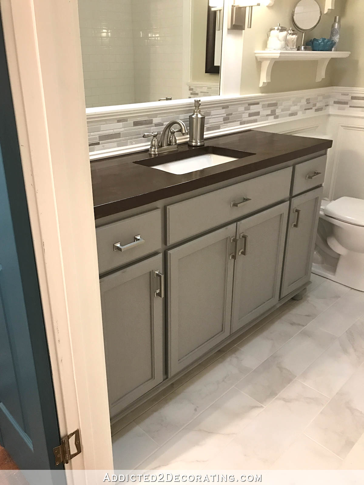
So yesterday I made a quick color decision and just went for it. I tried out Benjamin Moore Classic Gray, which is what I have on my walls in the breakfast room, living room, music room (as the darker areas of the stencil) and hallway (as the darker stripes), but it looked so completely washed out (almost off-white) in the bathroom. Then I tried Benjamin Moore Kendall Charcoal, which is what I have on the console table in the hallway, but it was way too dark and dreary.
Then I had the brilliant idea of mixing those colors in a 1:1 ratio. It was just the gray I was hoping for.
After rejecting the gray trend for so long, this whole gray thing is still quite new to me. It does seem a bit shocking to walk by that bathroom and see so much gray after seeing a dark teal vanity for so long…

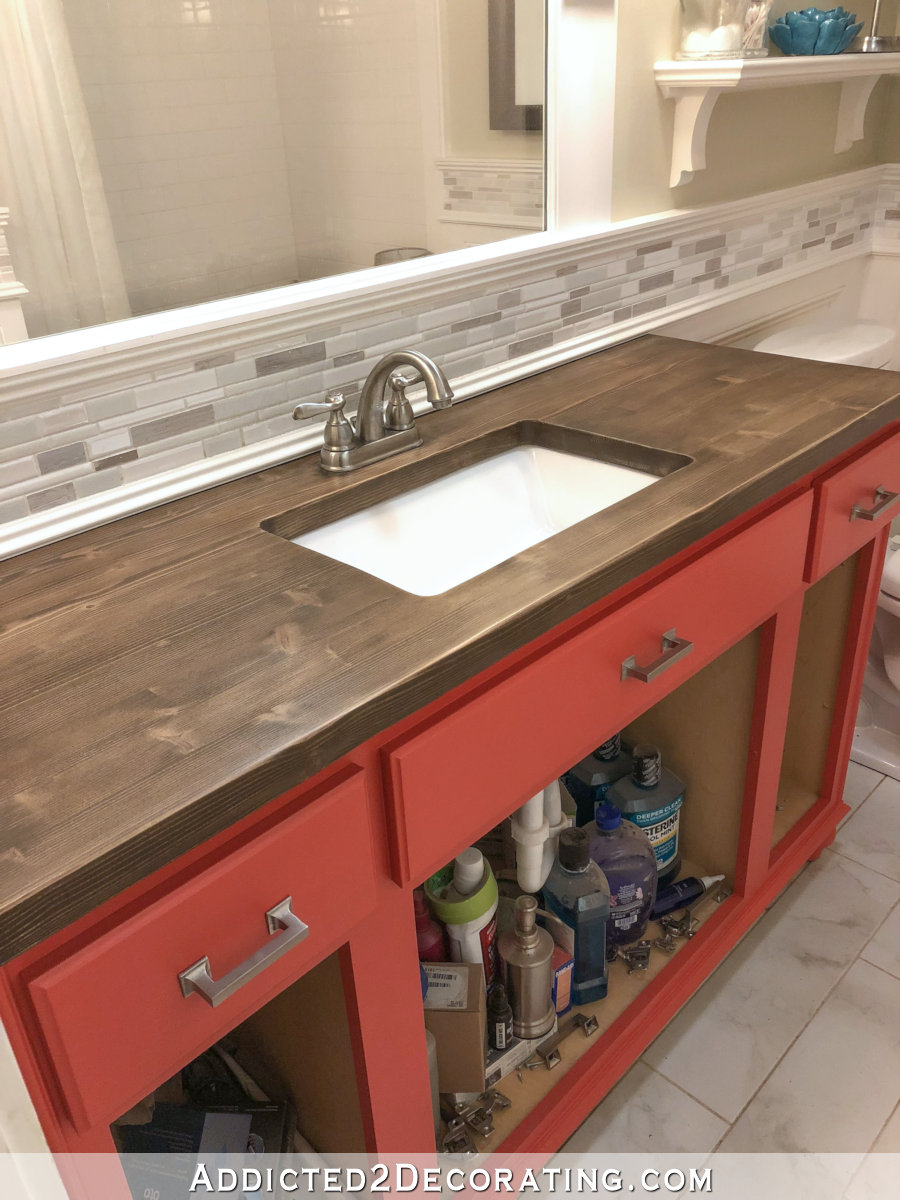
But I do really like the gray with the mosaic tile accent and the floor tile. And I think it looks cohesive with everything going on in the hallway.
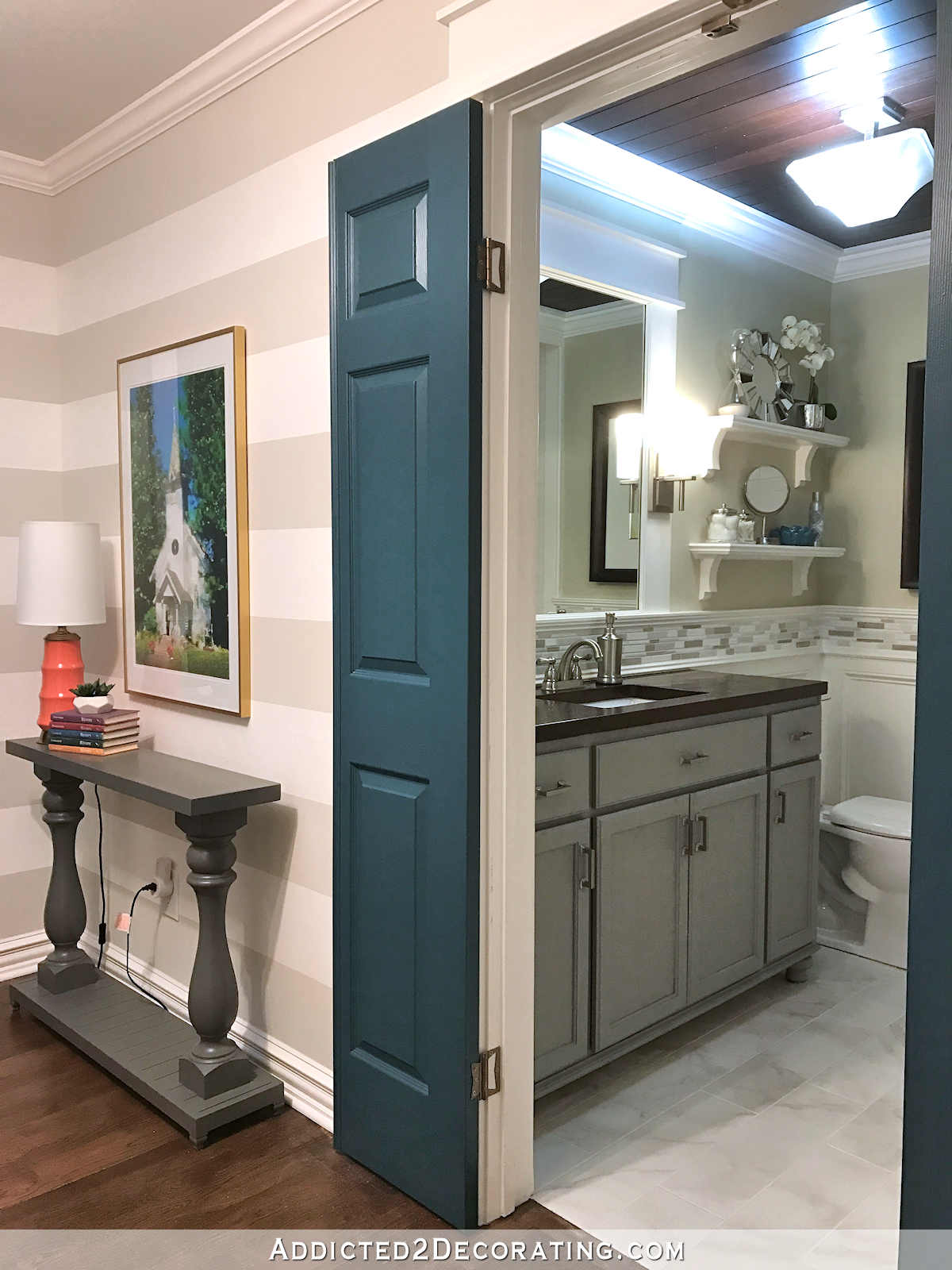
I’ll keep the light green wall color for now, but I might rethink that in the future. And by that, I mean next year. I’ve got more than enough to focus on this year. 🙂 At least for now, the bathroom isn’t clashing with the hallway, so I’m pleased with it. And now I can finish that drawer (or rather drawers — I made a bit of a design change) on the hallway cabinets and get this hallway completely finished.
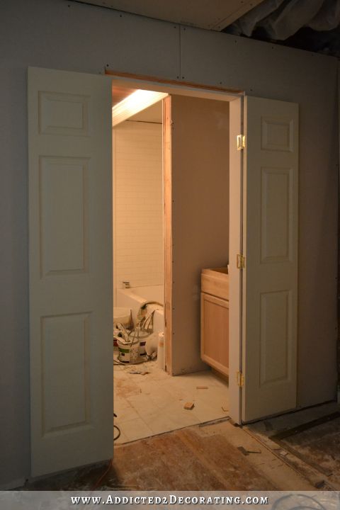
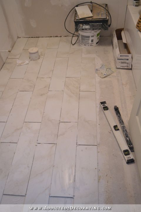
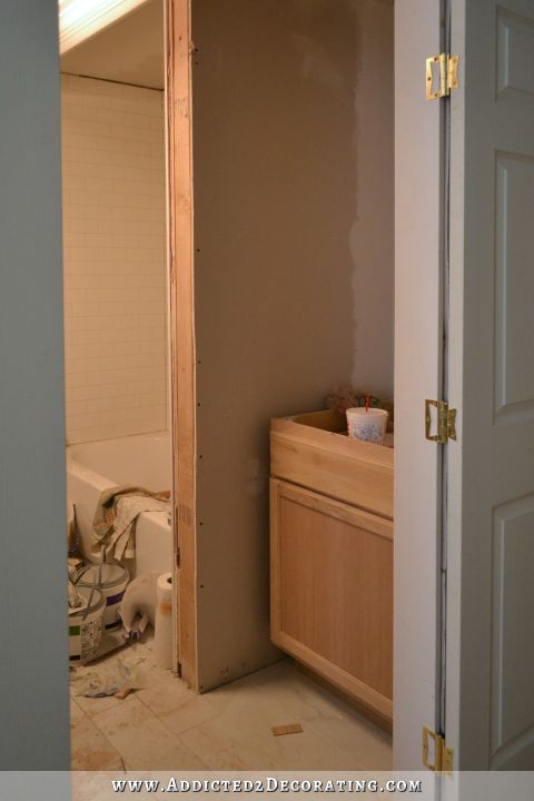
By the way, if you’re new to my blog, you probably missed this bathroom remodel! This bathroom used to look like this…
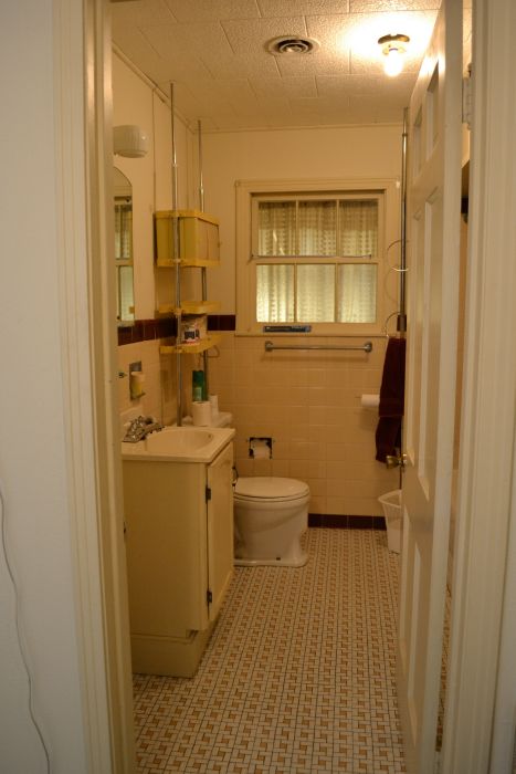
So I tore it down to the floor joists, wall studs, and ceiling joists…

…and then completely rebuilt it so that it looked like this…
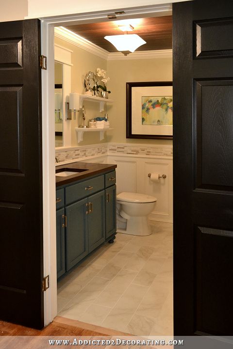
You can click here if you want to see the whole before and after post for this bathroom remodel.

Addicted 2 Decorating is where I share my DIY and decorating journey as I remodel and decorate the 1948 fixer upper that my husband, Matt, and I bought in 2013. Matt has M.S. and is unable to do physical work, so I do the majority of the work on the house by myself. You can learn more about me here.
Swoon! It all looks so nice!
It looks very nice with the backsplash and pulls the whole bathroom together. Check it off your list!
I like it a lot, but i know how much you love color. I would bet that in time you will change the gray. Lol
Another perfect custom mixed color by Kristi. The color goes so well with both the mosaic tile and the floor tile. Well done, another item already checked off your 2018 list. Congrats!
I LOVE IT.
It may not clash with the hall now, but it is lackluster now too. The blue was so beautiful and elegant. Black would look better in my opinion.
I agree with Carol F. I’ve been so use to seeing color in all your remodels. You definitely are going in the opposite direction. Nothing wrong with that. It’s your house and your choices. I will continue to follow along with you because I really like seeing what you do. Happy New Year.
Keep in mind that several rooms are far from done. There will be plenty of color when all is said and done. 🙂
I so disagree. The teal in the bathroom was awful. So much better now.
I love it!
I LOVE it, but gray is my thing. I think gray is a the most elegant neutral…clearly, because I have 5 different shades of gray in my home. When I deviate, it’s usually to crimson or navy, both of which work beautifully with gray.
It’s not one of your typical colors. You seem to gravitate to brighter, more vibrant colors, so I hope you’ll be happy with it. It’s beautiful, and works so well with the colors in your tile!
Ooh! I’m another person that loves gray, I’ve been using it for 45 years!
Kristi, the custom mix gray is just perfect!
Think you really hit the nail on the head! Everything is coming together so beautifully.
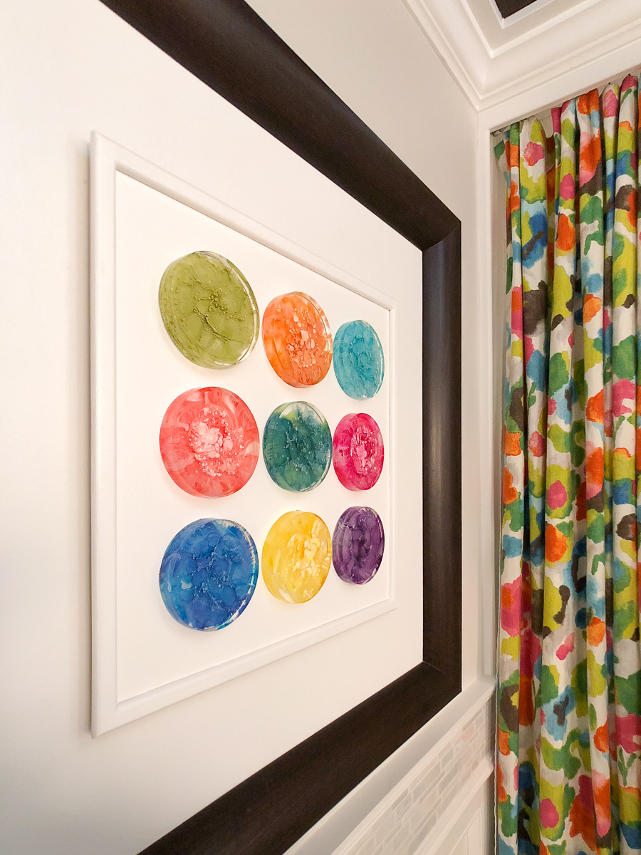
I think the custom gray you mixed hits just the right note in the bathroom. It’s not dramatic, but is subtle, and lets the painting become the focal point. It also is, as you said, cohesive with the hallway, from which it will be viewed. I like the green wall tint, which appears to have some gray in it. It adds a bit of color, picks up tones in the artwork, and is soothing. After all, green is Nature’s color! I’m glad you’re leaving it for now, and who knows, you may just decide to leave it there for good. I noticed, in my decorating over the years, that I will try a number of things before I find the right combination and settle on that. Then, it is good for 10 years or so, lol!
Looks perfect! So what if you change your mind! That is why they invented paint!!
Complete agree. The bathroom looks a gazillion times better than when she brought the place. Also, I love it when she changes her mind.
Yes, I think the grey color is a winner. But the teal was nice too. If it clashed with the teal doors, it is hard to tell from photographs.
So question – what did you do the the outside of the house where that bathroom window was? did you put siding over it?
That window went into the sun room which will eventually be changed too. So it doesn’t hurt being covered by a wall.
Yep, that window looked into the sunroom. That area behind that wall will eventually (hopefully next year) be a hallway.
The gray is perfect. The color works well with the palette you chose for the hallway as well as with the tile in the bathroom. Well done!
I agree on the gray. Keeping the green wall is good too because of your shower curtain and all the green in your custom picture. The gray is still a neutral color that it works with the green. The shade is great. Not so light you can’t see it or too dark that it overpowered. I love how it goes with the wainscot tile & floor tile. You want color for your picture from that anlgle for your pic, just add something on the shelves. Mark the bath as finished. You’ve got more than enough to do. You can always circle back around later when your other tweet projects are done for changes. When you picked the teal on the vanity you didn’t know for sure what was going on in the hall.
I think it looks really nice with the flooring and tile trim. Because of the angle of the photos, some people have forgotten that there’s not just color on the door but color in the shower curtain, and color in the artwork and accessories.
Beautiful! If you’re craving more color, that’s what accents are for. But I love the calmness of it as is.
I agree completely with you, Cyd! Sometimes it’s okay to let accessories bring the pop of color. The whole color palette in the hallway and bathroom is so sophisticated and calm. The coral lamp in the hallway plays well with the color in the wedding photo and the blue jars in the bathroom looks awesome with the picture. Well done,Kristi!
I love it. Check!! 🙂
Definitely not lackluster IMHO; I think you hit a home run with the bath remodel, this color hits it out of the park!!! Goes so well with the vanity top, floor and creamy trim
I find that I like the grey even better than the teal. It’s more cohesive with the surrounding tile, and it still offers enough contrast to make it stand out.
I resisted the grey thing for a long time myself – and over the last couple of years embraced it in my living room – with a watery blue and bright chartreuse green for contrast. I absolutely love it and every time I enter the room I marvel that I like it so much.
The rest of my place is pretty high contrast – lots of black and white – but my living room is more soothing with the contrast toned down considerably.
First paragraph: Agree 100%! Five more of these:!!!!!
Oh so soothing to my eye! Love that you have given gray a try. Also love the teal accents in the bathroom to tie it all together.
I like it even better than the teal. Both were winners but I think this color plays so nicely with the tile. It’s a great supporting actor to connecting the counter with the ceiling, making it a very cohesive room.
Um, you make the bathroom look so easy from this vantage but I was watching at the time and that is probably the most admiration and empathy I have ever felt for you and that’s saying a lot! I recall your effort to make a nice level floor and widen the doorway and the awful red waterproofing stuff that was necessary but upsetting. I felt it all from the safety of my laptop lol! BTW the gray is really nice. I’m following Maria Killam at mariakillam.com and she warns that the gray trend has peaked so keep it on replaceables and repaintables and you have done that.
PERFECTO!! It goes perfectly with the mosaic tile and the floor. It has almost a taupe look to it from my screen. I think the pale green walls keep it from washing out the colors! I think it is beautiful 🙂
I really like the gray with the tile and backsplash. I am still not loving the green, though. I know you like greens, but I find greens harsh in a bathroom. Makes your skin look greenish and makes it hard to apply make-up, etc. I still think that a really, really, super light, lightest color peachy-pink is the best color for a bathroom. Works great with most skin tones. I also think a tiny hint of pink would actually look nicer with your hallway vignette than the green does. But, that’s just my opinion! LOL! Regardless, great job!
I think it turned out great !!!!!
Loved the teal but this is terrific. Not every single thing (color) has to be a star. Stars needs “supporting actors”.
Love watching your progress.
Well put, bravo. 🙂
Well put, bravo. 🙂
I like the old, original bathroom best. (Just a joke!)
The bathroom is stunning.
I think the gray looks ok, but I loved the teal. Is there a reason you didn’t paint it the same color as the door, or even a shade lighter?
Teal is my favorite color, but I have so much of it in my house that it’s even starting to be too much for me. This gray probably isn’t permanent, but it’ll do for now.
Classic look now. Mixing paint colors has always been a pleasant color surprise for me as well.
How do your cabinets hold up compared to if they were professionally painted? I’m inspired by you to repaint my kitchen. It is professionally hand painted timber with lacquer over the top. After 10’years the finish is still beautiful, but I hate the colour. I’m just concerned that if I pant it, it will chip with time.
They hold up fine. But if you want super strong durability, I highly recommend topcoating with General Finishes High Performance water-based topcoat. That stuff is amazing!
I LOVE IT! It is so much more cohesive with the backsplash and flooring. Maybe when you get around to repainting the wall color, you will find a super “pop” color to give you the pizzaz you love. I would vote for something in the orange range – it goes well with gray, and will also look good from the hallway.
I think the gray is lovely. It gives the other elements in the room some space to shine. The teal seemed to steal ll the attention–at least in pictures.
It so nice to be getting posts again! Here’s to a great 2018!!!
The colour is lovely.
Kristi, that color is perfect. Please do not change it ever. I love it.
I miss the teal… I love colorful Kristi. 🙂
Kristi, I love this and how it picks up the tile on the backsplash! One thing that my brain thought by looking at your photo. With the beautiful wood ceiling and the wood vanity top, perhaps the top of the console table should be stained the same color. Just a thought. Adore you as always.
Sheila F.
I really like this, and I’m not usually a gray loving person. It all just looks so serene. And I do like that sage green on the walls, hope it stays for a while!
I so love the little shelves above the toilet and wish you had a tutorial for them. Did you source the corbels or cut those yourself?
I don’t know if you were reading my blog way back during my kitchen remodel in 2014, but I had a mishap and left some cabinet doors, along with 10 corbels that I had purchased, outside overnight after painting them and they got rained on and ruined. The corbels, which I had purchased at Home Depot, were warped and no longer 90 degree angles. I was able to use my miter saw and cut some of those down into much smaller corbels for the shelves.
The shelves are made of two layers of either MDF or plywood (probably MDF) glued together to make a thick shelf, and then I attached some decorative moulding, mitered on the corners, around three edges to cover the raw edges. I assembled the shelf to the corbels with glue and nails. Then I measured the distance between the corbels, cut a piece of quarter round to that length, and attached it to the bottom of the shelf between the corbels so that the flat sides were against the bottom of the shelf and against the wall. I attached it to the shelf with wood glue and nails. Once it was dry, I pre-drilled holes in the quarter round and used that to attach the shelves to the wall using screws through the pre-drilled holes and into the wall. I countersunk the screw heads a bit and covered them with wood filler and paint so they wouldn’t show.
I know it’s much easier to follow with pictures, but hopefully that will help! 🙂
Thank you! Ive been with you since the plastic spoon mirror, so maybe 2010. Yikes, that’s a long time! Anyway, thank you for the detailed instructions.
Thanks, again, for saving that hideous bath.
Don’t you sometimes feel like your in the book “If you give a mouse a cookie”? I know I do. I painted the guest room, then I wasn’t happy with the hallway. So I painted the hallway, ………..then didn’t like the color in the stairwell, and on and on. Now I’m working on the color for the living room. It has to look good with the dining room, entry and stairwell plus work with the kitchen. I’m leaning to a soft gray because my entry is a pine green, soft minty green in the dinning room, and kitchen has dark stained bottom cabinets with white ones on top. In theory they all should work together but undertones can drive you crazzzzy. I’m going to prime all the living room walls then chose with samples on white paper. Your grays are looking lovely.
When I saw the before and during pictures of that bathroom, I decided that you really must be Wonder Woman!! I think it is beautifully turned out, but if you ever decide to repaint it, a rich deep coral would be beautiful.
Gorgeous! I was rather sorry to see the teal go, but that custom gray looks marvelous! The whole hallway and bathroom look amazing!
This is the first time I visited your blog and I totally love what you’re doing. Particularly the renovation is flawlessly perfect. And I am so in love with your work. Keep doing. 😉
I’m a color girl, too, and am going bold in our house we just built, but I think the grey looks really nice in that bathroom. Maybe just an accessory or two on the vanity to add a pop of color? I love your bathroom so much!
Kristi,
It looks great but I really liked the teal color with your wood countertop. Agree with the person who suggested the same stain color as your ceiling.
You are amazing and an inspiration!
This is the first time I visited your blog and I totally love what you’re doing. Particularly the renovation is flawlessly perfect. And I am so in love with your work. Keep doing. 😉