Hallway Wall Options
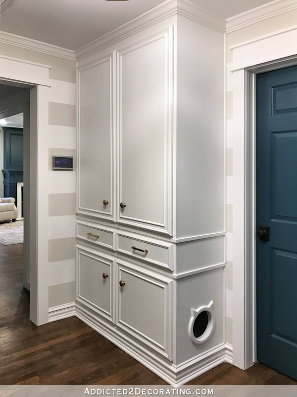
I actually worked on a house project yesterday! It felt really good to get back in there and get my hands dirty again. I worked so slowly that I didn’t even get far enough along to show you anything exciting, but I’ll try again for tomorrow. At least the hallway cabinets are in progress!
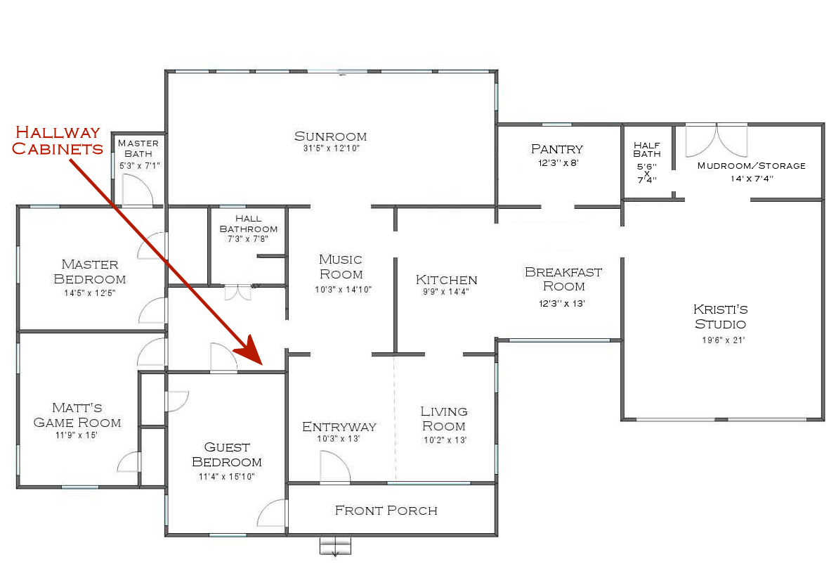
In the meantime, I’ve been trying to think of what I want to do with the walls in the hallway. Like I mentioned yesterday, this hallway is more of an open rectangle, like a small room, rather than a long and narrow hallway that you have in most houses. I edited yesterday’s post around noon to add this, so some of you may have missed it, but it shows not only the placement of the hallway cabinets, but also the shape of the hallway.
That hallway is bigger than the hallway bathroom, and almost as big as my kitchen! Matt loves it because he can maneuver around in there much easier than he could in a long, narrow hallway.
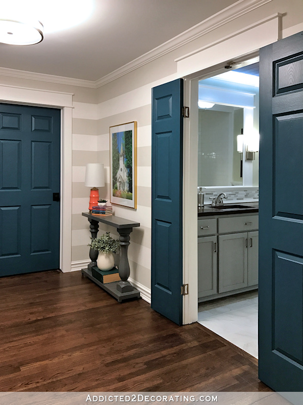
But you can see that while it is kind of like a room in itself, it does have five doorways leading into it, so once the floor-to-ceiling, 48-inch-wide cabinets go in, there’s not really a whole lot of wall space left. Most people might ignore it, but I think it’s a great opportunity to do something bold and colorful that I might not otherwise do in a larger room where I would be spending quite a bit of time.
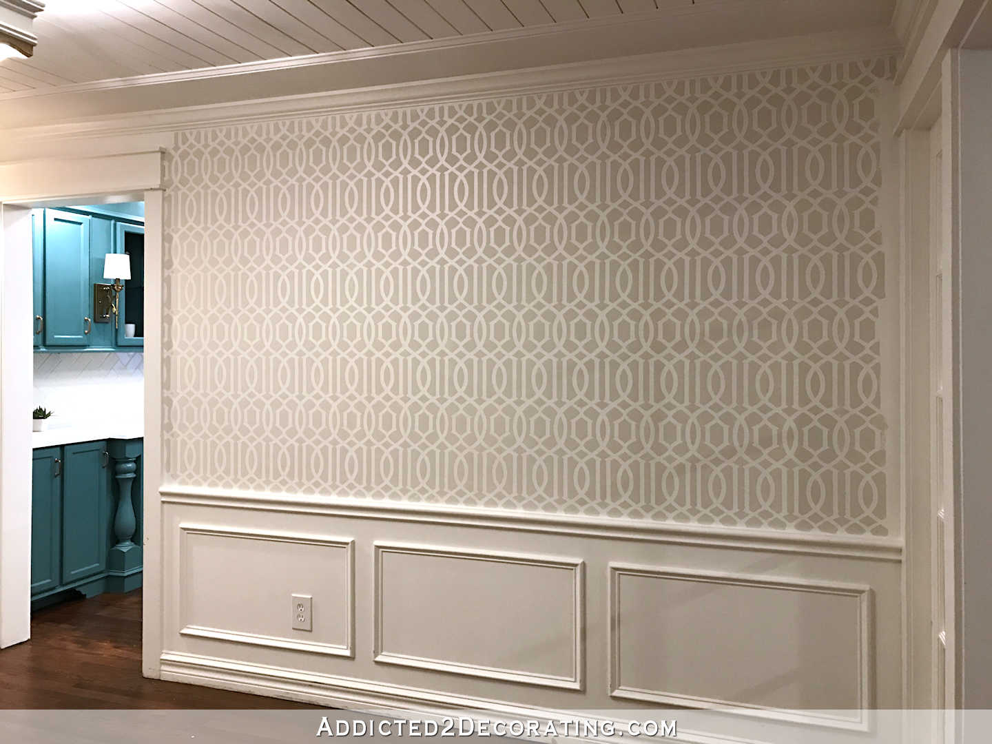
The only current limitation to what I do on the hallway walls is that the music room walls are clearly visible from the hallway. Those walls have a white and light gray trellis stenciled design on them.
So that rules out any kind of geometric design on the hallway walls. I’ve looked and looked for inspiration, and there are four ideas that really appeal to me — (1) big, bold floral, (2) stripes, (3) colorful marbled, and (4) blended ombre.
I think a big, bold floral pattern in the hallway would look amazing. I’d love something like this design, but with color rather than neutrals. And it wouldn’t have to be multi-colored. Just green and white, or teal and white, would be beautiful.
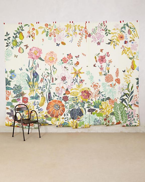
But I also love colorful florals. I’ve had my eye on this wallpaper from Anthropologie for quite some time now. I wouldn’t actually use this wallpaper, though. It’s much too heavy on the yellows, pinks, and oranges, and way too thin on the blues and greens to go in my house. But I could use this large scale design as inspiration for my own handpainted design using colors that would work better in my home.
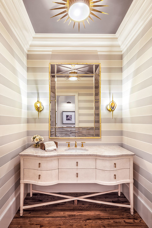
Stripes are always a favorite of mine, and there are a thousand ways to do a striped design. This has been a favorite of mine for quite some time now, with the tiny white stripes separating the wider stripes.
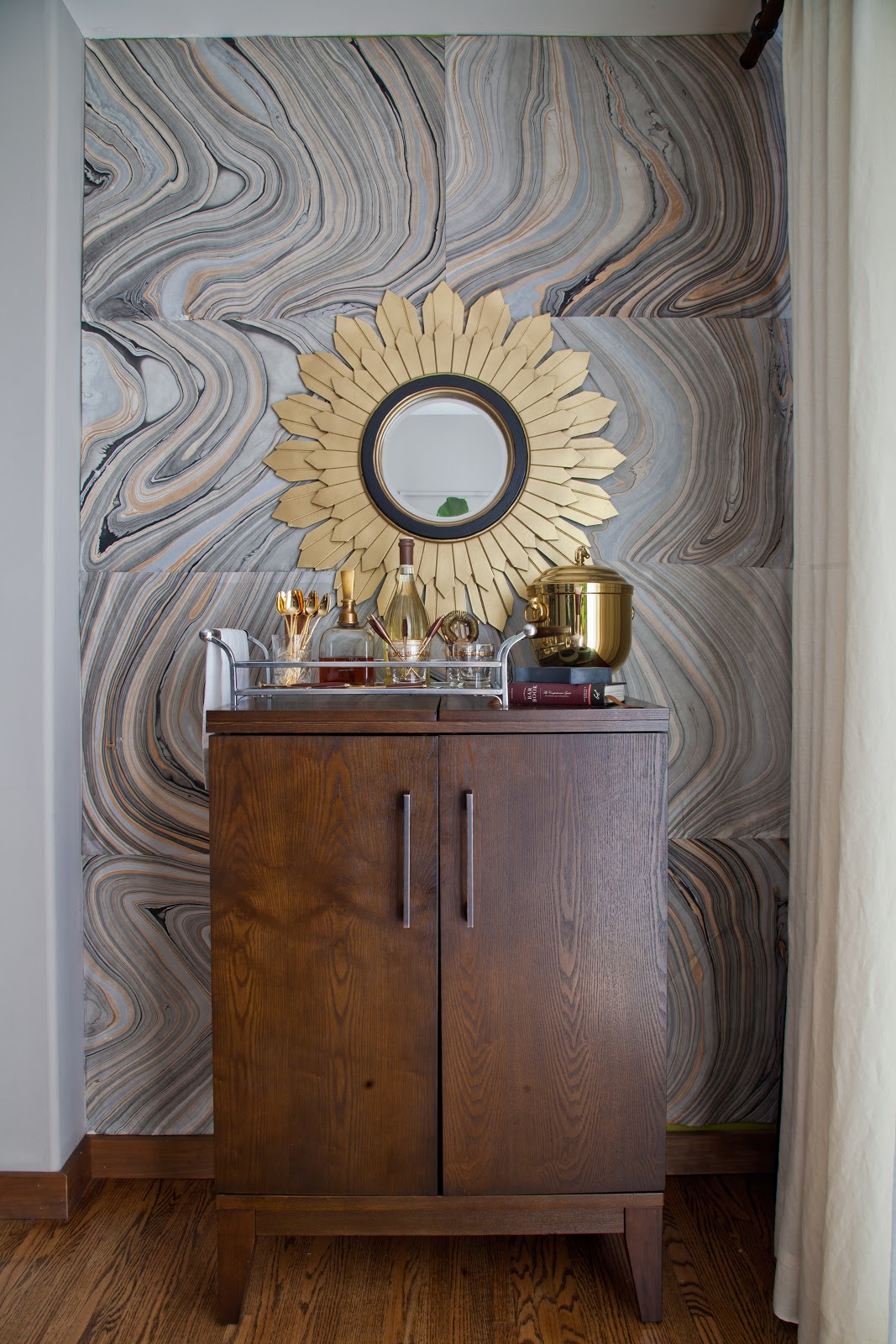
Some of you are going to think this is crazy and too busy, but I’ve had this idea saved in my “house ideas” file for years now. I’m sure you’ve seen examples of people using marbleized paper to cover their walls.
You can buy those marbleized papers ready to use, but of course, finding the exact color you want might be a challenge. So for the longest time now, I’ve wanted to attempt marbleizing my own papers using custom colors, and then using those papers on a wall. That has been one of those “someday I want to try this” projects that I’ve had in my file for years now. And since my hallway doesn’t have much wall space, this might be the perfect time to try it. Of course, it could be a complete flop, but it would be fun trying!
And the finally there’s this blended ombre wall design that I’ve also wanted to try for a while now.
Isn’t that amazing?! I love it because it kind of has that watercolory look to it that I love so much, but I think it would also be pretty easy to do, and much less time-consuming than the other designs.
If I were forced to choose which one I like the best right now, I’d go for the last blended ombre design. But ask me in an hour, and I could be leaning towards stripes. 😀 The only thing I know for sure is that my hallway walls will have something other than one solid paint color on them.


 via Puistolassa

I really like the ombré, I think it what least competes with your music room. I love the subtle graduated look
I agree here.
My feeling toward this is sort of like when you had your striped kitchen floor. I’m like you can love, love, love an idea for years but not all loved ideas can be crammed into one home harmoniously. (I know from past experience) But it’s your house, whatever floats your boat. This hallway will be seen from your living room and through your music room into your hallway, but you know that. The cabinets sound enviable, wish I had the space for them!
Ooooh what if you did the blend with more simple linear drawing with that stuff?
That stuff referring to the busier floral pattern.
Ohhhh yes I agree
See? This is why I share my preliminary ideas with y’all, because they always lead to awesome ideas from so many of you. I LOVE this idea!!
My first choice is the hombre effect too, but I also like that big bold black and white floral! Maybe tone it down to a charcoal gray? Looking forward to seeing what you decide!
I love the big floral (Planete Deco) or the strips!
I have the marbled look in my front living room/office on 1 wall. The wallpaper is from Candace Olson and it comes in 4 or 5 colors. You can order on Amazon or Steve’sblinds and wallpapers. I took a picture and can’t figure out how to attach. I really like most of your selections on here.
https://www.google.com/search?client=safari&rls=en&q=candace+Olson+Onyx+wallpaper&oq=candace+Olson+Onyx+wallpaper&gs_l=psy-ab.3…119128.121029.0.121325.5.5.0.0.0.0.118.529.1j4.5.0….0…1.1.64.psy-ab..0.3.337…0i13k1j35i39k1.3drUCOP08Go
OMG, that is gorgeous!!!!
those are beautiful
WOW, love the Candace wallpapers!
I LOVE this wallpaper!! I want this in my home somewhere!! (Entry Hall comes to mind!) Gorgeous!!!
Stunning.
Absolutely gorgeous!
I love the first photo you showed with the black and white and I actually like those colors in your house with what you already have. All of the designs except one are simple but bold. The field of flowers is just too busy for what you are going for. Of the three, I agree the Ombré is quite nice and would be very unique. Would you incorporate the ceiling too? Painting it the lightest color. But by far, my most fav is the first photo.
I’d probably just do the ceiling white. I’m partial to white ceilings, especially in such small areas with no natural light.
Like in your bathroom, I think a deep, dark ceiling is actually very dramatic, like a night sky, and makes the ceiling push away from you. Really enlarges the space, rather than enclosing it. I think it has the opposite effect than folks think…. By the way, I think ombre with white or silver simple line-drawn florals would be amazing.
I think the anthropologie paper would look awesome on the back wall of the pantry or in the small bathroom near your studio.
I love the watercolor ombre! Many times ombres feel too much like stripes with a little blending, but this one is much more random and beautiful. I think stripes in this room are too similar to the geometric pattern in the music room in that both patterns are very structured. The watercolor ombre (or the floral) is the opposite of structured. It could be overwhelming in a larger space but would be just the right amount of interesting with the limited wall space of the hallway.
I agree – the stripes could feel very busy with the geometric pattern. I love the ombre. Or doing a much more watercolor-y and soft version of the floral wall paper.
what about a soft ombre effect with a floral “outline” similar to the floral design you like?
Love that idea!
That would be a perfect solution. And I love the ombre, it add just the right touch without being overwhelming
I like the wide tone on tone stripes the best. I’m afraid the other patterns would close in a room with no windows. Carrying the same tones from the music room would be more cohesive. But….I’m sure whatever you do will be right for you!
Although I like all of your options, I prefer the stripes. You can use any color you wish to make it yours and it will play nicely with the music room stencil. I still remember the argyle pattern from your condo hallway. Too busy for this project but maybe you can tuck it somewhere in the house eventually.😁
Sheila F.
Why not combine a couple of those looks? Make the walls ombre’ and add a wide horizontal stripe? Or use your background color and make a wide horizontal stripe with the flower pattern of your choosing? I loved the hand painted wall art of birds and butterflies and something similar would look really nice in this area. You could make it as subtle or as bold as you want. Just some thoughts from me.
I do like the idea of combining the ombre effect with a white floral pattern over top like some have suggested. I think that would be beautiful.
Totally agree.
I prefer the Ombre or the 1st floral in the same shades as your Dining room.
I see the big bold floral or the ombre.
Blended Ombre’!
I like the ombre too! Is the music room stenciling still not finished or is that just an old photo?
It’s still not finished. That’s the project I was working on when I had my nerve issue the first time (the worst time), and I think it was caused from repetitive motion while holding my arm at or above face height. To be honest, I’ve been afraid to pick that project up again because of that. But I WILL get it done. 🙂 Or my mom will. She has volunteered to come finish it for me, but she just hasn’t had the time yet. But one of us will get it finished eventually.
Oh….Moms are the best! That is so nice of her to offer to finish it! I can understand feeling scared to aggravate the nerve again….perhaps this is a good reason the hallway design shouldnt be too diy intricate (painting floral design instead of sourcing a wallpaper). Whatever you choose we know you will (eventually) get exactly whats right for your home! So glad to see the project creativity coming back!
I feel the ombre would compete the least with the other rooms. Done in teal with white trim on the woodwork and doors would look cool. I think the other patterns would look too busy and look dated more quickly.
My one question that you have not addressed is the lighting in that space. It looks like it is dark and dependent on the ceiling fixture as the only source of light for that big space. The wall color or option you choose should be light so it does not darken the area even more. That said, the wall paper that Erin found from Candace Olson is beautiful. From the hall you can definitely see into the kitchen and the teal colored swirl paper could match your teal kitchen color and it would just tie every room together in a different sort of way. I know you know this, since you live in that space, but since you have not really talked about lighting, I brought it up to see if you have a plan for that.
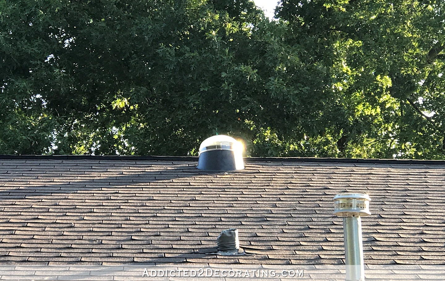
There’s no light in there right now. The wiring is in place, but I just haven’t selected a light fixture. I don’t think there’s been a light in there in well over a year. So it’s very dark right now. I plan to put a solar tube in there eventually, but I don’t know if that will be part of the project I’m doing now. But maybe!
We have a solar tube in our bathroom and LOVE it! It gives off a lot of light, even on a full moon night.
The ombre is beautiful, but looks a bit rustic for your home. I’d love to see your take on the marble paper.
I vote blended because it’s simple. You can probably see the gray trellis walls from the hallway so I think simple is the way to go. But I dont like the colors of the blended ombre in the sample photo. It’s kind of an inky gray like someone left a ballpoint pen in the laundry. Maybe a nice teal blending into white instead?
I would do either dark teal or green. Teal would be my first choice, but I do get concerned that teal is always my first choice for EVERYTHING. 😀 I might need to branch out a bit.
I like floral walls, but I would probably go for larger scale, like your niece’s bedroom but with different colors for my own house but you’ll pick just the right thing for you and it will look great!
My only thought is how much light is in the hallway? Or will you add canned lighting if that is what it is still called. LOL! I know they make some great LED lighting now. Can’t wait to see the hallway finished.
The hallway currently doesn’t have any light at all — neither natural nor a light fixture. I’ve been without a fixture in there for over a year. But I do plan to install one soon, and I also plan to put a solar tube in there for natural light.
The Ombre photo reminds me of the lazure technique used in segment 2 of this episode of TOH: https://www.thisoldhouse.com/watch/arlington-arts-crafts-decorative-touches-make-difference
I copied all your pictures onto one page and I really like the agate wallpaper’s pattern with the music room pattern. It’s hard to say what’s best though without seeing the actual color and pattern combinations together with the music room walls.
The Candace Olson paper someone mentioned is nice but too busy for my taste. I’ve wanted to do agate somewhere but I’m more drawn to the enlarged, version of it in a few panels rather than lots of small repeating panels. I really like a lot of Alex Turco’s minerals collection which I think you have enough talent to duplicate with paint on your walls.
http://www.designrulz.com/design/2013/03/waterproof-art-panels-by-alex-turco/
In addition, what colors were you thinking of for the 3 bedrooms off the hallway? If I were going with color in the hallway, I’d be choosing something that would unite all those choices. Since those rooms aren’t done yet, I wouldn’t do anything that required either a lot of work or cost as you’ll probably change the hallway when they’re done. This makes the ombre a good choice for now.
Where can I find the black and white floral wallpaper. I love it! my vote is for the ombre look with a few whimiscal additions, maybe a few butterfly or flowers, etc., scattered on the walls (and ceiling). I love the idea of using the lightest shade as the ceiling color.
Floral is nice, but i prefer something more simple fo the hallway, but definitely not stripes
My first thought is the big bold floral but I would also keep in mind what would be in he connecting rooms now and in our near future future plans.
Torn on this one… mostly because I’m not a fan of florals. I’d go with a plain wall, maybe “play” with a painting technique to make it look like linen or a subtle texture or make an oversize art piece or a communication “board”. Also keep in mind this hall eventually may be expanded so chose a way you can continue it years down the road. But here’s my least favorite idea, to more favorite with short reasons.
Stripes- Too geometric and detailed (esp w/white stripes), might compete with stencil.
Handmade mural/wallpaper/floral- I like, but more as something you can keep or move later might get busy if it extends all around to doorway to music room.
Marble wallpaper- My husband would be cheering you on he loves marbleized paper, we saw it done at a maker faire with magnetic inks. Overall might be too busy or difficult to marble it juuust how you want it in design and color. I’d play with the paper marbleizing technique and be okay for a backup.
Ombre- Favorite, easy to “blend” in any wall repairs and continue later, afraid it could be too much of a trend right now, but you’ll be re-visiting this space later, and can make that decision then.
Just a thought, paint or prime the walls basic white and wait. You still have a lot more elements to add to your entire house. These may “busy” up things. In the meantime your hallway would look amazing.
Consider keeping it simple, at least for now, either continuing the gray from the entryway or the same white as the cabinet. Put a row of pegs on the wall on the other side of the door next to the cabinet for overflow coats or from visitors who entered via the front door. Use the smaller paintings you did recently on the other walls.
Choose whatever makes you smile as you walk by. (No one is ever going to linger in that space) I like the floral idea because it would be a total surprise. However, less busy and in the colors you love, allowing more white space. The eye needs to rest for a few seconds.
I personally had an idea in my mind, that you would do a chair rail with some white picture frames (wainscoting) above them filled with your entryway left over grasscloth wallpaper. Then they could be a feature on their own, or the background to some artwork.
Blended ombre! And show us how to do it (as im sure you will).
Here we go…so many new ideas! Looking forward to your decisions and watching the progress
I read most, but not all the comments above. I will add my humble opinion, not that you need it. My first thought is with so many doors, I would stay away from anything even remotely linear. The stripe kind of made me feel like I was in one of those rooms without an exit, because the stripes kept my eye travelling around and around the room. Scary! (LOL!) I like the big floral the best, then the ombre, then the marbleized design. I am leery that the size of the area and all the doors would cause the ombre to not be very effective. I might get dizzy with the marble. With all the doors, hoping you try to visualize whatever you choose before committing. Wallpaper would be the easiest method, but even with wallpaper there are a lot of cutouts to deal with. I would choose a complimentary paint and just do that alone if it were me. But you are not me – you have way more talent that I do!
I love the marble or ombre’ effects. Just my two cents.
The large scale Alex Turco panels that Chris mentioned are to die for. I think it would look beautiful on a scale not quite as busy. It wouldn’t be hard either, you could use the method where torn cardboard pieces are dragged through a glaze over the layered colors of your choice. Check “faux agate” on Gorgeous Shiny Things blog.
I vote for just painting the walls the same soft gray as the stenciled wall. I’m afraid there might be a kind of cacophony of color and pattern between the rooms. This room will give your eye a place to rest before entering another fabulously decorated space. I’m usually sharing your vision but can’t wrap my mind around it this time. Between your great cabinets and hung artwork, i know it have the panache you wish.
I was afraid I was going to be the only wet blanket here today. I agree with Deb, I think putting another pattern or unique painting style in here will be too much. The “wall treatments” would then be centered in your music room and hallway, right next to each other, which feels unbalanced to me. If you leave all your bedroom/bathroom doors open, I think having a somewhat neutral hallway space would create a perfect canvas or “looking glass” to see into all the rooms, because I’m sure you’ll get creative in those as well! I do absolutely love the suggestions above- ombre walls with either a white or glossy (in the same color) floral pattern on top. That would be absolutely beautiful, but I think in a bedroom or bathroom.
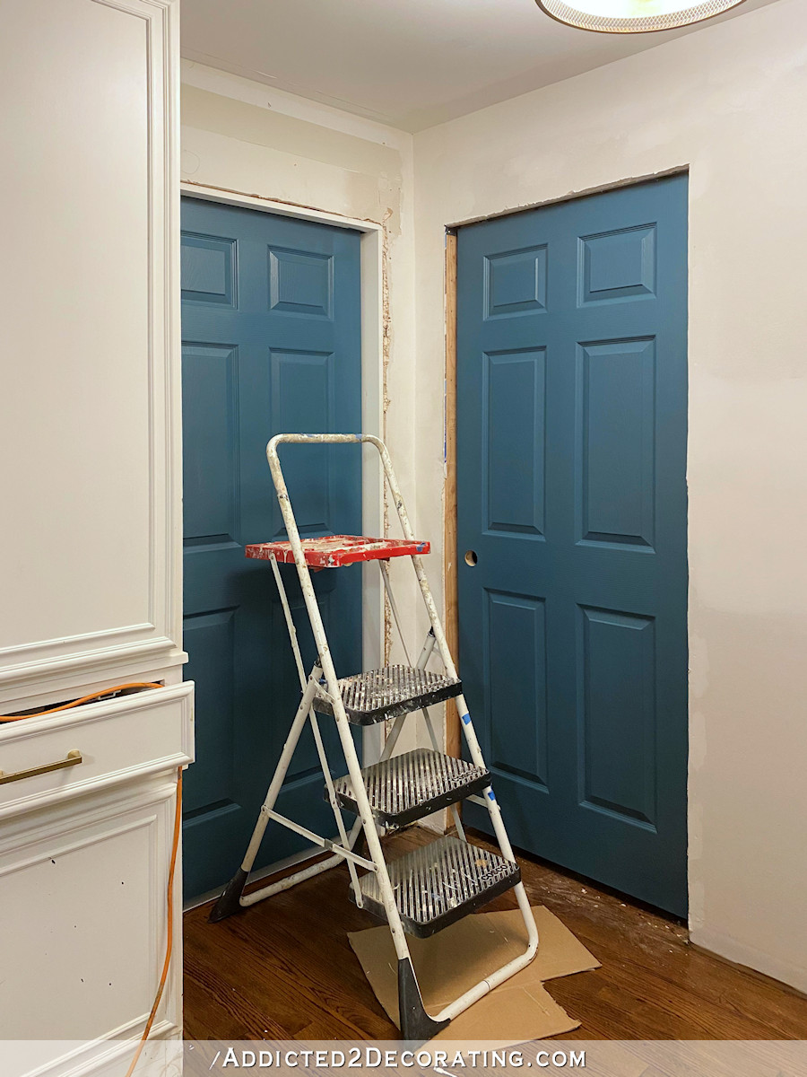
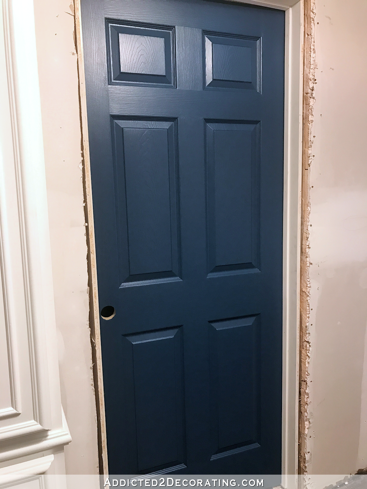
So glad to see I’m not the only one. Kristi, frequently I read what you’re planning, think it’s too much, then it’s gorgeous when you do it. But in this particular space, I’m thinking plain walls, maybe with some small framed art in a group somewhere. You’ve got 5 doors (which you’ll be painting black, right?), the cabinets, and the visual impact of the rooms that open from the hallway. Not to mention the visual impact the hallway will have on those other rooms. What my mind’s eye is seeing is visual overload, no place for my eyes to rest. I agree with Deb…keep it simple, at least for a while. Then decide. All that said, it’s your house, your taste, your time, money, and labor. And I have been wrong, at least a time or two in my lifetime. 🙂
Love the ombre effect, but with so many doors I think I would save that treatment for another room/wall.
I think something like this……obviously the bottom portion can be interpreted in a number of ways.
https://i.pinimg.com/736x/2c/4a/3b/2c4a3b932c3b007ce8b95e6ce0116e75–tongue-and-groove-ceiling-ceiling-treatments.jpg
It keeps it light, it blends all of the doors and openings, it gives you a natural height/place for hooks, and gives you a top portion you can paint a pop of color or paper.
I love the ombré , how about done in the same colours as the music room and find an awesome statement ceiling light that would cast a light into the other rooms. And make the ceiling the feature instead of the walls. Are you still planning on black doors?
I think this would be a great place to try the marbleized wallpaper.
Kristi, I have had a very similar ombre wall picture in my old PAPER file for decades. Now that I think about it–two pictures. One is watery blue and the other has different pastel colors on each wall of a small bathroom.
I like the ombre. I like the soothing, calm feel it has to it. Particularly, as it is heading to and from bedrooms. I don’t know if I like it as it relates to the music room wall, though. For me everything feels busy next to that. Perhaps ombre in the bedroom instead. I wish I had your skills!