Living Room Fireplace Color — White Or Gray?
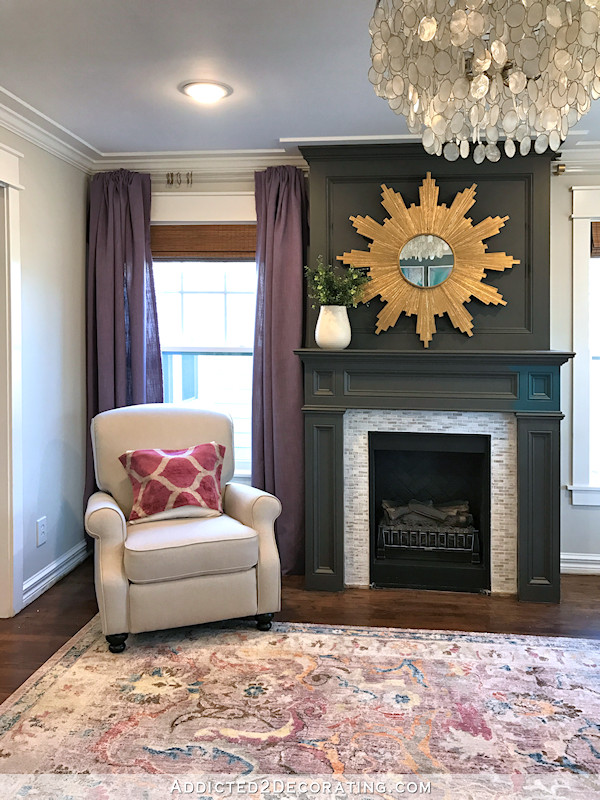
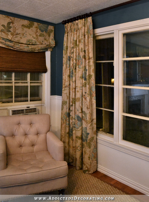
I got my 24 yards of lilac fabric cut into panels yesterday so that I’d be ready to start on them as soon as I have everything else I need, so I decided to just drape two of the fabric lengths over the curtain rod to the left of the fireplace to see what they’ll look like.
The color is perfect. It looks so beautiful with the rug, and I’m very excited about getting them done and installed. But now I’m really wondering about the fireplace color. Sometimes I look at that gray next to the purple and love it. Other times I think it might be too dark. And still other times I see just a tinge of green undertone in that gray that I don’t really like.
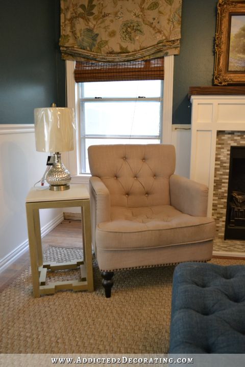
(Never mind that dark teal square. That was a test from a couple of weeks ago. And I still don’t have a pillow insert for that pillow on the chair, so it’s draped over a too-large pillow insert.)
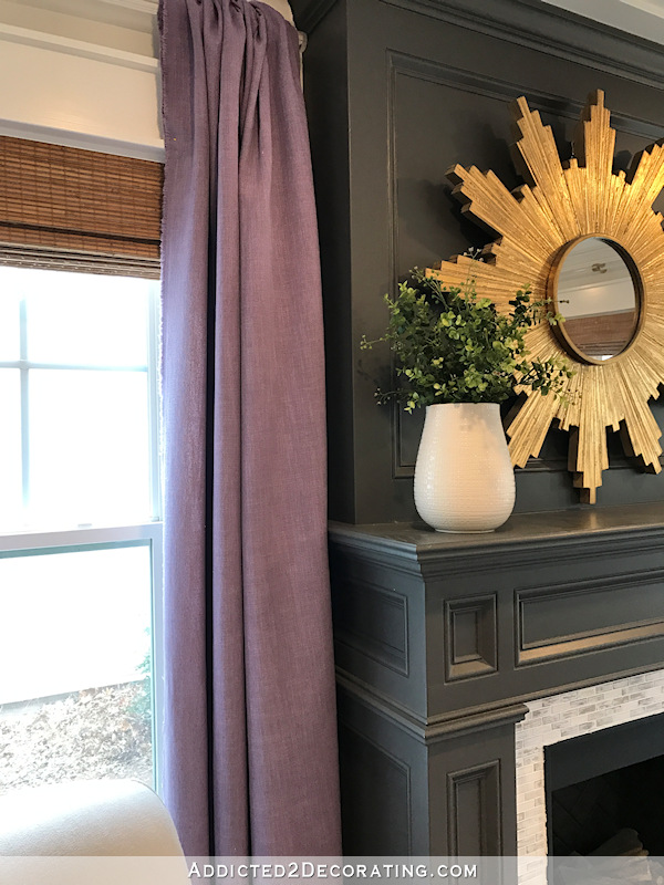
I painted the fireplace gray back in December 2016, when I had a much different vision for this room. So I’m okay repainting it to go with my new plan for the room if need be. Here’s a closeup of the fabric next to the fireplace. Do you see that green undertone, or is it my imagination? And it’s not a pretty green, either. It’s like an army green undertone.
The only other color possibility that I can think of is white — the same Behr Polar Bear as the trim in the room. The fireplace used to be white, so I tried to do a cut-and-paste to see what that would look like.
It’s not perfect…obviously. It was a much brighter day when I took the picture of the white fireplace, because it looks very bright white compared to the trim in the room I took this morning. But rest assured that I’d paint it to match the trim. And the perspective isn’t quite right, but you’ll get the idea.
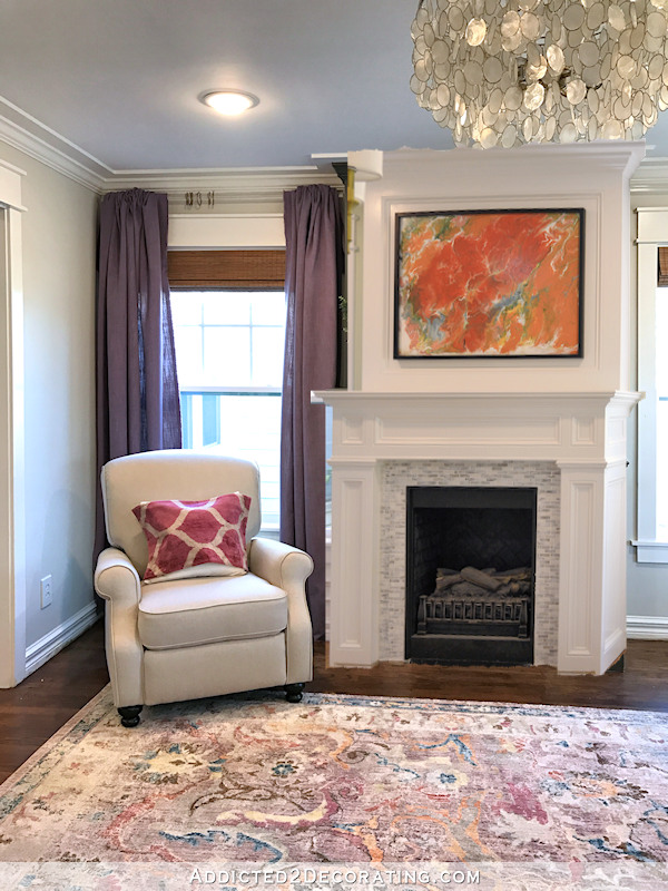
I do like that it would brighten the room. I used to love dark, moody colors in rooms (and dark, moody rooms in general), but I seem to be drawn more and more to light and bright rooms.
But there’s something about the white fireplace that just seems a bit blah to me. Here’s a picture of it in white from March 2016 when I was still planning on this room being a dining room.
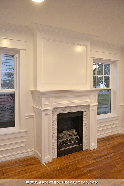
Granted, several things have changed now. My floors are darker, the walls are a light warm gray, and all of that trim is gone from the walls. The room looks warmer and feels more inviting now. But I’m still not quite sold on having a big white fireplace front-and-center in the living room.
Opinions? Should I keep it the current color (Benjamin Moore Kendall Charcoal without the white)? Paint it the actual Kendall Charcoal, which is just a touch lighter than the current color? Paint it white? Something else altogether? I’ve tried for two weeks to think of what that “something else” could possibly be, but I come up empty every time.

Addicted 2 Decorating is where I share my DIY and decorating journey as I remodel and decorate the 1948 fixer upper that my husband, Matt, and I bought in 2013. Matt has M.S. and is unable to do physical work, so I do the majority of the work on the house by myself. You can learn more about me here.
keep it gray, but maybe a little lighter
Yes. A lighter gray. Not white for that warm inviting room.
Agreed! Maybe a shade or two darker than your wall color? White is too bland in the room.
The gray color dominates the room. If you decide to keep it gray a lighter shade would be better
If was me
If it was me, I would go with the White. The grey will close in your room too much. Also if it was white then you can add any colors as accents you like. I never get bored with white. I have been working with colors since “1982”! You will get tired of the grey,trust me! The fabric is very pretty with the rug. I can see Navy as accent color also.
Then as you bored with the grey you wouldn’t have to repaint it! Just a thought!
You’re doing great with your choices–love the “swirl” of colors you’re incorporating! The grey does seem to overpower the colors in the room without picking up enough of the background color in the rug; it just seems too green without being enough grey, in my opinion. Everything else is coming together so well! Beautiful, thoughtful and happy room! 🙂
I agree! A lighter shade of gray would be pretty.
Gray. It stands out and looks important. White just gets lost in the wall color and does nothing.
Paint the wall Above the fireplace the same gray as walls. Paint fp a soft white, not too stark, maybe with a hint of gray. Dress up the mantel with texture & color (navy blue/gold). Add the lovely gold star piece on the wall above fp. Pick up navy blue & gold elsewhere in room with a few touches here & there. Once repainted & decorated, the mantle will ‘soften’ to your eye. The plum fabric and rug are gorgeous but fp color’s dark green undertones take away the fun.
Boy, in the photograph that paint screams green to me (That’s why digital cameras are the bomb). How about a gray with a deep purple undertone?
Me too!
YES, paint it the same value gray, but a cool gray. The contrast is stunning with the sunburst.
Agree. It looks too green.
I’d go with a dark gray with purple undertones.
I like it dark and moody… just not in that color.
Yes … What they said. White washes out all that beautiful tile and woodwork. The green undertones in the current gray are not your imagination. Go lighter gray with purple undertones.
I agree that in the pictures here, the fireplace does show green. However, our master is painted Kendall Charcoal and there is not a hint of green anywhere to be found… if any color, I tend to see a tinge of dark blue in it. Interesting…
Maybe a bit lighter gray that doesn’t tend to pick up any green?
White!
White
What about a shade of grey that is darker than the walls but lighter that the color of the fireplace now. I don’t care for the white on the fireplace, I feel like it sucks the life out of the fireplace. That beauty needs to pop!
I agree. Maybe 2-3 shades darker wall color.
I agree!
I like that, too. But it needs to be lighter than the drapes. My personal feeling is that the darkness of the current color competes too much with the drape color.
That is what I was thinking too!
I agree
love the gray
I’ve always adored your fireplace in grey, so it came as a bit of a surprise to me that I think it doesn’t look so good with the lavender anymore… (I like that curtain colour, though!). I wouldn’t go back to white on the fireplace, as I agree with you, it’s a bit boring. If yours were my house, I would instead change to a lighter grey that complements your wall colour and the colour of the fabric and the carpet!
My thoughts exactly !! Had never seen the green in that grey paint before, but today with the drapery fabric next to it…..the green jumped right out at me. I think grey, but a lighter shade with NO green undertones.
I love the fireplace as is, but I agree it doesn’t look fantastic with the purple curtains. In my opinion, I think the purple should go. I love the color, but I don’t think they look good with the white or the gray. And I kinda think they clash with the roman shades, too. Seems like they’re too similar with no contrast, and I think it looks a little muddy. 🙁 I’m sorry!
I just spent almost $700 on fabric. Getting rid of the purple isn’t an option. 🙂
I personally love the lilac with everything in the room except the gray fireplace. It’s too dark, maybe the green undertone is wrong too. Lighter gray, but darker than walls. Something from the rug maybe? It looks like it has a gray in it.
White fireplace is almost harshly cold with the wonderful colors you have going now.
Those purple drapes are perfect! But weren’t you going to upholster those chairs another color? If so, wait until they are upholstered and then visit the fireplace color again. White would not seem right if you leave the chairs the color they are now. By the way, can you tell us again what the website was where you ordered the electric fireplace? I’m about to order as large a one as I can get for my real fireplace.
The chairs that are going in this room are some fully upholstered chairs that I’ve had in storage for years, just waiting for the opportunity to use them. I’ll be upholstering them in the neutral creamy white Crypton fabric that I originally bought for the sofa, and I’ll be doing the contrast welt and buttons in a darkish velvety purple.
My fireplace insert came from Electric Fireplaces Direst — http://www.electricfireplacesdirect.com/
It’s funny how we’re all different. I can see where you’re coming from, but I actually love the drapery color with the roman shades. It looks very inviting to me, while at the same time relaxing. Lucky for us, Kristi shares her process with us and we’ll get to see where she lands! 🙂
I love the Roman shades, too. They’re basically stained wood, similar in color to my hardwood floors. I don’t ever think of colors as clashing with stained wood. In my mind, the warmth of stained wood goes with pretty much anything.
I LOVE the curtains in the room. I’ve always seen a green undertone in the fireplace pictures though, and it’s more obvious with the purple beside. And it seems very “heavy” for such a bright colorful “happy” place. Seems I’m in the minority, but I love the fireplace in white. If not that though, maybe a lighter gray with more purple undertone like anothrr poster suggested?
Its hard to say, considering we are not seeing your green couch, and potentially colorful chairs? But I am assuming with all of those other colorful pieces, I’d also say white😊
Another vote for white.
Uh oh, I hope my comment didn’t come off as snarky or rude! I’m not trying to be the new Mary Ann Looby. I’ve loved everything about this room up until the purple curtains BUT….was that close-up photo in the original blog post? Or did you add that later and I overlooked it? Because it does all look nice together in that photo, I guess it all has to do with lighting! And I didn’t think the shades clash with the purple, more that they blend because they’re similar in….saturation? or shade? I don’t know the right word for it. When you had those reddish floors, you wrote a post about how you felt they were clashing with everything and throwing off your whole color scheme. Neutrals don’t always fall into the background and it’s all very personal, like Theresa said. I’m sure it’ll all be pretty once it’s said and done 🙂
Ha! No, I didn’t think your comment was snarky. 🙂 I did add the closeup as an afterthought because I noticed that the other pictures weren’t really showing the lightness of the color. The fabric looked darker in those original pictures than it is in person. It’s not a bright purple fabric, but it’s not dark either.
There isn’t much contract between the tile surround and the white fireplace but the tile looks better with the gray fireplace (even though the gray fireplace looks green to me). A different shade of gray would look great! I know this is a lot of work and could be expensive but would you consider replacing or painting the tile? You would have more options then with the fireplace color.
By the way, the color of the curtains is gorgeous and the fireplace structure is stunning (just not loving the color)!
Funny, I was thinking the tile looks better (less contrast and “noise”) with the white fireplace. 😉
I thought the drapery color was going to go perfectly with the gray, but you’re right. It feels like there is some green in there. Somehow it’s off. Makes me wonder if the original Kendall charcoal would be any better. I’m sure you’ll figure out a creative solution!
I wanted to sew your draperies, was my quote too high?
Your quote was very reasonable. My bank account was just too low. 🙂
I would leave it the grey until you finish getting your curtains made and up and all the other things in the room finished and see how it all goes together. I think you need some sort of darker focal point to go with the rug. I like white but think its too much in the room.
I agree. Leave it grey for now. Perhaps after all the finishing touches have been completed, repaint or use a gloss to tame the green tone you are seeing.
The darker gray right now is a beautiful color, but a heavy for what you have going on in the room in its latest looks. Lighter gray would coordinate better and still keep it interesting. I prefer lighter gray to teal or white.
I love the gray fireplace. It “holds it’s own” with your other colors and doesn’t get lost That being said, it’s your house and if the color is bothering you now, you know it always will. Go with your gut.
Is the fireplace constructed of wood that you could strip and stain in the floor color? The current color does read green and I don’t think white is the answer.
No, most of it is MDF. But now that you said that, it makes me wish I had built it out of stain grade plywood. In my mind’s eye, that looks gorgeous, and would add so much warmth to the room.
What if you painted it white with medium gray inserts?
I absolutely agree, stained wood would be gorgeous for the fireplace. Definitely do not paint the fireplace white. Love, love the lilac curtains.
I was thinking the same thing – if it weren’t MDF, you could stain it to go with the shades. I don’t like it as it is now (with the fabric ) and I don’t care for it in white either. Short of rebuilding the fireplace, I maybe would opt for a shade or two darker than the wall color. But that really doesn’t sound like a great choice either. However, I just had a thought…could you maybe change the tile to go with the drapery fabric? That, combined with the slightly darker wall color on the fireplace would maybe work. IDK. I’m afraid I’m not much help on this one. 🙁
Well maybe faux painted wood color? Just to test that out! Wood mantle at the very least, Maybe weathered barnwood shade of gray would be the right value. Not white for sure tho.
Knowing you, you’ll tear it all out and rebuild with stainable wood!!!! LOL! Which would be gorgeous!IMHO!
I thought the same thing…a beautiful stained fireplace would be perfect.
What if you did a darker version of the wall color? I like the grey and contrast with the walls, but I think the current grey is too dark.
Hi Kristi! Before the curtain fabric was in place, I loved the gray… but now I think white is the way to go! I think the fireplace has enough architectural interest now that it can hold its own in a “plain” color. And the room is not yet being lived in, with all the dimension and interest that brings- candles or other objects on the mantel, a basket for throws and magazines by the fireplace, small art pieces on the wall behind the chair… so of course it looks a little unfinished yet! To me, you have done an amazing job of creating a beautiful envelope that you can now fill with lovely objects as you desire! Looking forward to seeing what you do now that so much of the hard labor is done.
Leave it until you get your curtains done and maybe some of the other projects in the room. When everything is put together, your perspective might change. (BTW, I like the gray, but I do see the green undertone you’re talking about.)
Ok, since you’re asking, I’m loving the way the dark is adding moodiness to the room, and though I don’t see it, if the gray is too green, then it probably should be changed to a purple based gray. Which got me thinking that maybe something super moody like dark inky purple (like eggplant skin-almost black) might look awesome….it’s just paint!
As I was writing this post, I originally said that the only other non-white, non-gray color that I can think of that would look good is a dark, velvety purple. But then I deleted it because I thought, “People are going to think I’m crazy suggesting a dark purple fireplace!” 😀
I for one think you should try it!!
Actually, I think you may be onto something here.
I think you should try this. Might be some rework if you hate it, but this sounds warm and lovely.
a very tempting idea – I can imagine that it looks stunning ith all the other colours going on and it would be so you, Kristi (as in: colourful, unexpected, convincing :))!!
Hi Kristi,
I love the drape color – not loving the dark grey on fireplace at all – greenish looking. When I first looked at it, I thought a dark purple as well for the fireplace, but I am not sure about the existing tile working with that color. I think you might like the white fireplace once the drapes are done and the accessories are all in place. Some small tweaks to accessories can make a huge difference. I would wait until then to decide.
Now – the idea of a stained wood fireplace the color of your floors really appeals to me – can you just remove the molding and buy wood veneer to cover and then replace moldings?
I know it’s going to be beautiful as usual:)
JoAnne
I immediately thought of something similar to the purple of the buffet in your breakfast room. It would be beautiful with that rug!
Oooo love this idea, check out Farrow and Ball’s “brassica” on Pinterest. It’s a very changeable color, sort of between a dark purple and a gray that could work really well!
Kristi,
I agree with the purple idea, I have thought that all along. A deep smoky purple would be beautiful, especially with the gorgeous drapery fabric, IMHO
Stay warm now, ya hear!
This was my thought too . if not painted purple try using a purple glaze over the existing gray color. This would give more dimension to the piece. All white leaves it very flat.
The green does jump out at you with the fabric next too it. A glaze would tone it down.
I love the white compared to the current dark gray.
When I painted a wall in my home Mindful Gray, I noticed a purple undertone (that eventually receded). Maybe give it a try!
What about a white fireplace with some shade of gray in the insets of the panels? Not too much contrast, just enough to make the beautiful mantel and surround stand out. I love the purple with the rug and the shades.
This is what I was thinking too. The white is a definite improvement to me, and brings more attention to your beautiful rug and drapery. The purple was lost or muddied in what appeared to be the dark green gray of the current fireplace color, but the contrast of the gray and white tile got lost in the all white fireplace. Maybe by pulling in some of the light gray of the tile into the fireplace inserts or trim would balance it out. Just as a side note I am totally besotted with your new kitchen color. It is stunning!!!
So far, this comment by Vicky is most like my opinion. I think the white is a bit too bright, but the gray doesn’t work with the shade of the drapes. I LOVE the color of the drapes. Looking at the tile for inspiration (well, that’s neutral, so now what?) I began to think that it reminded me, and not in a bad way, of the accent tile in the bathroom (but I am too lazy to try to find a photo of that) and that a good color might be the same color as the cabinetry you just repainted in there (although I can’t remember that, either, but I remember thinking it was a great choice). *However* what might be bothering me most (and yes, I do see lots of green in that “gray” on the fireplace) is the level of color. I think it just needs to be a lighter color, whatever the choice, especially with the level of color in the rug. Sorry if that sounds confusing.
I like the white. What about changing the tile on the fireplace? I don’t know if that’s an option but I think it would be pretty to pick up the teal in the rug.
Perhaps start by splitting the difference . . . Above the mantel, paint your trim color (white) and below, leave it the current charcoal?
now that makes more sense to me than anything…it needs a stroke of white in there to make it pop..and Sherri might have hit on the right thing to do. Just a thought to consider…
White makes everything look fresh. I love it!
White for sure. Love the drapes, shades and art. Very uplifting and happy!
White! White! White!!!!!!!! The fireplace is gorgeous and you already have plenty of color going on…(rug and drapes are PURRFECT)…don’t let it get too distracting! 😽
I love the light and bright with it being white with art above
I think a lighter gray would look best- maybe you could pull something from the tiles on the fireplace surround that’s just slightly darker than the walls?
I’m all about light and bright like you. How about picking out a light-mid gray from the tile on the fireplace?
I like the white, because I definitely prefer light and bright rooms. But I get what you mean about the blahs. You could always paint the raised parts with gray to give it up life? Or…..combine the dark dreary gray with the white and lighten it a little more (LOL) so you use a very muted gray….still light but not boring white. Me…I like splashes of color, so I’d probably take some of the mauve/rose from the carpet and paint the raised white parts.
Maybe using the hybrid grey color you used on your bathroom cabinets would be a good option?
Yes! That’s what I was thinking!
White is way too expected and makes the fireplace recede. I like the olive tones of the grey with the lavender. If you don’t, then find another gray tone. I agree with everyone saying finish the drapes before painting.
Definitely white. It’s just too much going on otherwise. You need to calm the room down a notch and let those GORGEOUS curtains shine. When you add in throw pillows and blankets and other textures, the grey will be even more glaring.
I love the white and how it makes the colors POP.
I would pick out a lighter color from the carpet; there are some pretty blues in there. blue (light gray) and purple work really good together for a calming environment.
I don’t think white is the answer. Maybe a lighter gray but darker than the walls. Could you finish everything else in the room before making a final decision and repainting the fireplace?
wait
think about it more. incorporate the fireplace color if possible.
I like the gray. I think it looks nice next to the purple drapes and for some reason, the white next to the light colored chair is a washout.
One thing that might be interesting (though not necessary) would be a white or light-colored hearth (the stone plate that would go on the floor in front of a real fireplace) set against the dark floor. Marble, maybe?
Soft grey, a tad darker than the walls – a grey shade from your tile insert? love the drapery color!
Definitely, white!
The current gray is too dark and I am not sure you will be content if you paint the fireplace white. You should do a lighter gray.
I love the color of your drapery color. I think the white fireplace would be beautiful with your new look. It’s an upscale, elegant and timeless look that you have going through your home. Remember, you will be accessorizing your mantle, and as your accessories change with the season, your options are more open without clashing.
I like the gray and I’m really a white preference type person in all instances. I feel it pulls the room together in a completely different way than just white does. It reflects some of the color in the rug and it creates more of a “moody” room with some personality which I think fits your personality from what I can gather from reading your blog, but obviously I don’t know you. Bright is nice, but I think you have a bright breakfast room and from the entry into the music room also seems bright to me (but could be camera and light causing that), so it seems like having one room that leans a bit towards the “moody” would be a nice addition.
Although you might want to consider the gray to have more of a purplish undertone than the green currently there.
With the purple panels next to the grey fireplace, you do see a tinge of green undertone. My first thought is to go with a lighter gray. I like how bright the white makes the room feel but it doesn’t give much contrast to the pretty mosaic tile surround. So, my thought is if you go with a lighter grey, it would still give some contract to the tile surround and make the room brighter.
Love how the room is coming together. Great job!
I vote for a lighter gray, maybe one of the other grays in the tile around the fireplace?
A lighter gray with purple undertones would be nice. I would also suggest that on the 2 windows flanking the fireplace that the curtains be pushed to one side of the window – the side away from the fireplace rather than one on each side of the window as you show in the picture. It just seems that the curtain panel next to the fireplace is crowding it.
Whatever you end up doing will be good – it always is!
I loved the dark gray until seeing it with the lilac – now it looks dark green?! I’d suggest a lighter gray (maybe pull a gray out of your rug) or white. White is “plain” but think of how you’ll be layering it with decor and flanked by those lovely curtains.
I wasn’t a fan of the purple draperies, but after seeing them in the room, I think it’s beautiful. I think the purple curtains, with the white fireplace and your gold mirror wood read very warm, yet dark and moody. I also think it would balance out the room and not be so color heavy on that side.
Totally agree
Me too! Totally agree. Elegant and classic but light-hearted! White for sure.
I love the gray! To me it makes the room feel rich and warm, whereas the white does not. I also really love gray and purple as a color combination (I have several color palettes saved that combine those two). I do agree that the current gray shade isn’t quite right- maybe a little dark and a little green. But, I think if you have a gray mixed or pick a slightly lighter shade, you’ll love it.
I do also love the idea of wood. Could you take the shelf part and strip and stain just that (or cover it with a piece of stainable wood) so that you’d have a hint of wood? Even if you ultimately go with white, you might try the wood shelf just for some extra warmth.
I TOTALLY agree! I think the part of the fireplace that makes it “heavy” is the upper portion. What if you painted that the lighter grey (wall color), and then retrofit just a wood mantle? I think that would be beautiful. I think with the curtains, windows, fireplace, it is just a heavy wall.
I also have thought many times if you get ALL of the furnishings in and then make a decision, you might not need to repaint. I feel as a stand-alone piece the color choice is different then the entire room. Isn’t that what you would tell a client?
Keep up the good work… I enjoy every post!!
Karla has hit on the principle of decor: the wisdom of considering the whole not the pieces as though each is independent. We are not seeing what Kristi sees—the entire room. This discussion is focusing on one or two elements. The fireplace next to the drapery fabric, mainly.
The drapery fabric is lovely. It blends so well with the rug. There is a softness in the room because of the rug. It sets the tone of quiet elegance. (While it may not be an intended addition to stay, the pillow cover on that chair jangles me. An afterthought, at best.)
What color should the fireplace be? It is premature to decide. Get everything else decided and in place and then the choice will jump right out. I don’t see that as the priority at this point. I do think the present color is not right. It is too heavy. I hesitate to think white is the answer. (The white armchair right there has to be considered too. The wrong white on the fireplace could make it look shady.) Redoing the fireplace by painting/staining parts of it would just add more for the eye to take in.
Perhaps come back to it later to avoid tunnel-vision. It will come together in time.
I like it the color that it currently is. It is a bit dark but it brings drama to the room AND it shows off the pretty glass tiles you have on the front of the fireplace. My opinion is to leave it alone but that is MY opinion and yours is the only one that matters.
First, I agree that the panel pushed against the fireplace is too crowded. Opening them to the outside might make more sense – and you can visualize that with the two panels you’ve cut.
Second – what about something in the blue/ teal family to tie in to your kitchen cabinets without being matchy? Or a grey with purple tones. The rug has SO many shades to choose from lol!
Yes! Yes! Yes! I agree with Vee! I actually like that square of teal you painted. Maybe a little lower value tone, but it would be beautiful.
The white fireplace is also pretty, but then the chair is a bit off next to it. My vote is to find a light/med. gray for the fireplace that looks good with the drapery, chair, and rug.
The wall color is lovely as is.
I personally love the white…but that is me and definitely not YOU!!! The gray is too dark and heavy. Go with a lighter gray same tone as walls but darker!
I like color over white for the fireplace. What about a lighter charchol with a hint of lavender paunt added?
How about white on the fireplace and then some glaze to pop out the detail? Love the new curtain color!
Though I’m a fan of white woodwork, I like the gray fireplace just not that gray with the lilac. It’s hard to tell from the photos but I’m guessing you like the lilac with the wall color so I’m inclined to go with those who think a color a couple of shades down on the paint chip would be nice.
I see green in the fireplace as well. I think the curtains look lovely and they are just right with your rug. However….. that fireplace is now way too dark. It simply overpowers the beautiful muted colors in the rug. I agree the white fireplace is blah … but it really needs to be a lighter version of some color. The grey would be fine in a lighter shade. Not a light grey, or any pastel, but much lightER than what is there now.
Hi Kristy! I LOVE the color of your draperies ! So much I want to wrap myself in them…. and I am not a big purple person. I used to LOVE the dark grey on your fireplace, but you are right – I do see green now that you have the draperies up. I also vote for going with a lighter shade of grey (maybe darker than your walls) or maybe a grey with a purple undertone… ORRRRR just throwing this really out there but I LOVE how the colors on your rug mix together. Would it be TOO crazy to have a light (maybe almost white/grey) blue fire place…. ? Pulled from the blues in your rug… Or even a very light Coral… ? I mean, I love how you are always drawn to colors (and I live vicariously through you for that!) so if there is anyone that would try that, I am sure it would be you. Or a really Dark Purple… I think I remember last year maybe it was Sherwin Williams who elected SHADOW as their color of the year, and it was a Dark moody Purple. They had a picture of it on a rounded staircase with a wood banister in front, and it caught my “non purple loving” eye. I am sure whatever you pick will be stunning ! And I cannot wait to see it !!!
I would paint fireplace a lighter shade of gray. I agree with some of the other folks comments–wait until room is more finished before re-painting the fireplace.
What about adding in white elements? Maybe paint the “mantel” portion white and make frame out some of the squares in white? Or a lighter, coordinating gray?
I like the sounds of a lighter gray on the fireplace.
Yes, I see the green undertones too. I agree with those who suggest a grey that’s just a little darker than your walls. Or even the white would look good. But I also think the big gold mirror is throwing it off. I’d love to see a big piece of artwork there that incorporates all of the rug colors.
Stain the mantle. Texturize the fireplace with some type of stone and change the wall color to an accent color.
The room needs some contrast, some yin and yang. The white would provide it and would be a natural accompaniment to the woodwork.
This wall is directly opposite the credenza, grasscloth wall, and paintings on the entry wall. When looking at the room as a whole, this side of the room with the dark gray fireplace and purple draperies is too “heavy” for my taste. My choice would be the same white as the woodwork trim.
I agree. The beautiful lavender fabric gets lost next to the dark gray fireplace.
Love seeing your process, thank you for being so open with your design ideas and projects. I know you said the purple fabric is it, but the fabric reads heavy and dark, at least on my computer screen. Keeping it light and bright…..would love to see how white cotton sheers would look. Would keep it light and bright and fireplace the focus.
Obviously, you have a vision, can’t wait to see it all come together.
White shows off the rug and couch. Grey makes the room look dark and heavy!
White. Absolutely.
yay. I’ve been waiting for this post. The dark gray fireplace obscures the lovely tile work, and white does the same thing. I agree with everyone here that a darker shade of the same tone of gray that is on your walls (just a bit darker) would be lovely. Right now it’s just too heavy. You can even go with a more “brown” gray, which would compliment the purple and the shade color. Sent you and email with the gray that is in my head.
The weird part- is I think the fireplace is the right darkness for contrast, I just think it’s too green. I see the gorgeous drapes and the dark fireplace pops with the tile on the fireplace, pops with rug, chair etc. But something is off on the color of the fireplace. i agree, it’s too green. My first thought is more charcoal… Is there more of a purple undertone charcoal gray? Color is just so weird plus my screen interpretation. lol
The purple definitely brings out a green undertone. I prefer the fireplace white as it looks brighter to go better with the new room colors.
Keep the gray but go lighter… the dark sucks the life out of the room now and a solid white would be blah…
I vote for white or the same color as the walls. Most of the room is in softer tones, the dark fireplace stands out more and becomes the room’s anchor, focal point. The lighter color just feels a lot more calming.
I think the fireplace should be the color of the trim. You’re only showing one corner of the room, and the rest of the room is very colorful, with other focal points. Color is fine but know when to step back!
I’m with many here who say NOT white. You won’t like it if you do. lol
If you’re going dark, go eggplant, if you’re going lighter, go with a lighter grey with purple undertones. I love your drapery materials, fabulous!
And yes, I too can see the green tone in your picture.
Eggplant sounds gorgeous and bold!
Before you repaint the fireplace, I would rethink the wood blind…that kind of sticks out like a sore thumb when you just glance at the room….maybe if you went with a different style of blind it would all blend…plus one blind to try is a whole lot cheaper than everything else…plus a lot less work to try it!!
The purple fabric is perfect! Unfortunately, they get drowned out by the gray. The photoshopped white fireplace gives your room a real feel of elegance!
Polar bear white. Then add more color by the accessories on the mantel. Bring in more green and even teal. Candles and candle holders, a pot with some greenery.etc…
I would go with white, I love colours very much but I prefer for the bases of a room to be white, for example, trim, fireplace, etc. I think that colours when are next to white, just pop even more and look more pure and vibrant. Love the new colour for the curtains by the way…
I had noticed the greenish undertone in some of your previous photos, but it kind of came and went depending on the light and the surroundings. Now with your new curtain fabric, it does stand out. The fabric seems dark and the fireplace dark also. So do you need both panels on the window? Perhaps one on the outside would keep things lighter, but still grounding. The gray on the fireplace itself I like better dark, but perhaps with a purple undertone. The white fireplace just seems too flat. I know you will figure it out, and it will be stunning as usual!
The current gray is not bad, but it does seem dark and heavy against the lilac.
The white definitely brightens things up, but then I feel like your lilac is coming across as a pastel.
I would go with a very light gray. I can’t remember what color your walls are in this room, but from these pics they look light gray. What about painting the fireplace the same color as the walls, or if you think that wouldn’t look good, just a little darker than the walls to provide contrast, if needed.
I’d definitely paint the fireplace the same white as the trim and molding in the room. The dark gray competes with the teal cabinets in your kitchen. Sometimes a large expanse of wood just needs to be neutral. When you get the rest of your fabrics in place, along with your accessories, you will need the relief of the white fireplace. Just my two cents. I can’t wait to see what you do!
How about if you divide the fireplace with 2 colors? One on top and one on the bottom? The rug can be your inspiratiion. The fireplace is just too big for one sweep of color. And one of those colors could be a purple one on the bottom and the background color of the rug on top.
I would take out the “insert” from the top half of the fire place and paint it the same gray as the wall. I think your gold mirror would look great against the gray and without the trim insert (sorry not sure what the technical name is) it’d fit a little better. Then I’d paint just the fireplace white. I’m sure whatever you do will turn out great, can’t wait to see what you decide!
Gray is being done to death right now, it’s gonna be the 70’s avocado green before it’s over. So I’m not in a good mind for gray at all, to go ahead and get that out there.
But it seems to be fighting for attention in that tone. I might try a sample of the lightest gray tone from your tile or go back to white and let the other beautiful accents have their moment in the sun.
I can definitely see that the gray color leans towards the yellow family. Can you find a lighter gray or grayish color that tends blue in your carpet? I think I see some, but photographs are not always true to color.
I love the curtain fabric.
I have never liked that dark gray color. Maybe a lighter gray, but darker than the walls. I’m a fan of the white. I think the original fireplace in white is absolutely gorgeous. It brightens the room. Can’t wait to see what you decide on.
Have you thought about maybe doing both grey and white? Oh I wish I could post a picture to the comments! If you keep the dark grey (or a similar one with purple undertones, though I also LOVE the idea of a deep purple fireplace!) as the chimney column and paint the mantle and…legs?…white I think it would offset the fireplace enough that it draws the eye without overwhelming the room. The gold mirror looks amazing on the dark grey and might get lost in a white fireplace, but keeping the mantle to the floor grey and painting the chimney column white could also look good.
Overall though, my vote is to keep the darker grey or one like it!
Also, I definitely see the army green. That’s one thing I dislike about gray, the way it grabs the colors around it to become something different than was planned. I suffered through a totally true gray that turned periwinkle because it was beneath the chair rail of blue above it. In fact, we just carpeted my son’s room with charcoal gray carpet. He wanted blue walls which makes the brand new carpet look blue.
Yes, colors can be funny when you put them together. My mother, an amateur artist, took a class entirely about color combinations and how they look together and change, fight, energize, or complement each other. Pretty interesting. That’s much of what’s going on here, and part of liking so much color in one room, and what makes that a challenge.
You can’t go wrong w the white. It’s beautiful. That dark color sucks the life and light and beauty out of the room.
excuse me, Vicki, I don’t want to come across as impolite, but I have to counter you here: you can definitely go wrong with white! Esp. as Kristi loves colours and it has already happened that she changed a white background to colour (I seem to remember: in this very room) because the white was just a bit too boring! White is a rather safe colour (and don’t get me wrong: I do have lots of rooms painted in white as I’m nowhere near as adventurous as Kristi is!), but it is often rather bland and very often, when Kristi choses colour, she convinces me that her choice is so much better than white!
WHITE
The gray of the fireplace and the color of the fabric have the same color value (dark, medium, light)
I see them as both medium. So they cancel each other out. No complimenting. They both steal away the others glory. But honestly, the white you have pictured is WAY better. Look at your rug. It’s light next to the dark floor. They set on another off. So rich!! You need the same contrast with the fireplace. Of course the fireplace painted white against white walls is bla. There is no color in the room to play off it. Not a fair test. SO…..
WHITE. NO CONTEST!
Yowzers…comment overload! Good to have so many people who care follow you!
Here’s one more thought: I agree with you about the greenish undertones (as they read in the photo).
But since YOU don’t know what you want to do yet, I’d go ahead with your window treatments and the other projects you HAVE decided on for the room….then go back and see what works best for the fireplace color.
More mock ups will help you narrow the field, and you can paint it when you’re ready (i.e., know what speaks to you).
I love the fireplace in gray, but think it would look much better with more of a medium-colored gray (not light and not dark) with a more neutral undertone. I think the FP would not stand out enough in white, and the gray is lovely with the drapes, just lighter. P.S. Can you share the source of that gorgeous lavender fabric? I adore it!
The fabric is from fabric.com: https://www.fabric.com/buy/0553040/abbey-shea-augusta-woven-lilac
Just note that it’s heavier than what I generally use for draperies, but it’ll still work. I ordered about 30 different purple/lavender/lilac fabric samples, and the color of this one was just perfect (not too dark, not too light, not too bright, not too childish, not too reddish, etc.), so I’ll deal with the heavier-than-optimal weight for draperies. For the first time ever, I’m actually not lining these with blackout lining because that would make them ridiculously heavy. I bought the absolute thinnest white lining I could find for these. So you know it’s heavy fabric if I’m doing without my beloved blackout lining. 😀
The fabric is gorgeous! I’m in love with the drama of the gray fireplace fitting between the purple curtains on each window. I think you would do well to keep the drama and not go white. You could always tone the drama down once you get the curtains up.
Thanks so much, Kristi!!
I love it in white, but i think a pale gray will be perfect.
leave it for a bit. Pull the rest of the room together and see. If yu haven’t come to a decision by then, let it simmer for a bit more. It will come to you. Better to let it simmer than to repaint and still don’t like it.
Do the curtains and put them up. Live with them for a while with the dark fireplace and then choose :).
I have purple and green, to go together, in my wardrobe. I love it. If you said you liked the green undertone of the grey, I’d support you on that.
But if you need to paint the fireplace, grey, not white. The white just sinks the fireplace into the wall, loses the accent on the tile, just doesn’t work.
I’d love to do a whole room in shades of purple and of olive…but it would have to be in a different house. Oh well.
I love the lilac! However, I do think it’s competing with the dark charcoal fireplace. There’s a lot going on in that corner with the curtains, the architectural moulding, and the fireplace, and it’s hard to know what the focal point is. The white gives the curtains more breathing room. However, that white is too stark and makes your light colored chair look dirty, even though it’s definitely not. I agree with some of the other commenters about keeping the part above the mantel white (to provide more visual contrast with the curtains) and painting the insets of the fireplace a light gray that matches the rest of the walls/chair.
I did a little mockup:
http://i68.tinypic.com/292o2df.jpg
[IMG]http://i68.tinypic.com/292o2df.jpg[/IMG]
I am surprised but I like that! I would consider painting the central part of the upper half the gray, too.
I love it when people do mock ups for me! Thank you! 🙂 And I’m very surprised, but I really love that! I generally don’t like when inserts like that are painted a different color, but I really love how that looks. I’m adding that idea to my “seriously consider this” stack.
White has my vote. Every element of the room does not need to scream “color.”” That being said, I am sure you will find what makes you smile and it will be more than beautiful.
I actually think white would be stunning with the sunburst mirror hanging there. White would look great on the fireplace, while still allowing the other colorful elements in the room shine. Like the mirror, which I think is gorgeous and should stand out!
IMHO go with the white. Same as the trim.
*Let your artwork above the fireplace and the beautiful colorful accessories be the attention grabbers…otherwise it may look too busy.
I agree! I believe the white fireplace+gray walls+purple drapes+art work=Kristi’s triumph!
My vote is white or a very light gray/purple undertones same tone as the fabric. I liked the color of the fireplace before the fabric color. Now the two together do not complement each other. I can’t wait to see what you decide. This room is gorgeous.
Keep it! I LOVE the purple next to the grey- and I’m not typically a moody room fan but I think they look gorgeous together!
I think it’s the sunburst mirror that’s throwing you off. The mirror works with the fireplace color, and the drapes work with the fireplace, but the mirror and the drapes clash. Try taking it down for a few days while you finish the drapes and see what you think.
How about painting the fireplace a coral color? That would look beautiful with the purple drapes
I definitely like the statement of the dark fireplace and would never go white. Maybe just a dif tone if there’s a green undertone. The dark fireplace led me to your blog and I’m so happy it did. 😊
I’ve never liked the dark gray on the fireplace. It somehow always seemed off to me. As I scrolled through the comments, I noticed a pattern of “white is too boring, maybe a lighter gray…” Then I saw a comment that mentioned the tile and my first thought was the custom color of the bathroom vanity just might be the perfect color for your fireplace. I really love how the vanity color ties in with the bathroom tile and I think you would get the same results in the living room.
What I was about to say, try the vanity color, You can just relocate a vanity door vs painting to test in that room’s light.
If you do end up trying a lot of other chameleon colors out, a lot make some moderate sized sample boards with favorite colors from scraps. Note on the back how you mixed, and with the relevant color codes. Then you’ll have a collection of favorite samples to have on hand to test in different light as you finish future furniture/cabinet pieces.
I’m wondering about the same shade as the walls. No, no, no, that won’t work. Go with a shade, or 2, darker.
IMHO, NOT white. I like the slightly moodiness of the dark-colored fireplace with all the brightness in other areas of your home. I DO see the greenish undertone in the fireplace gray though. So, a slightly lighter gray (darker than your walls), a gray with purple-ish undertones OR I can see you choosing a deep rich purple! Whatever you choose, it will be Grand.
ok, I usually like white on a fireplace, but on yours, it doesn’t seem to really work. I do like the grey, and yes, I see the slight green undertone, but I like it with the purple. However it’s not my house and what you like is more to the point! Can you find a grey without a green undertone? I know you went with a yellow undertone with the polar bear white, what if you looked for a grey in that color section? If they have one, lol…
I would go with a lighter gray, I think. But I definitely wouldn’t do anything until you have all the other furniture done in the room. The drapes are going to be gorgeous!
I like the grey. I think the gold mirror is now throwing it off. Try removing the mirror and see how it looks. I’m not sure you’re going to like the white. The grey is deep and rich and it works, even with a green undertone. It’s a lovely focal point. I would keep it.
Gray comes in 3 undertones; purple, green and blue so that’s why your green gray is clashing with your drapes, it’s got the green undertone
There’s not enough contrast with the drapes so those who are saying a purple gray are correct. and a much lighter shade will work better (in my opinion).
Don’t know if anyone else posted this because I didn’t read all the comments, but what about painting the overmantel white and doing the fireplace surround in a lighter gray? I agree the existing gray is too dark and too green next to the curtains.
What about the gray you just painted your bathroom vanity?
Have you thought of painting the fireplace the same dark purple as your buffet in your breakfast room? I believe it would be lovely with the white trim and your drapes.
I actually did try a sample of that on the fireplace today. It looks way brighter in the living room than it does in the breakfast room. I was quite shocked. 😀
Looking at the rug could you pull the dark blue out of it leaving the mantle white? It would really pop that gorgeous tile surround and your beautiful starburst mirror. Just a thought. I’m in love with your kitchen and breakfast room, so I know whatever you come up with will be wonderful.
Why not black? Every room needs a little black, and the gray just feels trendy and not really what a permanent, structural, traditional piece should be, in my opinion. Otherwise I’d say white, but that seems a little drab with all the other white and makes the chair look kind of off.
Would the gray from the vanity in the hall bathroom work?
Get all the drapes made and hung, knowing something will change with the fireplace.
You are correct that the dark grey no longer works with the drapes. And that end of the room is too heavy in feel and seems to be out of balance with the entryway wall.
I think white will be blah to you unless it was the right white. I wonder how a white with a pearlescent cast or sheen would look. It might reflect more of the purple from the drapes but be very interesting. Perhaps.
If the dark fireplace color is too distracting, I would give it a quick coat of your fall back trim color and proceed with getting the drapes up. I am dying to see the whole room with drapes because I think they will have a dramatic effect on the entire room.
I would finish every last thing in that room (curtains, upholstery, pillows, lighting, etc) and then see what you think about the fireplace color.
I can definitely see the green undertones in that grey so you are not imagining it!!
I’m not liking the white at all… there is now depth to the room with the white fireplace.
Can you find a grey with more of a blue undertone… or would that clash with the wall colour?
Personally, I’d go with a MUCH lighter shade of gray. The darker gray doesn’t allow the veining in the surround to pop….it gets lost….and the white is just too stark. If you find a lighter gray with a purple/blue undertone, it could be perfect!
I think the gray looks very green also. I do like the thought of the white fireplace, but the tile surround almost disappears. Could you add some trim between the tile and wood of the mantle and paint that a lighter gray with purple undertones?
Just thought of something, if you want to think about changing the fireplace. Not sure if it would work for yours, but here goes…..have you ever heard of papering a surface with torn paper bags? It ends up looking like leather or stone. You tear brown bags (or kraft paper ) in varying shapes, use wallpaper paste to adhere them, overlapping the edges slightly, then go over the top with additional paste (or poly ) to seal it. I’ve done it before on a wall and a dresser top, and it is a cool look. Just thought I’d mention it!
I vote not white. However I love how the gray picks up the gray in the tiles. What about testing a lighter gray with that has a purple undertone and goes with your wall color and tiles. Also, when something in a room feels off to me I look to see if the lights, mediums and darks are balanced well. The dark gray worked before because it was in balance. Now that you have added the beautiful curtains the balance is off. I say select the best of both worlds and go with a mid-tone purple gray. I know you will select the right color in the end.
This may be out there but I think a light yellow (goldish)would be good. I take that from the close up picture with the sunburst. Look at the bottom of the sunburst where it is lighter.
White! I always like when the fireplace matches the trin.
Wow, I totally see army green! I love white for a fireplace. Something lighter and a neutral because youre using lots of color elsewhere!
Gray for the mantle/surround, perhaps a shade lighter. White for the upper wall part. Are you trimming the edges of the drapes? If so, consider that into the mix.
Definitely a lighter grey – perhaps the same as you just painted the bathroom vanity??
How about a soft grey from fireplace tiles, no darker than medium tone? The present dark charcoal grey overwhelms the other colors, looking too heavy in the space, and the green undertone is evident.
Your renovations are inspired and beautiful! You are very talented.
Change out the star burst mirror for something with rug colors and leave everything else the same. Like the mirror just not above the fireplace!
did I miss the post about the living room ceiling fixture???
Well, this is funny. I searched back in my archives to see when I posted about the chandelier, and I shared about my new chandelier in the same post where I shared my new fireplace paint color — the Kendall Charcoal that I’m now considering getting rid of. 😀 Anyway, I got it back in December 2016. More here… https://www.addicted2decorating.com/living-room-progress-new-fireplace-color-chandelier.html
Have you considered painting the top of the fireplace white and the bottom a lighter gray?
I feel like it’s the gold color of the mirror, not the gray that is the problem. Before repainting I would try another piece of art or something.
I have always thought the fireplace was a pronounced green-gray and (sorry!) I’ve never liked the tone, but hey, it’s your house. The cool violet tone emphasizes how warm that gray is. However, I really like the very saturated tone of the fireplace, and I agree with you that the white would be blah after the look of the saturated tone. How about a very cool gray, but very saturated? I’m sure there is something out there that would work with the walls, rug, and drapery fabric. I think the drama is good, and the room is definitely not dark because there is a lot of light coming in those windows.
I’m LOVING the purple fabric, Kristi! Truly a great choice!
Although it seems I’m in the minority… I vote for a white fireplace and yes the only option is the white to match your trim, IMHO. Personally, I feel that the fireplace in the dark gray is now too much of a commanding presence in the room and the white will make your space feel more open and airy. The sunburst will still look amazing… in fact I think I will like it even better. Although some think that white is boring, I think the architectural details will be more apparent. And finally… your fireplace will look very classy in white. Love seeing your room come together so wonderfully.
You are my inspiration to start work on my old place. 🙂 I have a similar setup in my 1885 farmhouse, and am also working on figuring out what to do with it. Love love love the purple drapes. What about spray painting the shades the trim color so they don’t distract, pushing the purple shades to the outside only (not against the fireplace), and painting the fireplace either the trim white, or a shade deeper than the trim on the paint fan. Whatever you do, it will be absolutely fab! Most important is that you love it!
I begged you do white kitchen cabinets…..and you were right! I love your cabinets. Now I am begging you to not do a white fireplace….find a lighter grey you like. I suggest SW Passive!!!! it’s my favorite…no matter trust your gut!!!
I would paint the moulding white on the fireplace same as the trim and the part above the mantel (where the picture is hanging) the same color as the walls. I think painting the whole fireplace all the same color makes it stand out too much and compete with the rest of the elements in the room. Love the blog!
White. In floral arranging we are always told to incorporate at least one white element. It pops the other colors instead of trying to have everything compete. Trying to always have everything a color is distracting. One woman’s opinion.
I would go with the white. I would replace the starburst with something that helps you pull any needed color to that side of the room once you get the room done and know what you need up there. This gives you the option to change things around periodically. I think the white will look better with the tile surround than the gray does. I think a lighter color will lift the heaviness a bit. You have so much detail on.that fireplace it can stand alone without needing to be so dark.
So, I’m clearly in a minority–maybe the entire minority–but I love the dark fireplace next to the curtains. I like the contrast, I like the fact that the fireplace is not white (so generic!) and I love the deep gray tone as it picks up a bit color from the rug. Sorry! I would keep it. It’s like the eyeliner in the room!
Leave it for now!! You have so many other plans going on, maybe your idea about your fireplace will change when you come back to it after finishing other rooms. You don’t know for sure what route you’ll go in the other rooms–maybe this dark grey will tie it all together. Leave it for now, it looks fine.
I think you are headed in the right direction by going lighter, and while I really like the white, it’s a stinker to keep clean. What about using one of the midtones from the fireplace tile? No too matchy matchy, but would keep the fireplace elements related. Can’t wait to see what you choose.
Your livingroom is lovely. but i would like the fireplace white.
Hi Kristi,
You could glue sheets of wood veneer, stain and varnish.
I love that lilac.
If you don’t want the fireplace itself to be the focal point in the room, paint it the same as the trim. It is part of the ‘shell’ of the room, and can be accessorized to add color and interest without competing with the other elements in the room. I love the purple color of the drapery fabric; it picks up the color in the rug and contrasts nicely with the turquoise accents elsewhere. I would never have thought that purple and turquoise would look right together, but the rug pulls it all together. Did I mention that I LOVE the purple drapery? 🙂
I’ve looked at it again and the trim on it really makes it stand out. The nice thing about the white is it also make the tiles stand out. Have you considered adding gold rub’n’buff to the trim to see if that creates a better transition. the two dark colors of the purple and gray are competing, but perhaps some gold on the trim to create that dimension will help it stand on it’s own as a center piece.
Firstly, you’re not crazy–the first thing I saw when I looked at the picture was heavy green. It looks like a jungle next to those drapes. That being said, I really like the idea of a lighter charcoal. The white feels more like you’re trying to blend the fireplace off into the wall instead of present it as a focal point.
Plus if you paint the fireplace white…you’re going to end up recovering the off-white chairs in front of it.
Another look at this corner: Kristi, I assume you are planning to have your draperies cover the two windows flanking the fireplace? A few people have commented that it would look best to pull them away from the fireplace. Essentially, it seems to me that the fireplace will always look crowded, no matter what color it is, if that much fabric is used with no ‘breathing’ space between the f.p. and fabric.
I love the fabric and your chair. (I hope there will be some kind of landing spot for tea and crumpets. Alien sitting spots need such.)
Happy mulling.
The gray does read green, but the white just seems washed out with all the trim and the lighter wall color.
I think a navy or dark blue would be pretty next to the purple drapes and would also pull out the blues in your rug and balance the grass cloth on the opposite wall.
I personally love White. I think a lot of people think of it as a non-color…but I think of it as an amazing color! I buy all the design mags that put out the “White Issue”….but that’s me. If you don’t like it, I’d go with a lighter grey. You are not crazy….that grey is reading ‘green’ next to the lilac.
The fireplace wall is definitely greenish and much too dark for the mid-tones you are using. What about choosing one of the medium gray shades in the tile surround?
I think I’m in the minority here, but I love the white! The grey does look a bit army green to me in this set of pictures and next to the drapery fabric (which is gorgeous!) I can’t wait to see what you decide!!!
I like the contrast of the gray… I just think it needs to be lighter and less green. The white doesn’t do anything for this space. Maybe a less stark white would work, but I’m still leaning towards gray. This room is really coming together. The purple drapes are perfect!
Wow, my blog feed is late on picking up this post. You already have a ton of comments about this! I think you are right that the white fireplace is classic but sort of blah for this room, but the current gray is too close in value to the lavender curtains. Go for a lighter gray, pulled from your mosaic tiles, with a faint blue or purple undertone. Not the green gray undertone that’s for sure. My 2 cents seem to match a lot of others’ 😉
Without seeing the rest of the room, I can’t answer. If the rest of the walls are light with no darker elements. Would that side of the room look too dark and unbalanced with the darker fireplace and darker curtains? From these photos the current color doesn’t work. It does look green. If the rest of the room is lighter, I would say white. Or err on the conservative side and consider a shade darker than the walls on the same paint strip. You have lots of color in accessories. Beautiful curtain fabric choice. Take luck.
I like the white fireplace. I believe it is more “timeless.” I keep looking at your beautiful capiz chandelier with the gold accents. I am thinking if you could add a touch of gold trim to that fireplace area—-maybe gold log grates instead of the black iron ones or a gold frame on the painting instead of the black frame and then some gold metal candlesticks or vases on the fireplace it would really “warm up” that fireplace and complete the look you are going for. Love the room.
Have you ever considered just prime coating things until you have pulled your rooms together? You do so many do overs that could be eliminated if you just waited to get your colors lined up. You have amazing talents and I know paint is cheap, but your time and energy could be conserved by slowing down the paint step. Love the drape fabric, and I know you will figure it all out and make it beautiful in the end.
You are 100% right about the green undertones in that grey. I would prefer white because then I could make the focal point something in the room to draw your eye into the room itself, like that gorgeous rug that is bringing it all together. Love the drape fabric, think you have a true winner there though I would call it mulberry and not lilac but I’m an artist and those are the types things that bug me-haha. I do not care for the pillow in the chair, I do not think it is the right color or pattern for the room. And the wood shades are wonderful and give that cozy room feel to your room. It’s coming together so nicely, congrats to you! PS I change out what is hung over my fireplace every 6 months or so. Maybe consider something like that rather than being hung up on the perfect item. Also, check out the Nell Hills Blog, she has great ideas-a little fussy for your taste but still the ideas she has could still apply.
I guess I’m in the minority. How anyone can say white doesn’t pop, recedes, too boring, etc., when that deep fireplace literally sticks out into the room, is beyond me. It’s a beautiful architectural element in the room! Nobody is not going to notice it just because it’s painted white. The color of the tile looks just as good with the white as the charcoal, and when I scroll between the pictures I see zero difference in the color of the chair beside the white or the charcoal.
So for me, the curtains don’t look good with the charcoal, but they do look good with the white. Therefore I might be sad to see the trendy eye-catching color go, but happy to gain the beautiful color with the drapes.
Gray
I love, Love, LOVE the purple fabric! However, I agree that the fireplace has an army green undertone with the purple beside it. In my own home, I love lots of white (I can layer colors on top without competing with the white. I am a TERRIBLE painter so changing the paint is not an easy fix for me.) …..But I love seeing your bold colors and I think the fireplace disappears when it’s white. Several others have suggested a grey that has purple/blue undertones which would look great. But what about a color that matches the love seat or the blue chairs. I think of those as “peacock colors” – what about another peacock type color that would complement those? Is there another one peacock color in the rug?
I can see the actual Kendal Charcoal on the bottom and some lighter color on the top. I think the entire fireplace painted the dark color is a little overwhelming or heavy, but just the fireplace surround painted a dark color would be stunning.
White. There’s nothing prettier than white trim in a house.
I don’t see the green you were wondering about. But a warmer white or slightly lighter gray would be fine. I’m curious, who is the maker and what is the name of the light gray on your walls. I wanted light gray in the main part of my home, painted it, but now feel like it has too much blue in it. I like yours.
It’s Benjamin Moore Classic Gray.
I see the green undertone and it does feel a bit dark. I’d try a different grey or pick a color that complements some of the colors in the rug.
I love the grey color of the fireplace as it is. There is an undertone of green, and I think that looks awesome with the lilac drapery fabric (magenta and green are complementary colors). Purple and green are one of my favorite color combinations; the very subtle green undertone in your grey fireplace is perfect, and is also in harmony with your rug.
What about a mid-tone taupe? So many of the taupes I see seem to have an undertone of lavender. Farrow & Ball’s Elephant’s Breath or Mole’s Breath look like they would be pretty, too.
My living room is a cream color with white trim. I painted one accent wall a sage green. My fp is a tan brick. What do you think about painting the brick that sage that is on adjacent wall. The mantle is white like the trim in the house.
It’s hard to say without seeing it, but I’m a fan of painted brick! I guess it just depends on if you want it to blend in or stand out. I painted my mom’s brick fireplace the same creamy white of her trim color. It looks amazing! Her walls are a neutral greenish tan color. It’s beautiful!