Finished Bathroom Artwork & Dining Room Rug Indecision
Hey there! I’ve had some non-blog, non-house-related things to attend to the last two days, so progress on the bathroom remodel has stalled a bit. But earlier this week, I did get every single last bit of the trim installed and wood filled, and then I got everything partially caulked. So while no real progress has been made for two days now, I did take some time yesterday to finish up the artwork for the main wall in the bathroom.
To recap, I initially tried painting a canvas. I bought a rectangle canvas because the original plan was to hang it above the toilet. Then when I got it home and looked at it in the bathroom, I decided that I wanted it on the end wall instead. I should have returned it for a different size, but I didn’t want to make another trip to Michael’s, so I just used the one I bought and turned it horizontally. So the size and orientation, along with the subdued colors that I used, all added up to a pretty “meh” piece of artwork that really didn’t do anything for me.

So I searched in my stash of frames and came across a piece of artwork that I’ve had for about eight years now. The artwork itself wasn’t what I wanted in there, but I thought the frame was perfect, and I loved the silver leafed mat liner.
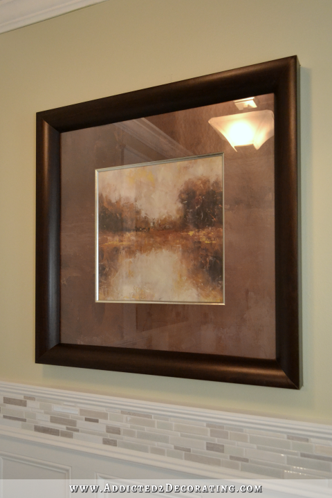
I’ve always found the actual print to be dull and depressing…and way too orange. So yesterday, I got out my paints and watercolor paper, and I painted something new to go in the frame. And this time I kept in mind the advice that some of you gave me — to add a touch of bold color like pink. So here’s the new, final artwork for the bathroom.

Now this one I really like! And as you can see, I also painted the mat white to brighten things up. That dark brown mat was also dull and depressing. To paint the mat, I used a small 4-inch foam roller and flat latex paint. It took three coats to cover it completely.
Now it’s bright and colorful, and I think that the silver leaf mat liner really sets off the artwork.
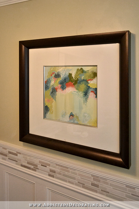
I still haven’t gotten a piece of non-glare glass for it, and I’m not really sure if I want to. The shiny glass makes it very difficult to photograph, but in person, it also adds lots of shine and glimmer to the room, which I really like. So right now, I’m undecided on that.

Anyway, that’s done, and I love it! I think it has everything this wall needed — a thick dark wood frame that ties in with the countertop and ceiling, a wide white mat to brighten things up, a touch of shimmery silver to tie in with the other silver/stainless finishes, and of course, some bright colors to bring a bit of life and movement to that wall.
And here’s a before and after view…
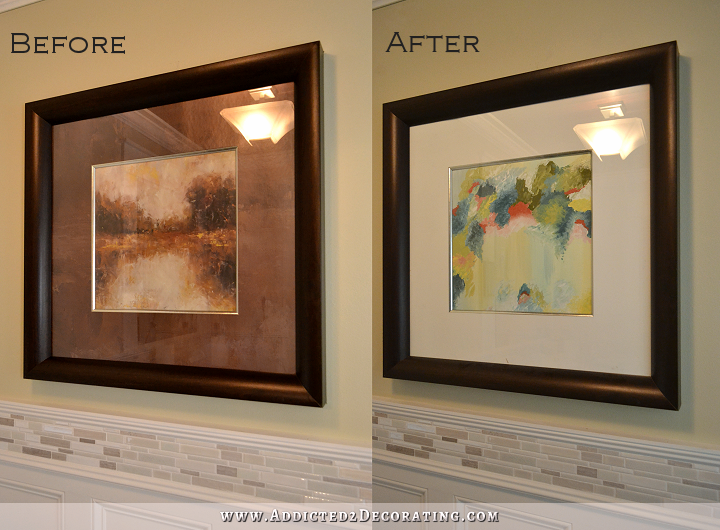
Better, right? I think even if you don’t particularly like abstract art, you’d still agree that the new is much better suited for my bathroom than the original. 🙂
And speaking of “better suited,” I’m trying to decide if the rug I bought from Overstock for my dining room is the right rug, or if I should send it back and find something better. It was delivered earlier this week, and as soon as I opened my front door and saw it sitting there, I got so excited. But my excitement quickly disappeared.
In the picture, it looked white. Or at least, off white. Or a creamy white. But it definitely looked like some shade of white.
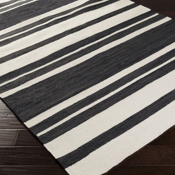
It’s not white at all. I would say it’s more of a light tan. In fact, it’s closer in color to the oatmeal linen fabric I have than it is to white, and I don’t think anyone would ever look at that oatmeal linen fabric and mistake it for white linen.
So I didn’t even bother to completely unwrap and unroll the rug. I’ve just been planning on sending it back and finding something new. The problem is that I can’t seem to find anything I like! I’ve searched for “black and white striped rugs” until I can’t search any more. The problem is that they ALL look black and white in the pictures, but if you read the descriptions and/or the customer reviews, you find that once again, they’re not white at all.
I think the closest that I’ve found is the IKEA Stockholm rug, which is described as black and off-white, and if you search for images of the Stockholm rug, you will see it used in all kinds of white rooms, with all kinds of white furniture. I think it’s close enough. So I had almost decided to go with it, but the more I look at pictures of it, the more I’m unsure if I even like it. I love stripes, but I want full stripes that go all the way across the rug. This design does crazy things to my eyes.
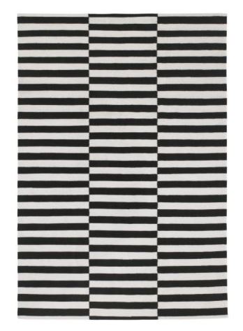
I finally gave up on black and white striped rugs last night, and started looking at jute/seagrass rugs again. I can’t find one on the size (8′ x 11′), color (light and natural, not orange) and price range ($400 or under) that I need that has good customer reviews.
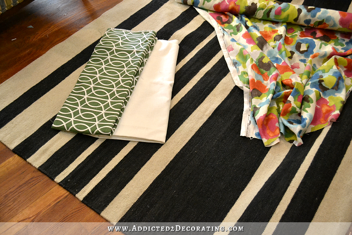
So this morning, I placed everything on the floor — rug and fabrics — to take a picture of them together to show you how awful the rug is, and why it won’t work. But interestingly, after seeing the picture, I’m wondering if it just might work after all!
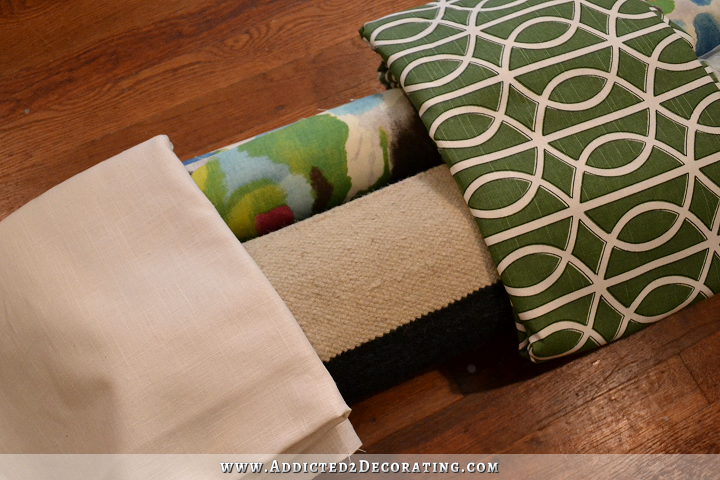
The white linen is the drapery fabric (it’s more of a creamy white, and not stark white). The green and white is the trim for the draperies. And the floral is for the captains’ chairs at the dining table. In the middle is the rolled up rug. And just like all of the other black and “white” striped rugs I’ve found, the picture makes it look lighter and brighter than it looks to me in person. And I didn’t edit this picture at all.
So maybe there’s a reason that rug manufacturers don’t really make black and white (true white) rugs. Maybe they know something I don’t. Once it’s unrolled and placed in the room, it’ll probably end up looking much brighter than it does rolled up in the package. It might surprise me! And maybe I’ll find out that I’ve wasted a bunch of time this week being disappointed in this rug, and trying to find a replacement. 🙂
It really doesn’t look bad at all in the picture above, right? Or is that just me giving in because I’m tired of searching for rugs? 😀
EDIT: I decided to unwrap and unroll the rug and floral fabrics to get a better look. Here’s how everything looks…

Addicted 2 Decorating is where I share my DIY and decorating journey as I remodel and decorate the 1948 fixer upper that my husband, Matt, and I bought in 2013. Matt has M.S. and is unable to do physical work, so I do the majority of the work on the house by myself. You can learn more about me here.

I vote for you to keep the rug. I actually like all of the colors when you place them near each other 🙂
so do I
I completely agree. The rug looks great. I’m not sure that a true black and white rug would look better and I think that Ikea rug is way too busy.
I agree too.
Maybe you have already thought about this – what if you kept the oatmeal linen for the drapes and ‘tea dyed’ the green trim for the drapes? You would still have the green you want and you could keep the grass cloth above the wainscoting on the long wall and it would tie in with the ‘not white’ stripe on the rug?
Just a thought
I had the same issue with two black and white rugs I ordered for my kitchen. I ordered the black and white Birmingham from Wayfair and was so excited by my choice. I had seen it used quite a bit in blogland. John and Sherry of YoungHouseLove used it on the staircase of their current home. Like you I was so disappointed to open it and find that the “white” was more a cream or off white. Not what I was going for next to my white kitchen cabinets. But I put the rugs down anyway and they are perfect. On the floor it reads as white. Some trick of the eye? I don’t know but the manufacturers must have figured it out. Now I think a true white would look too stark. I really think the rug is going to look great in your dining room.
Love the artwork! Looks great in your bathroom.
I vote for keeping the rug. I looks great with your fabric choices. Like you, I struggle with rugs. I can never really find one I like. But I like this one and may order it for my entry way!
Very good artwork. It’s a keeper.
I like all three together. I don’t think you would like a stark white in the rug, not to mention cleaning issues. It’s OK to have different shades of white–certainly keep the green and white trim, it makes everything else pop. Also with a black table it will look more white. Hate the Ikea rug.
I was thinking the same,pure white rug would show up every single mark!
I like them all together. This rug will be sitting under a black table, with bright floral captain’s chairs. I have a feeling that when all is said and done, the fact that the white is not a true white is not going to be the first thing that you notice.
It will be dark under there so one of two things could happen: it will look even darker or because of that i might just blend into the background. How about painting a rug on the floor? Looks great, you get the perfect colors you want, its easy to clean and no worries for Matt.
It will be dark under there so one of two things could happen: it will look even darker or because of that it might just blend into the background. How about painting a rug on the floor? Looks great, you get the perfect colors you want, its easy to clean and no worries for Matt.
Keep the rug!
Yes it goes well with it all together In my opionion. 🙂 good job
I think they all look pretty good together. I’m betting that the rug will look good once everything is complete and its under the table. I truly love the splash of give this room.! Go forth and decorate!!
Have you thought about painting a floor cloth it would not be as weighty as a rug but might work with some kind of padding under it. I love the bath art work and I think the reflecting glass is a sparkling addition. I don’t personally care for the rug or the combo you photographed mainly because of the white in your trims and wainscoating but that’s just me, whatever you do will be superb as usual and I among many cannot wait for your next post. Have a blessed beautiful day!
LOL forgot to say I too get crazy eyes looking at the other rug…what’s up with that?
Me too!! I had to scroll down real fast cause I was getting dizzy trying to look at it, lol!
Me too! Crazy eyes!
I totally agree with you Len! Kristi, I don’t think you are going to be happy with this rug in the long. There are just to many different kind of whites going on.
Keep! Looks great together! Love the art work as well!
Love the artwork! As for the rug, I think you will be pleasantly surprised when it is all put together! If not, roll it up and send it back! I didn’t like the way the Stockholm rug played with my eyes either!!!
I was picturing more white/white with your linen curtains and fabric backgrounds rather than creams or oatmeals. Your pops of colors would show up much better using whites. Also, the tiles in your kitchen backsplash and wall are white and that will be seen in your dining room once you open up the wall as you plan. Just say’n. You are a great decorator and you will make it all come together as always. Have you given thought to painting a rug with the black and white stripe colors you prefer? It’s been done before.
I prefer the rug as is!
I really like the rug, especially the variation in the stripe pattern, but I also like the comment about creating your own floorcloth so you can get the white to your liking. So far your color & fabric choices complement each other well.
I think you should keep the rug. If later you don’t like it – you can always paint the “white” in the truer white color that you want.
I agree, I was wondering if there was some way to “paint” or bleach the stripes white-r?
Love the new artwork for the bathroom. Painting the mat white actually seems to cut down on the glare from the glass. Go with it for now and if you find in future that it’s too glare-y, replace at that point.
Dining room rug looks fine with other fabrics in photo. Get the rest of the room done and then try it with everything. If it doesn’t work, you can either return it or touch up the white stripe with some paint. You did it before with your sofa!
What else needs to be done to complete the bathroom? I think the couple of days you’ve taken off were just what was needed to allow the tub ceiling tile to set up and the wood filler and caulking to harden. So, now you can whizz through the sanding and get it all painted and be finished with the bathroom. There is method in your madness, lol! Can we hope to see a finished bathroom photo next week?
Onward and Upward!
A big Yes! on the artwork. I love the new custom art and the colors meld so well with the room. Great job! And I vote yes on keeping the rug. I don’t think you really want stark white on your floor. The only problem with keeping the rug would be if you settle on the black and white stripes for the entry wall, which might make the rug look dirty in comparison.
I wonder if the grasscloth would work now, if it ties in with the rug shade of white?
I like it all together…plus, it’s not like the “whites” are all going to be right next to each other so if they’re not exactly the same, I don’t think it matters.
Your painting in the bathroom looks great! Love it. I can’t wait to see the entire bathroom, with the new shower curtain, all done. It is just beautiful.
The rug…I hope people don’t start throwing rotten tomatoes at me…but, I don’t think you are going to like it. The rest of your decorating is turning out to be so chic and kind of “cover of architectural digest-ish”. And that rug, while it is very cute – nothing “not cute” about it – just seems too casual for what seems to be coming together in your room. My mom, who has the best taste in the world as far as I’m concerned, has always said that the floor and/or your rug can be another wonderful work of art. As much as you love bold statements of color, and as great as you are at finding “steals”, I bet your perfect rug is out there…waiting…wondering “where oh where is Kristi…” 🙂 But, if you decide to keep that rug…hey, it’s your house! And, you know what you want and like! I’ll happily support you 100%! 🙂
How did you paint the mat? That opens up possibilities for “reclaimed” art.
I love all your choices! None of them are going to be right beside each other except the drapery fabrics and in the pictures the oatmeal linen has enough white to blend well with the contrasting green accent on the leading edge of the drapery. Besides that linen will fade into the background once the bold fabric on the chairs gets upholstered. As far as looking odd with your bright white subway tile in the kitchen, if I remember correctly, you grouted with off white or ivory grout, so I don’t think it is a problem. I can’t wait to see it come together! Oh, and the watercolor in the bathroom looks fabulous!
IMHO a black carpet remnant with bound edges would be a better choice for a rug. Even a black nubby berber-ish. The painted mat is also an improvement.
I vote to keep the light colored rug. I have also had problems with the color white and how it looks in certain circumstances. I recently purchased a white frame with a bright white mat to go with a watercolor on bright white paper which came with a mat but it was a cream color. With the brighter white mat, the mat actually took on a blue cast in the area I wanted to display it. But when I put the creamy white (which originally came with the painting) mat back in the frame, guess what? It all blended perfectly with the white wood. I guess the artist knew what they were doing when they put the creamy white mat on the painting to sell. Colors can be a real challenge and that is why what you did, putting them all together on the floor, gives you a better idea of what you might want. BTW, I think the black stripes are just too busy for the look you seem to be going for. You have the two printed fabrics and that is probably enough unless you wanted to add a pillow or something small in a tiny black print or stripe as an accent in the room. I can’t wait to see the finished product and I am excited to see how it will meld with the green kitchen! It should be beautiful!
Hi Kristi, I like the rug! I think if it had been true white it would have been too stark. I am still having trouble swallowing that print for the chairs. Guess I will just have to wait and see. Seems as though you have everything in place, all you have to do is the grunt work of mudding and patching. Any word yet on the condo. Has your guy held an open house? Hope it goes soon so you can get your hvac done. It will make a world of difference to your ability to work in bad weather. Blessings
Love the new painting in the bathroom!
I REALLY, REALLY like your artwork in the bathroom! Perfect!! As for the rug………I say keep this rug and if it still is not the right color after the room is together, tape off the black stripes and paint the “white” stripes a real white color. The stripe pattern in this rug is so much more interesting than other striped rugs I have seen where stripes were the same width. So excited with you!!
Like your idea!
Lighter mat made a huge difference. I think I will be doing the same real soon. Would you provide a brief statement on how to paint the mat? (Brush vs craft roller. Type of paint. Tips?) Thanls
Please don’t change the rug….it’s perfect, and I can’t wait to see it when it’s all put together! 🙂
I know you’ve posted the answer to the question I’m about to ask but I’ve searched for it and can’t find it, so would you mind giving the link to where you found the fabric your planning on using on the captains chairs one more time please?!? I just love it and want to use it for some pillows in my spare bedroom!
I’m not necessarily voting for the IKEA rug, but I just wanted to say that I’ve seen it in person, and because of the large size of the rug, the offset stripes are not dizzying in person. I think the “crazy eyes” effect comes from it being so small on the screen. If there is an IKEA nearby, you might want to check out the rug in person.
I also love this IKEA rug in person, and under a table especially, the offset stripes won’t be an issue. The rug you have from Wayfair looks too tan…even as a neutral, it will unbalance the rest of the light, bright, non-muddy colors in the space.
Is it me or is that beautiful piece of artwork not centered? I do love all the combos for the dining room but maybe that perfect rug hasn’t shown itself just yet. Rugs are difficult to get right. The bathroom is really stunning. My favorite thing is the wood ceiling. I must start channeling my inner Kristi. You are such an inspiration. Whatever you end up with will be “just right” for sure.
The rug looks good to me. I think you should keep it!
I like the rug so I vote to keep it!
Love, love, love the bathroom art with the current glass! The striped rug I’m not a fan of – very block like to me. Maybe black & white/off white in a zebra?! Smaller “stripes” ? Def NOT the optical illusion rug! Stretching for suggestions!
I purposely mix my whites. I think it adds great interest to a room. KEEP THE RUG, IT’S BEAUTIFUL! 🙂
Am I way too off base if I suggest a raspberry colored rug with a black trim to tie in with the buffet? Maybe that is too matchy-matchy, but I would love to see that raspberry color in the dining room since the table is going black. Nice job on the artwork and I can’t wait to see the shower curtain fabric you picked!!
I like this idea too. I personally think the black and white stripe is too graphic for the other ideas in the room. Just my humble opinion!
All of the whites and creams do not have to match exactly to work together beautifully.
http://coolshire.com/white-fireplace-with-black-accent-color-living-room/
http://1.bp.blogspot.com/_faqPS7Rgucc/TExzddc5rpI/AAAAAAAAAcg/PAuEsSX4rSQ/s1600/dark+grey+white+and+yellow+rm.png
http://www.homedit.com/decorating-with-a-striped-rug-the-basics/striped-black-white/
http://4.bp.blogspot.com/-JVRoJBK2-pU/T9K-bOL32xI/AAAAAAAAZ0s/vIEtsv4ZqCI/s1600/fashiongray+behr.jpg
You are so inventive, why not just find a rug and paint black and white stripes on it? Get just the look you want!
Hi Kristi: Another option is to go to the carpet store and find a rug you like have them cut it to the size you like and bound in the black or white. This way you get exactly what you want. Sometimes they have large remnants just hanging around for a good price. Or like a few suggested, try painting your own zebra striped rug.
Slap me and paint me purple I had no idea one could PAINT a mat!?! My goodness, the possibilities in my own stash of frames is now endless 🙂 As for the rug choice with your fabrics – love it! However, I’m still lovin your artwork in the ‘loo 😉
Ha Ha Ha “Slap me and paint me purple!” I love this phrase! Made me laugh a lot. I have to remember this!
I love the painting you’ve done for the bathroom. Great colors! I think the new rug (from your pictures) works well with your fabrics, but I think you never truly know how it will look, until the room is finished and all the furniture is in there.
Seeing all the fabrics, etc. laid out……there is just something off & it doesn’t look quite right. Can’t put my finger on it…..just something.
I feel the same….something is just a little off….I’ve looked at the picture several times and maybe it’s the greens in the two fabrics…maybe it’s the blue…could it be the rug? Yes, no help here what so ever!
I love the bathroom art, and I think you should keep the shiney glass because it repeats the shine of the tile which I think is important. I also love the rug and the way the black repeats what’s in the chair fabric. The only change I would prefer is to turn your fabric for the green highlight stripe on your drapes 90 degrees. I love that the fabric is turned that way in the picture above. I think turning it gives it an interesting pattern that’s kind of fun with the chair fabric.
I feel that rug is too casual for the dining room. All the other items look very classy and high end, but the rug looks too casual for that room. I have seen the Ikea rug in a room, and I have to say, when your table is painted black and set on top of it, it will not look too busy…and the white looks closer to what you’re looking for than the striped black and tan rug has. I am not saying that you can’t make it work, you have a way of making everything work out beautifully!! Good luck and I’m sure I’ll love anything you decide to do!!
I agree, the rug is too “coastal” with the spacing of the stripes. I think you are pushing yourself to go more glam with this house and a rug with even spaces between the stripes would achieve that look. I also agree with the commenters that the Ikea rug is beautiful in person; I’ve loved it ever since seeing Nate Berkus use the original Madeline Weinrib one in his Chicago house. If you want full stripes on the rug, did you see this one on Overstock?
http://www.overstock.com/Home-Garden/Meticulously-Woven-Reze-Casual-Striped-Area-Rug-710-x-103/9441953/product.html
I think all whites and creams and beiges can be intermixed. You will make yourself crazy trying to always stick to the same cream in a room. The focus is the COLORS!, the whites/creams/beiges just ground it all.
I’m thinking that if it was a true white it would be too bright and detract from everything else you have planned. I’d hate for all your changes and then the first and only thing you see is that rug and not see all the other things. The IKEA rug is wrong – I’m with you, the pattern does something to my eyes and that would contribute to the problem rather than solve it. Unrolled and everything out – it really looks good!
Hi Kristi: I found this website for hand painted ikea rugs. http://www.homemadebycarmona.com/lulu-georgia-inspired-rugs/
I think all your dining room pieces relate well. I believe you have a warm wood floor that would lighten the cream stripes.
As for the art, glass is not recommended for a bathroom where you do steamy showers. You get condensation under the glass. If it is watercolor or areas of bare white paper are exposed you could spray it with acrylic matte spray and go without glass. The matt should be protected with your latex paint. You could do glossy spray if you prefer and spray the matt too. I like the square format and the colors in the art. Good job!
I’m in the crowd that says keep the rug! I think it looks good with your fabrics and color choices. The Ikea rug is even more crazy in person, I’ve seen it
I wasn’t feeling pink when you mentioned it, but love it in the artwork! It adds that spot of drama without being overwhelming. 🙂
Terrific upstyling of that framed art. Loving it, and whoever suggested a pop of color was spot on. Now you have me looking at old framed/matted prints differently. Thanks.
Confused much? Go with your gut! Take a couple days rest from it and take look at it together! That is what I do because I can get overload with pattern and color….understand I am someone with perfect pitch color…ha…I mean I can leave the sample at home and come home with the color match! had to do that a number of times because I forgot my samples…in fact almost all the time….ummm…never mind I had nothing to add except maybe make you laugh….laughing heals and increases your endorphins….energizes the spirit… Keep you spirits up!
Wow for the paint work it looks amazing well done! Now for the rug etc. I say keep the rug as it all looks complementary, love the complete look.
It’s your house, so it’s what you want. However, for my taste, it’s all a little too busy, but I’m betting it will be beautiful when you are finished with it. I do LOVE the bathroom picture though!
Are the vertical stripes in the dining room a creamy white? Whites can look good blending or being all the same white. All same white is pretty bold and blending is softer. All depends on what you want!
Isn’t one of the first rules of design to blend and not match…..isn’t that where too matchy matchy! came from?
Love the painting in the Bathroom because it is the perfet size for the wall! Great job.
Congratulations on a lovely piece of art again. Great job. It’s surprising how different the white in your rug looks from the stock photo from Overstock!
Personally. I don’t at all care for that rug with your other textiles. I think it does nothing to enhance or set them off, but instead succeeds in dulling them down. I just don’t find it to be a complimentary combination.
I know you have painted your own rugs before, and I would have no doubt that you could do it again for the rug you want in this area … and create a much better pairing. ~:)
LUV your painting!!
I wonder if you would have an easier time deciding on the rug after more of the other elements are in the room. There are a lot of loose ends right now. For me personally it is much easier to make decisions when there is more structure around the project. I think the rug you have now would work just fine. Black and white can be so jarring, and colors (including white) don’t have to match exactly, in fact, often times it’s more interesting if they don’t. Keep up the good work!
I’m really not sure about the rug. I think it’s too early on to know if it will work. I’d say keep it as long as you can and work on the other items to see how it all comes together.
Did you see the b&w rug in the foyer at stonegableblog? Really can see how the white plays differently on the floor ….
Re: white stripes in rugs …
One of my earliest memories is sitting in my grandmother’s kitchen as she scrubbed the kitchen floor on her hands and knees. And she told me then, “When you grow up, never have a white kitchen floor.” (It had some blue and grey flecks in it too, but no matter.)
When I grew up, I did choose a black and white linoleum for my kitchen floor, and my grandmother’s words came back to haunt me on a constant basis. Pure white anything on the floor of a room where food and beverage are served? You will live to regret it. Pure black showed dirt in a way I’d never anticipated, either. No matter how often and how hard I scrubbed, that floor rarely looked clean.
Unless you live a hermetically sealed life, you’re going to be living with a mottled black and something striped rug. Will shoes or wheels ever cross it? You’ll see every smudge, every trace, every piece of lint. Seriously.
I don’t mean to rain on your aesthetic parade, but I do wish you to have this input before you spend your money. Design-wise, my B&W floor was awesome. Practically speaking, it was cause for despair.
I’m worrying that I sounded too negative, and I would never want that. I’m just trying to offer you my experience with the use of black and white as a floor covering. From a design standpoint: it’s drop-dead gorgeous. Hell, I chose it myself! From a maintenance standpoint: it requires significant, sometimes major upkeep. If you’re willing to do that kind of upkeep (frequent spot removal, rug shampooing), then all is good. If not, you may want to reconsider placing it near a high traffic area and under a dining table. (If I’ve misunderstood your intended use, please forgive me.) If not the dining room, there will be many places in your home that would be less maintenance-prone (your future office?). Whatever you decide, I know it will be gorgeous.
Have you looked at the Olin rug from Crate and Barrel? It’s black and creamy white stripes. It may be an option to consider.
Kristi, all of the items are beautiful together! The fabric, the rug all look so put together! I’ll be waiting to see how it all comes together!
Kristi, sorry about all the “togethers”!
Even with just you and Matt white rugs tend to turn dingy pretty quick. It doesn’t really seem to matter how careful you are. Also, some of the best advice I’ve ever been given is to never try to match things exactly. It makes a room, or outfit, more interesting. Just make sure the kind of blend. It is especially true when things won’t be right next to each other.
In the last picture, I can see that the rug is not pure white, but everything looks good together. Another thing, most of the rug will sit under furniture, with shadows and light changes throughout the day, the difference will not be noticeable. I would quit overthinking it, keep the rug, and move onto something more important.
Keep going. You are amazing.
I like this rug with your scheme . . . But one commenter suggested ZEBRA!! Wow! That would be fantastic! I think that would just blow the roof off!
Love the bathroom artwork! And the rug does look more Briggs than white but I think it works really well with the other fabrics you’ve got there. (And true white gets too dirty too easily, so this will likely be better in the long run.)
What’s the return window from Overstock? I still maintain you need to try a rug IN your room before you’ll know if it fits. If you do decide to send it back hold off on buying somingthing until your room is mostly done.
I will say, I feel like we’ve seen this on the blog with other projects…you get fixated on finding a single element that matches your original vision…ignoring that the vision has grown and changed over the time of the project. Then when you finally find the element you realize it’s all wrong. I sort of feel like that’s where this rug thing is headed. You’re focusing on finding a white and black striped rug. Period. As the rug wasn’t part of the initial “THIS is what I want” process…why not try something new and hold off on deciding about the rug?
I don’t care for the rug color. To my eye it looks black and tan. I think black and off white or black and cream would work perfectly fine… but this one does not go with the vibrant colors in the floral fabric or the green fabric curtain trim.
Shades of Light has one that looks more off white than this one. Have you checked that one out?
http://www.shadesoflight.com/chic-indoor-outdoor-stripe-rugs-6-colors-available.html