Options For My Music Room Walls
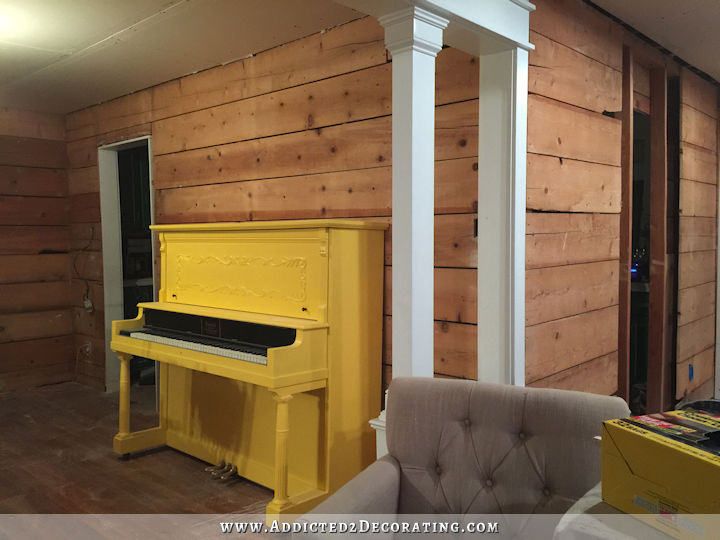
Now that my piano is refinished and repainted, I’ve been so anxious to work on the music room! I will not be making it a priority over the entryway and dining room, but I will probably be doing some projects in there as I’m also working on the entry and dining room. After all, these three areas are all open to each other, and all visible from the moment someone walks through my front door, so the music room really does need to be finished also in order for the entryway and dining room to look finished and presentable.
Since I went a completely different direction with my piano, and it looks a little more elegant than I had originally planned, I’ve been wondering if I might need something a little different on the walls. One thing I’m almost 100% certain about is that I do…definitely…want some sort of bird and tree limb design in there. I want it colorful, playful, and lighthearted. When the plan was to have a yellow piano, the Schumacher Birds & Butterflies wallpaper (or rather, my DIY version of that wallpaper) seemed completely perfect. But how would it work now with my more elegant piano? I did a little photoshoppin’ to see if I could get an idea of what it would look like.
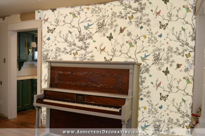
I actually do still really like it, even with the different colors on the piano than originally planned. On my hand-drawn version, I would be a bit more intentional about the colors I use, and bring in some greens that coordinate with the kitchen, and coral that coordinates with my buffet, and some other colors from my dining room fabric. And again, no butterflies. Just birds.
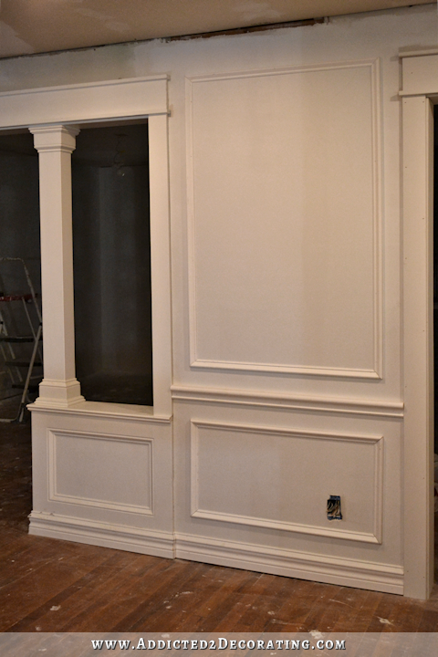
One thing I really like about that wallpaper is that the actual limbs are drawn in black, which would coordinate nicely with all of the other black that I plan to use (and have already used on the doors) in these rooms. But of course, since I plan to do my own version, I can make any changes I want. And if I go with this design, I think I would make the limbs more like the style that my mom did on my niece’s bedroom wall. The Schumacher version seems so messy and scribbled, and I think I want mine a little more…well…not scribbled. Here’s a closeup of my mom’s design…
I also had this idea that maybe instead of doing the design on a white background, I could use a color as the background. Yellow, perhaps? I happened to have two yellows on hand, so I tried them out. And after the paint was dry, I took about five minutes to scribble a design over the top just to get an idea of what it might look like.
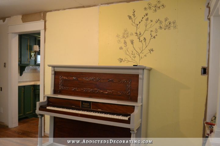
That vine looks terrible, so you’ll have to use your imagination. 🙂 When I do the actual, final design, of course I’ll take more care to do a good job, and I’ll also have a definite pattern and repeat in the design, since I do want it to look like wallpapaer.
Anyway, the yellow on the left is Behr Rich Cream. That’s what I used on the walls in the condo living room, breakfast room, and kitchen, which is why I happened to have some on hand. I think it looks awful. It’s so strange that it actually looked very yellow in the condo, but here it just looks washed out. That’s the second time I’ve tried using a color at the house that I used at the condo, and it looked awful and washed out.
The yellow on the right is the custom color that I had mixed for the piano and then decided not to use. I think it’s a very pretty yellow, but I just wish I were better at Photoshop so that I could get a better idea of exactly how that design would look on a yellow background. It’s hard to tell from my scribble. I do like the color, and I think it looks pretty with my kitchen, but I think I might prefer the white background. The white background would really let the colorful birds stand out more.
And then just this morning, as I was going through my “inspiration file” that I have for the various rooms in my house, I came across this wallpaper design that someone gave me a link for in a comment on a post a while back. (I have no idea what post, or who left the comment, and since I can’t find the link anymore, I have no idea where this wallpaper is from or how much it costs.)
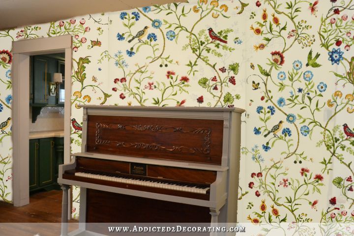
I really like this one, too. It’s also bright, and fun, and colorful. It definitely looks good with my kitchen, in my opinion, but I would still need to do my own DIY version of this because the colors in this aren’t right for what I’ve already done and still have planned in the adjoining areas. I’d need to add my own color palette to this design.
But since these vines and birds are much more realistic and detailed, I do question if I have the artistic ability to pull this one off. I’m quite certain that my mom does, but painting a pattern like that on all four walls of my music room, even if it is my mom, and even if it is a small room with lots of doors and relatively little wall space, is a heck of an imposition to place on another person. So whatever design I choose, I’d need to be able to do it myself. This one might require a lot of practice.
What I need to do is just come up with my own design. I need to take the things I love from each of these two design, discard the things I don’t like, and end up with the perfect design for my home. I like the use of only black for the limbs, leaves, and flowers from the first wallpaper, but I like the more realistic and less scribbled design of the second one. I also like how the vines are all curvy and intertwined and growing upwards on the second one.
Perhaps rather than getting my mom to paint a design on all four walls in the room, I could just get her to come up with one repeat of a design, inspired by these two wallpapers, that I can then transfer onto the walls myself using a projector. That seems like a good compromise. 🙂

Addicted 2 Decorating is where I share my DIY and decorating journey as I remodel and decorate the 1948 fixer upper that my husband, Matt, and I bought in 2013. Matt has M.S. and is unable to do physical work, so I do the majority of the work on the house by myself. You can learn more about me here.
I’ll be honest, Each of those makes the piano look small and not a focal point like it should be. Seems like a waste of a cute piano.
I agree with Diane ..the piano needs to be the focal point IMO because it is so beautiful. I live the vine work you have drawn on the wall… I would go that route ..It would be lovely
Yes, just the vine work without all the birds, flowers etc would look beautiful, in my opinion. And then the beautiful piano would stand out.
Yes, I agree. That was my first reaction, it takes away from the piano and looks too cluttered.
same reaction as Barb. Too busy looking with the flower “wall paper” and the design on the piano. when i look at it, i only see the wall instead of the beautiful detail on your piano.
Wainscoat the music room and keep it simple. Trees and birds are too old lady for you.
It looks like pretty exciting things are ahead for the music room. Only you are saying letting your mother help is an imposition. Maybe you ought to let her make that decision. She is an artist, and like you, is very proud to do her thing. If you had not put the yellow paint on the right (which I love) the cream yellow on the left would have been beautiful, and allow the birds to show up great. You are going to be so house-proud when this area is finished.
I think I may have mentioned this before, but if you really would like your Mom to do the design (or help with it), why not have her create the repeating pattern and then order custom wallpaper of the pattern? If you do a quick Google search, there are a few sites that let you upload your design and they’ll print rolls of wallpaper and ship it to you.
Granted, you’d have to have a decent scanner or really good lighting setup to photograph the print drawing, or maybe if you went to a print shop, they might be able to scan it for you.
Just a thought… And it’d save you a lot of time hand-drawing or tracing a pattern.
That was my thought, too. I haven’t ever used any of those companies, but I know Spoonflower and such aren’t too crazy in pricing for fabric, so maybe your own wallpaper would be doable?
My personal favorite is the Birds & Butterflies (or what will your version of it) But like you said I prefer the vertical-ness of the vines in the 2nd one. I was going to suggest exactly what you mentioned in your last paragraph about doing a single repeatably design and them transferring it with a projector.
I also think that white will be the best color against the design and the piano (which turned out amazing BTW!)
Good luck with whatever decisions you make!
I will be in the minority, I am sure. But all of those choices look opposite of your style. They all give the feel of “old lady house with the smell of moth balls lingering”.
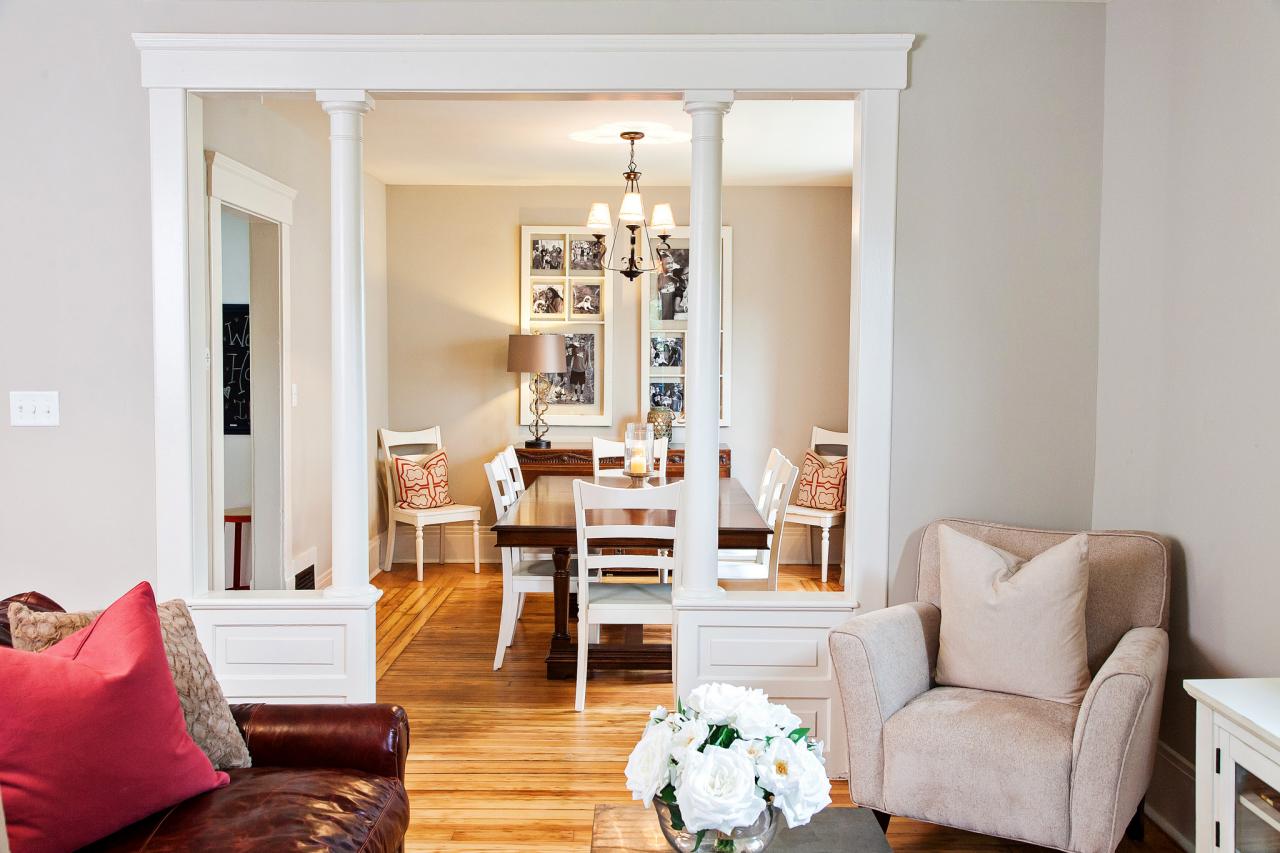
Aside from the “old lady look”, it always takes away from all the amazing other features like the pillared entry into the room, the rolling doors, and the peek of the kitchen reno.
I really feel lately every idea you are now coming up with are these over the top ones. I kinda feel like you are lost in what you want, and are just trying to keep making bold statement after bold statement. Not every single item you touch needs to be vibrant colors, or out of the mainstream. Simplicity isn’t always bad.
My sentiments as well!
i agree!
I agree.
I agree! Not a fan of the walls with piano. Perhaps bold art and neutral walls and let your french doors and piano be the stars of the room.
I don’t like either one. When you look at your plan for the dinning room. I would think you would have at lease one room that isn’t so colorful. You have a lot going on. You could have a print curtains.
I also agre with this comment.
I agree! Thinking of that wallpaper on all four walls seems dreadful.
I must agree with Jodi. “Old lady” room came to mind also. I know how much you love the sweet designs you’ve been working on. The piano changed that plan. The piano room needs more serenity, less whimsy. A place of charm and elegance. However, I’ve loved your choices and it’s where you feel happy.
I agree, this room should be a room of serenity and less whimsy. The gorgeous piano should take center stage. Perhaps when you finish the dining room and entry, you will be lead in another direction for the music room walls. Please note that this is not a criticism, you are an amazing DIYer.Your blog is my favorite, I love that your not afraid to get in there and get the job done..
Sorry, but I agree also. I love both of the bird wallpapers alone, but once you put it with the piano it does look cluttered to me 🙁
Agree. It is not fresh and young, and from your past posts, the art work you are drawn to is modern, fresh and young.
Ditto. The wallpapers are busy and detract from the beauty of the piano. I think a solid color wall behind the piano with your freehand or wallpaper on the other walls. I like your “scribble” on the brighter yellow but the additional colors are making things very busy.
Agree. It’s overwhelming.
I thought this was just going to be on one wall. I think it will be too busy on all 4 walls. IMHO
way too busy …simple is as simple does…go with a simple wavy branch …nix the flowered wallpaper…hate to say this but “ugh”…it takes away from that beautiful piano and that is not what you want
I’m with the first commenter, I’m not really a fan of any of them. 😐 It all feels like a LOT for 4 walls. Perhaps using it as more of an accent instead of the overall wall treatment? You always end up pulling it off though, so I’m sure even if you put it on all 4 walls it will somehow magically work. 😀
you could always do that sort paneled molding and frame the design, or fall back on a music score faded out as a background and do selected birds and vine over that
Yes! This ^ !
Hey Kristy,
What about freehanding the vines and flowers and using a stencil to add the birds. Cutting edge makes a couple stencils that are just birds by themselves. Reduces the required drawing ability!
I have to say – I’m not lovin’ it. I think those options are too casual given the plans for your dining/entryway and the look of the piano now.
And the ones with the yellow background? No. Just no. Not with the bright white trim and the whites in the kitchen and dining area.
Speaking as a graphic artist/designer – taking on doing mural work like that over 4 walls is something I would be leery of tackling and I’m no shrinking violet when it comes to home decor. I’ve done plenty of decorative painting in the past. In order to get it to work well you would have to plan out the design carefully along with repeats and scale and it’s going to be a tremendous amount of work in order that it not look messy or amateurish. If you are really determined to go that route – it may be worth it to look into sites like Spoonflower where you can design your own wallpaper, wall decals and fabrics.
In all honesty – I think you’re getting ahead of yourself. The piano looks great but now you’re starting a process of decorating around it. If it were me – I’d work on the areas where I’ve nailed down the elements and the direction – the dining area and the entry – and when those are more complete a direction for the music room may present itself.
I totally agree with this comment. I feel like you will start this and then change your mind again. Do the dining room and entry and then you will be better able to judge the flow into the music room. I know it’s probably a bit frustrating to hear but you do seem open to opinions. I love what you do and have learned a lot from your blog. But I agree with the other poster who said you seem to be going more over the top lately. It’s good to get out of your comfort zone but you also have to stay true to yourself.
Styles are really mixing here and they don’t mix all that well. Your kitchen and your dining room are actually more edgey (and I love them) then your previous decorating (in the condo). The birds and twigs are just too busy, the piano gets lost. Maybe some subtle stripes here? Or not so subtle. Something more graphic and modern. I like pretty much everything you do and have no doubt this vision will evolve.
I would go with something simple and understated so that the beautiful piano is the focal point of the wall. I do love both of the colorful walls but the piano gets lost in them. The darker yellow is a good contrast to the gray and dark walnut of the piano. I would keep the vine simple and perhaps use it to draw the eye to the focal point of the piano, and help it stand out. It will give the wall more interest and showcase your piano for the work of art that it is.
I agree with the comments that the wall paper is old lady looking & 4 walls is too much & busy & takes away from your piano. This room needs to flow with your entryway since it will be seen upon entry. I would go with more simplicity & do accents – artwork that have to do with music. A small seating area for folks to sit and listen to the piano. If this is your only instrument being displayed I would have things in the room that scream this room is about music. Otherwise it would just look like a room with a piano in it. I love your work you do. I know you love color but I don’t think this is the room to try to be so bold in. I don’t think you would be happy with it.
I am a lover of yellow. But, seeing the two choices behind that piano does nothing for the elegance of your house. I’m surprised I felt that way. Isn’t it amazing how strong a reaction we can have to colour? I think the final wallpaper is lovely, but wondering, like others have said, if it’s too loud for four walls?
I agree that the wallpaper is too busy behind the piano. The piano is so gorgeous I would think something more solid behind it would be best. Everything you do is amazing, so I am sure you will figure this out!
Well . . . . I think both wallpapers are too busy for that space. I realize you are going to sketch your own design so my idea would actually cut down on the work involved! I think some sparsely drawn (sketched) tree limbs and the occasional leaf in black only would be beautiful and elegant. I love birds but I believe that’s just too much for this area. And the less color you use in the wall design the more flexibility you will have with accent pieces/wall design. Just my thoughts! You always do a great job!
The piano comes across as dull and flat. I liked your original idea of yellow. You are definitely going to need something brighter and bolder on that wall if you’re trying to make it a focal point. I wouldn’t do all the walls, just the one behind the piano.
I agree, I really, really loved the idea of a yellow piano! I think it would have gone fabulously with either of those wallpapers, even if they were used just on the wall that is behind the piano. Although I think Kristi did a wonderful paint job on the piano I don’t think it fits in with her other decor. There’s no wow factor for me. Nonetheless, I’m sure that whatever direction Kristi goes it will end up looking magical!!! Plus it is her house and her choice, and Matt’s too!
I agree. I don’t care for the piano. I would have preferred the yellow piano, as first planned….and an even brighter yellow. I also agree with the comments saying “work on dining room & the answer for music room will present itself.” I know I’ve missed something, but these rooms, dining, music, kitchen are so grand~~~will you have a living or family room? Where you & your hubs can sit “of an evening” to relax, watch t.v. & chill out?
The new style for the piano is great, but the new wall colors don’t work with the piano colors. You will either need to go with a darker gray on the wall, or you will need a color that POPS!
I think you need something more graphic than the birds. I love the Schumacher paper but I don’t think it’s right with your piano. To me, it seems like something you would have used in your condo and while the condo is lovely, it’s not the same direction as you seem to be heading in this house. I personally am not a fan of “accent” walls, so I think if you pick a pattern or graphic it should be on all four walls, even if it is BOLD.
Your house looks fantastic so far, good luck! Maybe as you work through the dining and entry and see those pieces in place it will steer you in a direction for these walls.
I like the idea of using your hand painted birds and vines in the music room. While I love the yellow on the right, I don’t think I would like the painting on it. I think it looks better on white. I was drawn to the greens in the wallpaper with the green in your kitchen cabinets in the background. Also, I’m not sure I would like that on all 4walls – maybe just 1 as an accent? Good luck and don’t fret! Everything will come to you and it will work out. It always does.
I don’t usually comment on others design because it is so personal, but if you are set on having wallpaper and want your own design why not have your mother draw the design and have the paper made. It would be a lasting and beautiful room in your home. I am not sure where you have it done but with Google I am sure you can find out. I have seen this done and it was beautiful. If it is expensive maybe just do one wall. Your Mother would be flattered to have a piece of her art made into your wall covering and take the original art and frame it for her or use it somewhere else in your home.
I’m thinking the wallpaper is taking away from the beautiful piano, which is probably the focal point here? Not liking it at all. I do like just the freehand black outline of the tree limbs, but not on the yellow. Could you just do the limbs, very sparsely, and put a shadow of the birds (no color).
BTW, I love the wallpaper. Just not in this context.
Why can’t you just paint the walls and decorate with colors around the room? If the piano is the focal point then plain walls seem the best option.
I love the idea of merging the two designs! I really love the white background instead of the yellows. I’m getting excited to see this come to life!
As much as I like the birds and butterfly theme, and I do, I think it falls flat for your music room done in this way. It just doesn’t hold up to your beautiful piano or gorgeous kitchen. Maybe for a future mudroom or powder room. I would love to see you do some shadow boxes surrounded by a bright wall color (as you were thinking for your dining room) and then feature a design within those boxes. See the chinoiserie silk wallpaper with gold bamboo frame I pinned from http://www.aestheticoiseau.com/ (my pin: https://www.pinterest.com/pin/22799541840257826/0) I tried to copy and paste photo but it didn’t work. What do you think?
I’m sorry, I couldn’t get past that Moroccan coffee table. Gorgeous! 😉
My first thought when I saw this gorgeous piano was “vintage” song lyrics as wallpaper! You can do it! Love Love Love your work <3
I’m worried that such a design on all four walls, top to bottom, will look way too busy – the second photo kinda made me dizzy already… Work should be much easier though with a projector! What a genious idea!!!
As for the wallpaper, or any other images you may need to track down, you can search google by image – you upload your image there and it finds it on the web. Go to https://images.google.com/ and click the little camera icon next to where you normally type your search.
I am still thinking framed as art to add a touch of whimsy to an elegant room, at best. While I like both examples (2nd one best) I am finding it busy over all. It is easy to give an opinion, but please realize my whole house needs a décor do over and I am busy being stumped by the entire thing. You always do fabulous stuff. Can’t wait to see.
Yes I agree! Just use it as a framed art piece, not as a wallpaper. Its very busy looking. I love the second one the best but just not for the music room, especially since its all open and visible from the foyer.
Didn’t read through all comments so maybe it’s been said…what about just doing one larger branch with a couple birds on the piano wall. I think otherwise it’s too busy. Then on the other walls, do the yellow or maybe even continue the wainscoting? Even on the bottom half of the walls?
Love the piano…………..but I do think the beautiful wallpaper overpowers the piano. I LOVE the idea of a single branch above the piano and a solid wall color in the entire music room.
My mother always told me that its’ important to have negative space in your home (and gardens) so your eye has a place to rest. I know you will be doing some special things in your dining room (along with the beautiful buffet), so perhaps the “negative” space of your music room will allow you to have more fun in all the adjoining rooms.
The birds and branch “wallpaper” could possibly be used on the wall in your eating area that leads out to your garage.
I think the original birds and butterflies (minus the butterflies) with the white background and black vines would go really well with what you have planned for the entryway and dining area. Bonus is you can use all the colors from the other rooms and kitchen to really pull all the room colors together into the design. I don’t think it’s too busy at all and I love the creativity and whimsy of it. Go for it.
I agree! Love this idea! It’s forward thinking, fun and elegant all at the same time. You ROCK Kristi!
I am trying to envision this but I am having a hard time. Could you get a picture from closer to your front entry way, so we can se the pony walls and gorgeous black doors…as well as the piano?
Thanks Kristi!
The piano is beautiful! I think a darker wall for it would make it show up much better. Since the edges around the piano are light it would really stand out. Maybe you could have your birds on just one wall.
It seems a little busy for a floor to ceiling application in a small room and I think it competes with your piano. What if you did wainscoting all they way up the walls and just did the design in the upper panels? I thought you mentioned something like that when you were looking at options for your foyer? It would be less busy and a lot less work!
I agree….tall wainscoting with design on top!!!
This is what I was thinking too. It’s strange to have such a strong negative reaction….. but imagining that design on four walls is the opposite of a calming home retreat. Over stimulating in a small room might be a better way to express. Good luck Kristi!
I like this idea too!
I am drawn to the last wallpaper. The green looks great with your kitchen in the background. I do agree with most commenters, though, that the piano looks blah against the busy wall. Perhaps a tall wainscoting with the bold wallpaper on the top (with white background).
The wallpaper is way too busy behind your tasteful piano. I like the idea of the elegant molding for that room. It would come across as an area to rest your eyes after the visual stimulation of the dining room, the pizzazz of your bold piece in the foyer and a nice preparation for that amazing kitchen. Let that beautiful piano shine!
What a treat to see visit your site each day! Thank you!
I say go with the simple vines and let the piano and the wonderful kitchen be the show (with the great doors, and cool table, etc.) (lol) that you have done in the house.
Looks like I’m going to be odd man out on this one because I LOVE the idea of doing your version of the Schumacher Birds & Butterflies wallpaper. However, I think what I love about it is the clean simple look of the black hand drawn branches against the white background so when you change the background color to yellow it looses that crisp clean look and feel. For some reason I thought you were going to be running wainscoting thru the entry and dining room? Am I just dreaming that up? I think the white wainscoting with the wallpaper above it and that piano in front of it (with it’s new beautiful finish) would be striking! I know your talented enough to pull off the hand drawing on the walls, but have you thought about doing your own wallpaper through Spoonflower!?! I would love your version of wallpaper for my master bathroom but I’m not talented enough to create it myself! Thanks again for sharing your creative self with the rest of us. I look forward to your post every day!
Kristi you did such an amazing job refinishing that beautiful piano! If it were mine, I would want it to be the focal point of the wall it’s set against.
I love your idea of the colorful birds & branches in that room. How about doing that on 3 of the walls but on the piano wall doing just a single color from the wall paper & only putting the elegant black branch on it to compliment the wall paper & piano.
Love that you think outside the box!
Sorry, I haven’t read anyones’ responses but I say, solid colored walls and butterflies etc on the ceiling.
If this prints twice sorry, it didn’t look like my comment got posted. Anyway, I say paint the walls a solid color and do the butterfly WALLPAPER on the ceiling. (I’m not thinking yellow works with your kitchen next to it but it’s your house.
I think the birds and branches wallpaper on the ceiling Is a great idea too!
I think that everyone agrees they are not good choices. If you must have some sort of wallpaper, maybe like a beige/ white wide stripe??
It’s not right, it’s too much. However, what about doing a large painting of the design you like, frame it and hang it on the clean white neutral wall behind the piano (or elsewhere in the room)
I am a big fan of the wall paper. I dont love the first one with the piano and kitchen. It seems too traditional. I love the last picture. It is brighter and fun. Reminds me of a polished cotton or chintz. I think if you are going to go the wallpaper route then the last one is the way to go. It really pulls the kitchen into the room. Your instincts are pretty good so go with them!
Way way way to busy! Your beautiful piano gets lost in the background IMHO. The wallpaper is all I see when looking at this, with something “blah” in front of it! My eye does not see the piano at all, just a very busy wall! However, it is your house and you’re the one who has to look at it 24/7.
I like the additional color in the second wallpaper. But I don’t like the obvious linear up/down direction of the vine. Do the b&b with birds and flower groupings.
Will this be over the whole walls or upper portion with wainscoting? For some reason I had wainscoting in mind. I think upper portions with the busy pattern will be fine…but the two toned piano doesn’t look good against a fill wall of the busy paper.
I’m a little confused. Weren’t you doing the pretty studded stripes on your walls?
I didn’t like how that was turning out.
I went back and looked at the post. I think the striped walls would be awesome in that space with the piano.
I think you need to finish the other projects you have and then come back to this.You will have a better idea after there done. Sometime it’s not good to have so many projects going at one time.
I like the very simplified version of the birds design. However, I agree that it takes away from the piano. I would use the birds design on three walls, with or without a color behind it. On the piano wall, use the same wall color – either leave off the design, or draw a frame around the piano with the the black Sharpie to tie it into the other walls.
I’m afraid I agree with all those who don’t like the wall design. It’s much too fussy and busy to be in the midst of your more boldly designed rooms. You’ve developed a very different ambiance for your home that doesn’t coordinate well with this delicate, fussy look. The very graphic design of the sliding doors and even the choice of concrete counter tops have impact and oomph to them. Even if you make the branches less lacy, I still think it will look like a before picture rather than the intended finished product.
I also think you received very good advice from the graphic designer who tried to dissuade you from such an undertaking unless you actually have paper printed which, though a wise course, might be cost prohibitive.
Although I think the piano looks pretty, I question the color. I think it’s going to make it more difficult to find a color you’re happy with on the walls, and it’s not a smooth transition looking into your green kitchen. I think a better color would have been similar to your counter tops and then with a tinted wax over it so it wouldn’t be matchy matchy but would have flowed nicely as your eye was attracted to the kitchen beyond.
I have no doubt, however, that your music room will ultimately be as lovely as the rest of your home
Kudos for your niece’s room! You and your mother did a beautiful job, and your niece must be thrilled.
I agree that the piano gets lost in front of the wallpaper. I don’t have a clue what you could do, but I am confident that you will be able to make it POP! Do you get discouraged when your “fans” disagree with your ideas? I hope not! This is, after all, your house! Love seeing your thought processes in progress – you always impress me!
I’m surprised at the number of really strong reactions. Texas Memaw said it well. It is your house.
I painted a bedroom in two shades of green. Everyone thought it was a terrible idea, because the greens are closer to chartreusse (sp?) than mint or forest, but I did it and I like it. And next month a young friend is moving in . . . she loves the room.
Kristi, I went back up to look at the picture again. I love the look of the piano against the wallpaper, especially with the infrequent pops of color from the birds. And I don’t think the piano will get lost with the pattern. It’s not lost in the photo.
I don’t get discouraged with other people’s opinions, and I don’t mind people expressing their opinions at all as long as it’s done in a nice and helpful way. What DOES discourage me is when I feel like I have absolutely no idea what I’m doing, and every time I feel like I have it figured out, I realize I don’t. That discourages me, and that’s how I feel right now. But that’s because of me, and not anyone else. 🙂
I think it all just means that your heart and brain are working their way through everything to reach what you really want.
Why do you have to have it all figured out yesterday? I think the part you have the most fun with is the planning and it gets you through the drudge of all the tasks you have to do in the rooms that you have figured out but aren’t to the fun stuff yet. I’m kind of the same. 🙂 I think you should keep your options open and evaluate once you have the dining room and foyer done. By the end of that process, I am sure a clear direction will present itself for the music room.
I think you may be just a little too far ahead of yourself right now. It happens to all of us! But at the same time, as I tell people, I like pickles, and ice cream, and ketchup, but I wouldn’t put them all in the same bowl at the same time. Maybe this wallpaper/diy design belongs in your office, or the breakfast room instead… or maybe it will end up in the molding in the living room, but right now that’s not a decision that can be made. Need to see it develop. So step back, and start at the beginning, and let it happen! You are talented, and it will happen when it’s supposed to!
Kristi, you have a lot of balls in the air here – perhaps you’re too many steps (and ideas) ahead of yourself. Focus on the dining room/entryway, and what you do there will speak to you and tell you what to do. And it will be awesome. 🙂
We have TOTAL confidence that you will figure this out…..it just takes time Kristi.
Well to be honest….I don’t like any of the choices. Looks like my Grandmas house. Of course I’m not a big fan of busy floral wallpaper, but these choices just seem out of place with the other great things you have done and with your plans for the dining room…..but just my opinion!!!
I’d say less is more. Why would you think you have to make it look like wallpaper with repeats all over? Wallpaper was made to imitate hand painted/stenciled art on walls…so why not do your elegant line drawing, black on white with a spot of color? Make it your focal wall or panel, and let the rest of the room compliment it.
i usually love your design choices but this time not so much. I think this style of birds and limbs are busy and old lady looking. You have chosen this style twice , shower curtain and drapes , and have changed your mind. If you are determined to have a birds and limbs I would suggest a subtle oriental style design that would enhance the room and not fight for attention but blend all your rooms together. Personally I think this room already has elements that shout look at me . Of course we all have different opinions and styles. You have wonderful taste and it is your home.
The piano absolutely just fades away in front of that busy wallpaper, in my opinion. I’m really not feeling any of the choices, but, it’s your choice.
Wondering for the limbs, if a watered down color of the gray from the piano would work so toning things down. Then adding a bit of black line just here and there to add subtle definition to them.
Is the final color of the door trim the cream?
All of the trim is white.
I think horizontal tone on tone stripes would be pretty. Maybe something shimmery. Wouldn’t take away from the beautiful piano.
I thought I understood your vision for the rooms you are now going to work on, but once you painted the buffett coral, then the piano brown and gray, I somehow have lost my sense of any of it now. To each his own; however I’m still a fan of yours, ok?
Please step back and take a deep breath, Kristi. You’ve already spent so much time, effort and money on your kitchen floor, your living room, your first dining room table…only to realize later that it just wasn’t you at all. I get the feeling that you’ve gotten to the point of just spinning your wheels and never really getting to the place you want to be. The piano is so very beautiful, and the wallpaper just makes it disappear. In my humble little opinion, the birds and vines are WAY too busy and cluttered for even one wall, much less all of them. I can imagine walking in your front door and being hit with so much color, pattern and texture that my brain wouldn’t know what to focus on first. I am currently living in house #39, and I’ve made my share of decorating mistakes. Sometimes elegance and simplicity really are best. And when all else fails, ask your mom for her brutally honest opinion 😉
I don’t have to ask. She shares it readily. I got a text from her about my walls almost immediately after I hit the “publish” button on this post. 😀
And…what did she say???
To paraphrase: “Ummm…no. That’s not going to work.” But she used many, many more words 😀
I like the last wallpaper sample, but my eye is immediately drawn to the blue flowers, and I think you want the focal point to be the piano. Perhaps if the design was less busy, with fewer flowers, it wouldn’t detract from the piano so much.
I love the wallpapers–both of them. And was really excited about them with the yellow piano. But now, I’m not sure I love the look.
I kind of like the yellow wall with simple black vines and such “growing” out of the piano! lol
I understand your choice and LOVE how the piano turned out, but am still kind of bummed you aren’t getting a yellow piano with that birds and butterflies wallpaper–I really loved that vision…
me too,think it would have been amazing with the yellow piano!
Hi Kristi, I have to agree with some of your other commenters. I think the piano is getting lost against both wallpaper designs. Like you, I don’t generally like gray but the piano turned out to be so pretty and elegant. Previously when you were talking about using the paper (the birds & butterflies, it was much less prominent since it was only on the top portion of the wall. Also, the colors you contemplated for the furniture to be placed in front of the wall paper were much brighter and stronger than the gray reads. When I look at your Photoshopped version with the paper on the whole wall I see wallpaper first, then as an afterthought, its like “Oh, and what a pretty piano you have”. If you intend to use the paper on all the walls, it could become so busy that, as you walk in the front door, your eye zings to it, missing all the other beautiful elements that you have instead of the entire multi-room scheme to lead the eye around the rooms on a voyage of discovery encompassing the entire space. As always, I am looking forward to seeing the outcome. Oh, I really like having your own pattern drawn on the walls and painted but so it looks like wallpaper. I like the thought of you guests discovery when they find it isn’t wallpaper, but hand painted. Can you photograph the envious look on a few faces?
I have to agree with the general consensus, that the wallpaper looks too busy behind the piano. I think something subtle like stripes with minimal colour contrast, or in the some colour but different paint finishes would look nicer.
However, if you have your heart set on using the “wallpaper” I have to agree with Susan above – perhaps tone the colours down a bit, instead of using bright saturated hues use greys for the branches and muted colours for the birds, possibly above some wainscoting as others have suggested?
I don’t care for any of the options you presented today. Sorry!
I like both of the wallpapers equally. The first one is more subtle and sophisticated but the second is more colorful and fun.
I think the flowery vine that you drew freehand is pretty.
It would sure take a long time to draw and paint the entire music room though. Wouldn’t it be easier just to slap up the wallpaper and look at birds and butterflies?
I honestly don’t like any of those choices with the piano. I feel that if the piano was painted green or yellow, like you were initially going to do, then those wall treatments could work, but not with the brown and gray piano.
Dearest Kristi: I went back and read your post about painting your piano yellow, “Reconsidering A Painted Piano”. I think you should maybe revisit that post to try to refocus. I know you think that yellow would look terrible with the walnut, but I think it would look wonderful! Bright and cheerful, just like you had originally wanted. I think the grey on the piano is what’s throwing things off. I actually like the wallpaper and your original vision of yellow on the piano! Seriously, go re-read your post. 🙂 https://www.addicted2decorating.com/reconsidering-a-painted-piano.html … it might help you!
I agree with most of those responding that the ” birds and branches ” are way too busy and are not complimenting your gorgeous piano but detracting from it. (They are pretty in and of themselves, however– maybe in a guest room?) I also don’t think the yellow is “singing” with the combo of the gray and walnut (at least not on my screen, imho). Have you considered a blue or blue-green of some sorts– maybe a light teal or grated turquoise? I think it would compliment the wood and the gray beautifully. Just a thought. You always solve the decorating “dilemma” in the end, above and beyond expectations, so I can’t wait to see how it finally turns out!
Oops- the above should read “grayed” turquoise , not “grated”-sorry. I am doing this on my phone and forgot to check for any “predictive spelling” errors!
Knowing what I’ve seen of your work, Kristi, I think you will surprise everyone with how this comes together. Some pieces of your projects I could not envision but you pulled it together and it turned out fantastic. I think you will do your wallpaper and tweek colors and design and it will go wonderful with the room. I agree that this room is visible from the front door and thought should be given to the design. I know you will pull it off!
I think the wallpaper, birds, flowers, branches, etc. just seems too traditional and too old lady. Even if you do bright, bold colors.
I haven’t read your original ideas for the room, but I assume if it’s going to be a music room it’s going to be about more than just the piano.
I think the painted piano is a nice blend of modern and traditional with the gray paint and wood finish, and it’s also neutral. With this room joining rooms that are going to be much more colorful, I think you should keep it simple. This is the place to use that black and white striped rug. Maybe paint the walls white or cream. And keeping with the stripes you contemplated for the dining room, I think you should paint a huge treble clef staff paper design on the wall behind the piano. It will be bold and graphic, but not over power the room. Then you can add colorful art to the other walls.
Something like this:
https://www.google.com/url?sa=i&rct=j&q=&esrc=s&source=images&cd=&cad=rja&uact=8&ved=0CAcQjRxqFQoTCIqquNH8tccCFYWbHgodGxsN7w&url=https%3A%2F%2Fwww.pinterest.com%2Fexplore%2Fguitar-display%2F&ei=dOXUVYqgA4W3epu2tPgO&bvm=bv.99804247,d.eXY&psig=AFQjCNE4T8KfhlLugq_MpgEdHRRYvq-h6g&ust=1440101704801296
Just a thought.
I really like the idea from the person who suggested doing a faded music score. You could place colorful birds on the staves as the notes. If I tried to do it, I don’t think it would turn out so well, but I think it would be incredibly cute with your brain and execution behind it. You could do any color for the background…maybe the teal/turquoise Phyllis suggested and then use your other main colors in the surrounding areas for your birds…the coral, green, etc.
This is a fun idea, with birds on the music score!
I love the “birds and butterflies-butterflies” wallpaper, but I agree that it seems to take away from the piano. What if you painted the walls white or ivory, and used a gold metallic pen to draw on the design? That wouldn’t be as “poppy” as the black and white version, but I think it would still have a grand and elegant effect, while not detracting from the piano itself.
I think what made sense with a yellow piano doesn’t make sense with this one. Maybe you should let your entry and dining room develop before you make decisions for your music room. Seeing those rooms more together might make the music room direction more self-evident.
What happened to the “studded” stripes??? Love the thought of he piano being “the show”– not the wallpaper…and the stripes looked so good from the kitchen. Thank you for allowing us to play in your process!
Kristi, whatever you end up doing, I know will be fabulous! As you work on your dining room and entry, ideas for this room will percolate in your brain and pouf! you will know exactly how to make it all work. Have no fear!
Kristi
IMO your piano gets lost in front of that wallpaper. Since you love birds so much maybe a wavy sheet music design above the piano with your colorful birds as the notes. That way the piano would not be dwarfed by all the busy walls. I love your work and am sure whatever you chose will be wonderful. I really appreciate your talents.
I think you should look at lots more photos of Toby Fairley’s designs (she’s your favorite, right?) and then start to picture your piano in one of them. Because I see these designs as working with the way you did the living room the first time, but not with the photos of her designs that you like so well. I think that will put you back on track with the modern look you are after.
KRISTI, there is a place where you can send a photo of something that you draw or like and they can make it wall paper for you. So I’m thinking maybe if you put together something you like, take a picture and send it… the bad thing here I forget who does it.. I didn’t read everyone’s email so not sure if any one else might of suggested it. If I find the name of this place, I will let you know.
This print won’t do! Go with the original stripe and nail heads! That would look awesome with the piano gold matching golds in nailhead. Piano would be main focal piece but so blinded with black doors!
That should be blended with black doors and the gold peacocks. You will master it. In the end!!
I think both designs are too busy, and old lady-ish. How about using the hand drawn branches from the first image just to frame the wall with the piano, a few coming down from above, with a bird or two and a just the tips of the branches along the bottom of the wall. You could do the same for the other walls but have a few more branches and birds, still focusing on the top of the wall.
Perhaps a larger print with fewer colors, like by Julia Rothman?
I know I left another comment above, so forgive me for commenting twice. I believe I said to you once (re: the fabric which you tried using twice) that I think your taste is far more sophisticated than what you are initially attracted to. I think that’s happened again here. You’re trying to put the visual equivalent of Mendelssohn’s spring song on your walls. Not that there’s anything wrong with that, but it isn’t you. The woman who was thinking about rustic sliding doors made something elegant and European instead. I just went back again and looked at your piano, and it’s a game changer. Beautiful walnut wood, classical elements (columns and acanthus leaves), classical proportions. I suggest that (after you finish your dining room/entry!) you sit down with a cup of whatever in front of your beautiful piano, and let it speak to you. There are all kinds of visual elements there that you could run with. You could make pilasters for your walls (picking up the motif from the columns and giving you those vertical lines that you initially went for). You could carve scrollwork that matches the piano’s and make a mold of it and put some kind of raised “plaster work” on the walls. Lots of possibilities! But I think your piano is the key to that room, and you have to give it the time to express itself, and to absorb what it is that it will tell you.
Thoughtful advice. 🙂
How about a chair rail about 2 feet down from the ceiling with a great solid color on the bottom and then use your wall paper above it?
I agree with the majority of the comments here about thinking the wall paper is too busy. Since the piano is the focal point of the room how about asking your mom to do a large painting to place over the piano with a the trees and birds with colors that coordinate with your other colors. It would tie all the rooms together and would showcase your beautiful piano and your mother’s artistic endeavors.
I think the wallpaper is too busy. I envision your Sarah Dorsey stencil in a pearl/matte contrast in this room.
I would work on your entryway and dining room more. Each item is beautiful in its own right, but those photos aren’t coming together for me. The pony walls, molding, large striped curtains, and rolling doors are so crisp and fresh. The piano (to some extent) and the wallpaper options seem to be pulling in the opposite direction. You’ll figure it out!
Perhaps a vine wallpaper or the stripe with bird prints in pretty gold frames to match the gold leaf
http://i5.absolutearts.com/portfolio3/s/sosum/peacock_perfect-1342063952.jpg
Tried to comment earlier, but not sure it went through and I don’t want to go back and read all the comments to find out! 🙂 Unfortunately, I don’t like the wallpaper with the piano at all. Way too busy now that you have decided to go with the gray and walnut combo on the piano. I am really surprised you liked the gray as it seems kinda out of place with all the colors you have shown us that you plan on using in this room. How far away from the front door/entryway/living/dining room will the piano be??? I am sure that once you get all of your other beautiful fabrics and furnishings in place, that wall will begin to speak to you and you will come up with something great!
The piano is about 16 feet from the front door, and probably about the same distance from the dining table, although the dining table is kind of around the corner. But you can see both of them from the front door.
Wow…..overwhelming, the amount of ppl that don’t like the wallpaper and piano together. I LOVED what you did to the piano! You gave it the the character and love it’s 100 yr old bones needed. Now continue with the dignity it deserves with a more simplistic room design. A small amount of birds and black branches would be nice. BYW.. I love the color yellow, but not with the color of the piano. Good luck- deep breaths and it will be beautiful!
Kristi, l love wallpaper # one…one would feel they were playing the piano outside in a field…”me anyway” second one seems two busy for that Beautiful piano…..l personally love the color….echoed, what ever you decide WILL LOOK AMAZING GIRL!!!!!
You could always just paint the walls the cheerful yellow, just to get those rooms ‘presentable’, and then live with it for a bit to decide whether or not you want to do the ‘walllpaper’ look. I too am wondering if that much pattern would be overwhelming.
I actually like the second wall paper, especially with your kitchen. My thoughts are a little can go a long way. How about have three thirds of the wall in a solid colour of your choice, and then the wall paper idea just on the top third. I’m not American but I think they call it a picture rail, with the wall paper above it. I think you know Sarah Richardson a canadian designer and I’ve seen her take a very busy wall paper and just use it a little. I think it could look brilliant. I look forward to seeing what you decide.
Your piano is gorgeous, I wouldn’t take away from it with the yellow wall behind it. I like the first design on a cream wall!
I loved the design on the wall when you were planning on painting the piano a bright, fun color but I don’t like it at all with the piano the way you have it painted now. I love the way the piano turned out, but don’t like it against that patterned wall at all. I also think that pattern on the wall is too much for all the walls in the music room. I would limit the busy design to one upper wall with something very colorful in front of it to bring out the color in the birds.
I’ll repeat what I said in the first discussion about the entry wall – I love the bird wallpaper idea, but I would blow it up to a much larger scale and simplify the pattern some. I think larger black leaves and stems with bold-colored birds would be striking. It wouldn’t look so “busy” as the images above, and especially with the back wall being mostly your awesome doors, I don’t think it would be too much to do on all the walls.
I agree that the piano looks lost with both of those wallpaper designs. As your piano is the focus point, I think the walls should be more subdued and not so whimsy with the pattern of the wallpaper, as the piano looks so classic and elegant now. I personally loved your vertical stripes and nail head trim, it looked high end and would look great with the piano. I also agree with one of the other comments that the nail head trim would bring out the peacock handles on the black doors and the piano feet. I also like the idea of vintage music scroll maybe inserted into wainscoting or framing on your walls. Your entryway/dining room and kitchen have gorgeous bright colors so I think the music room needs to be a little calmer/serene IMO to blend the rooms together.
While the wallpapers you are considering are GORGEOUS, they seem to be overpowering the room. I think its because your walls are so long. Maybe you could use those papers in a smaller room so that the room looks like the inside of a jewel box. If you papered inside of a guest closet, it would be a lovely surprise for your guests!
I am a sucker for all things bird, but I also agree this all over pattern would be too much for this elegant room. Whimsical touches would be brilliant though I think. Why not paint the birds and branches as a border or frame around the doors and windows. They could even branch out a bit from them, while still leaving open spaces for other artwork and places to rest the eye ( like that lovely piano!). How fun would it be to even bring some 3d pops to the pattern with texture on the birds?
I love seeing your creative mind work. Thank you for sharing the experience with us! God bless!
I **love*** the wall paper but the piano seems strange next to it.
What about something slightly ‘ferny’? Because it would flow nicely when you pan your eye from the kitchen cabinets to this wall. Just a thought. 🙂
Just a suggestion : the focal piece is your piano, so maybe paint the background in a plain color and place a painting representing birds, flowers and branches above your piano! What do you think? But whatever you’ll choose, it’s gonna be the right choice! 🙂
I love all of the wallpaper options! they fit your style to a tee! Perhaps they wouldn’t seem so “busy” if they were paired with some of that gorgeous wainscoting that you do? Also, since you plan to freehand the design, maybe instead of such a small print, you could “blow it up” a bit larger? Whatever you decide to do, it will be beautiful! I can’t wait to see it!!!!
I didn’t read the comments so this may already be out there……
What about a subtle “conglomeration” (for lack of a better word) of music (notation) phrases??
Hope all is well in your world….
Blessings,
J
Personally, I love the Schumacher birds and branches wallpaper behind the piano! The colors seem just right to me, and I don’t think the piano gets ‘lost’ at all in front of it — in fact, I think it shows it off quite nicely! I think the other wallpaper is not as elegant — but rather more of a ‘cute’ look, which is probably not what you’re going for.
There sure are a lot of good ideas to draw from in all these comments! I can’t wait to see what you decide to do! I’m sure it will turn out fabulous like all of your other designs!
I really love the idea of a busy wallpaper. I may be in the minority but I would prefer the room not to scream “MUSIC ROOM” Yes a piano will be in there, and yes it is super beautiful but for me, it doesn’t need to be the focal point. Maybe people are focusing on the term “music” room. I kind of love a home with one really grand room that the others feed off of in a more subtle way.
I think the direction feels “like you” to me (not that it matters) more than the condo did. I think those who were really drawn to the condo design may not like your music room. They are quite different.
I think your piano is about the prettiest (and most creative) of any antique pianos I’ve seen refurbished with paint. The taupe and real wood are striking! I love it!
Since you’re looking for something airy, have you thought of music notes that appear to be floating out of the top of the piano? Or, just something musical? I am a musician and when I look at that piano, I see a stoic, quiet little piano that probably has had an interesting past life and was once worn but now refreshed, Something artistic drawn in above and/or around it that would suggest that the piano is sitting there, like a wise old woman/man reflecting on its life.
I SO enjoy your blog. I’m basically a lurker, as I’ve never commented before but this time, I felt I must. I love what you’ve done with your kitchen, bath and home in general but especially with that piano!
Good luck figuring it all out.
Wow. Not the plan – just reading the comments. Nothing else. Just WOW.
Quick question – in the last photo did you try making the entryway to the kitchen the same grey as the piano? If so, I like it! The wallpaper is clearly a contentious issue haha – I do think something too busy distracts from the beautiful piano but maybe something playful yet less repeated could work really well? Maybe even using some sort of abstraction from the inlay design of the piano?
I didn’t do anything to the trim around the door — not on the photo or in reality. It’s just primed and unpainted trim. It’ll eventually be painted the same Polar Bear white that I use on all of my trim.
Pale yellow with hand stenciling would be nice, and a compliment to your beautiful piano.
Im a little late with this comment, but I regrettably have to agree with the majority on this one. Knowing how much you love this wallpaper (and I think it’s pretty cool as well) I think it would look amazing in your bedroom, either on one wall as a focal point, or on all the walls, along with some simple bedding. The piano came out beautifully. Keep up the great work. You inspire me every day.
I couldn’t help but smile and think of you when I saw one of the images in this link: birds only with vines fabric wall hanging. Cheers, Ardith
http://www.designimprovised.com/2014/05/master-bedroom-ideas.html
Here’s the specific image file:
http://1.bp.blogspot.com/-LkvW_jVQ3Lw/U2GxT3wEM7I/AAAAAAAAXvM/gtHWuNY1bM4/s1600/Master-Bedroom-Ideas-8.jpg
Sear Kristi,
I love the look of your ‘new’ old piano! Very Elegante!
I just reread the posts to wrote about the grass cloth and about the stripes in the music room that you have been trying out and they were and are very imfomative! I might give the grasscloth a try in my tiny foyer, 5.6 x 9.3. It has the front door on the narrow side, 3/4 glass insert with a silver and tectured clear glass in an art deco style. One wall has 5 foot opening to living room and the opposite wall has a five foot closet door opening……small enough to not be intimindating I think! But I digress.
I do not seem to have a picture in my mind of your dining room and living room vision other than the teal sofa and the black table. But I do love the piano and the stripes on those walls. I think the stripes with nailhead make a perfect frame for your grey and wood piano. I just think you need some metalic type silver in the room to bling it up a bit and relate to the grey piano. Maybe a vertical modern and traditional bird motif on every other vertical stripe or every other other stripe. hahah modern bird stencil stripe, plain stripe, traditional bird stencil stripe, and another stripe. Stencils could be done in various silver grey charcoal and green and teal to tie in living room and kitchen. I am going to hae to find your floor plan to see what goes where . haha Good perfect work. You are a true craftswoman.
Hi Kristi, my mom and aunt give a bunch of their magazines when they are done with them and we pass them around to each other. This last pile of magazines that they gave me was a copy of HGTV magazine from March 2015 on page 84 ( maybe you can google it to find it)there is a photo of a entranceway with a wall paper that is very similar to what you want to use with a black trim. Take a look at it. It might help with your vision. Good luck!
Well, when I read your entry about all the negative feedback regarding your music room wallpaper, I had to rush right over and see what all the hub bub was about and, of course, weigh in. 🙂
I love, love, love the birds and butterflies in the top picture, however, I don’t think it goes with the paint job on the piano (and I’m guessing you don’t have plans to repaint the piano)
The soft yellow with the hand painted vine is pretty I think. Yellow and gray are a match made in heaven and the vine sort of mirrors the trim on the piano which I think works nicely.
No negative feedback here!
Beth