A Little Breakfast Room Voodoo (Repainted Buffet)
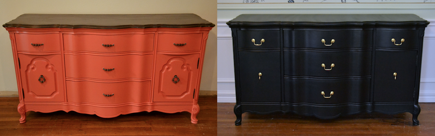
I got my buffet painted yesterday, and if you’re keeping count, this is the third time. 🙂 The first time was a coral color by Behr called Japanene Kimono (you can click here to see that…it’s a beautiful color). The second time was black. Just Pure Black from Behr. (See that one here.)
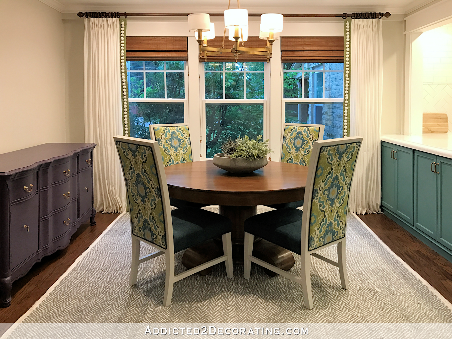
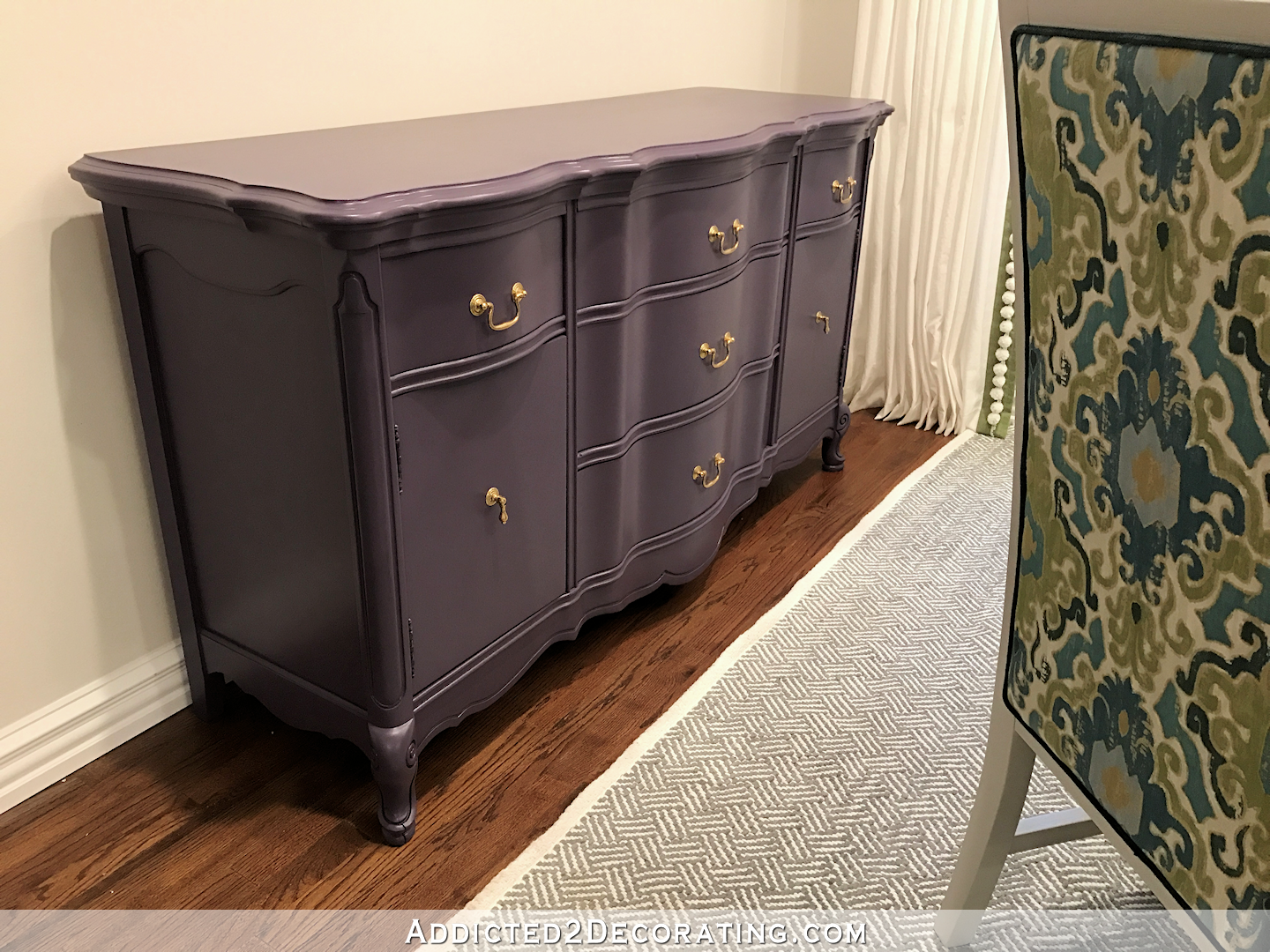
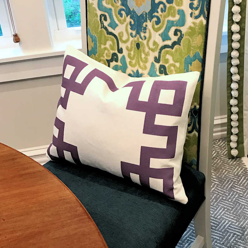
And this time I chose a color from Behr called Voodoo. It’s a dark, moody purple color somewhere on the plum-to-eggplant spectrum that’s just a bit lighter than Benjamin Moore’s Shadow (i.e., their color of the year). I originally thought of going with Shadow, but that color is so dark that it almost doesn’t even look purple in some light. And while I didn’t want my buffet screaming for attention (so no fuschia or yellow or orange), I did want it to be obvious that it was painted a non-neutral color.
See it over there, all dark and moody and unassuming?
Purple is new for me. I haven’t used purple in decorating in over a decade, and for many years I had a real aversion to it. It wasn’t until a few months ago that I gave it another look and decided that there are, in fact, some purples that are really beautiful and I could actually live with.
I had originally planned to paint the buffet green. But as I mentioned yesterday, when I went to pick out a paint color, with my paint and fabric swatches in hand, the green just started feeling way too matchy-matchy. I felt like I wanted something different and unexpected. I actually did consider yellow, along with a few other warm colors, but I felt like those would be too demanding. They’d be sitting over there on that wall screaming for attention as soon as someone walked into the kitchen.
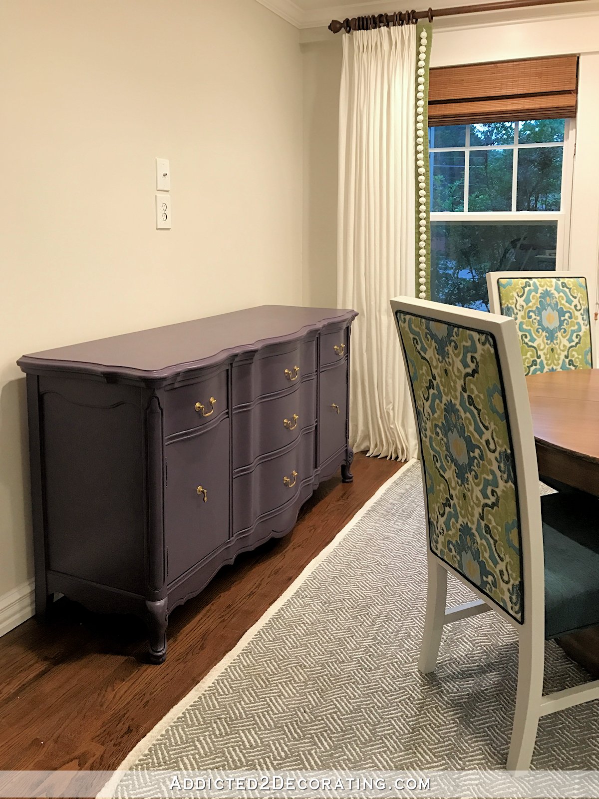
A dark purple, on the other hand, would be a bit unexpected while complementing the other colors, giving the buffet some visual weight to ground that wall, and giving me a dark base to add lighter and brighter colors on top and above it without that wall turning into a carnival. (The carnival will happen on the wall with the pantry door. 😀 Just kidding. Kind of.)
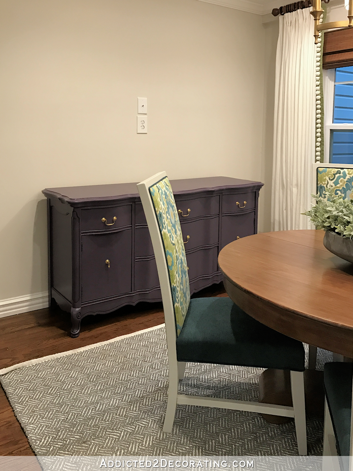
And I must say, it’s very fitting that this buffet ended up a shade of purple. It was given to me by my bonus sister Cathi (aka, my step-sister), and purples are her favorite. Every time I text my family members for input on a color for something, she responds, “PURPLE!” 😀 So now I finally have purple on the very piece of furniture that she gave me. That seems right. 🙂

Addicted 2 Decorating is where I share my DIY and decorating journey as I remodel and decorate the 1948 fixer upper that my husband, Matt, and I bought in 2013. Matt has M.S. and is unable to do physical work, so I do the majority of the work on the house by myself. You can learn more about me here.

I’ve never been a huge purple fan, don’t dislike it, just not a color I’m drawn to. I think you nailed this color! Love it!!!
That is really pretty. It looks great across from the teal cabinets and really breaks up the matching colors. I love it!
I’ve never….ever…been a fan of purple, either. But I. LOVE. THIS! Perfect choice!
I love this! It looks amazing with those teal/blue-greens.
Also, VERY excited to see what kind of carnival the pantry will have. I’m so glad you (and I) love color!
LOVE the color!!! Did you spray it or brush it? It looks sooo smooth!!
It’s brushed. Paint conditioner (Floetrol) helps get that smooth finish.
How much do you use in the paint
I use exactly what it states in the directions on the bottle. I think it’s eight ounces per gallon of paint. Don’t ever use more than the directions state or you’ll have super thin paint that takes many coats to cover anything. I learned that one the hard way. 🙂
Do you remove the old paint or just paint on top of it?
When I read your color description before I saw the photo, I was a bit disturbed. However, after seeing the room and then the close up near the chair, I think it’s going to work out nicely. Your color choices and decorating sense are the reasons I’m drawn to your blog – keep it up!
How do you get your painted furniture to be so smooooth? Mine always look like I painted it.
Was this sprayed or brushed and did you have to sand it first
I brushed it. I did give it a quick sanding by hand with 150-grit sandpaper before painting. Since it had previously been painted with latex paint, that’s all it needed this go ’round. The first time I painted it, I was painting over a lacquered factory finish. That time I sanded it with my sander and by hand, primed it with oil-based primer, sanded it again, and then painted it.
The key, especially when brushing, is paint conditioner. You can see my painting tips here: https://www.addicted2decorating.com/how-to-paint-cabinets-with-a-paint-brush-and-get-a-near-perfect-finish.html
Can you set up an affiliate link for the Floetrol? If I am going to buy it on your recommendation I would just as soon give a commission to you!
How nice of you! Here’s my affiliate link to it on Amazon –> http://amzn.to/2qeVwYS And do be sure to use only the amount stated on the bottle. If you use too much, you’ll end up having to paint about four coats to get a solid color. Ask me how I know that. 😀
HAHAHA!
I have to say that I’m disappointed. I was really hoping for a pop of color – like fuschia! I wish I could say that I like it, but I don’t. Too dark for me. But if YOU like it – that is all that matters! 😊
The chairs provide that pop of color – the buffet color is a nice supporting actor than enhances the overall scheme. My thoughts are that a louder color would have clashed with the chairs no matter how much it “went” with them. But isn’t it wonderful that the world is so diverse and that we each have control over our very own spaces?
Well said!
I’m with you–not my cup of tea. Love the purple, but I guess I like matchy-matchy and this seems too far out of left field. 😉 But whatever makes you happy in your home you should have. 🙂
Perfect color!!
I am a big fan of purple. I just love deep dark colors!
My husband LOVES purple, too!!
You are an amazingly supportive husband, Matt. 🙂
Thank you. What this world seems to be lacking is supportive spouses.
Or those with bad taste, lol!
What a gorgeous color of purple!!!! I can’t believe how fast you paint furniture. Granted you’ve had a ton of experience, now. 😉
Kristi… I’m so glad you think outside the box. I probably would have gone with the dark blue from the chair fabric. That would be an “expected” choice. Your purple is what makes rooms come alive and makes them look collected and interesting and not matchy-match.
Everyone is commenting on the buffet…. but I cannot get past how beautiful the flooring is 😀
I was thinking along the same lines. I’ve always thought my warm wood floors provided a nice contract to the cool greens and blues I decorate with, but after seeing these, I’m reconsidering 🙂
I love purple and I love this color. Great compliment to the teal. It really grounds the room.
Your breakfast room just keeps getting more and more beautiful! Love the purple buffet, along with everything else you’ve done to the space! Your blog is always a ray of sunshine!
When does your garage to office conversion begin? I’ll bet you are getting anxious to have that started.
It’s looking like it’ll be started in June. I’m very excited!
Love it! Do you strip the paint each time before you paint the new color?
No, I just give it a quick sanding by hand with 150-grit sandpaper and paint right over the existing paint.
Love it! Lately I am really drawn to purples – I think it’s because I love lilacs and need spring to get here! Very nice!
Purple was my favorite color as a kid, now it’s blue especially teal and aqua. I always thought purple looks wonderful with the teal and turquoise. The room is really coming together. Just wondering, do you sand down some of the old paint to prevent too many coats from building up or did you just paint over the black and orange colors?
I have a media console that I store books in that is a really dark wood stain that doesn’t fit the room but the style matches well. The room is done in blues (walls, curtains, pillows, rug) creams (sofa), whites (trimwork) with touches of grays (curtain print) and blacks (curtain rods, picture frames). I’ve been looking through tons of paint swatches trying to find just the right color to paint it (thinking more blue now rather than gray or white). It is so hard to find just the right color to complement the other tones in the room, but I’m leaning towards a darker blue like navy. Usually I have no problem picking a color, but the light changes in this room so much throughout the day (lots of windows) that colors keep looking different.
I do sand by hand with 150-grit sandpaper, but that’s just to scuff up the surface of the existing latex paint finish to give it some “tooth” for the new coat of paint to grab onto. I don’t do any sanding to actually remove any previous layers of paint. Now if I paint it a few more times, I might need to strip some off first. 🙂 But I’m hoping this third time is the final time.
As is anything you show us… I read- and I’m like… “purple”? really? How?(I love purple) Then I SEE and as usual… stunned and awed at how it somehow works. It pops the darker colors on the chairs, and the green in the drapes- and it “goes” with the cabinets, and just oooooh ahhhhhhh…
So what is my take-away? Just commit dang it. I think (speaking for myself) I’m too busy worrying that it won’t look right(time is money, stuff is money, etc) that I just don’t consider something and go with a safer option and feeling incomplete. Sometimes you have to commit to it- to see if you truly like it and it works. I have tried for several years to shy away from my favorite color palettes that I am instantly and subconsciously drawn to. When I should just commit to it and branch out from there.
Thank you for another sublime example of exquisite design. <3
Well, you nailed another one! The purple is perfect for the buffet, I love how it complements the teal in the kitchen. I’m sure the lighter brighter colors will come in with accessories, while the darker purple grounds the room. Unexpected, definitely not trite, it certainly says “Kristi”!
PERFECT!
This color is stunning! I have not been able to keep up lately and what a fun peek at all the progress in your nook. I love your curtains – the trim is so fun. And please keep us posted on how you like the rug under table once you live with it for a while. I love the way it helps define a space and am tempated to do it in my home, but I fear the chairs and benches will drag. Although now that I think of it, i bet I could find some little sliders that helped them glide….thanks as always for sharing your home with us. Such an inspiration!
This color is the perfect couterpoint to everything else. It is just what the room needed, and it will help make the eye bounce around the room once your other accessories and art are put in. Love it.
It is a silly little thing that the perfectionist in me notices. The room gets more and more gorgeous but the thing that draws my eye is the one burned out light bulb in the chandelier.
The purple is stunning!
Ah, a fellow OCDer! Me, too…LOL!
Love it, painted my kitchen island base the same color!
That shade of purple is totally perfect for your room. I love the more “muddy” tone, it looks classy without being too fussy. You have a great eye for color! And I agree with you on not using colors that were already in the room – glad you went this way. If you had gone with green or blues, it would become too match-y match-y. This is a more collected look! Once again, great job!
Love it!! I reallllly like how it adds a complimentary color to the room so all the blue and green doesn’t blend together. 🙂
I love the subtle of buffet and that it’s not matchy match.
Love it. I can’t wait to see the room when you do some accessorizing. I think a touch of purple is now called for in the concrete bowl, though as a black thumb gardener, someone else will have to make the suggestion of what that might be.
I was thinking the same thing. Since you can’t get any more of the sage foliage maybe you could find some dark purple foliage that is very pretty to mix in there. I thought that might then draw the eye to the buffet and pull them together. I may be wrong but it’s what hit me immediately on seeing the table and buffet together.
I think that the purple looks great against the grey walls.
I’m looking to be the sole naysayer here and say I’m not such a fan of it with the other colours in the room, I think I would have preferred to see it a deep navy, perhaps one with greenish undertones like that Hale Navy colour that’s so popular around the webs these days.
That said – it’s your space and if you’re happy with it that’s all that really matters.
This room is absolutely beautiful! Showcase! And your choice of color for the buffet is downright awesome. I would’ve never thought that purple would work. Your ideas are…Wow. I have been following for a very long time now and I have loved your home. Your ideas inspire me. Keep up the good work. I look forward to every email in my inbox.
Love it, love it, love it! Can’t wait to see how you finish this room.
Okay I’m gonna rock the boat, but I won’t say “should have”. I really like the purple color.That being said, I think something a bit smaller and in a wood tone would look lovely. It just looks like a lot of paint. My favorite things in this room are the chairs and drapes, really I love the whole room.
Yea, my guess of purple was correct, and the shade is perfect. I absolutely love it! This is such a happy space and you should give yourself a giant pat on the back for all the hard work, trial and error, to get it just right for you. Well, it’s right for me too but I’m not in your area, so I’ll enjoy it from the photos you so generously share with all of your readers. Love it!
I’m moody & unassuming, so I LOVE IT! Fabulous, Kristi…just fabulous!
It’s lovely. I’m guessing you may add a bit of purple in your artwork by the pantry. And look how smart you are with your outlets all ready for a TV.
And……the way you hang curtains/drapes is perfection every time.
I thought you would be choosing a purple with more reddish undertones and was curious as to how that would fit with the other colours. but this variety is – of course 🙂 – perfect in the room! and even though I’m a big fan of black, the buffet is more beautiful now.
two more things: I am amazed by how quick you can paint (and flawless, too) – it takes me a lot longer to wait for the paint to dry in between, but of course I don’t have your experience at all…
and the other: it’s great to hear Matt’s opinion every now and then – and I’m amazed about the fact that there is a man who likes purple!!! very rare in my experience, but how great that he/you can relish this beautiful space as well 🙂
Kristi,
I’m curious, what is going above the buffet (which I love) that the plug ins are for???
I’m mounting a tv on the wall there. Strange for a breakfast room, I know, but it’s the wall directly ahead when I’m standing at my sink, so I can wash dishes and be entertained, and the only time Matt and I watch shows is when we’re eating meals. So it works for us. 🙂
Oh I love that!!!! Love your colors & style. Show photos when the tv is up.
Wow! The voodoo purple color really brings out the vibrant teals/greens in the back of the chairs. It is like it just popped! I love it. Also did you use the General Finishes topcoat again or did you decide not to? Was wondering because it has a nice sheen on it.
I love purple and especially a dark purple but for some reason I’m not seeing this piece of furniture work in your breakfast room. I feel like it boxed in your room. I’d have to agree if it was smaller and maybe wood tone or the purple with either glass doors or open shelving at the bottom I think it would keep your room light and bright. However I am not a decorator and it’s not my house so I’ll zip it😬 I am in love with your curtain Pom Poms- they are beyond cute and inspiring. Let’s face it everything you do make is inspiring. Maybe once your tv is up and you work your accessory magic we will all see your vision come to fruition! Thanks for sharing with us!
LOVE the purple. LOVE the pompoms. Those two unexpected items keep the room interesting yet are not too far out there. Gives the room a “classy whimsy”.
You nailed it! Can’t wait to see the rest.
Your home is really coming together beautifully! As a reader, I feel like you found your direction and doubled your stride once you started listening to yourself again. Your ideas are interesting and your work is fantastic. Keep doing what you’re doing. 🙂
Super cute, the whole house so far is like “WOW’ …cozy, unique, beautiful….greens and blues are my colors too and I have been adding some burnt orange lately as my 3rd color but like you have a sister who loves purple so this is feeling very cool to me…you are so inspiring!
We are in the market for a new house that will be smaller than our current one and am all about ramping up the cozy factor and based on what you have done with your kitchen, I am more open to painting existing cabinets a fun color as opposed o ripping them out in my next house 🙂
You for sure NAILED IT! I had a dining room table base with glass top that I painted this color and considered it a “neutral”, surprisingly it will blend beautifully and yet remain unique!! Nailed it!!!
Your buffet has never looked better! Please make your contractor protect this perfect room and kitchen from their dirt and mess and chaos. I know how they are.
Kristi you’ve nailed it again……..the buffet is an amazing color and somehow I think the Voodoo purple color makes the blue/green/teals pop even more! Simply gorgeous!!! You’ve definitely found your decorating groove again, everything is flowing and coming together what seems like so much easier this year for you! Well done.
I have always heard you should add something black in each room to ground it. But, I think that rule could include this shade of purple. It really grounds the room, and keeps it from that “purchased a room” look. All lovely!!!
I wonder what your green credenza with the wood finished top would look like in there.
Ooh, there’s a thought. A different direction, but I bet it would look right at home.
I bet she tried it 😉
I was really sad to see the coral go but I’m so glad you did the purple. It came out awesome!
Now, you have me wondering if I should change my mind on the gray I bought for my buffet. 🙂
I love rooms that have an unexpected color. It keeps it from feeling contrived. Your breakfast room is turning out really lovely.
I have to say that your talent is truly showing in this room. While you are using “all the color” you love, the room is still restful. No one thing is screaming for attention, and the overall effect – the feeling I have when looking at it – is surprisingly “neutral.” I’m probably not saying this right, but it really is an amazing result considering all of the color that you are using in this one small-ish space. Really, really lovely!
Beautiful purple. It is so sophisticated. It’s so great to have you test out colors for the rest of us. Ha! My sister goes for more gaudy purples, but I think I could live with this color. I may even copy you and use it on my very large buffet.
This room just keeps getting better and better. I love the purple! It’s something different but it’s so complimentary, but, like most everyone else agrees, not predictable. And what you did to the simple IKEA curtains is really special. To me that’s one of the first things that draws my eye. They terrific with the Pom Pom trim and pleats, in fact they look like professionally made drapes (which they are). I like it that Matt weighs in on the choices too. You two are going to enjoy this room every single day. Once again, nicely done! Looking forward to the pantry!
Beautiful! Gorgeous! Amazing! Stunning! Perfect! Fantastic!
Absolute perfect color with the blue/green/teal colors going on! I love dark purples but would have never thought to do a piece of furniture. (Accent wall or something). I also love the pom-poms on your curtains.
It just balances the room, IMHO 😉 And the fact that Matt loves it, icing on the cake 🙂
Beautiful! Gorgeous! Amazing! Fantastic! Perfect!
Absolutely perfect color to balance the room with the blue/green/teal colors in there! Love the pompoms on the curtains!
The fact that Matt loves it…icing on the cake 😉
Your room looks so pretty! You can tell you are a decorator. I would never have thought of purple, but it is so pretty. I am so happy for how your kitchen and breakfast room have come together. It must feel so good to have these main rooms looking so wonderful! Can Matt get on that rug okay? I worried about it, but sure you had it handled.
Purple is my favorite color!! I’m picturing a few purple looking succulents in that centerpiece bowl with the greenery.
Purple? Oh, no no. Let me tell you what you SHOULD have done with that wall…..heh heh. Couldn’t resist. It’s all good and lovely. And, of course, it should have been purple!!
I’m not even sure how I found your blog, but girl,I am so glad I did! No kidding-every day I am anxious to log in and see what you have been up to. You truly never cease to amaze! I am a neutral girl through and through (bring, I know) but this room (oh heck-your whole home!) is just spectacular! When I first started reading today’s post, I thought “purple”? Really? But you really have a vision for the whole room (oh hck- your whole home!) and your energy to get things done is admirable as well. This is not something I would want to live with, but this is refreshing and fun and it is SO YOU! You and your purple lovin’ hubby must be tickled purple!
I adore that color, and you did a fabulous job painting. I agree with the others about wanting some repetition of the violet elsewhere in the space.
Absolutely Stunning.
Kristi, it’s just so lovely! I really love that particular shade of purple, and love how it complements the other colors in the room. I’m a huge aqua/turquoise/sea glass fan, and have always thought pinks and purples go well with those blue/green colors. Everything about this room is just so pretty together, it looks like a welcoming and relaxing space.
It’s simply beautiful. I didn’t think I was a fan of purple either but that purple is just gorgeous. It’s just a nice little difference in the room to really make your room look awesome. I can’t wait to see the rest. This room is progressing so nicely … it’s been smooth making up your mind in this room. Isn’t that nice when things click? (from someone with an Un-clicky house)
I am loving how your kitchen and breakfast room are looking! SO beautiful and your buffet is a fun surprise color! Of course teal is my favorite color so I was super stoked when you brought that in! 🙂
I adore that colour. It’s me all over. I love most shades of purple. Mainly because my mother hated purple and it was a great way to be contrary.
I hope you don’t think I am being rude saying this though….. I can’t see it for you. I suspect it will get another paint job. I’ve read and reread your post and what I am seeing is you wanting to branch out. The phrase “some purples that I could actually live with” says to me that you are settling rather than deciding. I love that you stretch outside your comfort zones but you usually go back to what you know and love. As much as I love purples I am really enjoying your teal and green combos. I think it’s wonderful that you like to try different colours. I just think you will wind up painting the buffet at least one more time.
Again, not trying to be rude. Last thing I would want to be. I love your posts and greatly enjoy watching your thought processes.
Beautiful, as we’ve come to expect from you. I’m so happy that Matt has a place to sit with you while you’re cooking, or whatever. And a beautiful place for you both to eat meals together. Your vision is wonderful, and it’s being fulfilled.
Love Behr Voodoo, that’s the color of my library in satin with a copper tin ceiling.
That’s a very interesting version of purple… I’ve been looking for a purple to paint a buffet of mine, and this one (not too primary, not too red, not too muddy) is really intriguing me…
I like some of the suggestions to add a purple toned sage in with your green on the table… to mix the colors of the room up. That might be a good tie together. And I’m looking forward to seeing the pops you mentioned of the warmer tones in the decoration… Fun!
Kristi,
It’s, as usual, very beautiful. I love the room.
JoAnne
Not sure. I’m NOT a daring decorating type. I’m thinking you’re going to tie it in somehow. So I’m going to reserve my opinion for when the whole room is finished.
I love the purple. Did you spray, brush or roll it on? Did you have to put a primer?