Testing New Kelly Green Paint Colors (For My Kitchen Cabinets)
This weekend I got all of the trim for my breakfast room and pantry windows and doors purchased, so I’ll be starting that project today. I also picked up some new kelly green paint samples to try out. The paint colors I tried out were Benjamin Moore, but I had them mixed at Home Depot in Behr paint. They have all of the colors from major paint brands color matched in their system, so you just have to ask for them by name. They may not be a perfect match, but they’re generally close enough for me.
So the two I wanted to try were Benjamin Moore Clover Green and Once Upon A Time.
I got the idea for the first color from this bathroom picture from HGTV.
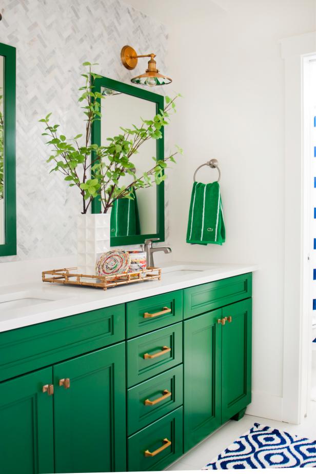 via HGTV
To be clear, I don’t know for sure if that is BM Clover Green on that bathroom vanity. But after searching and searching for the color, I came across a comment where someone said, “That looks like BM Clover Green,” so I decided to give it a try.
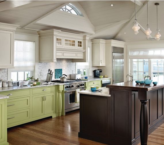
And then the BM Once Upon A Time paint color is what was used on the cabinets in this kitchen.
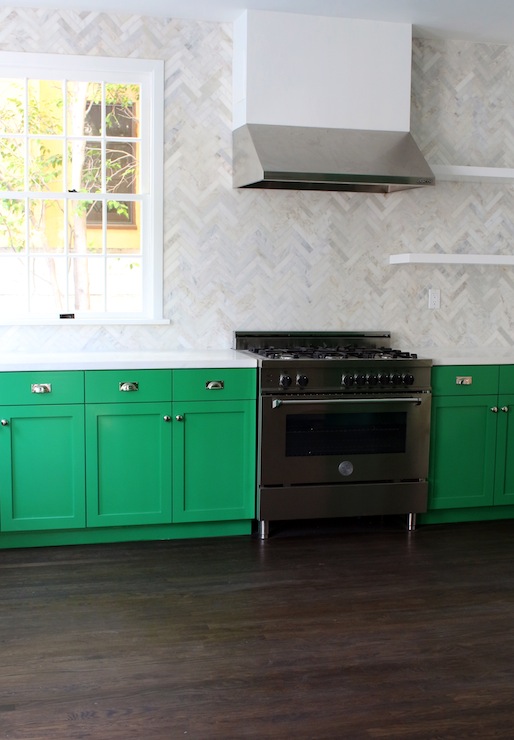
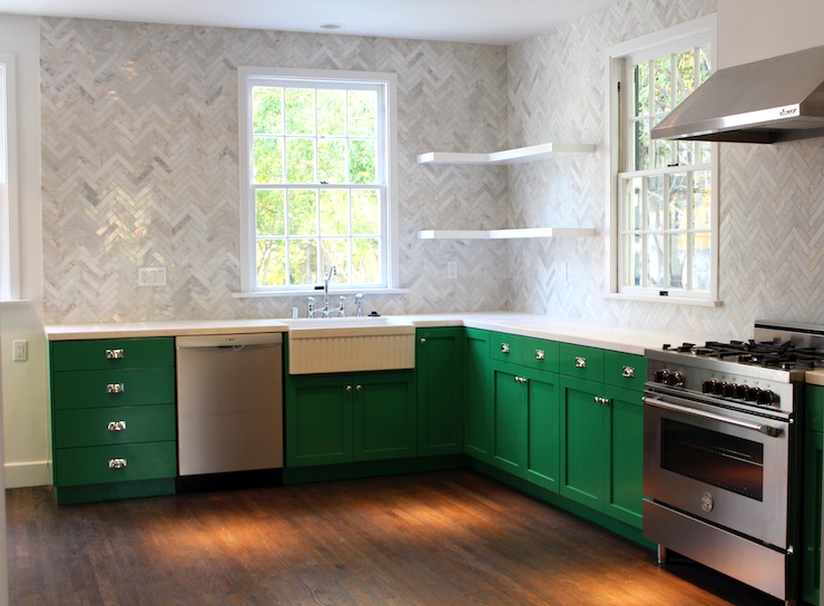 Kitchen by Kishani Perera, via Decor Pad
You can see in this picture that it’s a much brighter green.
 Kitchen by Kishani Perera, via Decor Pad
So here are my test swatches of those two colors, both mixed in Behr paint from Home Depot. The BM Clover Green is on the left, and the Once Upon A Time is on the right. And you can see how both of those compare to the Sherwin Williams Derbyshire that is currently on my cabinets. (Please excuse the mess. I still haven’t cleared away my tools and supplies from the peninsula.)
They’re both different from what I currently have, which is good. But obviously the one on the right is much different. The Clover Green is still fairly dark, but has more yellow than the Derbyshire currently on the cabinets, so it looks like a truer Kelly green.
However, when I get them right next to each other, the difference between the Derbyshire and the Clover Green is almost not enough to warrant repainting the cabinets. The Once Upon A Time, on the other hand, is completely different, but I do wonder if it might look too washed out.
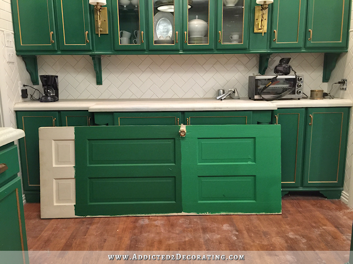
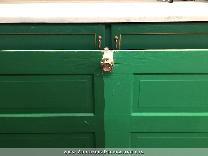
So, since I really like both, but I’m not completely satisfied with either one, I decided to see what it would look like if I mixed the two colors about half and half. I painted that color on the middle section right between the two.
I think that might be a winner! It’s definitely lighter than the current Derbyshire color on my cabinets, but it’s not so bright that it looks washed out.
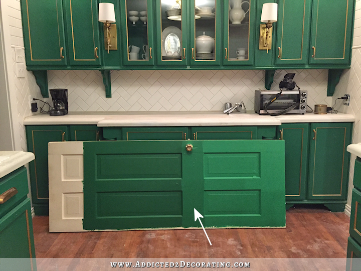
UPDATE: The pics above were all taken last night. Here is a picture taken during the day, although it’s kind of overcast today and not as bright as it is on a sunny day.
So for now I’ve ruled out the Clover Leaf on the left. It’s just too dark. I need to get a little further along in my design plan before making a final decision, but right now, I really like that middle color. The brighter green on the right scares me just a tad.

Addicted 2 Decorating is where I share my DIY and decorating journey as I remodel and decorate the 1948 fixer upper that my husband, Matt, and I bought in 2013. Matt has M.S. and is unable to do physical work, so I do the majority of the work on the house by myself. You can learn more about me here.

I like the middle color too! In my mind that’s the color your cabinets have always been–I never realized they were so dark.
Also, is it a coincidence that your two inspiration pictures both have marble herringbone back splashes 😉
Not too fond of the one on the right–it does look washed out and blah. I must admit I love the color of your cabinets now; it’s a rich emerald green to me and stunning. What if you painted over the gold?
I had the same thought!
Sounds much easier to me too
Maybe pull the inspiration pictures and your color swatches into photoshop. Then color sample them both to see how close they actually are. You know you like the inspiration colors. But maybe sampling the colors would help you see them better. You might find out one color has a lot more blue in it. Or one is actually quite darker. Maybe you will find the one you don’t love is actually an almost perfect match. It might help in your decision making.
I prefer the current color of your cabinets and think that if you can incorporate that color into the breakfast room (art, maybe a buffet or server) it would look great.
DITTO
I REALLY like the brighter color on the right. The closer you can get to the green in the bathroom pic the better :). That bathroom is stunning and would work well against the white cabinets on the uppers. If all the cabinets were going to b green the middle color could b ok but still not enough a contrast from current color. You are not afraid of color girl! Go bold!
Have you looked into Farrow & Ball paints? They have very intense true colors that seem to be popping up in all the shelter magazines! Just a thought!
Also Laurel Bern Interiors blog has a F&B cross match to Benjamin Moore colors on her website/blog post. FYI.
Thanks for the F&B tip…I love their colors but the price per gallon is so high.
PS Kaufman Paints has a new program where in you buy a small pot of his color for say 50 dollars and you add it to any base paint from any company where you live and mix your own tone. Again FYI.
I agree that the Clover color is not worth the effort, and I like the idea of brightening it up, but I would be worried about putting that bright green next to black (either the music room black, black counter tops, or anywhere else you plan on using black) because it might look like a comic strip. I would definitely get a lot further into the design before you repaint. Like, maybe even get your hall tree done and get the hallway finished before finishing your design. You might want to live in the more finished space for a while, get used to how the new windows and openings affect the light, etc.
I agree that the total effect might not be harmonious if a bright green is used. I wouldn’t call it comic book effect, but I am concerned that large amounts of bold color might overwhelm the space available and make it look too busy. But maybe that’s me. I go for calm usually.
Also, the lighter green sample to me tends towards a 1930s green almost that jade green look. I think the light tone would detract from the contemporary look you are going for.
I do like the center color. I ,however, would caution you to wait until you complete the breakfast room before changing the color of the cabinets. The reason is that when you choose you final wall colors and window coverings you may have changes in the way the light plays on the cabinets. You may find that you will want to go even lighter. I am always amazed at your work. And I love your design ascetic. I look forward to reading and seeing you get to the fun part of decorating all these rooms! It is going to look AMAZING!
I so agree…wait is the better choice. There are so many other projects vying for your time and expertise. You may find if you wait that what you have already is just the right one.
Agree. Please, please finish the breakfast room before deciding what you want to do with the kitchen.
Agree…too much re-doing and jumping around!
Agree!
Your current color gives rich and elegant look.
Yeah…there’s that word again. Elegant. That’s part of the problem, honestly. I never wanted an elegant kitchen. Yesterday I was thinking about how I wanted my house to feel, and the words that kept repeating in my head were fun, bright, cheerful, colorful, lighthearted, comfortable, welcoming. I’m just not an elegant person.
I think you’re going to find it’s more than just the paint color making that room feel elegant. There’s the gold leaf, the base trim, the hardware, the tile, the lighting, and the appliances. You’ve also made those same decisions in your music room. You’re going to have to change major decisions in at least two nearly finished rooms if you want to pull back from elegant. There’s no reason an elegant room can’t be bright or welcoming.
I think you sometimes confuse using every color and pattern and design with sending the message of fun and colorful when you instead end up overwhelmed. Some rooms in my house are more formal than others but nearly every room feels welcoming because it includes character. Nearly every room feels colorful because while I might only have 1 or 2 colors, I layer them and use them with texture which makes them feel more comfortable too.
I think no matter what green you pick, you’re still going to feel it is wrong. You are trying to use saturated pastels in the dining room, bold neutrals in the music room, muted country colors in the bathroom, and jewel tones in the kitchen. It seems like this is causing you to feel uncomfortable and unwelcome due to the lack of flow.
I think you’re spot on about the colors.
Very good observations. Prefer the current emerald green to the others. The brightest reminds me of Crayola. Your house overall is not elegant in the stiff, snobby way, but in a classy way. I think it all depends on your definition of elegant.
I agree wait till the breakfast room is painted before rushing to change the kitchen.
But your green cabinets are fun, cheerful, bright welcoming, colorful and comfortable. Maybe not lighthearted, but then 6 out of 7 ain’t bad, as Meatloaf would say.
I think the only reason your kitchen looks elegant is all the gold you have used. Get rid of the gold on the cabinets. If necessary, spray paint the light fixtures with one of the many metallic spray paints. They are great. I took a six arm solid brass (which all these young people call gold)Williamsburg chandelier and spray painted it with a ivory primer. Then I painted over that with an ivory stone finish spray paint. I hung it back in the master bedroom and found the cutest square shades for it. I also spray painted two Carolina mirrors (I have 4 of them I kept asking for them for Christmas). I hung them on either side of the bed with the lamps on the nightstands reflecting in them. I love the look. I have also redone all of my metal patio furniture, going from black to bronze. It looks more up to date and so far it has held up through two winters. This year I found covers on sale for the table and chairs and chaise lounges. I really like the textured and metallic spray paints.
PPS It is called Donald Kaufman Paint Pigment and explains it on his site!
I like how vivid the sample on the right looks. The center color doesn’t appear to be a significant change from the Derbyshire you already have (which I really like, BTW). It would seem if you’re really wanting a color change, the color on the right offers a real difference.
I know it isn’t a true Kelly green, but Sherwin Williams Alexandrite is a nice green that I’ve used on furniture. Not the best lighting, but you can see it here: https://www.pinterest.com/pin/221450506651334020/
Something seems off about all 3 colors to me. I realize you aren’t purchasing the paint today, but none of the new colors seem to be right (fun or bright enough) in comparison to all the inspiration pictures you’ve been providing.
I feel like the lighter color does look lighter, but not brighter, like it has a more opaque base. I think that a true Kelly green would be much brighter like in the first inspiration photo.
Have you considered just color-matching directly from the photo using the color scanner they have at Home Depot? I’m thinking that even if you find out what color they used, professional photographic lighting and editing is going to change it quite a bit. When you get the can home and paint a swatch, it probably looks very different in your own home. If you color-match the photo, however, it should look a lot more like the photo itself, which is what you’re really liking anyway.
I’ve used their color matching service for years, usually from an inspiration piece like a fabric swatch or an old piece of trim I’m trying to match the white on, and I’ve always been happy. Just remember to save a picture of the label on the top of the can with the formula so you can have the same exact shade re-mixed if you need another gallon.
Hi Kristi!
Not sure if you have thought of this or if someone else suggested it, but when you repaint the “buffet” wall, what about doing it all in the new green (upper and lower cabinets) and adding back the gold? There is something about this area that I think would be cool and interesting to be a little different that the horseshoe area of the kitchen (with green lower and white upper cabinets as you plan). Since there seems to be less daily use in this area as I see from your picture, the gold would be less likely to wear away. I know that “elegant” isn’t a word you wish to use, but I actually see the gold in the buffet area as more of a whimsical choice, fitting better into your desired feel for the space. Just my thoughts anyway. No matter what you do, I am sure it will be fantastic!!!!! You live here so you ultimately have to be happy with whatever direction you choose. I am just thankful that you are sharing it all with us – both the good and the “didn’t quite work” plus everything in between!!
I really love your blog, Kristi; any morning you have a new post is a good morning for me. As I was scrolling through your inspiration photos this morning I couldn’t help but notice that the green I liked best was the one I was scrolling past at the right of the screen = your current kitchen. That kitchen was the thing that first attracted me to your blog. I love your current kitchen and the way it interacts with the rest of your house. For example, the gold that showed up outlining your entrance mural seemed to have been inspired by (and ties in beautifully with) the gold leaf on your kitchen cabinets. I underestand the need to improve on the gold-leaf situation in the kitchen since it isn’t holding up under use, but didn’t you use a gold paint on some side tables a while back? Maybe something like that could be used to replace the gold leaf. I guess the bottom line is that my favorite green is whichever one looks the most like what you currently have and I hope your new kitchen doesn’t stray too far from the beautiful one you have right now.
That is definitely BM Clover Green in the first photo as I took special note of that bathroom, featured in HGTV magazine. About two years ago, I painted a chest in my foyer in Clover Green and LOVE it. We seldom use our front door which means i seldom see the piece but it’s my favorite thing in the house, not too dark or light — just punchy. Wanted to offer my opinion as someone who’s actually used Clover Green. Good luck making your decisions. Picking paint colors is HARD!!
I love the color of your cabinets now. If you didn’t want an elegant kitchen, why did you trim with gold? I’m not particularly fond of the gold trim, but it looks wonderful in an “elegant” way. I think the gold coins the term “elegant” in the comments. I do like the idea of white uppers and green lowers, but definitly use your current color of Derbyshire. Remember this was the color you chose after testing and testing before. Can’t wait to see what you choose and the finished product! I’m sure it will be beautiful.
I used the gold because I thought it would be pretty and different and a fun project to do. 🙂 I wanted a beautiful kitchen at the time. It’s taken me two years to realize that “elegant” just isn’t me.
You have had a penchant for gold. When you were working on the dinning room table and I saw the gold, I thought here she goes. Then you outlined something on the bird wall (the most beautiful thing I have seen in a home) with gold, I think. I am not sure if it is TX or just you. But gold is always associated with big and beautiful and I can see the gorgeous Miss America’s who have come from TX decked out in gold. It always attracts attention. I don’t know anything about TX, but maybe gold is the interpretation of glitz and glamor from the Lone Star State. I even think your pantry light is a bit over the top. I get exactly what you mean, but if you are looking for cozy and colorful and welcoming for your breakfast room, I think the pantry light will through it off. I could be totally wrong, and like everyone says, this is your house and you have to live in it. I don’t mean for this to sound patronizing, but when you change and change and change something and finally get it to where you know it is right, I just smile and think to myself, “our little girl is growing up”. You just like to try everything on, until you find the perfect fit. It can make people crazy, but as long as you can handle it, go with it.
Oh I so like what is on your cabinets now
The inspiration photo from Elle kitchen in the previous post appears to have a glaze over the green. It would be interesting to see what 3 shades up from Once upon a time…an extreme vivid green with a light “chocolate glaze” over it would look like.
I agree that it seems an even more extreme green might be needed if “fun bright cheerful colorful lighthearted….” is the goal.
No matter what…..I think your design has some elegance to it! That amazing music doors look elegant with a twist!
So amazing!
Is there a way to put off the green descion and choose other colors design-wise? If you are more “sure” with the white on the top cabinets, I’d reccomend doing that first. Save the door, paint your white on the top half of the test door, then see what grows on you. How are you handling the fridge cabinet(it is top and bottom)?
Oh, i agree! Doing the top cabinets white first will change the lighting effect in the whole room!!!!
I agree😀By changing your uppers to white first, you will get a much better feeling for the bottom color.
If you truly want Kelly Green then use the one on the right. It will not appear washed out after 2 coats against the white background of the remainder of your kitchen.
i love the green color you have now and I will probably love whatever color you choose. But something you said hit me: you said you do NOT want elegant. I gotta say… that “elegant” gold leaf trim is beyond elegant (and personally I love it). Why not photoshop your cabinets and experiment with non traditional (out of the box) trim colors? Try things you would never imagine! Who know? Maybe we are all looking at the wrong item? Ps: I am your biggest fan!
I can’t believe you are entertaining repainting your cabinets. God bless ya!
Hi Kristi – You are the most tireless DIYer I know of! I’m exhausted just hearing you talk about re-painting your kitchen cabinets.
We recently remodeled our kitchen. I knew I wanted black for both the lower and the upper cabinets. When the cabinet maker asked whether we wanted oak or maple, I was caught off guard. And I chose oak — even though I do not love the deep grain of oak. But the matte black on top of the oak grain is stunningly beautiful. It ended up being the best decision of our remodel. We also added three windows so the kitchen gets tons of natural light – like yours does now.
Instead of filling all that oak grain (a project which, by itself, sounds extremely tedious!) consider black!
Well I’d encourage you to repaint the upper cabinets white first. Picking a white that bends with the white tile and white appliances may be a challenge in itself. It could completely change the color of green you think looks best.
Plus staining the countertops black (if that’s the goal) introduces even another element. Maybe you can buy some black fabric and lay it over part of the countertops after uppers are painted white to get an idea of how each green choice will look.
I prefer the Once Upon a Time. It has “life”, the others (including the current) are so blah. Yes, I’d wait until your uppers are painted before deciding.
Another thing to try – ask the store to give you 75% of your current color. Or some other percentage. It will lighten it a lot and might be another choice to consider.
I absolutely agree that changing the upper cabinets to white should be the next step…..I think that it will give you a clearer perspective on further colour choices.
Wouldn’t it be easier to pick a paint color after your fabrics are picked out and you’ve decided on an overall color plan for the rooms?
I totally agree with you, Julie. I’ve been a decorator for 30 years, and I’ve always found it much easier to choose a paint color to go with fabrics rather than the other way around.
That’s the way all decorators do it!
I’ve followed you for awhile now, just never commented. For me, your kitchen as it is, is the most gorgeous I have seen. Obviously, do what you wish, but I will mourn its passing when you change it! Thanks for allowing me to tag along.
Color match the Lacoste handtowel in the inspiration photo – I think they sell them at macy’s/nordstrom’s. It’s the perfect Kelly green, (Lacoste design team know their primary colors, haha), all 4 of the others seem muted/dusty, though that may be lighting.
I’m not going to get long winded here. Straight to the point – LEAVE THOSE DAMN CABINETS ALONE!!! LOL They are perfect. The combination of the brilliant green broken only by the fantastic Gold accessorizing…………..there’s nothing to change!!! I love it just the way it is.
Agree
I really like the middle colour, and I also like your kitchen inspiration with the mix of the green and the white cabinets…
Oh Kristi, I hate to hear that you’re planning to change the kitchen color. Remember how hard you worked to get just the right shade and how much you love it? It’s not the color that makes the kitchen feel elegant. It’s the pretty lighting, gold trim, and footing/ support pieces you have all over. I would urge you to consider going in stages:
1. Paint over the gold trim (with current color) and remove the ornate pieces. Live with that for a while to see how it feels. A simpler look will lend itself more for the color to be enjoyed. Even the hardware might need to be removed or changed temporarily to have a less formal look.
2. If you still don’t like it after a while, paint only the upper cabinets white and see how they go with the lowers in their current color along with your current counter top.
You have a lot to do in surrounding areas that will occupy your time and help along with the decision making.
Thank you for letting us look at the process with you.
I have to say… you are bold in your colors, Kristi. 😉 I love that about you.
The (right sample) bright green really is a different look… but I think it will breathe fresh life into your kitchen which is missing with the beautiful dark green you currently have. I know you are in love with the middle green… but it seems a wee bit flat and lackluster to me. That being said… color choices are so very personal. I would just be sure that you can duplicate it somehow in your adjoining spaces for a cohesive feeling. Regardless of what you choose… I love your spirit and your creativity… and I am always impressed with the final outcome.
I agree with those that say paint the uppers white first. It’ll change the whole look to your kitchen. At that point I would again decide on greens, and maybe it won’t even need to be changed at that point.
it’s so interesting to read how people view color! I do agree with others who said elegant can be fun and colorful. I also agree that changing the cabinet color on top will make the light reflect differently in your room, and that waiting until that’s done to change the green on your cabinets is probably a good idea.
I am not even remotely daring enough to choose a green of any shade (I see your color choices as daring and creative, not at all formal or reserved) so I will continue to live vicariously through your color choices as you have a great eye for what you like and how it works in your home. I love green, and I think all the shade, from your original color choice, to three in your post today, are wonderful colors!
I think I missed something. Why are you going to the work of repainting your kitchen cabinets a slightly different green when you so carefully picked out the original green, and you have so much other work that is more urgent?
Nothing in my house is urgent. 🙂 In my post on Friday, I explained the two main reasons I’d like to include some changes in my kitchen as part of my whole-house decorating plan. I’m not necessarily going to do the work now (although I might…I’m not ruling it out), but since I will be repainting the cabinets and have an opportunity to change some things that I’ve realized don’t work for me over the last two years, then I need to go ahead and make some decisions. As I’m working on my whole-house decorating plan, my kitchen is key. It right in the center between the breakfast room, music room, and front room. It’s literally the link between all of the rooms, and therefore if I’m going to make bold decorating choices in my kitchen, my choices for literally every other room will be affected by those kitchen choices. So I can’t finish the breakfast room (which includes painting the back of the peninsula) until I know what I’m doing in the kitchen. It also dawned on me today that if I do decide to do a wall mural on the breakfast room walls, it would be so much easier to do it before I add trim to the doors and windows. So again, the sooner I can come up with my decorating plan, with the kitchen in at the center, the sooner I can get things done in the other rooms.
Are there specific (colorwise) elements from the tied in rooms you’d like to keep? If so, use them as an extra bit of deciding factor.
I cannot, for the life of me, understand why you would re-do a re-do when you have so many other projects that require your attention. WAIT is a 4 letter word but could be most appropriate concerning your already bright and welcoming kitchen. I am a huge fan of your style,innovation and whimsy and am eager to see the outcome of your other projects.
Regarding matching specific brand colors, I have had good results with removing the “ingredient” label (where it says 10% white, 15% ocher, etc.) on a can of the real thing (you can buy samples from BM on line) and giving it to whatever paint store you use. Also have done well with asking for an existing color at 50% or 25% to get the same shade in different intensities.
Remind me again why you are changing the color. I know you want to get rid of the gold, and I don’t blame you. I also know you want the upper cabinets painted white, I can understand that, but why change the Derbyshire. I think it is a very pretty green. The other colors are nice for a piece of furniture, however, I think they are just too green. I would try changing one or two door to plain Derbyshire and see how it looks. I really think you are over thinking it. Also I am afraid that painting the concrete counters black is going to be a chalange. I have painted an out side concrete porch black and I finally realize what I should have done was stain it black. I had it all powerwashed off, and I am going to stain it in the spring. The porch is protected so it was not the weather. I know you plan to seal the countertops when done, and that may make a difference. I just think it is a lot of work for something that you might not like. How hard would it be to remove the concrete counter tops? If they come off in big pieces you might consider getting black honed granite. It is not shiny at all. It probably would not cost that much since your kitchen is not that big. I have a friend who got it in her kitchen and it is very pretty. I have soapstone which I love and think would look great with your oldfashioned sink. The only problem is that it is expensive and I think it is going up in price as it gains popularity. Good luck with it. Anxious to see how the breakfast room comes out. It will be great to have that room. When you do the sunroom the house will pretty much be complete, since office and bedrooms and hallway are a drop in the bucket for you! You could crank them out in a week or two. I would love to hear what an appraiser has to say about the increase in value you have added to the house. That to me, is where you really can pat yourself on the back.
Just my opinion, but I think a beautiful black on the bottom cabinets and then white on the top cabinets would flow beautiful with your house and accent with the green
I am flabbergasted! I love your cabinets.
Are you going to fill the grain of all of the cabinets? If so i hope you will post about it. I have old oak cabinets that I want to paint but am afraid the grain would show like you pointed out in a previous post.
Also, what sheen of paint did you use originally on the green cabinets? Would a higher sheen minimize the oak grain?
I also love the existing green. I agree that removing the gold accents would make it less “elegant” and like the idea of white upper cabs with the green base cabs!
Anything you decide on will be great tho!! You are an inspiration. Thanks for sharing!
Maria B.
Yes, I’ll be filling the wood grain, so I’ll be sure to share those details. The higher the sheen, the more stuff like that will show. I prefer a lower sheen. On the green, I used Benjamin Moore Advance in a satin sheen, but it was too shiny for my taste, so I ended up topcoating the cabinets with Rust-Oleum polyurethane in a matte finish.
I haven’t read any of the comments. So, if you’ve heard this 70 times, forgive me. 🙂 What about the color on these mirrors? It is beautiful and so happy and fun! (imho) 🙂 “Valspar’s Luscious Green.”
http://www.dimplesandtangles.com/2012/05/mirror-mirror-on-wall.html
(Three comments on one post — a record for me.)
I think instead of trying to pick a kitchen cabinet color in isolation, you should base it on what works with your mural. You know you love that.
I originally found your blog months ago because I was looking for green kitchens after seeing photos of Cameron Diaz’s green and brass kitchen. I was shocked when I read that you had done it all your self, and was so amazed at how beautiful it turned out. Why I am not sure, because I was planning on doing the same, build my own kitchen, I guess I was way more impressed with what you did than what I was planning… 🙂
At any rate, I have been vacillating between vibrant deep green and soft, green-blue similar to robins egg blue, but recently found another green, but almost forest green kitchen and so when looking again, and again came across your blog, so I have spent the last couple weeks going through about a year and a half of your postings. 🙂 But I have chosen the color family I am going with the vibrant green, and will keep the other color as the butlers pantry leading into the kitchen. The photos of the green kitchen with the marble herringbone walls, as one of your examples is also one of the kitchens I have saved recently so was very happy to see it here. And I really love the bath vanity and looked up Benjamin Moore paints and found Amazon Moss that seems to also be very close to that color. I am so grateful to you for your amazing skills and your very fine taste.
This is such a funny post for me because I painted my kitchen green because I love yours so much! But I couldn’t put my hands on a darker color without making my small kitchen look microscopic.
I put an “old ” Behr paint on my cabinets that I had to get them to “color match” with their old system. It’s called Herbal Tea. You might see if maybe that’s a good middle ground for your room?
My first color combination that I found a deep affinity with was a Kelly green and bright purple (I was in kindergarten I still do love it for creating mosaics/ coloring for enjoyment). I think that I now would love Kelly green (or am I thinking emerald?) and gold (as in gold leaf gold tones). I see your dilemma – especially with the light not ‘warming’ up the green at times. Kelly green with the white, black or navy – is inadequate for a good mix of warmth and cool tones, to me for a color-lovin’ decorator such as your self, as I can understand! Once the gold tones are added that, I think, this opens the door to some soft aqua and creamy pink, some iridescent/ abalone accents too (and bright lime green perhaps 🙂 – my two cents. Love your condo photos!!