Colorful Orange Lamp Makeover (Plus A Few Entryway Plans)
I turned my attention to my entryway yesterday out of frustration. My original goal was to get all of my studio shutters installed and show you today how they turned out. Then I realized I hadn’t ordered enough hardware to finish the six studio shutters. Ugh!! So now I won’t have finished studio shutters until probably sometime towards the middle or end of next week.
So I wanted to find a quick and easy project that I could start and finish, and that would brighten my day a bit. I decided that a lamp makeover for my entryway fit the bill.
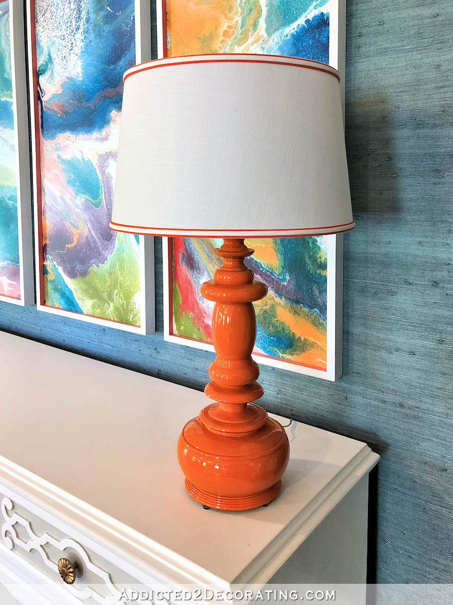
You might recognize that lamp. I actually used two of them in the first version of my entryway makeover. For that makeover, they were green and had white shades with black trim.
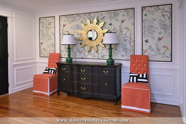
And you know what’s funny? I never actually wired those lamps. They have no wires, so they don’t actually work. If that’s not the epitome of “form over function,” I don’t know what is. 😀 But y’all know I’ve never claimed to be a practical person. As long as it’s pretty, function is secondary to me, although I am getting a big better about focusing on function as I get older.
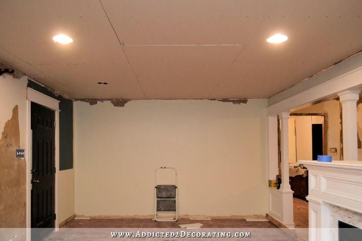
Anyway, those lamps actually started out as floor lamps that I bought at Target soon after we moved into this house. Here’s a blast from the past 😀

It’s so crazy looking back at those pictures of the living room looking like that. It makes me wonder who the heck I was decorating for. It certainly wasn’t me!
Anyway, at some point, I accidentally knocked one of the lamps over and broke it, and then when I did the first entryway makeover, I used the unbroken parts from that lamp along with the other lamp to make two matching table lamps.
After searching for the last four months for the perfect pendant lights for the entryway (I had my heart set on pendant lights, which you can read about here) and never finding any that I liked enough to click the “confirm purchase” button, I finally gave up. I know many of you will be glad about that. 🙂
And then after spending 20 or 30 minutes here and there over the last two weeks trying to find the perfect table lamp(s) and never finding anything that seemed just right, I finally gave up on that as well. So yesterday, I dragged this lamp back out (only one this time — I’m going against my need for perfect symmetry, which is challenging) and gave it a good sanding with 15o-grit sandpaper, and then sprayed it using Rust-Oleum Real Orange.
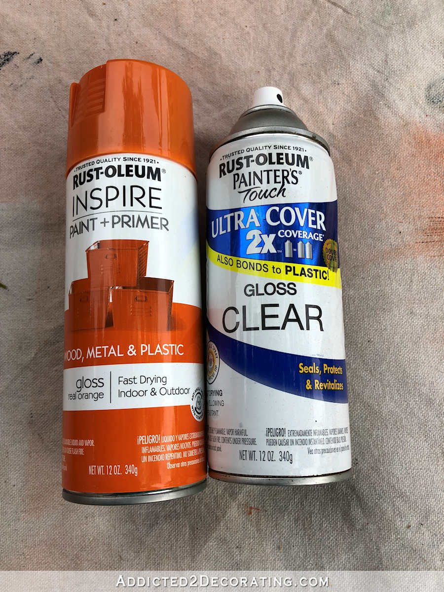
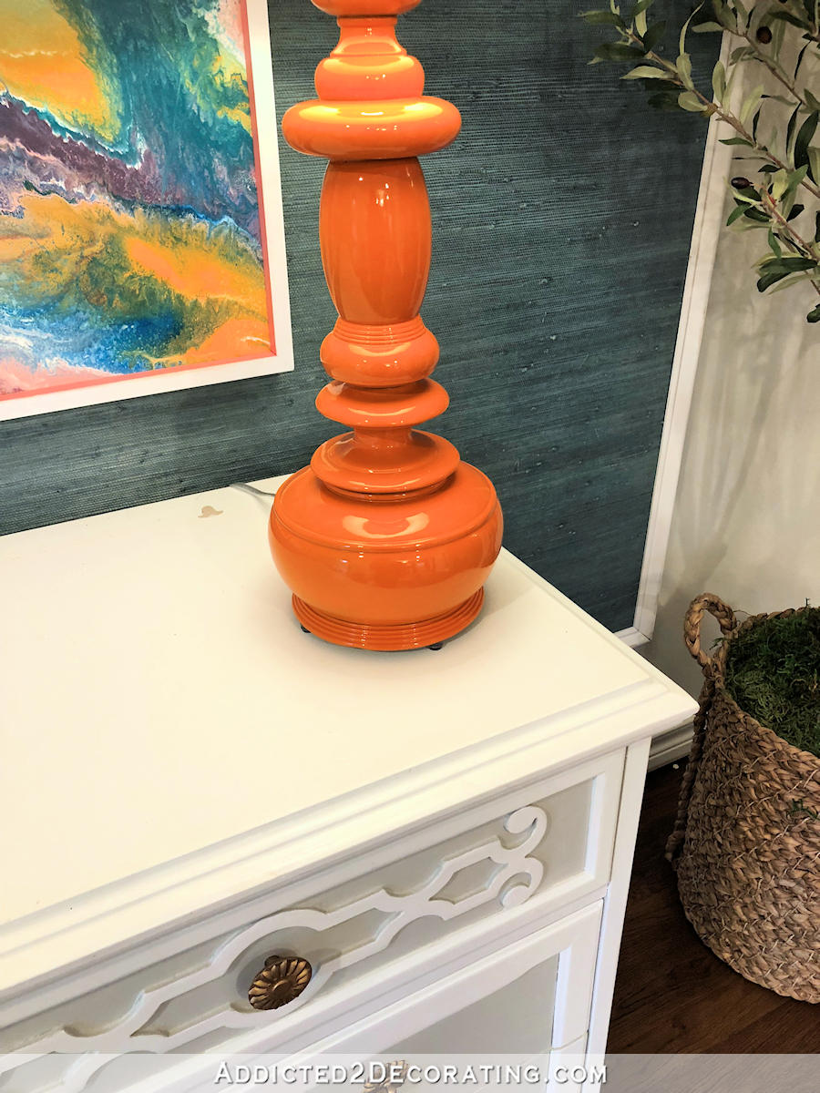
I used a gloss finish, but it wasn’t quite shiny enough for my liking, so I followed up with a about three coats of clear gloss. It turned out just right. Look at that shine!
For the lamp shade, I used an idea that I saw on Instagram recently, but for the life of me, I can’t remember who posted it. Anyway, y’all know I love my embellishments, and when I saw this idea, I thought it was just the right amount — not over the top, but not so subtle that it goes unnoticed. They had used a wider tape that matched the lamp base, with a thinner white running through the center of that.
So I used just regular double fold bias tape from Joann Fabric. The orange is an extra wide tape, and I attached it with hot glue.
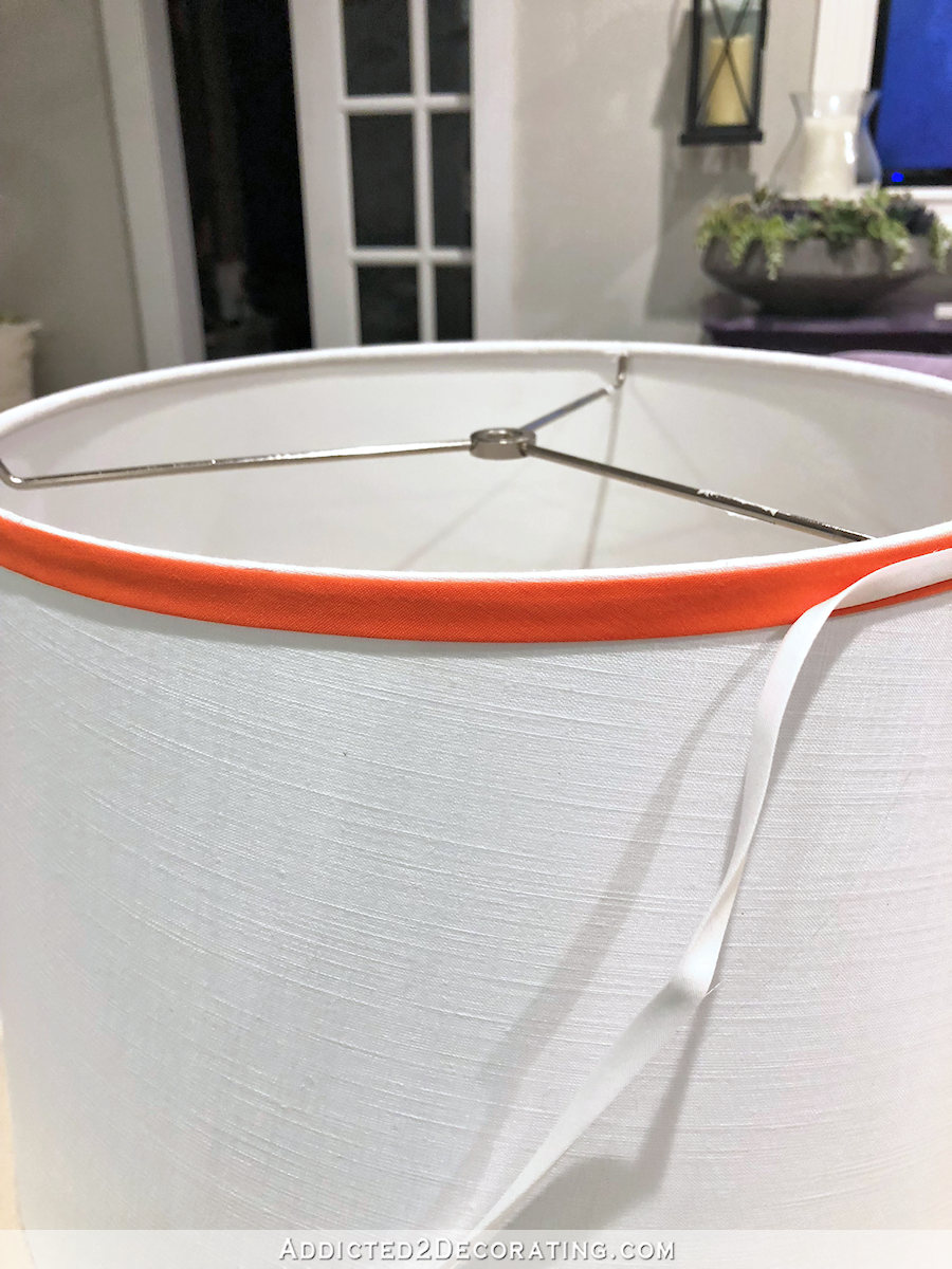
And then through the center of that, I added a white bias tape (standard width), also attached with hot glue.
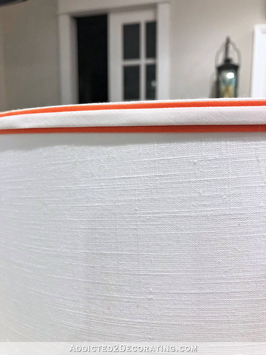
I did that around the top and the bottom of the shade, and once all four pieces were attached, I used a really hot iron to iron them as flat as they would go. I really like that little detail. Here’s how it looks with the lamp on (look, it’s actually wired now! 😀 )…
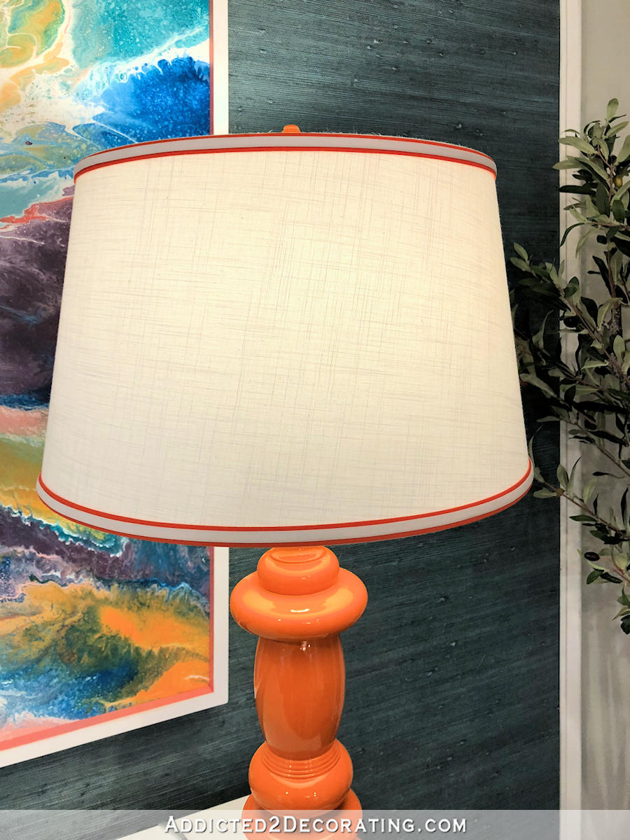
…and with the lamp off…
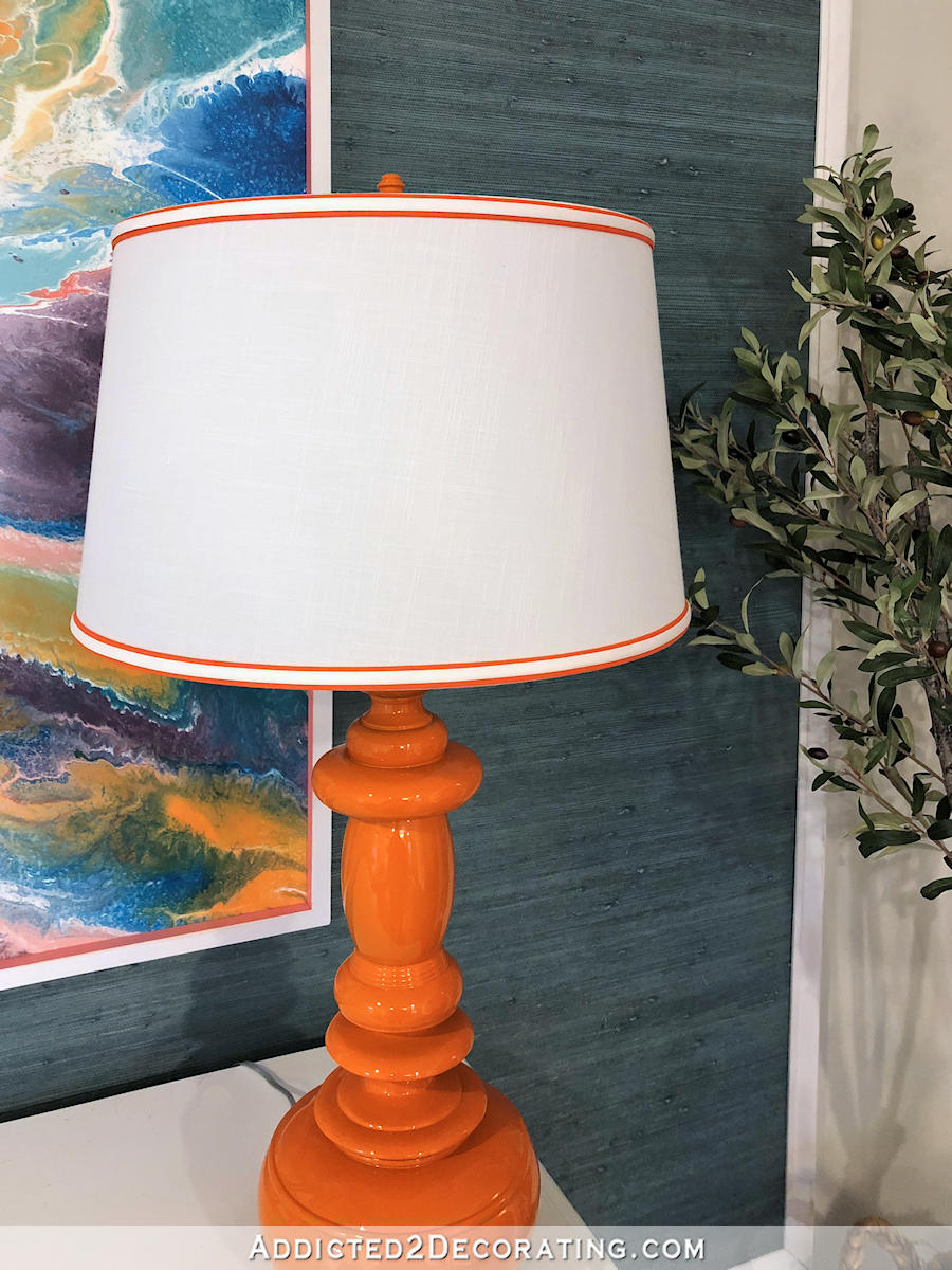
So my frustrating day ended on a good note and with a jolt of bold color, which always makes me happy.
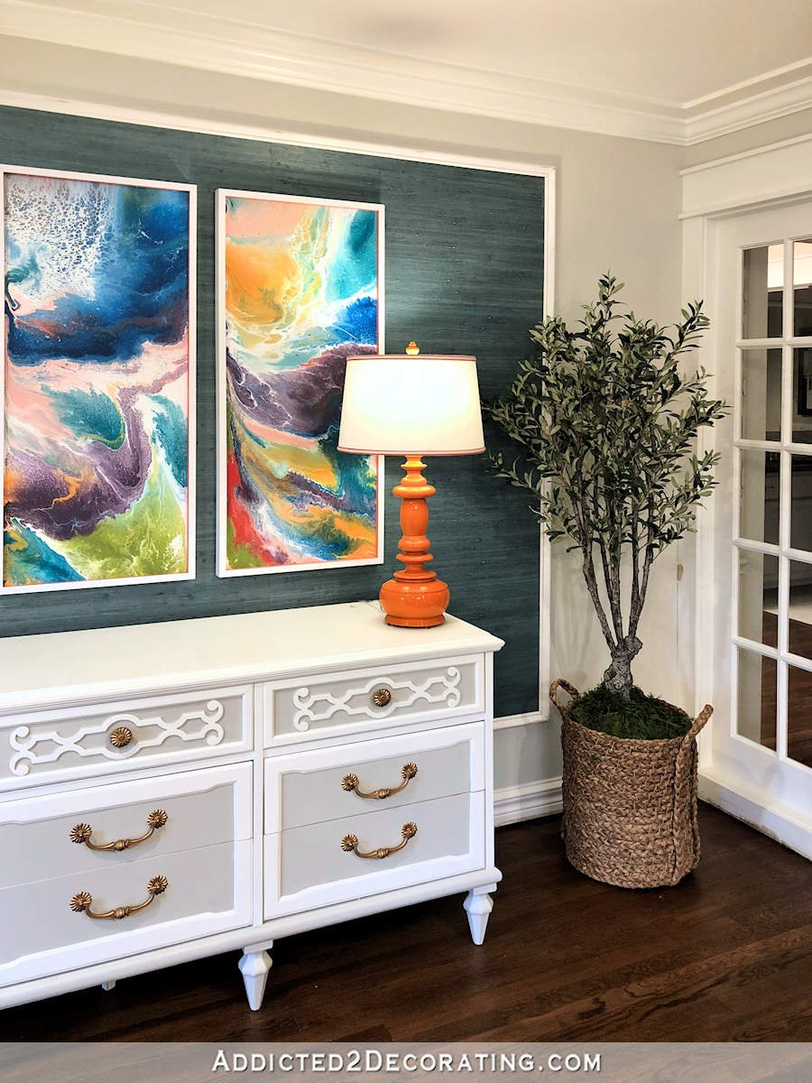
As for the rest of the entryway, I’ve got just a few more things that need to be done before I can call it finished.
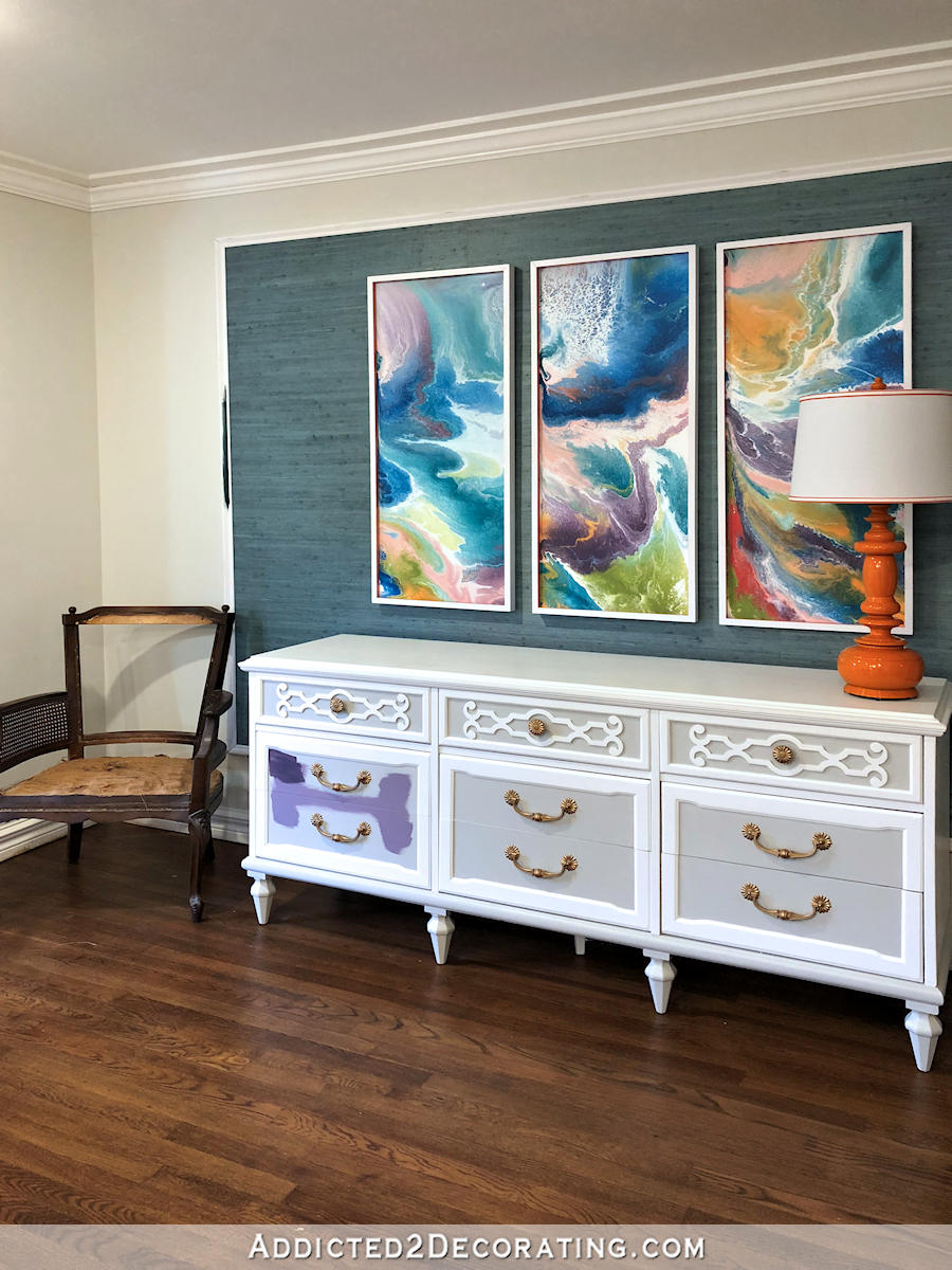
First, I want to paint the moulding around the grasscloth in the same teal that I have on the fireplace, which is directly opposite this wall. That’s what that strip of teal is to the left of the grasscloth. (If you need to get your bearings, you can see my recent house tour video in this post.)
I’m also going to repaint the insets on the credenza. The color that’s on there now looks okay in some light, and then it turns an awful purple gray at other times of the day. It really shows in this picture…
That drives me crazy, although every time I say that about something, Matt reminds me that that’s a very short trip. 😀
After about 13 years of shunning all things purple, I finally like purple again in general, but that icy purple gray just doesn’t work for me. So I’m going to repaint just those areas. The irony is that I’m going to paint them purple, but it’s going to be something more in line with the purple on my living room draperies. No more light icy lilac gray. But the two colors I tested are also not quite right. I’ll keep trying until I find just the right one.
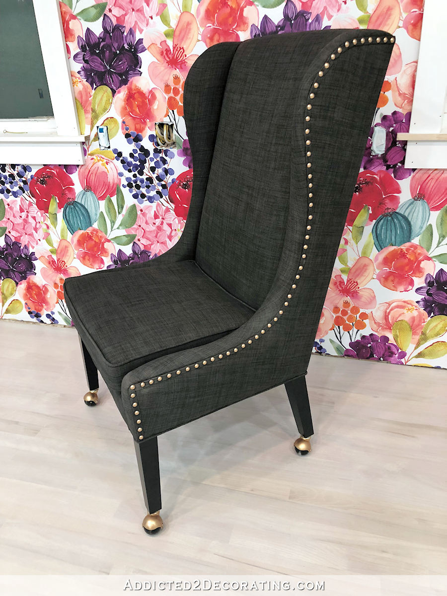
And finally, I’m thinking about upholstering that chair for the entryway. I’ve been hanging onto it for years just waiting for the right spot. Since I only have one, this is probably as good a place as any.
This “entryway” wouldn’t take long to finish if I would just focus on it for a few days, but right now the gorgeous weather keeps drawing me outside to work on outdoor projects. But perhaps once the really hot weather hits, I can spend a few days and get this area finished.


Love the glossy orange!
With all the symmetry going on… three pieces of art over the three drawer sections of the dresser… I think you need the other lamp.
I have a vision in mind for how I want to accessorize the credenza, and while it’s not perfectly symmetrical, I will be adding something to the other side for balance. But if that doesn’t work out, I do always have that other lamp and another can of spray paint! 😀
I like only one lamp.
And, can three (panels on wall or dresser) really be symmetry? Lol. If that’s the case, you would need three lamps. Just being silly- no offense meant to anyone. But truly, I love the lamp, and that there is only one- balance out the other side with something else decorative. 😁
Yes, asymmetrical symmetry.
The lamp is great! It matches the orange in your painting perfectly and the shade is trimmed out beautifully. I really like it.
The chair is a nice size and shape for your entryway and is always an extra seat that can be used in the living room when you have a lot of guests.
Kristi, I have always liked the deep eggplant color you used on the credenza in the breakfast room. Would that color work on the entryway cabinet? I keep wanting to see that color on the fireplace, especially next to the purple curtains, but I know how much you like the color you have on it. Paint is such a simple thing that makes the most difference in a look. I worked for years in a picture frame shop and the mat choices made a huge difference in the look of a print we were framing.
I think that might actually be the darker color that I tested. Maybe I need to paint more of it on there and give it a second look before writing it off. My thinking is that the fireplace wall has the dark teal fireplace with purple curtains flanking it. So I’d like to echo those colors on the entryway wall to give balance to the room, with the teal grasscloth, dark teal border, and then purple (similar to the medium purple drapery color) on the credenza. But of course, it doesn’t have to match exactly, and that dark purple from the breakfast room buffet looks beautiful with the living room draperies. I’ll probably give it try. Like you said, paint is a simple thing.
For what it’s worth, I instantly thought of the deep eggplant too. I think it would be rich and beautiful…
Me too, and it will look great with the front door! I can’t see doing the teal around the grasscloth, but if it makes you happy…..that’s what counts.
I love your redone lamp. Orange speaks to me lately, and I don’t know why! LOL!
You could bring a drawer from the kitchen credenza in and place it on the piece to see if you like the color there.
Looove the orange lamp! I dream of seeing you incorporate more orange in your decor. Can’t wait to see the updates on the entryway!
LOL……..Orange is my LEAST favorite color and I would never use it in my house or wear clothes that were orange…..BUT…that Lamp looks FABULOUS in your entry : – ) It was just what was needed ! ! !
And I think that chair fits perfectly in that spot…….now the fun of deciding what fabric to use.
I wonder how the drapery fabric would work on that chair…too same-same?
Who were you decorating for before!?!? LOL! I like the subdued colors, but they are so different from where you are now! Love the orange lamp and I have no doubt that when you finish the chair and get the rest of the credenza decorated, you’ll have enough symmetry.
Sorry your plans for the shutters got thwarted! Another day in DIY… Have a good weekend!
Wow 3 coats must be the magic number because that finish is awesome! love the double bias tape never thought of doing two layers. Great tip. Things look like they’re really coming together in that room.
You ironed the bias tapes after they were attached? I didn’t know one could do that without warping the shade itself. Good to know!
I love the orange lamp! I’ve been thrift shopping for a couple of table lamps for the last couple of weeks and finally found a couple that will look great spraypainted. I’ll have to do the glossy coats too, because I love how it looks. I really like what’s you did with the bias tape on the shade as well, what a great way to customize a plain old lamp shade.
Love the ORANGE on the lamp, and thanks for the shade embellishment tip. The 2 layers of bias tape really set it off. I have an already orange lamp with a white shade that I may try that on!
So in love with the lamp and the shade is to die for! Personally, I think the one lamp is great. I feel too much symmetry is too contrived and matchy-matchy.
Again just a personal opinion.
yes, yes, & yes
Absolutely liek the lamp and its colour! But also think having one in this enviromnebt more than enough. Great job!!! You are so much skillful in everthing you start! This is something fantastic for a simple woman,,, maybe a bit unreal???
Me too…..I agree…lol
The entryway is so elegant and cheerful! Thanks for the tips on the lamp, I’m going to try it out.
I really like the orange lamp—especially the shade trim and how it echos the orange/white frame on the art. Nice touch.
I really wish I had started a tally years ago of every item or wall you’ve ever painted a neutral color and then repainted it with a bolder color. 🙂
The lamp looks awesome, by the way!
Love the lamp! I think the change of colors on trim and the credenza is an overkill, with the teal and purple. Your original colors made the brighter colors sing.
I agree with this. Between the two rooms there needs to be a bit of subtlety.
I agree. Don’t take away the beauty of your art by putting too much color on furniture to compete with it. I like the subtelty of the plain credenza. Wouldn’t one of your basic go to colors be good enough to show a contrasgt but not the icy purple color? Just a thought.
Your ingenuity never ceases to amaze me. I love the detail with the bias tape — I have found all manner of uses for it, too. Whatever happened to those cool orange chairs you built?
Wowee, that orange lamp really brightens up that corner! It looks like the color spilled off the painting onto the lamp, lol. I think two of the same thing would be too much, though, and detract from the glow of the one orange lamp. JMHO.
Love the orange lamp. No need for symmetry. Whatever else you choose to add to the table decor will make it even more interesting.
I agree! Symmetry is for hotel lobbies! HA!
I really loved the bird entryway but I have to say in a side-by-side comparison that your current, bolder entryway is more appealing. I agree with a few of the others though that doing both the trim and the credenza may be a bit overboard. I’d leave the trim white to complement the white frames of the triptych. I am interested to see what painting the inserts on the credenza a dark purple or the teal of your fireplace would look like. You can always paint it back lighter if it doesn’t work.
The trim on the lamp is a really nice and easy upgrade. I think I’ll do my bedroom lampshades this weekend.
I have not been a fan of that fussy credenza. Love the purple! I think it would look awesome painted a solid color…
Kristi, the lamp is perfect! The color, the gloss, and the shade!
Repainting the credenza will be a satisfying project too!
You didn’t ask… but as I look at it I’ve always felt that the inserts on the doors should be the same color as the rest of the credenza. It feels too busy to me and seems to conflict with the beautiful art. However, I do like the color accent on the drawers. Sometimes less is more. IMHO
Agreed.
I think the more muted purple like the drapes is a good idea. There are a lot of bright colors there and a neutral is sometimes needed to set them off. The chair looks good there but will it be in the way of opening the door?
I ended up moving it to the other side of the credenza. It feels less cramped there, and doesn’t get in the way of the door.
I love the lamp. I want to paint one that looks shiny like yours in bright pink or turquoise. Also, the shades are very nice and did they come on the floor lamps from target, please? Don’t laugh, but I have never owned a hot glue gun. Can you suggest an excellent one to purchase, please? I see more amazing projects done with them and want to try one but have no idea what to purchase. I hope you will get a chance to answer my questions at your convenience but I know you are very busy. I totally trust your opinion.
Many thanks,
Debbie (a fellow Texan now living in Ga)
I bought this lampshade at Lowe’s. It was sold separately, and I think it was around $20.
I used to buy the little cheap hot glue guns that they always have near the checkouts at Hobby Lobby and Michael’s. Then one day I saw a big hot glue gun at Home Depot and bought it. It was awesome! That’s the only kind I’ve used since. I don’t know the brand, but as long as you’re getting a big high temp hot glue gun that uses the big sticks (about 10 inches long and 1/2″ diameter), it’ll work well. Both Home Depot and Lowe’s should have them.
Thanks kristi – YOU ROCK!
Love that lamp! Have you considered switching the picture with the orange in it to the other side for color balance? Can’t wait to see that chair! Your house is my dream house!
I actually ended up moving the lamp and the tree to the other side (the left) and putting the chair on the right side. Looks much better, and it does balance out the orange better.
Think the “warm weather to be upholstered” Chair seem to balance out the one orange lamp perfectly……
You are my hero !!! So glad I found your site. Busy catching up and can’t wait to see what you will be doing next.
I’m glad you are repainting the credenza. I never liked the icy purple gray. It is too similar in color value to the walls; it neither complements nor contrasts with them. I don’t have a color recommendation, and I have thought about it each time you have shown a photo of the entry way. I guess purple is as good a place to start as any!
Wow. You change your mind alot. I do too. I am glad you go for you want no matter what!!
Kristi, the orange on that lamp is gorgeous! Bright, bold, warm colors – chrome yellow, bright red, citrus orange, and hot pink – used to be my favorite colors, but as I’ve gotten older, I’ve flipped totally into loving mid-tone sea colors like aquas, turquoises, rich seafoams, and soft beachglass greens. I find them calming as opposed to the excitement of those bright tones. That said, I’m LOVING that orange lamp and am now thinking a nice shot of a bright color like that mixed in with my favorite beach-y colors would be a nice balance.
Those three gloss coats make that orange color sing — at first I thought it looked like a ceramic lamp, now I’m thinking it looks more like an opaque orange glass lamp. Just beautiful!
I love your entryway! Sets the perfect mood for the rest of your home.
The chair in the corner will be great mix of practical need in an entranceway as well as another decorative element. However, have you tried opening your front door with it there? I worry it will hit the door, especially if you prefer to leave the front door open.
It was a problem, so I ended up flip flopping everything yesterday — chair on the right, olive tree and lamp on the left. It looks better and also just “feels” better, somehow.
LOL…the woodbutcher tells me the same thing about “short trips”….
The orange lamp is great….I’m glad you flipped it….sounds like it would look better to me too.
Thank you for the hint about the lampshade….I have one that will get a makeover as soon as I have time to go to the fabric shop :^)
Blessings,
J
I love the lamp. What a great idea for the shade.
Great choice on the orange! It’s my favorite color.
I sooooo want you to be my best friend!!! You do amazing work!!!
So, a follow up on this post. I was just looking at your instagram page, and right now the pictures are lined up so that your photo of your orange lamp is right above a photo of your living room drapes (with the greek key). In the photo of the lamp, you can see the top part of the credenza/dresser that you want to repaint. I’m thinking that if you do a purple that “matches” your drapes, it’s going to get too matchy matchy. I would go for a deeper purple, like the deeper shades in your abstract paintings. Just a thought.
I 💘💘💘 your orange lamp! I love orange so much, I painted our laundry room orange when we moved in this house. I think I’m the only one that likes it, though! Have you thought about using the deep eggplant/aubergine that’s in your paintings? I think it’s a beautiful color. Have you ever used the Amy Howard’s spray lacquer? And she also has the Bright Idea top coat spray. The sprays are supposed to be very high gloss, and the colors are beautiful (no orange, though). I have several porcelain lamps I want to use the lacquer on. I think it will really bring them up to date. I also love to embellish my lampshades. I buy small remnants of expensive trims whenever I visit high-end fabric stores. The prices are good, because you don’t need much to go around a shade.
Just catching up on posts- what a pretty lamp! I love the glossy finish.
Also- bias tape on a lampshade? Brilliant! Layering the white over the orange gives it so much depth… I’ve got a few lampshades that could use a little color, so I may be imitating this idea.