Living Room Progress – New Fireplace Color & Chandelier
My first attempt at painting the fireplace gray was a big fail, but this time I think I got it right. Here’s how it turned out…
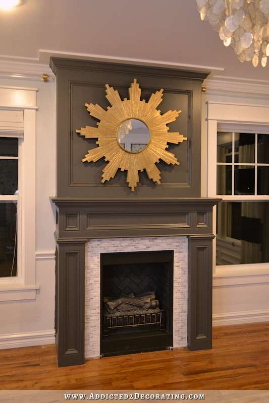
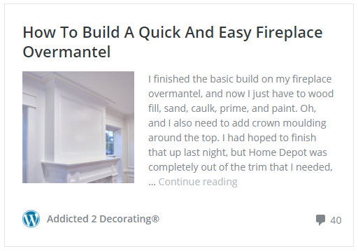
I really love how my gold sunburst looks against the dark gray color. I made that sunburst earlier this year. You can find that project here.

EDIT: Yes, I do realize that sunburst is too big for the fireplace. 🙂 I do want a sunburst up there because it’s so pretty against the dark gray, but I’m going to keep an eye out for a smaller one with a lighter look to it that will actually fit inside the upper frame on the fireplace.
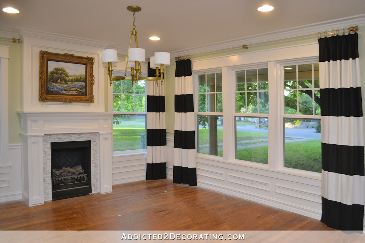
I painted the walls around the fireplace in Benjamin Moore Iceberg. A couple of people had warned that Iceberg looks really blue on their walls, but it doesn’t at all on mine. It looks barely blue. It might even be too barely blue. I might try out the one that’s just a bit darker called Smoke. I still have touchups to do on the wall below the chair rail. You might notice that I removed the frames (decorative trim) below the windows. Things just looked a bit busy, so I’m in the process of repairing the wall where I removed them. I’m going to remove the ones under the other windows as well.
So what color is the fireplace? Well, I headed to Benjamin Moore to look at the two most-suggested colors — Kendall Charcoal and Wrought Iron. I did a bit of searching and found both colors used in this one room on the blog Dear Lillie. The walls are Kendall Charcoal, and the door is Wrought Iron.
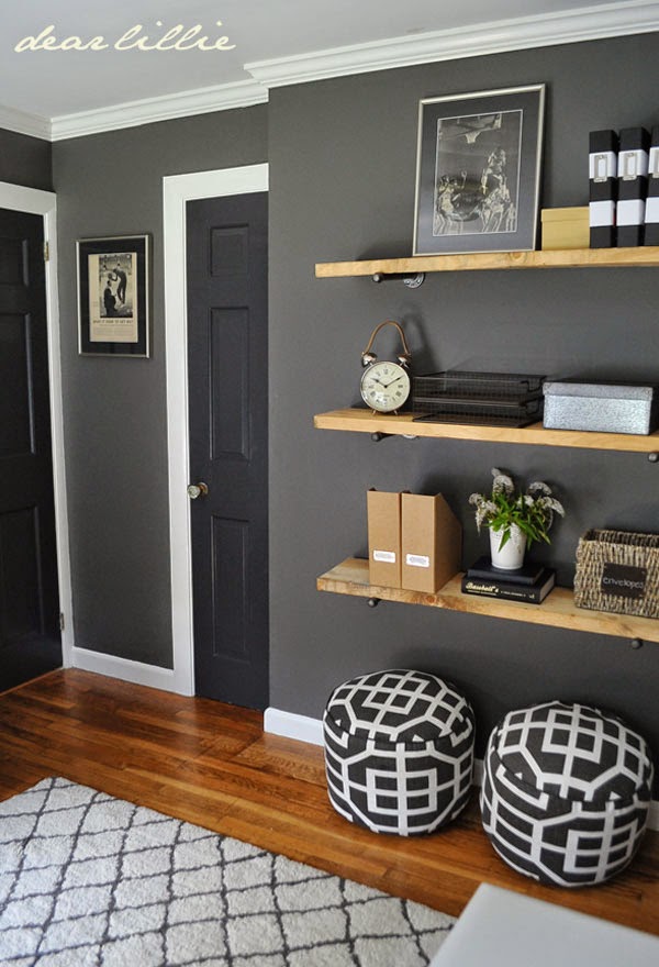 via Dear Lillie
I really liked the Kendall Charcoal, but it wasn’t quite dark enough for me. The Wrought Iron was a bit too dark, and even looked black in some pictures. So I asked the guy if he could make the Kendall Charcoal darker, like 10-25% darker or so. At first he said he could, but then he realized there wasn’t enough room in the can for that much colorant since I was only getting a quart.
But he looked at the formula and said, “I have an idea. This formula has quite a bit of white in it. Why don’t I just omit all of the white?”
So that’s what he did. My fireplace is basically Kendall Charcoal with all of the white removed from the formula to make it darker. A brilliant solution, right?
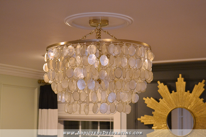
And here’s my new chandelier…
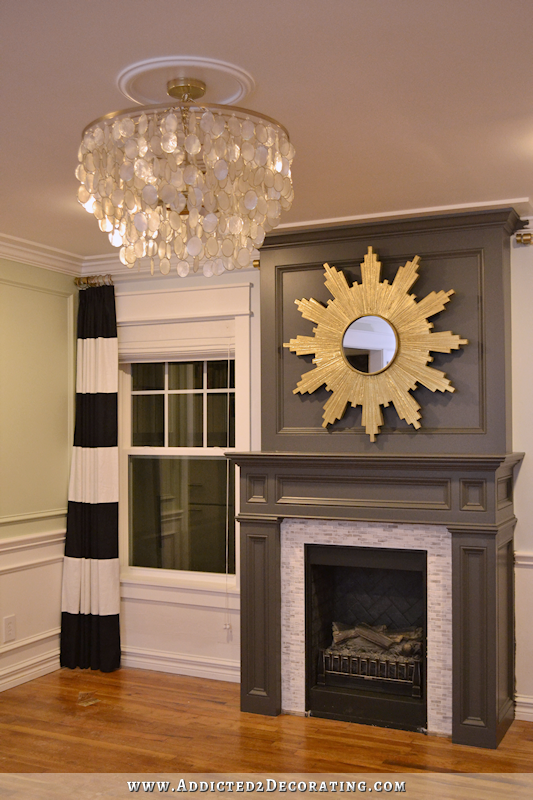
Obviously I still have some painting to do on that green wall. 🙂 And the window will look different very soon with new fabric and natural woven shades. But the chandelier…ahhhhh. I’ve wanted a capiz shell chandelier for a very long time now. A real one. I made a faux capiz shell pendant light a while back, and it still hangs in our bedroom.
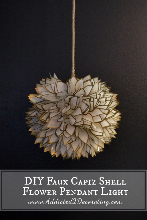
And while I do like how it turned out, and it was a fun project to make, there’s really no substitute for the real thing. Real capiz shells have a pearlescent look to them that can’t really be replicated in any of the DIY faux capiz shell versions that you’ll find on Pinterest.
So now I have the real thing, and it’s lovely and just what I wanted. This one is the Aurora 3-Light Capiz Shell Chandelier from Horchow*, and it comes in a silver and a gold finish.
I bought it during their 40% off sale with free shipping. I had originally had my eye on this Teardrops Capiz Chandelier from CB2*.
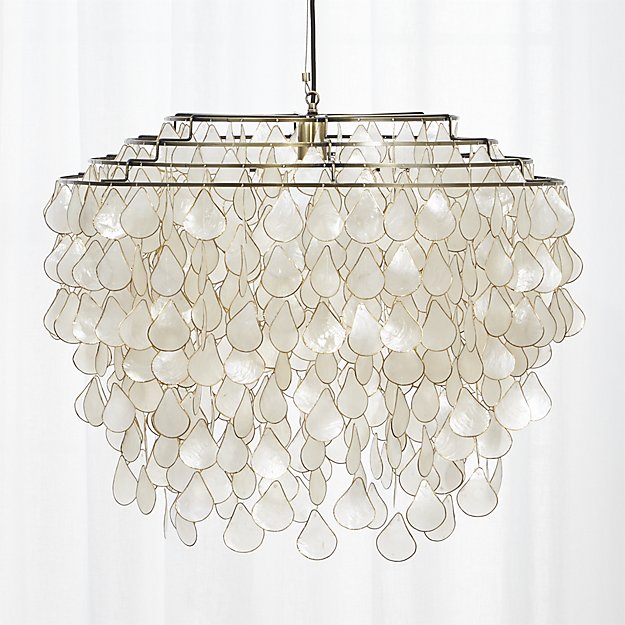
But three things kept me from hitting that “Checkout” button: (1) I didn’t like the step down design where you can see all of the rings at the top, (2) the light only accommodates one light bulb, and (3) it’s huge — 27.5″ diameter x 23.75″ high not including the cord. The height would have worked over a dining table, but wasn’t really what I needed in my living room.
So when I found the Horchow light at 40% off, which made it just $9 more than the CB2 light, I jumped on that. It’s 24″ in diameter, and only 16.5″ high not including the cord/chain. I adjusted it so that it was as close to the ceiling as possible. And I really like that it accommodates three bulbs.
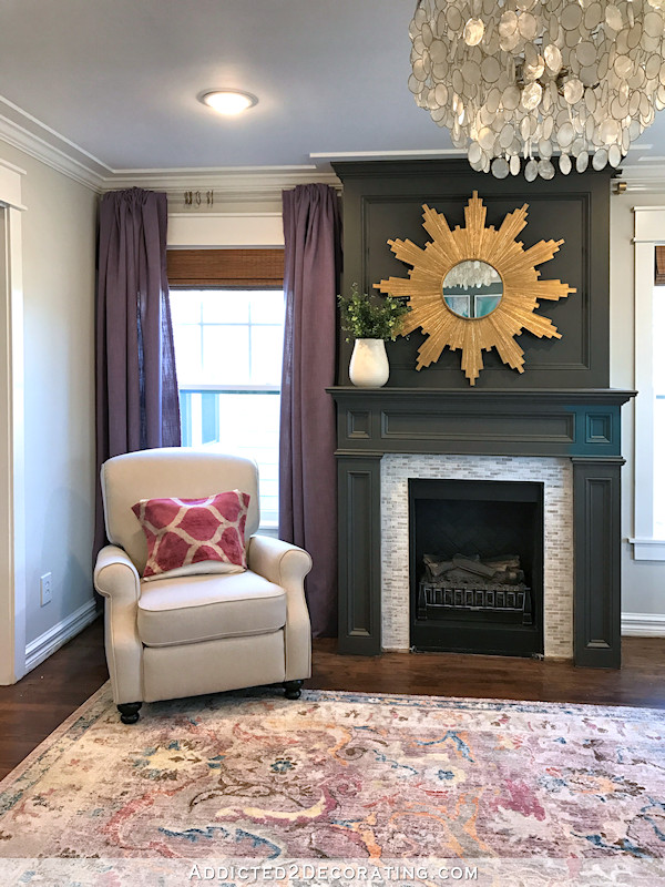
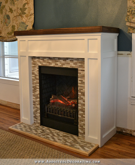
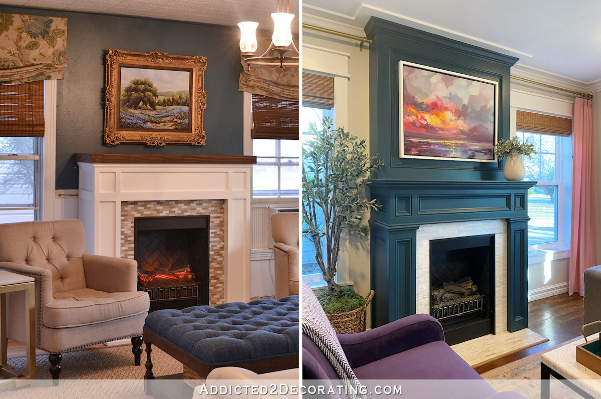
If you’re new around here, you might not realize that I actually built that fireplace from scratch…and it’s electric. 🙂 You can find the original build project here.
Then I added some trim and changed out the mantel to change the style from craftsman to traditional.
And then I added the overmantel here.
This fireplace has been through quite a transformation in its short life. 🙂 But I’m pretty sure the current version is my favorite.
Things are moving right along. I have so many projects that I could tackle next. What I should do is finish my kitchen cabinets. What I want to do is start on my new draperies for the living room. 🙂 It’ll all get done eventually, so I guess the order doesn’t necessarily matter.
[show_shopthepost_widget id=”2201100″]

Addicted 2 Decorating is where I share my DIY and decorating journey as I remodel and decorate the 1948 fixer upper that my husband, Matt, and I bought in 2013. Matt has M.S. and is unable to do physical work, so I do the majority of the work on the house by myself. You can learn more about me here.
The perfect color! Love it! The lamp is lovely too.
interesting time for a post 🙂 I think you must have sent it during the night, so that for once I get it with my morning coffee over here in Germany! I love the grey on the fireplace and am intrigued by your change of plans – cannot wait to see more of it, even though I find it sad that your mural will have to go. But I can always go back to the pictures of it, of course – and I’m curious about where you are going to put it next! Have fun with your newfound energy and plans, it’s great to be in on the journey!
The mural is going ??! How did I miss that ? 😢
Love the fireplace! I also love that you are removing some of the trim. I know that elegant is not the way you want go but I can’t help but think your “Mood Board” Makes me think “Cozy Elegance”. The soothing blues,greens and grays. The floral and wood elements. It really speaks to me. I feel I would want to come in and curl up for a good gossip! Lol. I look forward to watching this new decor unfold!
Love the fireplace. Just my opinion, the mirror looks too busy against the fireplace.
My opion too. The mirror over takes the room. If it was maybe smaller. Maybe you want the mirror to be the object of attention. I can’t even see the fireplace. While I’m giving my opinion I think it looked good when you had foot piece on the floor. ( don’t know what that piece is called.) Seems like something’s missing. Just one persons opion. Loving your blog! Being following a long time.
Haha! Yeah…it’s big. 🙂 I’ll probably end up getting a smaller and more understated one. I love the look of a gold sunburst against that color, and that’s the only one I had on hand. But it’s so big it doesn’t even fit inside the frame. 😀
I love the mirror as is…yes it’s bigger than it should be, but that’s exactly why I love it. Sometime breaking the rules is fun!
I agree, the mirror looks wonderful up there. It’s the sun and the sun is big and beautiful. Just my opinion.
I disagree. I think it’s cool that the sun is “bursting” out of the frame. It has a big impact and looks really nice!
I agree with Jenny…..that sunburst is absolutely gorgeous and I think the size is perfect! I also missed the post about you removing or painting over the mural.
I could go either way on the size of the sunburs mirror, but am hoping to see the landscape painting back over the fireplace to see how it fits once all the other elements of furniture, drapes and other color are in.
This is turning to a stunning room. Love the colour and the light. Will look fab when completed.
Looking great! The gold elements are tying together very smoothly, and the whole look is more modern. The curtain rods mesh with this new look much better, can’t wait to see it with furniture.
I think you have nailed it. It’s so important to go with YOUR vision for your home. I see where you’re going with the warmth.
It’s looking great!
The link to the chandelier doesn’t work for me.
Me either! I wanted to see the other color.
I love this one you got, the brass is a nice color, not so deep as some are. Loving the colors so far, and can’t wait to see what’s next!
That is a WIN! I wonder what the ceiling would look like painted in the Iceburg color if you darken the walls a tad….
That’s a great idea! And Smoke (the shade darker than Iceberg) is such a beautiful color.
BTW, I love the look of the Starburst mirror also!
The gray, it doesn’t have a green hue in real life, does it? I can’t imagine it would do that by simply eliminating the white. Capturing the real hues with a camera is hard for sure. I haven’t figured out that trick yet myself.
I love the fireplace and the mirror but not together – the mirror overwhelms the space – it would look better in a more open space – something less “heavy” would look better over your fireplace
I agree. While both are gorgeous- they seem to fight one another as the star of the show. That’s in the pictures, in person it may not be so. I think Kristi would notice it if it looked like that in person. Also Kristi- Smoke is really really blue. Try pale smoke. My kitchen is pale smoke and it changes with all the light at different times of day. But it’s always a beautiful pale blue.
Ugh. I was referring to the chandelier and mirror not the fire place and mirror. I think the fireplace and mirror are perfect together! I need to read more carefully. Sorry Kristi.
Yeah, it’s definitely too big. It doesn’t even fit inside the upper frame. 😀 I’d like a gold sunburst up there because I love how it looks against the dark gray, but I’d like something smaller and less heavy looking.
I got a sunburst mirror at Home Depot – very inexpensive – think it’s Martha Stewart – it’s less heavy and think it would work well for you
Another suggestion – i’m picturing a smaller sunburst mirror flanked by candle sconces –
I like it that size. Who says you always have to stay inside the box ? It really makes a statement and anything less would just be there. I know it was a small area but I never could of painted with the draperies there. I would of gotten paint on them. Like the blue but don’t know what the next shade up would look like. You worked so hard on those draperies is there any way you could use them in Matt’s office ? There not feminat. Men don’t like foo-foo.
I am loving your new colors. I actually love your striped curtains and if I didn’t live so far away, I would buy them from you. Since, apparently, you don’t want them any longer. 🙂
UPS? Fedex? 🙂
YES! Amazing!!! You are on a roll!!! Can’t wait to see what you do next!!!
So, here are my thoughts, not that they should drive your thinking! 1) I agree – smaller, lighter feeling sunburst for over the fireplace, 2) LOVE the chandelier, 3) I’m a little sad that you’re getting rid of the trim under the windows. I loved how classic it looked. But, maybe it was too busy. Might be hard to tell online. 4) I like the really pale blue in the pictures, but maybe its too washed out during the day? Not sure. You may want to live with the iceberg color for a while and complete more of your decorating decisions before going darker. 5) I will mourn the loss of the mural! While it will be a lot of work for you, I hope you’ll recreate it somewhere. 6) is the coral totally out? what will you do with your side chairs? 7) I would love for you to finish your cabinets and the wall with the cased opening to the kitchen. I would love to see that view from the living room back to the wall of cabinets! 8) ok, I’ve to to stop there. My mind is spinning. 🙂 Get to work! I want to see how this all plays out! 🙂
We used Smoke in my husbands office. He wanted a light blue that didn’t look like a baby blue and my Benjamin lady recommended it . It’s a very nice blue .
So , the mural is really going ? Well then , take a good picture if it!
This is definitely one of those “Ta Da” moments, Kristi. The fireplace looks wonderful. Cheers, Ardith
Awesome make over! I updated my outdated light wood fireplace to a dark gray a year ago. It has become my favorite makeover in our house. I also love the star mirror. I like the size and how it over laps slightly and adds dimension.
I really like the color of the fireplace. It is a showpiece. The light fixture is so pretty and bright – love it! The starburst mirror is beautiful on the fireplace and I like that it is big! I’m sure many disagree but I think it has impact and is a great contrast to the smokey color of the fireplace.
Wow! That chandelier is gorgeous! Do you know about how often Horchow has the 40% off discount? I’d really love to buy it, but I would need the discount. Thank you!
I actually have no idea. The only way I came across it is because I had been searching for capiz shell chandeliers, and this one showed up on my Facebook feed as an ad. I kept an eye on it for about two weeks before it went on sale with free shipping. Keep an eye on it, because they might have another big sale before Christmas.
I also love the oversized sunburst mirror! “Bursting”over the frame looks awesome-as another commenter said. It really makes a statement-it takes the fireplace to another level-I hope you keep it!
Kristi…..you’ve nailed it…..the fireplace color is simply stunning and I love it with the new iceberg paint wall color. Great combination. You have definitely got your designer groove back and can’t wait for each day to see what your reveals are! You are certainly going to be ending this year on a high with your new vision, plan and designs! Well done.
I think it looks great! I love how the fireplace turned out.
I wouldn’t mess with the blue until you have the draperies and some of the fabric furnishings done. If it still looks too light, then find something darker.
Gorgeous chandelier! It really takes the room up another notch. I’m not a fan of gray, but the fireplace color is rich and warm and beautiful. I like the contrast of the gray with the gold in the starburst mirror, drapery rods, and chandelier. The only thing I would like to see different is some kind of ‘hearth’ on the fireplace – maybe just a simple slate-like piece?
I’m liking this new direction you’re going. Sometimes we have to try different things before we find that perfect combination, and you are fearless in doing that. Onward and Upward!
Check out this mirror from Home Depot, it looks like it’s made from spoons!
http://www.homedepot.com/p/Safavieh-Royal-Leaf-Sunburst-28-in-H-x-27-5-in-W-Round-Framed-Mirror-MIR4028A/206786986
similar to this…
https://www.addicted2decorating.com/how-to-make-a-decorative-chrysanthemum-mirror.html
Love the color of the fireplace and the Iceberg on the walls. Think removing the trim below the windows is a great idea and maybe all the lower brackets removed would tone the busy down. Looks like you are enjoying yourself again. Enjoy.
Kristi, the more I look at your oversized sunburst mirror, the more I like it. It’s bold and makes a statement. Why not live with it, AND the current blue wall color, and see how it works with the drapery fabric?
I’ll probably do that. I’m in no hurry to replace it, and the more I see it in the room, the more I like the big, bold statement it makes. It actually looks more imposing in the picture than it does in person for some reason.
I think the mirror is perfect in that spot! It’s a little unexpected and out-of-the-ordinary because it’s larger than most people would envision for that space…but it works and makes your fireplace wall a stunning focal point in your living room. I really like the pale blue walls and think they will make the perfect backdrop for your curtains and furniture. It’s so great to see you enjoying decorating again and having confidence in what your instincts are telling you.
Thanks for sharing the ride with me : )
Love the new look and the beautiful capiz chandelier. Im just wondering why did you decided to paint before choosing your new sofa? (This is not a judgment, only a question)
PS: If you really want to get rid of the mural, all you have to do it cut it out, wrap it up and send it to me. I’m building a new home right now and it would be beautiful in my entrance, lol.
Do you mean the fireplace or the wall? I painted the fireplace because I figured it such a neutral color that it’ll go with pretty much any color that I pull out of my new color palette for the sofa. And I only painted enough of the wall color on that wall from the sample pot that I have so I could see the color next to the gray fireplace. I also painted another big sample on another wall. I won’t paint the whole room until I make my final decisions on the sofa and chair fabrics.
it was the wall that I meant and I agree, grey is a neutral. I thought you were painting the whole room. Have you looked at stonington grey and Coventry grey by BM. While they both have grey in them, they also have a blue. I had both in my last home and it looked amazing. I used the Coventry grey in my husbands office and he really liked it. 🙂
I am glad that the sunburst mirror is not going to go over the fireplace permanently. It looked good on the bird mural wall. Although the bird mural could stand on its own.
Hi Krisit:
I’m a long-time reader, but I”ve never commented before. I love your home…and all you’re doing. The new color on the fireplace is so pretty. I can’t wait to see the entire room once you’re finished. I also love your wide striped drapes. Would you mind sharing your source? I would love to have some in my LR and DR.
Thanks, Beth
Beth, I actually made those myself using two solid linen fabrics. You can find the tutorial here –> https://www.addicted2decorating.com/diy-black-white-horizontal-stripe-draperies-lined-pinch-pleated-finished.html
Not sure how I missed that post, but I should have known! If only I knew how to sew.
Thanks for taking the time to reply.
Oh my goodness, Kristi. The way you buckle down and get gorgeous things done is amazing to me! Iceberg is the perfect “canvas” for the rest of your ideas for the room. It’s pure freshness and light. Darker will drag down the room; you got this one right the first time. I’m excited to see it all come together. I’m betting your living room will be one of blog world’s very best DIY rooms!
I didn’t even particularly notice that the sunburst mirror falls outside the trim until I read the Edit note. But okay, you could get a smaller one, and if it happened to have a touch of capiz shell in it, that would play nicely with the beautiful new chandelier, without it looking like “a set” (blech).
Beautiful chandelier. Congratulations on getting better price! So glad you removed the extra trim under the windows.
Gorgeous! Love the dark grey
That fireplace is beautiful! It’s the same “pencil gray” that I have in my family room 😃 It looks fantastic with the ice walls.
Like the grey color. As you have already mentioned the mirror is too big for the space, but it sounds like you are planning to scale it down a bit. I still think the tile surround around the fireplace needs to go. It does not work and it will quickly become dated if it isn’t already.
Your home is coming together and I look forward to reading your posts. You have your enthusiasm and spark back!!
Even though the sunburst goes a bit outside the fireplace mantle frame, I think it looks fabulous and NOT too big. I know it’s probably not a permanent fixture, but I think it looks like it could stay for good.
Also, I think the tile around the fireplace compliments the grey, and does NOT date it.
What do I know… but I love the mirror on the fireplace! I vote drapes next so we can really love that fireplace wall and keep the gorgeous bird wall mural PLEASE!
I know why grey is my favorite color – and the fireplace and room look stunning. I actually always thought gold didn’t go well with grey, but I see here that it really does with the right grey. The size looks good (which you did a great job on both the fireplace and sunburst you made), however, it might be too large depending on how your other furniture and accessories in the room blend. I have been wanting to do a sunburst for quite a while and have the mirror for it – so your link will be handy! I’m delighted to see that you warmed up to greys. In our remodel, I am almost worried I may go with too much grey – which would suit me, but I am planning to use some stains and glazes to vary the hues just enough to suggest a grey blend in some areas. I finished the mosaic tabletop for the bathroom accent table – just need to grout it, and sand and finish the table. Today I am completing the frame and making a mosaic mirror for that bathroom that will go nice with the oil-rubbed bronze; and I finally changed the colors on the vanity accessories to match to remodel colors. The enamel turned out terrific on the vanity top that I did in a faux granite – I wasn’t about to spend a ton on a kit, and we are really pleased with the result. I am loving your blog; I did three a day a few years back and I’m not sure how you keep up when you are going 90 miles an minute to finish your home! But kudos for you!
I have an idea. Put the picture with the gold frame up. It’s more proportioned to the frame. Look at it. I bet you won’t see the wow factor of the over sized sun burst.
Was wondering if you could keep your wall mural if you went back and changed some of the bright colors — adding a few touches of your new color palette– it is stunning and I hate to see it painted over!
Your fireplace is beautiful!!!! I don’t think the sunburst is too big, I think it is perfect.
What color is the walls near the door and behind your shelfing?