My DIY Abstract Art And New Shower Curtain Fabric
This weekend I decided to try my hand at a piece of artwork for my bathroom. I was inspired by this abstract painting by Blair at The Fox & She.
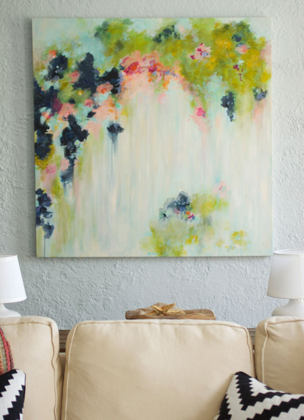 via The Fox & She
I love abstract artwork because it’s not really mean to be anything other than a display of color, movement, shapes and texture. And this particular painting is one of my all-time favorites.
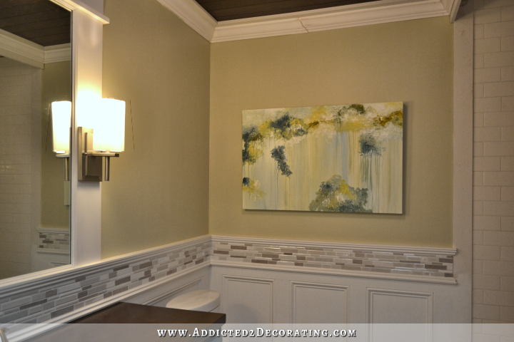
So I set out to create something similar that I could use in my bathroom. I don’t like mine nearly as much as Blair’s (I think I need quite a bit more practice 🙂 ), but here’s how mine turned out.

I tried not to look at Blair’s painting while I was doing mine, because I didn’t want to end up with a copy. I looked at it before I started, and then tried to do something similar — “inspired by” hers.
One thing I really like about Blair’s painting is that the colors are so bold and vibrant. Mine turned out way more subdued. It’s fine, but I would much prefer the bold, vibrant colors.
I really like the part along the top of the canvas, but I got a little too carried away with the drippy parts. The left side is fine for my taste…
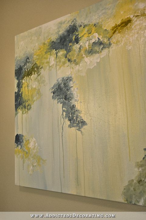
…but the drips and runs on the right side of the canvas are a bit much.

I really do like that top part, though. After I painted each section, I just used my hand to flick some water on it to create the drips, and I clearly used too much water on the right side.

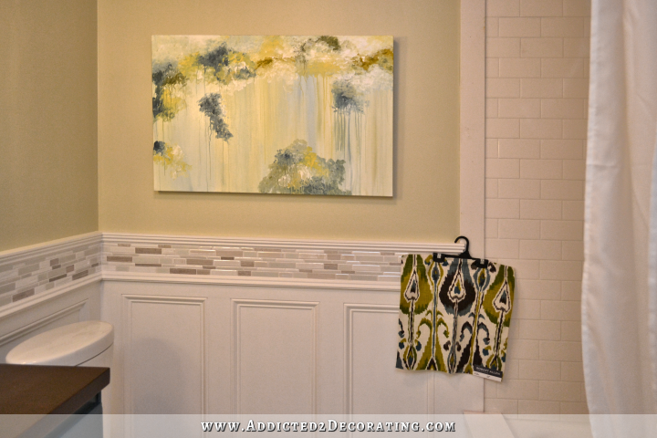
But for now, it’ll do. I might finish up the bathroom, and then give it another go. The good thing about paintings is that if you’re not satisfied with the result, you can just cover the first painting with a solid coat of paint, and start all over again. And it’s just fun to try. 🙂

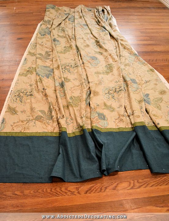
And speaking of starting over again, that’s exactly what I’m doing with the shower curtain. I decided to go with a different fabric altogether, and no flowers this time. Instead, I’m going to use this Robert Allen Ikat Bands in Rain.
I’ve never been particularly fond of ikat in the past. Even when it was all the rage, and you couldn’t visit a DIY or decorating blog without seeing ikat, I was just never really drawn to it. In fact, when I was looking for new fabric with my mom this weekend, I saw a couple of other ikat fabrics that were the right color, but I just didn’t like the pattern. But there’s something about this particular fabric that really caught my eye.
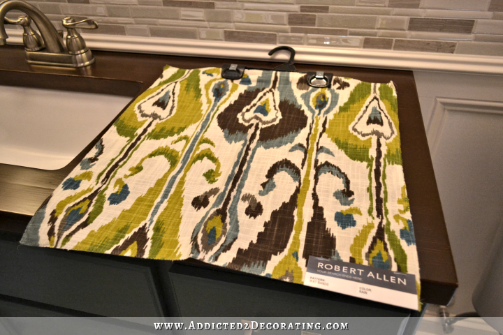
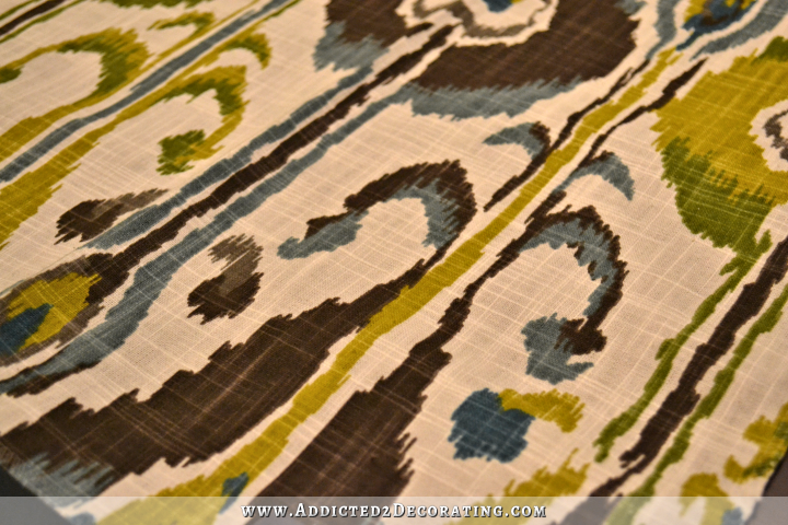
Not only do I really love the colors, but I also like the actual weave of the fabric. It’s cotton, but it looks like linen.
I found it at Hancock Fabrics, and it’s priced at $49.99/yard. That’s way more than I wanted to pay for the six yards of fabric that my shower curtain will require, so I searched online and found it here for $15.98/yard.
Anyway, it’s ordered, and hopefully it’ll arrive this week so that I can get this bathroom finished up!
UPDATE: I ended up doing another, more colorful painting for the bathroom, which I liked much better. You can see it here.

Addicted 2 Decorating is where I share my DIY and decorating journey as I remodel and decorate the 1948 fixer upper that my husband, Matt, and I bought in 2013. Matt has M.S. and is unable to do physical work, so I do the majority of the work on the house by myself. You can learn more about me here.

Love the artwork AND the new shower curtain fabric! It will look great when it’s all done. Have you thought about framing out the canvas in the same wood stain as your countertop? It may make the art “pop” more and tie in the browns with the ceiling and countertop and now in the fabric. Been following you for a bit and love to see your transformations!
Pears on a stick. Too 1960’a Olive Green.
Love the dripping clouds painting. Use it somewhere.
Go to Overstock.com. Rugs 78%off. Martha Stewart Links. Sure you’ll love it.
May I purchase your shower curtain that you decided not to use? Perfect for my bathroom!!!!
I immediately saw flowers falling from the sky in the first picture. In yours I saw a storm with rain falling! Perfect for a bathroom. I know that they are abstracts, but That is the beauty in abstracts. .. each person sees something different. BTW, I love the Ikat fabric. It puts a bit of boldness in the bathroom. (Of course I loved the other fanric. Probably because I simply am drawn to those colors! Lol) Excited to see the finished bath. KRISTI GOT HER GROOVE BACK!
I like your painting as it is and don’t find the drips too much – however what makes the other painting so special might be the format. It’s more of a square than a rectangle and while the latter does fit your bathroom wall very well, I could imagine that a square format would help (if you can cut the board at all).
Anyway, I have to congratulate you: for the first try, your painting looks really really good and I admire your can-do attitude when it comes to art!! I concur that lots of art is supposed to be decorative so we all should take a leaf out of your book and dare to create art ourselves!
Wow on finding that fabric for a MUCH lesser price Kristi!
Looking at the original painting by the professional artist I see a few important differences. First, she is working with a square canvas so your version looks squished. Your blob at the bottom right is too solid and you need some airyness like it is exiting the canvas and is not trapped. Like a soft cloud. Next are the values. She has some dark darks that make the image pop. You only have light and medium values. I think that if you paid more attention to the values and varied the thickness of the blobs more there would be more deminsion making the eye go deeper into the soft background. You could easily take away a few drops to make it less like stripes. I hope this helps. I’m an artist but don’t do abstracts. Tweeking a painting at the end is very common.
I love the new shower curtain fabric. You may want to tweek the painting further when it is up.
LOVE the new fabric choice! I just love how bold it is – it will look amazing in that space. *two thumbs up*
Oh my gosh, love the shower curtain fabric. My guess is your art choice will change totally once that is up. Maybe something black and white?
That’s what I was thinking. The abstract painting is totally overpowered and blown away by that new fabric – which I like very much.
Agree.
Your’s is perfect as usual. I am not by anyways a ” modern art’ fan but I am u explicitly drawn to every thing you do with this house.
So happy to see you back at it.
I too like your artwork but I would cut the piece in half and have two side by side with frames on each. Just a thought….Sadly, It’s far too easy to sit back and critique someone else. Love your work Kristi.
Inspiring – not an abstract fan myself but love the softness of both images – ignore the negative comments Kristi, I know folk mean well but…. I think you are amazing…. walk a mile in your shoes etc., fab-u-lous!
There’s a difference between negativity and constructive criticism. I would imagine that Kristi is happy to have her painting critiqued by an artist.
I really like your artwork! Everything you do is so well thought out. My first thought when I looked at the inspiration piece was….bougainvillea vine. First thought when I looked at your piece was…..grape vine. You might consider one addition – I like the top but the 3 “blue” areas underneath it seem to be disconnected, just hanging out there. Suggest they be connected to the top with more color. The new shower curtain fabric is so active and beautiful and over-whelms the artwork (in my humble opinion).
I think you’ve done an awesome job on the abstract painting, it looks great. I really LOVE the new fabric for your shower curtain (and I’m also not normally an ikat fan, but this is gorgeous) and well done for sourcing it online and getting it at a much more affordable price. The colors in the ikat fabric are totally suited to your bathroom, and will take your bathroom up a notch and make the room pop, it’s bold, sophisticated and so stunning and I personally think it’s more like you. Well done Kristi. I agree with Sheila F. you’ve got your groove back!!!
Kristi, I love your painting and it looks so good in your bathroom. I love abstracts too and I’ve tried to do a few and sometimes I’m happy and sometimes I’m not, but I love the doingness of it. I’m happiest with a paintbrush in my hand.
Rita
I like your artwork piece a lot! The drips add character and dimension and the color selections are perfect for the bathroom color palette. I love your current shower curtain but I’m guessing the new fabric will make me rethink it when I see it complete. : )
I knew the fabric looked familiar. Then I realized it was used for living room curtains by John & Sherry Petersik of Young House Love. I had pinned it sometime ago because I loved it too. I liked ikat before it was trendy, and I still like it.
Hmmm…the only ikat I remember them using was in their last house in the dining room. It’s considerably different — much more vibrant and no white background. http://www.younghouselove.com/photo-gallery-2/our-current-house/
I LOVE the artwork itself, but it seems to be too “matchy-matchy”, color-wise, with the rest of the bathroom. I love when picture frames match the color scheme of a room but a bit of contrast in the artwork, itself, is more appealing to me. Even if there was just one new color brought into the canvas you painted, it would have more interest in the room.
That’s just my humble opinion. And by the way, you rock in everything you do. You’re my hero in the renovation/do-it-yourself world! I’m still in awe when I look at the before picture of your bathroom. It’s hard to believe that the after shot came from the same room.
You could paint a white shower curtain in your abstract way, with acrylic paint and heat set it with vinegar to make it permanent. I like your abstract by the way, drips and all! That would make it really personal!.
On to something here! Paint an abstract shower curtain to “match” art. Perfect.
With the new shower curtain, what about having the ikat in two panels, like window curtains? Since you are using the white fabric liner, the decorative panels would look more balanced in two pieces. =]
Funny, I have to agree with the lady who saw flowers in the first picture and rain clouds in your picture. I think it was the use of the blues in your picture and the pinks in the first picture. Maybe before you cover the picture up completely try adding a touch of fushia. Love, love the fabric. Much more modern and contemporary then the other fabric. It is looking great.
Goodness!! you’re so danged talented!!!!! I love this…and even more..I love that you are not afraid to try new things….that is half the battle…keep on keeping on…love to see u work your magic miz kristi
I agree with Donna in that the values aren’t quite there yet. maybe missing the darker brown that is in the fabric which would bring in the wood look the first commenter mentioned? just add those tones in the painting a bit more and see. Also that brighter green maybe good. Donna’s ideas sound good.
That looks like it was great fun to create, can’t wait to try it :)!! Just wondering, would you consider turning it 90 degrees (right side at the bottom, runs horizontal)… reminds me of standing on a veranda looking out over a lake – very serene.
Thank you for sharing the fabric source. I love finding a good deal on fabrics as they can be so expensive.
I think the abstract painting is an impressive start but the colors seem to match with the rest of the room too much. Maybe the addition of orange??? Ok maybe not but something that will make it stand out, instead of blend in.
I like your painting……I see what you are talking about, but overall it looks like a nice rainy spring day :^)
Blessings,
J
PS: I think I need to follow you around and run off with your fabric rejects :^)
well as my art teacher would say (and she said it often) “you need to add red “!
Hi Kristi,
from a retired art teacher
The drips are what make the painting! More drips would be okay too. Now I am terrible at decorating and cannot even choose a small piece of tapestry for a footstool as I have no decorating vision so I admire what you do and all your carpentry skills.
Sharon
Kristi, I truly think you did a beautiful painting, and only your first attempt, no less! Please don’t let the “experts” unsolicited rude critiques, offered under the guise of “helping” discourage your future attempts at art. Some need to master the art of social graces and remember the power of words before commenting. Thank you for sharing your painting. It will be beautiful with your fabric choice. You have the eye to know whether it needs more, less or keep as is. You are so talented in every area of design and DIY. Sharing your talents on this blog as you do is a blessing to us all. Blessings to you…
Your creativity continues to inspire. Where will you have towel bars Orr hooks?
I love the ikat! I always think of it in the same terms as animal prints: It’s a classic that’s been around forever. A classic has peaks and valleys of popularity, but it never goes out of style. I’m very much looking forward to seeing the finished bathroom.
I’m happy for you that you got out of your “slump.” I think all creative people go through periods like that. Fortunately, they’re temporary; and we usually bounce back with renewed energy and inspiration. You certainly have!
I am so impressed with your skills! And your guts–you aren’t afraid of anything! I wonder if you could recommend any other fabric stores? Thanks…
My critique of your painting was not meant to be rude. As talented as you are, I doubt this is your first attempt at a painting. I am in a critique club as an artist and my paintings go on the easel for suggestions monthly. I thought it might be helpful if you wanted to go further with the piece of art. Now as a decorator, I could use your advice.
I didn’t take your comment as rude at all. 🙂 I welcome constructive criticism, emphasis on “constructive,” which yours was.
Your comments definitely weren’t rude. I loved what you had to say! -one artist to another
I would lay it flat and lightly mist some water on it with a sprayer, then blot it overall as to mute it more and get rid of the drips. Also being in a steamy bathroom it might even run some more on it’s own, unless the bathroom won’t be used much? Art.com might have something similar to the original? And a framed print would hold up better in a bathroom.
That fabric will look great in there! Can’t wait to see it finished.
Kristi, great fabric also your painting needs a bright bold color….strawberry. It would really make your painting pop!
I like the artwork and I’d suggest you simply frame it – add a linen inner border and use a wood frame. Maybe a metal accent too. Center of the picture should be based on a person who is 5’7″. Perhaps it is that height now, but it looks too low. I have a friend who hangs all her pictures too low — largely because she is short.
You could add a splash of color as someone else mentioned, but I would not do that until I saw how it looked with those 2 changes. I’d probably add the other pops of color with accessories.
What is the name of the fabric by Robert Allen? I can’t find it at Maryjo’s.
It’s called Ikat Bands Rain. Looks like they removed it since they’re out of stock. They have other colors, but not Rain.
Amazing, really. You’re a real artist
I’m jealous.