Beautiful Dark Gray & Black Fireplaces
Sometimes I have to wonder why white is our default color on so many things in homes — trim, kitchen cabinets, fireplaces, doors. All of that white gets so boring to me…obviously…which is why I have a green kitchen and black interior doors. And yet, when it comes to my fireplace, I painted it white without even giving it much of a thought. That’s just my default setting (paint it white!) when it comes to fireplaces.
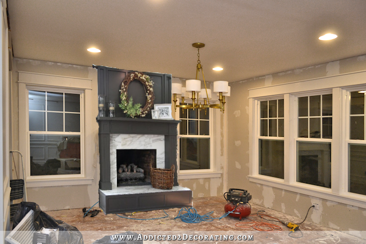
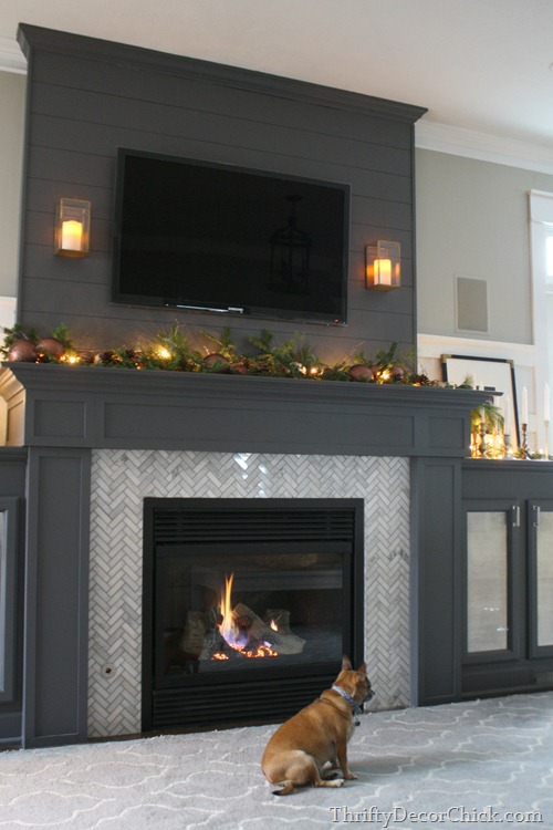
I still may paint my fireplace white if I’m convinced, after getting more of the room finished, that white really is the best color for the room. But I hadn’t even considered any other color for my fireplace. I mean, it’s like it hadn’t even dawned on me that another color was a possiblility…until last night. I had spent some time yesterday afternoon working on my fireplace overmantel (which I hope to show you tomorrow), and I was almost ready to start on the trim when I decided to stop for the day. Then last night I decided to take one more look at fireplaces on Pinterest before I made my final final decision about the style of my overmantel, and that’s when I saw this gorgeous fireplace from M. E. Beck Designs.
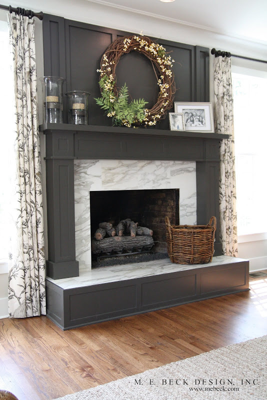
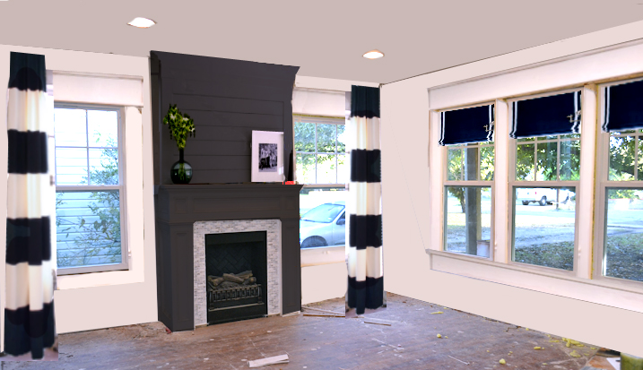
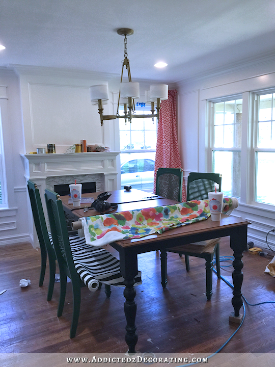
Isn’t that beautiful?! A dark, other-than-white color gives the fireplace such a presence in the room. So, as is my M.O. when I want to see how something will look in my room, I did a quick copy and paste of that fireplace into my terribly messy and far-from-finished dining room.
I think that’s absolutely gorgeous. The problem with my particular room is that I think the idea of a dark gray fireplace starts to break down a bit when I add the black and white draperies.

I think it might look great with a black fireplace rather than dark gray, but then I worry about the fireplace just looking like a black hole on that side of the room. What I do love is that the dark color keeps the fireplace as the focal point, and the draperies as backup players, where the white fireplace kind of disappears and brings more attention to the draperies.
So I really don’t know what I’ll end up with. I could always try the dark (black) and see if I like it. It’s just paint! If I don’t like it, it’ll just take a gallon of paint and an afternoon to correct.
After seeing that M. E. Beck fireplace, I started searching for more dark gray and black fireplaces. And now I’m convinced that white is way overused on fireplaces, and in so many cases, it really just washes out the fireplace and makes it disappear into the room, when that’s the exact opposite effect that should be happening in most cases when it comes to fireplaces. Just take a look at how beautiful dark gray and black can be.
 Eclectic Living Room by Tiburon Interior Designers & Decorators Jerry Jacobs Design, Inc.
Yep, I’m convinced that fewer fireplaces need to be white, and more need to be painted dark or even black. And the more I look, the more I think that mine might be one of them. It’s only paint, right?
EDIT: My mom, who is far superior at Photoshop than I, did two mock ups for me — one with a black fireplace, and the other with green. Yes, green. 🙂 The same green that’s on my kitchen cabinets. She also “painted” the walls and made everything look much cleaner. Here’s the black…
I don’t know. I think that looks pretty amazing. And hold onto your hats, because here’s green.
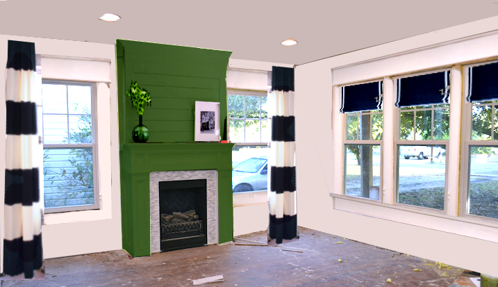
Ha! Talk about a statement!! 😀 For the record, my mom hates the green. Also for the record, I kinda love it. I love that it’s bold and different. I also love that it wont’ even let bold black and white striped draperies steal the focus from it. A green fireplace will always get the attention before anything else in the room, don’t you think? 🙂
I still haven’t decided, and probably won’t until more of the room is finished. But I love tossing around ideas.

Addicted 2 Decorating is where I share my DIY and decorating journey as I remodel and decorate the 1948 fixer upper that my husband, Matt, and I bought in 2013. Matt has M.S. and is unable to do physical work, so I do the majority of the work on the house by myself. You can learn more about me here.

I love the gray fireplace in your room! I’d rethink the black/white striped curtains if it were my room. I also like the curtains in the first picture of the gray fireplace!
Not that you need my vote but I totally agree with Arlie….. It’s the softer all over pattern of the draperies that make the picture….. Be them black or dark gray…. It’s because the drapery pattern is soothing. Those bold stripes really make the “Shoutout” and perhaps some how need to be less “Quieted”…..?
I totally agree with Alie, tone down the fabric and it will work
That’s exactly what I though!
me too!!
The subtle gray pattern on the draperies in the first picture wouldn’t be compatible with her chair fabric.
I agree with Arlie too. I dont really like the B&W curtains with the gray fireplace. I do like the ME Beck interior though.
I love your white fireplace, but the last picture you show, is very similar to your fireplace and doesn’t look bad in black. I guess it all depends on what color the walls are going to be.
Personally I prefer the white fireplace, but the black is very nice if that’s what you want. Do you have a full design plan for the walls, will the chairs have fabric etc? I think that I would decide on the fireplace color based on some of the other color choices, but I am not as brave as you are regarding color.
You read my mind. I love the idea of using another color altogether for the fireplace, something that is in the pattern color you will be using. I do love the black and dark gray however much better than the white. to me the draperies you are choosing is going to scream “look at me” and nothing much else might be seen.
It’s only paint
I like the idea of a dark fireplace, but I would then nix the striped curtains. They are very dramatic, and nothing is going to steal their thunder.
I agree with you about nixing the curtains but not because they’re too dramatic. They might look better with a black fireplace, but they’re still going to look like a referee’s uniform hanging there.
I agree…do not like those drapes!
Love the raised box and bench style hearth…Could so see you doing that now this is a dining room…brings fire box into better view with a table and chairs. Like the gray/black but agree with the curtain issue.
I was going to comment on the raised hearth also. I think it would be nice since the table will be blocking a lot of the view, But this post is actually about a gray or black painted fireplace. Gray or black would be a beautiful choice. Your table as I recall will also be black so I guess black or maybe even a matte black would be the more pleasing choice. And, with all the “features” that you incorporate into your rooms I would find the drapes too bold for cohesiveness. If you go back to your inspiration you may find that the room that the inspiration came from would be more toned down so that the drapes could hold a major role.
I think Kristi decided on a wood-toned table, but I agree that black or very near black would be a better color than gray for the fireplace. I also vote to put the emphasis on the fireplace by less bold draperies.
I think if you go dark you need to rethink the window treatments. Everything can’t be the focal point.
100% agree.
The grey looked okay, not great, but okay, until the bold black & white draperies were added. Then you lost me, just doesn’t look right to me.
Brick red! As much as *I* adore the charcoal, I agree that it’s too much of a good thing with your awning-stripe drapes. The fineness of the black pattern on the drapes in the inspo pic gives the reference but holds the tones in balance. Knowing your penchant for pop, why not stretch even further from white and try out a deeper shade of your accent colour?
I agree with other comments about nixing the striped curtains. The curtains in that original gray fireplace photo you found reminded me of the bird stencil you were planning to do in your music room! What if you make your own curtains with that pattern stenciled in black, or a dark gray, and go with the dark fireplace I don’t think you’ll be sorry!
As much as I love stripes, I agree with the comments above that the stripes would be too much (in my opinion already before you considered a grey or black fireplace – which btw I love!). Alice’s idea of adding your birds and branches wallpaper as curtains in this spot is genius – even though it will generate a hell of an amount of work, I guess… I for one would love to see how you paint fabric and learn it this way 🙂 whatever you will decide upon, I’m really curious to see the transformation in progress!
This is my opinion too but As usual a cut and paste really does not do things justice. Love the focal point being on the fireplace and not the window treatment .
I meant to also say because it is a cut and paste the white on the draperies are drawing and holding my eye . This may not not happen with your actual fabric. Do what you love and Dix it if does not work. Will that bold stipe be seen from outside or can a lining hide it?
That’s very true. It’s so hard to get an actual representation of what it’ll look like in my room with a cut and paste on a photo. The striped window treatments are so bright in the picture because the picture I cut them out of was really bright with the sun shining in the windows. It looks really odd to see such brightly lit draperies in a darker room in the early evening when the sun is going down. It looks really off, but if the fabric were actually in the room, with the lighting of the room only, it would look more in place.
Oh, and I line all of my draperies with blackout lining, so it’ll just be white from the outside.
The charcoal – gorgeous as it is – competes with the awning stripe. With your penchant for pop, why not stretch even further from white and try brick red? (Or a deeper shade of whatever accent color you were planning on)?
Why don’t any of my (insightful and polite) comments EVER show up?!
I have no idea what you mean. You’ve left three comments on this post, and they all show up.
Lauren, you might need to update the current website window after you post a comment so that it is shown to you!
I love the darker colors. My fireplace is a reddish wood which I hate the look of. We’ve talked about painting it a different color and both my daughters voted against white because they said it would look too country. ?? I’m actually thinking now of going with a deep bronze. Could be great?
Meh. Personally I don’t like the gray fireplaces at all. If it were me, I would stick to the classic white. It’s cleaner looking and more versatile. The fireplace and its dressing makes it a focal point. The dark color makes it look like a huge hole.
Kristi, I love the dark fireplace, very dramatic. However, the black and white drapery draws the eye away from the beautiful dark in the fireplace. The eye doesn’t know where to go and rest. If you look at the first pic in this post the eye stays on the fireplace even though the drapery is patterned.
I love the grey fireplace…what color are you going to paint your walls…I like the light grey with the darker fireplace like one picture. I like the little built-ins underneath the bookcases in the one picture also. How would the built-ins look underneath the windows flanking the fireplace??
I think I’m going to stick with white on the walls. There’s only about 10 inches underneath my windows, so I don’t really have room for built-ins.
I really love both ! But can you photoshop the wall color? That should make a difference in the outcome too. Either way its going to look so nice, I can’t wait to see the finished room!
I’m afraid photoshopping the wall color is a bit beyond my skill leven. 🙂 But I can get busy and get some paint on the walls!
It’s definitely only paint! The dark gray is very dramatic and appealing to me as is the dark chocolate brown example. I think using the dark gray would take the room up a notch for sure. Not so sure that black would be right, though. You can overuse black. I think you need the variation, imo. I’m with the other posters in no longer loving the black striped curtains once the fireplace is dark. Like the example photo, I think you would need to go with a white background fabric with perhaps a black geometric print. I’d like to see and ikat example. To me (and I realize you are the trained decorator here, not me) I would have to consider the plan for the whole room – wall colors, rug, chair seat fabrics to make the final decision on the whole effect. I know you will come up with something stunning.
My two cents: black fireplace and the striped drapes. The fireplace is the center of the that wall, focal point of room and the draperies accent it just like highlights on either side of a beautiful front door. Look forward to seeing it finished. Keep in mind that your table and chairs will block the full view of the fireplace when looking in the room.
Completely agree! Black fireplace, b&w striped drapery – BOOM, major drama.
A lot of people would run from that but as a woman who painted her kitchen cabinets green with gold, you are far beyond the safe zone. Go for it!
I’m with you guys. Black fireplace and striped drapery.
Oh, and I just wanted to add – I think black would be the better choice over charcoal with the other bright colours planned for the room.
Black would make a cleaner foil for the other colours.
I know I will love what ever color you pick.
I myself have lived with dark colors most of my life. For me white is refreshing , clean, and freeing. But I think it has do (for me) with where one is at in there life. And I need a lot of light around me! Especially in my home. I have done a major decluther and redoing my whole house and yes white is a very big part of it.
Sorry. But, I HATE the grey. It is SOOOO not as cute and/or classy as the white. And, I dislike the black, too. But, not as much as the grey. 🙂
While I was reading, though, I had an epiphany re: your window treatments! 🙂 If you decide that the black and white stripe curtains are not going to work, what about doing your remaining dining chairs in black and white stripe? (the ones other than your captain’s chairs) OR…you could revisit the black and white rug idea?!! If the curtains end up not working, I still think you can get your black and white stripes in there somehow. And, it will look awesome!!
P.S. I thought you hated grey.
I do hate most grays, but I don’t hate charcoal. The darker (and closer to black) the better for me. But I prefer black over any dark grays/charcoals.
Honestly, I don’t think the white fireplace disappears at all! It is fresh, clean and blends well with your idea for the draperies which is young and modern looking.
As usual, you’ve pointed out something I never even considered! Seemed like a taboo before you mentioned it, but why not paint a fireplace something different than white?
Love following your progress!
I absolutely love both, but my eye tends to draw more towards the white with the curtains. But I really think it would make the fireplace stand out if it were grey!
I I am surprised that I like the dark grey but I do! I hope it turns out to be what you like with the striped draperies.
I love the dark gray fireplace. Not sure about it with the black and white drapes. Maybe just solid white drapes?
I actually prefer the white fireplace when you factor in all of the wonderful color you will be adding with your accessories and chair fabric. I can more easily visualize a pop of color on your mantle with a white background better than with a dark background. I think the black and white curtains and your black roman blinds is enough black to tie this room in with the stunning music room. And….I’m surprised you keep bring up grays when you plan things out as I’ve read many times how you dislike gray. I can’t wait to see what you end up with as I love how you share your conflicts in deciding your final choices.
What color do you plan on painting your walls? That may be something to consider. If you’re doing dark walls, a white fireplace wouldn’t get lost. Yet, you don’t want a dark fireplace to compete with your curtains or the color of the walls. I still prefer your white mock up with the striped curtains.
While I love the gray, one thing I know about you from following your blog for the past 5 years or so is that you don’t like gray. When you do choose to use gray, you usually do not like it (case in point: the piano). Just my thoughts. What if you do white, but do the overmantle in black with white trim, or vice versa?
I like the black (vs. the gray). I think it needs the contrast of the white/light tile surround though. Similar to the marble look in the first pic. Also, what if you re-jig the curtain idea? Instead of the bold stripes that command all the attention…what about mostly white with thinner black stripes? Maybe the same width/treatment as the shades, only horizontal. I LOVE the idea of the horizontal striped draperies, I just think maybe not so bold if you are wanting the equally bold, attention grabbing black fireplace.
Wow, I really love the color of the grey/charcoal fireplace in the M.E. Beck Design and those drapes really compliment the color of it too. The copy and paste of it in your dining room looks so amazing, but sadly not with the black & white stripe drapes. I agree with Alice that the drapes in the picture look like the bird/tree pattern that you love, and would look absolutely stunning in charcoal/white with the grey fireplace in your dining room. And after all it’s only paint like you say! Can’t wait to see your over mantel design.
Love the dark fireplace – but the stripe drapes would have to go.
I love the grey fireplace…I agree with Arlie…I think the curtains need to go!
I know you have your mind set on the striped curtains, but as some others have said, they are attention hogs.
I think the striped curtains would serve better in a room (or on a wall) with nothing much happening. You do such pretty woodwork, I hate to see it eclipsed.
Now, having said that, a photoshop mockup may not give a complete picture (no pun intended). The mock up curtains seem quite jarring, but may be softer in real life.
I like the darker fireplaces.
Regardless of what you choose, I look forward to the emails.
I really like the mock up with the grey fireplace in your room. I would probably go a few shades darker on the fireplace to match a little bit closer to the black drapes but I love the total look!! It looks so balanced!! The white fireplace definitely makes the drapes pop more, but I just fell head over heels for the grey fireplace!!!
I love the idea of really making the fireplace the focal point! The striped curtains could merely be the exclamation points 🙂
What about a black that’s not midnight but more of a charcoal black? Yesterday Emily Henderson did a post about kitchen trends and talked about the trend with black cabinetry. I think the same aesthetic applies for other rooms. She said, “…Just as black works with everything in the closet, black can also work for our home. The updated black this year is slightly charcoal and also mixes in a lot of natural elements and whites into the space to keep it from feeling too dark, gothic, and moody.”
It’s worth looking at some different shades of black.
Did you say that you were having a wood table? There are so many things that still have to go into the room, Kristi, that it is hard for me to see it all?My vote is white fireplace….
Your mockup picture was also taken at night, so the windows look dark….but it might look different with light coming in?
Yes, I want a wood table with medium tone/natural wood. Nothing too dark.
Call me crazy…but what about Derbyshire Green? I am the kind of person that wants neutral fixtures and bright accessories and accents…but you are brave enough to paint the permanent things boldly and it works beautifully! I couldn’t even find anything like what I’m picturing when I searched Pinterest for pictures. Does that mean it’s a bad idea?…Or a brilliant one! It would definitely keep the fireplace a focal point no matter what you decide to do for curtains, but I’ve mocked it up here with the black and white. In any case, I think it would be fun to see you try, and you could always repaint if you don’t like it! 😉
http://imgur.com/9KILboA
Oh my gosh, I was JUST searching Pinterest and HOuzz for “green fireplace”! 😀 I personally think it would be gorgeous! And looks amazing with those black and white striped curtains, in my humble opinion.
I agree. I don’t know if this is what Kristi is going for, but, the green is darling!!! And, it is SO cute with the black and white! (don’t know how it would look across the room from the watermelon-ish buffet, though! might look great?!) 🙂
WHHATT?!!!!! That is crazy cool. Helloooooo statement!
But I am with you…the coral buffet, the yellow piano….is it getting too much?
You know, if she keeps the walls white and gets a wood table and a neutral rug, I really don’t think it will be too much. I DO think that that floral fabric she plans on putting on the chair backs will tie everything together. I think at first the coral and green does seem like a little bit of a stretch, but when you put that fabric in the mix, it all makes sense. Even the striped curtains!
There’s a good reason why white is classic. It looks clean and brings out architectural detail. The danger in copying some experimental look is that it can quickly become tiresome and passe. You can’t go wrong with white.
But when it becomes tiresome, it just takes a gallon of paint and a few hours to change. 🙂
M.E. Beck design looks nice because the veining in the marble matches the charcoal gray paint. I think black with your tile may read as more contrast, but I like the black IF you are sold on your stripe drapes and wall paint being white. I wonder how your wall there would look in all black? Fireplace and wall color the same, with white crown, and other walls white. Loved the music room.
If you aren’t sold on keeping the drapes, I agree with others that you need a softer look if you go bold on the fireplace. Even black stripe with a different color may work, to soften the contrast. Wonder if black/charcoal stripe would work? Just thinking out loud.
I know you will settle on what moves you best, and that you are mulling over the suggestions. Can’t wait to see what YOU decide! ( LOVE the Chandi, btw!! )
I love the gray, but it definitely doesn’t go well with your b&w strip drapes. I agree, also, that black might be too much. Like a big black hole, as you put it.
What about another deep color? What about picking-up a color from the fabric you’re going to use on the captain’s chairs or some other design element from the room?
Like the green on my kitchen cabinets? 🙂 Someone else mentioned that possibility, and now I’m really intrigued! I might have to try it just to see.
Maybe. 🙂
Know what else I really liked in your sample photos? One of the fireplaces doesn’t have a real over-mantel. Instead, it had a flat panel above the fireplace that gives the same feeling as an over-mantel without being quite so much of a presence.
OMG, here we go again, lol. Just paint the bloody thing and get it over with, you know you will do it eventually. As always, blessings
I love the grey fireplace but if it were me, I’d put the striped curtains on the big front window, just at the ends and the Roman shades on the smaller Windows on each side of the fireplace. Those bold striped curtains really take away from the beauty of the fireplace. However, I do love those striped curtains but the pattern is so big, I feel they should be on the larger window. This is just my opinion!
I absolutely love the dark gray fireplace and the drapes that are pictured with it in the first photo! I agree with a lot of the other posts and don’t particularly care for the black and white striped drapes. I am looking forward to seeing the end result of everything in this room and how it all comes together 🙂
Try the Derbyshire Green, as suggested by another comment. You can see into your kitchen from the dining room, which has that color, and the green has more life than the grey.
Don’t get yourself into the trap of putting too many ideas in one room. 🙂 I love the dark fireplace, but I think it works better in a room where the function of the room itself is to sit and stare at the fire. In the dining room, the primary function is to eat. I’d stay with the original plan of white fireplace and striped drapes. But, that’s just my 2 cents!! 🙂
My exact thoughts.
i love the black fireplace with the striped drapes. i saw one in a model house like ours except in black instead of white like ours and it looked marvelous.
Your new M.E.Beck design is the ONE that we used for our new fireplace last year. I loved it the minute I saw it! (But we did paint it white against a dark beige wall :). I still love it!
You have great taste and will do what’s right for you. I love the gray fireplace, but not with the drapes. I think you’ll tire of the striped drapes before you’ll tire of the dark fireplace. Just something to think about. I so admire your eye and talent for remodeling. You really are an inspiration.
Maybe too much dark fireplace with the zebra curtains. One or the other.
Have you chosen a wall color yet? I wouldn’t finalize the fireplace color until I know what that color is. A white fire place could stand out from the right wall color.
Below the chair rail will be white, and the top of the wall will either be white (Polar Bear – my trim color) or Behr Off White.
A couple of thoughts…I love how you do a mock up every so often to give you an idea of what an outcome might look like, but in this case, I notice your mock up with the dark grey is not your existing fireplace with the color grey, but the whole fireplace from your inspiration. It might give you a better idea if you use the one you have and do the color only for your mock up. Also, if any of the tile/marble/stone on your fireplace surround has a beige or tan tone I don’t believe grey or black would work so well. I remember you toned down the original tiles but there may still be the tones. Of course, you could try and give more of a light grey dry brush to do away with the beige. Your fireplace is smaller and the firebox appears to be more vertical than square or rectangular as in some of your inspiration photos. If you go with a darker color instead of white, won’t that make it look smaller? I prefer to keep it white and use color throughout the dining room for your punches of colors. It will look wonderful whatever you decide.
I forgot to mention that I really like your original idea of the plank over mantel and agree that it ties in with the beautiful music room ceiling.
Please, please find the fabric in the picture with the black fireplace and use that on you windows. Please don’t use those black and whites striped curtains. They seem too black against the fireplace. The soft pattern that was in the photo was so pretty and would look fabulous on your windows…..Good Luck Rebecca
I love bringing in the green from the kitchen, but I don’t like it on the ship lap; I think another topper is called for. Not sure about the stripe curtains, but I love it with the Roman shades. Would that be too matchy for you? Can’t wait to see this. Always an adventure on your site!
Are you totally set on white for the walls, and painting the fireplace a dark color? What about painting the walls something like this:
http://apartementlifestyle.net/handsome-black-white-striped-curtains-horizontal-image-decor/alluring-living-room-contemporary-design-ideas-for-black-and-white-striped-curtains-horizontal-image-decor/
It would allow your trim, tile and overmantel to pop, while not competing with the striped drapes.
Although I love the gray, I’d be very interested in seeing the fireplace in black…and so would YOU, so do it! It’s just paint! 🙂 I do really love that the inspiration fireplace has a raised hearth and hope you do that with yours. It makes the fireplace more substantial, in my opinion. Can’t wait to see what you choose!
I love the idea of doing something unexpected! I am painting my kitchen, which I agonized over the color choices for months. I didn’t want white and the ugly wallpaper wasn’t doing it for me. I also had to work around the dark red/maroon counters. I will soon have light blue cabinets with moody grey walls and yellow accents. Go different!
We had a white fireplace surround in the last house and I considered toning it down a bit, but never did. In this house, we did rock to the ceiling and I painted the mantel to coordinate with the stone. I love it! I added the link to my name if you’d like to look at it. (I love the green option, by the way, or maybe another color that you’ll be using in there?)
For some reason the link didn’t attach. Here it is if others want to see it.
http://www.plumdoodles.com/styling-the-fireplace-mantel/
That stone looks beautiful!
Thanks, Kristi. Sorry you had to search for it- I don’t know why it didn’t attach correctly. Anyway, I keep thinking about maybe a dark blue for your fireplace? I don’t know if you’re planning on using blue in there, but if you do…. 🙂
Ooo, yes! Dark blue is a fabulous idea!
I *love* the drapes in the M.E. Beck photo. I was glad to read that I’m not the only one who doesn’t care for the bold black/white stripes, lol. I just finished painting my fireplace white 2 months ago. Now I’m wondering how it would look dark gray. Green ? As much as I think your kitchen cabinets are positively gorgeous, I can’t see it on the fireplace.
Once again…Mom knows best. I love the green!! Like really LOVE it.
I gotta be honest… I’m kinda smitten with the green option! I’d rethink the drapery fabric and maybe go for the black and white stripes on a pair of Louis chairs.
Kirsti, love the dark grey but not sure on the drapes as the fireplace looses its focal point.what colour are you painting the walls? The white in the curtain material and the fire mantle white seems to fit better. Deciding is your call, so good luck.
Kristi, Go for the Green!!!!
It will tie the two rooms together, it looks fabulous with the striped drapes which you not only want, but you’ve been really looking forward to having stripes in the room for quite a while.
I have been thinking about painting my fireplace a dark gray. looking at the mock ups I am crazy about that green.
I like the dark charcoal fireplace with the striped black and white drapes. It ties in with the black and white music room . Is not painted the expected white and the stripe white and black drapes frames and anchors the fireplace .the white walls in the rest of room is just right. I think the green fireplace will be too much with everything else going on . The accent colors should come from the decorations in the room. Black and white great back ground for all color accents.
I think you should at least try the green…I think it would look awesome with the bold striped drapes. Like you said, it’s only paint!
Just looking at the room from this angle, and just looking at the mock ups this morning, I loved the charcoal but not with the bold stripe drapes. To keep the bold striped curtains, I seemed to only like white. But now that I’ve come back to see your mom’s mock ups, loving the green with the striped curtains!! Just remembering the coral table(?) and yellow piano, and wondering about all that color being visible in one glance. But from the one angle above, to use the lack stripes, LOVE the green!!
I totally surprise myself, but I live the green fireplace and the black and white curtains! Just an unexpected pop of color carried over from your kitchen! The curtains are not my favorite, but with the green I actually like them! Decisions…….decisions! Good luck!!
If you paint that fireplace green you will be turning the front of your home into a something like a carnival, or amusment park. Green, Coral, wildly printed chairs bold stripe drapes, come on Kristi, you are getting out of hand with this. Another note, after reading all these posts, sounds like very few people like the black and white stripe drapes. Where were they when you first suggested them? I think I said I didn’t like them. I know you live in Texas, and everything in Texas is suppose to be big, but speaking as the devils advocate, you are pushing the envelope. I think your mother may be the voice of reason you need to listen to, this time.Blessing
If I listened to my mom all the time, I wouldn’t have a green kitchen, and I love my kitchen. I’m not decorating my house for her…or for anyone else, for that matter. I’m decorating it for me, and I’m having fun along the way, even if that means painting my fireplace hot pink.
I love the green. Or would love to see a Navy (or a darkish blue, depending on the other fabrics). And I think the curtains, once in the same lighting as the room, will be beautiful with either.
The green mantle with the striped curtains looks amazing!!! I love love love it. About 13 years ago (before Pinterest) I painted my kitchen cabinets black and everyone told me not to do it and It will look terrible if it’s not white. I trusted my gut and did it anyway and that ended up being the one thing everyone loved about the kitchen and also a great selling feature. Like you said it’s only paint. It can be changed.
I love the charcoal mantle! Have you thought about going back to your original idea of putting the striped drapes on the front wall? Maybe it would be a little less busy on that wall & give you a focus from both the front door & the kitchen.
P.s. I love your design style & the way things always work out! It may take a time or 2 but it’s always beautiful in the end. It is refreshing to know I’m not the only one. My husband tells me that “they” make medication for how I will keep obsessing on an area of my home but once I know I’ve got it right, I will finally move on!
I LOVE the green and the striped drapes!
LOVE the green! And I think the stripe curtains are a great bold balance.
The black fireplace is gorgeous!!!
However I really don’t feel the same way about the green on… :-/
Isn’t there going to be your coral buffet on the other side of the room?
I like the idea of the black fireplace also tying in with the black walls in the music room and eventually the dark countertops in your kitchen.
Also when entering your house you will have that goegeous dark color with that pop of coral in the entryway and that yellow piano in the music room, instead of being distracted by that GREEN fireplace.
It’s funny, I think I initially commented before the post with your photoshopped pictures, and while I loved both looks I preferred the white. Now with the room “cleaned up” and the space looking more completed with the painted walls I MUCH prefer the dark grey/black fireplace LOL. That’s what I always say is its hard to get an idea in an incomplete space. You never really get a good idea of how it’ll look until you start incorporating the decor to tie it all in. The green isn’t in my personal taste, but it’s very much you Kristi and I know once complete it would look amazing and probably would really tie the whole house together! Especially with gold accents – wowzers! There’s no doubt in my mind that the fireplace NEEDS to be something other than white 😀
I feel silly even commenting, since your creative ideas are one of your amazing qualities! But my 2 cents says the white fireplace is going to bore you now. I love the gray with the softer drape color/pattern, but you are anything but a copycat. Which leaves me leaning towards the black fireplace with the striped drapes, which will be STUNNING! Your gorgeous color pops will come together with the chair fabric and coral buffet. And the light fixture and table will hold more attention if the fireplace isn’t green. Of course, you could try the green, but you already have green in the kitchen that you LOVE so I’m not sure you need to repeat it. Finally, raising the fireplace might be a good idea, depending on how much height that would leave above for the overmantle and decorative elements, which you don’t want to look “squashed”. Good luck! You are an amazing woman!!!!
Also, I’m concerned that the white fireplace surround will be “lost” with the white walls and the table & chairs in front of it. The black could bring attention to it, without overwhelming the room.
Oh my, I kinda love the green too! I think that would be gorgeous with your wood table, and the upholstered captains chairs with that green in the print would really stand out! As you said, it’s only paint, so have fun. I like the black too, but in the photo is looked dull next to the stark black/white drapes. I’m sure it will look much less so with the actual paint. It’s coming right along, and I’m enjoying being a “fly on the wall” for the journey!
Don’t know if it’s just me, but the past few posts have been spoiled for me by a pop up window asking me to test the new iphone7. Ypu can’t close the box, you have to either accept what it is offering or close your browser window (I read on my iphone). Besides annoying I wonder if your site has been hacked or worse – is your platform/carrier doing it deliberately? In any case, I’m not happy.
And by that I mean Profix Media, your platform, not you! 🙂
Lisa, I’m so sorry about that! Popup ads like that are caused by unscrupulous advertisers who sneak their redirecting ads into ad servers, even though they’re ALWAYS against the rules of the ad servers that I use. And the problem is that figuring out which ad is doing it, and which ad server it’s coming from, is almost always impossible because I’d need to know which ad is being displayed on your phone when it redirects, and where that ad is located on my blog. :-/ It’s so frustrating, and these types of redirecting ads are the scourge of the internet for website owners like me. It’s so discouraging any time one of these ads slips through and starts wreaking havoc on websites. I’ll notify all of my ad servers and see if there’s anything they can do about it. So sorry!
Just know that anytime you see a redirecting ad like that, I can almost guarantee you that the website owner/blogger has not authorized it.
Although there is a reason white is considered classic and usually used, a dark charcoal (almost a soft black) would look amazing! The green? No. With your Mom on that 100%!
LOVE the green!!
I love the… GREEN!!! it’s just paint right? I think that you should go with green and paint it white when you get bored…
I’m sorry I don’t want to sound rude, but I HATE the green. I love green and I love your kitchen, but I don’t like it on the fireplace. I do like the use of the green in the room though. Maybe perhaps in fabric and some accessories.
Our fireplace is very different from yours, It’s simpler and much, much shallower (the house was built 1959), but we made a choice that sort of combines your ideas. Our mantel surround is a bright white against the black metal stove insert (with dark brick surround) and the dark charcoal walls.
I don’t know how to paste a photo, but I show it here…
http://dipndip.blogspot.com/2014/03/by-kathleen-if-so-much-can-happen-in.html
With white walls and tile surround the black mantel and overmantel would be nicely framed and balanced. Or reverse that… what if the walls were dark and the mantel was white? Or must the mantel and overmantel match? Or must the trim match?
So many options, and all of them just paint… what a chance to play! Now I want to paint more things!
Honestly, until I started looking at interior decorating online a few weeks ago, I only knew fireplaces to be shades of brick and black – white was something entirely new to me! I think the dark grey looks best, but I will have to echo what the others are saying about toning down the drapes. Maybe light grey/dark grey striped drapes? That way you could still have an echo to the music room, but it would look softer and more inviting and coordinate with the fireplace. 🙂 The black and grey fireplaces look gorgeous!!
Black fireplace, white trimmed black blinds either side of the fire place, black/white curtains where blinds currently are – dramatic picture on overmantel.
OMG the green is SPECTACULAR!!!!! And totally makes a huge statement! LOVE LOVE LOVE it!!!
I always like to go with my instinct. If green makes sense to you, then you should paint it green. As far as my opinion, I would take gray because It can fit better with the rest of the room. Can’t wait to see more about this project, I really believe it was a fun one!
I wish I could find out which dark grey M.E. Designs used on their fireplace. Any ideas?