Entryway Artwork – Fluid Acrylic Abstract Triptych
For a long time now, I’ve envisioned some big, bold, and very colorful abstract artwork for the entryway. I know abstract artwork isn’t everyone’s cup of tea, but I absolutely love it. Well, some of it. So I decided to revisit the idea of acrylic fluid artwork, which is where you use very thinned liquid acrylic paints and pour them onto the canvas in various designs, and then use various methods to marble the colors together. I’ve spent hours watching YouTube videos on this technique over the last year, and this artist is my favorite right now.
I tried this technique once before, which I shared with you in this post. While I loved the marbled effect I got with that project, I wasn’t so crazy about the colors I used. After a while, it started to look like a raw cut of marbled beef…not exactly what I wanted on my wall. I ended up giving it away to someone who really liked it.
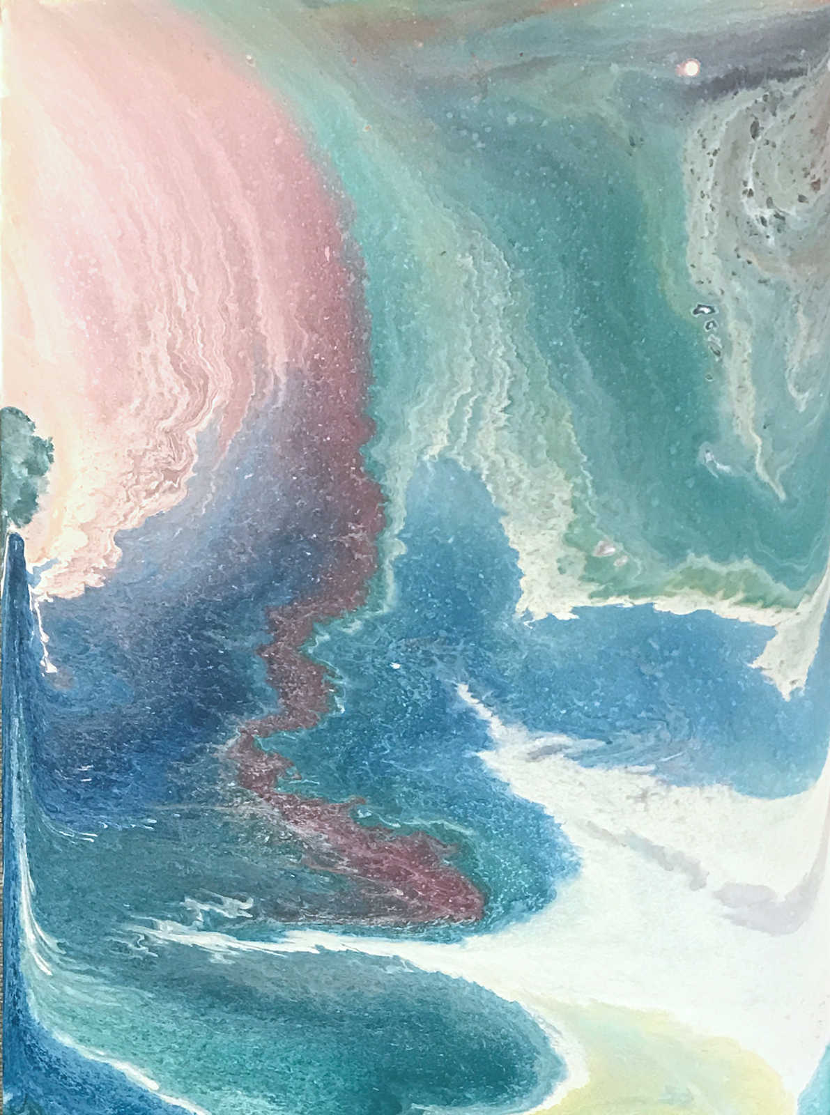
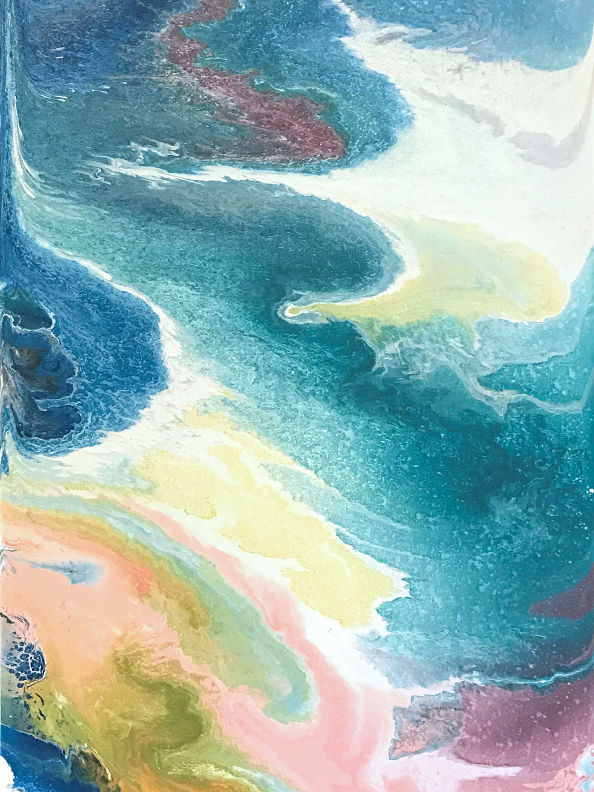
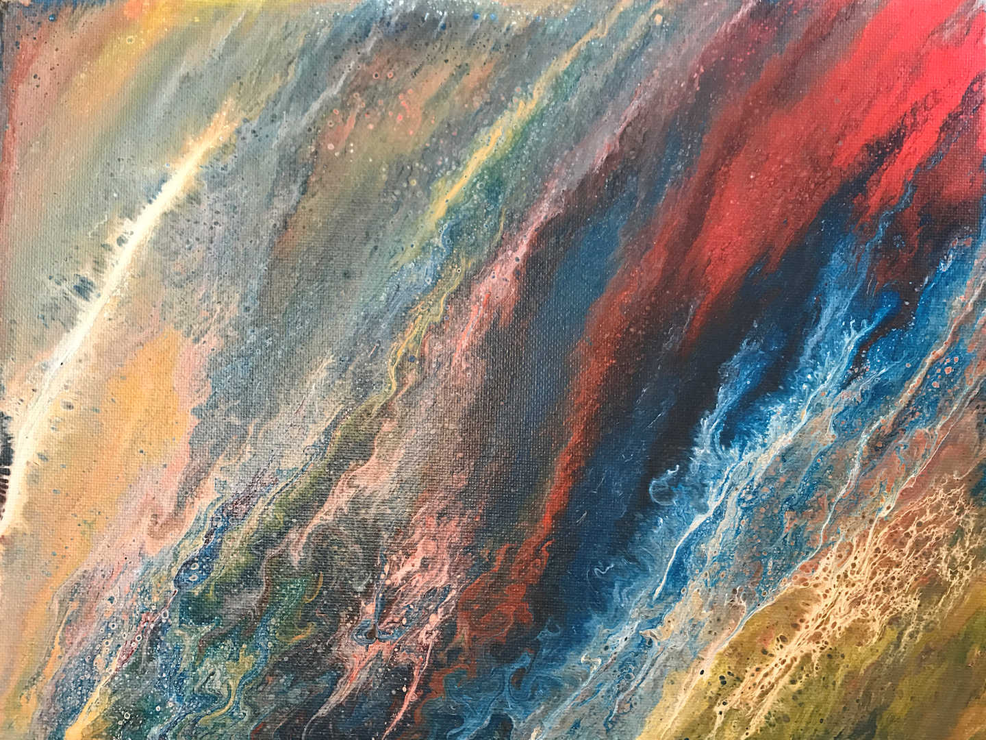
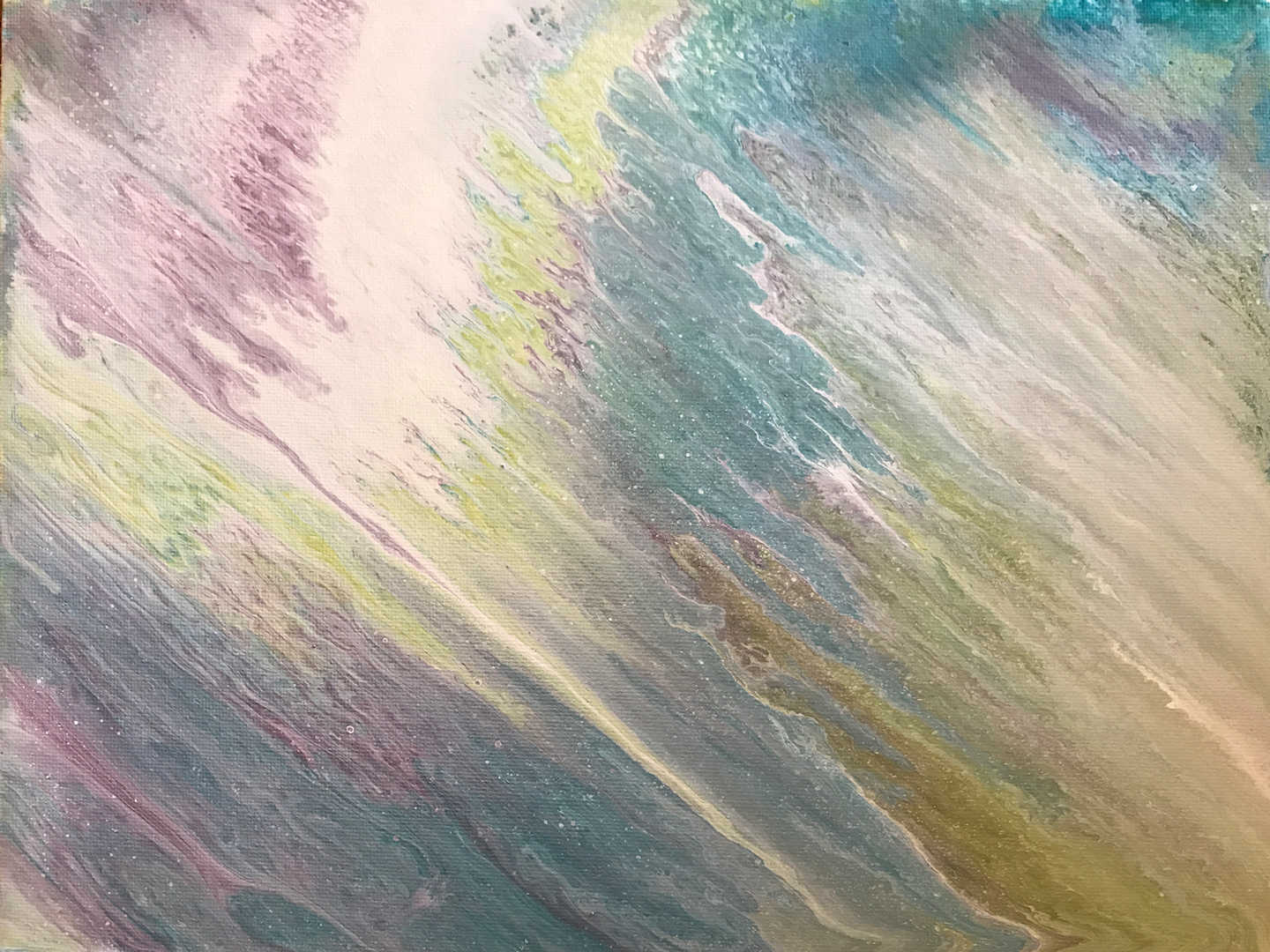
So this time for the entryway, I decided to do a triptych, and I went much heavier on the blue, green, and purple, and much lighter on the pink and orange. And as is typical for me, I didn’t do any kind of small practice pieces before doing these. I just went right to the big pieces. I still need to make frames for them, and those will be white to break up all of the color. But here’s how the actual paintings turned out…
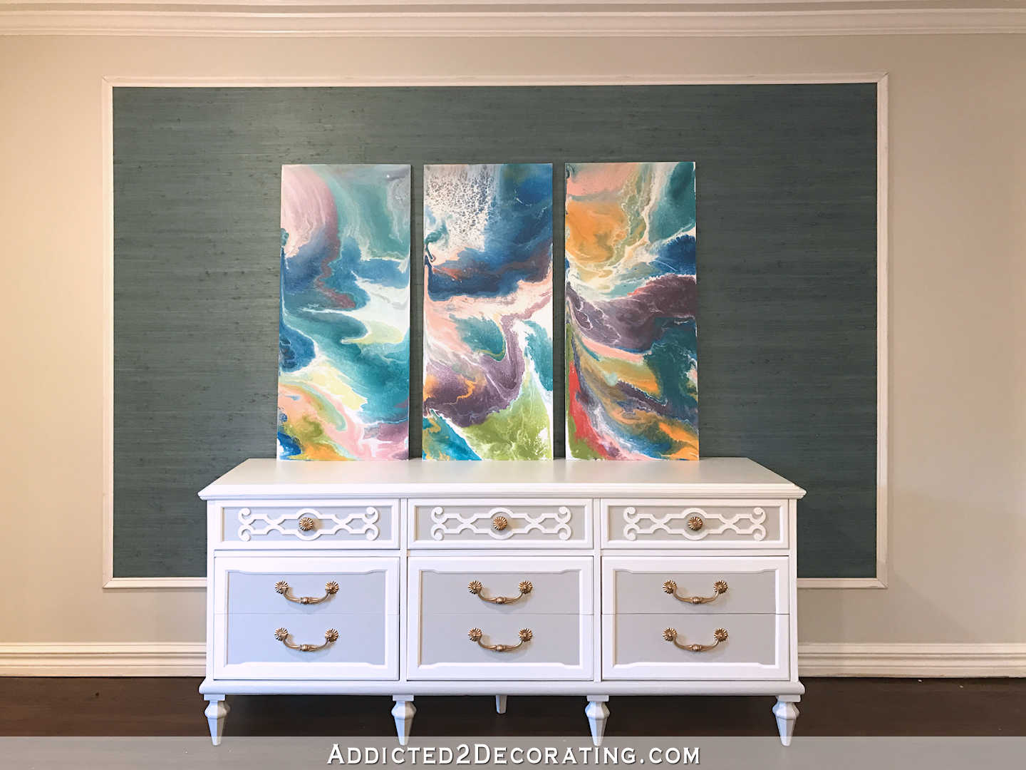
Each piece is 18″ wide and 42″ tall. I used 1/2″ MDF, and primed each piece with oil-based Zinsser Cover Stain before pouring the acrylic paints. After letting the primer dry really well for about three hours, and then sanding it smooth with 150-grit sandpaper, it was ready for paint.
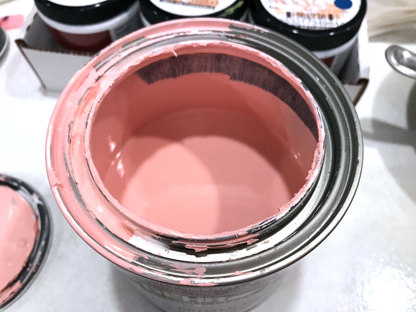
I used nine colors in all. The first was this light pink color. I mixed this myself, so I don’t have a name or formula for it.
And then I used these six colors…
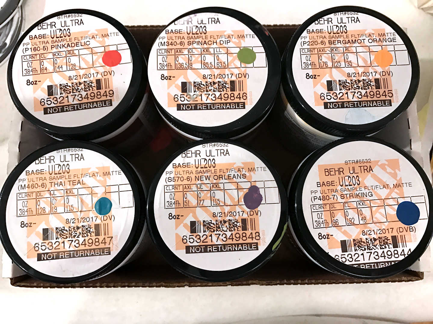
And then I made a light teal and a light purple using the Thai Teal and New Orleans colors above mixed about half and half with white.
These paints aren’t pourable directly out of the containers. They have to be thinned considerably before they can be used.
The formula that I use for mixing the paints is:
- 1 part paint
- 1 part water
- 1 part Liquitex Pouring Medium (I purchased it here.)
- 2 parts Floetrol (available at Home Depot, or you can find it here.)
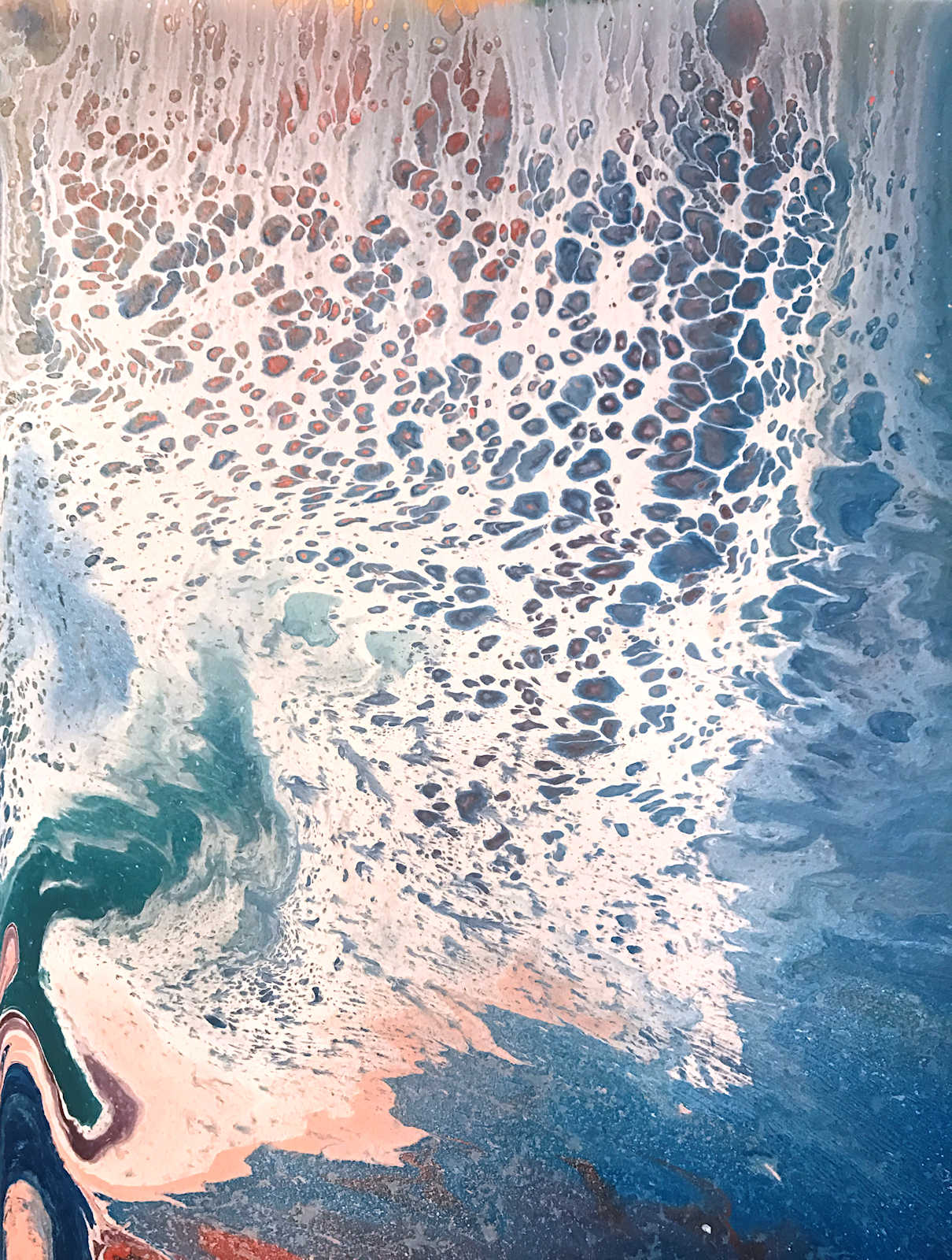
The consistency will seem very thin and watery, but it worked really well for me. The panel on the left is my absolute favorite one. I like the soft, heathered colors.
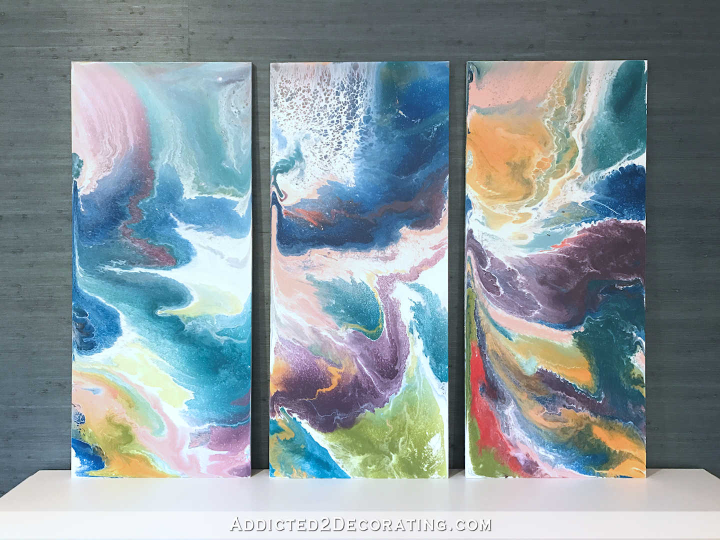
Here’s a closeup of my favorite part…
That heathered look was created by spraying water with liquid dishsoap in it over the top, and then using a propane torch lightly over the top. This is the torch I have.
These cell are created by adding drops of silicone to the paint, which you can find in small bottles at Home Depot. I estimate that I used about 1 drop per 2 ounces of mixed paint.

One more trick I used was to attach a pistol grip blow gun to my air compressor, which I set on a very low pressure, to move the paint around the surface.
After I did my entryway artwork, I had lots paint left over. I decided to just play around on some 11″ x 14″ canvas boards that I had on hand.
For this one, I used the dark pink, teal, green, blue, and white, and I used the blow gun quite a bit…
This one has dark pink, blue, green, orange, light pink, and white…
This one is one of my favorites, with blue, light blue, green, purple, and white…
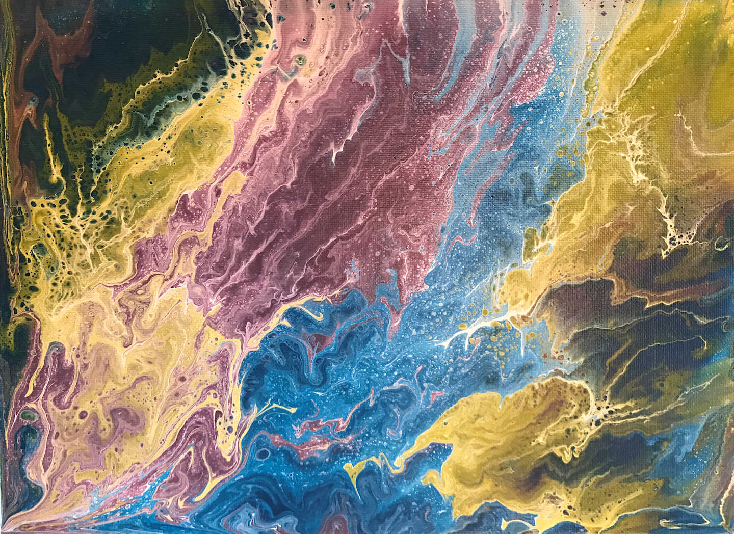
This is actually the first one I did, and I kept it simple with dark pink, orange, and white…
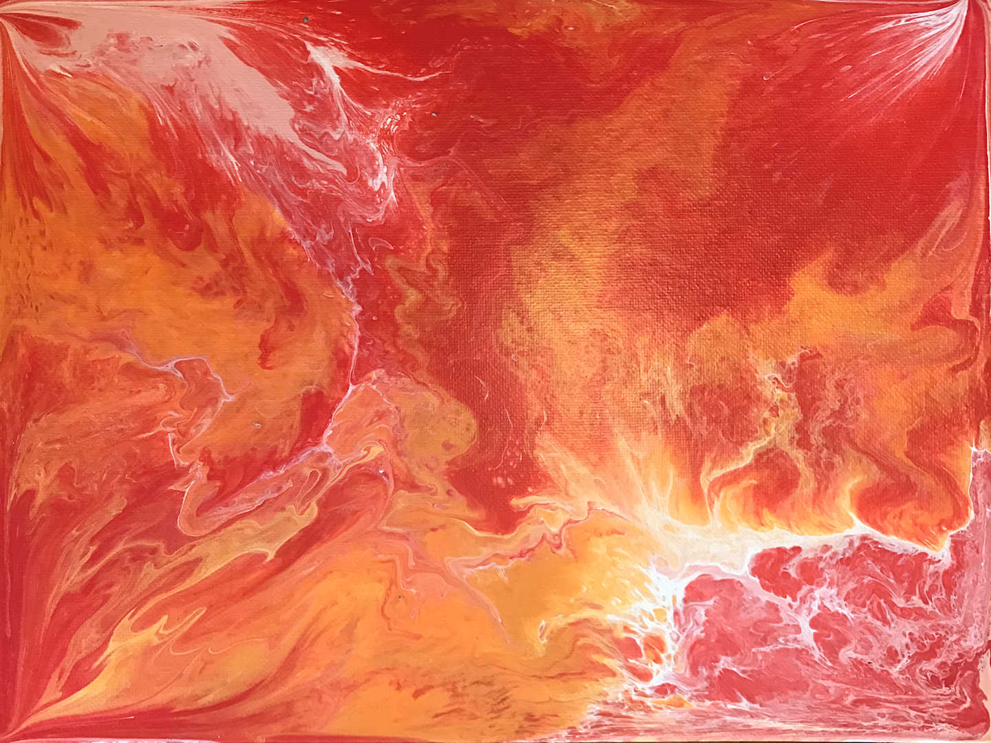
For this one, I used blue, green, purple, and white…
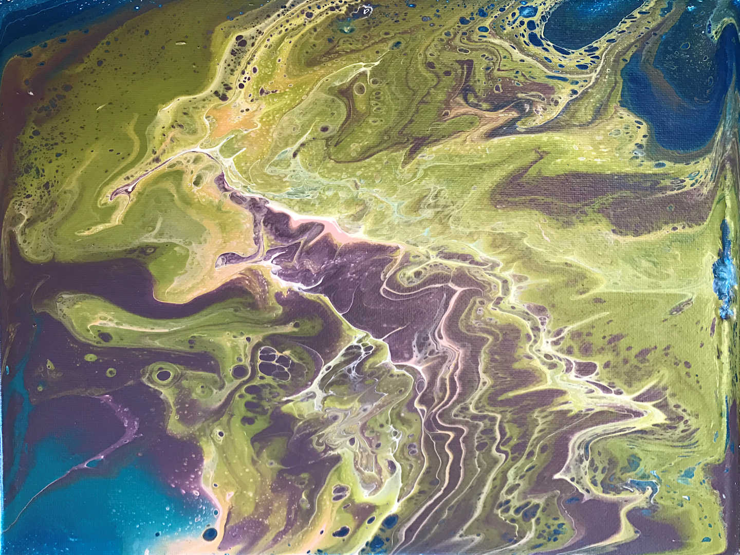
And finally, my absolute favorite one, with teal, purple, green, and white…
I’m having so much fun creating these, and it’s one of the most relaxing ways to spend a few hours of downtime. I have a feeling there will be quite a bit of fluid acrylic artwork in my future.
UPDATE:
I made some easy and inexpensive DIY frames to go on these paintings. Click here to see that project, and the finished framed artwork on my wall…


Addicted 2 Decorating is where I share my DIY and decorating journey as I remodel and decorate the 1948 fixer upper that my husband, Matt, and I bought in 2013. Matt has M.S. and is unable to do physical work, so I do the majority of the work on the house by myself. You can learn more about me here.
Wow! I love the work you did for your entryway. The colors blend together so well and every time I looked at it, I saw it differently. It’s one of those ‘changing’ pieces of art that will be beautiful no matter how many times you look at it or the light changes. Some of the small pieces might look good in your breakfast room? Wow!
Love these!
I love the art work for the entry!
OMG! I don’t even know what to say! All are absolutely breathtaking. Abstract art is my fav and yours are the most beautiful blending I’ve ever seen. I’m not lien away with your talent.
You should have a showing of your art work, you can pay for all of your home remodeling with the proceeds! Love your art!
My favorite is the blue, green, purple and white canvas. I would live to see that in my home somewhere! I may have to look into making some of these myself.
Kristi, I am absolutely in awe of your creativity!
Rita
As I was reading, I clicked on the link to view the first artwork before scrolling down. Stopped me in my tracks–it’s S.T.U.N.N.I.N.G. Absolutely beautiful!
Really nice art pieces! And yes, you should sell your art work.
I love the triptych and find the colour combination perfect -and very soothing! I would not, though, break up the impression the pictures make next to each other by framing them in white. Of course, I haven’t seen that yet, but I particularly like the effect of them “flowing” into each other (if that makes sense) and I think white frames would stop that. But of course, I’m humbly waiting for you to prove me wrong 🙂 Fantastic work!
I LOVE these, and I agree with Karen about the frames. I can see where the raw MDF edges might be a problem at this point, though. If you do frame them, I believe that the finished pieces should not be wider, when hung (so including the spaces between them), than the credenza below them, and that doesn’t give you much room.
I agree too! What about a thin black frame? I think it will blend in to the grasscloth a bit better and still keep the focus on the artwork itself.
LOVE these! Planning on selling any? I get first dibs!
Actually, I think I will sell them. 🙂
I’d love to have the one with a lot of red on the right side. Not the red/pink…. the 5th from the bottom. Shoot me a price and your address and I’ll send you a check. And don’t forget to sign it!
Wow! Love it. They are going to look gorgeous in your entryway.
Apparently, I need to learn how to do this. They are amazingly gorgeous! I just love color and this is a great way to display lots of color without overwhelming the space. Thanks for sharing 🙂
LOVE!!!
Beautiful! I usually avoid trying to “see” things in someone else’s art but I can’t be the only one who sees a raging waterfall, leading to rain, leading to a tornado or two.
Beautiful! I would love to see a video of the pouring process to get an idea of the thinness of the paint etc. Do you pour in rows or pour one color over another before using the pistol grip blower. Do you tilt from side to side?
I do all of the above. 🙂 I tried one poured in rows. I tried a couple where I poured the colors over each other repeatedly in puddles. I tilted all of them from side to side to let a lot of the excess paint run off and to create a marbled effect before using the blower.
I definitely want to try this. I can never find just what I’m looking for and if I do, I can’t afford it.
Those are gorgeous. Acrylic Pouring is exploding on Pinterest. It has become so popular because anyone can do it and they turn out stunning. I have been doing them for a couple of months and the last time I went to my art store to buy some Liquitex Pouring Medium they were out of stock and had no idea when their backorder would be filled. The factory can not keep up with the demand.
I really like these paintings. My mind perfectly wanders to strange places with them.
Amazing! You should sell these as prints! Love all of them.
I am impressed! I need to view some you tube stuff! I want to learn watercolor. I fiddle around with it, but don’t really know what I’m doing. BRAVO!
A video showing you making one of these would be fabulous! Ever consider a reader giveaway/ for one of them? (Hint,hint)
I like the idea!
Kristi,
Were all the additional art pieces the same size as your art for the front room? Will you use any of the additional art pieces else where in your home? I am just amazed these are so pretty and I never thought I would love abstract art. Way to go Kristi!!!!
No, the three for my entryway were 18″ x 42″. The six additional ones were 11″ x 14″.
This looks phenomenal! Love abstract so much more than landscape! I love your favorite one, too! Could perhaps replace the two you dif in there over the purple bench?!! These look much more professional and upscale
Totally and Completely COOL!
Ohmygoodness! These are super stunning, Kristi. I love them all and I echo what I’m hearing in these comments- you should definitely put these up for sale!
Very cool! They look beautiful!
I’m gonna be the naysayer here – while I quite like the paintings themselves I think mounting them over that grasscloth background does a disservice to both elements. By the time you add lamps or sconces on either side you won’t see much of that beautiful teal grasscloth.
With the grasscloth being framed the way it is it becomes like mounting a picture over a picture.
I also think the paintings are too strongly coloured and patterned for that spot, especially with the two toned treatment you gave the console. There is just too much competing for attention.
I expected that some would think it’s too much. 🙂 One person’s “too much” is another person’s “just right.” I was getting bored with the predictable and calm and needed something to shake things up a bit.
Yes!
I have to agree with Carswell. The pictures themselves are nice but don’t quite seem to belong in that space. Maybe the room is just too empty right now so they stand out so much. Looks like it was a fun project though.
I am not a fan of abstract art, but I absolutely LOVE these! I think it is the colors and the soft rounded shapes. Anyhow, they’re beautiful!
My thoughts exactly!
amazing!
b
OMG! These are absolutely stunning! I LOVE them, including the “extras” you did just for fun!! Can’t wait to see where you use all the extra ones as well 😉
Kristi, You are one creative woman, as well as being very generous with what you share. After your studio is in full operating mode, how about doing YouTube videos for those of us who want to see you do the art work you describe?
I actually just ordered the equipment to do that type of video. 🙂 Hopefully I won’t need to wait until my studio is done.
You can add another accomplishment to your many when you are a YouTube Star! Will you still speak to us when you are rich and famous? 🙂
OH my goodness……these are ALL absolutely gorgeous!! You have done an amazing job Kristi, it looks so professional. I’m going to YouTube right now to look at this acrylic fluid artwork. I love to paint and draw, but have not done any abstract artwork, but this style I really like a lot. I could see this being a new little side business for you, earning some extra renovation money. I think you could sell this art very easily!
Kristi, I’ve loved this artwork ever since you did the piece months (a year?) ago! I keep going back to it to show my husband. We just moved and have a big blank wall that’s just waiting for some version of this…I’m definitely going to try my hand at this!
OMG!! Along with all that talent in all your DIY projects, I am head over heels with the results of your latest work!! Couldn’t you sell these custom pieces in a New York Soho Gallery or even my house. The colors and movement show different functions and the different mediums used to create your art is amazing! Look forward to reading your posts daily.
This is beautiful! I absolutely love this idea of multi-panel art it has definitely become some of my new favorite decor items! You did a great job on this project I love it!
ooooh oooooh ohhhhh my!!!!! So my thought is you could sell some paintings to upholster your sofa and maybe chairs too! Fun stuff….yeahy AND they are BEAUTIFUL!
I’ve been doing pours recently and found that Floetrol works great as the pouring medium and so much cheaper than the Liquitex.
I love it! I hope you bought those Pier 1 chairs another person mentioned on a earlier post! They were teal and lavender and need to reside in the room with these paintings! Job well done!
I am just amazed how beautiful these are Kristie. I respectfully disagree with the comment that your paintings will be too much on your grasscloth wallpaper. Your grasscloth will be a beautiful back drop for these lovely paintings.
These pieces are just beautiful! I like a lot of abstract art, prefer ones that are soft and flow-y and calm (like yours), vs. the type that are sharp and angry looking, or have too much hyper energy/movement. I’ve wanted to try this technique for a while, haven’t gotten around to it yet. I’m in love with aerial views of the water off the Whitsunday Islands in Australia, it is so calming! This technique would likely lends itself to recreating that look. http://www.lonelyplanet.com/travel-blog/tip-article/wordpress_uploads/2015/03/Whitehaven-aerial-view_cs.jpg https://cdn.audleytravel.com/-/-/79/223086036153251224043000053118064134134174004218.jpg
Gorgeous!
I see paintings by Kristi in the near future! I’ve always loved that type of artwork. Can you use regular canvas to do this?
Yes, you can. I just needed an odd size, and didn’t feel like making my own canvas stretchers and stretching my own canvases. MDF seemed like the easiest (and cheapest) option for my purposes. But you can certainly do this on canvases. In fact, they’re very pretty when you use gallery wrapped canvases and let the paint flow onto the edges, and then hang it without a frame.
Kristin these are gorgeous! Kudos!!!!! You talents always amaze and awe me! What’s next?
One question…. seems I read somewhere that there is some over coat clear protectant people put on their paintings so they don’t fade. Are you aware of such a product? Have you used it?
Hate to these beauts fade.
I don’t know that it’s absolutely necessary, but yes, there are sealers for acrylic art that come in brush-on or spray. Since the paint goes on these pretty thick, I’d probably wait a week or so before sealing them. I haven’t used it on these paintings, but I have used them before. You can find the in the art section of Hobby Lobby or Michael’s.
18″ wide and 42″ tall is really great dimension..! it is large enough and beautiful.
Kristi, these are stunning. I am not artistic (at all) and found this process fascinating. I would never have been able to choose the combination of colours. Each time I look at them another area catches my eye. Another talent which obviously has many of us envious! Looking forward to seeing it all together.
Love all the blues and purples. My favorite is the far left panel too.
They all are gorgeous but I would be terrified to put a blow torch to anything.
these are awesome!! THey remind me of the nail polish ones. Where you put nail polish in water in a tub the size of your piece then swirl colors and dip in your canvas and pull out. It dries shiny like polish and looks cool with the metallic polishes. I have learned tho……. no dollar store polishes they are too old. New fresh polish is best. BTW i just love your blog. MY FAVORITE. Hate it when you are laid up with the pains of life and living. your blog is something i read to relax at night. YOu are SO talented. Love your creativity etal!!
Definitely going to be doing this. It’s similar to what I’ve been doing with acrylic paint on water color paper. I do have question? Are you adding the silicone to the paint before pouring or on the canvas after the pour? My favorite is the one on the far right. The boldest of the three.
Although i love your artwork, my initial reaction was the overall size and covering the beautiful grasscloth. I could envision panels 2 and 3 hung lengthwise , one above the other, but think one larger canvas in the same technique would look classy. I am a huge fan and know whatever you decide will look amazing..
This is my style of art! Love it. I often lean towards more abstract..sometimes a nice simple floral- like cherry blossoms, but not a big fan of people paintings. The bright bold colors are stunning! and really like how its 3 canvases.
Your art is amazing! I am trying to learn how to do this, I have watched tons of videos and read lots of info. Yours looks a bit different in that you have larger areas of color. Could you please tell me how you applied the paints to the board? I would love to make something similar for my daughters 1st apt.
If you’ve watched videos on YouTube, then you’ve probably been inundated with videos showing a “dirty pour” method, where the artist pours lots of different colors into one cup or container, turns that one container over onto the canvas, and the moves the paint around as the various colors begin to present themselves. That’s not what I did at all. 🙂 I kept all of my paint colors in separate cups. I first poured a whole lot of white paint all over the canvases (I actually used MDF board, not stretched canvases). And I made sure that all of the surfaces of the canvases were coated with white paint. Then I took my cups with the individual paint colors, and one at a time, I poured it onto the canvases in large swooping, swirling motions. I did overlap the colors at times with the large swooping, swirling motions, and I also intentionally left quite a bit of white space on the canvases. Once I had the colors poured and swooped and swirled like I liked them, I then started tilting the canvases (one at a time) to begin moving and blending the paints. I also used a blower (around $5 at Home Depot) attached to my air compressor (set at a very low pressure) to blow the paint around the canvas as I wanted. And that’s pretty much it.
Thank you so much for such a detailed (and quick) response. That does really help. I love to look of a variety of the acrylic paint pouring techniques, but yours is a standout for sure. I love everything about it. I’ll be adding the frame as well. Thanks again.
Do you take orders and sell these? Very nice paintings.
I don’t at the moment, but I’m planning on it starting at the beginning of next year.
Thanks, That’s great.
you.are.amazing!!!
taking orders yet?!!
Yes, I would totally buy the artwork in your foyer! It is gorgeous. I just stumbled across your blog on a sleepless night….It is great 🙂