Gray Fireplace Fail
So I painted my living room fireplace gray. Don’t even ask me what’s going on with me and grays. I’ve been telling you the last year (or longer) that I hate them, and now evidently I’ve painted my upper kitchen cabinets a light gray (greige…whatever), and now I’ve painted my fireplace a darker gray. And now, for some reason, I love grays. They look so pretty with all of the blues, greens and purples I want to use.
But my fireplace painting has turned out to be a fail. I can and will correct it, but this first attempt was definitely a misstep.
Two lessons learned here. (1) Don’t ever pick out a paint color “by memory,” and (2) any time I say, “I’m just going to take a break from this big project I’m working on and do this small quick project,” the quick project will almost always turn into some big, drawn out project.
I wanted to take a break from my kitchen cabinets (and I’m also waiting for more Timbermate to arrive) to work on this quick and easy fireplace painting project that has now taken up two days, and will take at least one more because I tried to pick out a paint color by memory. Ugh. I know better than that. I really do. But I was standing there in the Benjamin Moore store with all of their glorious paint swatches before me, and I thought to myself, “I just need a dark gray. How hard can it be to pick out a dark gray that coordinates with my Revere Pewter kitchen cabinets?” Well, evidently it’s much harder than I thought.
I searched through my memory and recalled this picture in my mind…
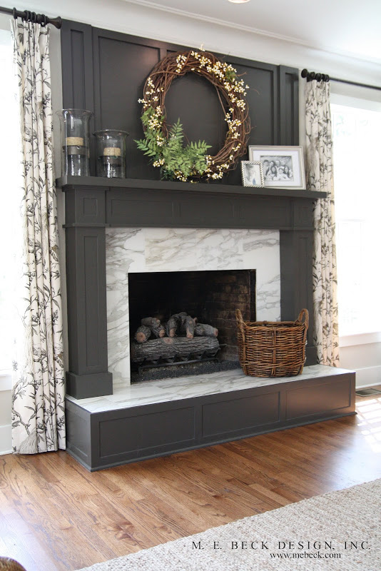
Why I didn’t actually look at the picture before picking out a color, I have no idea. I had my phone right there in my hand, but it just didn’t dawn on me to look it up. Again, I was thinking, “Dark gray…how hard can this be?” After all, I was standing there with my Revere Pewter and Gentleman’s Gray samples right there in my hand, so I grabbed a couple of dark grays (greiges) and somehow ended up with this…

That’s Galveston Gray. It’s a pretty color. Very pretty, in fact. But it’s just not as striking as the fireplace in the first picture. The sample looked soooooo much darker than that. And it looks much darker on these walls…
And on these walls…
I mean, neither of those look as deep and rich as the top fireplace picture, but it sure doesn’t look as washed out as my fireplace.
Anyway, I’ll definitely need a new color. And this time, I’ll go to the store with that top picture actually in my hand and not just in my mind. I hate having to relearn lessons I already know, but I guess I needed a good reminder. Evens something so simple as “dark gray” isn’t quite so simple when you have hundreds to choose from.
You can see some of the wall colors I’ve tested in here, including the Revere Pewter that I’m using on my upper kitchen cabinets. It’s right there in the middle (the only neutral) and looks way darker on my wall than it does on my cabinets.
And yes, I even tried a very light, muted purple — Benjamin Moore Porcelain. That paint chip looked so muted and pretty, but the color turned quite dark and way more saturated than I expected on my wall. (See? That’s what I expected with Galveston Gray, too!)
The color I’ve decided to go with in here is this really light blue called Iceberg (also Benjamin Moore). I think it’ll look so pretty next to a dark gray fireplace.
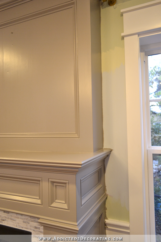
Excuse my messy painting job against the walls. 🙂 Since I’ll be painting the walls also, I wasn’t too careful with my gray next to the wall.
So now you know my goal — Iceberg walls and a dark gray fireplace. I guess I’m heading back to the paint store today. I’d love to get this finished today because my new chandelier arrived, and I’m so anxious to see my dark gray fireplace with my new chandelier. The new drapery fabric also arrived yesterday, so this room will start taking shape very soon.

Addicted 2 Decorating is where I share my DIY and decorating journey as I remodel and decorate the 1948 fixer upper that my husband, Matt, and I bought in 2013. Matt has M.S. and is unable to do physical work, so I do the majority of the work on the house by myself. You can learn more about me here.

Kristi, when you get a chance, will you post a picture of your painted piano before you painted it yellow? It was two toned and gorgeous. I would love to have a similar one but i need your picture!
It’s here –> https://www.addicted2decorating.com/refinished-and-painted-upright-piano.html
All of my projects can be found by clicking on the “DIY Projects” link on the menu at the top.
I have Iceburg on a wall along with other sample colors. Against the other blue samples, it was coming off rather bright, cold, and almost neon-like. I wanted bright for my basement hall though but wanted a warm bright, if that makes sense! Can’t wait to see your room painted in it to help me finish my paint job!
How interesting. I tried it in my music room, and really couldn’t see any blue in it at all. It just looked really light gray. So I tried it in the living room, and can see some blue in there, but it doesn’t look like a bright blue at all. It’s all about lighting. It’s amazing what lighting does to colors.
Isn’t it? I’d say lighting has almost everything to do with how the paint comes off. But also the amount of color used in a room can affect its appearance. I’ve gotten to where I paint large sample squares (2×3) but still, once the entire room is painted, the color can be different enough, I’ve had to repaint the whole room again!
Why not use your gentleman’s gray on your fireplace? That way there’s no need to reinvent the wheel and you know it fits into your overall color scheme.
The Gentleman’s Gray is actually a dark blue. I don’t want a blue fireplace. 🙂
I agree that it’s too light. Can’t wait to see what you decide on. Grey-tones have come a long ways. There are so many these days that it’s hard to make a choice. When I get around to repainting my cabinets, they will be a light grey and I want a red backsplash.
I have never thought of grays. I’m a rustic girl. But I really love that dark gray fireplace. I also love the curtains. I have knotty pine den. I really want something different. (my knee’s are shakin, lol )
Oooo. I like that light blue iceberg color. I actually think the grey you have on your fireplace looks nice, but maybe not with the iceberg.
Kristi, you need to paint your walls HUSK GOLD. It’s the perfect shade to complete the room with the dark grey and chandelier. Iceberg is going to be too weak and Husk Gold will offer the same depth as your other colors. It’s a top tier version of iceberg. Just try a swatch on your wall, it will not disappoint.
She’s been looking at Benjamin Moore colors. Who makes Husk Gold? Valspar???
We’ve been doing a lot of grey in our house. I really love it, and how it has the ability to play with other shades so well. Our main hallway and family room grey has a hint of green, but our kitchen is Benjamin Moore’s Oxford Grey, which is very icy blue. I LOVE it.
Whatever colors you pick, it’s very refreshing to see the excitement return to your blog and your writing. You sound SO much more upbeat, and that’s what working on your home SHOULD be!
I’ve always enjoyed your ideas, even the redos, but now it seems like you’re having as much fun as your readers. Looking forward to what’s next!
I think picking a colour can drive a person crazy. Sometimes I pick at random too. What colour is that on the fireplace you like above?
She doesn’t give colors and sources for client projects.
I think the fireplace color looks very similar to the color I painted the doors in my house – Iron Ore by Sherwin Williams. I’m sure I’ve seen doors painted the same color somewhere in the blogosphere, but I don’t remember where.
Looks like it could be Iron Mountain. I have used it both inside on my doors and on my shutters.
Is there a chance that they mixed the wrong color? I would take it back along with the paint chip if you can’t tell from the can.
No, they mixed it right. I just chose wrong. 🙂
Well, darn! It wouldn’t have saved your labor but it would have saved the paint cost. Love the dark gray in your inspiration picture.
With all of your changes, Kristi, will you be keeping your gorgeous mural? I hope so, because I love it!
It didn’t make the cut for the living room/entryway, but I’ll be using the pattern elsewhere.
The amount of light in your living room can really create havoc on a paint color. Even if you choose the same paint color as your inspiration picture, isn’t there a possibility that it won’t work? Maybe you should get more samples!
Enjoy reading about your adventures!
My favorite dark grey was, in a past basement that matched dust way to well for our cleaning habits. It created an effect similar to your inspiration picture, and was paired with a deep yellow on the walls. Suprisingly it worked well. When my inlaws were re-painting the upstairs to sell the home, they used a selection of lighter greys between different rooms, and it opened up the woes of greys how different they were depending on the room. My favorite was called “squirrel”, I think I liked it more from the name. I was still drawn to squirrel despite it “changing” what it looked like depending on the light.
How will the Iceberg work with your mural?
It won’t. 🙂
Behr has a really pretty dark gray… Urbane Bronze I believe.
You make me chuckle! I have done the darn thing a hundred times. You always make me realize that we both are normal!
Well, it is lovely, but not as stunning as the fireplace in the first picture. Lighting can change how the color looks in a room. I am not a “grey” fan either….but I am picking colors for projects that are on the grey spectrum. Go figure.
As you mentioned, lighting plays a huge role in how colors appear. Will you use LED bulbs or incandescent bulbs with your new chandelier? If you will have table lamps, be sure to use the same type bulb as your overhead. In my experience, LED can give the most true color. From your post yesterday, I thought perhaps you could paint the birds within frames for your TV disguise. Do you already have the tv or will that be a new purchase for the breakfast room? Like you, my favorite of the inspiration photos was the first one. I can’t see using any of the others for it. However, be sure you really will be closing it for when it is just you and Matt instead of only the rare occasions when family come. It might not be worth the trouble. It’s for you two, not for others as you came to realize with your living room…dining room….and again a living room.
You always make me feel better and free to take chances.Thank you.
Does it matter that your mantle is solid wood. Does that affect the paint color as opposed to wallboard?
I don’t think it affects the color.
Good to know, Krista! Thanks!
I’m just curious, you have lot’s of “new” stuff coming in the mail. What do you do with the “old” stuff you no longer want? Do you sell some of it or donate? I know anybody that is fortunate enough to snag one of you old projects will be thrilled with it, but have you thought about donating to a local charity/church that may be looking to furnish someone’s home for the Christmas holiday or any other time of year? I’d love to see HGTV give you a $1000, a month, a small crew and then just turn you loose in an empty house for a makeover. I absolutely LOVE your blog!
I do a mix of things. I’ve given things away, and I’ve also sold some things. And yes, I’d love for someone to give me money each month to make over rooms! 😀 That would be so fun! I’ve actually thought about what I might do when I finish my house. One thing I’ve contemplated is buying up old houses around us that need some love and attention and remodeling them and then renting them out. Another idea I’ve had is to maybe travel around and do room makeovers for people. I’d love that!
*making interested cat face: big eyes with ears and whiskers swiveled forward* Wow, by “travel around,” I’m wondering if you mean outside of Texas? If so, how would you like to come to Los Angeles? 🙂 I’ve got an apartment that needs so. much. help. – the bedroom, and the combo living/dining room. I just can’t get any of it together.
Maybe you could offer a service where you do a lot of the consultation/planning/product buying, etc. online, and have products delivered to the client location. Then you’d just travel to the location for the actual room makeover bit. And the client can help with painting, any DIY stuff, etc. Sounds like a great plan to me (LOL!). You’d have a list a mile long for something like that, but I wanna go first!
Kristin,
Did you use Advance for the fireplace? I have come to the conclusion that Advance comes 1 or 2 shades lighter than the sample paint (which is matte).
Also, I used iceberg in my Hall bathroom. It is a beautiful color but it has blues in it and really bright. My advice will be to try one wall first as I am not sure it will work with dark grey.
Yes, I did use the Advance! Interesting observation about the color. And I do think I’ll paint as much of a wall as I can with my Iceberg sample because you’re the second person to describe it as a bright blue. It looks so muted in my music room (almost just looks gray), and in the living room I can see the blue, but I really don’t want a bright blue.
Kristi,
Iceberg looks very muted in my home. Almost grey, just a hint of blue. And the Dark Pewter that is on the chip is on several of my interior doors
looks fabulous.
I used a light grey that looks geyish-blue at night, & I used a “pencil grey” on an accent wall. While I had my doubts, I actually love the pencil gray – and I swear it really does look like you’ve taken a pencil and colored in the wall. With white framed black & white photos on the accent wall, it looks really nice! 😃 Good luck.
This brings up an interesting question. If you have a room to paint with lots of light, do you try to choose colors towards the cooler end of the spectrum to test (say, a gray with more blue in it) or go with hues that are warmer (using the gray example, one with more yellow in it) in order to balance the light? Or, another example, a north-facing room as opposed to a south-facing room. The quality of the light changes the color. Is there any way to predict what will look better? I always seem to miss the mark when trying to figure out what will end up being a good color. Too many swatches!
PLEASE make sure that you get your fireplace painted ( to your satisfaction) before painting walls!!! Would be horrible for you to do all walls, then hate them with your fireplace!! Speaking from experience on that one!! 😫😫😫
I believe the color in your inspiration picture is Peppercorn. Sarah from TDC used it on her fireplace:
http://www.thriftydecorchick.com/2014/09/a-painted-fireplace.html
What about BM Amherst Gray or Kendall Charcoal? I think those would mimic your inspiration fireplace.
I agree. Kendall charcoal looks very much like the inspiration fireplace. Our tv/family room is painted that color with the ceiling painted revere pewter as is the rest of the house. They work well together.
Check out Thrifty Décor Chick’s Peppercorn fireplace: http://www.thriftydecorchick.com/2014/09/13-planked-wall-finished-fireplace.html She has used that color throughout her house with success.
This was the color I was thinking of. I think it is definitely close to the target.
Love the idea of a dark gray on the fireplace. Ditto the color Peppercorn Sarah uses at Thrifty Décor Chick. Truthfully, not sure on the wall color. It seems so light and cold on my computer screen that I can’t give a decent vote!
I can’t see how you will ever get your house done because you go back and change so much of the things you have finished. 😉 First it was bright colors, now it’s softer more muted colors. I’m not saying this to be unkind. Just an observation. I’m glad you are doing what makes you and Matt happy. in the end, that’s all that matters!! 😊
Yep, I’ve mentioned several times that I’ve felt completely lost and frustrated this last year. But now I’m on the right track, I have a plan, and I’m full steam ahead. 🙂
I painted a bedroom Iceberg by BM. It was suppose to be grey with a hint of blue. That bedroom is now called the blue bedroom in our house. I would suggest a big swatch before you paint much of the room.
Kim,
I think that this color is really influenced by the lighting. It looks much more grey at certain times of the day in my home.
Take a look at Dior Grey by BM. I’m addicted to it.
I have Iceberg on my ceilings, with Palest Pistachio on my walls in my living room and I love it. I plan on using it on my bedroom walls.
Have you considered a glazed zinc to go over the light grey? I have a page dedicated to my favorite color; it’s grey, and it’s because grey simply goes with every other color imaginable – in my opinion. I did one of my guest baths in Grey Metal – which is very dark. Did not sand the oak stained vanity or wall cabinet, just cleaned them with alcohol, and they turned out great with two coats of the satin latex. The grain slightly shows, if you like that look as I do. Otherwise, it’s easy to cover, as I’m sure you know. I purchased Granite Grey for the masterbath vanity, the mirror frame that is essentially a three mirror cabinet with the light bar built in, and another large wall cabinet that hangs above the toilet. I am considering painting the block glass window shelf that has beautiful crown molding, which my husband made, and hangs just above the jacuzzi. Granite is much lighter and I am considering adding a coat of poly over the paint just to the vanity cabinets, then doing a light sanding and adding a zinc glaze for a nice satiny look and a little definition. You sound like me, in that you have too many projects going at one time! I am also trying to finish one mosaic of a waterfall, while doing another mosaic tile over a frame we made for the 2nd guest bath we are working on. Also, as a last minute chore, I designed an accent table my husband is just about to complete. That, I will sand, paint, poly and glaze; I spent a few minutes yesterday laying out some mosaic tiles for the top on cement backer until I was satisfied with the design, and I am gluing down at eleven p.m! It’s fun, and it’s exhausting and at times it can be daunting; but in the end – it is so worth it! It’s hard to do when, like you – I am also working on and planning future rooms for an entire home remodel and redecorating! You are doing a terrific job, so try not to stress over the color – you can add anything you like to darken it up, and until you rest up – it can wait because it certainly doesn’t look like an eyesore – it’s a nice warm tone until you get around to making your brand of perfect!
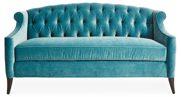
If you’re still looking for velvet sofas you m want to check this blog post.
http://www.thegritandpolish.com/farmhouse-living-room-a-sofa-for-a-new-room/
We’ve had a fail with gray and it was our fireplace too. We picked a light gray, gorgeous in the samples and it turned out a purple-gray when we painted. Awful! We learned that never buy a gray that has red in it! Good luck with your fireplace. That rich gray you chose looks stunning!
As I was painting over the light gray last night, it struck me that the light gray actually looked like a very light purple. And not in a good way. :-/ I didn’t remember it looking like that during the day so it must be my lighting in that room, but the night time look was definitely on the purple side.
Surprising, your fireplace came out looking almost metallic copper on my screen. (Gorgeous, but not gray.)
What I mostly noticed in your wonderful close-up was how uniform the paint finish looks. You used BM’s Advance, but did you brush again like with your cabinets?
Also, meant to ask you at the time of your new kitchen cabinets blog: Why did you decide to brush instead of spray your cabinets this time?
As always, your skill and speed just amaze me. I am in awe of your talent. So glad I found your blog!
I did use Advance, and I brushed it on. On my cabinets, I decided to brush because it puts the paint on thicker and pushes the paint down into the wood grain to create a smoother finish. On a wood with minimal grain, I would have sprayed. But my cabinets are oak with lots of grain.
I just want you to know, we are twin sisters. I too hate gray and yet I too am planing on painting my fireplace dark gray and accent my living room in gray fixtures and accent pieces, even to the point of have an accent chair recovered inside charcoal fabric. I will admit my new sofa will be very light cream and so will my new wall color. But still, gray….I can’t believe I even want to do this, but I do.