I’m Getting New Cabinet Doors (Pssstt…I Need Your Opinion!)
Remember the other day when I shared what I’ve accomplished so far on my family room? I mentioned that the center cabinet wasn’t finished yet, as I eventually wanted to reconfigure the doors so that the cabinets look less “kitchen-y”.
Well, I hadn’t thought that the doors would be in the budget any time soon, because when I’ve priced doors before, I’ve always been told that they would cost around $50 each. So I was just going to be content with what I had until I got finished with some more pressing projects and had money to spend on doors.
But two days ago, I found a cabinet maker (a quite TALENTED cabinet maker) who charges an unbelievably low price for doors! So I’ve decided to go ahead with it. Now unfortunately, new cabinet doors for my kitchen are still not in the budget just yet, so I’ll just be focusing on the center section of the living room cabinets.
So here’s where I need your help!
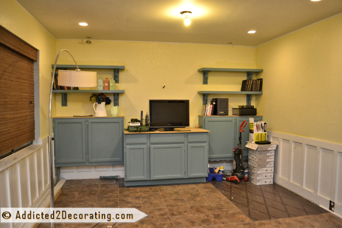
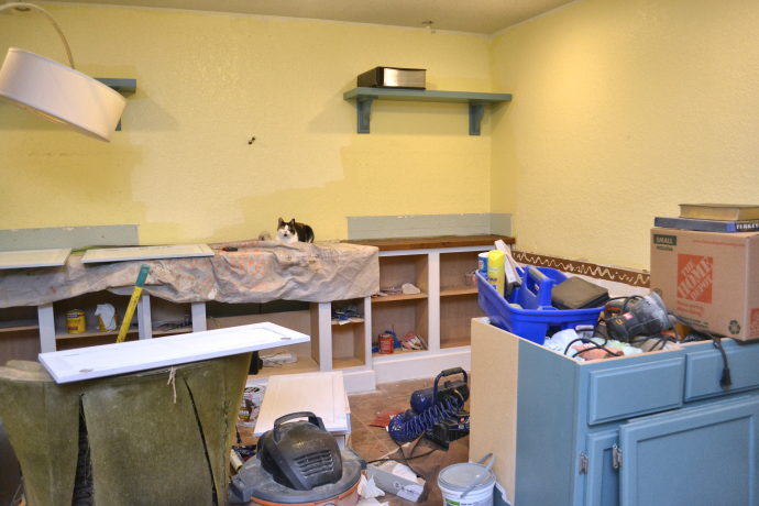
This is what the cabinets look like right now:

Very stock, very kitchen-y. But with a bit of reconfiguration of the doors, that will be remedied. And keep in mind, I will also be adding moulding all the way to the floor to get rid of the toekick. Also imagine that I’ve found the perfect hardware! Oh, and have a finished countertop! My goodness…so much still to be done!! 🙂
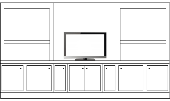
The plan I’ve had all along in my mind looked something like this:

That would require simply removing all of the spacers between the drawers and doors, and replacing the drawer/door combos with tall doors. Shelves inside would hold dvd player, X-Box (a necessity, of course), and other items.
But just this morning, I was looking at it, and wondered if something like this might be more visually interesting.

If I went this route, I would keep the outer sections just as they are, and just reconfigure the middle section with two taller doors, and shelves inside.
By the way…in the process, I think I’m also going to pull out this entire middle section and cut down the depth of the cabinets a bit, so that they’re more like 18 inches deep, rather than 24 inches deep. (Hey, give the girl a jigsaw, and she thinks she can do anything!) 😀
So help me, please!! What do you think? And which option would look more family room-y, and less kitchen-y?
UPDATE:
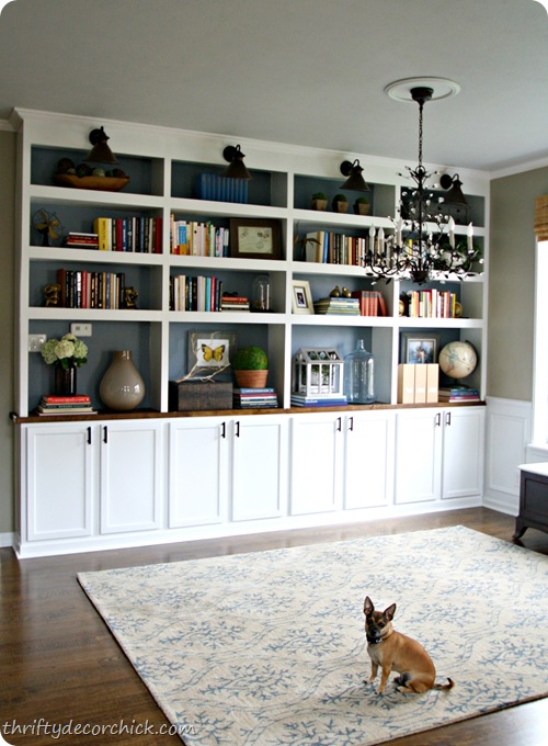
I finally finished the cabinets on this wall, and I ended up making some pretty significant changes. Click here to see the final improved design.


Addicted 2 Decorating is where I share my DIY and decorating journey as I remodel and decorate the 1948 fixer upper that my husband, Matt, and I bought in 2013. Matt has M.S. and is unable to do physical work, so I do the majority of the work on the house by myself. You can learn more about me here.

I like the second one with the drawers but I can't tell if that would make it look more "kitchen-y" or not. The drawers would probably be handy though (I'm thinking storage).
Ditto, Scientific Housewife. I use a bedroom dresser for a buffet in our dining area, and it doesn't look bedroomy at all, although it does have drawers, which, I might add, come super-handy!
I am inclined to straight clean lines so I lean towards your first design. With its knob arrangement I find the second design to be a bit busy. While I am not Sarah Richardson by any means, I am a Canadian as is she and am a retired teacher reincarnated as a Home Stager/Redesigner living in Halifax Nova Scotia. Do you get Sarah's television show in Texas? She is an incredible designer. While, as I said I am not Sarah Richardson I invite you to check out my blog which can be accessed through my website. I provide design tips for those who like me have high end tastes but mid to low range budgets. I enjoy your blog Kristy
and look forward to your upcoming postings.
Joanne http://www.ravereviewhomestaging.com
I vote for #2 – much more interesting!! The whole unit is already so linear, I think the whimsical placement of the drawer/door pulls would make them look less "stock". Gorgeous color that you chose, btw!!
Hi Kristi…
Definitely #2…it's much more visibly interesting.
I'd also STICK with the 24" depth of the cabinets. A girl can NEVER have enough storage space. And if you have the countertop already finished, isn't it finished to fit a 24" depth?
Just my thoughts…as an Interior Designer…
Jan
I am also voting for the second one. Because first one is very much simple. 2nd one looks attractive.
I like the first one better due to the clean lines mentioned above, however – you may want to consider some sort of opening/glass/mesh for the space in front of the components as it is quite a pain to have to open the cabinets/leave the cabinets open everytime you want to watch tv. Maybe you could figure out a way to have a pocket slide out or someting cool like that – just a thought 🙂
I'm agreeing with most everyone else that the 2nd one looks nice. Looking forward to seeing the finished project 🙂
I am also voting for the second one. Because first one is very much simple. 2nd one looks attractive.
Hi Kristi…
Definitely #2…it's much more visibly interesting.
I'd also STICK with the 24" depth of the cabinets. A girl can NEVER have enough storage space. And if you have the countertop already finished, isn't it finished to fit a 24" depth?
Just my thoughts…as an Interior Designer…
Jan
I am inclined to straight clean lines so I lean towards your first design. With its knob arrangement I find the second design to be a bit busy. While I am not Sarah Richardson by any means, I am a Canadian as is she and am a retired teacher reincarnated as a Home Stager/Redesigner living in Halifax Nova Scotia. Do you get Sarah's television show in Texas? She is an incredible designer. While, as I said I am not Sarah Richardson I invite you to check out my blog which can be accessed through my website. I provide design tips for those who like me have high end tastes but mid to low range budgets. I enjoy your blog Kristy
and look forward to your upcoming postings.
Joanne http://www.ravereviewhomestaging.com